Design style guide设计风格指南
What is Shenzhen Huaqiangbei?什么是 Shenzhen Huaqiangbei?
Shenzhen Huaqiangbei translates the world's densest electronics bazaar into a design language where every surface functions like a circuit board — organized, legible, and charged with industrial purpose.深圳华强北将全球密度最高的电子元器件集散地转化为一种设计语言,让每一个界面都像电路板一样运转——有序、可读、充满工业目的性。
Shenzhen Huaqiangbei in briefShenzhen Huaqiangbei 速览
Shenzhen Huaqiangbei is a design system born from one of the world's most extraordinary commercial ecosystems. Huaqiangbei — the electronics district straddling Huaqiang North Road in Shenzhen's Futian District — is not merely a market; it is an industrial nervous system where raw components, assembled modules, shanzhai prototypes, and finished consumer devices circulate within a few city blocks. The aesthetic that emerges from this environment is precise, dense, and unapologetically functional. It reads like the physical world it maps: part numbers stenciled in monospace type, status indicators blinking at the edge of panels, copper traces dividing space the way a printed circuit board divides its substrate.深圳华强北是一套从全球最非凡的商业生态系统中生长出来的设计语言。华强北——横跨深圳福田区华强北路的电子元器件集散地——不仅仅是一个市场,更是一个工业神经系统:原始元器件、组装模块、山寨原型与成品消费电子在几个街区内密集流通。从这个环境中浮现出的美学,精密、致密、毫不掩饰其功能性。它的读感如同它所映射的物理世界:等宽字体的料号编码、面板边缘闪烁的状态指示灯、像印刷电路板分割基材一样划分空间的铜箔走线。
The visual language draws directly from the material culture of electronics manufacturing. The dominant ground is the cool blue-green of soldermask — the protective coating applied to PCBs — interrupted by the warm gleam of exposed copper traces and the sharp white of silkscreen annotations. Nothing in this palette is decorative; every color existed first as a technical necessity before it became an aesthetic signature. Information is structured the way a component spec sheet structures it: taxonomic, right-aligned, using contrast and weight to communicate urgency, category, and state without relying on illustration or metaphor.这套视觉语言直接取材于电子制造业的物质文化。主色调来自阻焊漆——涂覆于PCB上的保护涂层——那种冷调的蓝绿色,被裸露铜箔走线的暖光与丝印标注的锐利白色所打断。这套色板中没有任何装饰性色彩;每种颜色都先作为技术必需存在,才成为美学签名。信息的组织方式如同元器件规格书的组织方式:分类明确、右对齐,用对比度与字重传达紧迫性、类别与状态,而不依赖插图或比喻。
Where many design systems derive their authority from historical art movements or brand identity programs, Huaqiangbei's authority comes from the factory floor. Its grid is the grid of a bin organizer, its color logic is the color logic of LED status indicators, its typographic hierarchy mirrors the hierarchy of a component datasheet. The result is a system that feels both deeply specific — unmistakably rooted in a particular place and industry — and broadly applicable to any interface where density of information and clarity of state must coexist.许多设计系统从历史艺术运动或品牌标识体系中获取权威,而华强北的权威来自车间地板。它的网格是零件分拣盒的网格,它的色彩逻辑是LED状态指示灯的色彩逻辑,它的字体层级映射元器件数据手册的层级。结果是一套既极具特殊性——明确根植于某一具体地点与行业——又具有广泛适用性的系统,适合任何需要信息密度与状态清晰度共存的界面。
See the Shenzhen Huaqiangbei design system →查看 Shenzhen Huaqiangbei 完整设计系统 →
Where does Shenzhen Huaqiangbei come from?Shenzhen Huaqiangbei 从何而来?
Huaqiangbei's story begins with the Special Economic Zone that Deng Xiaoping designated in Shenzhen in 1980. The SEZ granted Shenzhen unusual freedoms — to attract foreign capital, experiment with market mechanisms, and build industrial capacity at a pace the rest of China could not yet match. Electronics manufacturing gravitated to the Pearl River Delta naturally: proximity to Hong Kong provided logistics infrastructure and access to international components markets, while the mainland's labor force provided the density of skilled assembly workers that the industry required. By the mid-1980s, Shenzhen's electronics corridor was already distinct from other Chinese manufacturing zones in its orientation toward component trade as much as finished goods production.华强北的故事始于1980年邓小平为深圳划定的经济特区。特区赋予深圳非同寻常的自由度——吸引外资、试验市场机制,以中国其他地区难以匹敌的速度建立工业产能。电子制造业自然向珠三角聚集:毗邻香港提供了物流基础设施和进入国际元器件市场的通道,而内地劳动力则提供了这一行业所需的高密度熟练装配工。到1980年代中期,深圳的电子走廊已在对元器件贸易的专注程度上与中国其他制造业区域截然不同——这里同等重视元器件交易与成品生产。
The 1988 opening of SEG Plaza — a ten-story tower built by Shenzhen Electronics Group on Huaqiang North Road — created the vertical archetype for what Huaqiangbei would become. SEG concentrated what had previously been scattered across the district: component traders, equipment suppliers, and the intermediary brokers who connected factories to assemblers to exporters. The building's floor-by-floor specialization — resistors here, connectors there, screens on another floor — established the taxonomic logic that still governs the district and that the design system inherits as grid and hierarchy. By the 1990s, dozens of similar buildings had risen around SEG Plaza, and Huaqiangbei was recognized internationally as the world's single-largest concentration of electronics components trade.1988年,赛格广场由深圳电子集团在华强北路建成开业——这座十层高楼为华强北此后的形态创造了垂直原型。赛格广场将此前分散于区域各处的商业力量集中起来:元器件贸商、设备供应商,以及连接工厂、装配商与出口商的中间经纪人。楼层间的专业化分工——这层卖电阻,那层卖连接器,另一层卖屏幕——确立了至今仍支配该地区的分类逻辑,这一逻辑也作为网格与层级被设计系统所继承。到1990年代,赛格广场周围已崛起数十栋类似楼宇,华强北在国际上被公认为全球规模最大的电子元器件贸易集聚地。
The shanzhai phenomenon — the culture of rapid reverse-engineering, disassembly, and creative recombination that flourished in Huaqiangbei throughout the 2000s — is as important to the district's character as its legitimate trade. Shanzhai manufacturers did not merely counterfeit; they iterated. A phone released by a major brand might be disassembled, improved for a specific regional market (louder speakers, longer battery life, dual SIM before dual SIM was mainstream), and shipped within weeks. This culture of radical informality and speed — of treating any existing design as a starting point rather than a fixed object — infuses the Huaqiangbei aesthetic with an energy that purely corporate industrial design lacks.山寨现象——2000年代在华强北蓬勃生长的快速逆向工程、拆解与创造性重组文化——对于理解这片区域的性格与其合法贸易同样重要。山寨制造商不仅仅是仿冒者;他们是迭代者。某品牌发布的手机可能在数周内被拆解、针对特定区域市场加以改进(更响的扬声器、更长的电池续航、比主流更早的双卡双待),然后发货出厂。这种极度非正式与高速运转的文化——将任何现有设计视为起点而非固定对象——为华强北美学注入了纯粹企业工业设计所缺乏的生命力。
Figures like hardware hacker Bunnie Huang, who documented the shanzhai ecosystem extensively in his writing and open-source hardware projects, and Naomi Wu, whose maker projects and online presence brought Huaqiangbei to a global English-speaking audience, helped translate the district's culture into an internationally legible story. Seeed Studio, founded in Shenzhen and deeply embedded in the Huaqiangbei supply chain, formalized the connection between the district's component culture and the global open-source hardware movement — demonstrating that the same ecosystem that produced shanzhai devices could also produce carefully documented, community-oriented hardware projects. This dual identity — simultaneously informal and rigorous, chaotic and systematic — is the tension that makes the design system interesting.硬件黑客Bunnie Huang通过大量文字记录和开源硬件项目系统性地呈现了山寨生态系统;创客Naomi Wu以她的制作项目和网络影响力将华强北文化带给全球英语受众;而深深扎根于华强北供应链的Seeed Studio则将这片区域的元器件文化与全球开源硬件运动正式对接——证明了产出山寨设备的同一生态系统也能孕育有文档、有社群导向的硬件项目。这种双重身份——非正式与严格并存、混沌与系统共生——正是使这套设计系统充满张力的根源。
What defines the Shenzhen Huaqiangbei look?Shenzhen Huaqiangbei 的视觉特征是什么?
PCB-Ground PalettePCB底色调
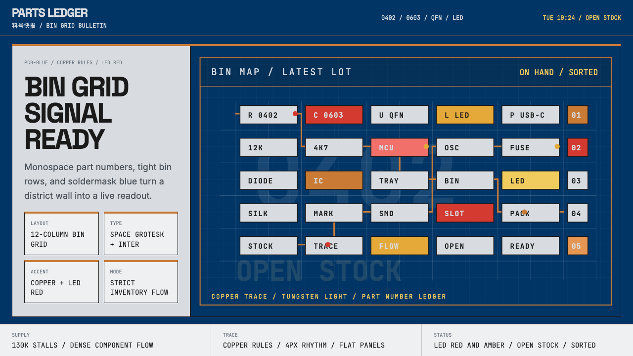
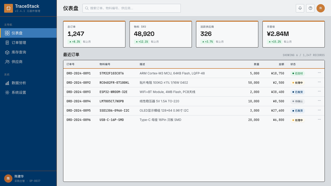
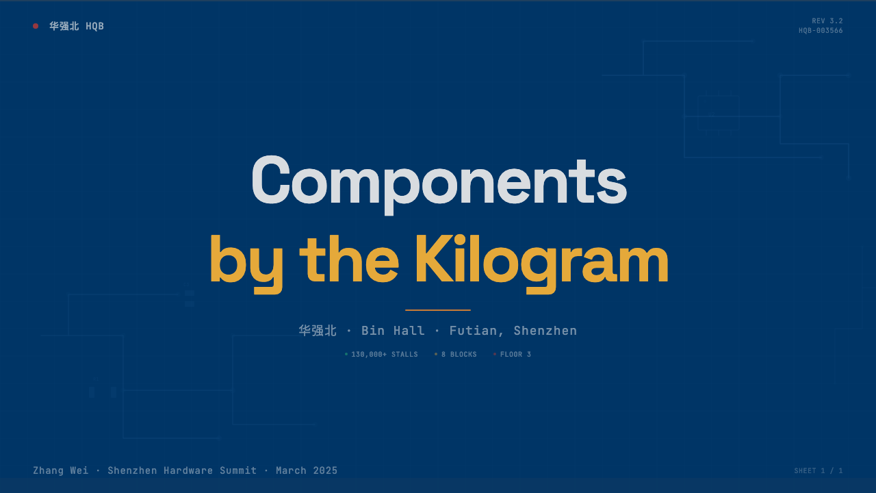
The foundational color is the cool, saturated blue-green of soldermask — the resin coating that protects circuit board copper from oxidation and short-circuits. This is not a blue chosen for brand neutrality or calming association; it is a blue that exists because of a manufacturing necessity, and its industrial authority is precisely what the design system appropriates. Against this ground, warm copper-toned accents trace dividing lines and connective paths the way etched traces carry current across a board. White silkscreen-register annotations mark labels and part identifiers. The palette has zero decorative colors; every hue earns its presence by performing a function.基础色调来自阻焊漆——保护电路板铜层不受氧化与短路的树脂涂层——那种冷调而饱和的蓝绿色。这不是一种为品牌中性或平静联想而选择的蓝;它存在是因为制造工艺的必要性,而其工业权威感正是这套设计系统所借用的。在这一底色上,暖调铜色的强调线条如同蚀刻走线在电路板上传导电流一样划分区域、连接路径;白色的丝印注记标记标签与料号识别码。这套色板中没有任何装饰性色彩——每一种颜色都因执行某项功能而获得存在的理由。
Monospace Information Density等宽字体与信息密度
All primary labeling — part numbers, status codes, measurements, identifiers — is set in monospace type. This choice is not stylistic nostalgia for the terminal era; it is functional. Monospace letterforms maintain consistent horizontal rhythm across varying character counts, which is essential when columnar alignment of alphanumeric codes carries meaning. A resistor part number and a voltage specification must align to the same column margin because the alignment itself communicates relationship. Secondary text — descriptive copy, category headers — may depart from monospace, but the moment a string becomes a code or an identifier, it returns to fixed-width rendering.所有主要标注——料号、状态码、参数、识别符——均以等宽字体排设。这一选择并非对终端时代的风格怀旧;它是功能性的。等宽字体在字符数量变化时维持一致的水平节奏,这在字母数字码的列对齐本身传达意义时至关重要。电阻料号与电压规格必须对齐同一列边距,因为对齐本身传达了关系。次级文本——描述性文字、类目标题——可以脱离等宽,但一旦字符串成为代码或识别符,它就回归到固定宽度的渲染。
Status-Indicator Accent Logic状态指示灯的强调逻辑
Small, saturated accent colors appear in the system the way LEDs appear on a physical device: infrequently, at the margins of panels, and always carrying precise semantic meaning. A green accent signals active or passing state, corresponding to a power-on LED or a continuity tester reading. An amber or yellow accent signals warning or standby, matching the cautionary illumination of a charging indicator. A red accent signals fault or critical state. These colors are never used decoratively or for brand warmth — they are reserved exclusively for machine-state communication. Their sparing use is what gives them authority; overuse would collapse the signal.小面积的饱和强调色在系统中出现的方式,与LED在实体设备上出现的方式完全一致:频次低、位于面板边缘,且总是承载精确的语义含义。绿色强调对应激活或通过状态,对应开机指示灯或导通测试仪的读数;琥珀色或黄色强调对应警告或待机状态,对应充电指示灯的提示照明;红色强调对应故障或临界状态。这些颜色从不用于装饰或品牌温度——它们被专门保留给机器状态传达。节制使用是其权威性的来源;过度使用会使信号崩溃。
Bin-Grid Layout元件盒网格布局
The layout grid is modeled on the physical organization of a component bin organizer — the rectangular grid of small labeled compartments in which surface-mount resistors, capacitors, and ICs are stored and sorted. Every content region is a discrete cell: bounded, internally consistent, labeled at its top-left corner or top-right corner depending on convention, and separated from adjacent cells by a defined gutter. Content does not bleed between cells; a card is a bin, and nothing about its contents is implied to extend beyond its edges. This creates a density of information that is navigable precisely because each unit is clearly bounded.布局网格以元件盒的物理组织为原型——那种储存和分拣贴片电阻、电容与集成电路的矩形格子容器。每个内容区域都是独立的格子:边界明确、内部一致、依照惯例在左上角或右上角标记标签,并通过定义好的间距与相邻格子分隔。内容不跨格溢出;一张卡片就是一个格子,其内容绝不暗示延伸至边缘之外。这种信息密度因每个单元边界清晰而可以导航。
Copper-Trace Dividers铜箔走线式分割线
Section separators are rendered as fine lines in the copper accent — thin, precise, and at the boundary between sections rather than decorative elements floating in whitespace. Like the traces on a circuit board, these dividers are structural connectors as much as separators: they imply that what sits on either side is related by design, not merely adjacent by arrangement. Dividers never carry embellishment, shadow, or gradient. They exist at the minimum weight needed to register as a boundary, and their warmth against the cooler ground palette creates a visual hierarchy that requires no additional color differentiation.章节分割线以铜色强调线呈现——细而精确,位于区域边界而非漂浮在留白中的装饰元素。如同电路板上的走线,这些分割线既是分隔器也是结构性连接:它们暗示两侧的内容是设计上的关联,而非仅仅在排列上相邻。分割线从不携带装饰、投影或渐变。它们以最小所需的线重存在,刚好能被识别为边界;其暖调在更冷的底色调中创造出无需额外色彩区分的视觉层级。
Datasheet Typography Hierarchy数据手册式字体层级
The typographic hierarchy of the system mirrors the hierarchy of an electronic component datasheet: a bold, large component name or category at the top; a secondary line for the specific model identifier or variant; then a dense body of specifications arranged in short, right-aligned label-value pairs. Headers are assertive and high-contrast; body text is tight and neutral. The convention of right-aligning values against left-aligned labels — so that the equals sign is implied by spatial alignment rather than character — creates a visual scanning path that works quickly under high information density. Columns of specs do not require decorative rules between them; the consistent left and right margins of the label-value pairs create their own order.系统的字体层级映射电子元器件数据手册的层级:顶部是粗重而大号的元件名称或类目;第二行是具体型号识别符或型号变体;随后是以短促、右对齐的标签-数值对排列的密集规格正文。标题强势而高对比度;正文紧凑而中性。将数值右对齐于左对齐标签的惯例——使等号关系由空间对齐隐含而非字符表示——创造出在高信息密度下能快速扫描的视觉路径。规格列之间不需要装饰性分割线;标签-数值对一致的左右边距自行产生秩序。
Functional Texture功能性纹理
Where texture appears, it references the physical surfaces of electronics manufacture: the faint grid impression of a PCB substrate, the stipple pattern of a solder paste stencil, the cross-hatch of a ground plane fill. These textures are never used for visual richness in a decorative sense; they appear at low opacity as background differentiation between functional zones, the way a PCB's ground fill distinguishes the power plane from the signal layer. The system permits no textures that lack an industrial referent — no organic grain, no paper, no fabric. Every surface in this aesthetic is a manufactured surface.当纹理出现时,它引用的是电子制造业的物理表面:PCB基材隐约的网格压印、焊锡膏钢网的点阵图案、铺铜填充的交叉线网格。这些纹理从不以装饰意义上的视觉丰富性为目的;它们以低不透明度出现,作为功能区域之间的背景区分,如同PCB的铺铜填充将电源层与信号层区分开来。这套系统不允许任何缺乏工业参照的纹理——没有有机木纹、没有纸感、没有布料质感。这一美学中的每一个表面都是制造出来的表面。
See the Shenzhen Huaqiangbei design system →查看 Shenzhen Huaqiangbei 完整设计系统 →
Who shaped Shenzhen Huaqiangbei?谁塑造了 Shenzhen Huaqiangbei?
The founders of Shenzhen Electronics Group, which built SEG Plaza on Huaqiang North Road in 1988, created the physical archetype for Huaqiangbei's organizational logic. By concentrating component trade in a vertically stacked, floor-by-floor specialized building, they established the taxonomic, compartmentalized hierarchy that defines the district and, by extension, the design system. SEG Plaza's structure is the original bin organizer; every grid layout in the Huaqiangbei aesthetic is descended from its floor plan.深圳电子集团的创始人于1988年在华强北路建成赛格广场,为华强北的组织逻辑创造了物理原型。通过将元器件贸易集中于垂直叠加、按楼层专业化分工的建筑中,他们确立了至今定义该地区的分类式、分隔化层级——这套层级也延伸进了设计系统。赛格广场的结构是最初的元件分拣盒;华强北美学中的每一套网格布局都源自它的平面格局。
Andrew 'Bunnie' Huang is an American hardware hacker and open-source advocate whose deep engagement with Shenzhen's electronics ecosystem — documented in his writing, talks, and the open-source Novena laptop project — gave the global maker community a rigorous, unsentimental account of how Huaqiangbei actually works. His work demonstrated that the shanzhai ecosystem was not merely counterfeit production but a genuinely innovative manufacturing culture, operating at a speed and flexibility that branded consumer electronics could not match. By taking the district seriously as an engineering and cultural phenomenon, he helped frame Huaqiangbei as a subject worthy of aesthetic and intellectual attention.Andrew「Bunnie」Huang是美国硬件黑客与开源倡导者,通过大量文字、演讲和开源Novena笔记本项目深度介入深圳电子生态系统,为全球创客社群提供了一份关于华强北如何真正运作的严谨而去浪漫化的记录。他的工作证明,山寨生态系统并非单纯的仿冒生产,而是一种真正具有创新性的制造文化,以品牌消费电子无法比拟的速度与灵活性运转。通过将这片区域作为工程与文化现象认真对待,他帮助将华强北框定为值得美学与智识关注的对象。
Naomi Wu, a Shenzhen-based maker and online presence known as Sexy Cyborg, brought Huaqiangbei to a global English-speaking audience through videos documenting her hardware projects, the local maker scene, and the district's component ecosystem. Her work translated the granular, technical reality of shopping for components in Huaqiangbei into accessible narratives, while simultaneously representing the district's integration of maker culture, gender, and Chinese urbanism in ways that received international attention. She is one of the clearest connectors between Huaqiangbei as a physical place and Huaqiangbei as a legible cultural identity.深圳创客Naomi Wu(网名Sexy Cyborg)通过记录硬件项目、本地创客场景与华强北元器件生态系统的视频,将华强北带给了全球英语受众。她的工作将在华强北采购元器件的细粒度技术现实转化为易于接近的叙事,同时以受到国际关注的方式呈现了华强北在创客文化、性别与中国城市性方面的整合。她是连接作为物理地点的华强北与作为可读文化身份的华强北之间最清晰的纽带之一。
Seeed Studio, founded in Shenzhen and closely integrated with the Huaqiangbei supply chain, occupies a distinctive position as a bridge between the district's component culture and the global open-source hardware movement. By producing documented, community-oriented hardware modules using the same supply chains that feed the shanzhai ecosystem, Seeed demonstrated that Huaqiangbei's speed and component density could serve rigorous engineering community goals as readily as informal product iteration. Seeed's house style — clean, schematic, documentation-oriented — is among the most considered institutional expressions of the Huaqiangbei aesthetic in a designed commercial context.Seeed Studio在深圳创立,与华强北供应链紧密整合,作为连接该区域元器件文化与全球开源硬件运动的桥梁占据着独特地位。通过利用供养山寨生态系统的同一供应链生产有文档、有社群导向的硬件模块,Seeed证明了华强北的速度与元器件密度可以同等良好地服务于严格的工程社群目标与非正式的产品迭代。Seeed的视觉风格——简洁、示意图式、以文档为导向——是华强北美学在有意设计的商业语境中最具思考深度的机构性表达之一。
No individual founder created Huaqiangbei; the district is the emergent product of the Pearl River Delta's manufacturing networks — the interlocking web of component suppliers, tooling shops, PCB fabricators, assembly lines, and logistics hubs that formed across Guangdong Province following the Special Economic Zone designation. These networks created the supply-chain infrastructure that made rapid iteration possible: a design change could propagate from concept to physical prototype in days because every necessary production step existed within a small geographic radius. The visual density and taxonomic rigor of the Huaqiangbei aesthetic is inseparable from the geographic and economic density of the ecosystem that produced it.华强北没有单一的创始人;这片区域是珠三角制造业网络的涌现产物——经济特区设立后在广东省形成的元器件供应商、模具加工厂、PCB制造商、装配生产线与物流枢纽相互交织的网络。这些网络创造了使快速迭代成为可能的供应链基础设施:设计变更可以在数天内从概念传播到实物原型,因为每一个必要的生产环节都存在于极小的地理半径内。华强北美学的视觉密度与分类严格性与产生它的生态系统的地理与经济密度密不可分。
How do you use Shenzhen Huaqiangbei today?今天怎么用 Shenzhen Huaqiangbei?
Applying the Huaqiangbei design system correctly requires accepting its core premise: information density is not a problem to be solved by reducing content, but a condition to be organized by building better taxonomic structure. The system is not a minimalist language — it is a dense language with rigorous internal logic. Attempting to apply it while simultaneously reducing content density will produce something that looks like a PCB pastiche rather than a coherent system.正确应用华强北设计系统,需要接受其核心前提:信息密度不是一个通过减少内容来解决的问题,而是一种通过构建更好的分类结构来组织的状态。这套系统不是极简主义语言——它是具有严格内部逻辑的密集语言。试图在应用它的同时减少内容密度,只会产生一种看起来像PCB视觉模仿而非连贯系统的结果。
For presentation slides, the Huaqiangbei system works best in technical contexts where the audience expects information, not persuasion. Cover slides benefit from a high-contrast composition: a dominant PCB-blue ground, a component-style identifier in monospace as the deck's category label, and a large title in a contrasting weight and color. Content slides should be treated as component datasheets: label-value pairs for key metrics, monospace for all identifiers and codes, copper-accent horizontal rules as section breaks. Data slides become schematic diagrams — bar and line charts inherit the color logic of status indicators, with functional green for positive values and cautionary amber for thresholds.对于演示文稿,华强北系统在受众期待信息而非说服的技术语境中表现最佳。封面页适合高对比度构图:主导性的PCB蓝底,等宽字体的元件式识别符作为演示文稿的类目标签,以及对比字重与颜色的大号标题。内容页应被当作元器件数据手册处理:关键指标的标签-数值对,所有识别符与代码使用等宽字体,铜色强调水平线作为章节分隔。数据页成为示意图——柱状图与折线图继承状态指示灯的色彩逻辑,正值使用功能性绿色,临界值使用警示性琥珀色。
For web interfaces, the system is particularly well-suited to developer tools, hardware dashboards, IoT monitoring interfaces, and any technical product where users are professionals who read dense information quickly. Define a strict column grid and commit to it; allow no organic or irregular column widths. Reserve the PCB-blue ground for primary panels; use near-white for secondary areas and deep near-black for high-attention zones. Interactive state changes should use the LED accent logic precisely: green for success, amber for pending or warning, red for error or fault. Navigation should be typographic and taxonomic — think of it as the floor directory of SEG Plaza, not a consumer app's hamburger menu.对于网页界面,这套系统特别适合开发者工具、硬件仪表板、物联网监控界面,以及任何用户是快速阅读密集信息的专业人员的技术产品。定义严格的列网格并坚守它;不允许任何有机或不规则的列宽。将PCB蓝底保留给主要面板;次级区域使用近白色,高度关注区使用深近黑色。交互状态变化应精确使用LED强调逻辑:成功用绿色,待处理或警告用琥珀色,错误或故障用红色。导航应是字体性与分类性的——把它想象成赛格广场的楼层导引,而非消费类应用的汉堡菜单。
For editorial and marketing contexts, the style carries associations with hardware documentation, open-source projects, and technical authority. A blog or documentation site applying this system should treat its sidebar as a component index — monospace labels, consistent indentation levels, no decorative icons beyond minimal geometric indicators. Marketing pages can use the system's poster-quality contrast: full-width blocks with PCB-blue grounds broken by large copper-accent headlines, with specifications listed below in tight label-value columns as proof of technical substance. The system is particularly effective for hardware product launches, technical community events, and maker culture contexts where authenticity and technical credibility are primary values.对于编辑与营销语境,这种风格携带着与硬件文档、开源项目和技术权威的联想。应用这套系统的博客或文档网站应将侧边栏视为元器件索引——等宽标签、一致的缩进层级、最小几何指示符之外无装饰性图标。营销页面可以利用系统的海报级对比度:PCB蓝底的全宽区块被大号铜色强调标题打断,下方以紧凑的标签-数值列列出规格参数,作为技术实质的证明。这套系统在硬件产品发布、技术社群活动,以及真实性与技术可信度是主要价值的创客文化语境中尤为有效。
A common mistake when applying this system is treating the PCB-blue and copper accent as a color palette in isolation — picking the hues but applying them with the structural logic of a different design system. The colors only work correctly when they are performing their semantic functions: ground, trace, annotation, status. Using copper as a decorative accent on a layout that has no taxonomic structure, no monospace identifiers, and no grid logic produces something that looks costumed rather than authentic. The other common error is over-texturing: adding PCB substrate textures at high opacity as decorative backgrounds rather than at the faint, functional levels where they belong.应用这套系统时最常见的错误,是将PCB蓝与铜色强调孤立地当作色板处理——只选取色调,却用另一套设计系统的结构逻辑来应用它们。这些颜色只有在执行其语义功能时才能正确工作:底色、走线、注记、状态。在没有分类结构、没有等宽标识符、没有网格逻辑的布局上使用铜色作为装饰性强调,只会产生一种像是穿了戏服而非真实表达的效果。另一个常见错误是过度纹理化:以高不透明度将PCB基材纹理作为装饰性背景添加,而非在其应处的低频、功能性层级上出现。
See the Shenzhen Huaqiangbei design system →查看 Shenzhen Huaqiangbei 完整设计系统 →
Shenzhen Huaqiangbei — FAQShenzhen Huaqiangbei · 常见问题
Is the Huaqiangbei aesthetic limited to hardware or electronics contexts, or can it transfer to other industries?华强北美学是否只限于硬件或电子语境,还是可以迁移到其他行业?
The system transfers to any context where dense, structured information must be navigated quickly by professional or technically sophisticated users. Financial data terminals, logistics tracking interfaces, code review tools, and scientific instrumentation software all share the organizational challenge that the Huaqiangbei system addresses. The key condition for successful transfer is that the content actually has the taxonomic structure the system assumes — labeled categories, state indicators, identifier strings. Applying the aesthetic to consumer content (travel apps, food delivery, social media) produces visual dissonance because the content does not have the internal logic the design language is built to communicate.这套系统可以迁移到任何需要专业或技术用户快速导航密集结构化信息的场景。金融数据终端、物流追踪界面、代码审查工具和科学仪器软件都面临着华强北系统所应对的组织挑战。成功迁移的关键条件是:内容本身确实具有系统所假设的分类结构——有标签的类目、状态指示符、识别符字符串。将这种美学应用于消费类内容(旅行应用、外卖、社交媒体)会产生视觉失调,因为这些内容不具备设计语言所要传达的内部逻辑。
How does this aesthetic relate to other industrial or technical design systems like NASA data visualization or terminal interfaces?这种美学与其他工业或技术设计系统(如NASA数据可视化或终端界面)有何关系?
Huaqiangbei shares the functional-first premise of those systems but differs in its specific material referents. NASA data visualization and aerospace HMI design derive their authority from a tradition of engineering rigor and national institutional weight — their color systems and typography emerge from legibility research under operational conditions. Terminal interfaces derive their aesthetic from computing history and the physical constraints of CRT displays. Huaqiangbei's referents are commercial and tactile rather than institutional: the circuit board, the component bin, the stencil annotation. Where aerospace design tends toward austerity and suppression of color, Huaqiangbei's status-indicator logic is more permissive of saturated functional accents. The systems are conceptual cousins rather than the same tradition.华强北与这些系统共享功能优先的前提,但在具体的物质参照上有所不同。NASA数据可视化与航空航天人机界面设计从工程严谨性与国家机构权重的传统中获取权威——其色彩系统与字体排印来自操作条件下的可读性研究。终端界面的美学源于计算机历史与CRT显示器的物理约束。华强北的参照是商业性与触觉性的而非机构性的:电路板、元件分拣盒、钢网注记。航空航天设计倾向于朴素和压制色彩,而华强北的状态指示逻辑对饱和的功能性强调色更为宽容。这些系统是概念上的近亲,而非同一传统。
Does the shanzhai association create branding risk when using this aesthetic for a legitimate commercial product?当为合法商业产品使用这种美学时,山寨的联想是否会带来品牌风险?
For most Western audiences, the shanzhai association is weak or absent — the aesthetic reads primarily as technical precision and industrial authority rather than informal manufacture. For Chinese audiences, the reference is more legible, and there the association carries a more complex set of values: not only informal copying but also creative energy, rapid iteration, and a particular kind of street-level ingenuity. Whether this is a liability or an asset depends entirely on the product. For hardware projects, maker tools, or technical communities, the association with Huaqiangbei's culture of rapid prototyping is a positive signal. For enterprise software or financial services, the informality could work against the desired positioning, and the system should be applied with greater restraint and institutional framing.对于大多数西方受众,山寨的联想是微弱或缺席的——这种美学主要被解读为技术精密性与工业权威性,而非非正式制造。对于中国受众,这一参照更为清晰,其联想携带着更复杂的价值集合:不仅是非正式仿冒,还有创造性活力、快速迭代,以及一种特定的草根智慧。这究竟是负担还是资产,完全取决于产品本身。对于硬件项目、创客工具或技术社群,与华强北快速原型文化的联想是一种正面信号。对于企业软件或金融服务,这种非正式性可能不利于期望的定位,系统应当以更大的克制与机构性框架来应用。
How should the system handle color when the interface needs a light mode and a dark mode?当界面需要明暗两种模式时,这套系统应该如何处理色彩?
The system's native mode is the one that most closely mirrors the physical PCB: a saturated blue-green ground that falls toward the medium-dark range of the value scale, with lighter annotations and copper-warm traces. A light mode adaptation requires promoting the near-white annotation color to the ground and pushing the blue-green to accent or panel-border roles. The copper accent survives the inversion well, as it reads warmly against both light and dark grounds. The status indicator colors — green, amber, red — are robust across both modes when used at their functional weights. The critical adjustment is that on a light ground, the grid and bin-divider logic must be reinforced with explicit rules or color fills rather than relying on the dark-ground contrast that the native mode provides.这套系统的原生模式最接近物理PCB:偏向中暗色调的饱和蓝绿底色,配以更亮的注记色与铜暖色走线。明色模式的适配需要将近白色的注记色升格为底色,将蓝绿色降至强调或面板边框的角色。铜色强调在反转时适应良好,因为它在浅色与深色底面上都呈现出温暖感。状态指示颜色——绿、琥珀、红——在功能性权重下对两种模式都有良好的鲁棒性。关键调整在于:在浅色底面上,网格与分格逻辑必须通过明确的分割线或色彩填充来强化,而不能依赖原生模式的深色底面所提供的对比度。
Is Huaqiangbei appropriate for branding and identity work, or is it primarily a UI and layout system?华强北适合用于品牌与识别设计,还是主要作为UI与布局系统?
The system's identity applications are strongest when the brand itself is embedded in hardware, technology manufacturing, or maker culture. As a wordmark environment, monospace identifiers and PCB-ground color fields create immediate technical authority — effective for a component supplier, a hardware accelerator, or an electronics publication. For brands operating outside these sectors, the visual language may communicate the wrong set of values: precision and industrial function are not universally desirable brand attributes. As a UI and layout system, the Huaqiangbei language has broader applicability because the taxonomic, status-indicator logic it provides is genuinely useful in many information-dense professional interfaces regardless of the underlying industry. The system's best use cases are those where the design language and the product's subject matter reinforce each other, rather than one being imposed on the other.这套系统在品牌识别上的应用,在品牌本身嵌入硬件、技术制造或创客文化时最为有力。作为文字标识环境,等宽识别符与PCB底色色块能立即建立技术权威感——对于元器件供应商、硬件加速器或电子出版物而言效果显著。对于在这些领域之外运营的品牌,这套视觉语言可能传达错误的价值集合:精密性与工业功能性并非普遍期望的品牌属性。作为UI与布局系统,华强北语言具有更广泛的适用性,因为它提供的分类式、状态指示逻辑在许多信息密集的专业界面中确实有用,与底层行业无关。这套系统最佳的使用场景,是设计语言与产品主题相互强化的场景,而非两者中的一个被强加于另一个之上。
Related design styles相关设计风格
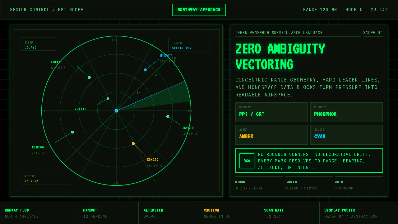 Air Traffic Control RadarOperational gravity. Phosphor green rings, sweep wedges, and monospace blips…军工级冷静:磷光绿同心环、扫描扇面与等宽光点建立零歧义。
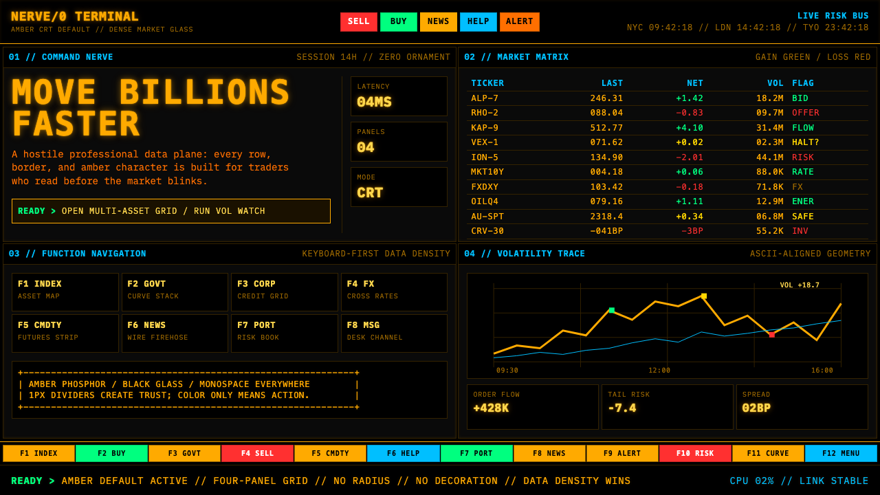 Bloomberg Terminal (Amber CRT)Hostile data authority. Amber mono grids and four hard panels make black glas…强硬的数据权威。琥珀等宽字与四格硬边框,让黑玻璃像市场神经。
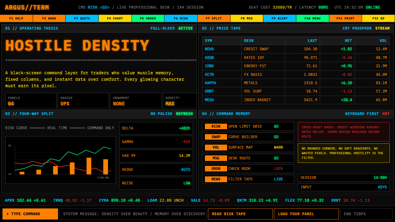 Bloomberg Terminal (CRT Green)Hostile density wins. Orange CRT mono, black grids, and four-panel data walls.敌意密度取胜:橙色CRT等宽字、黑底四分屏数据墙。
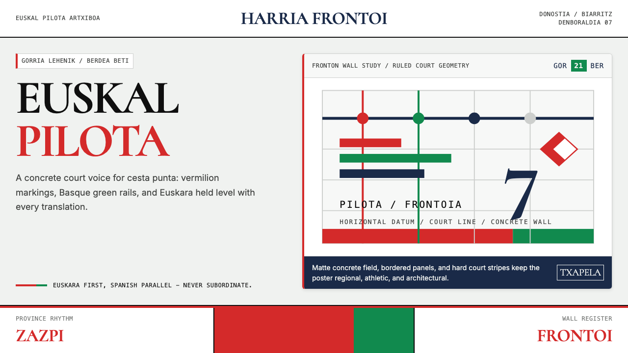 Basque Pelota Fronton Red & GreenFiercely regional. Vermilion court stripes and Basque green rule a concrete g…地域锋芒鲜明:朱红球场线与巴斯克绿统治混凝土网格。
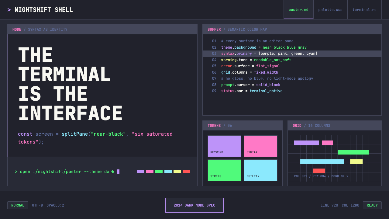 Terminal Vim Dracula (2014)Terminal-native darkness. Near-black panes carry six saturated syntax colors…终端原生的暗色:近黑分屏承载六色语法高亮与等宽网格。
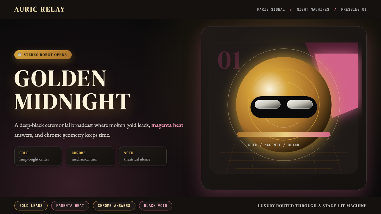 Daft Punk Discovery (Gold-Helmet)Warm sci-fi disco. Gold serif caps orbit a magenta void with chrome-disc geom…温热科幻迪斯科:金色衬线大字环绕品红虚空与铬色圆盘。