What is Terminal Vim Dracula (2014)?什么是 Terminal Vim Dracula (2014)?
Dracula turned the developer's terminal into a design statement — six saturated syntax colors glowing against a near-black, slightly violet-shifted canvas that coders across every tool and platform adopted as their permanent night mode.Dracula 将开发者的终端变成了一种设计宣言——六种高饱和强调色在近黑、略带紫调的画布上发光,令全球各工具平台的程序员将其奉为永久的夜间模式。
Terminal Vim Dracula (2014) in briefTerminal Vim Dracula (2014) 速览
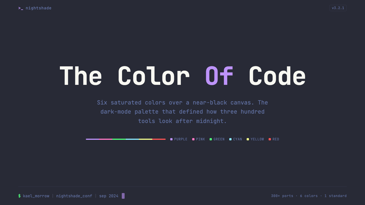
Terminal Vim Dracula is a dark color scheme and design vocabulary that originated in 2014 when Brazilian developer Zeno Rocha released it as a Vim and terminal theme. Its visual identity rests on six saturated accent colors — purple, pink, green, cyan, orange, and yellow — hovering over a background that is neither pure black nor neutral dark gray, but a deep near-black carrying a subtle violet undertone. That particular background choice is the design's fingerprint: it prevents harshness while maintaining contrast, and it gives every foreground color a unified atmospheric quality.Terminal Vim Dracula 是一套暗色配色方案与设计语言,源于巴西开发者 Zeno Rocha 于 2014 年以 Vim 与终端主题形式发布的作品。它的视觉身份建立在六种高饱和强调色之上——紫、粉、绿、青、橙、黄——漂浮于一种既非纯黑亦非中性深灰的背景之上:那是一片携带着微妙紫色底调的深邃近黑。这一背景选择正是该设计的指纹:它在消除刺眼感的同时维持对比度,赋予每一种前景色统一的大气质感。
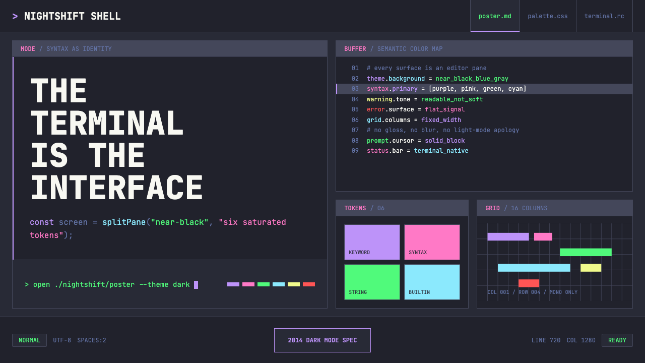
The system treats the entire screen as an editor pane. Type is always monospaced, surfaces stack like split terminal panels, and color functions the way syntax highlighting does in code — not as decoration, but as a semantic signal. Purple marks keywords, green marks strings, pink marks function names, cyan marks constants, orange marks numbers, and yellow marks special tokens. This strict color-to-meaning mapping means the palette is never arbitrary; each hue carries a specific communicative role.该系统将整个屏幕视为编辑器窗格。字体始终是等宽的,界面层叠如终端分屏,而色彩的运作方式则如同代码中的语法高亮——不是装饰,而是语义信号。紫色标记关键词,绿色标记字符串,粉色标记函数名,青色标记常量,橙色标记数字,黄色标记特殊符号。这种严格的颜色与含义映射意味着色板从不随意——每种色调承载着特定的传达职能。
Dracula spread far beyond Vim: by the mid-2020s it had been officially ported to over three hundred applications, editors, and terminals, making it the most widely installed dark theme in the history of developer tooling. Its influence extended into the broader design culture of developer-facing products, where deep dark backgrounds, saturated neon accents, and monospaced type became conventions rather than novelties.Dracula 的影响力远超 Vim 本身:至 2020 年代中期,它已被官方移植至三百余款应用程序、编辑器与终端,成为开发者工具历史上安装量最大的暗色主题。它的影响延伸至面向开发者的产品设计文化中,深色背景、饱和霓虹色强调与等宽字体从新奇特性演变为行业惯例。
See the Terminal Vim Dracula (2014) design system查看 Terminal Vim Dracula (2014) 完整设计系统
Where does Terminal Vim Dracula (2014) come from?Terminal Vim Dracula (2014) 从何而来?
The theme emerged from a personal frustration. Zeno Rocha, a front-end developer based in São Paulo, Brazil, was dissatisfied with the available dark color schemes for Vim in 2013 and 2014. Existing dark themes tended toward either muddy, low-contrast palettes that strained the eyes after hours of reading code, or aggressively high-contrast schemes where pure white text on pure black backgrounds produced uncomfortable visual tension. Rocha wanted something between those poles — saturated and vivid enough to be pleasant, dark enough to reduce eye strain, and internally coherent enough to feel like an intentional visual system rather than a collection of arbitrary color choices.这套主题源于一种个人不满。巴西圣保罗的前端开发者 Zeno Rocha 在 2013 至 2014 年间对当时可用的 Vim 暗色方案深感失望。现有的暗色主题要么色彩混浊、对比度不足,长时间阅读代码后令眼睛疲劳;要么过度高对比,纯黑底面上的纯白文字产生令人不适的视觉张力。Rocha 想要介于两极之间的东西——饱和而鲜明到令人愉悦,暗色到足以减轻眼部疲劳,且内部连贯到能够感觉像一套有意为之的视觉系统,而非随意色彩拼凑。
He released the first version in 2014, initially targeting Vim and the iTerm2 terminal emulator. The name was a deliberate flourish — Dracula, with its gothic connotations of darkness and nocturnal life, suited a theme designed for developers who worked deep into the night. The aesthetic sensibility was already present in that first release: the violet-tinged dark background, the specific set of six accent colors, the commitment to keeping backgrounds recessive and letting foreground colors carry all communicative weight. What Rocha had intuited was that a dark theme could be a designed object, not merely a preference setting.他于 2014 年发布了第一个版本,最初面向 Vim 与 iTerm2 终端模拟器。名称选择带有刻意的华彩感——Dracula(德古拉)带有哥特式的黑暗与夜行生活意涵,契合一套专为深夜工作的开发者设计的主题。那种美学感性在第一版中就已成形:略带紫调的暗色背景,特定的六种强调色,以及让背景保持后退感、让前景色承载全部传达重量的一贯追求。Rocha 凭直觉感知到的是:暗色主题可以是一件被设计的作品,而不仅仅是一个偏好设置。
The theme's adoption accelerated dramatically in 2015 and 2016, when the open-source community began producing ports for editors and tools far beyond Vim — Sublime Text, Atom, Visual Studio Code, JetBrains IDEs, Xcode, iTerm, Hyper, and dozens of others. Each port preserved the core palette while adapting it to the host environment's syntax categories. By maintaining a clear specification of what each color meant semantically, Rocha ensured that the theme remained recognizable across wildly different host applications. This portability was itself a design achievement: most color schemes degrade or mutate across ports, but Dracula retained its identity.2015 至 2016 年间,随着开源社区开始为 Vim 之外的编辑器与工具生产移植版——Sublime Text、Atom、Visual Studio Code、JetBrains 系列 IDE、Xcode、iTerm、Hyper 等数十款——主题的采用量急剧加速。每个移植版在适配宿主环境语法分类的同时,都保留了核心色板。通过为每种颜色的语义角色维护清晰规范,Rocha 确保了主题在截然不同的宿主应用中依然可被辨识。这种可移植性本身就是设计成就:大多数配色方案在移植中会退化或变异,而 Dracula 保持了自身身份。
In 2020, Rocha launched Dracula PRO, a commercial extension of the free theme that added refined variants, additional color roles, and UI components beyond the terminal and editor context. The move signaled a broader ambition: Dracula was no longer purely a syntax theme but a design system with commercial and lifestyle dimensions. The community that had formed around the theme — hundreds of contributors, fan art, merchandise, and a strong social media presence — reflected how the theme had become something closer to a subculture identity marker than a mere tool configuration. Terminal aesthetics had arrived as lifestyle.2020 年,Rocha 推出了 Dracula PRO——免费主题的商业扩展版本,增加了精细变体、额外的色彩角色,以及超越终端与编辑器语境的 UI 组件。这一举动标志着更宏大的野心:Dracula 不再仅仅是语法主题,而是一套具有商业与生活方式维度的设计系统。围绕这套主题形成的社区——数百名贡献者、粉丝艺术、周边商品,以及强劲的社交媒体存在——折射出它如何从一种工具配置演变为更接近亚文化身份标记的存在。终端美学,作为一种生活方式,已然登场。
What defines the Terminal Vim Dracula (2014) look?Terminal Vim Dracula (2014) 的视觉特征是什么?
Background and Atmosphere背景与氛围
The background is Dracula's most deliberate choice: a very deep tone that is not neutral black but carries a perceptible violet lean. This violet undertone creates atmospheric unity — every accent color is perceived against a background that shares a color family with the purple accent, producing a sense of coherence rather than arbitrary contrast. The result is a canvas that feels less like a void and more like a specific place: a well-lit room at night, dark but not hostile.背景是 Dracula 最具匠心的选择:一种极深但并非中性黑的色调,带有可感知的紫色倾向。这一紫调底色创造出大气层面的统一感——每种强调色都被感知于一个与紫色强调色同属一个色系的背景之上,产生连贯性而非随意对比的感受。结果是一块感觉不像虚空、更像一个具体场所的画布:夜晚一间灯光良好的房间,幽暗但不带敌意。
Six-Color Accent System六色强调系统
Where most color systems use two or three accent colors, Dracula deploys six: purple, pink, green, cyan, orange, and yellow. Each color originated in a semantic role within syntax highlighting — marking keywords, strings, functions, constants, numbers, and special tokens respectively. This one-to-one relationship between color and meaning is what prevents the palette from feeling chaotic. When applied outside code contexts, the six colors retain their identity as a coherent family because they are tuned to coexist against the specific background tone.大多数色彩系统使用两到三种强调色,Dracula 则部署六种:紫、粉、绿、青、橙、黄。每种颜色都起源于语法高亮中的语义角色——分别标记关键词、字符串、函数名、常量、数字与特殊符号。这种颜色与含义之间一对一的关系,正是色板不显混乱的原因。在代码语境之外使用时,六种颜色依然保持连贯家族感,因为它们经过调谐,能够在特定背景色调上共存。
Monospace as Visual Grammar等宽字体作为视觉语法
Monospaced type is not merely a font choice in Dracula — it is the grammar of the entire visual system. When every character occupies the same horizontal space, layout becomes a coordinate grid: columns align perfectly, indentation becomes meaningful spatial structure, and the text block reads as architecture rather than prose. In design applications of the style, monospaced type communicates that the interface is precise, technical, and honest about its underlying structure. It is type that refuses to prettify itself.在 Dracula 中,等宽字体不仅仅是字体选择——它是整套视觉系统的语法。当每个字符占据相同的水平空间时,版面便成为坐标网格:列对齐完美,缩进变为有意义的空间结构,文字块读起来像建筑而非散文。在该风格的设计应用中,等宽字体传达出界面的精确性、技术性,以及对其底层结构的坦诚。这是一种拒绝自我美化的字体。
Terminal Panel Composition终端分屏构图
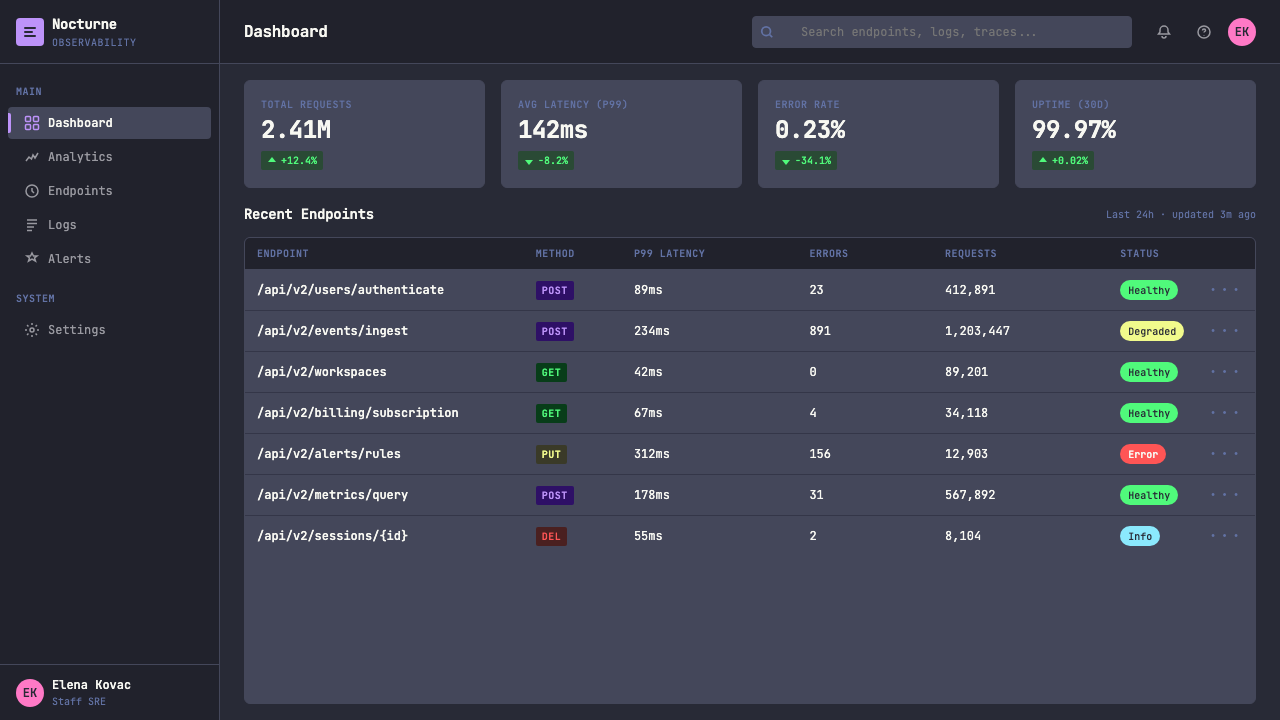
Dracula's spatial logic comes from the split-pane terminal. Surfaces are stacked and divided like editor windows — a slightly lighter dark panel sitting inside a darker outer frame, status bars running as solid horizontal bands at top or bottom, column structures that evoke file trees or buffer lists. This paneled architecture replaces the card, modal, and container conventions of mainstream UI design with something rawer and more modular. Space is divided rather than floated; elements sit in defined regions rather than casting shadows to imply elevation.Dracula 的空间逻辑来自分屏终端。界面层叠分割如编辑器窗口——略浅的深色面板嵌于更深的外框之中,状态栏作为实心水平条带横贯顶部或底部,列结构让人联想到文件树或缓冲区列表。这种分屏式架构以更原始、更模块化的东西取代了主流 UI 设计中的卡片、模态框与容器惯例。空间是被划分的而非漂浮的;元素坐落于明确区域之中,而非依靠阴影来暗示层级高低。
Semantic Color Logic语义色彩逻辑
In Dracula, color is never purely aesthetic. Every accent hue entered the system with a function — marking a grammatical category in source code — and that functional origin disciplines how the colors should be used in any context. When applied to UI components, Dracula colors work best when they continue to carry consistent meaning: one color for interactive actions, another for success states, another for warnings. The system resists decoration because its colors remember their origins as communication tools, not paint.在 Dracula 中,颜色从不纯粹是审美选择。每种强调色进入系统时都带着功能——标记源代码中的语法类别——这一功能起源约束着这些颜色在任何语境下的使用方式。应用于 UI 组件时,Dracula 的颜色在继续承载一致含义时效果最佳:一种颜色用于交互操作,另一种用于成功状态,再一种用于警告。这个系统抵制装饰,因为它的颜色记得自己作为传达工具而非油漆的起源。
Flat Darkness Without Void无虚空的扁平暗色
Dracula is rigorously flat — no gradients, no soft shadows, no simulated depth through blurring. But its darkness does not feel empty or hostile, because the violet undertone and the calibrated saturation of its accent colors give the dark space warmth and atmosphere. This distinguishes it from both the austere darkness of purely neutral dark themes and the aggressive darkness of themes that maximize contrast without concern for prolonged readability. Dracula is designed to be lived in for hours at a time.Dracula 是严格扁平的——无渐变,无柔和阴影,无通过模糊模拟的深度感。但它的黑暗并不令人感到空洞或敌对,因为紫色底调与强调色经过校准的饱和度赋予了暗色空间温度与氛围。这使它有别于纯中性暗色主题的严酷感,也有别于以最大化对比度而不顾长时间可读性的攻击性暗色主题。Dracula 是为了一次性使用数小时而设计的。
Powerline and Glyph IntegrationPowerline 与字形集成
Dracula was designed to work with Powerline — the terminal prompt extension that uses special glyphs to create arrow-shaped status bars and segmented information displays. These glyphs, rendered in the Dracula accent colors, become structural elements: they define boundaries between information zones and communicate the direction of reading. This glyph vocabulary, borrowed from terminal power-users, is part of what gives the style its recognizable technical character — it is a design language that requires knowledge of its own toolchain.Dracula 的设计考虑了与 Powerline 的配合——这款终端提示符扩展使用特殊字形创建箭头形状的状态栏与分段信息显示。这些字形以 Dracula 强调色渲染,成为结构性元素:它们定义信息区域之间的边界,并传达阅读方向。这套字形词汇借自终端高级用户,是赋予该风格可辨识技术特征的部分原因——它是一套需要了解自身工具链的设计语言。
See the Terminal Vim Dracula (2014) design system查看 Terminal Vim Dracula (2014) 完整设计系统
Who shaped Terminal Vim Dracula (2014)?谁塑造了 Terminal Vim Dracula (2014)?
Rocha is the creator and primary steward of Dracula. A Brazilian front-end developer and technologist, he built the original theme in 2014 out of personal dissatisfaction with existing dark color schemes for Vim. His decision to open-source the theme and actively support community-contributed ports was the key factor in Dracula's extraordinary spread: by welcoming hundreds of contributors and maintaining a clear color specification, he enabled the theme to proliferate across every major developer tool while retaining a coherent identity. His subsequent launch of Dracula PRO in 2020 transformed the theme from an open-source utility into a commercial design system, demonstrating that a developer tool aesthetic could sustain a product and community of significant scale.Rocha 是 Dracula 的创作者与主要守护者。作为巴西前端开发者与技术人,他于 2014 年出于对 Vim 现有暗色方案的个人不满而构建了最初的主题。他选择开源主题并积极支持社区贡献移植版,是 Dracula 非凡传播的关键因素:通过接纳数百名贡献者并维护清晰的色彩规范,他使主题得以在每一款主要开发者工具中扩散,同时保持连贯的身份认同。他随后于 2020 年推出的 Dracula PRO,将主题从开源工具转变为商业设计系统,证明开发者工具美学可以支撑起具有相当规模的产品与社区。
Sivers, founder of CD Baby and prolific technology writer, was among the early adopters and vocal advocates who gave Dracula credibility beyond the Vim-centric community. His adoption of the theme and references to it in writing helped extend its reach into a broader audience of developers and technologists who followed his work. The endorsement pattern he represents — respected practitioner adopts and names the theme publicly — was central to how Dracula built trust across communities that had no direct connection to the original Vim ecosystem.Sivers 是 CD Baby 的创始人与多产的技术写作者,他是早期采用者中公开倡导 Dracula 的代表人物之一,为主题在以 Vim 为中心的社区之外建立了可信度。他的采用行为以及在写作中对主题的提及,帮助将其影响力扩展至更广泛的开发者与技术人受众。他所代表的背书模式——受人尊敬的实践者公开采用并提名该主题——是 Dracula 在与原始 Vim 生态系统无直接关联的社区中建立信任的核心机制。
Prakash, a policy researcher and open-knowledge advocate, represents the cross-disciplinary reach that Dracula achieved as it spread beyond pure software development contexts. His presence among key figures associated with the theme illustrates how a developer tool aesthetic can travel into adjacent communities of researchers, writers, and knowledge workers who adopted terminal-centric workflows and, with them, the visual culture those workflows carry. Dracula's influence among non-developer technologists was a significant part of its cultural footprint.Prakash 是政策研究者与开放知识倡导者,代表着 Dracula 在向纯软件开发语境之外扩散时所达到的跨学科影响力。他在与主题相关的关键人物中的存在,说明了一种开发者工具美学如何传播至研究者、写作者与知识工作者等相邻社区——这些人采用了以终端为中心的工作流程,也随之接纳了这些工作流程所承载的视觉文化。Dracula 在非开发者技术人群体中的影响力,是其文化足迹的重要组成部分。
No single figure, but the hundreds of community contributors who built and maintained official ports for editors, terminals, and tools across the ecosystem deserve recognition as collective authors of Dracula's reach. Each port required understanding the semantic roles of the six accent colors well enough to map them correctly to the target application's syntax categories and UI states. The quality and consistency of these ports — many of which are meticulously maintained years after initial release — transformed a personal Vim theme into a cross-platform design standard.没有单一人物,但数百位社区贡献者——他们在整个生态系统中为编辑器、终端与工具构建并维护官方移植版——作为 Dracula 影响力的集体作者,理应获得认可。每个移植版都需要充分理解六种强调色的语义角色,以便将它们正确映射至目标应用程序的语法类别与 UI 状态。这些移植版的质量与一致性——许多在首次发布数年后仍被精心维护——将一个个人 Vim 主题转变为跨平台设计标准。
How do you use Terminal Vim Dracula (2014) today?今天怎么用 Terminal Vim Dracula (2014)?
Dracula is one of the few design styles rooted in developer tooling that translates coherently to slides, interfaces, and editorial contexts — but only when its internal logic is respected rather than superficially borrowed. The core rule is that the six accent colors must retain semantic consistency: each should mean something specific and should not appear interchangeably. When every accent appears on every element, the system collapses into decoration. When each accent occupies a defined role — one for primary actions, one for data highlights, one for warnings, one for navigational indicators — the palette earns its complexity.Dracula 是少数根植于开发者工具的设计风格之一,能够连贯地转化应用于幻灯片、界面与编辑内容——但前提是尊重其内部逻辑,而非表面借用。核心规则是:六种强调色必须保持语义一致性,每种应有特定含义,不得随意互换使用。当每种强调色出现在每个元素上时,系统便沦为装饰。当每种强调色占据明确角色——一种用于主要操作,一种用于数据高亮,一种用于警告,一种用于导航指示——色板才能承担起它的复杂性。
For presentation slides, Dracula works especially well on covers and data-heavy content pages. A cover benefits from the depth of the near-black background: title text in the lightest neutral tone reads against the dark field with high contrast, while one accent color — purple or pink — appears as a single geometric accent or underline to anchor the hierarchy. Content slides should respect the monospaced grid logic: use a monospaced typeface for code samples or data labels, apply the semantic color assignments to charts and tables (green for positive values, orange for cautionary figures, red tones for critical states), and resist the temptation to use all six accents on a single slide. Data visualization in this style looks best when bar charts and line graphs are treated as terminal outputs — stark, high-contrast, labeled with monospaced annotations.对于演示文稿,Dracula 尤其适合封面与数据密集型内容页。近黑背景的深度令封面受益:最浅中性色调的标题文字在暗色底面上以高对比度阅读,而一种强调色——紫色或粉色——作为单一几何强调或下划线出现,锚定层级关系。内容页应尊重等宽网格逻辑:为代码样本或数据标签使用等宽字体,将语义颜色分配应用于图表与表格(绿色表示正向数值,橙色表示警示数字,红调表示关键状态),并抵制在单张幻灯片上使用全部六种强调色的诱惑。在这种风格下,数据可视化在条状图与折线图被当作终端输出来处理时效果最佳——鲜明、高对比、以等宽字体标注。
For web UI design, Dracula is ideally suited to dashboards, developer consoles, CLI-tool companion interfaces, and pricing pages targeting technical audiences. The approach: use the near-black violet-tinged background as the primary surface, establish a slightly lighter dark panel tone for card and sidebar backgrounds, and reserve the accent colors for interactive states, status indicators, and categorical differentiation in data. Navigation should be typographic and minimal — labels in a neutral light tone, with active state marked by a single accent highlight. Form elements and inputs look most coherent in this style when they have defined borders in a mid-dark tone rather than ghost or floating appearances. The Powerline-inspired segmented status bar is a natural header or footer treatment for technical dashboards.对于网页 UI 设计,Dracula 最适合面向技术受众的仪表板、开发者控制台、CLI 工具配套界面与定价页面。方法如下:以近黑紫调背景作为主要表面,建立略浅的深色面板色调用于卡片与侧边栏背景,将强调色保留给交互状态、状态指示器与数据中的类别区分。导航应当是字体性的且极简——中性浅色调的标签,以单一强调色高亮标记活跃状态。在这种风格下,表单元素与输入框以中深色调的明确边框呈现时最为连贯,优于幽灵式或浮动外观。受 Powerline 启发的分段状态栏是技术仪表板天然的页眉或页脚处理方式。
For editorial and marketing work, the style functions as a signal of technical credibility and nocturnal energy. A Dracula-inspired landing page places the near-black background against full-width feature sections, with headlines in a large monospaced typeface and accent colors used sparingly for call-to-action elements, category labels, or data pull-quotes. The aesthetic resonates with developer tools, cybersecurity products, data platforms, and any product that wants to communicate precision and depth. Marketing emails in this style use the dark background throughout rather than alternating with light sections — consistency reinforces the sense of a complete designed environment rather than a borrowed palette.对于编辑与营销内容,这种风格充当技术可信度与夜间活力的信号。受 Dracula 启发的落地页将近黑背景置于全宽特性区块之中,以大尺寸等宽字体呈现标题,强调色稀疏地用于行动号召元素、类别标签或数据引用。这种美学与开发者工具、网络安全产品、数据平台,以及任何希望传达精确性与深度感的产品高度契合。这种风格的营销邮件从头到尾使用深色背景,而不与浅色区域交替——一致性强化了完整设计环境的感受,而非借用色板的印象。
A common mistake when applying Dracula is treating the six accent colors as an invitation to use all of them at once at full saturation. The colors coexist because they were tuned to do so against the specific background tone — but on a dense slide or a busy UI, they compete rather than harmonize. Effective Dracula application picks two or three accents as the working palette for a given context and holds the others in reserve for specific semantic duties. A second common error is substituting a pure black background for the violet-tinged near-black: the result loses the atmospheric warmth that distinguishes Dracula from generic dark mode and makes the accent colors read as harsh rather than vivid.应用 Dracula 时最常见的错误,是将六种强调色理解为同时以全饱和度使用所有颜色的邀请。这些颜色之所以能够共存,是因为它们经过调谐,适合在特定背景色调上共处——但在密集的幻灯片或繁忙的界面上,它们会相互竞争而非和谐共处。有效的 Dracula 应用是为特定语境挑选两到三种强调色作为工作色板,其余保留用于特定语义职能。第二种常见错误是用纯黑背景替代紫调近黑:结果会失去使 Dracula 有别于通用深色模式的大气温度,并使强调色显得刺眼而非鲜活。
See the Terminal Vim Dracula (2014) design system查看 Terminal Vim Dracula (2014) 完整设计系统
Terminal Vim Dracula (2014) — FAQTerminal Vim Dracula (2014) · 常见问题
Is Dracula appropriate outside developer and technical contexts?Dracula 适合在开发者与技术语境之外使用吗?
It can work outside those contexts, but its signals travel with it. Dracula communicates precision, technical depth, and nocturnal seriousness. In creative industries, gaming, music, cybersecurity, and data-heavy media — where those associations are positive — the style translates well. In contexts where warmth, accessibility, or broad consumer appeal are priorities — retail, family products, healthcare, food — the style's darkness and technical vocabulary work against it. The question is always whether the product's audience will read the visual signals as credible and cool, or as alienating and opaque.它可以在这些语境之外使用,但其信号会随之传递。Dracula 传达精确性、技术深度与夜间严肃感。在创意行业、游戏、音乐、网络安全与数据密集型媒体中——那些关联感是正面的——这种风格的转化效果很好。在温暖感、可及性或广泛消费者吸引力是优先考量的语境中——零售、家庭产品、医疗保健、食品——这种风格的暗色调与技术词汇会起到反作用。问题始终在于:产品受众会将这些视觉信号解读为可信且酷炫,还是疏离且晦涩。
How does Dracula differ from other popular dark themes like Monokai or Solarized Dark?Dracula 与 Monokai 或 Solarized Dark 等其他流行暗色主题有何不同?
Monokai, which predates Dracula and was the default theme for Sublime Text, uses a warmer dark background with more orange and yellow in its accent palette — it reads as vivid and energetic. Solarized Dark is a precision-calibrated scheme where every color relationship was mathematically defined to maintain constant perceptual contrast; it is cooler and more restrained, with muted accent tones rather than saturated ones. Dracula occupies a middle position: more saturated and vivid than Solarized Dark, more systematically purple-shifted and coherent than Monokai. Its particular combination of violet background undertone and high-saturation accents gives it a distinctly atmospheric quality that the other two lack.Monokai 比 Dracula 更早出现,曾是 Sublime Text 的默认主题,使用暖色调的深色背景,强调色板中橙色与黄色更为突出——感觉鲜活而充满活力。Solarized Dark 是一套精密校准的方案,每种颜色关系都经过数学定义以维持恒定的感知对比度;它更冷静克制,强调色调柔和而非饱和。Dracula 占据中间位置:比 Solarized Dark 更饱和鲜明,比 Monokai 更系统性地偏紫且连贯。紫调背景底色与高饱和强调色的特定组合,赋予它另外两者所缺乏的独特大气质感。
Can Dracula be used effectively in a light-mode layout?Dracula 可以有效应用于浅色模式版面吗?
The honest answer is that a light-mode Dracula is not Dracula — it is a palette derived from Dracula. The six accent colors are tuned specifically to appear against the violet-tinged near-black background; on a light or white ground, they behave differently. Purple and pink may still work at high contrast, but green and cyan tend to read as muted against light backgrounds, and the overall atmospheric coherence that defines the Dracula experience dissolves. If the goal is to use the color family in a light context, treat it as a separate design problem: select which two or three of the six translate cleanly, adjust saturation for light-ground readability, and do not claim the result as Dracula.诚实的回答是:浅色模式的 Dracula 并非 Dracula,而是源自 Dracula 的色板。六种强调色是专门针对紫调近黑背景调谐的;在浅色或白色底面上,它们的表现会有所不同。紫色与粉色在高对比度下或许仍然有效,但绿色与青色在浅色背景上往往显得暗淡,而定义 Dracula 体验的整体大气连贯性也会消散。如果目标是在浅色语境中使用这个色系,应将其视为独立的设计问题:选择六种颜色中哪两到三种能清晰转化,针对浅色背景可读性调整饱和度,并且不要将结果声称为 Dracula。
Why is monospaced type so central to the Dracula aesthetic, and is it mandatory?为何等宽字体在 Dracula 美学中如此核心?这是强制性的吗?
Monospaced type is central because the entire design system originates in the terminal and the code editor — environments where monospaced type is not a stylistic choice but a functional requirement. Every structural decision in Dracula flows from this origin: the column-based layout logic, the way information is annotated rather than typeset, the sense that content is being output rather than composed. Monospaced type in Dracula contexts signals technical authenticity. That said, it is not mandatory for every element in every application. Proportional type can appear in body copy or long-form content while monospaced type anchors code references, data labels, and UI controls — this combination acknowledges the origin while remaining readable at length.等宽字体之所以核心,是因为整套设计系统起源于终端与代码编辑器——在这些环境中,等宽字体并非风格选择,而是功能需求。Dracula 中的每一个结构性决定都源自这一起源:基于列的版面逻辑,信息被注释而非排版的方式,内容感觉是被输出而非被构建的感受。在 Dracula 语境中,等宽字体是技术真实性的信号。尽管如此,它并非每种应用中每个元素的强制要求。比例字体可以出现在正文或长篇内容中,而等宽字体锚定代码引用、数据标签与 UI 控件——这种组合承认了起源,同时保持长篇阅读的可读性。
What makes Dracula feel different from generic dark mode, and how do you avoid a generic result?是什么让 Dracula 感觉不同于通用深色模式?如何避免产出通用结果?
Generic dark mode typically means a neutral near-black or dark gray background paired with white or light gray text, with blue as the single interactive accent. Dracula differs in three specific ways: the violet undertone in the background creates atmospheric warmth; the six-color accent system creates categorical richness; and the monospaced typographic convention creates a sense of technical grammar. To avoid a generic result, the violet undertone must be present — pure black or neutral dark gray destroys the effect. At least two accent colors should be actively used, with semantic roles assigned to each. And monospaced type, even if limited to specific elements, should appear somewhere to anchor the terminal-origin signal.通用深色模式通常意味着中性近黑或深灰背景配以白色或浅灰文字,以蓝色作为唯一的交互强调色。Dracula 在三个具体方面有所不同:背景中的紫色底调创造大气温度;六色强调系统创造类别丰富性;等宽字体惯例创造技术语法感。要避免产出通用结果,紫色底调必须存在——纯黑或中性深灰会摧毁这种效果。至少应积极使用两种强调色,并为每种分配语义角色。等宽字体,即便仅限于特定元素,也应在某处出现以锚定终端起源信号。
Related design styles相关设计风格
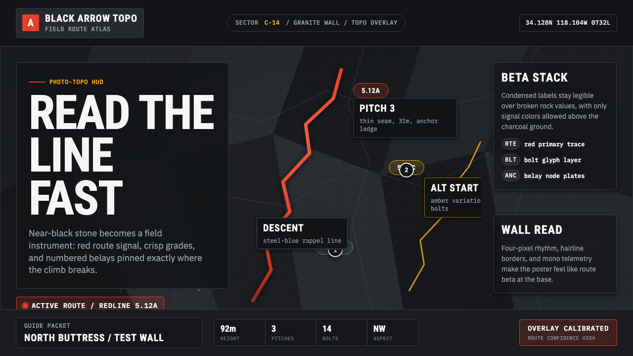 Climbing Topo GuideBeta at a glance. Red route telemetry cuts across near-black stone and conden…一眼读懂路线。红色拓扑线切过近黑岩面,紧缩标签如仪表读数。
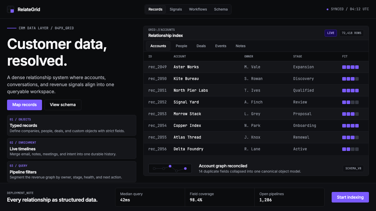 Attio CRMCRM stripped to its data layer. Single-pixel borders, monospaced IDs, violet…把 CRM 还原为纯粹数据层:单像素边框、等宽 ID、紫罗兰作为唯一强调色——…
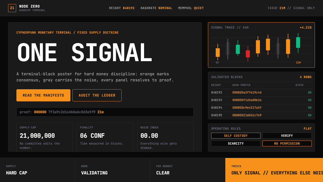 Bitcoin Maximalist OrangeOnly signal, zero spectacle. Orange mono data grids on terminal black enforce…只有信号,拒绝表演。终端黑上的橙色等宽数据网格,锁定硬钱秩序。
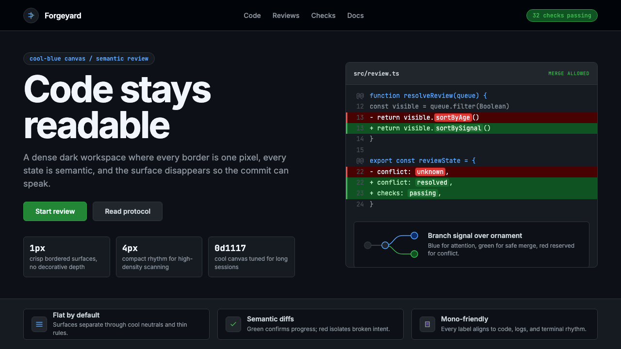 GitHub DarkCode-first darkness. Cool-blue canvas, 1px borders, green/red diff lines.代码优先的暗色:冷蓝画布、1px边框、绿红diff线。
 GitHub README Markdown (2014)Calm code authority. Blue links, gray code panels, and Inter/Mono stack on wh…沉稳的代码权威:白底蓝链、灰代码块与等宽节奏。
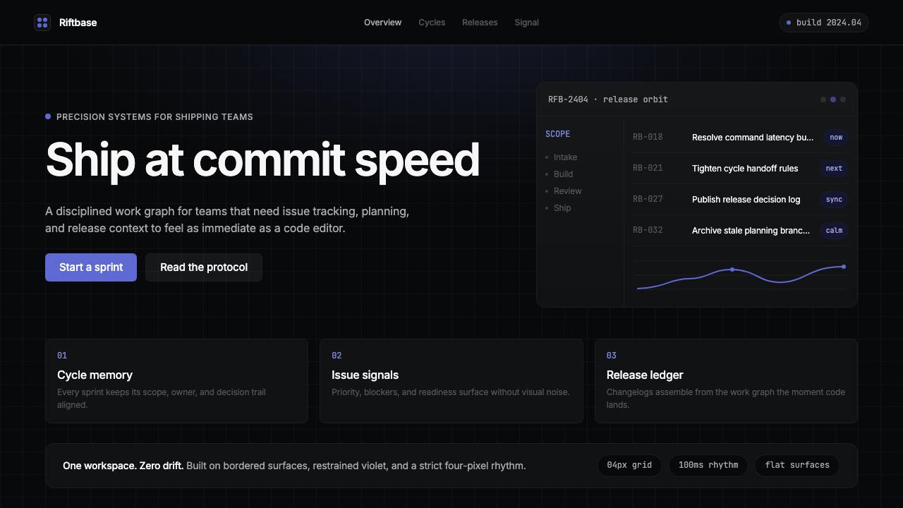 Linear 2024Precision down to the millisecond. Near-black, indigo-violet accents, Inter D…开发者工具美学的标杆:近乎纯黑、克制靛紫点缀、Inter Display 字体…