What is Concrete Skatepark?
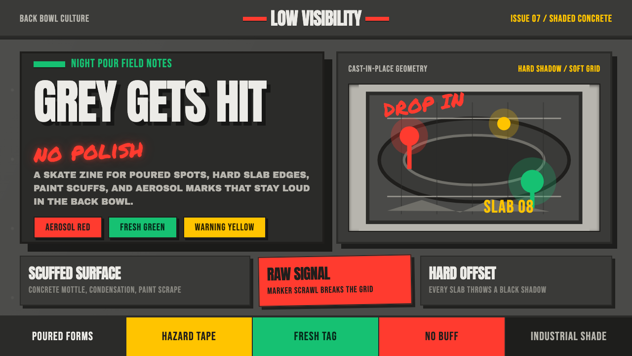
Concrete skatepark brutalism takes the scarred grey of a drained pool bowl and the neon flare of spray paint and turns them into a screen aesthetic built entirely around shadow.
Concrete Skatepark in brief
Concrete skatepark brutalism is a visual language built from two things that were never meant to be a design system: institutional poured-concrete architecture and the graffiti that gets written on top of it. The base is a cast, light-grey bowl surface — the kind of municipal, unpainted concrete found in drainage channels, underpasses, and purpose-built skate terrain — repainted in flat institutional grey and then marked, tag by tag, with spray paint. Nothing here is designed in the conventional sense; it is built for durability and then claimed by the people who use it.
The palette is almost entirely grey until it suddenly is not. Krylon red, Montana green, and a hazard-stripe yellow appear only as interruptions — a tag on a wall, a stripe on a lip, a warning stencil — never as fields of color. That restraint is what makes the accent colors detonate: against acres of flat grey, a single patch of saturated spray reads as loud as a siren.
The photographic sensibility matters as much as the surface. This aesthetic is shot, not lit — the best tags and the richest color live in the shaded, low-visibility back bowls where street and skate photographers have always pointed their lenses, because that is where the culture actually happens, away from the polished, well-lit street-facing ramps built for spectators.
Where does Concrete Skatepark come from?
The word brutalism itself comes from architecture, not skateboarding. It derives from the French béton brut — raw concrete — a term architects including Le Corbusier used for buildings that left poured concrete exposed rather than clad or finished. Postwar Britain adopted the label for a wave of municipal, civic, and educational buildings that wore their structural material openly: heavy, grey, unapologetically functional. That same raw poured concrete, built for permanence rather than beauty, is what decades later became skateable terrain almost by accident.
Skateboarding's move onto concrete has a specific origin point. During the mid-1970s California drought, skaters in Venice and Santa Monica began riding the empty backyard swimming pools left behind by water restrictions. The Zephyr team and the riders later mythologized as the Z-Boys found that a pool's curved concrete walls behaved like nothing a flat street or a plywood ramp could offer — a continuous transition from horizontal to vertical. That discovery is the direct ancestor of the purpose-built concrete bowl: skatepark designers began pouring kidney-shaped and full-pipe terrain that deliberately reproduced the geometry skaters had found by accident in drained pools.
By the late 1980s and into the 1990s, skaters stopped waiting for cities to build parks for them and started pouring their own. Burnside Skatepark, built illegally and without permits by local skaters under the Burnside Bridge in Portland, Oregon, starting in 1990, is the most cited example: a crew mixed and poured concrete themselves, expanding the spot over years, and its rough, hand-built geometry became a template that DIY skate crews across North America imitated through the 1990s and 2000s. This is the DIY spot-building movement the aesthetic draws its name and texture from — unglamorous, unpermitted, built with whatever concrete and labor was available.
Graffiti arrived on these surfaces the same way it arrives on any concrete: as an unauthorized claim of space. Writers tagged the walls of skateparks and drainage spots for the same reasons they tagged trains and underpasses — visibility, territory, and self-expression on a surface nobody was going to repaint. Skate and street photographers, working for magazines and zines built around this subculture, documented the result in the low, contrasty, often flash-lit style that became inseparable from the look: grey concrete, saturated spray, and deep shadow, captured exactly as it existed rather than staged for a shoot.
What defines the Concrete Skatepark look?
Color
Grey is the field, not an accent — flat, institutional, and nearly total. Red, green, and warning yellow appear only as small, deliberate interruptions: a tag, a painted stripe, a stencil. The rule is scarcity — accent color works because it almost never shows up, so when it does it reads as loud as spray paint on a wall genuinely does.
Surface and Texture
Nothing is smooth. The ground reads as cast concrete with visible aggregate grain, paint scuff, and the faint bloom of condensation staining. Surfaces should look poured and used, not printed — no polished gradients, no glossy sheen. Wear is a feature, not a flaw to hide.
Typography
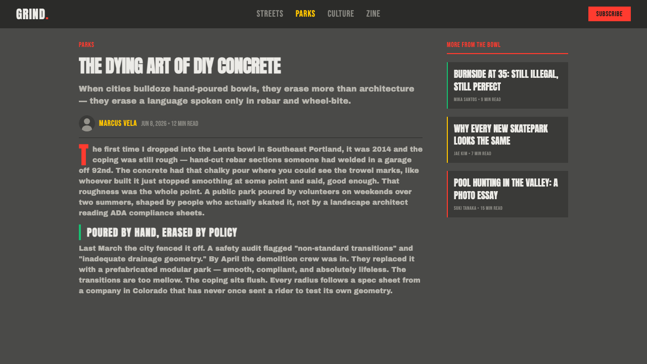
Two registers coexist and never blend. Heavy, condensed signage lettering carries structural information — headers, labels, anything that needs to read as official. Loose, hand-scrawled marker script carries everything unofficial — asides, tags, informal notes — sitting at odd angles across the condensed type rather than aligned to it.
Composition and Lighting
The aesthetic is staged as low-visibility shade rather than bright daylight. Forms emerge from a darker ground the way tags emerge from a shadowed back bowl, and color is placed to pop out of that shade rather than sit on an evenly lit field. Deep shadow functions as active composition, not empty background.
Wear and Weathering
Surfaces carry visible history: chips, scuffed edges, and layers of paint over paint where one tag has been sprayed over an older one. This layered, accumulated quality distinguishes authentic concrete-skatepark texture from a single clean graffiti motif dropped onto a plain background.
Mark-Making and Graffiti Layer
Tags are gestural, asymmetric, and overlapping rather than laid out on a grid. They function as an informal, human counterpoint to the rigid poured architecture beneath — evidence that the space was claimed after it was built, not designed as a unified whole from the start.
Who shaped Concrete Skatepark?
The term brutalism descends from the French béton brut — raw concrete — used by architects including Le Corbusier for buildings that left poured concrete exposed rather than clad. Postwar Britain adopted the label for civic and municipal structures that wore their structural material openly. This architectural raw-concrete tradition is the physical ancestor of every surface this aesthetic photographs.
The Southern California surf-and-skate crew centered on Venice and Santa Monica, mythologized as Dogtown and the Zephyr team (Z-Boys), pioneered riding the empty backyard swimming pools left by the mid-1970s drought. Their discovery of a pool's continuous curved concrete transitions is the direct origin of the purpose-built skate bowl.
Built without permits by local skaters under the Burnside Bridge in Portland, Oregon starting in 1990, Burnside is the most cited example of the DIY concrete spot-building movement. Its crew poured and expanded the terrain by hand over years, and its rough, self-built geometry became a template imitated by DIY skate crews across North America through the 1990s and 2000s.
The subculture's photographers and magazines documented spots and writers in a low-light, high-contrast, often flash-lit style shot on location rather than staged. That documentary approach — capturing color as it genuinely existed against shadowed concrete — is where the aesthetic's photographic sensibility originates.
How do you use Concrete Skatepark today?
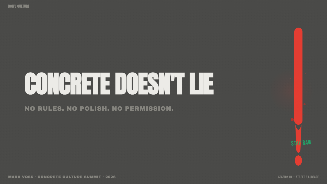
For presentation slides, a cover works best as a near-total grey field broken by one loud accent — a large condensed title lockup treated like a spray-painted tag, sitting off-axis rather than perfectly centered. Content slides should keep the grey as a calm working surface: body text in the clean condensed type, with the spray palette reserved for a single highlighted stat, label, or call-out per slide rather than scattered throughout.
Data slides suit this system particularly well when treated as diagrammatic tags rather than conventional charts — a bar or a percentage rendered as if stenciled or sprayed onto the grey ground, using exactly one accent color per data point being emphasized. Resist the urge to color-code an entire chart with the full red-green-yellow set; that reintroduces the visual noise the style is built to avoid.
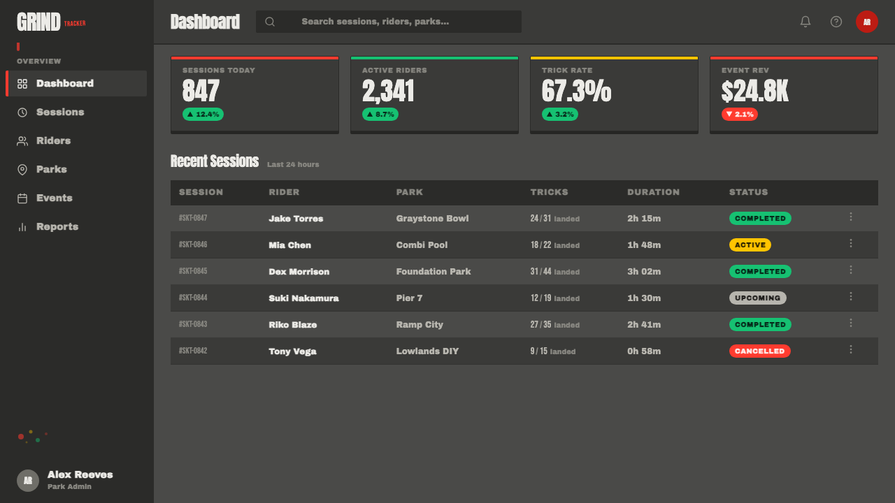
For web interfaces, this aesthetic favors dark-mode dashboards and pricing pages where the surfaces themselves read as cast concrete panels: dark grey cards, condensed labels, and a single accent color reserved for primary actions, active states, or tier distinctions. Navigation and secondary text should stay in muted greys so the accent genuinely functions as an alert rather than one color among several competing for attention.
In editorial and marketing contexts, the style supports street-culture publishing, music, sport, and youth-brand work particularly well. Hero imagery should favor low, contrasty, shadow-heavy photography over bright, evenly lit product shots, and headlines can borrow the condensed-plus-scrawl typographic contrast directly — an official-feeling headline with a handwritten aside beneath it.
The most common mistake is treating this as generic urban grunge and spraying color everywhere for texture. The system only works if grey dominates by a wide margin and the accent colors stay genuinely rare; a page that is one-third red, one-third green, and one-third yellow reads as chaotic rather than as concrete interrupted by a real tag. A second mistake is over-polishing the grey into a smooth flat design-system neutral — the aggregate texture and visible wear are load-bearing, not decorative.
Concrete Skatepark — FAQ
Is this the same thing as the internet's raw-HTML 'brutalist web design' trend?
No, though they share a name and a spirit of refusing polish. Web brutalism is a screen-native reaction against slick templated design — exposed system fonts, default blue links, unstyled markup. Concrete skatepark brutalism is a photographic and material aesthetic borrowed from a physical subculture: cast concrete texture, institutional grey, and spray-paint accent color, all shot in shadow. It can be rendered with fully custom, highly designed layouts — the rawness lives in the surface and the palette, not in withholding styling.
Does the palette always need to be this dark?
The aesthetic is built around shadow, so a genuinely dark or near-black ground is central to how it works — the whole logic of accent colors detonating against grey depends on that grey sitting in low light. A brighter, fully daylit version loses the specific character described here; it becomes generic urban texture rather than the shaded back-bowl look this system is built from. If a lighter treatment is required, it should still preserve deep localized shadow rather than flattening everything to even, bright grey.
How do I keep the hand-scrawled tag type legible?
Treat the scrawled marker style strictly as a secondary, accent layer, never as the primary reading path. All structural information — navigation, headers, body copy, data labels — should stay in the heavy condensed signage type, which is built for clarity at small sizes. The hand-scrawled register is reserved for short asides, callouts, or decorative marks where legibility matters less than character; keeping that division strict is what keeps the whole system readable.
Which products or brands does this style suit, and which should avoid it?
It suits products with a genuine connection to skate, street, music, or youth culture, and any brand that wants to read as unpolished, subcultural, and confident rather than corporate. It struggles for finance, healthcare, enterprise software, or any context where trust depends on a sense of order and restraint — the deliberate roughness and graffiti layer will read as unserious or even alarming rather than authentic in those settings. As with any culturally specific aesthetic, it should be applied with genuine understanding of the subculture it draws from, not as decoration.
Related design styles
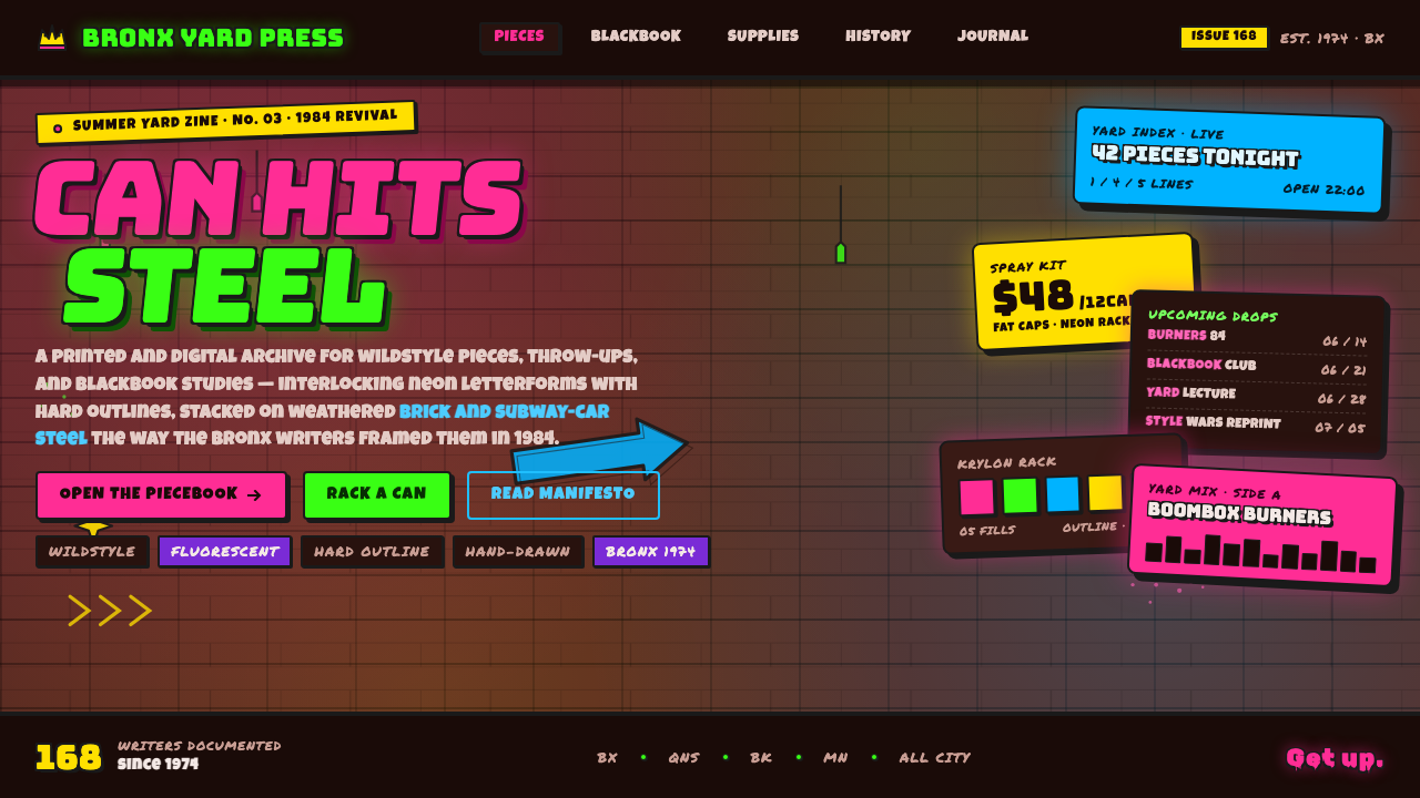 Wildstyle GraffitiBronx walls, sprayed loud. Neon pink-and-green fills, hard black outlines, Bu…
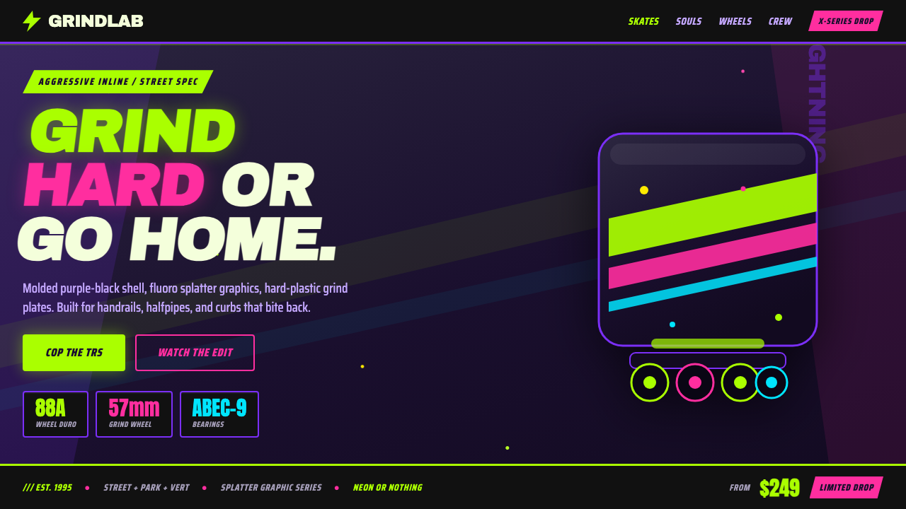 90s Aggressive Inline SkateX-Games attitude in plastic and paint. Fluoro lime and magenta slash across m…
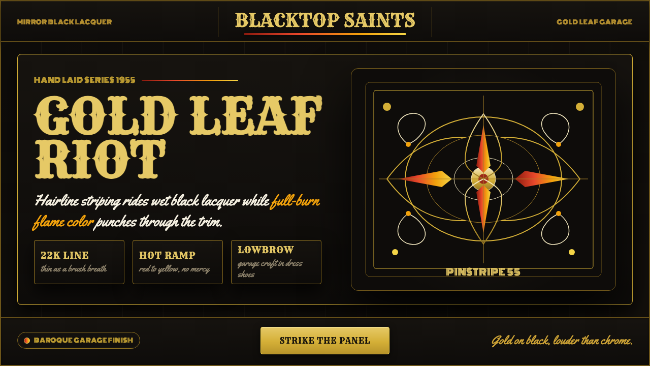 Kustom Kulture PinstripeGarage baroque burns hot. Rye woodtype, black lacquer, gold hairlines, flame…
 Psychedelic Fillmore (Mouse, 1968)Legibility becomes ritual. Magenta-cyan vibration and bulbous mandalas melt t…
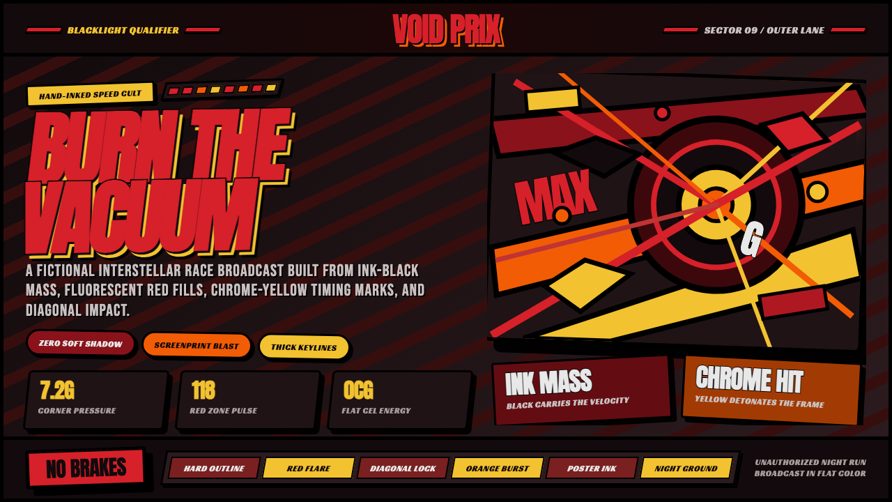 Redline Space RaceSpeed made violent. Ink-black mass, racing red, chrome yellow, and diagonal k…
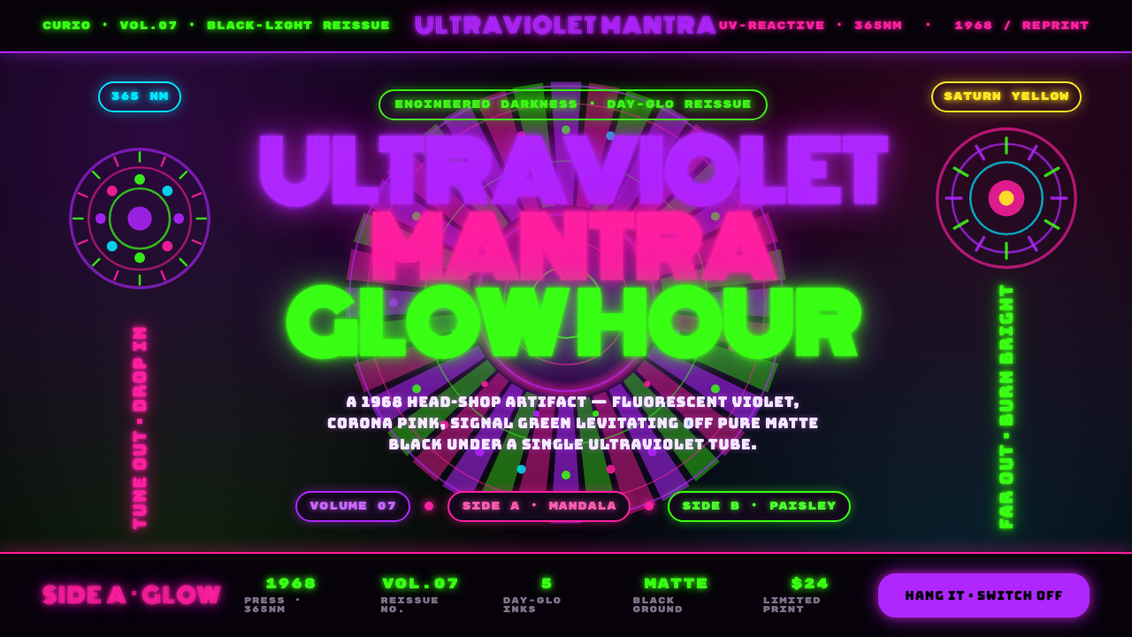 UV Blacklight PosterEngineered darkness. Day-Glo violet, Corona pink, and signal green levitating…