What is Wildstyle Graffiti?
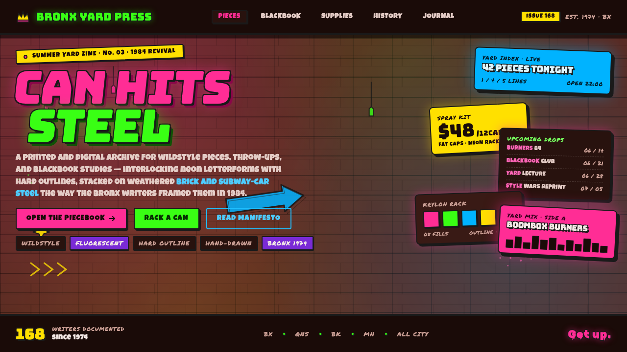
Wildstyle Graffiti turns the written name into urban voltage — interlocked letters, arrowed extensions, neon fills, and black outlines compressed against brick and subway steel.
Wildstyle Graffiti in brief
Wildstyle Graffiti is the most complex form of New York graffiti lettering. Its characters overlap, twist, and lock together until a word approaches abstraction. Arrows shoot from stems, counters collapse into neighboring forms, and extensions cross the composition like improvised scaffolding. The result is deliberately difficult to read: recognition belongs first to viewers who understand the visual codes of the scene.
The style is built through layers. Fluorescent pinks, electric greens, and other intense fills are contained by hard black outlines, then sharpened with highlights, interior cuts, drips, and secondary marks. These devices do more than decorate the letters. They separate crowded forms, establish depth, and keep the piece visible against dark, weathered surfaces.
Wildstyle carries the physical character of its setting. Brick joints interrupt a curve; steel panels divide a word; stains and aging remain visible beneath the paint. Rather than hiding this rough substrate, the style uses it as resistance. Its energy comes from the collision between controlled lettering and an imperfect urban ground.
Where does Wildstyle Graffiti come from?
Wildstyle emerged within the broader New York City graffiti era, whose span in the supplied history runs from 1950 to 1990. Its specific center was the Bronx, and its immediate visual environment was the city wall and subway car. Graffiti names were not presented as detached typographic studies; they were painted across brick and steel, where darkness, weathering, joints, and existing marks became part of the image.
Tracy 168 pioneered wildstyle in the Bronx during the mid-1970s. The decisive development was the transformation of relatively direct lettering into a tightly interlocking system. Letters acquired arrows, folds, crossings, and extensions; the name remained the structural core, but reading it required following multiple paths through the composition. Complexity became both a visual achievement and a marker of fluency within graffiti culture.
The style peaked through the 1980s as part of New York subway graffiti and the visual culture surrounding hip-hop. Its aggressive color, compressed movement, and enlarged lettering made it suited to dark urban substrates. The subway-car surface introduced steel into a language already associated with weathered brick, while fluorescent and electric colors intensified the contrast between painted identity and the city beneath it.
Lady Pink stands alongside Tracy 168 in the supplied account of the style's key figures. Together, their presence situates wildstyle not as an anonymous decorative effect but as a writer-driven lettering culture. By the end of the period, its central grammar was clear: the name as image, difficulty as distinction, layering as construction, and the urban surface as an active participant rather than a neutral background.
What defines the Wildstyle Graffiti look?
Electric Color
Fluorescent pink and electric green form the signature contrast, joined by other neon-like hues when the composition needs additional separation. Color is loud because it must compete with dark brick, aged steel, stains, and existing marks. A dominant fill usually binds the word together, while a contrasting accent identifies cuts, highlights, or selected letter sections.
Interlocking Letterforms
Letters behave less like characters placed in sequence than like parts of a single mechanism. A stroke may pass behind one form, emerge through another, and terminate as an arrow elsewhere. Counters narrow, stems bend, and neighboring letters share edges. The word becomes a compact network whose readability depends on tracing relationships rather than scanning from one side to the other.
Arrows and Extensions
Arrowheads, hooks, bars, and sweeping terminals push energy beyond the basic alphabet. Some extensions clarify direction; others deliberately complicate the route through the piece. They create centrifugal motion, making the lettering appear ready to expand past its allotted surface. Used well, each extension grows from a structural stroke rather than floating as an unrelated ornament.
Hard Outlines
Heavy black contours hold the composition together. They separate adjacent neon fills, restore letter boundaries after forms overlap, and protect the silhouette from a visually noisy ground. Interior black cuts can divide a broad fill into planes, while an outer contour gives the entire name a unified mass. Soft edges would weaken the style's authority; boundaries must feel sprayed yet decisive.
Layered Depth
Depth is constructed through overlap, outline hierarchy, highlights, and offset forms rather than naturalistic modeling. One letter disappears behind another and returns elsewhere; a bright edge lifts a plane forward; a dark interval opens a channel between crowded strokes. The space feels compressed and shallow, closer to stacked painted layers than to an illusionistic scene.
Urban Substrate
Weathered brick and subway-car steel are not interchangeable wallpaper effects. Their seams, abrasions, stains, and tonal variation provide the resistance against which the lettering becomes vivid. A convincing application lets some of that material remain visible, so the piece feels attached to a surface with history rather than placed on a polished dark panel.
Drips and Highlights
Drips preserve the behavior of sprayed paint, while highlights sharpen selected edges and make dense forms easier to separate. Neither should be distributed evenly. A few directional drips can extend gravity through the composition, and concentrated highlights can reveal the intended reading path. When every edge gleams and every stroke leaks, the marks lose their explanatory role and become visual noise.
Who shaped Wildstyle Graffiti?
Tracy 168 is identified as the pioneer of wildstyle in the mid-1970s Bronx. His importance lies in establishing complexity itself as a defining principle of graffiti lettering: the name could remain present while its characters became interlocked, arrowed, folded, and nearly abstract. That shift supplied the structural foundation for the style's later peak in the 1980s.
Lady Pink is named among the key figures of Wildstyle Graffiti. Her place in the supplied history connects the style to the writer-centered culture of New York graffiti rather than to a detached graphic trend. In this context, wildstyle is understood as authored street lettering: identity, technical command, and the visual force of the name are inseparable.
New York subway graffiti is the movement context in which wildstyle reached its 1980s peak. Subway-car steel gave the lettering a dark, segmented, industrial ground, while the culture favored names large and forceful enough to operate as images. Wildstyle condensed that environment into a recognizable grammar of neon fill, black contour, interlocking form, and controlled difficulty.
How do you use Wildstyle Graffiti today?
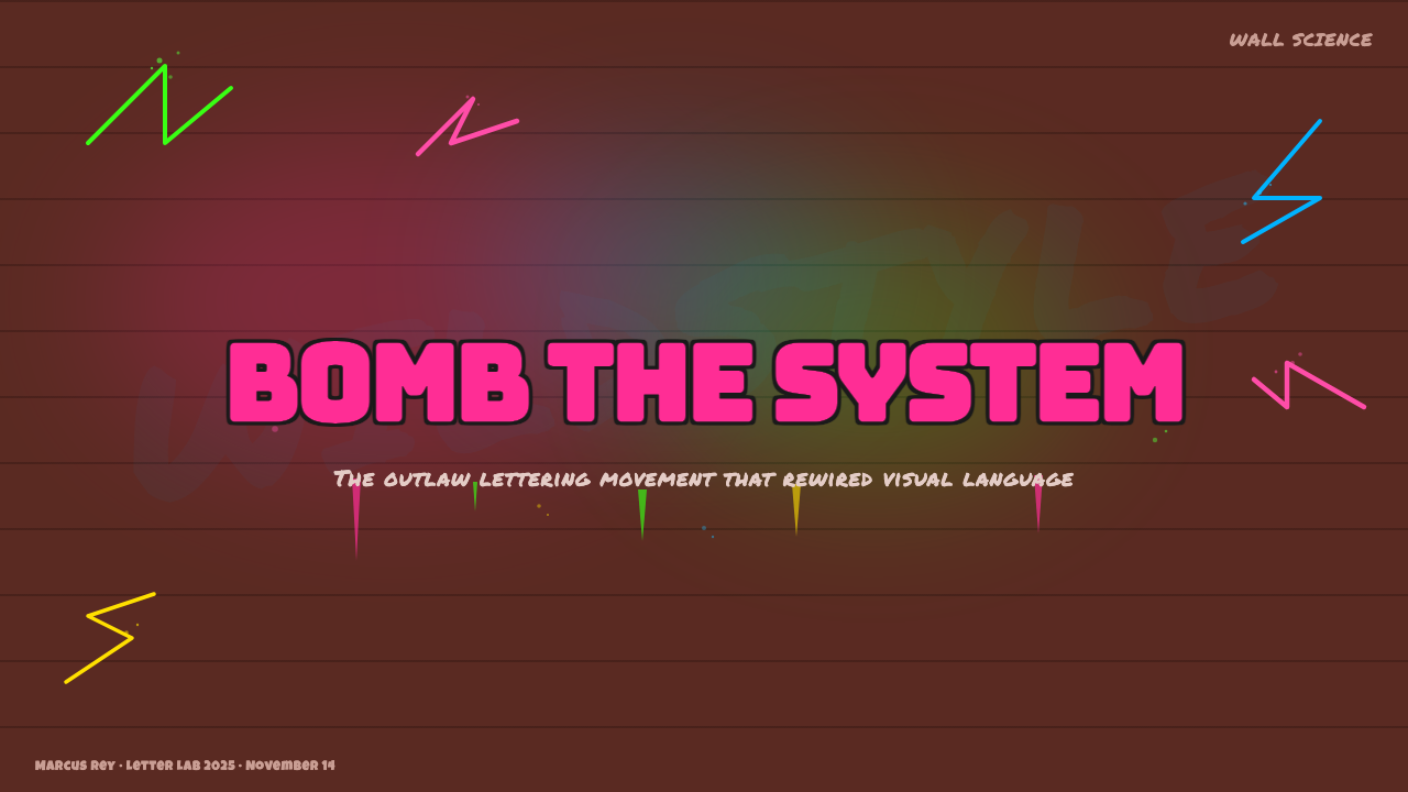
For presentation slides, Wildstyle works best when the lettering is treated as the principal event rather than a decorative font applied everywhere. A cover can place one enlarged, interlocking title across a dark brick or steel field, with neon fill and black contour carrying the identity. Content slides need a calmer supporting system: direct body typography, generous dark space, and small graffiti-derived arrows or painted marks used only to connect sections. The contrast between an explosive display title and restrained information is what keeps the deck readable.
Data slides should borrow wildstyle's layering without sacrificing comparison. Use intense color to identify important series, black contours to keep adjacent shapes distinct, and arrow-like connectors to guide the eye through a sequence. Charts should remain simpler than the title artwork; if every bar, label, and annotation receives an outline, drip, and highlight, the data becomes another illegible tag. Let the graffiti language frame the evidence and emphasize turning points rather than distort the underlying relationships.
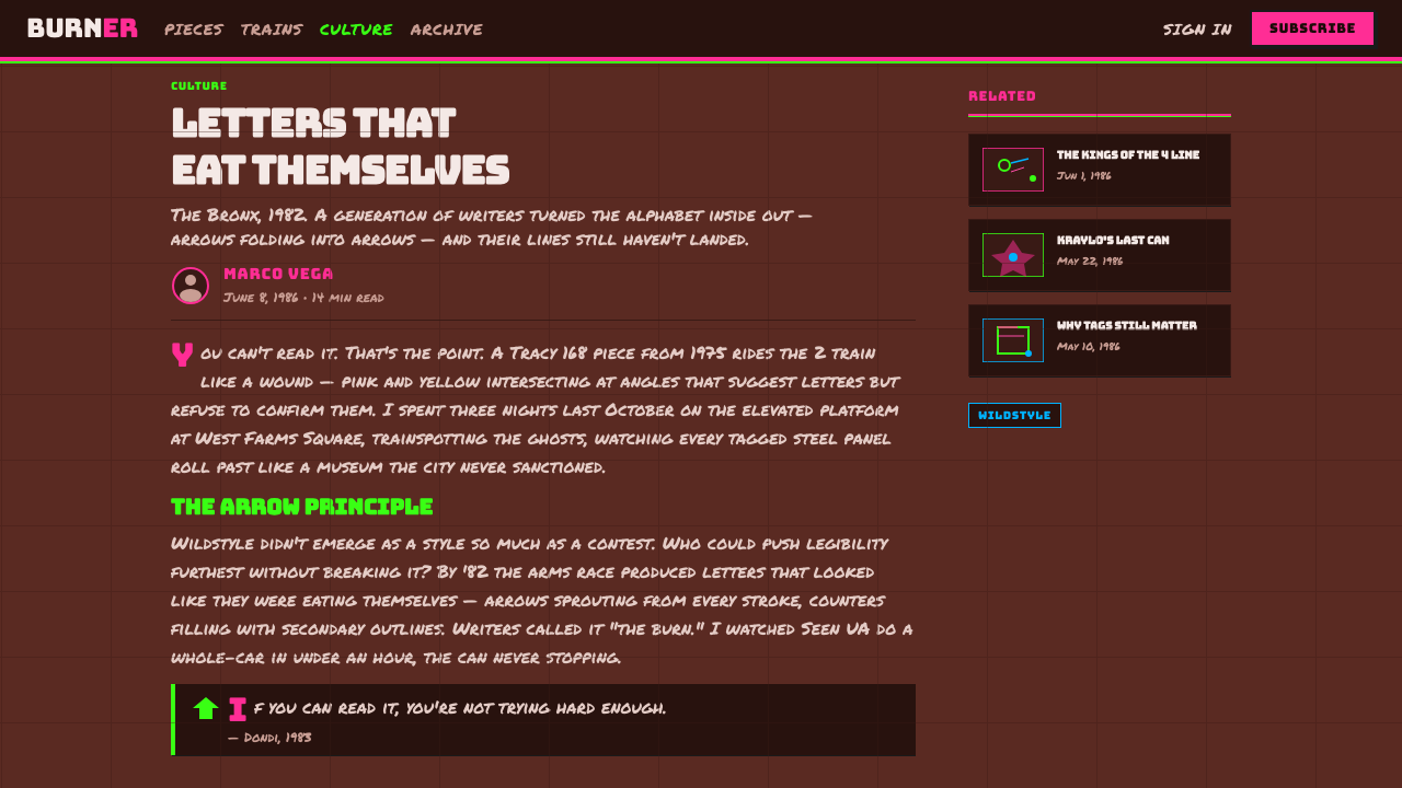
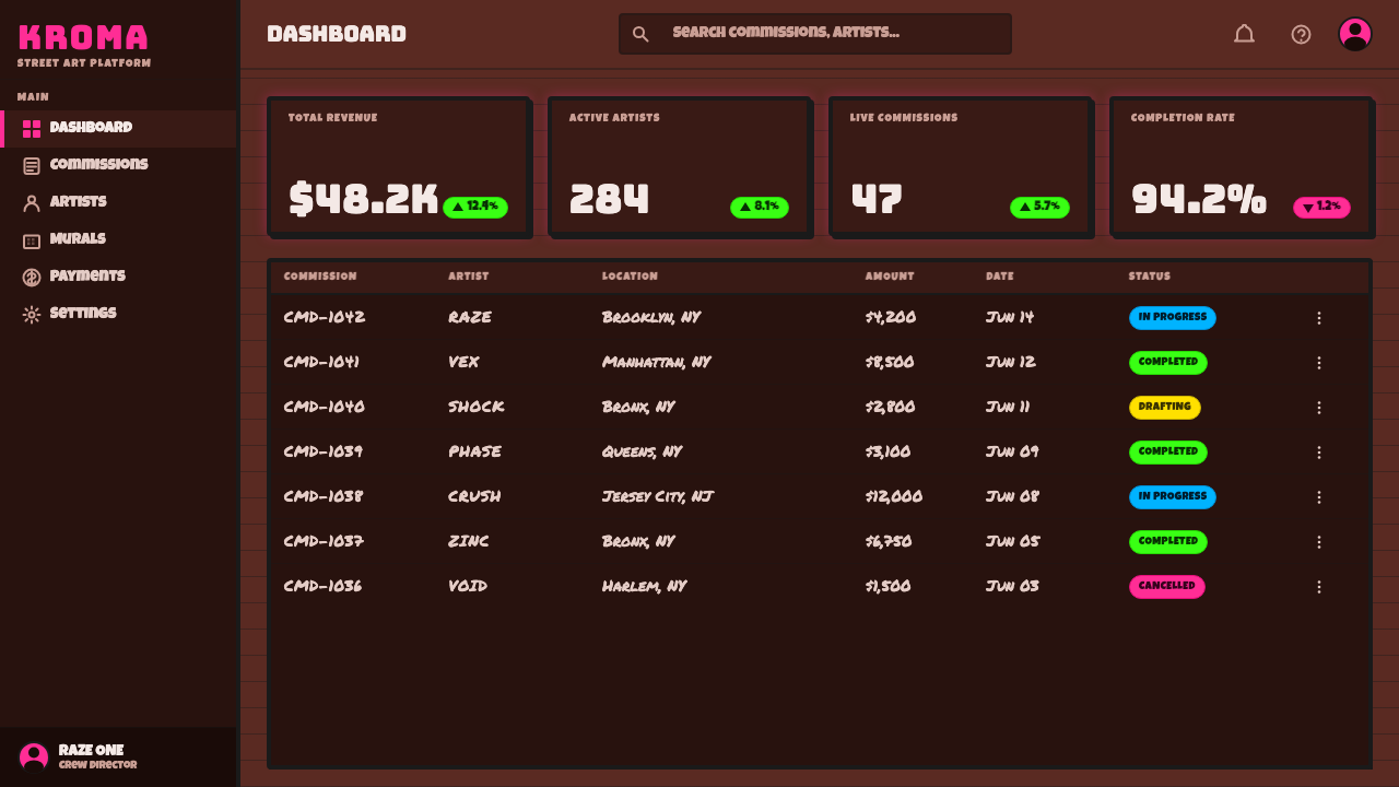
For web interfaces, the style is most effective on music, culture, event, or creator-facing dashboards where energy and identity matter. Navigation and controls should remain plain enough to operate quickly, while hero areas, active states, category headers, and selected metrics carry the wildstyle voice. Pricing pages can assign each tier a distinct electric fill and use outlined panels against a dark weathered ground. The recommended tier may receive a stronger silhouette or a controlled arrow extension, but essential terms and actions should never be buried inside interlocking display lettering.
Editorial and marketing layouts can use wildstyle to establish attitude before returning to a readable text rhythm. An article opener may crop an oversized word so that arrows and letter fragments cross the edge, while the following sections use clear columns and occasional painted call-outs. Campaign pages can alternate dense graffiti moments with quieter dark fields, allowing product photography or copy to breathe. Brick and steel textures should support the narrative of place; repeating them behind every section reduces a meaningful substrate to generic distress.
The most common mistake is equating wildstyle with maximum decoration. Adding arbitrary arrows, neon colors, drips, and outlines to ordinary lettering does not create the style. The forms must interlock as a coherent word, the black contour must clarify real overlaps, and accents must direct reading through the complexity. Another failure is applying near-illegibility to functional text. Keep names, hero statements, and expressive campaign phrases available for abstraction; keep instructions, prices, labels, and data unmistakably clear.
Wildstyle Graffiti — FAQ
Why is Wildstyle Graffiti intentionally difficult to read?
Difficulty is part of the style's structure and identity. Interlocking strokes, arrows, folds, and extensions turn a name into a visual problem that must be traced rather than immediately scanned. This rewards familiarity with graffiti lettering and distinguishes technical control from ordinary writing. The goal is not complete obscurity: the underlying name should still organize the composition, even when a general viewer first encounters it as an abstract image.
Does every Wildstyle composition need neon pink and green?
No, but fluorescent pink and electric green express the supplied theme especially clearly because they strike hard against black contours and dark urban surfaces. The deeper principle is electric contrast: an intense fill must remain distinct from the substrate and from neighboring letter planes. A limited selection usually creates more force than many equally loud colors competing without hierarchy.
How should ordinary text accompany wildstyle lettering?
Supporting text should be direct, stable, and visibly separate from the display piece. Wildstyle already supplies compression, motion, and detail, so body copy does not need to imitate those qualities. Use hierarchy, spacing, and quiet dark areas to create a readable counterweight. The expressive lettering can name the page or section; ordinary typography should explain, compare, and guide action.
Can Wildstyle work without brick or subway-steel texture?
Yes, provided the composition preserves the relationship between vivid lettering and a resistant dark ground. Brick and steel connect the style directly to its Bronx and subway context, but a contemporary application can use a simpler dark surface if outlines, overlaps, and material contrast remain convincing. What should be avoided is a pristine backdrop that makes the lettering feel like a detached logo with arbitrary distress added afterward.
Where does Wildstyle Graffiti struggle in digital products?
It struggles wherever immediate comprehension, calmness, or dense functional reading dominates. Complex letterforms are poorly suited to instructions, long passages, prices, tables, and frequently used controls. The dark ground and electric accents can also become exhausting when every screen maintains the same intensity. The style succeeds when concentrated in identity-bearing moments and supported by a quieter interface; it fails when expressive difficulty becomes the default behavior of the product.
Related design styles
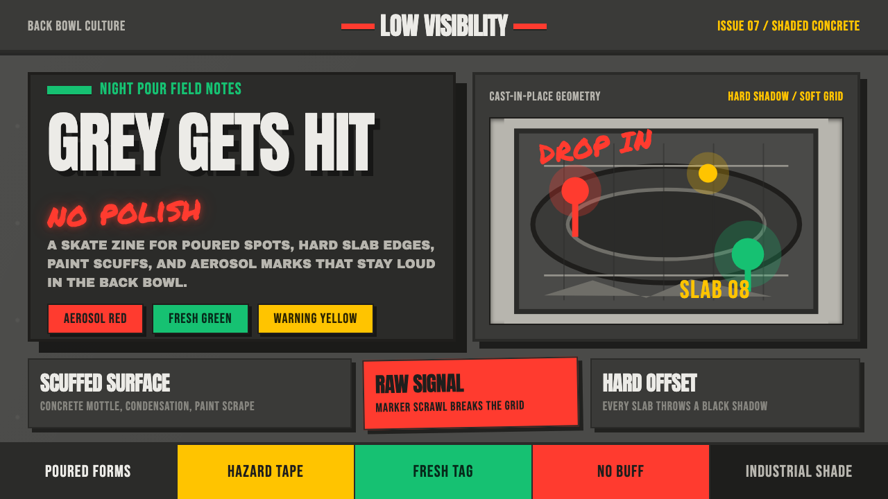 Concrete SkateparkRaw concrete detonates. Grey slab blocks carry red, green, and warning-yellow…
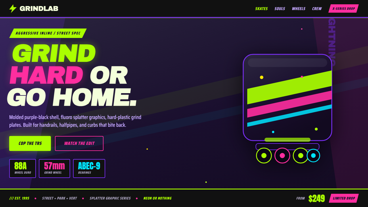 90s Aggressive Inline SkateX-Games attitude in plastic and paint. Fluoro lime and magenta slash across m…
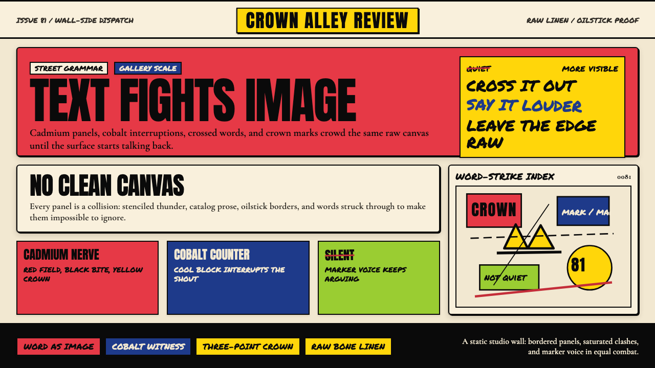 Basquiat Neo-ExpressionismExplodes off raw linen. Cadmium red, cobalt blue, Anton blocks, and struck ma…
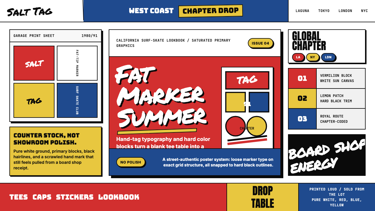 Stüssy StreetwearStreetwear starts rough. Vermilion blocks, marker script, and black hairlines…
 Acid House Smiley (1988)Rave energy hits first. Acid yellow on black, Anton caps, smiley glow.
 Corita Kent SerigraphJoy printed at full volume. Flame red, hot pink, and misregistered type flood…