What is UV Blacklight Poster?
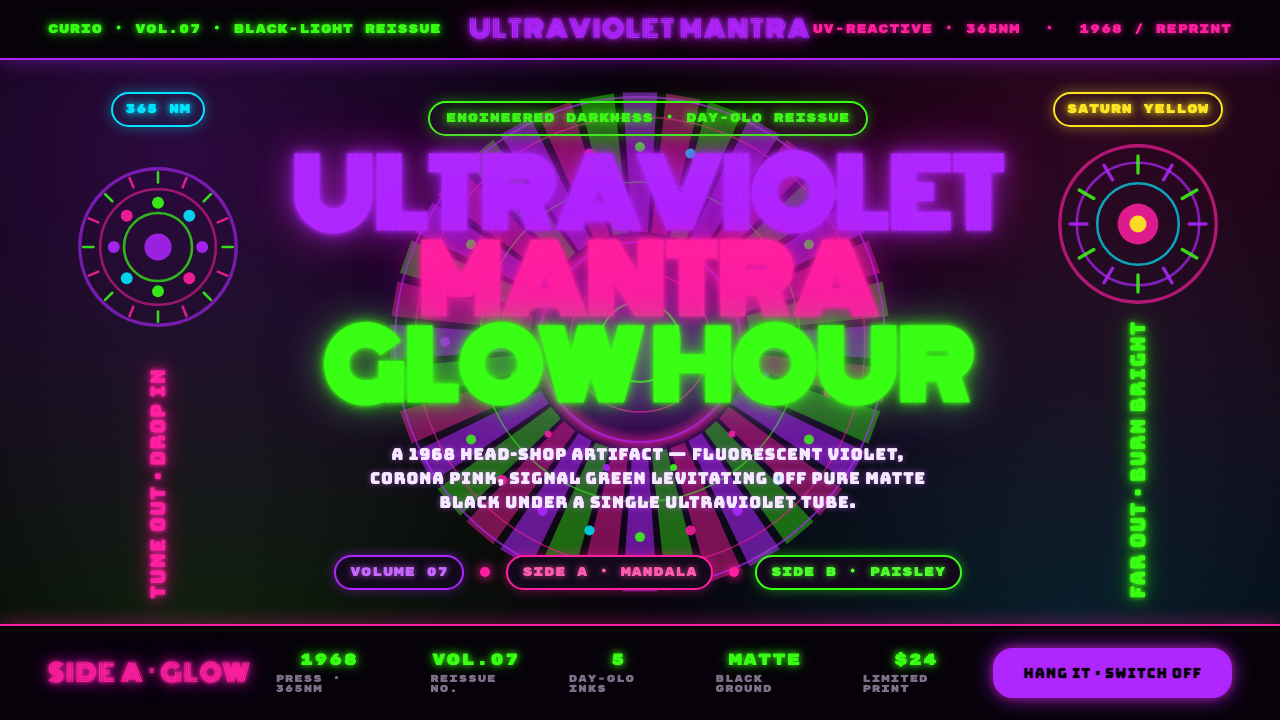
UV Blacklight Poster turns darkness into a display system: fluorescent violet, pink, and green seem to hover above matte black like ink caught in ultraviolet light.
UV Blacklight Poster in brief
UV Blacklight Poster is a poster language associated with the 1968 psychedelic heyday and the North American head-shop counterculture scene. It was made to perform under a black-light tube. Its fluorescent inks — electric violet, Corona pink, and signal green — do not merely decorate a dark surface; they appear to detach from it. The black field becomes an engineered void that gives every luminous mark room to radiate.
Its distinction from generic psychedelic design is this commitment to darkness. A typical psychedelic composition may use vivid color, warped lettering, and ornamental movement, but the UV blacklight poster organizes all of those elements around the optical drama of fluorescence. Matte black absorbs the surrounding visual noise. Against it, each colored contour, halo, paisley curl, and mandala-like ring reads as if it has its own ultraviolet source.
The style pairs Day-Glo fluorescent print with swirling, melting lettering derived from Art Nouveau revival forms. Letterforms bend, coil, and soften into the surrounding ornament instead of sitting apart from it as neutral labels. The result is intentionally saturated and dense: radiating shapes overlap, patterns rotate through the composition, and empty space is treated as a missed opportunity for glow.
Where does UV Blacklight Poster come from?
The UV blacklight poster belongs to the 1968 psychedelic heyday within a broader counterculture poster era extending from 1950 to 1990. Its North American setting was the US head-shop scene: an environment where posters could function as atmospheric artifacts as much as printed announcements. A poster was expected to transform a wall when the room changed from ordinary light to black light.
Day-Glo Color Corp., associated here with the Switzer brothers, supplied the fluorescent-print foundation that made the visual effect possible. The important idea was not simply bright pigment. Fluorescent inks were used in concert with a pure matte-black ground, so the dark field would intensify the apparent lift and radiation of violet, pink, and green. The medium determined the aesthetic rather than merely serving it.
Artists associated with Bahr Gallery blacklight posters developed the image world around that print behavior: swirling optical fields, radiant halos, layered mandala-like forms, and lettering that appears to melt or circulate rather than rest. Their compositions borrowed the sinuous impulse of Art Nouveau revival lettering, then pushed it into the saturated visual pressure of psychedelic art.
Head-shop poster printers carried this language into repeatable printed artifacts. That production context helps explain its total visual density. The style was meant to announce itself immediately under ultraviolet illumination, not to reward restraint in daylight. Its enduring identity is therefore inseparable from the sequence of matte darkness, fluorescent activation, and a surface that seems to vibrate without ever becoming physically illuminated from within.
What defines the UV Blacklight Poster look?
Engineered Darkness
Pure matte black is the active foundation of the composition, not a neutral background. It suppresses ordinary depth and lets fluorescent marks appear suspended. The black field should feel uninterrupted and absorbent, so every colored form has the sensation of emerging from a space with no visible boundary.
Fluorescent Radiation
Electric violet, Corona pink, and signal green are treated as emissive presences rather than ordinary fills. They should feel charged against the black ground, often through nested outlines, halos, repeated contours, or adjacent color pressure. The goal is not soft realism but the sensation that color is visibly energized.
Melting Lettering
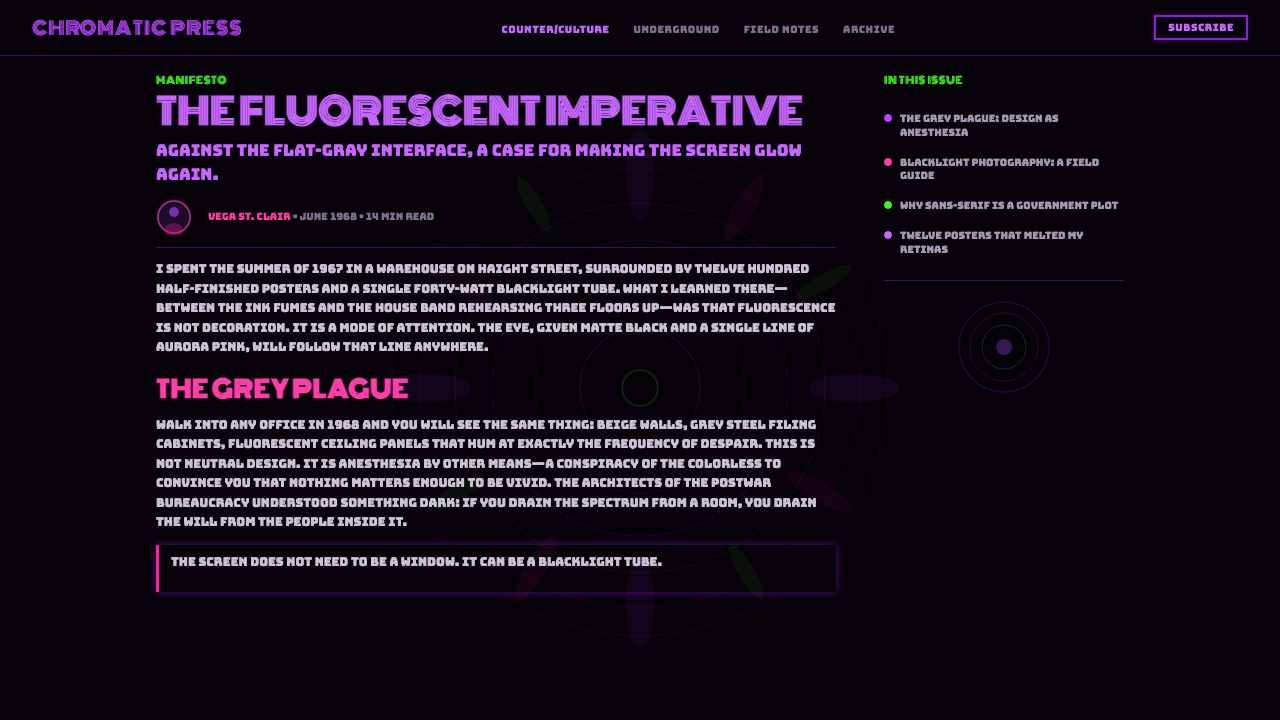
Typography follows the swirling logic of Art-Nouveau-derived lettering. Characters stretch, curl, broaden, and merge with their surroundings until words behave like ornamental forms. Readability remains important, but conventional straight baselines and detached, rigid type are secondary to motion and atmosphere.
Rotational Ornament
Mandalas and paisley motifs supply continuous movement. Rings seem to turn inward or outward, while curled teardrop forms braid through one another. These motifs are not quiet background texture; they are structural currents that pull the eye through the poster and prevent the composition from settling.
Saturation and Density
The style resists visual restraint. Forms crowd, overlap, echo, and radiate across the entire field. Empty space is minimal because the poster seeks immersive visual pressure: an all-over surface where the viewer encounters color, pattern, lettering, and glow at once rather than in a calm reading sequence.
Ultraviolet Illusion
Every element should look as though it is lit only by ultraviolet light. This does not mean simulating a real lamp or a natural scene. It means maintaining a unified impossible lighting condition in which black recedes completely and fluorescent forms seem to radiate from their own edges.
Who shaped UV Blacklight Poster?
Day-Glo Color Corp., associated with the Switzer brothers in the source material, represents the fluorescent-print basis of the style. The company matters because UV Blacklight Poster depends on the relationship between fluorescent ink and matte black, not on color used independently of its viewing condition.
The Bahr Gallery blacklight poster artists stand for the visual authorship of the form: psychedelic density, radiant optical pattern, and fluid Art-Nouveau-revival lettering. Their role is not merely decorative; it demonstrates how image-making could be organized around the expected transformation of a poster under black light.
Head-shop poster printers gave the style its public, reproducible artifact form within the North American counterculture scene. Their work connected fluorescent production, blacklight viewing, and wall-scale visual impact, making the poster an environment-changing object rather than a purely informational sheet.
How do you use UV Blacklight Poster today?
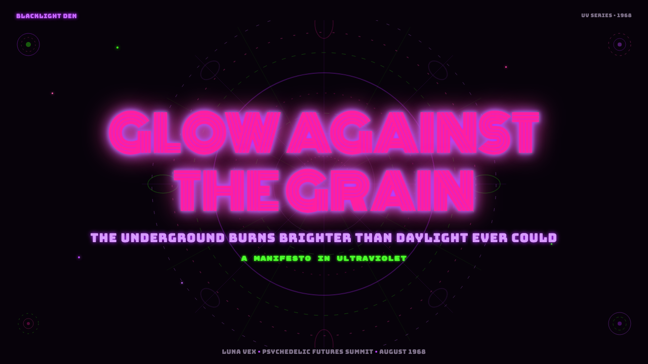
For presentation covers, UV Blacklight Poster works best when the title is treated as a luminous event rather than a restrained heading. Set it inside or against a field of curling ornament, then let violet, pink, or green establish the primary visual charge over uninterrupted black. Keep the concept theatrical: the cover should suggest that the slide has entered a blacklight room, not that it has borrowed a few neon accents.
Content slides need more discipline than a historic poster, but they can retain the same optical logic. Use a deep black field, make one fluorescent family lead the hierarchy, and allow secondary colors to mark related ideas or transitions. Titles may curve or swell with the ornamental system, while supporting text should remain clearly readable within calmer pockets of darkness. The effect should be immersive without making every sentence compete with every motif.
For data slides, translate charts into radiant signs. Lines, bars, nodes, and category markers can glow against black, while repeated contour treatments help major values feel electrically present. Avoid neutral gray corporate-chart habits: this style depends on decisive black and fluorescent contrast. At the same time, reserve the densest patterning for framing areas so the actual comparison remains legible.
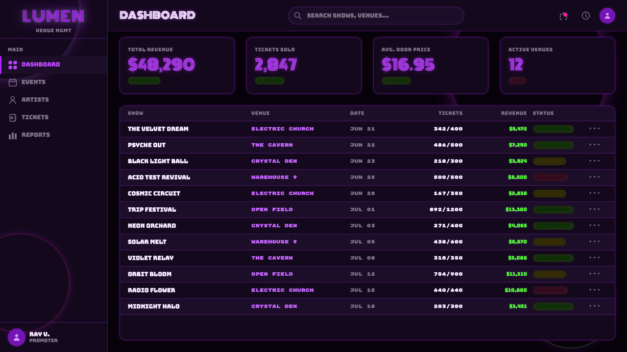
In web interfaces, the style fits campaign pages, music-adjacent experiences, event announcements, and expressive landing screens more naturally than utilitarian dashboards or pricing flows. It can still inform a dashboard when the product genuinely wants nocturnal spectacle, but navigation, controls, and dense information require stable reading zones. Use black as the environmental field, fluorescent color as the active signal, and ornamental motion around rather than beneath essential tasks.
The most common mistake is treating UV Blacklight Poster as generic neon-on-black. That loses the point. The style needs the specific relationship between matte darkness, Day-Glo-like fluorescence, swirling Art-Nouveau-derived type, and all-over psychedelic density. A sparse black interface with a bright gradient, a conventional sans-serif title, and a few glowing outlines may be neon, but it does not recreate the blacklight-poster artifact.
UV Blacklight Poster — FAQ
Is UV Blacklight Poster simply a dark version of psychedelic design?
No. It belongs to psychedelic art, but its identity is more specific: it is engineered for black-light viewing. The matte-black field and fluorescent inks are interdependent. Psychedelic motifs and distorted lettering matter because they amplify that fluorescent optical condition, not because the style merely prefers saturated color.
Why is the black background so important?
Because the all-black field creates the contrast condition that makes violet, pink, and green appear to levitate. If the ground is broken into ordinary colored panels or filled with unrelated texture, the fluorescent forms lose their apparent isolation. In this style, darkness is an active material.
Can the lettering be conventional and still feel authentic?
Conventional lettering can support readable secondary information, but it cannot carry the central image alone. The characteristic display lettering is swirling, melting, and Art-Nouveau-derived; it participates in the same movement as the paisleys and radiating forms. A rigid title weakens the sense that the entire surface is under one ultraviolet spell.
Where does this style struggle in contemporary product design?
It struggles wherever calm scanning, sustained reading, or neutral trust is the primary need. Its density and luminous contrast are designed for atmosphere and immediate impact. Use it selectively for expressive moments, then protect practical tasks with quieter reading zones; otherwise the same visual intensity that makes a poster memorable can make an interface exhausting.
Related design styles
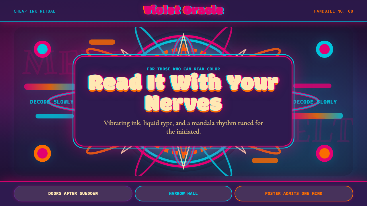 Psychedelic Fillmore (Mouse, 1968)Legibility becomes ritual. Magenta-cyan vibration and bulbous mandalas melt t…
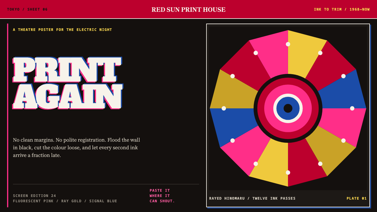 Tadanori YokooPrints against polite order. Fluorescent pink cuts through black with a rayed…
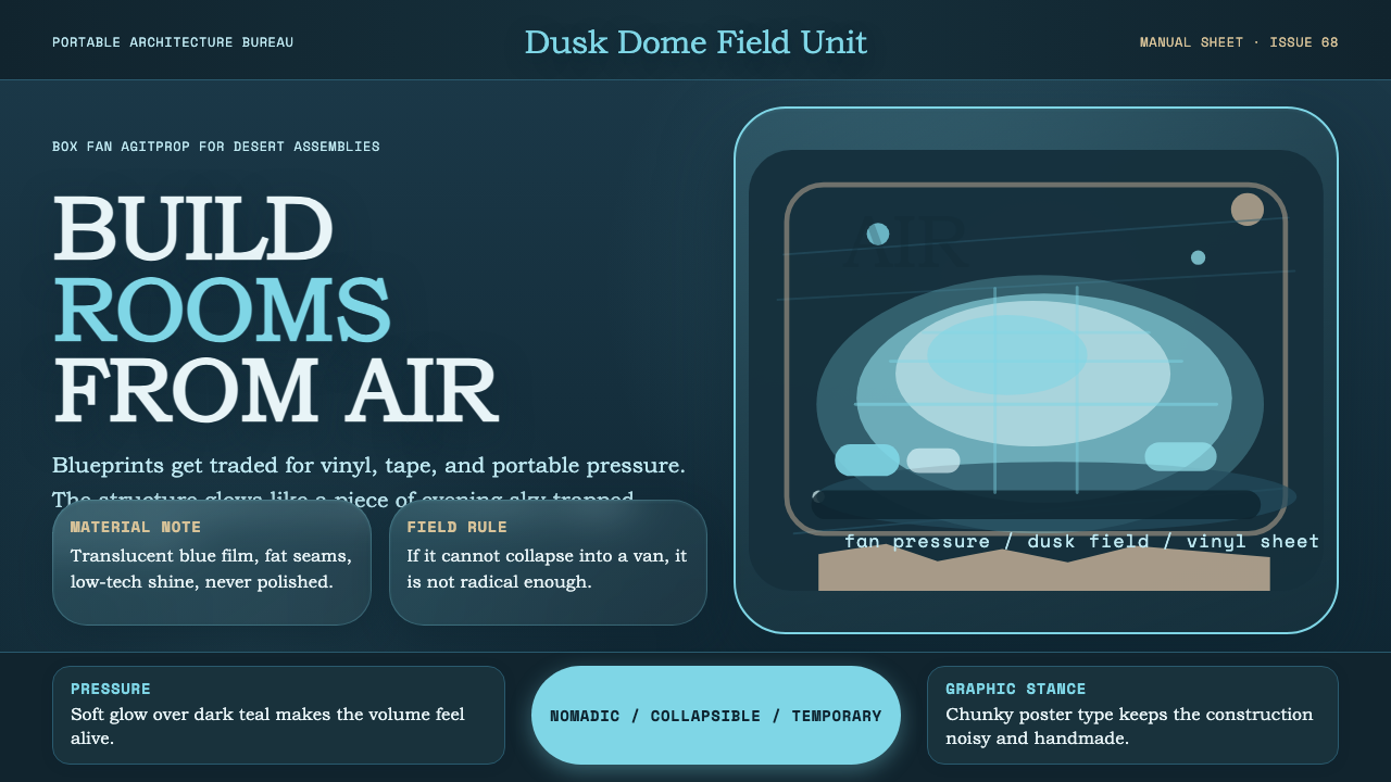 Ant Farm InflatablesTemporary architecture glows. Vinyl-blue domes swell over dark desert teal.
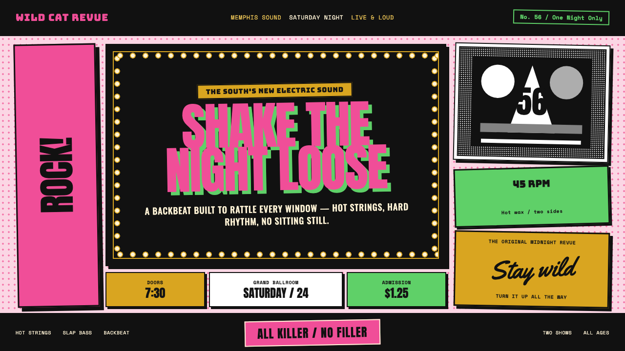 Elvis Presley (1956)Rock learned to shout. Bubblegum pink, acid green and jailhouse type land wit…
 Funk Baile MixtapeNight refuses subtlety. Neon pink/yellow flyer plates cram chrome type on bla…
 Hulk Gamma GreenDon't make us whisper. Muscle green, trouser purple, inked panels, Ben-Day ha…