What is Tadanori Yokoo?
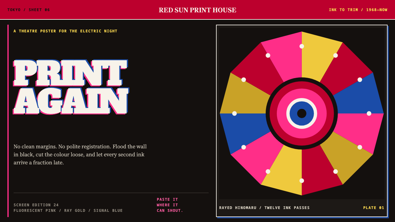
Tadanori Yokoo's silkscreen posters flood the sheet with black and fluorescent ink, then break the order with a rayed sun, an open mouth and slipped registration.
Tadanori Yokoo in brief
Tadanori Yokoo is a Tokyo graphic artist whose silkscreen prints of 1965 to 1971 turned Japanese post-war design against its own polite order. The sheets run corner to corner in silkscreen black, then carry fluorescent, Day-Glo-class inks, fluorescent pink over hinomaru red over two golds, that no four-colour printing press can reproduce. The style is deliberately loud, deliberately flat and deliberately uncomfortable.
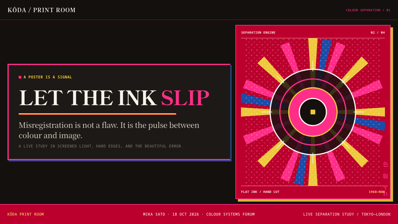
The engine is almost always the same: a rayed rising sun, an open mouth, a single blue eye, and vertical columns of kanji cutting across the fan of rays. These are combined like a collage of flat colour fields, halftone images and hard shapes pasted into one sheet. The halftones were cut by hand and the colour separations slip, so the misregistration is not a filter added later. It is what the printing looked like.
As a design language it is dark, saturated, unframed and confrontational. There is no white margin. Nothing is polite and nothing is tidy, yet it is not random: the same few elements recur and the same compositional logic organises each sheet. Yokoo's posters take the collage logic of ukiyo-e and carry it into the street life of underground theatre.
Where does Tadanori Yokoo come from?
Yokoo worked in Tokyo in the years after the war, when Japanese design schools had adopted Swiss-style modernism wholesale: neat grids, generous white margins, sans-serif type and an ideal of neutral, objective communication. The library describes his silkscreens as a direct counter-move. He did not refine that order. He printed against its grain, filling the sheet with black and putting images of body and emotion where the grid would have put restraint.
The core body of work is the silkscreen series of 1965 to 1971, with a landmark in 1968, the year of the commission connected to the Museum of Modern Art's 'Word and Image'. The movements the library lists tell the story from three sides. Japanese post-war graphic design supplies both the discipline he was reacting to and the technical craft he used. Psychedelia supplies the saturation and the unease. And the revival of ukiyo-e collage supplies the idea that a print can be assembled from separate, flat, richly coloured pieces.
Material conditions shaped the look. Fluorescent inks of this class sit outside the range of ordinary four-colour reproduction, so they could only be printed as separate flat layers, one screen per colour. Halftones were cut by hand, which gave the dots an irregular quality, and because registration between screens was never perfect, colour plates slid off the edges of the shapes they were meant to fill. What looks like a stylistic gesture was in part an honest record of the process.
The posters he made for the underground theatres Situation Theatre and Tenjō Sajiki took the style into the streets. A poster for a performance is not a gallery work; it has to grab a passer-by. Yokoo's sheets did that by borrowing the collage habits of ukiyo-e, in which many small visual sources are arranged into a single dense image, and pushing them into the idiom of the 1960s.
What defines the Tadanori Yokoo look?
Silkscreen Black Flood
The ground is a near-total silkscreen black that runs from cut line to cut line with no white margin. Black is not a background to be framed; it is the field into which everything else is pressed. This dark, solid flood is the structural decision that makes the fluorescent inks work, because against it they read as light rather than as colour beside colour.
Fluorescent Inks
Colour is fluorescent pink over hinomaru red over two golds: inks of a Day-Glo class that no four-colour press can reproduce. They are opaque and flat, never gradients, and they are used at the edge of the possible. The goal is not realism or harmony but shock. The pink cuts through the black, and the red and gold fight for attention beside it.
The Rayed Sun
A rising sun with radiating rays is the recurring engine. It organises a sheet around a centre and gives the composition a fan of lines that other elements can cut across. It is a form with deep Japanese associations, and in Yokoo's hands it is turned up until it seems to vibrate.
Fragments of the Face
An open mouth, a single blue eye: body parts appear as isolated signs rather than as complete portraits. Cropped and pasted, they behave like words in a headline. They give the sheet its uncanny, confrontational address, and they look as if they have been cut from other pictures and placed without apology.
Vertical Kanji Columns
Type runs in vertical columns of kanji that cut across the fan of rays. The columns are perpendicular to the radial structure, so two systems collide on the sheet instead of cooperating. Text here is a graphic mass first and a message second, though it remains legible in context.
Slipped Registration
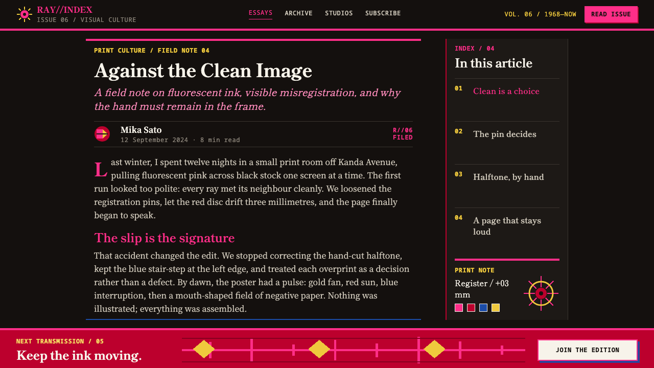
Halftones were cut by hand and colour separations slip, so edges of colour miss the outlines of the shapes they belong to. This misregistration is not a filter applied afterwards; it is what the printing looked like. Reproducing it means offsetting flat colour layers deliberately, not blurring or glowing them.
Who shaped Tadanori Yokoo?
Yokoo is the sole key figure in the library's record for this style, and the silkscreens of 1965 to 1971 are its core. His work in Tokyo set itself against the Swiss-style modernism that Japanese design schools had adopted wholesale. His signature is the combination of fluorescent ink, hand-cut halftones and a small set of recurring motifs: the rayed sun, the open mouth, the single blue eye and the vertical kanji column.
Situation Theatre was one of the underground theatres for which Yokoo made posters. A poster for an underground troupe had to work on a wall, in a street, against the noise of a city. That context explains the style's loudness: the sheet is an announcement, a provocation and a piece of printed theatre at once, and it carries the collage logic of ukiyo-e into that street setting.
Tenjō Sajiki was the second of the underground theatres for which Yokoo drew posters. Taken together with Situation Theatre, it shows that this graphic language grew out of work with performance. The posters are best understood as part of a scene rather than as isolated art objects, and the way elements collide on the sheet echoes the way a stage can set unlike things against each other.
In 1968 Yokoo received a commission connected to the Museum of Modern Art's 'Word and Image'. For this style the date is a useful anchor: it places the work in an international context during the years in which the silkscreens were still being made, and it confirms that a print rooted in Tokyo's underground theatre could be read far from it.
How do you use Tadanori Yokoo today?
Tadanori Yokoo is a poster style, and it is at its best where a page is meant to be shouted. It suits festivals, music, theatre, youth culture and independent publishing, and it works as a brand moment inside a more conventional product. It is a poor choice for neutral, utilitarian screens.
For slides, the cover is the strongest use: a full-bleed black field, one large rayed sun or fan of lines, a single fluorescent pink block, and a vertical column of type crossing the rays. Content slides can keep the black ground and use a single fluorescent colour per slide, with body text kept horizontal on a flat plate. Data slides work if charts are built from flat opaque blocks of saturated colour, slightly offset from their outlines, with no glow, gradient or soft shadow.
For web interfaces, treat the style as campaign design rather than the base of a whole app: an event landing page, a ticketing flow, a launch microsite, an onboarding moment or a pricing hero. Use black as the page and flat fluorescent colour for primary actions and highlights, and keep forms and tables calm, on solid plates. A deliberate slip between a colour layer and its edge can mark hover or focus, provided the text stays readable.
For editorial and marketing work, it fits posters, album and festival graphics, magazine covers and interview openers. Vertical headline columns add drama to horizontal scripts and feel natural in vertical ones. Collage the elements: a cropped eye, a mouth, a sun, a block of halftone, each flat and opaque, laid against one another with deliberate collisions.
The most common mistake is to treat fluorescent as glow. Neon-style blur, outer glow and gradients make the page look like a night-club sign, whereas the original is opaque, flat ink on black. The second is perfect registration: clean, aligned colour plates turn the style into ordinary pop graphics. The third is overuse. One sun, one dominant fluorescent colour and one column of type per view is stronger than a page full of motifs.
Tadanori Yokoo — FAQ
Is this the same as 1960s psychedelic poster art?
They are related but not identical. The library lists psychedelia among the movements behind Yokoo's work, and the saturation and unease are shared. But the grammar differs: Yokoo's sheets are flat silkscreen with hard halftones, vertical kanji columns, a rayed sun and a collage logic taken from ukiyo-e, rather than flowing lettering and melting forms. If the page swirls, it is not this style.
Why does the style only work on a dark ground?
Because the sheet floods in black and the fluorescent inks need that darkness to read as light. Against white or cream, pink and gold become ordinary decorative colours and the whole composition loses its shock. A pale variant is possible only if you accept that it is a different, much quieter look and not a version of the original.
How can I imitate fluorescent ink on a screen?
A screen cannot reproduce a fluorescent ink exactly, but it can approximate the effect. Push hues to the limit of saturation, keep them flat and fully opaque, and set them against solid black so they read as light. Resist the temptation to add a glow: fluorescent ink does not glow in the digital sense, it simply refuses to look muted.
How do I keep text readable in such a loud layout?
Give reading text a calm place. Keep body copy horizontal, on a flat plate in black or a single fluorescent colour, with generous contrast. Let the vertical kanji columns, the sun and the fragments do the shouting, and treat them as graphic mass. The chaos belongs to the ground and the graphics; the information layer should stay clean.
What does misregistration mean in a digital layout?
It means a flat colour layer sits slightly off the shape it belongs to, the way a misaligned silkscreen plate leaves a sliver of ground showing on one side. In a layout that is a hard-edged offset copy of a shape, not a blur or soft shadow. Use it sparingly and consistently so it reads as the printing process, not as a rendering mistake.
Related design styles
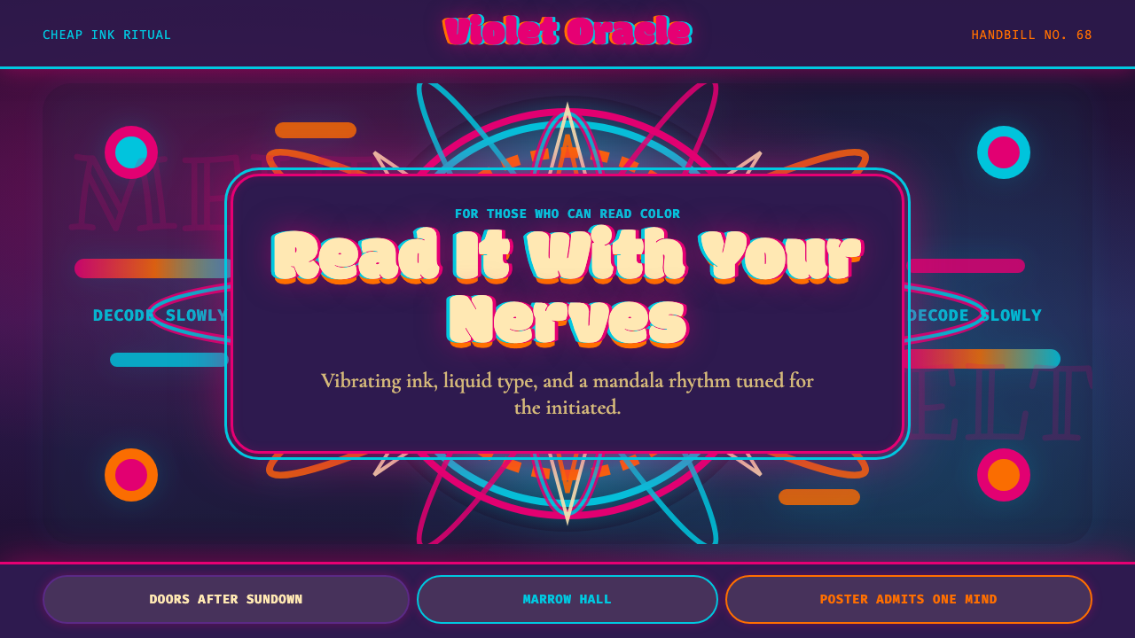 Psychedelic Fillmore (Mouse, 1968)Legibility becomes ritual. Magenta-cyan vibration and bulbous mandalas melt t…
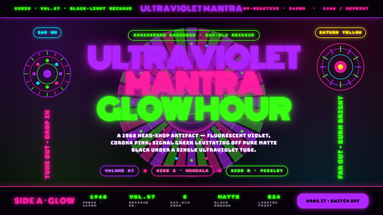 UV Blacklight PosterEngineered darkness. Day-Glo violet, Corona pink, and signal green levitating…
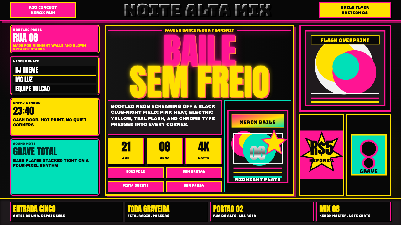 Funk Baile MixtapeNight refuses subtlety. Neon pink/yellow flyer plates cram chrome type on bla…
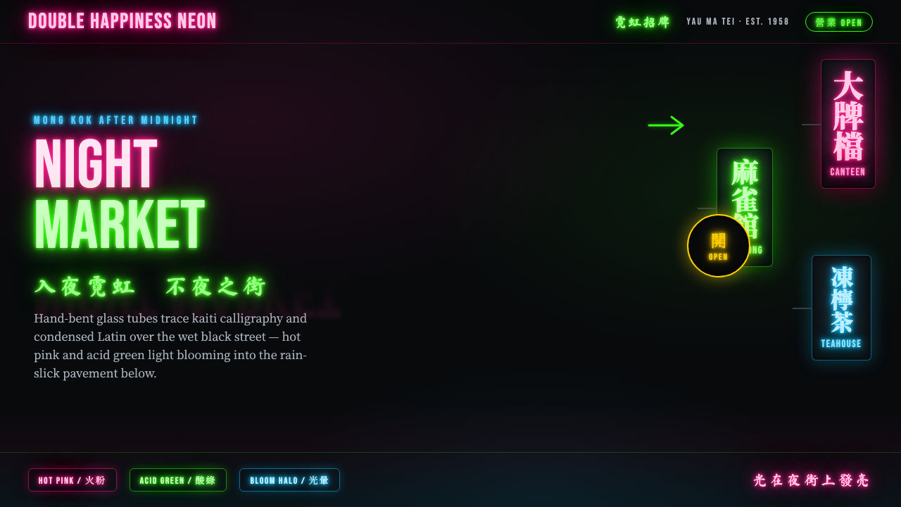 Hong Kong Neon SignboardsLight only reads against the wet black night. Hand-bent pink and green tubes…
 Jungle / Drum & BassRaw rave voltage. Neon green Anton, camo strips, and xerox grain hit black.
 Lucha Libre PosterStreet-poster voltage. Yellow Anton banners, crimson diagonals, cobalt grids…