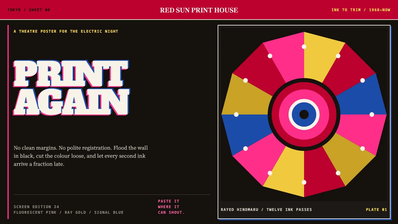
About Tadanori Yokoo
Tadanori Yokoo printed against the grain of the Swiss-style modernism that Japanese design schools had adopted wholesale. His sheets flood corner to corner in silkscreen black, then carry Day-Glo-class inks that no CMYK press can reproduce — fluorescent pink over hinomaru red over two golds.
The engine is almost always the same: a rayed rising sun, an open mouth, a single blue eye, vertical kanji columns cutting across the ray fan. The halftones were cut by hand and the separations slip, so misregistration is not a filter applied afterwards — it is what the printing looked like.
- Origin
- Tokyo, Japan
- Era
- 1965–1971 silkscreens; MoMA Word and Image commission 1968
- Key figures
- Tadanori Yokoo
- Movements
- Japanese post-war graphic design · psychedelia · ukiyo-e collage revival
Tadanori Yokoo design spec
Colors
Typography
The other 11 sections — buttons, cards, spacing, motion, techniques and more — open once you unlock. Download the DESIGN.md or send it to your AI in one click. Unlock once, yours forever.
Sign up nowStyles similar to Tadanori Yokoo
Also inspired by art & artists, with a close feel.
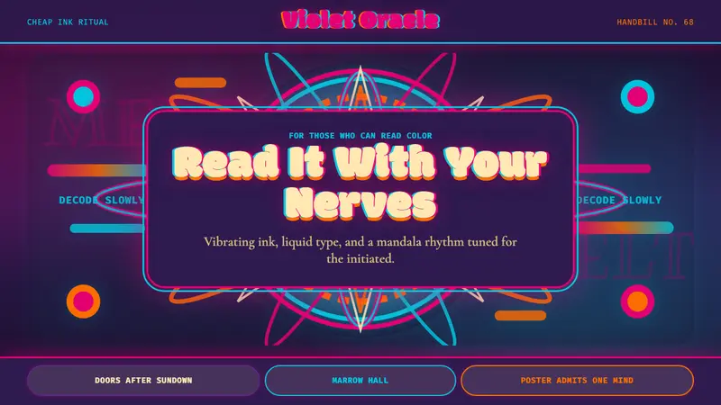 Psychedelic Fillmore (Mouse, 1968)Legibility becomes ritual. Magenta-cyan vibration and bulbous mandalas melt the frame.
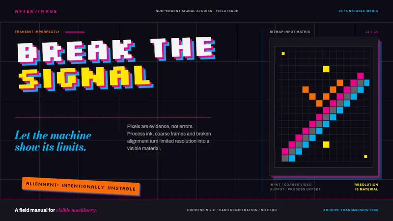 April Greiman HybridResolution becomes material. Bitmap type and process magenta collide on a broken grid.
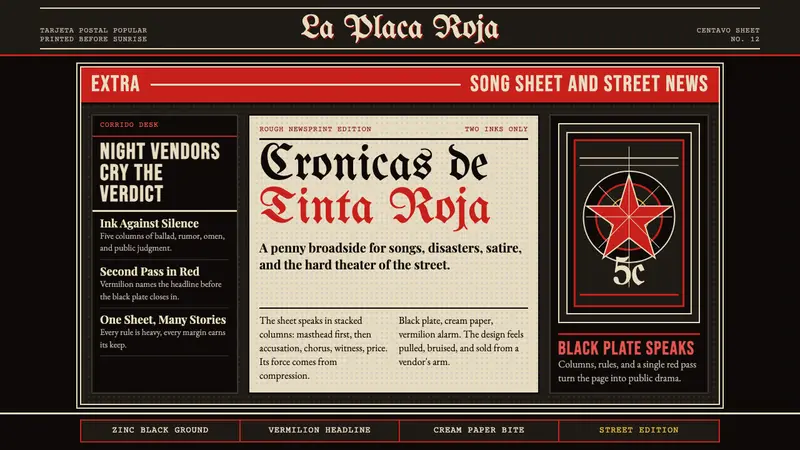 Mexican Tarjeta Postal (Posada Engraving 1900)Tabloid drama in two inks. Fraktur mastheads, vermilion rules, and cream newsprint bite.
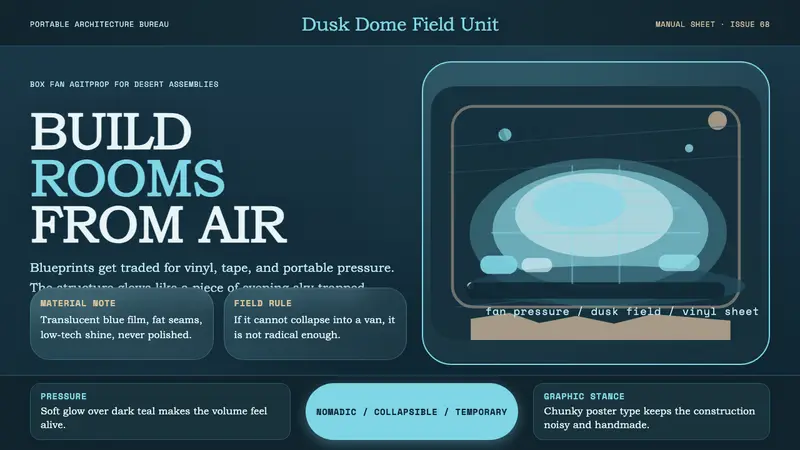 Ant Farm InflatablesTemporary architecture glows. Vinyl-blue domes swell over dark desert teal.