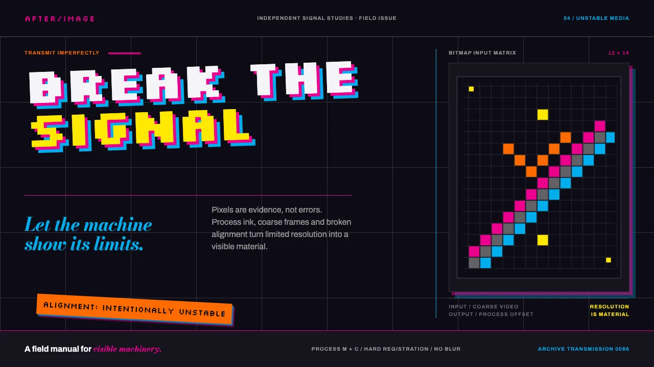
About April Greiman Hybrid
In 1986 April Greiman turned one issue of Design Quarterly into a single fold-out poster, 25½ by 76 inches, composed on an early Macintosh. Does It Make Sense? prints dark and floats video frames, bitmapped type, supernovas and lunar landings across a deep field, with the typography tilted off the Swiss grid.
She called the method hybrid imagery: handset type merged with digital elements at the exact moment the tools could barely manage it. This system keeps that posture — process ink on video black, resolution treated as material, alignment broken on purpose.
- Origin
- Los Angeles, California, USA
- Era
- 1986 (Design Quarterly 133); Los Angeles practice from the late 1970s onward
- Key figures
- April Greiman · Wolfgang Weingart · Jayme Odgers
- Movements
- New Wave / Swiss Punk · California New Wave · Early desktop-computer graphic design
April Greiman Hybrid design spec
Colors
Typography
The other 11 sections — buttons, cards, spacing, motion, techniques and more — open once you unlock. Download the DESIGN.md or send it to your AI in one click. Unlock once, yours forever.
Sign up nowStyles similar to April Greiman Hybrid
Also inspired by art & artists, with a close feel.
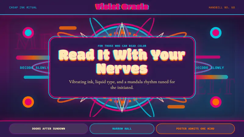 Psychedelic Fillmore (Mouse, 1968)Legibility becomes ritual. Magenta-cyan vibration and bulbous mandalas melt the frame.
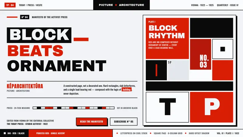 Lajos Kassák MA ConstructivismPage as building, not picture. Red and ink slab-sans blocks set asymmetrically on printed white.
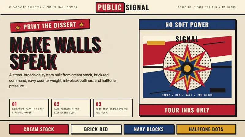 Shepard Fairey OBEYSilkscreen propaganda shouts. Cream paper, brick red, navy blocks, halftone grit.
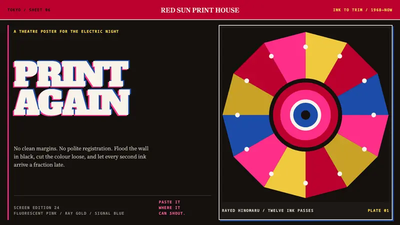 Tadanori YokooPrints against polite order. Fluorescent pink cuts through black with a rayed gold sun.