What is April Greiman Hybrid?
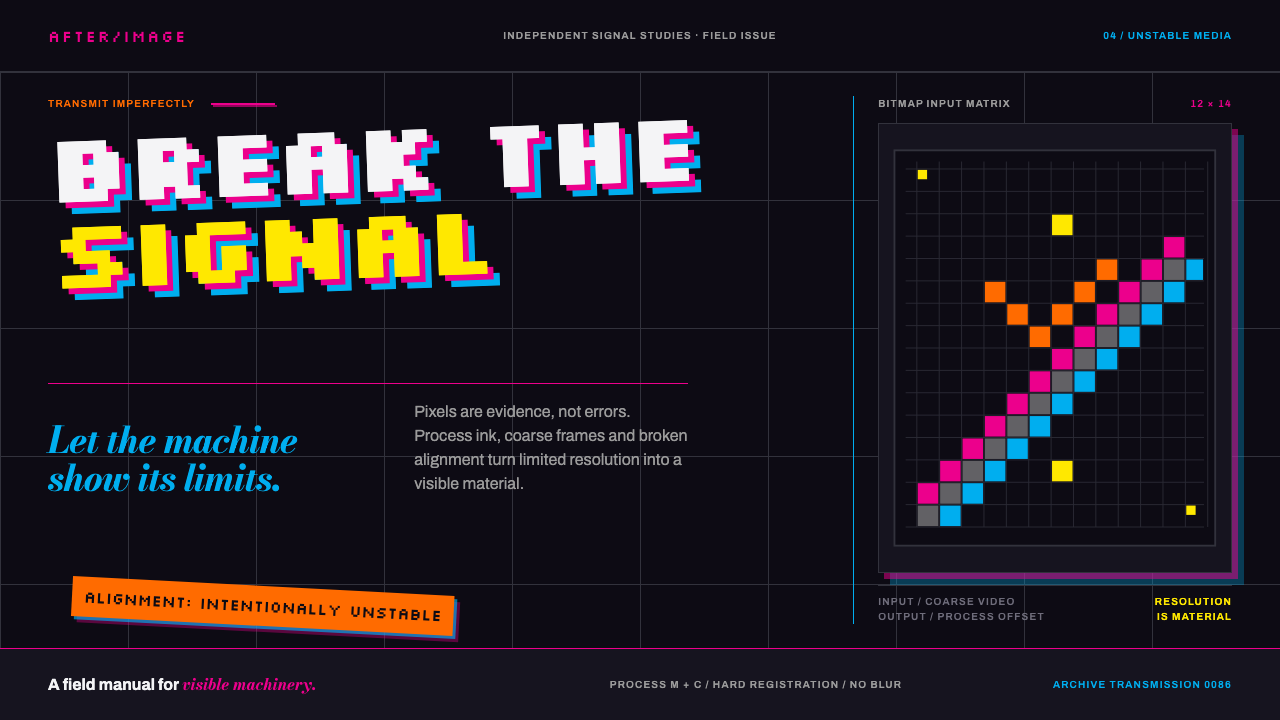
April Greiman treated the early Macintosh screen the way punk treated the guitar — resolution itself became raw material, and the Swiss grid became something to lean on and then knock over.
April Greiman Hybrid in brief
April Greiman Hybrid Imagery is the visual language that grew out of a single object: the May 1986 issue of Design Quarterly, which Greiman turned into one continuous fold-out poster, 25½ by 76 inches, titled Does It Make Sense? Composed on one of the earliest Macintosh computers available to a working designer, the piece printed dark — a deep, almost bottomless ground rather than a lit white page — with video-camera frames, bitmapped type, cosmic imagery, and archaic symbols floating across it at different depths. The typography does not sit obediently on a horizontal baseline; it tilts, several degrees off true, against a grid that is visibly present but deliberately disobeyed.
The style takes its name from Greiman's own term for the method: hybrid imagery, the fusion of a designer's hand-set typographic training with digital tools at the precise moment those tools could barely keep up with her ambitions. The jagged, staircase edges on the bitmapped letterforms are not a retro filter applied after the fact — they are the literal, undisguised evidence of a video digitizer and an eight-bit screen doing their honest best in 1986. Slight misregistration between printed color layers, visible screen-door texture in scanned photographic elements, and the coarse grain of early halftone reproduction are treated as authentic marks of the moment, not flaws to be smoothed away.
Where Swiss International Style built order from a flat plane and a rigid column grid, hybrid imagery builds a deep field: elements are stacked, overlapped, and set at conflicting scales so that the page reads less like a poster and more like a long exposure of several transmissions arriving at once. Process magenta and cyan collide directly on video-black grounds, joined by a hot fluorescent orange used sparingly as a jolt of contemporary color against imagery — satellites, lunar landings, ancient diagrams — that otherwise reads as timeless or even archaic.
Where does April Greiman Hybrid come from?
The rebellion behind hybrid imagery did not start in Los Angeles. It started a decade earlier in Basel, Switzerland, where the typographer Wolfgang Weingart began teaching students to break the very rules that the Basel school itself had spent a generation codifying — the rigid, mathematically governed grid of Swiss International Style. Weingart's students learned to overlap type, tilt baselines, and let letters collide in ways the International Style considered errors. Design historians came to call this loosening New Wave typography, or, more provocatively, Swiss Punk: a rebellion staged from inside the very institution that had invented the orthodoxy.
Greiman carried that rebellious grammar across the Atlantic and into a Los Angeles design practice she built from the late 1970s onward. On the West Coast, Swiss Punk's typographic looseness met an entirely different visual diet — American technology culture, science fiction, pop imagery, and an optimism about computers that Basel's post-war European design schools had never had reason to cultivate. The result is often described as California New Wave: Weingart's grammar of broken rules, now speaking with an American accent and reaching for a mouse instead of a hand-set typecase.
The turning point arrived in 1986, when Design Quarterly's editors handed Greiman an entire issue to do with as she wished. She used it to make Does It Make Sense? — one of the first major works of graphic design composed on a Macintosh computer, at a moment when almost no professional studio had committed serious work to the machine. Her longtime collaborator Jayme Odgers, whose own layered, photographic sensibility had already shaped a generation of Los Angeles design alongside her, belongs to the same circle of practitioners credited with pushing hybrid, technology-inflected imagery into the mainstream of American graphic design during these years.
What made the 1986 poster historically pivotal was not simply that a computer was involved, but that Greiman refused to hide the computer's limitations. Early desktop publishing tools of that era produced jagged bitmap type and low-resolution digitized video almost by default; most designers treated this as an embarrassment to be minimized. Greiman treated it as the honest visual signature of a genuine technological transition, and in doing so gave graphic design a new subject: the machine's own resolution, presented as material rather than hidden as a limitation.
What defines the April Greiman Hybrid look?
Deep Ground, Not Flat Page
The page reads as a near-black field with real perceived depth, into which layered imagery appears to float at different distances rather than sit flush on a lit white surface. This inverts the assumption, standard to most print design, that the page is a bright plane holding objects; here the page is closer to a dark sky holding transmissions.
Process Color on Video Black
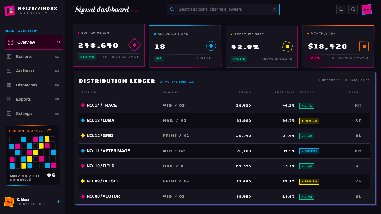
Process magenta and cyan are allowed to collide directly against a near-black ground, joined sparingly by a hot fluorescent orange. Color is not softened into a palette of harmonious tints; it is used at the intensity of raw printing ink meeting the darkness of a switched-off screen, so that every hue reads as a jolt rather than a wash.
Bitmapped, Unsmoothed Type
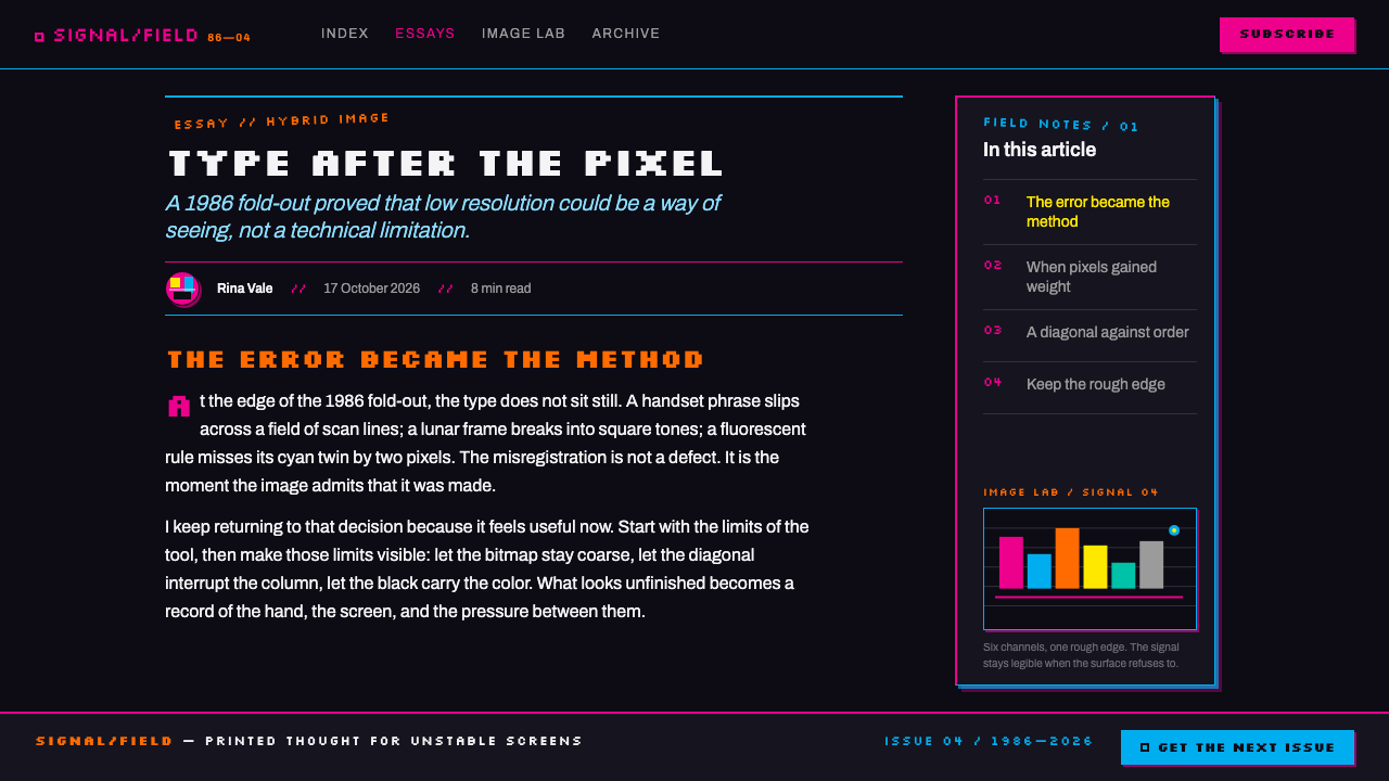
Typography keeps its jagged, stair-stepped edges rather than being redrawn with smooth curves. The bitmap grid is presented as a genuine typographic voice in its own right — proof of the specific low-resolution technology that produced it — rather than an artifact to be cleaned up in the name of legibility or refinement.
Grid Present, Grid Disobeyed
An underlying grid remains visible and structurally legible, but baselines and blocks are tilted several degrees off true rather than aligned to it. The grid functions as a reference the eye can still sense, which makes its violation feel deliberate and confident rather than careless.
Collaged, Multi-Scale Imagery
Video-camera frames, cosmic and astronomical imagery, and archaic or mythic symbols are layered together at conflicting scales within a single composition. A vast celestial photograph might share the frame with a small isolated glyph, with no attempt to reconcile their scale into a single consistent logic.
Honest Misregistration
Slight offsets between color layers, screen-door texture in scanned photographic elements, and coarse halftone grain are retained rather than corrected. These are treated as authentic evidence of a specific printing and imaging technology at a specific moment, not as errors requiring cleanup.
Deliberate Asymmetry
Composition never balances through mirroring. Weight is distributed unevenly across the field — a dense cluster of type and imagery in one region answered by a large area of near-empty dark ground elsewhere — so the page feels charged and directional rather than settled.
Who shaped April Greiman Hybrid?
Greiman authored Does It Make Sense?, the 1986 Design Quarterly issue-as-poster that made hybrid imagery a recognized visual language. Working on one of the earliest Macintosh computers available to a practicing designer, she treated the machine's low resolution and the jagged edges it produced as genuine material rather than a limitation to disguise, establishing a template that later designers would return to whenever they wanted print and screen technology to argue openly with each other on the same page.
Weingart taught in Basel, the very institution most responsible for codifying Swiss International Style, and used that position to dismantle its rules from within — overlapping type, tilting baselines, and treating collision as a legitimate compositional tool. His students called the result New Wave typography, or Swiss Punk, and it is this loosened grammar that Greiman carried across the Atlantic and adapted for an American, technology-saturated context.
Odgers worked alongside Greiman within the same Los Angeles circle credited with pushing layered, photographic, technology-inflected imagery into the mainstream of American graphic design during the late 1970s and 1980s, contributing a visual sensibility that shares hybrid imagery's appetite for collage, depth, and unresolved scale.
How do you use April Greiman Hybrid today?
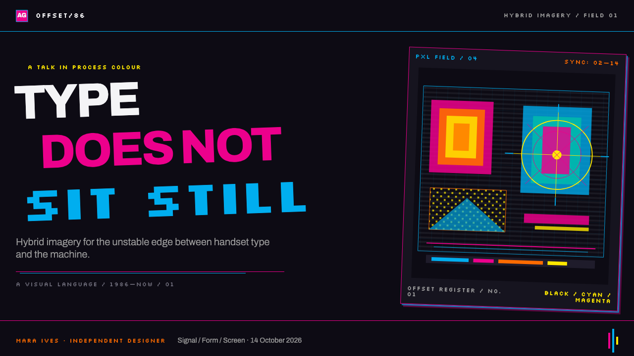
Hybrid imagery translates well into presentation decks that need to argue for a technological or transitional moment rather than present settled information. A cover slide benefits from committing fully to the deep dark ground, with a single dominant image — a diagram, a photograph, a piece of archival technical imagery — floating off-axis against it, and a title set in a deliberately unsmoothed, high-contrast typeface tilted a few degrees from horizontal. Content slides should resist the temptation to normalize into a clean grid; instead, let one supporting image or chart sit at a conflicting scale to the body text, and keep a visible but disobeyed grid so the layout still reads as organized rather than chaotic. Data visualizations work well rendered as glowing, isolated marks against the dark field rather than as boxed charts on a white card.
For web interfaces, the style suits developer tools, technical documentation, and product pages that want to signal innovation or a moment of technological rupture rather than calm reliability. A dark, near-black canvas becomes the default background rather than an optional dark mode; typographic elements can carry a deliberately blocky, bitmap-adjacent character in headlines while body text stays legible and restrained. Hero sections benefit from layered, overlapping imagery at different depths — a background diagram, a mid-ground photograph, a foreground line of tilted type — rather than a single flat banner image. Interactive elements should feel like signals arriving from a distance: a colored glow on hover works better than a soft, ambient drop shadow.
In editorial and marketing contexts, hybrid imagery is well suited to feature stories about technology, transition, or reinvention — a company's founding story, a retrospective on an obsolete format, a piece about the early internet. Pull quotes can be set in bitmap-adjacent display type, tilted against the body column's baseline, while photographic material is treated with visible grain or scan artifacts rather than retouched to a clean, contemporary finish. Section breaks work best as a shift in ground color — from near-black to a slightly different near-black — rather than a decorative rule.
The style also carries real weight in poster and event-identity design, its native medium. A single dominant image, cropped tight and set at an angle, paired with tilted display type and one or two fluorescent accent marks, reproduces the confidence of the original Design Quarterly poster far more convincingly than a symmetrical, evenly lit composition ever could.
The most common mistake is treating hybrid imagery as a retro filter — adding scan lines, chromatic aberration, or fake pixelation to an otherwise conventional, cleanly gridded layout. The style's power comes from the grid being genuinely present and genuinely violated, and from the roughness reading as the honest byproduct of specific tools rather than a decorative texture applied afterward. A second common error is overusing color: authentic hybrid imagery leans on one or two saturated hues against darkness, not a rainbow of simultaneous accents.
April Greiman Hybrid — FAQ
Is hybrid imagery the same as glitch art?
They are related but not identical. Glitch art, as it developed later, usually manufactures digital error deliberately as an aesthetic effect, often through software corruption or compression artifacts. Hybrid imagery predates that movement and documents a different situation: the genuine, unmanufactured limits of an early Macintosh and a video digitizer in 1986. The roughness in hybrid imagery is historical evidence of real tool constraints, not a simulated failure.
Why does the style insist on a dark ground rather than white?
The 1986 poster that defined the style printed dark, with video and cosmic imagery treated as light emerging from a deep field rather than objects resting on a lit page. A white ground would flatten that sense of depth and turn the layered, floating composition into a conventional collage. The darkness is what allows scale conflicts and overlapping imagery to read as genuine depth rather than clutter.
Can hybrid imagery work in a light-mode product?
It is possible but difficult, and it changes the style's core logic. The near-black ground is not a stylistic preference that can be swapped for a light equivalent without cost — it is what makes floating, overlapping, differently scaled imagery read as depth rather than mess. A light-mode adaptation should still isolate a small, contained area as a genuinely dark field for the most hybrid-imagery-specific elements, rather than attempting the full effect across a bright canvas.
How does this differ from plain Swiss International Style?
Swiss International Style builds order from a rigid, mathematically consistent grid on a flat, evenly lit page, with alignment treated as a virtue in itself. Hybrid imagery keeps a grid present as a structural reference but deliberately violates it — tilting baselines, layering conflicting scales, and building a sense of depth rather than a flat plane. It descends from a rebellion against Swiss orthodoxy, not an extension of it.
Does hybrid imagery suit every kind of brand?
No. It works best for brands and stories built around technological transition, experimentation, or reinvention — early-stage technology products, creative and design-adjacent tools, retrospectives on obsolete media. It is a poor fit for contexts that need to project calm, settled reliability, or warmth: financial services, healthcare, family-facing consumer products. The style's deliberate roughness and darkness can read as unfinished or unsettling in those settings, even though within its own logic every rough edge is a considered decision.
Related design styles
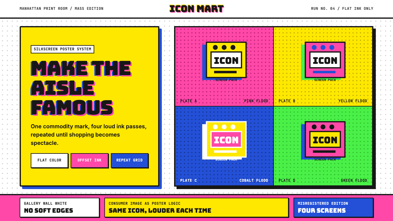 Warhol PopMass culture turns iconic. Hot pink, yellow, cobalt grids repeat flat silkscr…
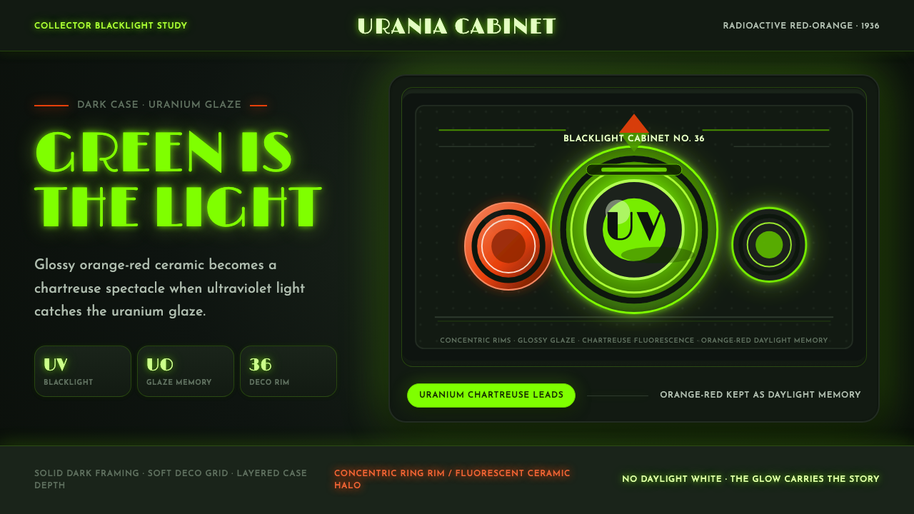 Fiestaware Radioactive Red-OrangeGlows like a collector's secret. Chartreuse rims cut through a dark deco case.
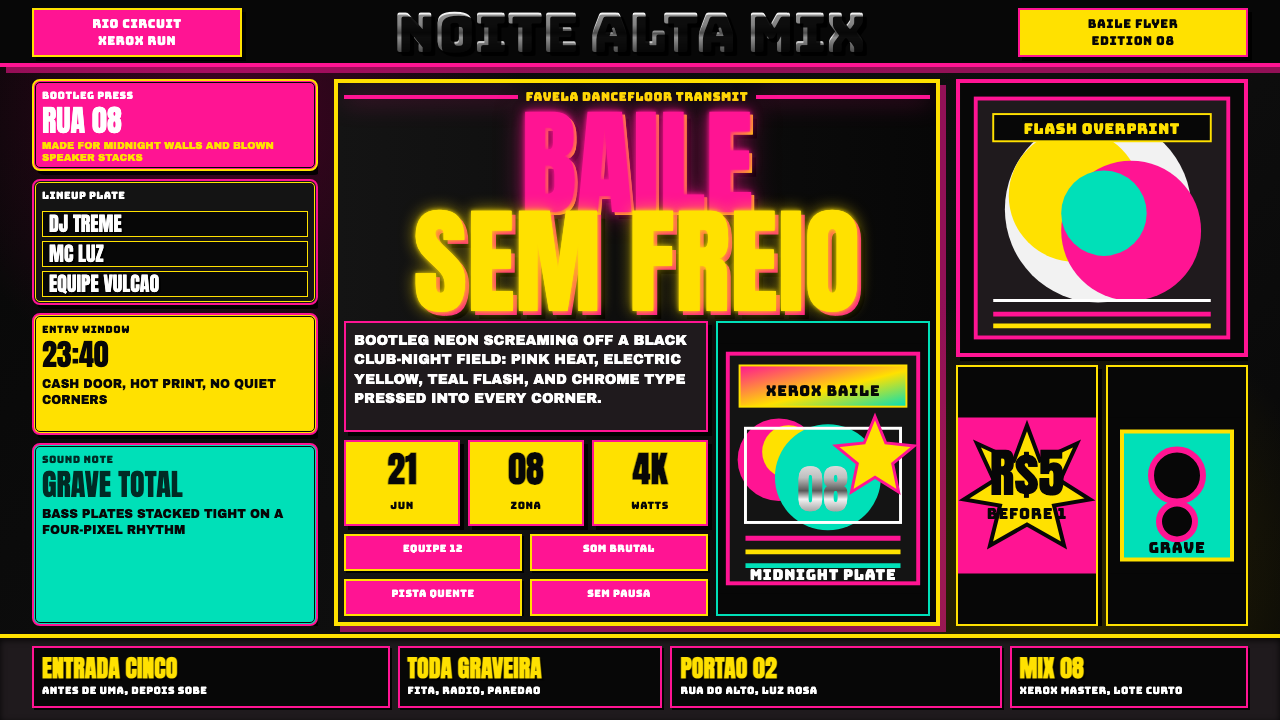 Funk Baile MixtapeNight refuses subtlety. Neon pink/yellow flyer plates cram chrome type on bla…
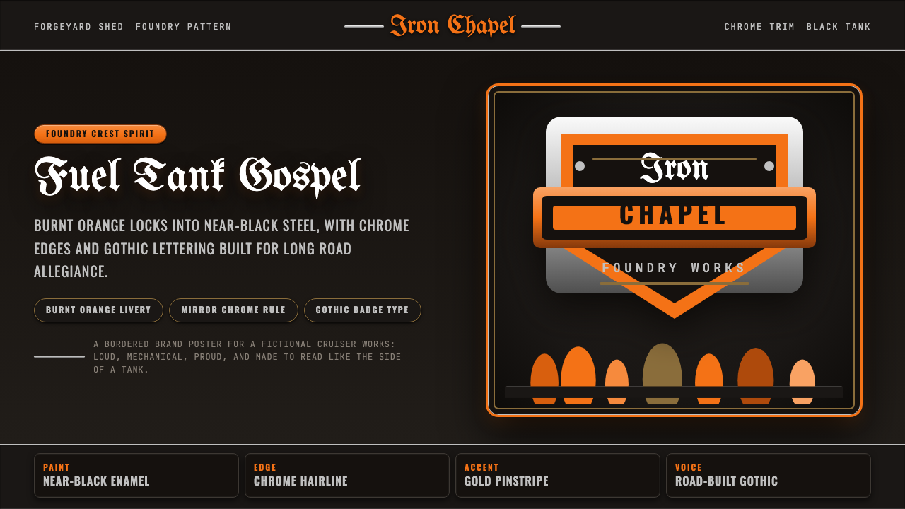 Harley Orange & BlackBuilt like a tank badge. Burnt orange, chrome hairlines, gothic type on near…
 Hollywood Golden Age (1930)Black-and-gold spectacle commands the night. Marquee bulbs frame monumental D…
 JPL Visions of the FutureSpace travel as print craft. Burnt orange silhouettes and Deco tan type on na…