What is Redline Space Race?
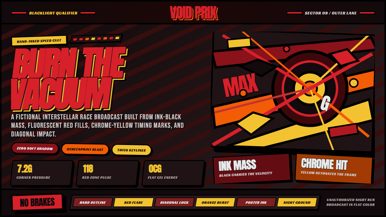
Redline Space Race turns velocity into a visual collision: black mass, racing red, chrome yellow, and diagonal force lines pushed beyond restraint.
Redline Space Race in brief
Redline Space Race is a dark, maximalist visual language derived from Redline, Takeshi Koike’s animated racing film made for Madhouse and released in 2009. Its premise is simple but extreme: racing should not look clean, aerodynamic, or technologically polished. It should look dangerous enough to tear the frame apart. Every composition treats speed as physical pressure, using black ground, fluorescent-feeling color, heavy outlines, and aggressive diagonals to make objects appear propelled rather than merely placed.
The style fuses several visual traditions without softening any of them. American hot-rod graphics contribute pinstriped energy, oversized machine forms, and the theatrical bravado of custom racing culture. Pop-art poster language contributes flat color fields, high contrast, and instantly readable silhouettes. Psychedelic rock-flyer illustration contributes visual overload, warped energy, and a willingness to let the image feel louder than ordinary representation. These influences are unified by hand-inked animation discipline: forms remain deliberate, closed, and graphically legible even when the frame feels close to exploding.
Its most important visual decision is the refusal of neutrality. The background is not an empty stage behind the action; it is an ink-black mass that presses against every colored shape. Shadow is not a subtle lighting effect but a solid compositional force. Racing red and chrome yellow do not decorate the scene. They puncture it. Thick black keylines hold the image together, turning cars, characters, smoke, debris, and typography into separate pieces of a single high-impact poster.
Where does Redline Space Race come from?
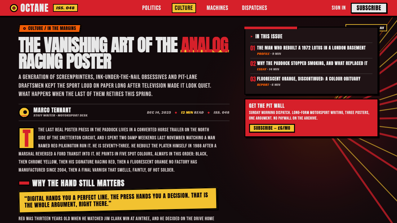
The immediate origin of Redline Space Race is Redline, a Japanese animated racing film released in 2009. Production ran from 2003 to 2009, giving its image-making an unusual sense of accumulation and commitment. Rather than relying on computer-generated spectacle, the film was hand-drawn across more than 100,000 cels with zero CG assist. That production condition matters to the aesthetic: the style does not imitate handmade intensity as a decorative effect. Its density, hard contours, and physical energy arise from a process in which every acceleration, vehicle surface, and visual impact had to be drawn into existence.
Takeshi Koike directed the film for Madhouse in Tokyo. The resulting visual world belongs to late-2000s animation, yet it deliberately avoids the cool digital sheen commonly associated with that period. Its surfaces feel printed, inked, and manually forced into shape. Flat fluorescent-like fills sit behind hard black keylines, producing an image closer to a screenprinted poster or a painted custom car panel than to conventional cinematic rendering. The visual system does not seek natural light, realistic material behavior, or invisible technique; it makes technique conspicuous and turns it into spectacle.
The source material identifies pop-art hot-rod graphics and psychedelic rock-poster illustration as central movements behind the look. Hot-rod culture supplies the racing vocabulary: machine aggression, ornamental speed marks, exaggerated bodywork, and graphics meant to announce performance before a vehicle moves. Rock-poster psychedelia supplies a different kind of pressure: visual density, color that seems electrically charged, and compositions that refuse calmness. Together, they create a racing universe in which each object seems designed for maximum signal rather than quiet credibility.
Hand-inked maximalist animation completes the synthesis. In Redline Space Race, maximalism is not simply a matter of adding more details. It is a matter of making every available element participate in motion. Diagonal lines act as trajectories, black fields act as weight, color fields act as impact, and keylines act as containment. The style is therefore useful beyond racing imagery because it offers a complete logic for communicating urgency, competition, launch, collision, and ecstatic excess without depending on realism.
What defines the Redline Space Race look?
Ink-Black Ground
The foundational surface is a dense ink-black field rather than a neutral light background. Black is not left behind after the layout is made; it is an active mass that gives colored forms their violence and scale. A red vehicle, yellow title, or pale chrome-like highlight becomes more immediate because it appears to emerge from darkness. This ground also makes empty space feel charged rather than quiet, allowing the composition to remain dramatic even where few elements are present.
Racing Red and Chrome Yellow
The signature accents behave like signal flares, not like a balanced decorative palette. Racing red carries heat, friction, danger, and mechanical appetite. Chrome yellow reads as ignition, warning, glare, and sudden exposure. Both colors are strongest when they appear as concentrated blows against black, supported by smaller flashes rather than dispersed evenly throughout the composition. The aim is visual detonation: color should arrive with the force of acceleration.
Hard Black Keylines
Thick black keylines lock every major form into place. They separate fluorescent-feeling fills, preserve readability inside visual overload, and make even unstable motion feel intentionally designed. The outline is never a delicate finishing detail. It is a structural chassis around the image, comparable to the heavy printed boundary of a poster or the graphic striping of a custom vehicle. When forms overlap, the keyline decides what remains legible and what becomes forceful compression.
Diagonal Velocity
The dominant directional grammar is diagonal. Cars, titles, bursts, debris, and framing devices should appear to enter, cut through, or escape the composition on slanted paths. Horizontal and vertical elements can still stabilize information, but they should feel subordinate to the larger racing vector. A diagonal in this system is more than a decorative slash: it is evidence of force. Repeated at different scales, diagonal lines create a sense that the frame has been caught in the wake of movement.
Flat Impact and Solid Shadow
Depth is created through overlap, scale collision, black mass, and abrupt silhouette change rather than through soft rendering. Shadow is treated as a solid shape with a graphic job to do: it may enlarge a form, hide part of a machine, or create a sudden break between competing color fields. Smooth tonal transitions would weaken the screenprint-like authority of the style. The image should feel cut, inked, and stacked, not softly illuminated.
Maximalist Signal Density
Redline Space Race allows a frame to carry multiple competing signals: giant typography, mechanical silhouettes, pinstripe-like marks, impact bursts, color fragments, and compressed background detail. The principle is not random clutter. Each element must intensify speed, scale, or confrontation. A successful dense layout still provides a dominant reading path, usually established by the largest shape, the strongest diagonal, or the brightest accent. Excess is controlled through hierarchy, not reduced into calmness.
Who shaped Redline Space Race?
Koike directed Redline, the 2009 animated racing film from which this style is derived. The film’s completed visual system makes hand-drawn intensity central rather than secondary: velocity, machinery, figures, and collisions are all expressed through emphatic contour, flat color, and compressed graphic force. His role establishes the style’s defining commitment to animation that looks manually driven at every level of the frame.
Katsuhito Ishii is identified in the approved source material as one of the key figures associated with Redline Space Race. Within the style’s public lineage, his presence belongs to the wider creative constellation surrounding a work that refuses polished restraint in favor of bold graphic impact, visual excess, and an overtly authored image.
James Shimoji is also named in the approved source material as a key figure connected to the Redline Space Race world. The style’s identity depends on a total sensory proposition rather than isolated surface choices: the black ground, explosive accents, hard outlines, and relentless movement all support a racing image designed to feel immediate, excessive, and unmistakably theatrical.
How do you use Redline Space Race today?
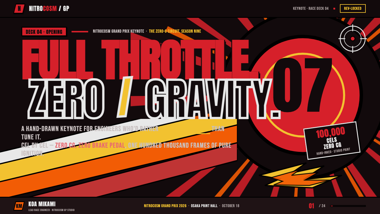
For presentation covers, Redline Space Race is most effective when the slide is treated as a launch surface rather than a document page. Let a large black field establish the atmosphere, then introduce one dominant diagonal object, title, or burst of color. A racing-red headline can cut across the composition while chrome yellow acts as a smaller ignition point. The cover should announce speed and stakes immediately, but the title must remain protected by strong keylines and enough surrounding darkness to read at a glance.
Content and data slides need more restraint than a poster, but they can preserve the style’s momentum. Use black structural fields to divide sections, red or yellow to identify priority information, and diagonal framing elements to direct reading from one block to the next. Charts should be simplified into flat graphic forms rather than rendered with soft volume or decorative effects. A comparison can become a collision between two color-coded masses; a timeline can become a racing trajectory. Keep labels stable and highly legible so that intensity supports understanding instead of obscuring it.
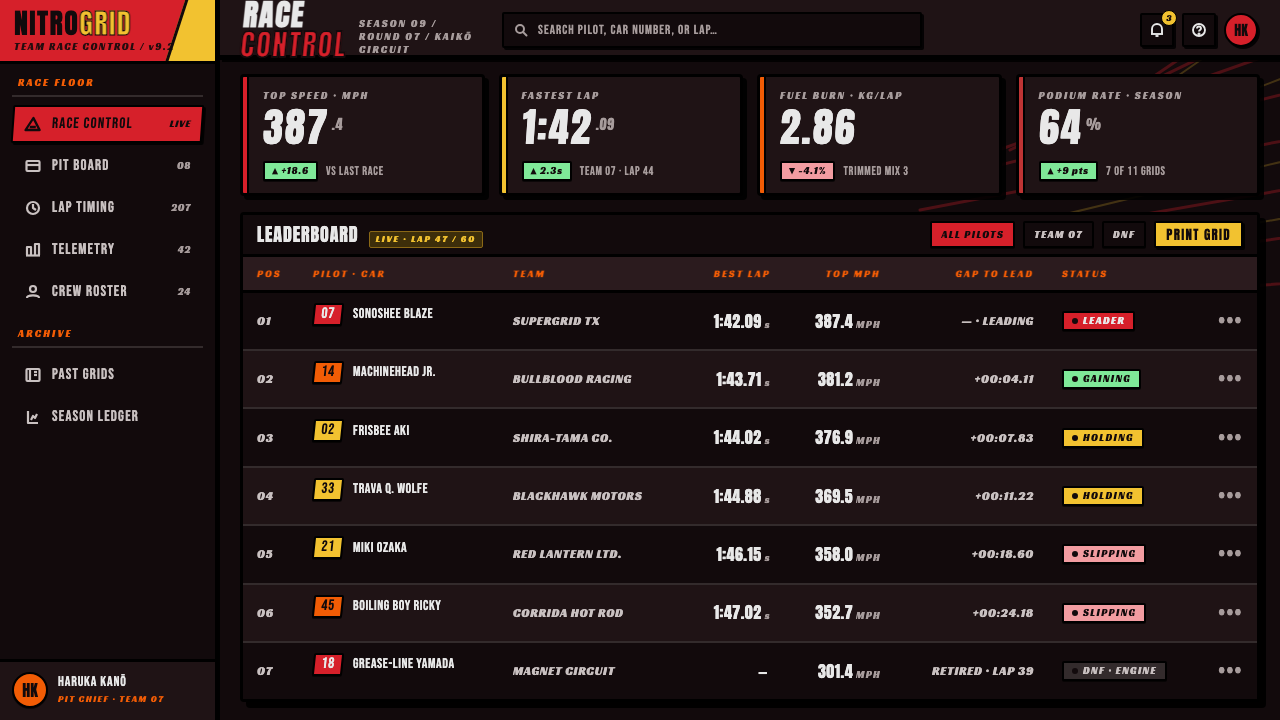
For web interfaces, the style is particularly suited to dashboards, event pages, competitive products, game-adjacent tools, motorsport content, and launches that need an unmistakable high-energy identity. A dashboard can use ink-black panels as containers, hard keylines to separate active controls, and red or yellow only for live status, urgency, selected states, or decisive actions. Pricing pages can frame plans as distinct contenders, using bold dark divisions and color bursts to emphasize the primary offer without making every component compete at equal volume.
In editorial and marketing work, Redline Space Race works best where the subject already contains tension: product reveals, limited releases, cultural events, racing stories, performance announcements, or campaigns built around velocity and confrontation. Editorial spreads can use oversized section titles, cropped mechanical imagery, and slashing diagonal separators. Marketing pages can alternate concentrated black fields with explosive color-led moments. The style should make the audience feel that information is arriving at speed, while a disciplined reading order ensures that the message is still received.
The common mistake is to mistake maximalism for indiscriminate saturation. Filling every area with red, yellow, black outlines, angled type, and visual noise removes the pressure that makes the style work. Redline Space Race needs contrast between detonation and containment: large black zones, a single dominant vector, a clear primary message, and accents that strike rather than spread. Another frequent error is replacing hand-inked decisiveness with glossy digital effects. Soft gradients, polite shadows, and smooth glass-like surfaces dilute the style’s printed, physical, high-friction character.
Redline Space Race — FAQ
Is Redline Space Race only appropriate for racing projects?
No. Racing is its original subject, but its transferable value lies in how it communicates pressure, momentum, competition, spectacle, and impact. It can work for game launches, music events, performance products, sports campaigns, dramatic editorial packages, and limited-release marketing. It is less suitable for products that need quiet trust, domestic warmth, low-stimulation usability, or a deliberately neutral institutional tone.
Why is the black background so essential to the style?
Because the black ground is not merely a dark-mode preference. It behaves as a visual mass that creates contrast, confinement, and danger. Red and yellow become explosive because they are forced to emerge against black, while black keylines can connect to the ground and make the whole image feel structurally unified. A light background can borrow individual motifs, but it usually loses the compressed nighttime intensity that defines the style.
Can this style use photography or should it remain fully illustrated?
Photography can be used, but it should be treated as raw material for graphic transformation rather than as a naturalistic window. Strong crops, hard silhouetting, black-field integration, flat color intervention, and decisive outlined framing can help photography join the visual system. A softly lit, realistic photograph placed untouched beside hand-inked graphics will usually feel disconnected, because the style depends on every element accepting the same forceful graphic logic.
How can a dense Redline Space Race layout remain readable?
Establish one unmistakable priority before adding secondary energy. Choose the main headline, central object, or critical action, then make every diagonal, burst, and accent either point toward it or reinforce its scale. Use black areas as breathing room, preserve clear contour separation with keylines, and reserve the strongest colors for the most important information. Density succeeds when the viewer feels overwhelmed by energy but never uncertain about where to look first.
What most quickly makes an application feel unlike Redline Space Race?
The quickest failure is smoothing away the friction. Pale neutral backgrounds, soft atmospheric shadows, subtle tonal blending, delicate outlines, and evenly distributed accent colors all weaken the style’s core contrast. Another failure is using diagonal elements without a sense of trajectory; a slant must imply acceleration, collision, or escape. The style becomes convincing when black mass, hard containment, concentrated color, and directional force all operate together.
Related design styles
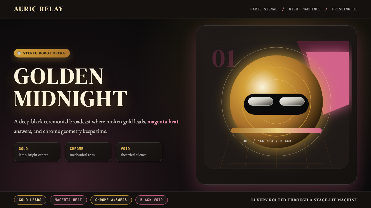 Daft Punk Discovery (Gold-Helmet)Warm sci-fi disco. Gold serif caps orbit a magenta void with chrome-disc geom…
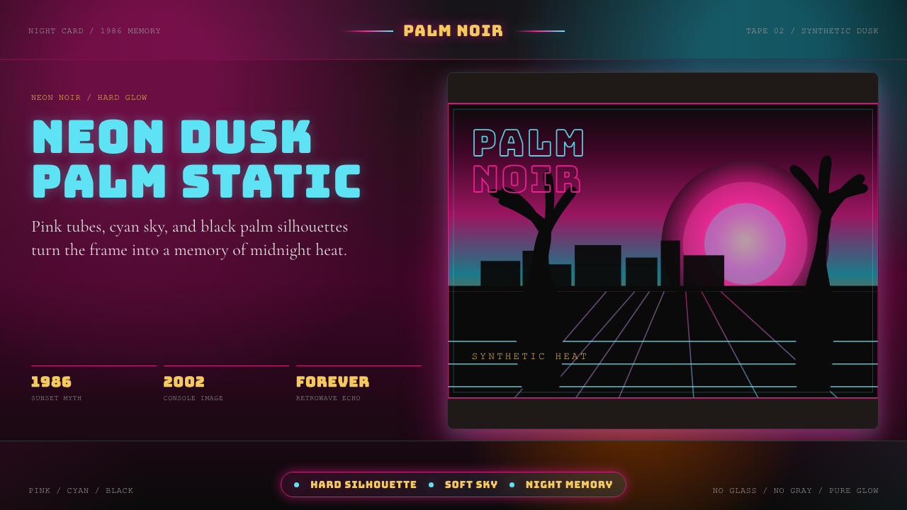 GTA Vice City (2002)Neon-noir nostalgia. Pink-cyan dusk, chunky type, and palm silhouettes.
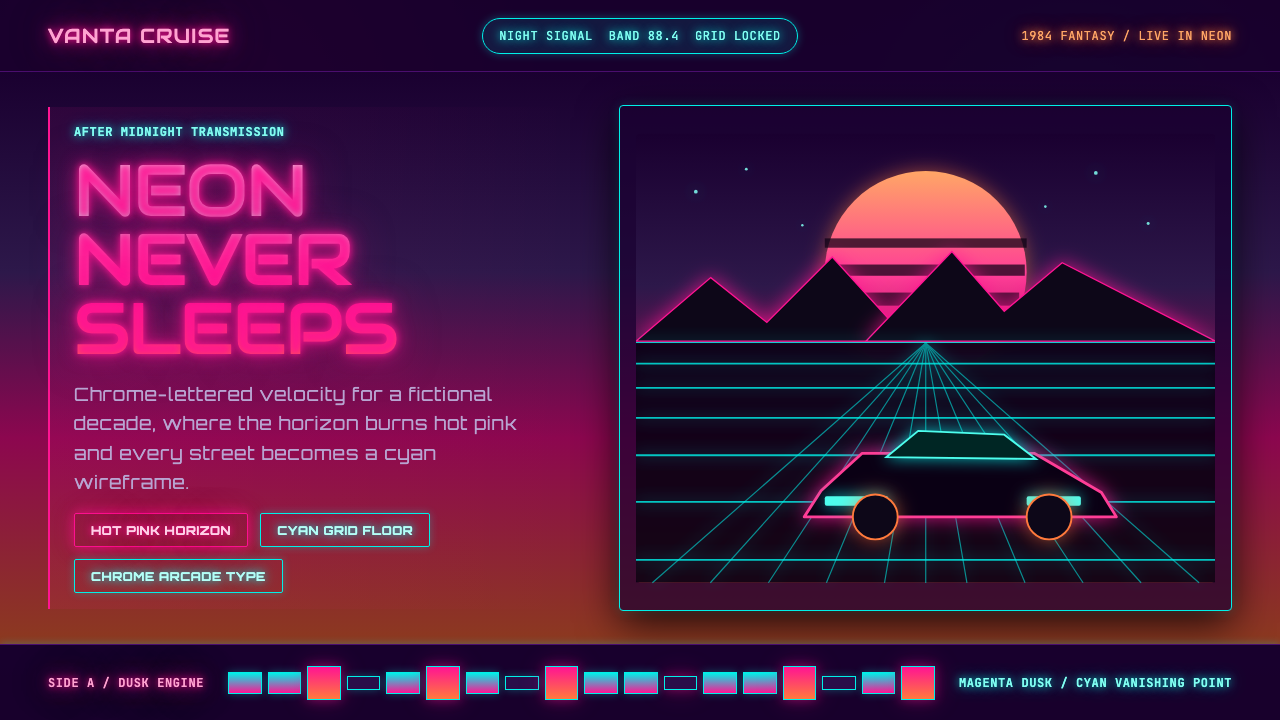 Synthwave Outrun 1984Sincere neon nostalgia. Hot pink sunset, cyan grid, chrome type against pure…
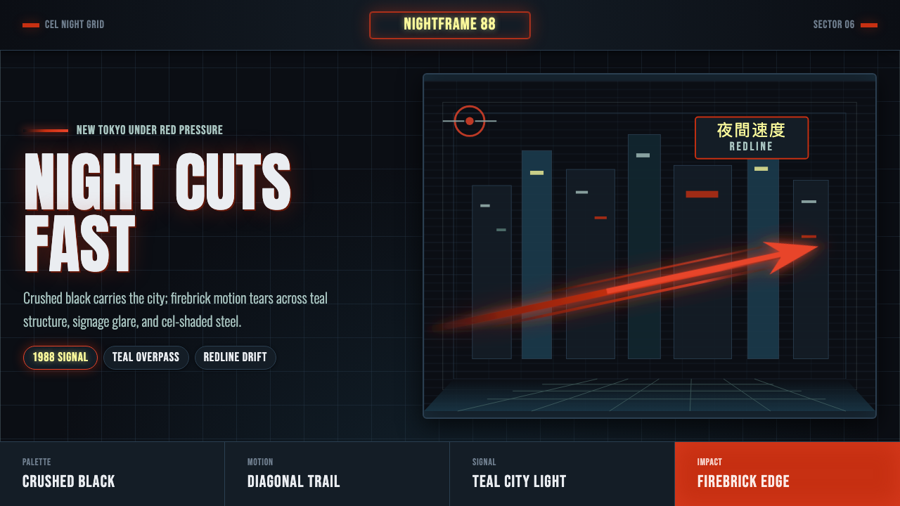 Akira Neo-TokyoNight moves fast. Firebrick trails cut crushed black, teal grids, and condens…
 Concrete SkateparkRaw concrete detonates. Grey slab blocks carry red, green, and warning-yellow…
 Cowboy Bebop Jazz-NoirCool at 3 AM. Bungee type, jazz yellow, red cuts, and cyan rules hit deep bla…