What is Phở Street-Stall Enamel?
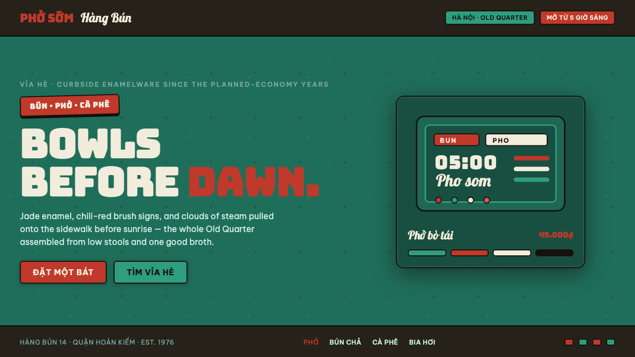
Phở Street-Stall Enamel brings Hanoi’s curbside noodle stall into a design system: dark jade enamel, chili-red brush lettering, cream bowl fields, and the tactile authority of a well-used sidewalk sign.
Phở Street-Stall Enamel in brief
Phở Street-Stall Enamel distills the visual world of Hanoi Old Quarter phở stalls from 1950 to 1990. Its source material is vernacular rather than institutional: jade-green enamelware from the socialist era, hand-painted red signboards, steam, chili, and low plastic stools gathered tightly along the curb. The result should feel close, practical, slightly crowded, and made for people who are already standing nearby rather than arriving from a distance.
The visual field begins in dark jade green. This is not a neutral backdrop and should never be treated like a sleek dark interface surface; it is the dominant enamel ground from which text, food imagery, labels, and decorative wear emerge. Chili-red brush signage supplies urgency and appetite, while cream appears only as a contained enamel-bowl field or a small relief area. It must not expand into the page background, because that would remove the style from the stall and turn it into polished editorial minimalism.
Its personality comes from material evidence. Chipped glaze, uneven brush pressure, dark rim lines, and slight irregularity are not incidental effects added after layout; they are the system’s evidence of touch, heat, handling, and repeated use. The style is street-level rather than corporate: direct enough to read quickly, tactile enough to suggest a bowl held in the hand, and dense enough to retain the energy of a sidewalk food stall.
Where does Phở Street-Stall Enamel come from?
The style belongs to socialist-era Hanoi street-food culture, specifically the phở stalls of the Old Quarter between 1950 and 1990. Its visual language was assembled in public, among objects that needed to withstand handling, visibility, and daily use. It is therefore best understood as a street-food vernacular: an environment where food, signage, seating, utensils, and surface wear formed one continuous visual experience.
State-era enamelware is central to that experience. Jade-green enamel bowls and related utensils establish the style’s dark, glossy, durable ground, while cream enamel appears as a smaller contrasting field. The relationship matters more than isolated color selection: the cream field reads as an object within the jade environment, not as a clean page waiting to be decorated.
Hand-painted signboard lettering supplies the system’s most expressive component. Chili-red paint, brush movement, and dark outlining transform names and short messages into visible gestures. This lettering should retain the feeling of a sign made by hand for a real stall. It is communicative first, but its variations in pressure and contour also prevent the composition from becoming sterile or mechanically uniform.
The originating figures are anonymous phở-stall vendors, hand-painted signboard painters, and state-era enamelware makers. Their work does not form a named authorship tradition in this source material; instead, it forms a shared visual ecology. A credible contemporary use should respect that anonymity by preserving the logic of ordinary service, lived material, and direct public communication rather than pretending the style is a luxury brand identity.
What defines the Phở Street-Stall Enamel look?
Jade Enamel Ground
Dark jade enamel is the governing field. It should feel glazed, durable, and slightly aged rather than flatly digital. Let it carry visual weight across the composition, with variation and wear suggesting a surface that has been handled, washed, and used in public life.
Chili-Red Signage
Red is active, appetizing, and public-facing. Use it for brush lettering, urgent labels, and decisive focal points. It should resemble paint placed with a hand, not a uniformly produced interface accent. Its intensity works best when surrounded by jade and dark rim lines.
Brush Lettering
Lettering is a painted sign rather than neutral typography. Preserve directional strokes, changing pressure, and a sense that letters occupy physical enamel. The text must remain readable at a glance, but clean geometric regularity should never erase the hand behind the sign.
Cream Bowl Fields
Cream is a limited object-color, not a page-color. Use it as a bowl-like interior, a contained label field, or a small opening among darker surfaces. This restraint keeps the jade ground dominant and makes every cream area feel like enamel catching light.
Dark Rim Lines
Dark rims give objects their edge and keep the palette grounded. They should outline bowls, panels, lettering, and chips with a firm handmade boundary. These lines are structural, not decorative: they separate surfaces, preserve legibility, and recall the dark edge of enamelware.
Wear, Steam, and Density
Chipping, brush texture, and crowded placement create the stall’s lived-in atmosphere. Imperfection should be specific and sparing, like glaze worn at an edge or paint interrupted by a stroke. The aim is not simulated dirt; it is evidence that the visual world belongs to food, heat, work, and a busy sidewalk.
Who shaped Phở Street-Stall Enamel?
The vendors are the practical authors of the environment. Their stalls brought food, bowls, seating, signage, and curbside service into one compact public setting. In this style, that practical intelligence matters: every visual gesture should still feel capable of helping someone recognize, approach, order from, or remain near a stall.
Signboard painters gave the street its red brush voice. Their contribution is not a fixed type system but a way of treating words as painted, public, and materially present. Contemporary lettering should inherit this directness and visible hand without turning irregularity into a decorative caricature.
The makers of state-era enamelware supplied the material language behind the jade ground, cream interiors, dark rims, and durable gloss. Their importance lies in the object logic of the style: color belongs to a surface with an edge, a use, and signs of wear, rather than to an abstract digital palette.
How do you use Phở Street-Stall Enamel today?
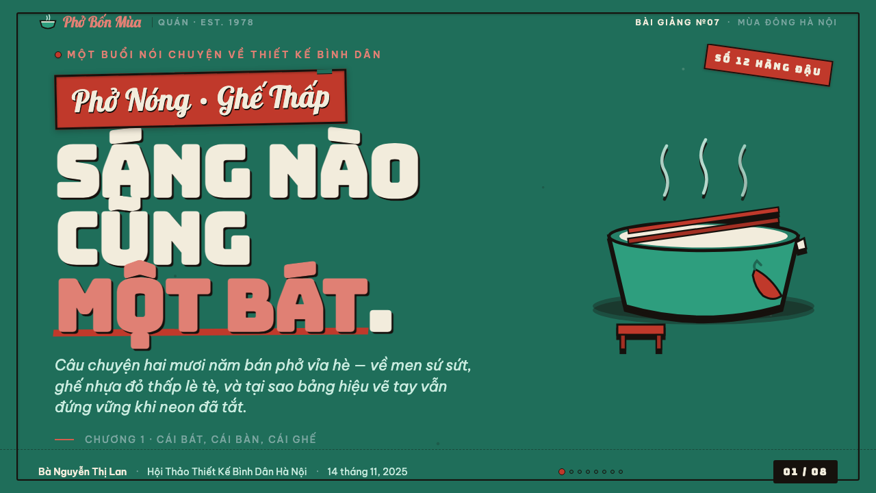
For presentation covers, treat the dark jade field as the stall’s main sign surface. A chili-red brush title can act as the immediate call from the curb, while a cream enamel form creates a contained counterpoint rather than a clean background. Keep the composition close and emphatic; it should feel like a sign encountered at street level, not an airy restaurant menu.
For content slides, use dark rim lines and contained enamel fields to separate information without polishing it into a corporate template. Let headings carry the painted-sign energy, while supporting copy remains direct and orderly. Data slides can translate bowls, labels, rimmed sections, and red highlights into a tactile diagram language, but charts must stay legible before they become atmospheric.
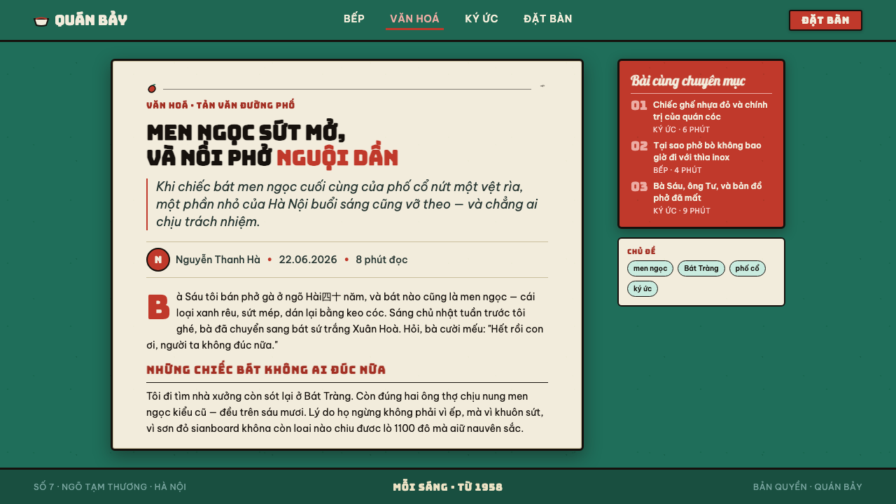
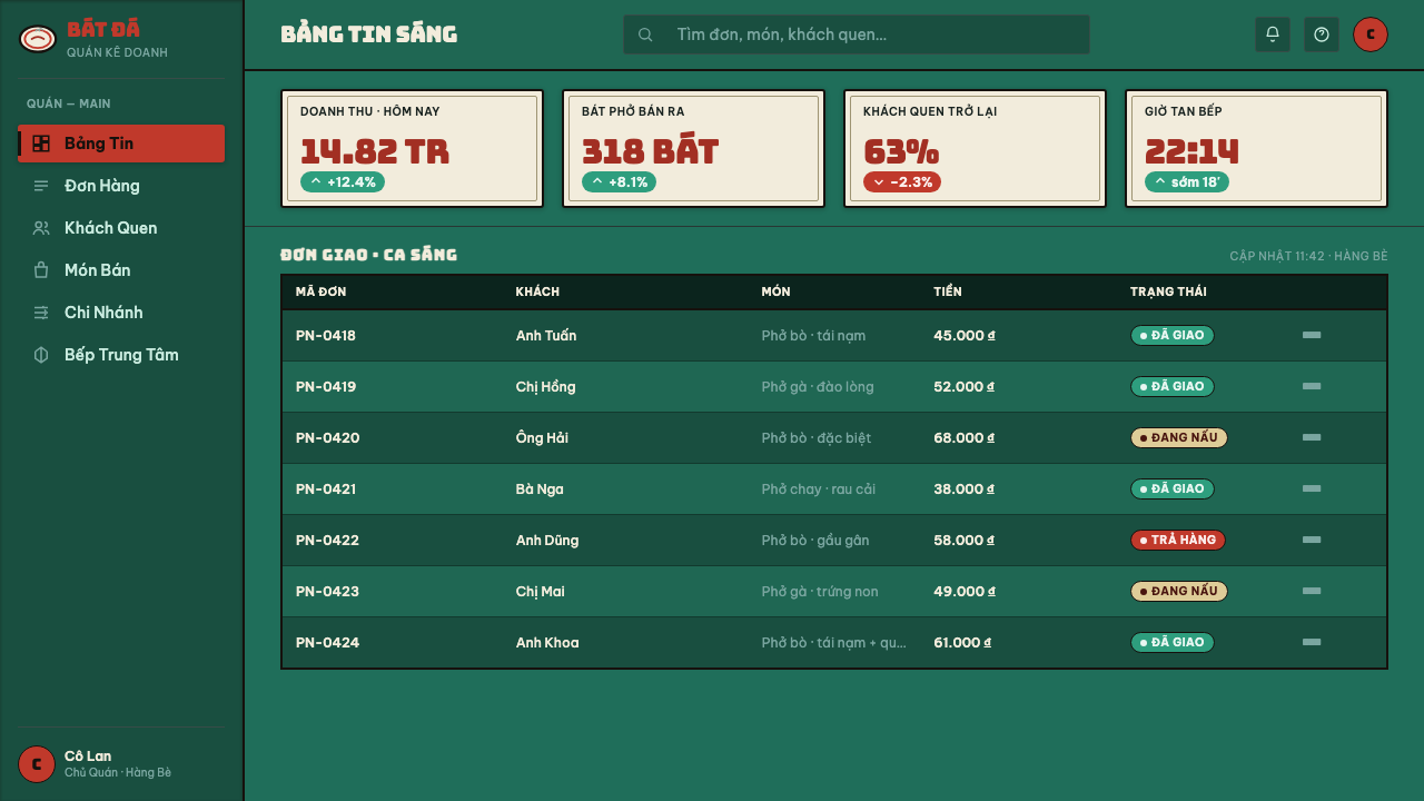
For web interfaces, the style is strongest in food discovery, menus, cultural guides, and dashboards that benefit from immediate public character. A jade ground can hold navigation and grouped information, while cream fields become object-like panels and chili red identifies active or urgent information. Avoid making every control look distressed; interaction still needs clear states and reliable reading.
For editorial and marketing work, use the style to frame stories about streets, food, craft, or local culture with a sense of direct address. Dense headers, brush signage, enamel-framed callouts, and small marks of wear can give a campaign the rhythm of a stall facade. Photography or illustration should support the food-and-sidewalk world rather than displace it with luxury hospitality imagery.
The common mistake is extracting jade, red, and texture as a superficial mood board. A polished dark background with generic brush text is not enough, and excessive chips or stains quickly become costume. Keep cream limited, preserve dark rims, let the brush lettering do real communicative work, and make every rough surface feel attached to enamel, handling, steam, or a crowded street-food setting.
Phở Street-Stall Enamel — FAQ
Is this simply a Vietnamese restaurant style?
No. The source is specifically Hanoi Old Quarter phở-stall culture from the socialist era, not a generic image of Vietnamese dining. Its identity depends on the relationship among jade enamelware, red hand-painted signs, dark rims, cream bowl fields, steam, chili, sidewalk density, and ordinary curbside service. Removing those relationships produces a broad restaurant theme rather than Phở Street-Stall Enamel.
Why must cream remain a small field rather than the main background?
Because cream represents enamel bowl space within a larger jade stall environment. When it becomes the page, jade loses its material authority and red lettering begins to read like clean editorial branding. Restricting cream preserves the sense that light surfaces are objects held inside the darker public setting, not a neutral canvas surrounding it.
Should every surface use chipped enamel texture?
No. Wear works as evidence, not wallpaper. Apply it where an enamel edge, painted sign, or handled object could plausibly show use, and keep important reading areas clear. If every area is chipped, the style stops suggesting ordinary use and begins to look artificially damaged. The dark jade ground, red brush lettering, cream fields, and rim lines should remain recognizable even with no texture present.
Can the style work for information-heavy products?
Yes, provided the street-stall atmosphere does not overrule information hierarchy. Use rimmed grouping, cream object-fields, direct red emphasis, and sign-like headings to organize dense material. The system is naturally suited to quick recognition in public space, so it can support dashboards and data views when labels, states, and relationships remain clearer than the texture.
Related design styles
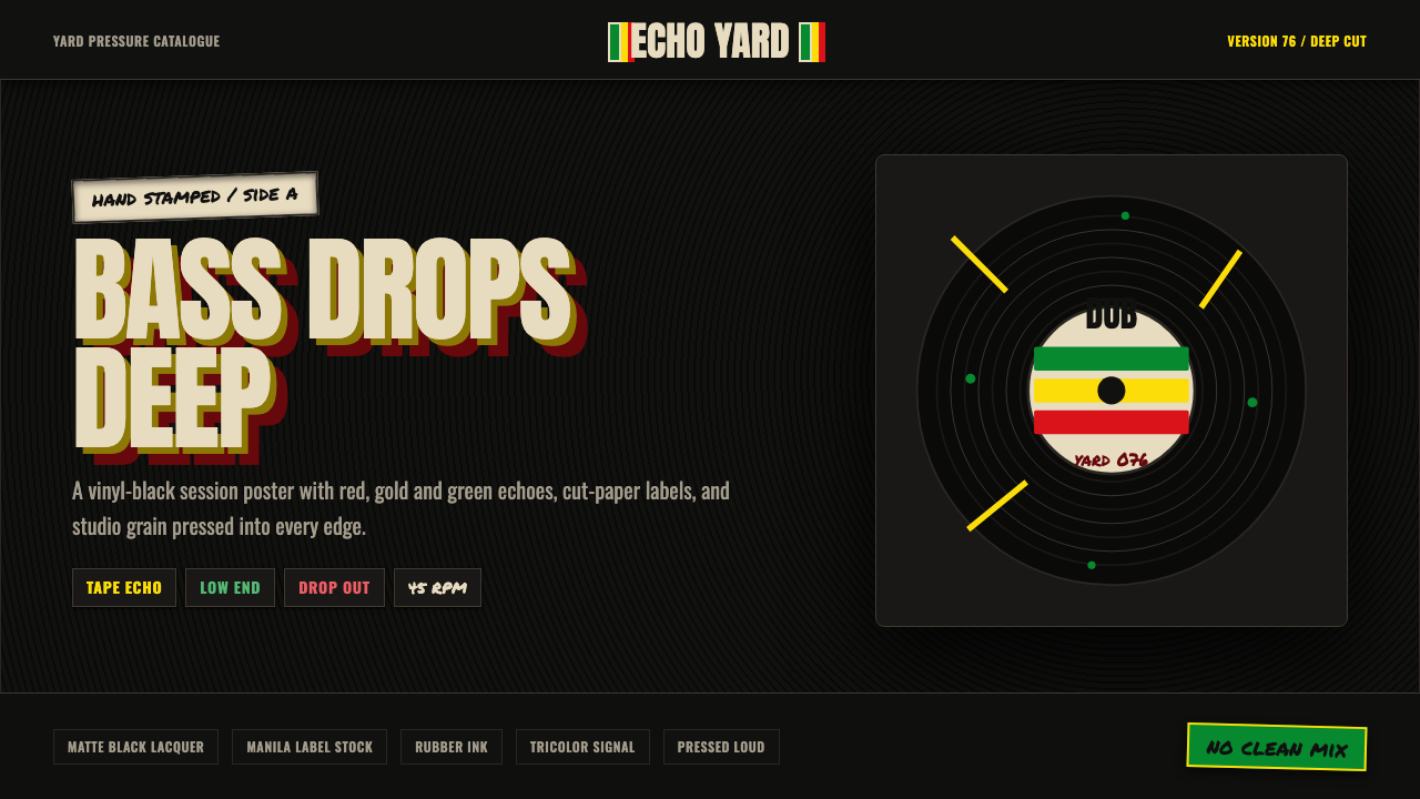 Dub SoundsystemStudio-dark and heavy. Vinyl grooves, manila stamp, green-gold-red echo type.
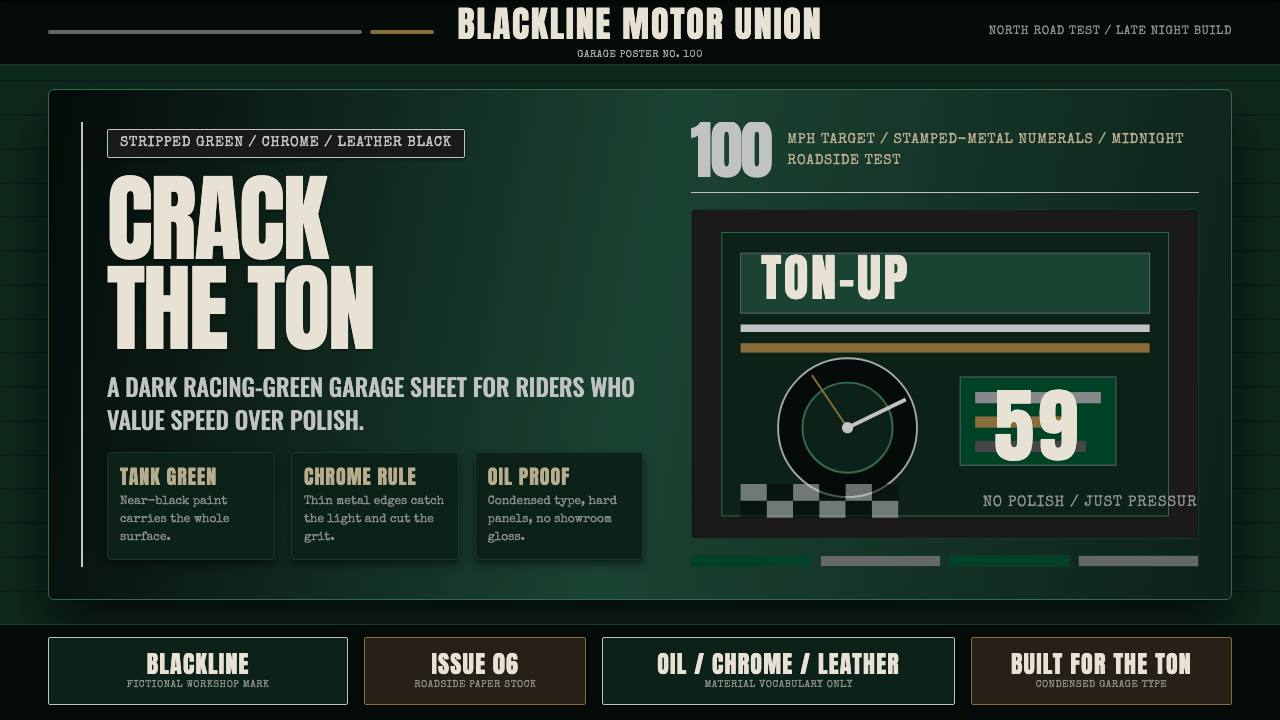 Café Racer Ton-UpGarage grit at speed. Near-black racing green, chrome rules, condensed sign t…
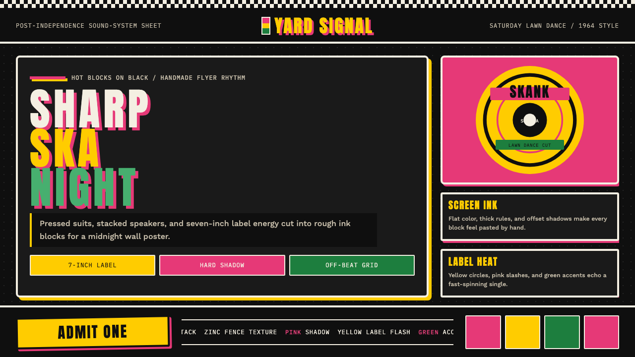 Rude Boy Jamaica Ska (1960)Street swagger hits hard. Hot pink and yellow blocks, checker trim, chunky ty…
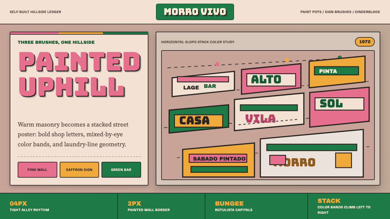 Brazilian Favela Rocinha 1970sHand-built warmth. Pink, saffron and green stripes climb cinderblock in rotul…
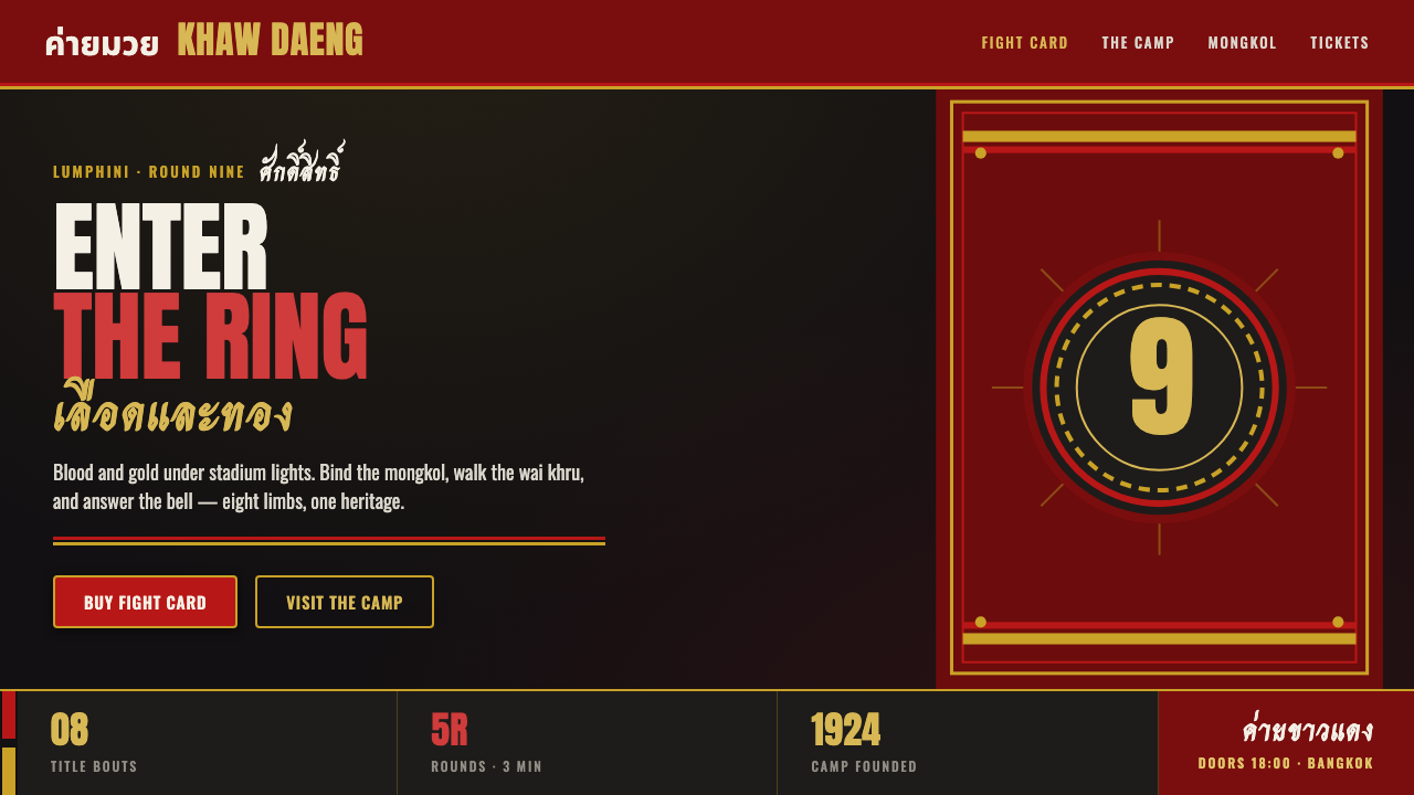 Muay Thai Camp BannerFight-poster physical. Blood-red and gold satin on near-black, heavy Anton ty…
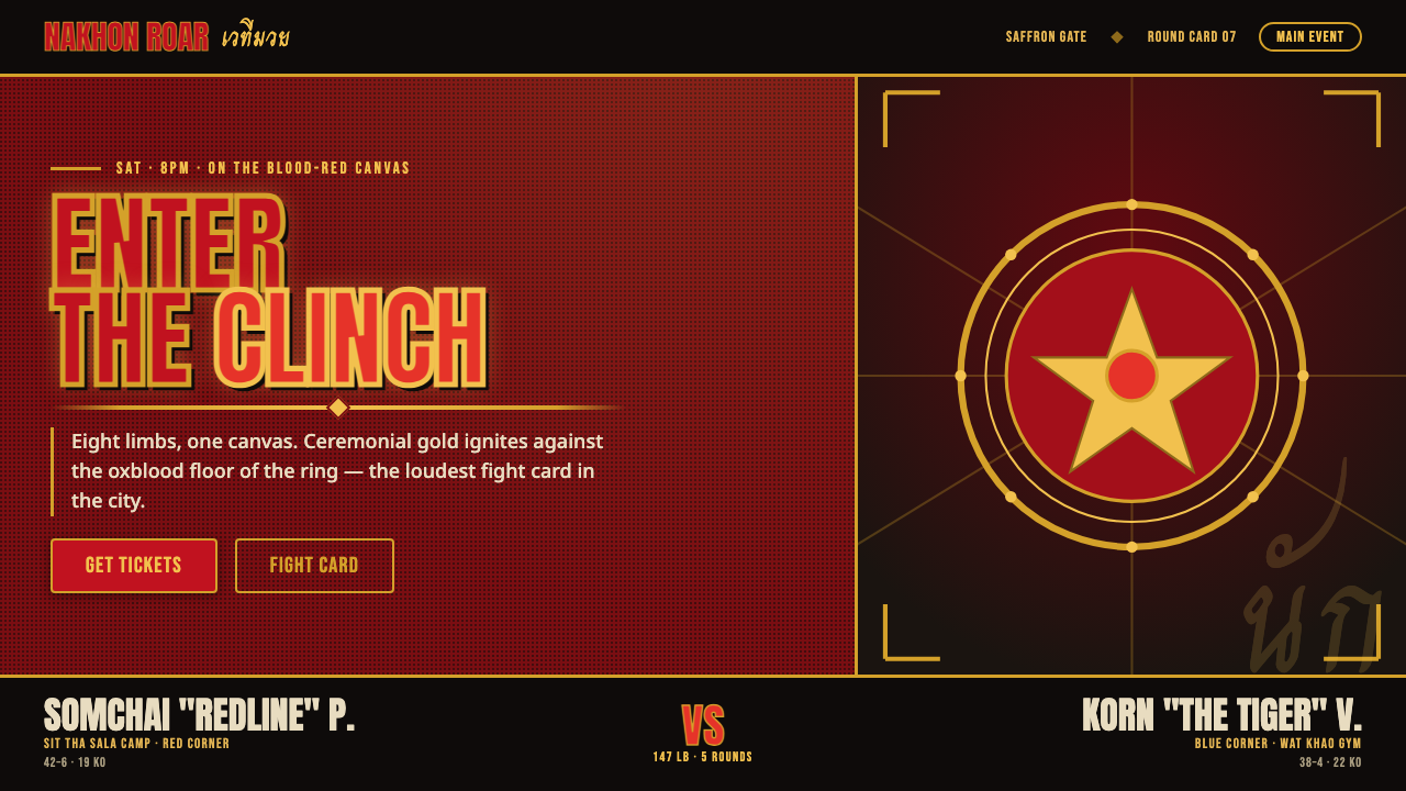 Muay Thai Stadium PosterBangkok's fight night, made loud. Ceremonial gold blazes on oxblood red under…