What is Yaowarat Chinatown Signs?
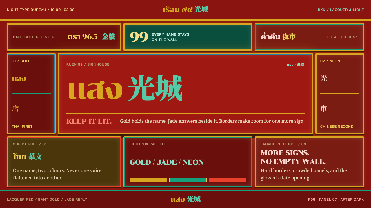
On Yaowarat Road in Bangkok, signs pile up into one continuous wall of type — baht gold and jade scripts inside hard-edged red lightboxes, where density is not a failure of layout but the layout itself.
Yaowarat Chinatown Signs in brief
Yaowarat Chinatown Signs is a design style drawn from the shopfront lettering of Yaowarat Road, the spine of Bangkok's Chinatown. Seen from the street, the road reads as a single wall of type: gilded lacquer boards from the era of the Teochew merchants, topped and overlapped by acrylic lightboxes and neon added in the second half of the twentieth century. Nothing was ever taken down to make room for the next layer, so the street is a layered archive of signage.
The style's logic is that this density is deliberate. More than a hundred gold shops hold the road together, their red facades carrying shop names in baht gold. Between them, sign makers followed a consistent rule: a very heavy Thai display face, Chinese characters set beside it in a different colour, and a contrasting border around the whole box. Each sign is crowded, but each is built on the same simple grammar, and that shared grammar is what makes the crowd readable.
Visually, it is a dark, warm, saturated style. Deep red lacquer provides the ground, gold and jade carry the lettering, and hard-edged boxes keep each message in its own territory. It is loud, but with order. Colour separates the scripts, borders separate the panels, and density becomes the composition rather than a flaw to be fixed.
Where does Yaowarat Chinatown Signs come from?
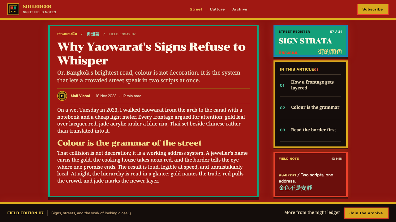
The source material places the style in Yaowarat Road, in the Samphanthawong district of Bangkok, Thailand. The street grew as a Chinese settlement, and its oldest visible layer comes from the Teochew merchants of the nineteenth century: gilded lacquer shopboards on which shop names were written in gold leaf and gold paint over red lacquer. This layer is the root of the street's colour scheme, because red and gold were already the colours of a Chinese merchant house announcing itself.
The second layer arrived in the middle of the twentieth century. The source dates the lightbox and neon stratum from roughly 1950 to 1990, when acrylic boxes and neon tubes were added to the street. The key detail is that the new did not replace the old. Lightboxes were hung over and in front of the lacquer boards, neon lines ran across them, and the facade grew into a stack of different eras. The density that the style celebrates is the physical result of this refusal to remove anything.
The street's gold trade supplies its backbone. The source describes more than a hundred gold shops along Yaowarat, with red facades and shop names lettered in gold. The reference list names Thong Bai gold shop among its key figures, together with the Teochew merchant families of Yaowarat and a typographic reference, BangkokType. Together they show the three forces behind the look: the shops that commission signs, the families whose heritage defines the visual language and the lettering craft that gives it form.
The style sits at the crossing of three traditions: Thai vernacular sign painting, Chinese-Thai bilingual shopfront lettering and Southeast Asian neon and lightbox signage. The bilingual rule is the most influential part. A very bulky Thai display face carries the name in the local language, Chinese characters sit alongside it in a contrasting colour, and a border in a third colour wraps the whole box. It is a compact system for fitting two scripts, two audiences and one brand into the same small rectangle.
What defines the Yaowarat Chinatown Signs look?
Red lacquer ground
Deep red is the field on which everything sits, descended from the red facades and lacquer boards of Yaowarat. It is saturated and warm, a colour of luck and trade, and it gives the style its aggressive, welcoming energy. Because the ground is so strong, everything placed on it has to be bold enough to hold its own, which is one reason the lettering is so heavy.
Baht gold lettering
Names on the red facades are written in a rich yellow-gold, the colour of the metal the street trades in. The gold is solid and warm rather than metallic-glossy, and it works as the primary text colour on red. It signals value and trust, which is exactly what a gold shop's sign needs to say, and it keeps the lettering legible from across a busy road.
Jade script colour
The second script is set in a cool jade green, a colour that stands apart from both the red and the gold. This is the style's most important rule: the two scripts must be different colours, so that the eye can tell them apart at once. The contrast of warm gold and cool green also makes the pair vibrate against the red, which is part of the signs' visual force.
Bulky Thai display lettering
The Thai script is set in a very heavy display face, with thick strokes and compact counters that stay readable at a distance and in neon. It is not elegant in the usual sense; it is built to be seen. In practice, the style asks for extra-bold weight, tight spacing and a strong silhouette, so that a name registers as a block before it registers as a word.
Contrasting borders
Each lightbox is wrapped in a border of a contrasting colour, and the box edge is hard and square. The border does the work that whitespace does in quieter styles: it separates one panel from the next. In a dense composition, borders become the grid, and a layout feels organised because every sign knows where it ends.
Density as composition
The street shows signs overlapping and stacked until facades disappear behind type. The source is explicit that this density is the composition, not a failure of it. Layouts in the style should therefore be dense on purpose: many panels, tight gaps and little empty space, kept under control by repeating the same grammar of colour, border and weight.
Layered strata
Gilded lacquer boards, acrylic lightboxes and neon coexist on one wall because nothing was removed. For design, this means layering is a legitimate technique: older-looking elements can sit beneath newer ones, and slightly mismatched panels can feel authentic. The effect should read as accumulated history, not as random clutter, so each layer still needs a clean edge.
Who shaped Yaowarat Chinatown Signs?
Thong Bai is a gold shop named in the style's reference list, standing for the more than a hundred gold shops that form the spine of Yaowarat. Their red facades and gold names are the emblem of the street. The source gives the shop as a reference rather than a biography, but its presence signals that the style's centre of gravity is the trade of gold, with its need to look trustworthy at a glance.
The families of Teochew merchants established the street's earliest visible layer, the gilded lacquer shopboards of the nineteenth-century settlement. Their taste for gold lettering on red lacquer is the origin of the style's palette. They are the reason the street speaks first in a Chinese commercial language, onto which Thai lettering and modern lightboxes were later laid.
BangkokType is named in the reference list on the lettering side of the story. The source gives the name without details, so this article does not describe its work beyond that. Its presence beside the shop and family names suggests that the street's heavy Thai display lettering has become a subject for type designers, as well as for the sign painters who made it.
The local sign shops are the quiet authors of the street's look. They followed the rule that gives the style its grammar: bulky Thai lettering, Chinese characters in a different colour and a contrasting border around the box. Their work is vernacular and repeated across many shopfronts, and the consistency of the result is what turns a crowd of signs into a recognisable design language.
How do you use Yaowarat Chinatown Signs today?
This style is for work that needs to be loud, warm and organised at the same time. The trick is to treat density as a design material: fill the space, but keep a strict grammar of colour, weight and border. Use a deep red ground, gold for primary text and jade for the second script or secondary information, and keep every panel in a hard-edged box.
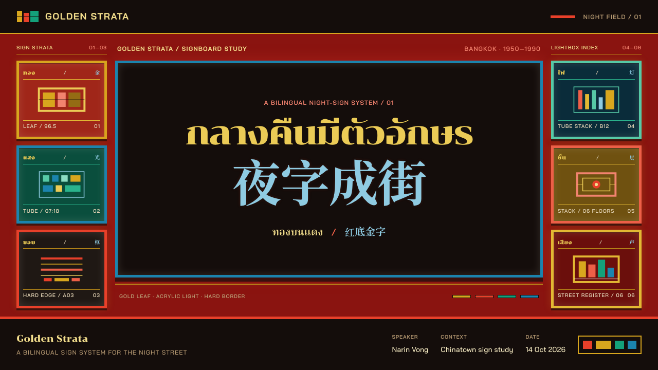
For presentation slides, a cover can be a single large lightbox on a red field, with the title in extra-bold gold and a subtitle in jade inside a contrasting border. Content slides can pack several boxed panels into a tight grid, each one a self-contained message. Data slides work well when each key figure gets its own sign-like box, with charts reduced to bold bars in gold and jade against the red.
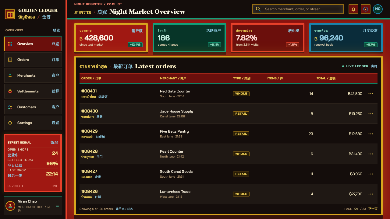
For web interfaces, the style suits bilingual products, marketplaces, food and nightlife, gold and jewellery, and any interface that benefits from visible energy. A dense dashboard is possible, as long as each module sits in its own bordered box and the type is heavy and high-contrast. Pricing pages can present tiers as adjacent signs, each with a bold name and a smaller second-language line in a different colour. Buttons should be solid blocks with square corners.
For editorial and marketing work, the style evokes street life, trade and layered city history. It fits stories about neighbourhoods, markets, food, migration and urban typography, and it works strongly in bilingual campaigns. A good approach is to treat each headline as a shop sign, with the second language in a contrasting colour beside it. Photography of real shopfronts and night streets belongs naturally with the system.
The most common mistake is to tidy it up. Adding generous whitespace, thinning the lettering or reducing the palette turns the style into generic red-and-gold decoration. A second mistake is to use more than a few colours: the rule is that colour separates scripts and borders separate panels, so extra hues weaken the grammar. A third, and a serious one, is to use fake or garbled Thai or Chinese characters as texture. The scripts are the substance of the style and must be real, correctly written text.
Yaowarat Chinatown Signs — FAQ
Is density really intended, or is it just clutter?
It is intended. The source says density is the composition, not a failure of it. What keeps the street from being chaos is a consistent grammar: a very bulky Thai display face, Chinese characters in a different colour and a contrasting border around each box. Dense layouts in this style have to follow that grammar strictly, or they fall into clutter.
Why do the two scripts need different colours?
Because colour is how the street separates languages. Thai and Chinese share one small box, so the eye needs an instant way to tell them apart. Setting one in gold and the other in jade gives each script its own lane without needing extra space. Using one colour for both makes the sign harder to read and loses the style's signature.
Why are there both gilded lacquer and neon in the references?
Because the street kept both. Gilded lacquer boards from the Teochew merchant era remain on the facades, and acrylic lightboxes and neon from roughly 1950 to 1990 were added over and in front of them. The style borrows the colours of the older layer and the hard-edged boxes of the newer one, and its sense of accumulation comes from the fact that neither replaced the other.
Can I use this style outside Thai or Chinese contexts?
Yes, but with care. The grammar of heavy display type, a second script in a contrasting colour and bordered boxes translates to any bilingual or dense-information setting. What does not travel is fake lettering: if you use the look to evoke the street, use real Thai or Chinese text, correctly written, and credit the tradition it comes from.
How does the style handle dark mode and glow?
It is a dark, warm style by default, built around deep red and saturated lettering. Glow in the neon sense can be suggested, but the lightbox itself should stay hard-edged and flat rather than blurry. A little restrained brightness around lettering is enough; heavy blur would undermine the crisp boxes that organise the composition.
Related design styles
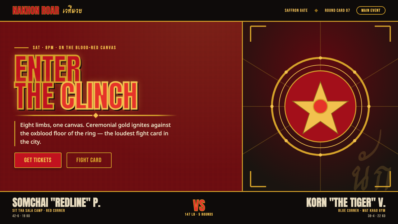 Muay Thai Stadium PosterBangkok's fight night, made loud. Ceremonial gold blazes on oxblood red under…
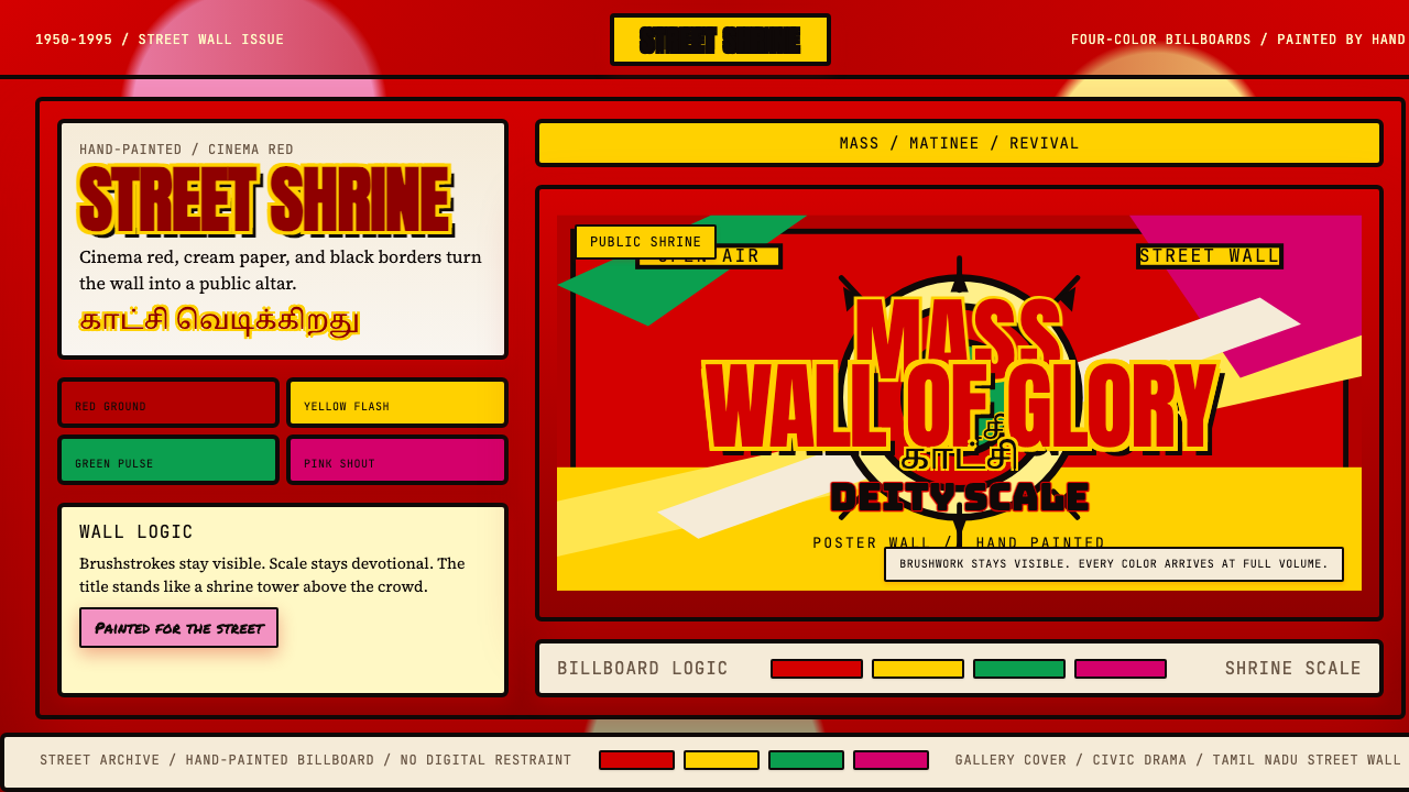 Tamil Cinema Poster (MGR era)The wall becomes a shrine. Red, yellow, green, and pink crash into cream pane…
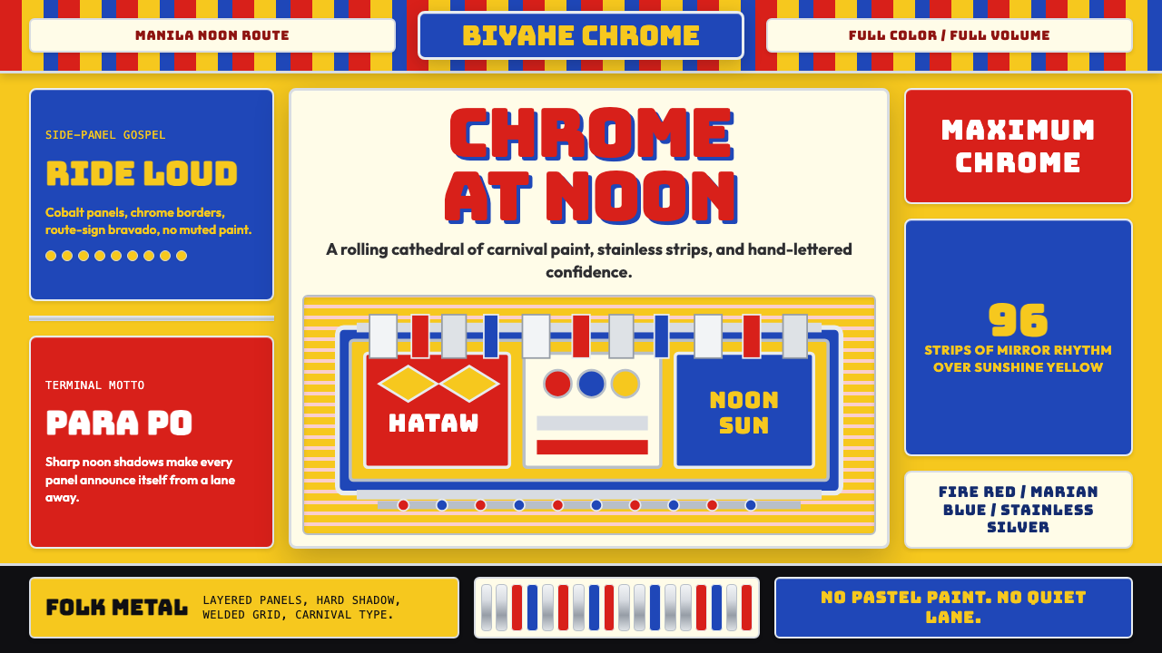 Filipino Jeepney (Chrome & Streamer)Maximalism has wheels. Sunshine yellow, chrome strips, Bungee route-sign type.
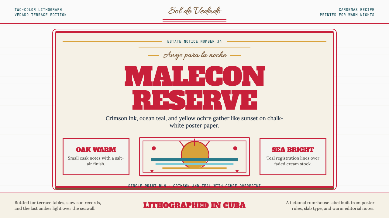 Havana Club Cuban RumSunset in print. Crimson slab type and ocean teal rules age on chalk-white pa…
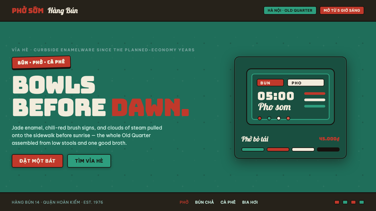 Phở Street-Stall EnamelHanoi's curbside noodle stall, systematized. Jade enamel ground, chili-red br…
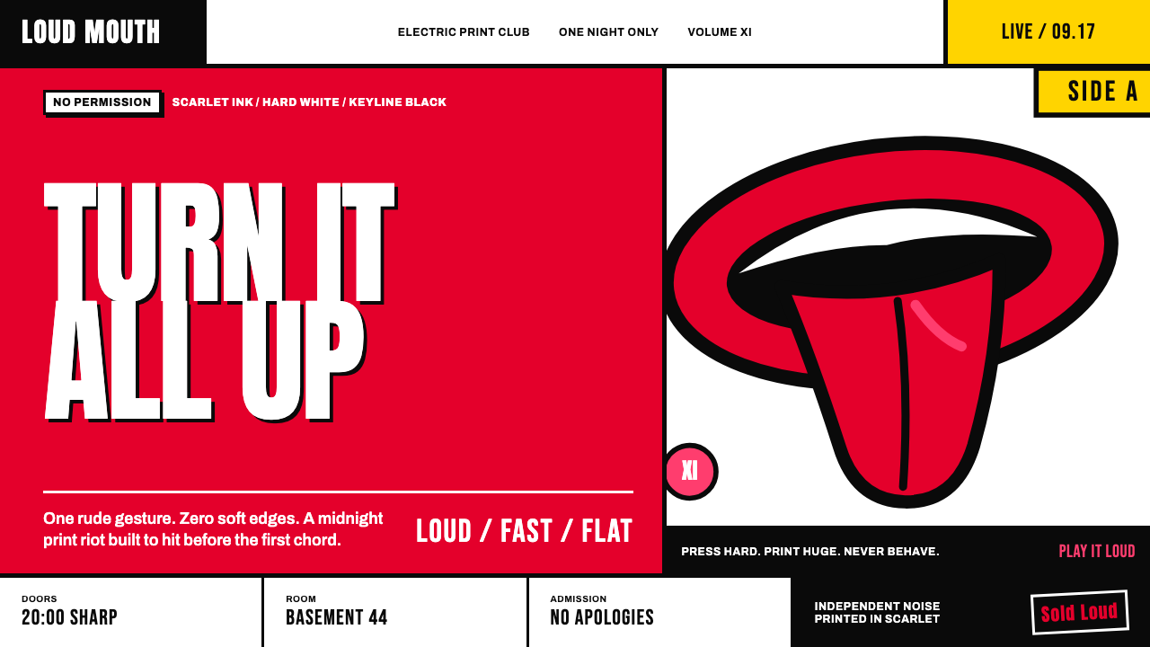 Rolling Stones Tongue (1971)Flat ink shouts loud. Scarlet curves, black keylines, and cropped poster scal…