What is Tobacco Curing Barn?
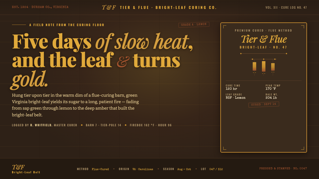
Slow heat turns leaf to gold: Tobacco Curing Barn brings amber leaf, dark timber, and the layered authority of a vintage American tobacco label into a warm nocturnal design system.
Tobacco Curing Barn in brief
Tobacco Curing Barn draws from the interior of a flue-curing barn in the bright-leaf belt of Virginia and the Carolinas. It imagines cured tobacco hanging from tier-poles in a dim wooden structure, where leaf shifts from golden yellow toward deep orange over a five-day cure. The visual mood is not rustic nostalgia in the generic sense. It is a specific atmosphere of controlled warmth: agricultural labor made visible through heat, shadow, weathered timber, and the concentrated glow of cured leaf.
The system translates that atmosphere into a dark, warm visual field. Amber, sienna, and straw-like tones appear as illumination rather than as decoration, emerging from brown-black timber grounds and aged, smoke-softened surfaces. Bright paper white has no place here. Contrast should feel like a lantern catching leaf in a barn interior: selective, directional, and rich enough to reveal texture without turning the composition cheerful or clean-room modern.
Typography supplies the second half of the identity. Slab serif, condensed sans-serif, and typewriter-like letterforms are layered in the manner of vintage American tobacco labels. Their relationship is deliberately unequal: a forceful product name, narrow factual information, and smaller stamped or typed details each carry different kinds of authority. The result should feel printed, stacked, and handled over time, rather than digitally polished into a single seamless voice.
Where does Tobacco Curing Barn come from?
Its historical setting is the flue-curing era of Southern United States bright-leaf tobacco, spanning 1900–1950. Virginia and the Carolinas form the regional frame: a bright-leaf belt in which tobacco was cured inside barns through slow, controlled heat. The design language begins with that interior condition rather than with an exterior farm image. Darkness is structural, wood is enclosing, and the leaf is the visible evidence of transformation.
Flue-curing gives the style its central drama. Green leaf enters a warm barn environment and, over the five-day cure described by this system, takes on golden-yellow and deep-orange character. That change suggests a visual hierarchy built around emergence: dim ground first, then timber, then small areas of glowing leaf. The palette should therefore behave as the record of heat working through material, not as a collection of unrelated autumnal accents.
American agrarian craft is an important part of the reference. The barn curer and bright-leaf farmer are not decorative symbols pasted onto a pastoral scene; their work defines the atmosphere of the place. Hanging, drying, tending, sorting, and labeling imply practical order. A composition in this style should therefore feel assembled around use, storage, identification, and material conditions, even when it is applied to a contemporary interface or editorial page.
Vintage US tobacco-label and packaging design supplied a complementary printed language. Period labels combined assertive display type with narrow supporting lettering and smaller utilitarian marks. Tobacco Curing Barn does not reproduce a particular brand or label. Instead, it borrows the broader visual logic of label stacks: a dominant name, compressed information, typographic bands, and enough imperfection or density to make the page feel like packaging with a history rather than generic heritage decoration.
What defines the Tobacco Curing Barn look?
Dark Timber Ground
The background should resemble weathered barn timber: deep, warm, absorbent, and visibly aged rather than flatly black. It establishes enclosure and makes every lighter element feel physically caught by the interior darkness. Use broad dark fields as the main atmosphere, not merely as a backdrop behind decorative content.
Cured-Leaf Glow
Amber, sienna, straw, golden yellow, and deep orange function as heat-made light. They should gather around focal information, highlighted imagery, or decisive interface states. Their warmth is strongest when surrounded by restraint; spread evenly across the page, they lose the sense of leaf glowing against timber.
Label-Stack Typography
Combine slab serif for names or claims, condensed sans-serif for clear hierarchy, and typewriter-like text for notes, provenance, or practical details. The styles should read as separate printed voices placed in one label system. Avoid blending them into a fashionable eclectic collage; each family needs a defined job and a visible level of authority.
Compressed Information
Supporting text belongs in bands, narrow columns, stamps, or compact blocks rather than generous floating paragraphs. This is not a license for poor readability. It is a way to suggest packaging information and barn records: factual, close-set, and materially connected to the object being identified.
Worn Print and Material
Texture should suggest handled labels, dry leaf, and weathered wood, but remain subordinate to legibility. Slight irregularity, faded edges, grain, or restrained print wear can deepen the reference. Heavy distress, fake stains, and noisy overlays turn the style into costume and erase the quiet discipline of the barn interior.
Warm Selective Contrast
Contrast is produced through temperature, density, and placement more than through bright white against black. Let dark timber carry most of the page, reserve the warmest tones for emphasis, and use muted light lettering where reading requires it. The mood should remain low-lit and deliberate, never glossy, fluorescent, or paper-bright.
Who shaped Tobacco Curing Barn?
Bright-leaf tobacco farmers anchor the style in the Virginia and Carolina agricultural landscape. Their role is not represented through sentimental farm imagery, but through the conditions surrounding the crop: leaf, handling, classification, storage, and the transition from green material to warm cured color. They make the palette and practical order of the system intelligible.
Barn curers embody the controlled environment at the center of Tobacco Curing Barn. The flue-curing process supplies its visual logic: slow heat, suspended leaf, dim enclosure, and gradual color change. Their work suggests that warmth in this style must feel managed and earned, never like an arbitrary decorative glow.
Vintage US tobacco-label makers provide the graphic counterpart to the barn. Their packaging language informs the combination of slab serif, condensed sans-serif, and typewriter-like details, as well as the use of stacked hierarchy and compact supporting information. The influence lies in printed structure and product presence, not in copying a particular historical mark.
How do you use Tobacco Curing Barn today?
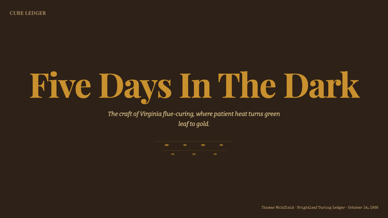
For presentation covers, use the barn interior as a compositional premise. Let a dark timber-like field dominate, place one warm leaf-like area or amber focal block where the eye should land, and give the title the firm presence of a label name. Supporting context can sit below or beside it in condensed and typewriter-like layers. The cover should feel stored, marked, and illuminated from within rather than decorated around the edges.
For content and data slides, keep the narrative legible by separating the three typographic voices. A slab-serif section title can name the subject, condensed sans-serif can organize labels and comparison points, and typewriter-like text can hold source notes or practical qualifiers. Charts should use dark structural fields with limited cured-leaf highlights for the most important series or conclusion. Avoid turning every data point warm; selective glow is what preserves hierarchy.
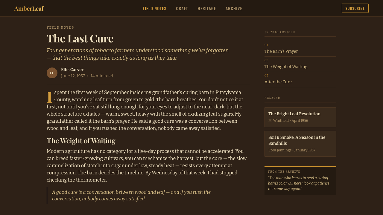
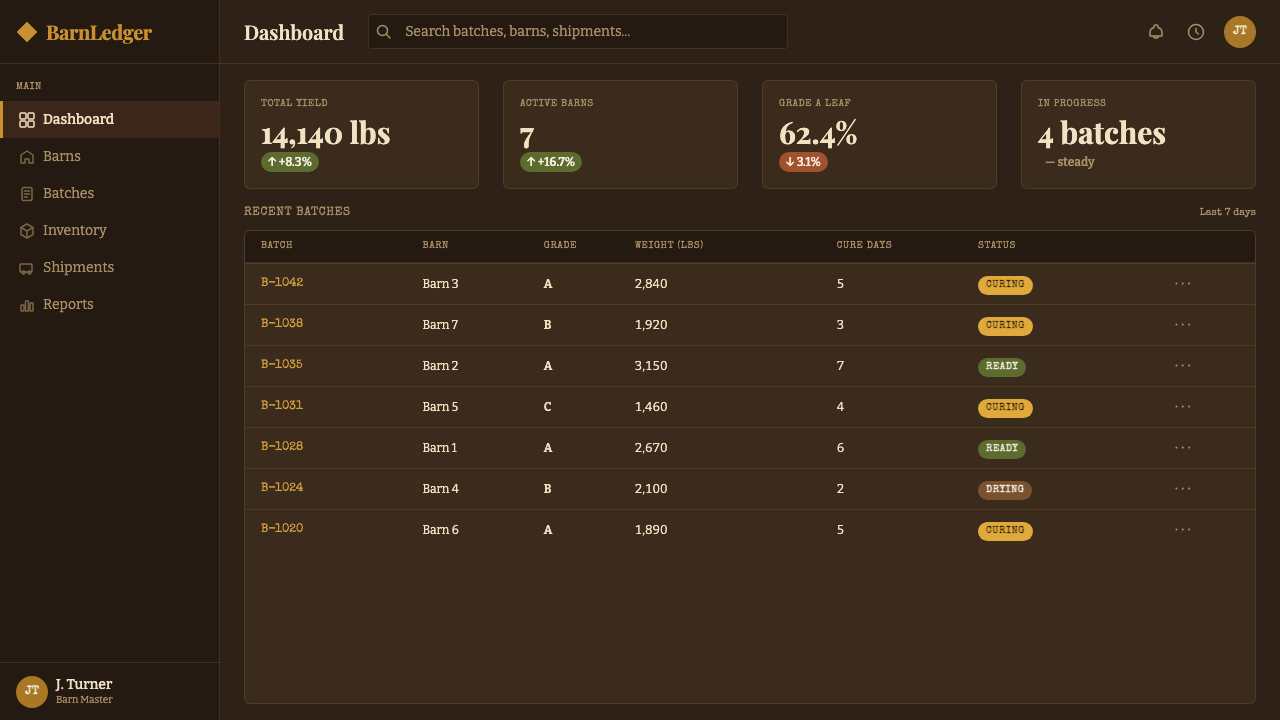
For web interfaces, this style suits dashboards, inventories, catalog-like tools, and pricing pages that benefit from material authority and concentrated attention. Use dark surfaces to organize the application into enclosed working areas, then reserve amber and sienna moments for active items, key statuses, selected tiers, or decisive actions. Navigation can behave like a label stack: clear, compact, and typographic, with each level visibly related to the next.
For editorial and marketing work, Tobacco Curing Barn is effective when the subject has a sense of process, provenance, craft, or collected material. Feature pages can alternate dense dark passages with warmer panels that reveal a product, quotation, or story detail. In editorial layouts, narrow notes and compact metadata work especially well beside a stronger headline. The atmosphere should support a specific narrative of transformation, not simply add rustic flavor.
The common mistake is reducing the style to brown backgrounds, distressed textures, and old-looking fonts. That produces a theatrical version of heritage rather than the disciplined warmth of a curing barn. The essential relationship is darker enclosure against small areas of heat-made color, paired with typography that distinguishes name, information, and record. Keep the texture restrained, protect readability, and never introduce bright-paper polish that breaks the low-lit world.
Tobacco Curing Barn — FAQ
Is Tobacco Curing Barn simply a rustic or farmhouse style?
No. Generic rustic styling often relies on broad pastoral signals, pale reclaimed wood, cheerful craft motifs, or casual domestic comfort. Tobacco Curing Barn is darker, warmer, and more process-driven. Its reference is the enclosed flue-curing interior of the bright-leaf belt, where heat changes hanging leaf over time. Weathered wood matters because it frames the glow; typography matters because it connects the space to tobacco-label packaging.
Why should the background stay so dark?
The dark ground is not an optional mood filter. It recreates the visual condition that makes golden leaf, amber information, and worn printed matter meaningful. On a bright paper-like field, the warm palette becomes decorative and loses its relationship to a dim barn interior. Darkness provides enclosure, depth through contrast, and a reason for warm color to feel like illumination rather than branding alone.
Can the palette include bright white?
It should be avoided as a dominant surface. The system explicitly favors amber, sienna, and straw against weathered dark timber, never bright paper. Where legibility needs a lighter tone, use it with restraint so it reads as aged print, muted lettering, or a small reflected highlight. A large bright-white field changes the setting from a warm curing barn to contemporary paper packaging.
How should the three type styles work together?
Treat them as a hierarchy of printed functions. Slab serif carries the memorable name or central claim, condensed sans-serif makes dense information easy to scan, and typewriter-like text supplies notes, dates, classifications, or record-like detail. The goal is not to display three personalities at once. Their contrast should make the page feel like a coherent label with different levels of information.
Where does this style work best, and where should it be used carefully?
It works best where process, provenance, craft, inventory, or collected information are central to the message: editorial features, catalog-like interfaces, focused dashboards, and product stories with real material substance. Use it carefully for experiences that need airy optimism, clinical neutrality, or playful everyday ease. Its dark enclosure and dense label logic are purposeful, but they can feel heavy when the product needs openness above all else.
Related design styles
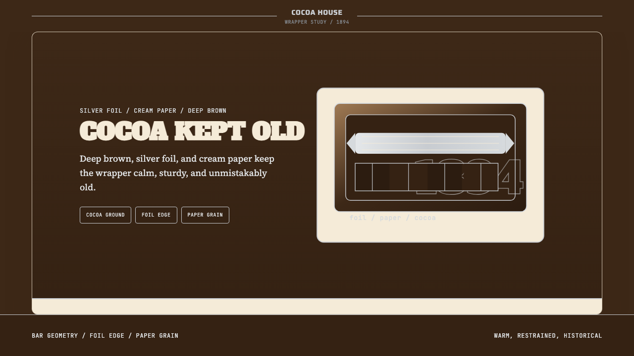 Hershey's Chocolate Brown (1894)Plain, enduring, warm. Cocoa brown meets silver foil on cream paper.
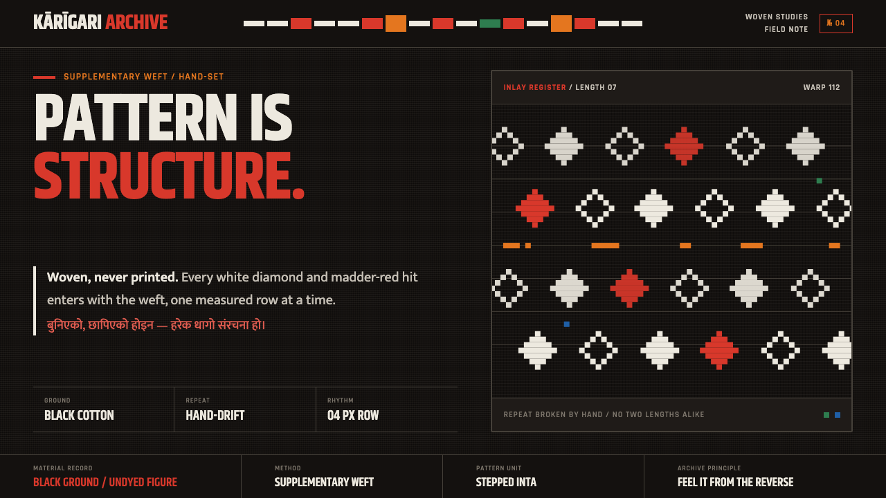 Nepali Dhaka TopiPattern becomes structure. White diamonds and madder-red hits advance row by…
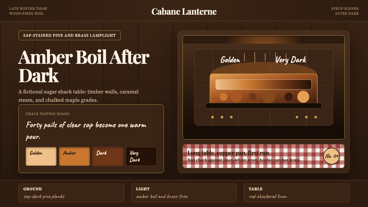 Québec Maple Sugar ShackWarmth boils in the dark. Amber serif type, brass borders, and gingham checks…
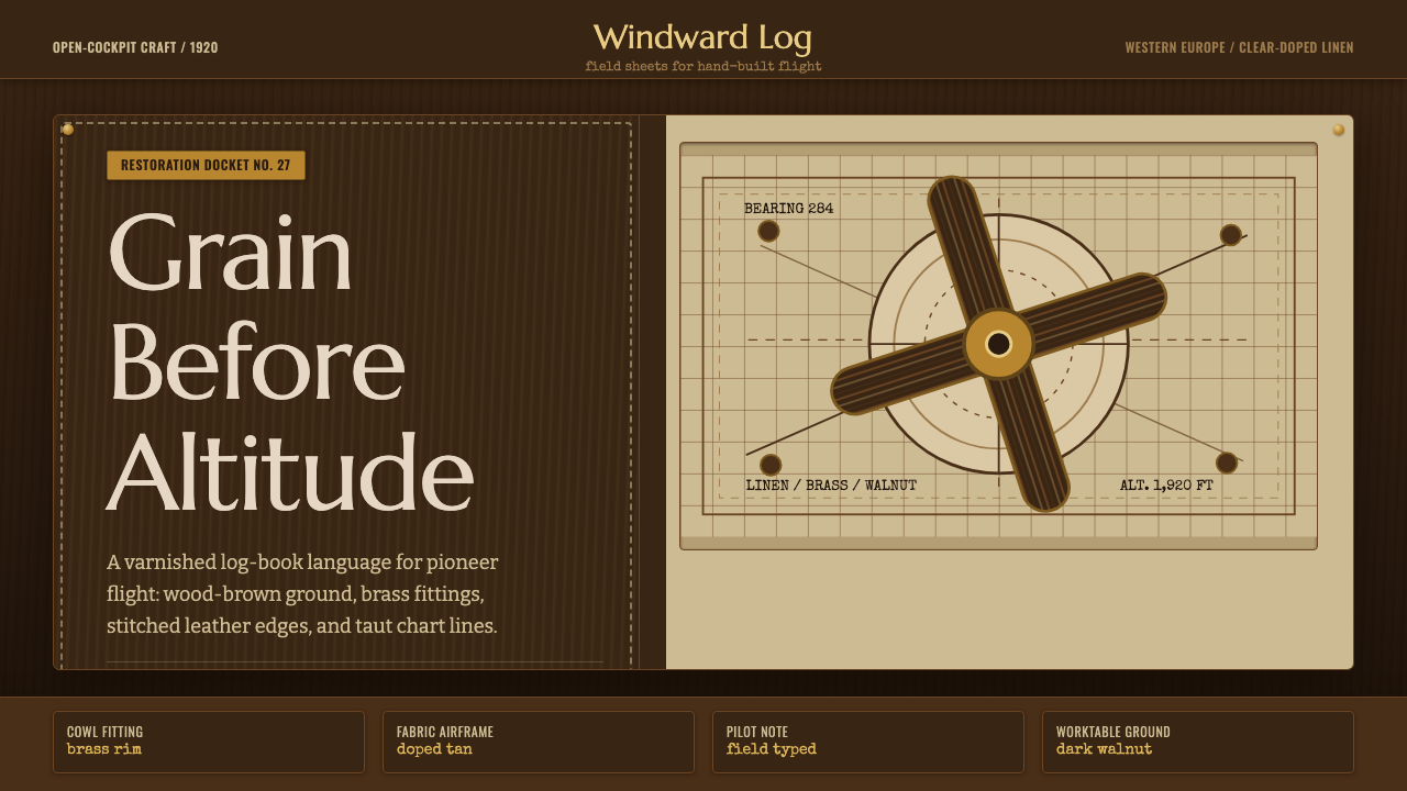 Biplane AviationPioneer flight feels hand-built. Dark walnut, brass, stitched edges, and char…
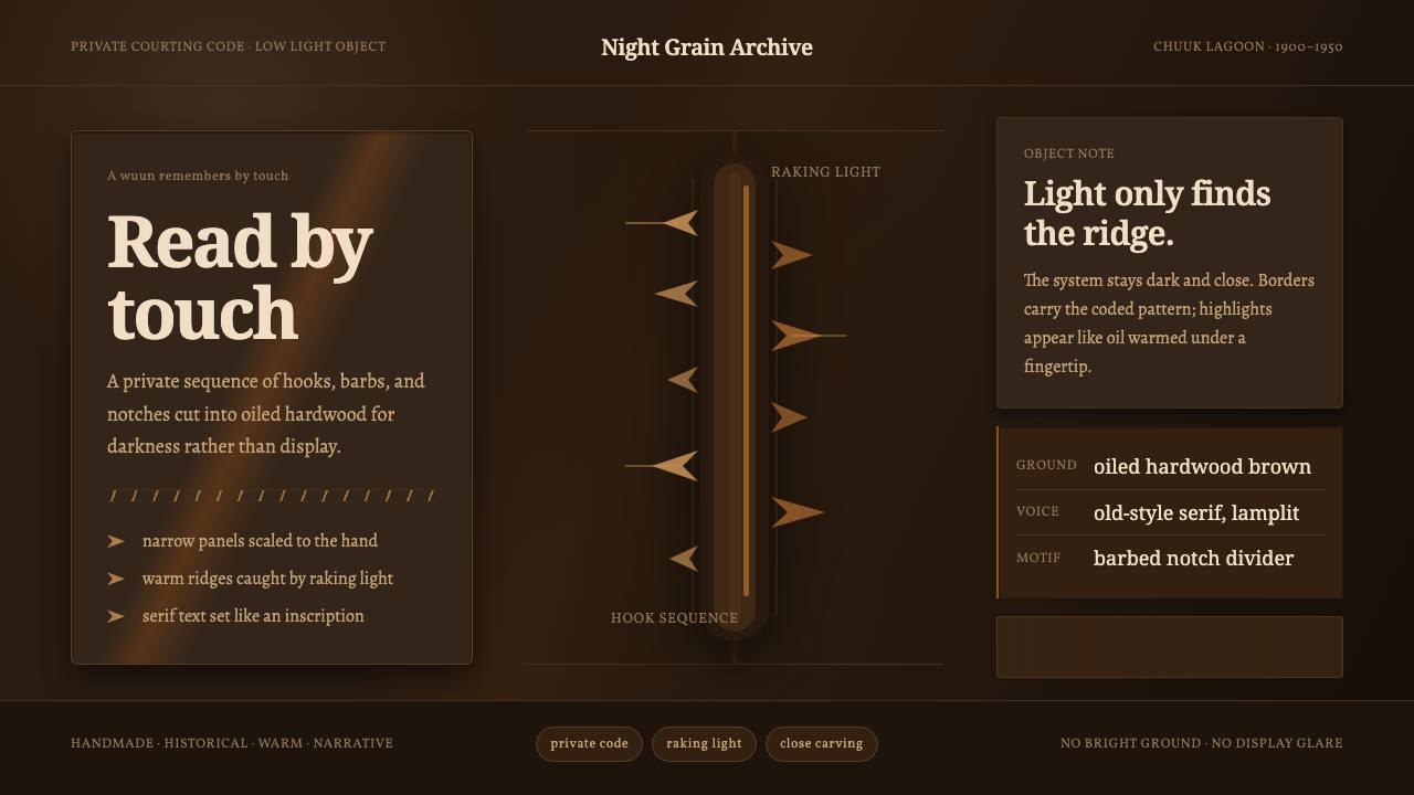 Chuukese Love Stick CarvingIntimacy carved for darkness. Oiled brown grain and hook-notches read by raki…
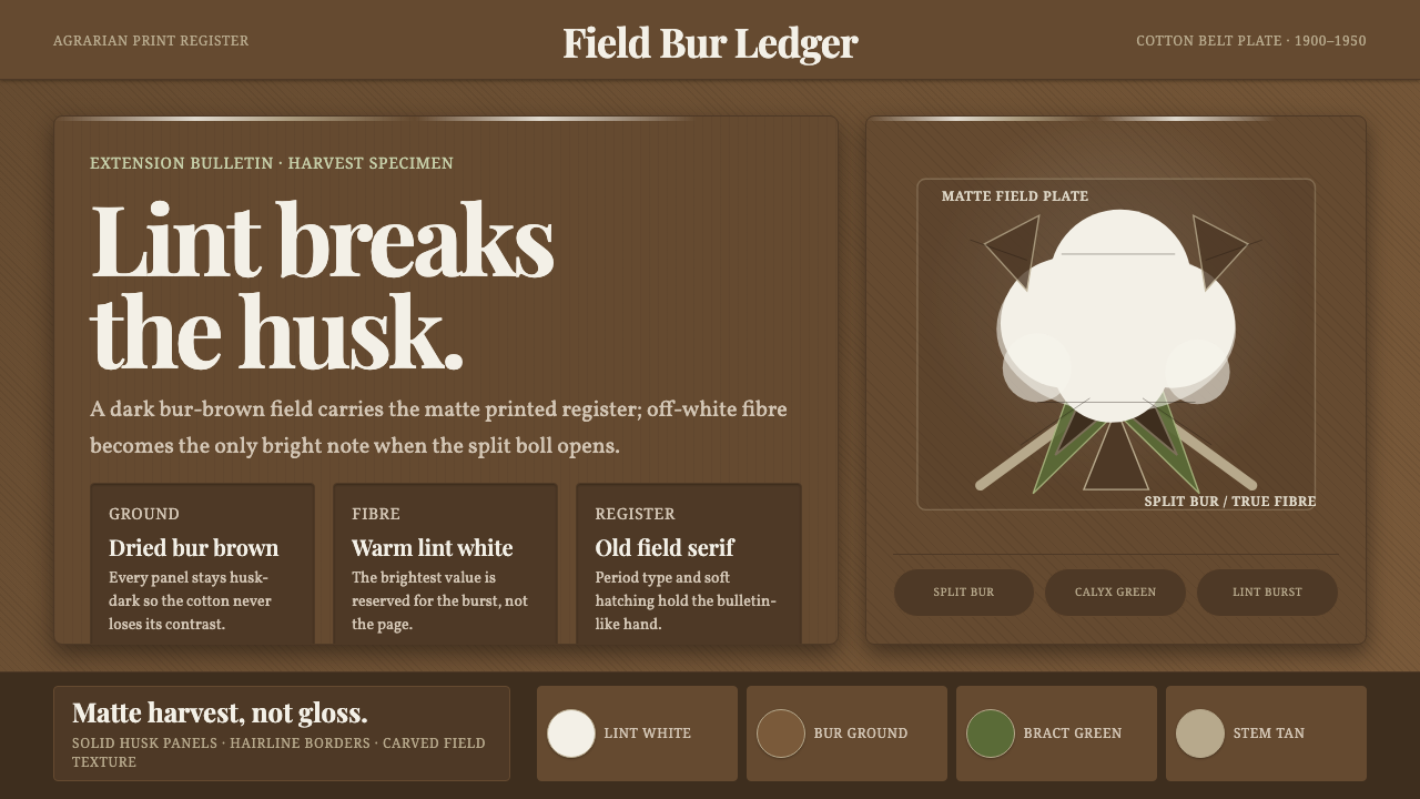 Cotton Boll HarvestHarvest contrast made matte. Off-white lint bursts from husk brown with field…