What is Ethiopian Coffee Buna?什么是 Ethiopian Coffee Buna?
Ethiopian Coffee Buna translates the world's oldest coffee ceremony into a contemporary visual language — forest green, burnt clay, and Geʽez gold that insist coffee began here.「埃塞俄比亚咖啡·布纳」将世界上最古老的咖啡仪式转化为当代视觉语言——森林绿、焦陶橙与吉兹金,宣告着咖啡起源于此。
Ethiopian Coffee Buna in briefEthiopian Coffee Buna 速览
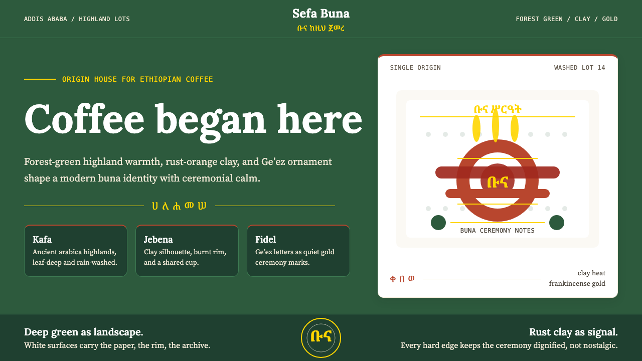
Ethiopian Coffee Buna is a contemporary design aesthetic rooted in the buna ceremony — the traditional Ethiopian coffee ritual that predates any coffeehouse culture by centuries. The visual system draws its palette from the natural world of the Ethiopian highland farm: the deep, muted green of coffee-bush canopy, the warm rust-orange of a hand-thrown clay jebena pot, and a muted gold that recalls frankincense smoke and the gilded margins of ancient Geʽez manuscripts. Against these earthen anchor tones, cream and off-white grounds provide the open breathing space that keeps the palette from reading as heavy.埃塞俄比亚咖啡·布纳是一套植根于布纳仪式的当代设计美学——布纳是比任何咖啡馆文化都早出现数个世纪的埃塞俄比亚传统咖啡礼仪。这套视觉体系的色板直接取材于埃塞俄比亚高原农场的自然世界:咖啡树冠的深沉哑绿、手工拉坯陶壶杰贝纳(jebena)的温暖铁锈橙,以及一种令人想起乳香烟雾与古代吉兹文手稿金色页边的静默哑金。在这些大地基调之上,奶油色和米白色底面提供了开阔的呼吸空间,防止整体色调显得沉重。
The typographic sensibility pairs editorial serif warmth — letterforms with visible calligraphic heritage — with Geʽez script ornaments used as dividers, drop caps, or section markers. This pairing is not decorative pastiche; it grounds the design in a specific and historically deep literate tradition. The Geʽez script, one of the oldest continuously used writing systems in the world, lends an air of quiet authority that no purely Latin typographic system could replicate. The result is a brand language that communicates both cultural specificity and international legibility.字体方面,这套美学将编辑感衬线字体的温度——那些带有明显书法传承痕迹的字形——与吉兹文字装饰相结合,后者被用作分隔线、首字下沉或段落标记。这种搭配并非表面装饰;它将设计锚定于一个具体且历史深厚的书写传统。吉兹文是世界上最古老的持续使用文字系统之一,赋予作品一种纯拉丁排版体系无法复制的安静权威感。最终呈现的,是一套既传达文化特殊性又保持国际可读性的品牌语言。
Where the Bauhaus aesthetic empties a composition down to pure geometry, Ethiopian Coffee Buna fills it with earned material detail — the grain of handmade Ethiopian paper, the silhouette of the jebena, the patterned border of a traditional habesha kemis textile. The style is ceremonial without being ornate: every decorative element traces back to a concrete ritual or craft object, so the overall impression is one of grounded authenticity rather than surface exoticism.如果说包豪斯美学将构图清空至纯粹的几何,那么埃塞俄比亚咖啡·布纳则以有来历的材料细节填充它——手工埃塞俄比亚纸张的纹理、杰贝纳壶的轮廓剪影、传统哈贝莎织物的图案边框。这种风格是仪式性的而非繁复的:每一个装饰元素都可以追溯至某个具体的礼仪或工艺品,因此整体印象是扎实的真实感,而非表面的异域风情。
See the Ethiopian Coffee Buna design system查看 Ethiopian Coffee Buna 完整设计系统
Where does Ethiopian Coffee Buna come from?Ethiopian Coffee Buna 从何而来?
Coffee's origin story is Ethiopian — and the buna ceremony is its oldest living ritual. According to the most widely circulated legend, a goatherd named Kaldi in the Kafa Province of southwestern Ethiopia noticed his goats behaving with unusual energy after eating berries from a certain tree. Monks at a nearby monastery, intrigued by his report, made a drink from the berries and found it helped them maintain alertness during long evening prayers. Whether or not this ninth-century legend is strictly historical, the broader claim is not disputed: Ethiopia is the indigenous homeland of Coffea arabica, and the forests of Kafa, Jimma, and Illubabor remain the most genetically diverse wild coffee stands on earth. The word 'coffee' itself is believed to derive from 'Kaffa,' the name of the southwestern Ethiopian province where wild coffee grew in abundance.咖啡的起源故事属于埃塞俄比亚——而布纳仪式是其最古老的活态礼仪。根据流传最广的传说,埃塞俄比亚西南部卡法省的一位名叫卡尔迪(Kaldi)的牧羊人注意到,他的山羊在吃了某棵树的果实后精力异常充沛。附近修道院的僧侣们对他的报告深感兴趣,用这些果实调制了一种饮料,发现它能帮助他们在漫长的夜间祈祷中保持清醒。无论这个九世纪的传说是否严格意义上属于历史事实,更宏观的主张从未受到质疑:埃塞俄比亚是阿拉比卡咖啡(Coffea arabica)的原生故土,卡法、吉马与伊卢巴伯的森林至今仍是地球上基因多样性最丰富的野生咖啡群落。「咖啡」(coffee)一词本身被认为源自「卡法」(Kaffa)——埃塞俄比亚西南部盛产野生咖啡的那个省份的名称。
The buna ceremony that gave this design aesthetic its name is not merely a brewing method — it is a structured social ritual that can last two to three hours and involves three rounds of pouring. The first round, called abol, is the strongest; the second, tona, is somewhat lighter; the third, baraka, means 'blessing' in Amharic and is traditionally the mildest. Coffee is brewed in a clay jebena over charcoal, served in small handleless cups called sini, and accompanied by roasted barley or popcorn. The ceremony requires the host to roast green beans in front of guests, grind them by hand with a wooden mortar and pestle, and brew in the same session — the whole arc from green bean to shared cup unfolding as a single continuous act of hospitality. Refusing an invitation to participate in buna is considered a significant social slight.赋予这套设计美学名称的布纳仪式,并非单纯的冲泡方法,而是一套结构化的社交礼仪,可以持续两到三个小时,包含三轮倒咖啡。第一轮称为「阿博尔」(abol),咖啡最浓;第二轮「托纳」(tona)稍淡;第三轮「巴拉卡」(baraka)在阿姆哈拉语中意为「祝福」,传统上是最温和的一杯。咖啡在木炭火上用陶土杰贝纳壶冲泡,盛于名为西尼(sini)的小型无柄杯中,搭配烤大麦或爆米花享用。这个仪式要求主人在客人面前烘焙生豆、用木质杵臼手工研磨、在同一场合冲泡——从生豆到共饮的整个过程作为单一连续的待客行为展开。拒绝参与布纳仪式的邀请被视为重大的社交失礼。
Modern specialty coffee culture, which emerged globally in the late 1990s and accelerated through the 2000s and 2010s, found one of its most important anchors in Ethiopian origins. The Yirgacheffe zone in the Gedeo region, the Sidamo highlands, and the ancient walled city of Harrar each produce coffees with distinct flavor profiles — Yirgacheffe's jasmine-floral and bergamot-citrus notes, Sidamo's stone-fruit depth, Harrar's dry-processed wild berry character — that became reference points for the third-wave specialty movement worldwide. Ethiopian coffee exports grew dramatically after 2008, when the Ethiopian Intellectual Property Office, with support from activist groups and specialty roasters, succeeded in trademarking the Yirgacheffe, Sidamo, and Harrar appellations internationally. This marked a turning point in how Ethiopian coffee was branded and perceived: no longer an undifferentiated commodity, but a terroir-specific product with a protected name and a story.兴起于1990年代末、在2000至2010年代加速发展的现代精品咖啡文化,在埃塞俄比亚产区找到了其最重要的锚点之一。格德奥区的耶加雪菲产区、西达摩高原与古老的围城哈拉尔各自出产风味截然不同的咖啡——耶加雪菲的茉莉花香与佛手柑柑橘调、西达摩的核果深度、哈拉尔日晒处理的野生浆果特性——成为全球第三波精品咖啡浪潮的参照坐标。2008年之后,随着埃塞俄比亚知识产权局在维权团体与精品烘焙商的支持下成功在国际上注册了耶加雪菲、西达摩与哈拉尔的产区商标,埃塞俄比亚咖啡出口大幅增长。这标志着埃塞俄比亚咖啡品牌化与认知方式的转折点:不再是无差别的大宗商品,而是拥有受保护名称与叙事的风土特定产品。
The visual design tradition that this aesthetic draws from runs parallel to the specialty coffee story. Addis Ababa's Piazza district is home to Tomoca, a coffee bar founded in 1953 by an Italian-Ethiopian family — one of Africa's oldest continuously operating espresso cafes — whose hand-lettered signage and worn ochre walls became reference images for a generation of Ethiopian coffee brand designers. The Geʽez script revival, a broader cultural movement with roots in Ethiopian Orthodox religious scholarship and Pan-African identity politics, brought renewed attention to the visual richness of the syllabary: its angular, stacked letterforms carry a visual density and rhythm distinct from any other writing system. Contemporary Ethiopian designers and internationally trained creatives working on Ethiopian coffee brands — drawing on figures such as Atea Albabo, Sara Yirga, and Eyasu Mekonnen — began combining Geʽez ornamental elements with modern editorial layout conventions around 2010, producing the design language that this aesthetic codifies.这套美学所汲取的视觉设计传统,与精品咖啡故事并行发展。亚的斯亚贝巴皮亚萨区的托莫卡咖啡(Tomoca)是一家由意大利-埃塞俄比亚家族于1953年创立的咖啡馆——非洲持续经营历史最悠久的浓缩咖啡馆之一——其手绘标识与磨损的赭石色墙面成为一代埃塞俄比亚咖啡品牌设计师的参考图像。吉兹文字复兴运动是一个更广泛的文化运动,其根源在于埃塞俄比亚东正教宗教学术与泛非洲身份政治,它重新唤起了人们对这套音节文字视觉丰富性的关注:其棱角分明、层叠排布的字形所携带的视觉密度与节奏感,是任何其他书写系统都无法复制的。以阿特亚·阿尔巴博(Atea Albabo)、萨拉·伊尔加(Sara Yirga)与埃亚苏·梅科嫩(Eyasu Mekonnen)等人物为代表,当代埃塞俄比亚设计师及国际培训背景的创意人士约从2010年起开始将吉兹文字装饰元素与现代编辑版面规范相结合,由此产生了这套美学所编纂的设计语言。
What defines the Ethiopian Coffee Buna look?Ethiopian Coffee Buna 的视觉特征是什么?
Color Palette色彩体系
The palette anchors on three earthen tones: a deep, slightly muted forest green drawn from coffee-bush foliage; a warm rust-orange referencing the fired-clay body of the jebena pot; and a soft antique gold evoking both frankincense smoke and the gilded borders of Geʽez manuscripts. These three colors never compete at equal saturation — the green typically dominates as the field or background, the rust-orange appears at medium density as an accent, and the gold is deployed sparingly as a highlight or divider. Cream and parchment grounds replace pure white, lending the palette a warm, material quality. Black is reserved for body text and precision line work.色板以三种大地色调为锚点:取自咖啡灌木叶片的深沉略哑森林绿;呼应杰贝纳陶壶烧制质感的温暖铁锈橙;以及一种柔和的古旧金色,同时令人联想起乳香烟雾与吉兹文手稿的镀金边框。这三种颜色从不以相同饱和度竞争——绿色通常主导大面积底面,铁锈橙以中等密度作为强调色出现,金色则克制地用于高亮或分隔线。奶油色与羊皮纸色底面取代纯白,赋予色板温暖的材料感。黑色保留给正文与精确线条。
Typography字体排印
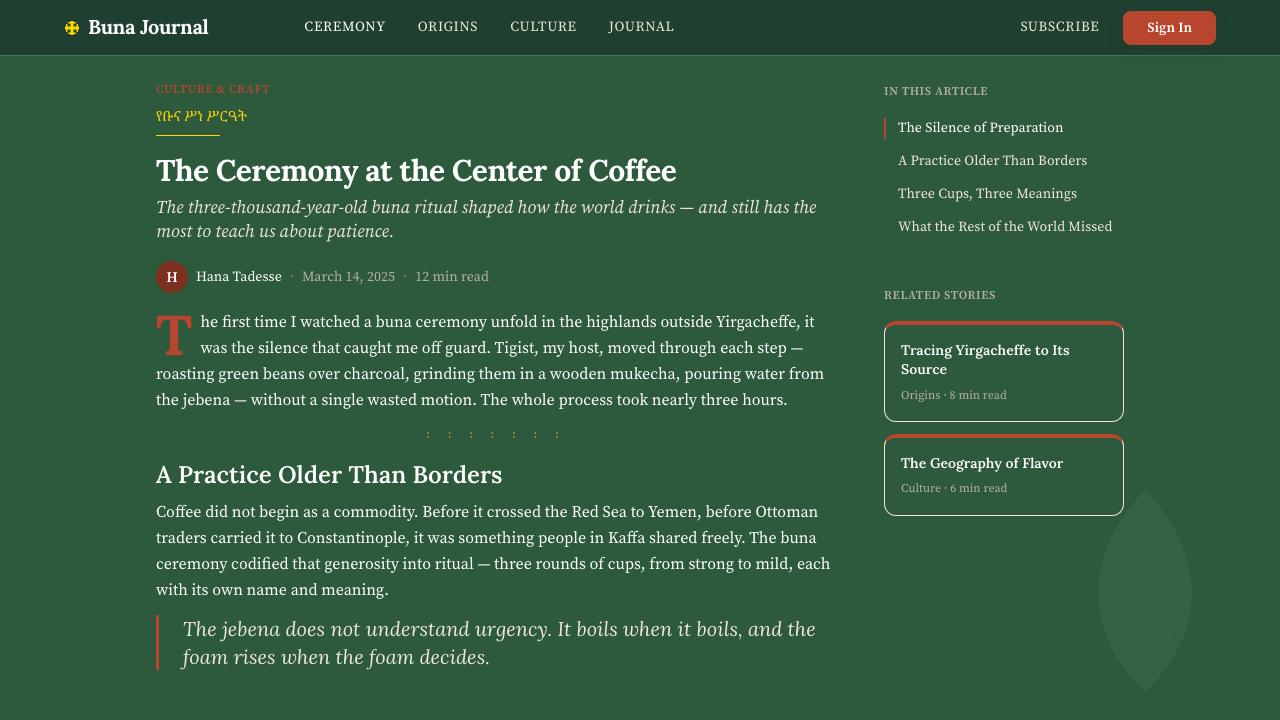
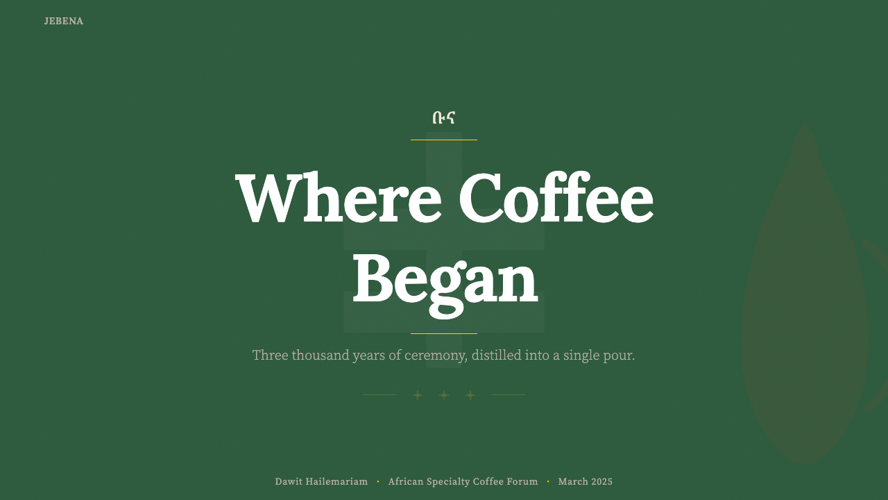
The typographic core is an editorial serif — a letterform with visible stroke contrast and bracketed serifs that reads as warm and authoritative rather than cold and mechanical. This is paired with Geʽez script characters used as structural ornaments: section dividers, large initial characters, or decorative borders. The pairing works because both writing systems share a quality of visible hand-making — the Geʽez syllabary was historically inscribed with reed pens, and the editorial serif carries its own calligraphic origins. Headlines are set large and spaced openly; body text is set at a comfortable reading measure with generous line height, reinforcing the unhurried, ceremonial pace of the buna ritual itself.字体核心是一套编辑风格衬线字体——带有可见笔触对比与括弧形衬线的字形,读来温暖而有权威感,而非冷漠机械。与之搭配的是吉兹文字符,用作结构性装饰:段落分隔线、大型首字符或装饰边框。这种搭配之所以有效,是因为两套书写系统都具有手工制作的可见质感——吉兹音节文字历史上以芦苇笔书写,而编辑衬线字体本身也携带其书法起源。标题大号、字间距开阔;正文以舒适的行宽排设,行高宽松,强化了布纳仪式本身那种从容不迫的仪式节奏。
Texture and Material质感与材料
Unlike geometric modernist styles that insist on flatness, Ethiopian Coffee Buna embraces visible texture as a carrier of meaning. The grain of handmade Ethiopian paper — characteristically uneven, warm, and slightly fibrous — appears as a background treatment or overlay that softens digital sharpness. Woven patterns drawn from habesha kemis textiles, characterized by their geometric border bands in contrasting colors, appear as framing devices for content blocks. These textures are always legible as references to specific material culture, not applied as generic 'organic' decoration. The effect is warmth without nostalgia, materiality without clutter.与坚持平面性的几何现代主义风格不同,埃塞俄比亚咖啡·布纳将可见的质感作为意义的载体加以拥抱。手工埃塞俄比亚纸张的纹理——其特征是不均匀、温暖、略带纤维感——以背景处理或叠加层的形式出现,软化数字媒介的锐利感。取自哈贝莎传统服饰的编织图案——以对比色几何边框带为特征——作为内容板块的框架装置出现。这些质感始终可以被解读为对特定物质文化的指涉,而非作为通用的「有机感」装饰应用。效果是温暖而不怀旧,有材料感而不杂乱。
Form and Silhouette形态与轮廓
The primary graphic form of this aesthetic is the silhouette — specifically the jebena pot, which appears as a logo anchor, section marker, or large illustrative element. The jebena's form is distinctively readable: a bulbous lower body, a long angled neck, and a small looped handle produce a silhouette that is both functional and sculptural. Secondary silhouettes include the coffee cherry cluster (three berries on a curved stem), the small handleless sini cup, and abstracted Geʽez letterforms used as graphic shapes. These silhouettes are rendered as flat solid forms, not as illustrations with shading, preserving the clarity of the overall compositional system.这套美学的主要图形形态是轮廓剪影——具体而言是杰贝纳壶,它作为标志锚点、段落标记或大型插图元素出现。杰贝纳的造型具有高度可识别性:鼓胀的下壶体、细长斜颈与小型环形壶把,产生一个既实用又雕塑感的轮廓。次要剪影包括咖啡樱桃串(弯茎上的三颗果实)、小型无柄西尼杯,以及作为图形形态使用的抽象化吉兹字母。这些轮廓均以实心平面形式呈现,而非带有明暗渲染的插图,以维护整体构图体系的清晰度。
Composition and Rhythm构图与节奏
Layouts in this style favor a slow, vertical rhythm rather than the horizontal speed of grid-heavy modernist design. Content is divided into generous sections separated by gold Geʽez ornamental dividers or bold horizontal rules, creating a sense of deliberate pacing — each section is a pause, like the three rounds of the buna ceremony. Asymmetry is present but unhurried: a large silhouette element anchors one side of a composition while open cream-colored space occupies the other, creating balance through weight rather than mirroring. The overall impression is that of a beautifully composed page in an illustrated book rather than a dashboard or a functional application screen.这种风格的版面偏好缓慢的垂直节奏,而非网格密集的现代主义设计所具有的水平速度感。内容被分割为宽阔的板块,以金色吉兹装饰分隔线或粗水平线分隔,营造出刻意节奏感——每个板块都是一次停顿,如同布纳仪式的三轮斟倒。非对称性存在但不急促:一个大型剪影元素锚定构图一侧,而开阔的奶油色空间占据另一侧,通过重量而非镜像取得平衡。整体印象是一本精美图文书的版面,而非仪表板或功能性应用程序屏幕。
Ornament and Restraint装饰与克制
Unlike purely minimalist systems, Ethiopian Coffee Buna does use ornament — but only ornament with cultural provenance. A Geʽez border is not generic decoration; it is a specific reference to a literate tradition. A textile-derived geometric band is not filler; it is a material memory. The discipline of the system lies in restricting decoration to elements with traceable origin, and in deploying each such element once and deliberately rather than repeatedly as pattern fill. The result is a sense of ceremonial sufficiency: everything present is meant to be there, and its presence carries weight.与纯粹的极简主义体系不同,埃塞俄比亚咖啡·布纳确实使用装饰——但只使用有文化出处的装饰。吉兹文边框不是通用装饰,它是对一套书写传统的具体指涉。源自织物的几何带纹不是填充物,它是物质记忆。这套体系的自律在于:将装饰限制在可追溯起源的元素上,并将每个此类元素一次性、刻意地部署,而非反复用作图案填充。结果是一种仪式性的充分感:所有在场的元素都应该在那里,且其在场携带着分量。
Imagery and Photography图像与摄影
When photography appears in this style, it is treated as a warm, textured document rather than a high-gloss commercial image. Coffee cherries on a branch, hands cupping a sini, the roasting of green beans over charcoal — images favor close physical proximity, natural light, and visible material imperfection. In layout, photography is framed with generous white or cream margins and sometimes overlaid with a warm tone wash that harmonizes the image with the earth-tone palette. Abstract illustrations — especially floral and botanical forms drawn from the coffee plant — appear as spot elements, rendered in the palette's three anchor colors against cream backgrounds.当摄影出现在这种风格中时,它被视为温暖的、带有纹理的文献记录,而非高光泽商业图像。枝头的咖啡樱桃、捧着西尼杯的双手、在木炭上烘焙生豆的场景——图像偏好近距离的物理接触、自然光线与可见的材料不完美性。在版面中,摄影以宽裕的白色或奶油色边距加以框定,有时叠加温暖的色调洗涂,使图像与大地色调色板和谐统一。抽象插图——尤其是取自咖啡植株的植物与花卉形态——作为点缀元素出现,以色板的三种基调色在奶油底面上呈现。
See the Ethiopian Coffee Buna design system查看 Ethiopian Coffee Buna 完整设计系统
Who shaped Ethiopian Coffee Buna?谁塑造了 Ethiopian Coffee Buna?
A pioneering voice in Ethiopian specialty coffee branding, Albabo's work on origin storytelling helped establish the visual and narrative framework through which Yirgacheffe and Sidamo coffees were presented to international specialty markets. By grounding brand materials in the specific geography and cultural practices of highland farming communities rather than generic African imagery, this approach set an early precedent for the terroir-specific visual language that later designers working in this aesthetic would formalize.埃塞俄比亚精品咖啡品牌建设的先驱声音,阿尔巴博在产区叙事方面的工作帮助建立了耶加雪菲与西达摩咖啡向国际精品市场呈现自身的视觉与叙事框架。通过将品牌材料扎根于高原农业社区的具体地理与文化实践,而非泛化的非洲图像,这一方式为后来从事这套美学实践的设计师将最终形式化的风土特定视觉语言树立了早期先例。
Working at the intersection of Ethiopian contemporary art and international brand design, Yirga contributed to the development of a visual system in which Geʽez script ornaments moved from ecclesiastical contexts into commercial and editorial design. Her practice demonstrated that the syllabary's visual weight and angular geometry could function as a modern design element without requiring the viewer to be literate in Geʽez — the forms carry authority and cultural signal independently of their semantic content.在埃塞俄比亚当代艺术与国际品牌设计的交叉领域工作,伊尔加对一套视觉体系的发展做出了贡献——在这套体系中,吉兹文字装饰从宗教语境迁移进商业与编辑设计。她的实践证明,这套音节文字的视觉分量与棱角几何感可以作为现代设计元素发挥作用,而无需观者具备吉兹文阅读能力——这些形态独立于其语义内容而携带权威感与文化信号。
Mekonnen's contribution to Ethiopian coffee visual culture centers on the integration of traditional craft objects — particularly the jebena, the sini, and the mekete roasting pan — into contemporary graphic systems as primary visual elements rather than nostalgic props. This move elevated everyday ceremony objects to the status of design icons, establishing the silhouette-based graphic vocabulary that is now central to the Ethiopian Coffee Buna aesthetic.梅科嫩对埃塞俄比亚咖啡视觉文化的贡献,集中于将传统工艺品——尤其是杰贝纳、西尼与梅凯特烘豆锅——作为主要视觉元素而非怀旧道具整合进当代图形体系。这一举措将日常仪式器物提升至设计图标的地位,确立了如今位于埃塞俄比亚咖啡·布纳美学核心的剪影式图形词汇。
As a writer and communications strategist whose work helped shape how the specialty coffee industry narrated its Ethiopian origins to global audiences, Neuschwander's influence runs through the editorial layer of this aesthetic. The style's practice of pairing visual richness with precise, encyclopedic origin storytelling — naming specific kebeles, elevation ranges, and processing methods — reflects the communications framework she helped develop. The text and the image work together to argue for specificity over generality.作为作家与传播策略师,诺伊施万德的工作帮助塑造了精品咖啡行业向全球受众讲述埃塞俄比亚产区起源的方式,其影响渗透于这套美学的编辑层面。这种风格将视觉丰富性与精确、百科全书式的产区叙事相结合的做法——具体到村级行政区(kebele)、海拔范围与处理方式——正是她所帮助建立的传播框架的反映。文字与图像协同工作,为特殊性而非泛化性进行论证。
How do you use Ethiopian Coffee Buna today?今天怎么用 Ethiopian Coffee Buna?
Ethiopian Coffee Buna is one of the more contextually specific design aesthetics in the Curio library — its authority derives from its cultural rootedness, and that rootedness makes it exceptionally effective for certain applications while genuinely unsuitable for others. Used well, it communicates ceremony, origin, warmth, and depth. Used carelessly, it reads as superficial cultural borrowing. The first question to ask before applying the style is whether the content has an honest relationship with the values the aesthetic embodies: slowness, provenance, material honesty, and communal ritual.埃塞俄比亚咖啡·布纳是Curio设计库中语境最为特定的美学之一——其权威感来自文化根植性,而这种根植性使它在某些应用中极为有效,在另一些场合则真正不适用。运用得当时,它传递仪式感、产区溯源、温暖与深度;运用不当时,它会被解读为肤浅的文化借用。应用这种风格之前,第一个要问的问题是:内容与这套美学所体现的价值观——缓慢、来源可溯、材料诚实与集体礼仪——是否存在真诚的关联。
For presentation slides, the style works best in contexts where storytelling and brand narrative take precedence over data density. A cover slide should anchor a large jebena silhouette or botanical coffee-plant illustration on one side, with the title set in a generous editorial serif on a warm cream ground; the Geʽez ornamental border or a thin gold rule frames the composition without enclosing it. Content slides should use the three-section vertical rhythm: a section heading in the forest-green anchor tone, body text in warm black on cream, and a single accent element — a small silhouette, a pull quote in rust-orange — to mark the slide's focal point. Data slides are the one area requiring restraint: the palette's warmth and ornamental character can compete with the legibility of charts. Use the forest green and rust-orange as fill colors for bar and line elements, keep backgrounds to cream only, and remove all textile or paper texture overlays.在演示文稿方面,这种风格最适合叙事与品牌故事优先于数据密度的场合。封面页应将大型杰贝纳剪影或咖啡植物插图锚定于一侧,标题在温暖奶油色底面上以宽松的编辑衬线字体排设;吉兹文字装饰边框或细金线为构图加以框定而不封闭。内容页应使用三段式垂直节奏:段落标题用森林绿基调色,正文在奶油底面上以温暖黑色排设,一个单独的强调元素——小型剪影或铁锈橙引文——标记每页的焦点。数据页是唯一需要克制的区域:色板的温暖感与装饰性可能与图表的可读性产生竞争。用森林绿与铁锈橙作为柱状图与折线图的填充色,背景严格限于奶油色,移除所有织物或纸张纹理叠加层。
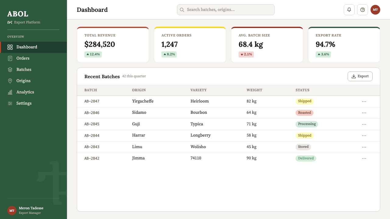
For web interfaces, the aesthetic translates well to brand-forward landing pages, origin-story sections within e-commerce sites, editorial features, and specialty coffee ordering experiences where the brand narrative is as important as the transaction. Dashboard and utility interfaces are a poor fit — the ceremonial pacing and textured backgrounds work against the rapid scanability those contexts require. On pricing pages, the style can work if the page is structured as a single long-form document rather than a comparison table: each tier becomes its own named section, set in the system's typographic hierarchy, with the gold ornamental divider marking transitions between tiers.对于网页界面,这套美学适合品牌导向的着陆页、电商网站内的产区故事板块、编辑专题,以及品牌叙事与交易同等重要的精品咖啡订购体验。仪表板与工具类界面不适合——仪式化的节奏与纹理背景会损害这些场合所需的快速可扫描性。在定价页面,若页面被构建为单一长式文档而非比较表格,这种风格是可行的:每个定价层级成为其自有名称的独立板块,在系统排版层级中排设,以金色装饰分隔线标记层级之间的过渡。
For editorial and marketing work — printed brand books, packaging, seasonal campaign materials, social cards — the style reaches its fullest expression. Coffee packaging in this aesthetic typically uses a deep forest-green ground for the primary face, with a centered jebena silhouette in rust-orange or antique gold and the origin name set in a combination of Latin serif and Geʽez script. Printed matter benefits from paper stock choices that reinforce the aesthetic: uncoated or lightly textured stocks echo the handmade paper reference, while glossy finishes work against it. Social card formats adapt well with a strict template: single background color, one silhouette, headline in large serif, single line of supporting text.对于编辑与营销工作——印刷品牌手册、包装、季节性营销物料、社交媒体卡片——这种风格达到其最完整的表达。采用这套美学的咖啡包装,通常以深森林绿作为正面主色,居中放置铁锈橙或古旧金色的杰贝纳剪影,产区名称以拉丁衬线字体与吉兹文字的组合排设。印刷品受益于强化美学的纸张选择:无涂层或轻度纹理纸张呼应手工纸张的参照,而光面纸张则与之背道而驰。社交媒体卡片格式以严格模板适配良好:单一背景色、一个剪影、大号衬线字体标题、一行支持性文字。
A common mistake when applying Ethiopian Coffee Buna is overloading the composition with ornamental elements — using the Geʽez border, the jebena silhouette, the textile band, and the paper-texture overlay simultaneously. The style's authority comes from the deliberate, single deployment of each element. A second common error is attempting to apply the palette to technology-forward or highly functional interfaces on the grounds that the brand happens to be a coffee product. The aesthetic communicates ceremony and slowness; if the interface needs to communicate speed and utility, there is a genuine mismatch that no color choice will resolve. Use Ethiopian Coffee Buna when the product's central promise is depth, origin, and ritual — not convenience.应用埃塞俄比亚咖啡·布纳时最常见的错误,是将装饰元素堆积于同一构图中——同时使用吉兹文字边框、杰贝纳剪影、织物带纹与纸张纹理叠加层。这种风格的权威感来自每个元素的刻意、单次部署。第二种常见错误是以「该品牌恰好是一个咖啡产品」为由,将这套色板应用于技术导向或高度功能性的界面。这套美学传递仪式感与缓慢;如果界面需要传递速度与实用性,那么存在真实的不匹配,任何色彩选择都无法解决。当产品的核心承诺是深度、产区与礼仪——而非便捷——时,才应使用埃塞俄比亚咖啡·布纳。
See the Ethiopian Coffee Buna design system查看 Ethiopian Coffee Buna 完整设计系统
Ethiopian Coffee Buna — FAQEthiopian Coffee Buna · 常见问题
Is this style appropriate for brands with no Ethiopian connection?这种风格适合与埃塞俄比亚没有直接关联的品牌使用吗?
The honest answer is: rarely, and only with care. The aesthetic's visual vocabulary is not generic African imagery — it is specific to Ethiopian material culture, the Geʽez writing system, and the buna ceremony. Applying it to a brand with no meaningful connection to these specifics produces work that reads as cultural appropriation rather than homage. The style works best when the brand, the product, or the content has a direct relationship with Ethiopian coffee culture: specialty coffee roasters sourcing from Ethiopia, origin-storytelling editorial, travel or hospitality brands with a genuine Ethiopian focus, or design work commissioned by Ethiopian organizations themselves.诚实的回答是:很少,且只有在谨慎处理的情况下才可能适用。这套美学的视觉词汇并非泛化的非洲图像——它特属于埃塞俄比亚物质文化、吉兹书写体系与布纳仪式。将其应用于与这些特定内容没有实质关联的品牌,会产生被解读为文化挪用而非致敬的作品。这种风格最适合品牌、产品或内容与埃塞俄比亚咖啡文化存在直接关系的场合:从埃塞俄比亚采购的精品咖啡烘焙商、产区叙事编辑内容、以埃塞俄比亚为真实重心的旅行或酒店品牌,或由埃塞俄比亚机构委托的设计工作。
How does Ethiopian Coffee Buna differ from a generic warm-earth-tone aesthetic?埃塞俄比亚咖啡·布纳与通用的暖大地色调美学有何区别?
The difference is specificity of reference. A generic warm-earth-tone aesthetic uses terracotta, ochre, and sage without those colors pointing to anything beyond a general mood of naturalness or warmth. Ethiopian Coffee Buna uses forest green because coffee-bush leaves are that particular green; rust-orange because jebena clay fires to that specific shade; antique gold because Geʽez manuscript gilding is that precise tone. The Geʽez script ornaments, the jebena silhouette, and the habesha textile pattern are not interchangeable with any other ethnic or cultural reference — they are exact. This specificity is what makes the style credible rather than atmospheric.区别在于参照的特定性。通用的暖大地色调美学使用赤陶色、赭黄与鼠尾草绿,这些颜色所指向的不过是自然或温暖的泛化氛围。埃塞俄比亚咖啡·布纳使用森林绿,是因为咖啡灌木的叶片正是那种绿;使用铁锈橙,是因为杰贝纳陶土烧制后正是那种特定色调;使用古旧金,是因为吉兹文手稿的镀金正是那种精确调子。吉兹文字装饰、杰贝纳剪影与哈贝莎织物图案,不可与任何其他民族或文化参照互换——它们是确切的。正是这种特定性使这种风格显得可信而非仅仅营造氛围。
Can this style work in a fully digital-native product, or does it require printed or physical materials to feel authentic?这种风格能在纯数字原生产品中有效运作,还是需要印刷或实体材料才能显得真实?
It can work digitally, but it requires translating the tactile references rather than literally simulating them. The handmade paper texture, for example, should not appear as a photographic scan tiled across a screen; instead, the principle it embodies — visible imperfection, warmth, grain — can be captured through careful color choices (off-white rather than pure white, muted rather than saturated tones) and gentle tonal variation in backgrounds. Similarly, Geʽez script elements work beautifully as SVG decorative components on digital screens; they do not require print to carry visual authority. The limitation is primarily contextual, not medium-specific: a fast-loading SaaS dashboard will not accommodate the aesthetic's ceremonial pacing regardless of whether it is digital or printed.可以在数字环境中运作,但需要转译触觉参照而非字面模拟它们。例如,手工纸张纹理不应以照片扫描形式平铺于屏幕上;相反,它所体现的原则——可见的不完美、温暖感、颗粒感——可以通过审慎的色彩选择(米白而非纯白,哑色而非饱和色调)与背景的柔和色调变化来捕捉。同样,吉兹文字元素作为SVG装饰组件在数字屏幕上效果很好;它们不需要印刷才能携带视觉权威感。局限主要是语境性的,而非媒介特定的:一个快速加载的SaaS仪表板,无论数字或印刷,都无法容纳这套美学的仪式化节奏。
What is the right way to use Geʽez script if my team does not include anyone literate in it?如果团队中没有人能阅读吉兹文字,应该如何正确使用它?
The Geʽez script should be used only in contexts where the characters are semantically meaningful, or explicitly as pure visual ornament in a way that the audience and any affected community would recognize as respectful. Using Geʽez characters that spell out a word in Amharic or Tigrinya without verifying the meaning is a production risk — the result could be nonsensical or offensive. The safer approach for teams without Geʽez literacy is to restrict use to established ornamental forms: traditional border patterns derived from Geʽez manuscript illumination, or single characters used as section markers after their form has been reviewed by someone with relevant expertise. When in doubt, a specialist consultant or direct partnership with Ethiopian designers is the correct path, not improvisation.吉兹文字应仅在字符具有语义意义的场合使用,或作为纯视觉装饰以受众与相关社群都能识别为尊重的方式呈现。在未经核实含义的情况下使用拼写阿姆哈拉语或提格里尼亚语词语的吉兹字符,是一种生产风险——结果可能毫无意义甚至冒犯他人。对于没有吉兹文识读能力的团队,更安全的做法是将使用范围限制在既有的装饰形式上:源自吉兹文手稿彩饰的传统边框图案,或在经具备相关专业知识的人士审核其形态后用作段落标记的单个字符。如有疑问,正确的路径是咨询专业顾问或与埃塞俄比亚设计师建立直接合作关系,而非即兴发挥。
How does this aesthetic handle light and dark mode?这套美学如何处理浅色与深色模式?
The canonical form of Ethiopian Coffee Buna is light-ground — cream and parchment backgrounds are central to the palette's warmth. A dark-mode inversion is possible but requires careful recalibration. On a very dark background, the forest green reads as nearly black and loses its character; the rust-orange can become aggressive; and the antique gold is the only tone that gains presence. A workable dark variant leans heavily on the gold as the primary accent and uses a very dark warm brown (closer to roasted coffee than to neutral black) as the ground, with cream reserved for primary type. The habesha textile and handmade paper textures generally do not translate well to dark modes and should be omitted rather than darkened.埃塞俄比亚咖啡·布纳的标准形态是浅色底面——奶油色与羊皮纸色背景是色板温暖感的核心。深色模式的反转是可能的,但需要谨慎的重新校准。在极深的背景上,森林绿几乎读作黑色并失去其特性;铁锈橙可能变得咄咄逼人;而古旧金是唯一增强存在感的色调。一套可行的深色变体应大量依赖金色作为主要强调色,以非常深的暖棕色(更接近烘焙咖啡而非中性黑)作为底色,奶油色保留给主要文字。哈贝莎织物与手工纸张纹理通常不能很好地转换至深色模式,应当省略而非加深处理。
Related design styles相关设计风格
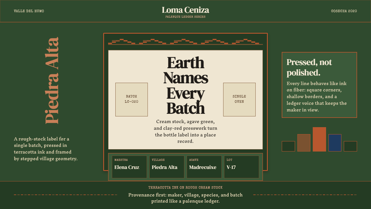 Mexican Mezcal CraftRooted and exact. Agave green, terracotta borders, and DM Serif labels tell t…质朴且精确。龙舌兰绿、赤陶边框与DM Serif标签记录批次。
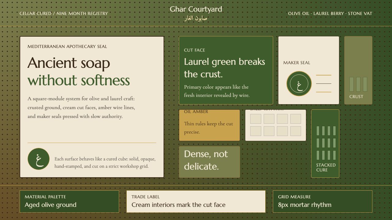 Syrian Aleppo Laurel SoapAncient without softness. Olive crust, laurel green, and stamped circles hold…古老而不柔软。橄榄皂壳、月桂绿与印章圆压住网格。
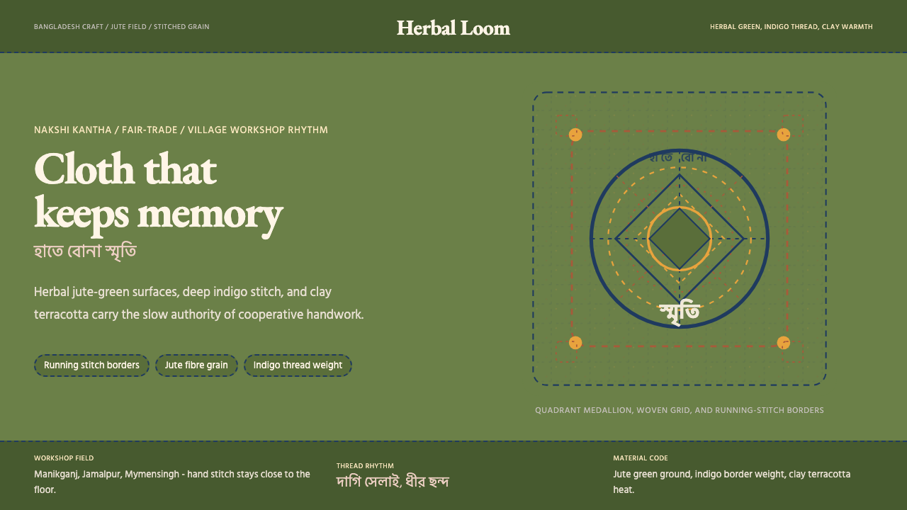 Bangladeshi Jute CraftMemory stays stitched. Jute green, indigo borders, terracotta warmth.记忆被缝进画面。黄麻绿、靛蓝虚线、陶土暖调。
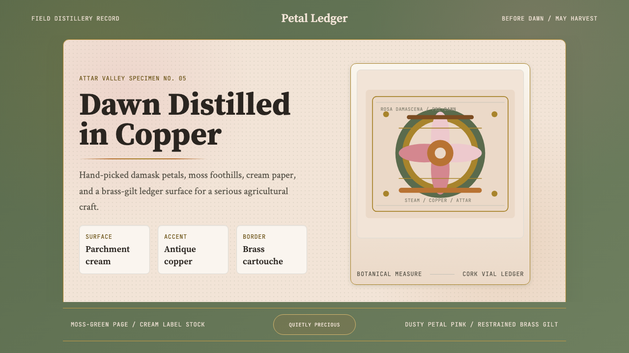 Bulgarian Rose Attar (Valley of Roses)Quietly precious craft. Moss green, dusty rose and brass borders frame a dawn…静谧而珍贵的农艺:苔绿、尘粉与黄铜边框装裱黎明标本。
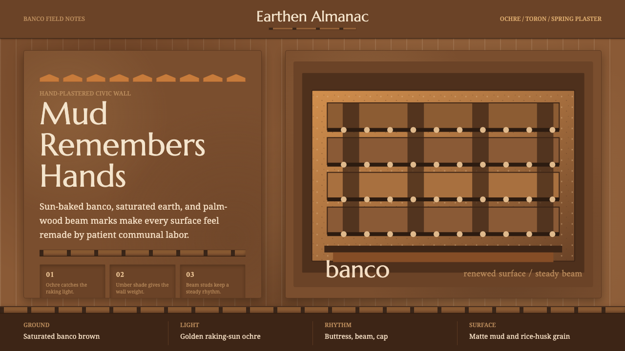 Djenné Mud MosqueBuilt from renewal. Banco brown, ochre caps, and toron grids feel hand-plaste…因更新而厚重。土棕、赭金尖帽与梁格呈现手抹泥墙。
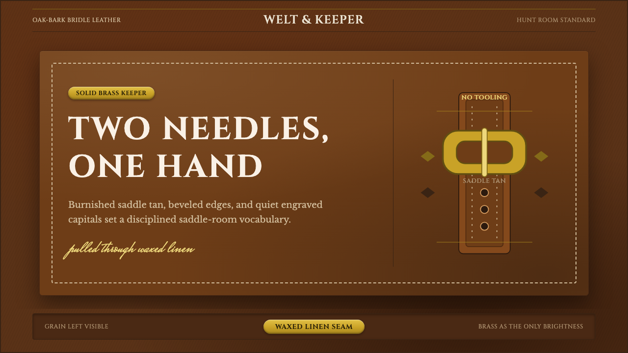 English Saddlery TanQuiet hand-made luxury. Saddle tan leather, brass accents, and waxed-linen st…安静的手工奢华。鞍棕皮革、黄铜点睛与蜡麻缝线。