What is Art Brut (Dubuffet, 1948)?
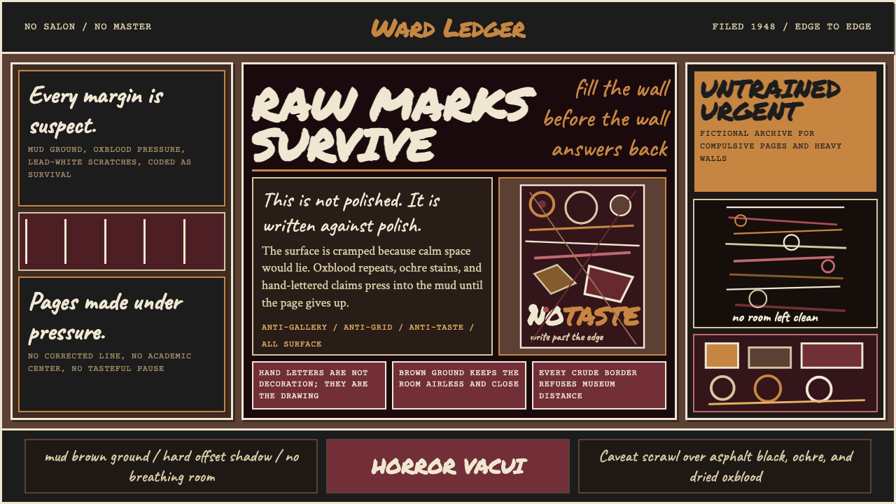
Art Brut tears up every rule of good taste — it is the art of those who drew because they had to, and the visual system that channels their obsessive energy into design.
Art Brut (Dubuffet, 1948) in brief
Art Brut — raw art — is the term Jean Dubuffet coined in 1945 and institutionalized in 1948 to describe work created entirely outside the fine-art establishment: the drawings of psychiatric patients, the obsessive manuscripts of visionaries, the carved and painted environments of self-taught recluses. Dubuffet saw in these works something that professional artists had lost — an urgency that had nothing to do with taste, training, or the desire for approval. The making was the thing itself.
The visual language of Art Brut is dense, insistent, and deliberately crude. Grounds are heavy and dark — mud brown, deep ochre, soot black — and marks are made on top of them with apparent ferocity: thick lines, scratched surfaces, letters that collide with images with no hierarchy between them. White space, where it exists at all, is filled. The horror vacui — the fear of emptiness — is not a flaw but a governing principle. Every available surface is treated as a surface to be marked.
As a design system, Art Brut channels that raw energy into interfaces and layouts that feel handmade under duress. Sophistication is the enemy. Finish is suspect. The goal is not to simulate outsider art decoratively but to import its structural convictions: that accumulation is more honest than restraint, that imperfection signals human presence, and that obsessive density can hold attention in a way that clean minimalism never quite manages.
Where does Art Brut (Dubuffet, 1948) come from?
Jean Dubuffet was born in Le Havre in 1901, the son of a wine merchant. He studied art briefly in Paris but spent his twenties running the family wine business, returning to painting only in his late thirties. This detour outside professional art circles may have sharpened his contempt for what he called l'art culturel — the polished, exhibition-ready art produced by those trained to produce it. When he returned to painting in the early 1940s, he did so as an explicit act of rebellion: deliberately rough surfaces, childlike marks, pigment mixed with tar and sand and gravel.
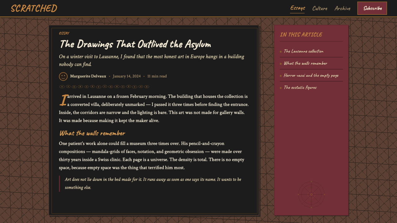
His real intellectual rupture came in 1945, when he visited psychiatric hospitals in Switzerland and encountered the work of patients whose art had never been made for public display. He was particularly struck by the drawings and paintings collected by the psychiatrist Walter Morgenthaler, who had documented the work of Adolf Wölfli — a Swiss patient who, over decades of institutionalization, produced more than twenty-five thousand pages of densely patterned manuscripts combining drawing, notation, and invented text. Dubuffet recognized in Wölfli's work something that the Paris galleries had systematically excluded: making as survival rather than making as career.
In 1948, Dubuffet formalized his collecting under the name La Compagnie de l'Art Brut and began assembling what would eventually become the Collection de l'Art Brut, now housed permanently in Lausanne, Switzerland, where it opened to the public in 1976. The collection includes works by Aloïse Corbaz, a Swiss woman institutionalized for schizophrenia who covered enormous sheets of paper with operatic figures in pure, saturated color; by Henry Darger, an American recluse whose fifteen-thousand-page illustrated novel was discovered only after his death; and by many others whose names were unknown during their lifetimes.
The movement's influence on mainstream design arrived indirectly — through punk graphics in the late 1970s (which inherited the horror vacui and the contempt for refinement), through grunge typography in the 1990s (which brought raw mark-making into commercial typography), and through the broader early-internet aesthetic in which crude HTML, lo-fi bitmaps, and hand-lettered GIFs created an unintentional vernacular. Contemporary digital design has revisited Art Brut deliberately, using its structural logic — density, imperfection, accumulation — as a counter-position to the clean-grid orthodoxy that dominates most product interfaces.
What defines the Art Brut (Dubuffet, 1948) look?
Color
The palette is anchored in earth and viscera: deep mud brown, dark ochre, oxblood red, and blackened grounds that feel dug from the earth rather than mixed from tubes. Against these heavy foundations, marks appear in raw white, chalky bone, and occasionally a raw primary — not as accent colors selected for harmony but as marks of urgency, the color of whatever was at hand. The overall effect is oppressive in the productive sense: the colors press toward the viewer rather than receding.
Mark-Making
The mark is the message. Lines are thick, gestural, and uneven — not the ruled lines of graphic design but the pressed lines of someone carving into a surface. Strokes often overlap, double back on themselves, and accumulate into textured fields. The impression is of a surface that has been worked, scratched, and re-worked: marks made by a person in a state of sustained intensity rather than by a process aimed at resolution.
Horror Vacui
The fear of emptiness is not incidental — it is structural. Art Brut compositions push marks to every edge, filling corners, margins, and any space that might otherwise read as deliberate breathing room. This total-surface coverage is one of the most distinctive qualities of the style and one of the most demanding to apply in design: it requires either genuine density of content or a willingness to introduce mark-making and texture as content in their own right.
Text as Image
In canonical Art Brut work — particularly in Wölfli's manuscripts — text and image occupy the same visual plane with no hierarchical separation. Letters are drawn, not set; they carry the weight and texture of marks rather than the neutrality of type. In design application, this principle manifests as hand-lettered headings, irregular baselines, and type treated as a graphic element rather than a container of content — legibility is respected but not prioritized over visual density.
Material Texture
Dubuffet's own paintings frequently incorporated sand, gravel, tar, and other non-traditional media mixed into the paint to create surfaces that were literally rough to the touch. In two-dimensional and digital design, this physical roughness translates into visual texture: grain overlays, irregular edges, surfaces that suggest the residue of process. Smooth, flat, and uniform surfaces are antithetical to the style; every element should appear to have been made under material constraints.
Figuration Without Refinement
Art Brut frequently depicts people, creatures, and environments, but with a total absence of academic refinement. Figures are distorted, compressed, elongated, and assembled from crude geometric approximations of anatomy. Eyes are circles or slashes, mouths are gashes, bodies are tubes. This unrefined figuration is not failure — it is a different standard of success, one in which expressive intensity outranks anatomical correctness. In design, it supports illustration styles that feel raw and handmade rather than polished.
Anti-Hierarchy
Professional design typically establishes clear visual hierarchies: primary information is larger, lighter, or more isolated than secondary information. Art Brut resists this. Every element competes with every other element for attention. Headlines shout at the same volume as captions; images press into type columns; margins collapse. This anti-hierarchical approach is genuinely difficult to apply in functional design without losing usability — the most successful applications introduce hierarchy covertly, through color or weight, while preserving the surface texture of equality.
Who shaped Art Brut (Dubuffet, 1948)?
Dubuffet (1901–1985) was the movement's founding theorist and most prominent practitioner. After years outside the art world running a wine business, he returned to painting in his late thirties with a fully formed contempt for academic technique. He collected obsessively, wrote polemically, and built the institutional apparatus — La Compagnie de l'Art Brut, later the Collection de l'Art Brut — that gave the movement its permanence. His own late paintings, the Hourloupe series begun in 1962, applied Art Brut's cellular, interlocking mark-making to large-scale canvas and eventually to architectural sculpture, demonstrating that the idiom could scale without losing its essential character.
Wölfli (1864–1930) was a Swiss psychiatric patient institutionalized in 1895 who, over the course of thirty-five years, produced more than twenty-five thousand pages of densely worked manuscripts. His images — which filled every available centimeter with interlocking figures, musical notation, invented scripts, and geometric borders — represent the most radical expression of horror vacui in the canon. The Swiss psychiatrist Walter Morgenthaler documented his work in a 1921 monograph, making Wölfli the first Art Brut figure to receive serious scholarly attention. Dubuffet considered him the supreme example of what Art Brut could be.
Aloïse Corbaz (1886–1964) was a Swiss woman who worked in the German imperial court before being institutionalized in 1918. Over the following decades she produced large-scale drawings on paper — and eventually on wallpaper, bed sheets, and other found surfaces — depicting operatic figures in intense, saturated color, often filling the image field with cascading fabric, hair, and ornamental detail. Her work demonstrates that Art Brut is not exclusively about darkness and heaviness: the chromatic intensity and figural exuberance of her drawings are as anti-academic as Wölfli's density, but in a completely different register.
Henry Darger (1892–1973) was an American recluse who worked as a janitor in Chicago for most of his adult life and was discovered, only after his death, to have produced a fifteen-thousand-page illustrated novel, In the Realms of the Unreal, accompanied by hundreds of large watercolor paintings. Darger's images — assembled from traced and collaged illustrations cut from children's books and magazines — are remarkable for their combination of visual delicacy with deeply strange narrative content. His story, entirely unknown during his lifetime, became one of the most cited examples of outsider art in the late twentieth century.
Carlo (1916–1994), born Carlo Zinelli, was an Italian Art Brut figure who, after working as a soldier and then a slaughterhouse laborer, was institutionalized in Verona in 1947. He developed an extraordinarily systematic visual language: repeated figurative motifs — running men, animals, vehicles — arranged in dense horizontal bands that circle the full perimeter of sheets of paper, often painted on both sides. His work illustrates how Art Brut, despite its associations with chaos and eruption, can be profoundly ordered — the order of a private cosmological system rather than of an external compositional convention.
How do you use Art Brut (Dubuffet, 1948) today?
Art Brut is not a naturally versatile style — its visual logic runs counter to the clarity-and-hierarchy principles that underpin most functional design. Applying it well requires deliberate decisions about where its particular qualities serve the communication and where they would undermine it. The style earns its place in contexts where rawness, intensity, and handmade authenticity are genuine values rather than decorative effects.
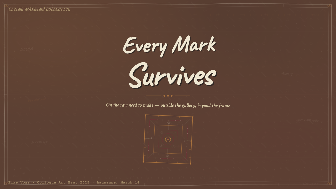
For presentation slides, Art Brut is most powerful on cover and section-break pages where the goal is impact rather than information density. A cover in this mode works with a heavy, textured ground, a single large figure or mark occupying the majority of the frame, and type that sits within the composition as a graphic element — drawn-feeling rather than set. Content slides require care: the style's anti-hierarchy instinct works against scannable bullet points and labeled charts. The most functional approach is to limit Art Brut's density to visual elements — textured backgrounds, hand-lettered labels, rough borders — while keeping body text in a readable but imperfect typeface. Data visualizations gain character when bars and areas carry texture rather than flat fills, but the underlying data structure must remain legible.
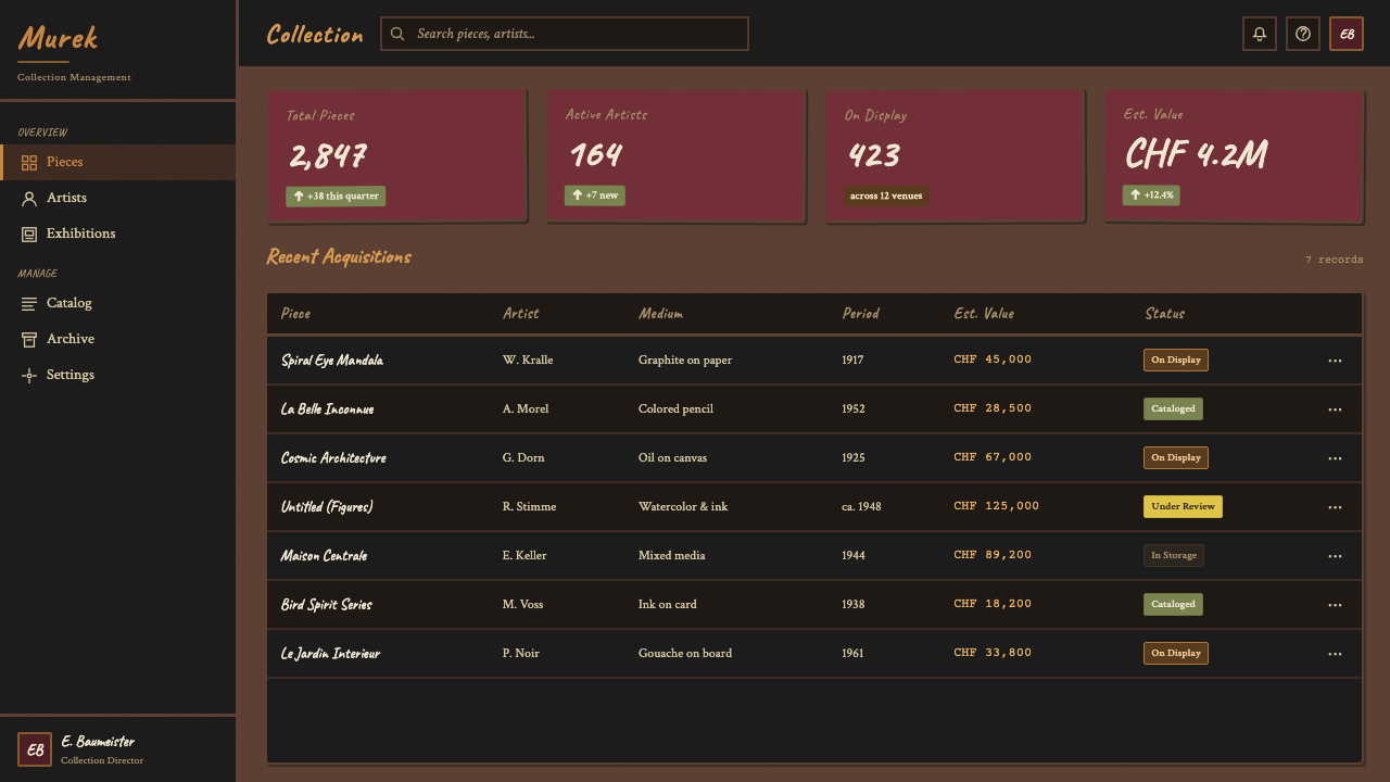
For web interfaces and dashboards, Art Brut is best applied selectively rather than globally. A full-site application of the style's density and anti-hierarchy would compromise usability for most audiences. Instead, the approach that works is importing specific properties: dark, textured backgrounds in hero sections; hand-lettered or rough-edged typographic treatments for display headings; card components with uneven borders or scratched-surface textures that suggest impermanence. Navigation and interactive elements benefit from remaining legible and predictable — the style's raw energy is best concentrated in expressive display areas rather than in utility components.
For editorial and marketing work, Art Brut has the most natural fit. Posters, album covers, book jackets, and campaign materials can absorb the full density of the style without functional compromise. A marketing page in this mode commits to a dark, heavy ground with text printed over it at full bleed, marks and textures layered across the surface, and a color palette drawn from earths and bloods rather than brand-safe pastels. The typography should feel worked rather than designed — irregular weight, inconsistent spacing, letterforms that suggest they were drawn. This approach signals authenticity, counter-culture credibility, and deliberate distance from the polished aesthetics that dominate most commercial design.
A common mistake when applying Art Brut is confusing texture with chaos. The outsider artists whose work defines the canon were frequently obsessive and systematic — Wölfli's manuscripts have rigorous internal logic; Carlo's repeated motifs follow strict rules of arrangement; Aloïse's color is intense but not arbitrary. Importing only the surface roughness without the underlying intensity produces work that reads as affected rather than raw. The other common failure is restraint misapplied: trying to use Art Brut as a textural accent on an otherwise clean design produces a hybrid that satisfies neither the clarity-seeker nor the rawness-seeker. Commit fully to the density, or use a different style.
Art Brut (Dubuffet, 1948) — FAQ
Is Art Brut the same as outsider art?
Art Brut is Dubuffet's specific term, coined in the 1940s, for work made entirely outside the professional art system by people with no art training and no intention of exhibiting. Outsider art is the broader English-language umbrella term that emerged in the 1970s and 1980s, partly through Roger Cardinal's 1972 book of that name, to describe a wider category that includes Art Brut but also self-taught artists who do exhibit, folk art traditions, and visionary art with religious motivation. Dubuffet himself rejected outsider art as too diffuse — he insisted that once an artist became aware of the art world and began making work for it, the essential quality of Art Brut was lost. In practice, the two terms are used interchangeably in English, though purists maintain the distinction.
How do you apply Art Brut aesthetics without appropriating or trivializing the original work?
This is a genuine tension. The original Art Brut makers were people in extreme circumstances — institutionalized, marginalized, often suffering — and their work has authentic urgency precisely because of those circumstances. Treating their visual language as an aesthetic choice requires honesty about the distinction between form and origin. The most defensible approach is to engage seriously with the structural principles — density, mark intensity, anti-hierarchy, horror vacui — rather than with surface markers. It also means avoiding the biographical as aesthetic: the goal is not to simulate madness or suffering but to understand why a particular visual logic arises from those states and whether that logic serves your design problem. The worst applications of Art Brut aesthetics are those that perform rawness while actually being quite controlled and commercially motivated — which is, ironically, precisely what Dubuffet argued against.
Can Art Brut work in dark mode or is it only a light-background style?
Art Brut is historically a dark-ground style — the foundational works by Dubuffet, Wölfli, and many others use heavy, dark backgrounds as their primary surface. The mud brown, soot black, and deep ochre that characterize the palette are ground colors, not accent colors. In this sense, Art Brut is naturally suited to dark mode, or more accurately, it was never primarily a light-background style to begin with. The challenge in dark mode is maintaining legibility of the marks against the dark ground — in the original paintings, the marks are often made in chalky white or pale pigment that reads clearly against earth-dark surfaces. In digital dark mode, the equivalent would be off-white, bone, or warm gray marks on very dark backgrounds, with the occasional raw primary as a point of intense contrast.
What is the difference between Art Brut and punk or grunge graphic design?
Punk and grunge graphic design share Art Brut's rejection of refinement and its embrace of roughness, but they arise from completely different origins and carry different cultural meanings. Punk design (associated with designers like Jamie Reid) is a deliberate political provocation — cut-and-paste ransom note aesthetics chosen to shock and offend the established order. Grunge typography (associated with figures like David Carson) is a formal experiment in illegibility and the limits of readability, applied within a commercial context. Art Brut, by contrast, was never made as provocation or as experiment — it was made by people who had no awareness of art movements or design trends. The rawness is not a choice but a condition. When contemporary design borrows Art Brut aesthetics, it is borrowing from a source that has no awareness of being borrowed from, which distinguishes it from punk and grunge, both of which were highly self-conscious about their own transgression.
Is Art Brut suitable for brands that want to appear trustworthy or professional?
Generally not, and the mismatch matters. Art Brut's visual language signals intensity, rawness, and independence from convention — qualities that are assets for music labels, independent publishers, cultural institutions, certain food and drink brands, and any brand that wants to position itself against mainstream polish. They are liabilities for financial services, healthcare, legal services, enterprise software, and any context where the user needs to trust that systems are reliable and controlled. The crude mark, the dark ground, and the horror vacui all suggest the opposite of institutional reliability. A rare exception is a brand that is specifically positioning itself as an antidote to corporate blandness in its own sector — where Art Brut aesthetics can function as a deliberate signal of differentiation — but this requires the brand to have already established credibility by other means.
Related design styles
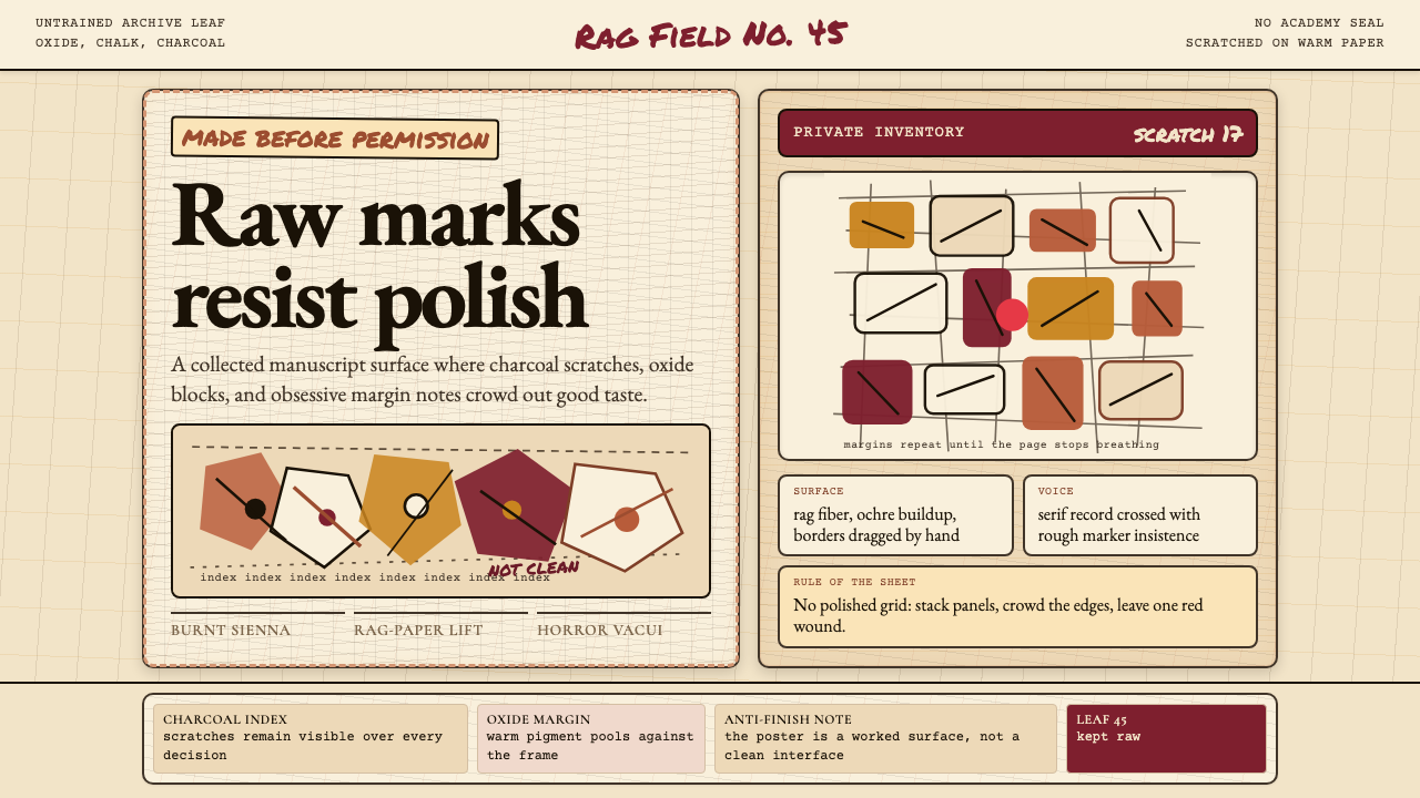 Art Brut (Dubuffet)Polish is refused. Bone-cream paper, earth pigments, scratched borders, dense…
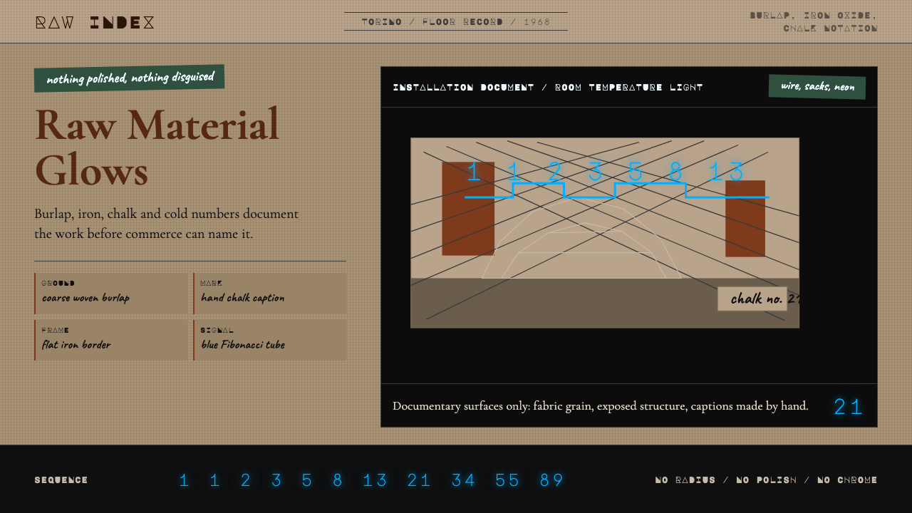 Arte Povera (Merz, 1968)Material refuses polish. Burlap ground, rust serif, chalk marks, neon Fibonac…
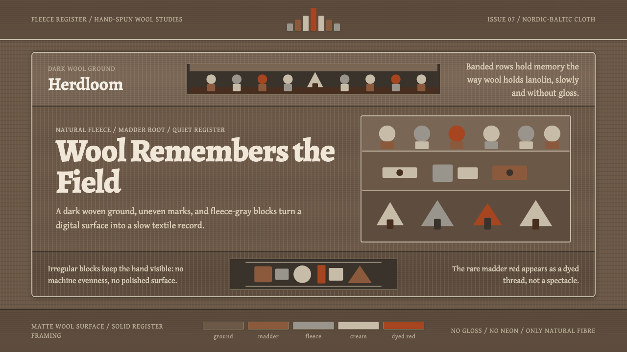 Estonian Folk Tapestry (Anu Raud)Quiet wool carries memory. Banded fleece browns and Alegreya type move like a…
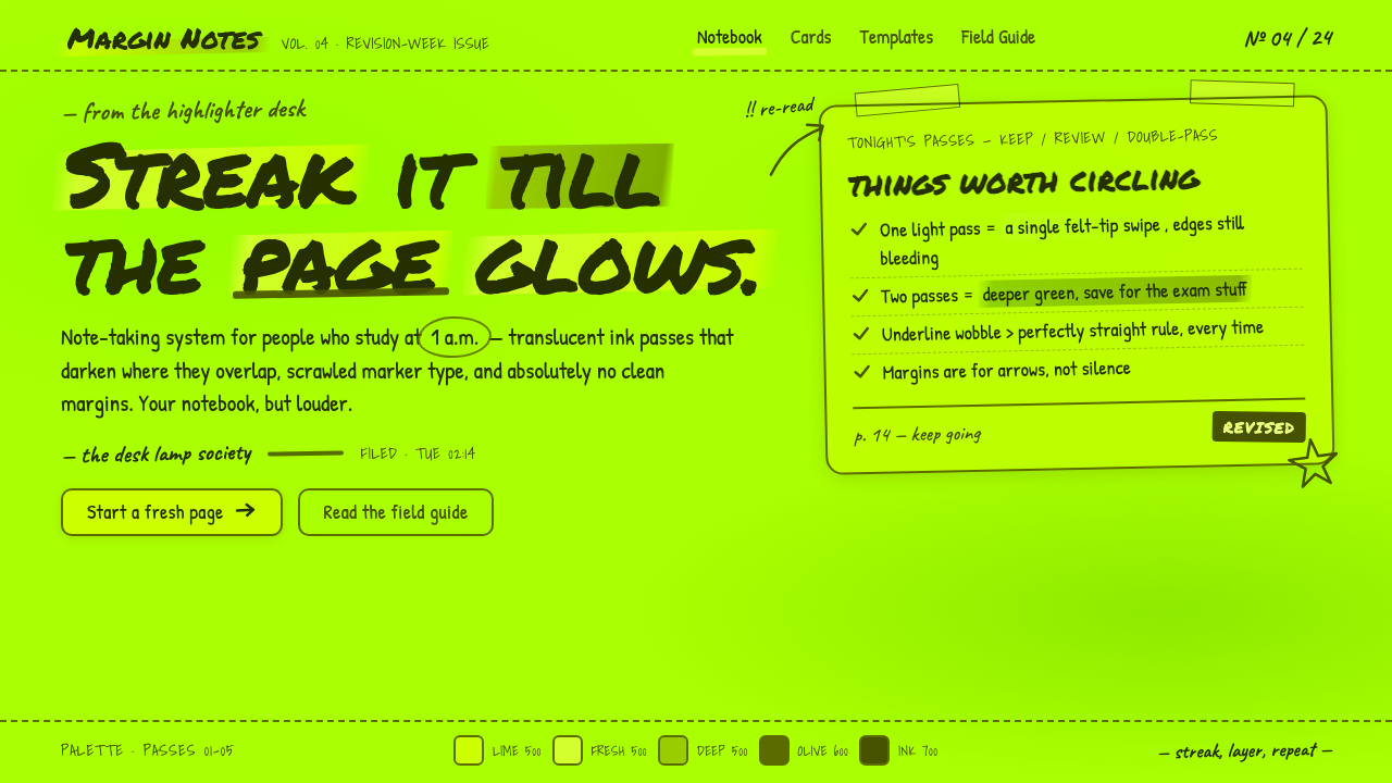 Fluorescent HighlighterStudy notes at 1am, made into a system. Translucent lime ink layered until th…
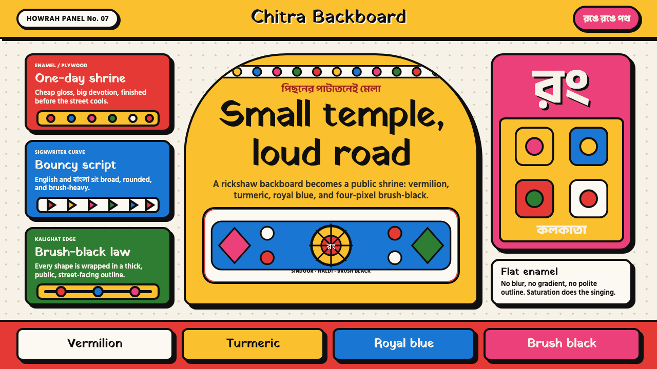 Bengali Rickshaw ArtStreet devotion shouts. Vermilion-haldi panels and brush-black arches turn pl…
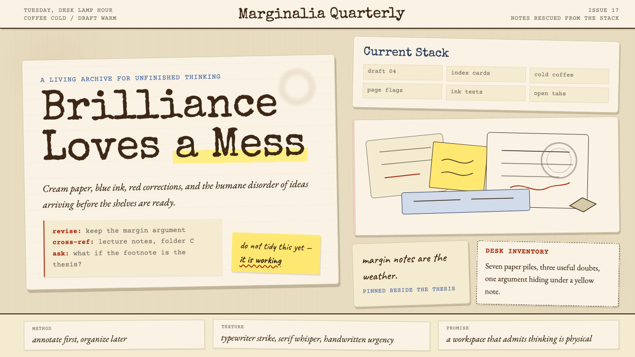 Chaotic AcademiaThe productive mess of a real scholar. Coffee rings, marginalia, post-its hal…