What is Estonian Folk Tapestry (Anu Raud)?
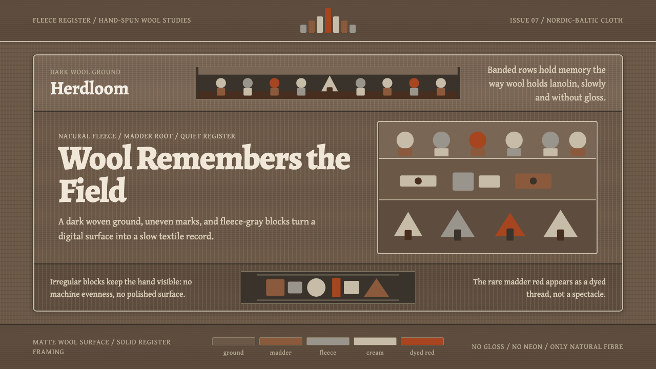
Estonian Folk Tapestry turns undyed wool into a quiet archive, where earthen bands, humble figures, and the steady rhythm of weaving carry memory without spectacle.
Estonian Folk Tapestry (Anu Raud) in brief
Estonian Folk Tapestry, as represented by the work of textile artist Anu Raud, is a wool-based visual language rooted in Estonia and the wider Nordic-Baltic craft world. Its defining materials are hand-spun yarns made from the undyed fleece of naturally coloured Estonian sheep. Fleece gray, natural cream, deep brown-black, and warm madder brown form a restrained palette whose variations come from fibre itself rather than from decorative color effects.
The imagery is direct and deliberately unpolished. Naive human figures, rams, and trees are simplified into compact silhouettes and irregular blocks, then arranged in horizontal registers that recall both woven borders and sequences of communal memory. The figures do not seek anatomical realism. Their weight, repetition, and placement matter more than detail, allowing a person, animal, or tree to function simultaneously as an image, a sign, and a unit in the larger woven structure.
Translated into a contemporary design system, the style retains the darkness, warmth, and patience of wool. Humanist serif type, especially the literary character suggested by Alegreya, carries language with softness and dignity. Broad horizontal groupings establish the loom-like rhythm, while irregular edges preserve a sense of the hand. Gloss, neon brightness, polished gradients, and synthetic brilliance are excluded; the desired atmosphere is tactile, grounded, and quietly enduring.
Where does Estonian Folk Tapestry (Anu Raud) come from?
The style belongs to the Estonian folk-textile revival and the broader field of Nordic-Baltic craft. Its source is not an abstract theory of rustic decoration but a material practice: sheep provide naturally varied fleece, the wool is hand-spun without dye, and the woven surface preserves those variations rather than correcting them into industrial uniformity. In this context, brown, gray, cream, and near-black are not merely selected colors. They record the character of the fibre and make the finished tapestry inseparable from the material from which it was made.
Anu Raud developed her tapestry practice in Estonia during the period identified with 1950–1990 and continued beyond it. Her work places recognizably folk-derived subjects within a disciplined woven order. Rams refer directly to the animal source of the wool, while human figures and trees bring social life and the natural landscape into the same visual field. These subjects appear as concentrated signs rather than descriptive scenes, allowing the tapestry to communicate through resemblance, rhythm, and inherited familiarity.
Horizontal registers are central to that communication. Instead of organizing a composition around a single illusionistic scene, the tapestry proceeds in bands. One register may hold repeated figures, another a row of trees or compact blocks, and another a quieter interval of wool. The result resembles memory arranged through recurrence: motifs return with small differences, pauses separate one passage from the next, and the eye travels across the surface as the woven structure itself was built.
The contemporary digital interpretation preserves this lineage by translating principles rather than imitating fibre literally. A dark wool-like ground supplies depth; muted blocks behave like areas of woven fleece; serif typography introduces a human, literary voice; and horizontal pacing recalls the movement of a loom. The translation succeeds when the screen feels calm and materially conscious. It fails when folk motifs become novelty decoration or when digital polish erases the irregularity that gives the source tradition its authority.
What defines the Estonian Folk Tapestry (Anu Raud) look?
Natural Wool Palette
Color begins with undyed fleece: soft gray, natural cream, dark brown-black, and warm madder brown. The palette should feel related rather than sharply separated, as though every hue belongs to the same flock and landscape. Contrast comes from placing pale wool against a dark ground or setting a warm brown beside a cooler gray. Bright synthetic accents would interrupt the material logic and turn restraint into costume.
Horizontal Registers
Content is organized in broad horizontal bands that evoke both the construction of a tapestry and the measured passage of a loom. Each band can carry a distinct type of information, motif, or tonal density, but all belong to one continuous surface. Alternating active and quiet registers creates pace without relying on dramatic transitions. The eye moves laterally, pauses, and continues, producing an experience closer to reading a woven sequence than scanning a conventional grid.
Folk Figures
People, rams, and trees are reduced to sturdy, naive silhouettes. Their simplification should feel confident rather than childish: a few irregular masses establish stance, species, or branching structure without descriptive detail. Repetition gives the motifs communal force, while small variations keep them from becoming mechanical icons. They work best as integrated parts of a band, not as isolated mascots floating above the composition.
Humanist Serif Type
Typography should possess warmth, readable texture, and a modest literary character. Alegreya provides the intended direction: its humanist serif forms can sit comfortably beside irregular woven imagery without appearing either clinically modern or ceremonially antique. Hierarchy comes through measured shifts in scale, emphasis, and spacing. Dense display effects, rigid geometric lettering, or aggressively polished type would compete with the patient voice of the wool.
Irregular Block Forms
Shapes appear cut, woven, and slightly uneven rather than mathematically perfected. An edge may step, taper, or change direction with the quiet unpredictability of hand-spun fibre. These irregularities must remain controlled enough to support clear composition; random distressing is not a substitute for craft. The goal is a surface where variation feels inherent to making, not applied afterward as a digital effect.
Matte Material Depth
Depth comes from tonal layering and the implied density of wool, not from gloss or theatrical lighting. Pale motifs may seem to rest upon a dark woven field, yet their edges remain matte and self-contained. Shadows, if suggested at all, should feel like differences in fibre or overlap rather than atmospheric illumination. The result is substantial without becoming slick: a visual weight that resembles cloth absorbing light.
Unhurried Negative Space
Empty areas act like quiet stretches of wool between narrative motifs. They prevent the bands from becoming decorative clutter and give individual figures enough presence to register as signs. Spacing should be generous but not airy in a polished modernist sense; it remains dense, warm, and connected to the surrounding surface. Silence is part of the composition, just as an unfigured passage remains part of a tapestry.
Who shaped Estonian Folk Tapestry (Anu Raud)?
Anu Raud is the central artist associated with this visual language. Her handwoven tapestries use hand-spun, undyed wool from her own naturally coloured Estonian sheep, binding material source and artistic subject into one practice. By arranging naive people, rams, and trees in horizontal registers, she gives folk imagery a disciplined monumental presence while preserving the warmth and irregularity of handmade fibre.
The Estonian folk-textile revival supplies the cultural frame for the style. It treats inherited motifs, local wool, and established craft rhythms as living resources rather than museum fragments. Within this frame, tradition is sustained through continued making: familiar figures can be simplified, rearranged, and given new compositional roles without losing their connection to collective memory.
Nordic-Baltic craft describes the wider regional context in which natural materials, restrained color, practical construction, and cultural memory reinforce one another. In this tapestry language, regional craft is not expressed through polished simplicity alone. It is present in the density of wool, the acceptance of irregular edges, the muted relation between colors, and the conviction that material character should remain visible in the finished work.
How do you use Estonian Folk Tapestry (Anu Raud) today?
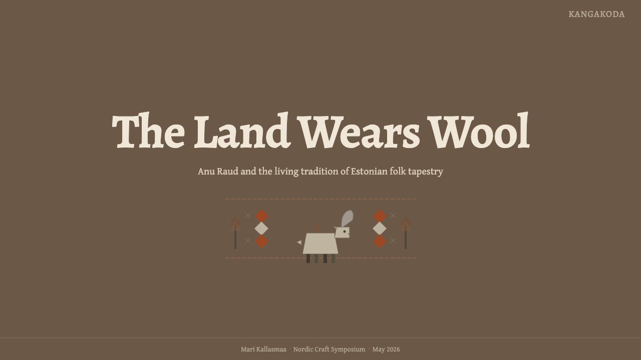
For presentation slides, the style is strongest when the deck is treated as a sequence of woven registers. A cover can place a single folk figure, ram, or tree within a broad dark field, accompanied by a warm serif title and one quieter line of context. Content pages should use horizontal bands to separate argument, evidence, and annotation. The composition may be asymmetrical, but it should feel settled, with muted blocks balancing one another like differently coloured sections of wool.
Data slides benefit from simplification and repetition. Bars, categories, or stages can become low, sturdy blocks arranged across a shared baseline, while small folk-like signs distinguish themes without turning the information into illustration. The palette should establish groups through natural tonal families rather than loud contrast. Tables need clear reading order and calm intervals; excessive rules would compete with the woven rhythm. The aim is to make information feel accumulated and comparable, as though each datum were another strand contributing to a larger pattern.
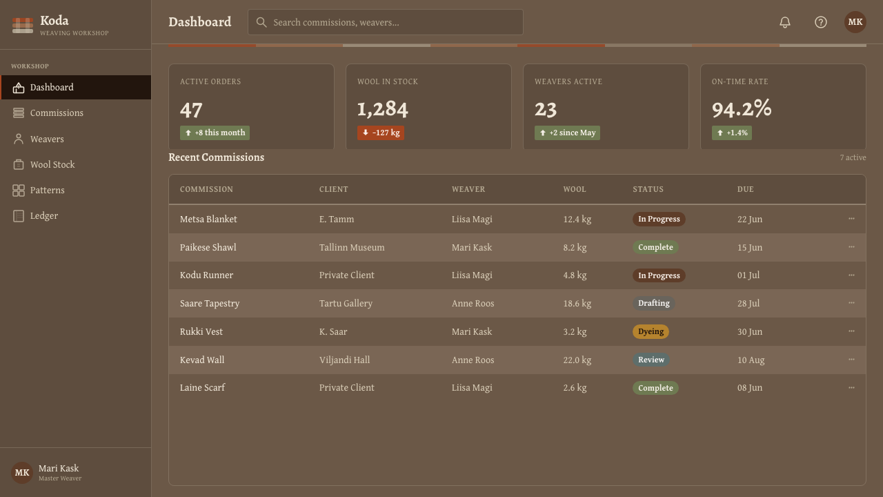
For web interfaces, Estonian Folk Tapestry suits dashboards, archives, cultural platforms, and pricing pages that need warmth without informality. A dark wool ground can support cream reading surfaces or banded content regions, while warm brown accents identify actions and selected states. Cards should feel like sections of one textile rather than detached floating objects. Pricing tiers can be distinguished through motif, tonal density, and typographic emphasis, with the most important option receiving stronger placement rather than artificial shine.
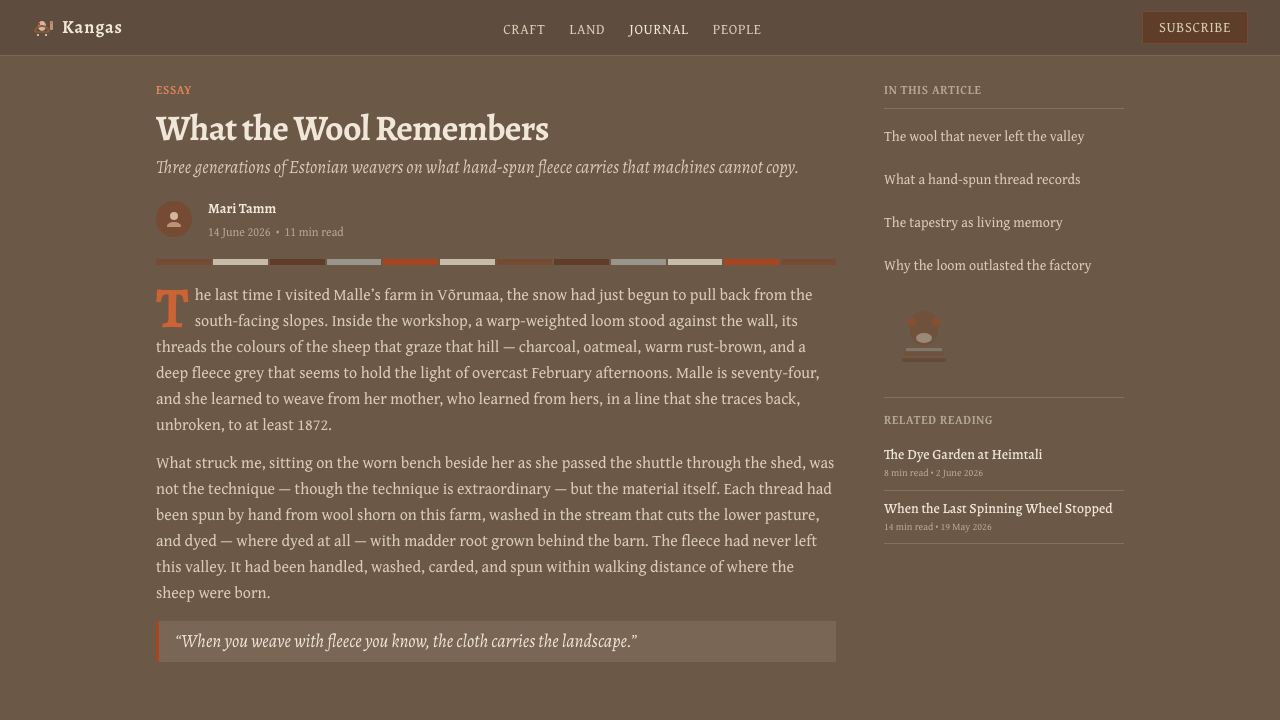
Editorial and marketing applications should use the style as a narrative structure. Long-form articles can alternate text passages with horizontal image bands, pull quotations, or simplified figures that act as chapter markers. Marketing pages can build momentum through successive registers: an opening statement, a quieter material story, a repeated field of benefits, and a concluding call to action. The voice should remain patient and sincere. Short, forceful slogans are possible, but they should be grounded by generous explanation and tactile imagery.
The most common mistake is to equate folk character with decorative abundance. Filling every band with trees, rams, borders, and rough textures turns a disciplined tapestry language into themed ornament. Another error is simulating wool with conspicuous digital noise while leaving the underlying layout glossy and hurried. Begin instead with structure: dark ground, muted tonal relations, deliberate horizontal pacing, warm serif type, and a few carefully repeated motifs. Material atmosphere should emerge from the whole system, not from a texture pasted over it.
Estonian Folk Tapestry (Anu Raud) — FAQ
Is this style simply a dark rustic theme?
No. Darkness and earth colors are visible features, but the style depends more deeply on the relationship between material, motif, and structure. Undyed wool determines the tonal range; folk figures connect the surface to shared memory; horizontal registers reflect the logic of weaving. A generic rustic interface may use brown backgrounds and rough textures while ignoring all three relationships. The result can look atmospheric, but it is not the same design language.
Why is undyed wool so important to the palette?
Because the colors are evidence of the material rather than decoration applied to it. Gray, cream, brown, and brown-black arise from naturally coloured fleece, so their relationship feels coherent even when the tones vary. Preserving that relationship gives the tapestry visual integrity and connects the finished surface to sheep, hand-spinning, and place. In digital work, the lesson is not to imitate every fibre but to keep colors muted, related, and materially believable.
Can photography be used with Estonian Folk Tapestry design?
Yes, provided photography supports the material atmosphere instead of overwhelming it. Images of fibre, hands, sheep, landscape, or woven surfaces can sit naturally within horizontal bands when their color remains restrained. Photography should be cropped as part of the register and balanced with quiet areas of type or wool-like color. Highly polished commercial imagery, brilliant lighting, and glossy product reflections would introduce a visual tempo foreign to the style.
How should folk motifs be adapted for a digital interface?
Reduce them to a few sturdy shapes and give each motif a clear structural role. A tree can mark a section, a ram can identify a category, and a row of human figures can express participation or community. Keep outlines and silhouettes slightly irregular, but do not add arbitrary damage. Most importantly, use motifs sparingly. They should help organize reading and reinforce meaning, just as woven figures belong to a register, rather than behaving as decorative stickers.
Where does the style work poorly?
It struggles when a product depends on speed, spectacle, synthetic brilliance, or a deliberately futuristic voice. Neon entertainment interfaces, glossy luxury presentations, and aggressively animated promotional pages conflict with its quiet fibre, muted palette, and unhurried rhythm. It can also become too heavy for dense operational tools if every surface uses dark wool tones. The style is most convincing when memory, craft, culture, land, or patient storytelling already belong to the subject.
Related design styles
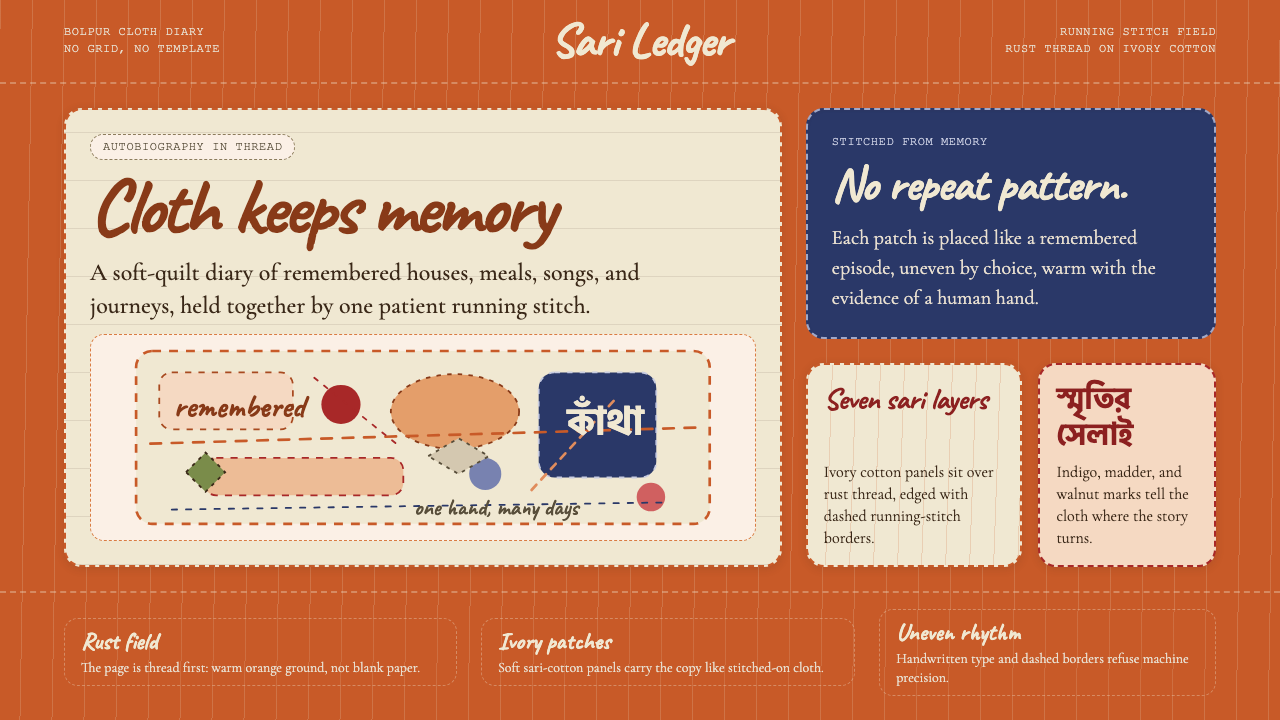 Bengali Kantha Running StitchAutobiography in thread. Rust stitch fields and Caveat lettering float on ivo…
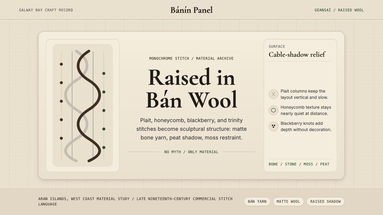 Irish Aran Island Cable KnitMaterial honesty raised in wool. Bone ground, moss ink, and cable columns cas…
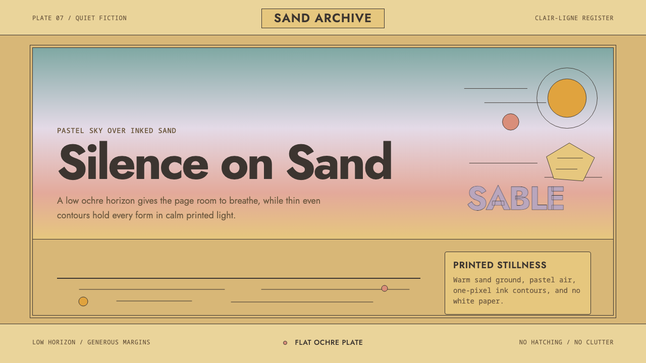 Sable (Mœbius)Still desert science fiction. Ochre ground, pastel sky, and thin ink contours…
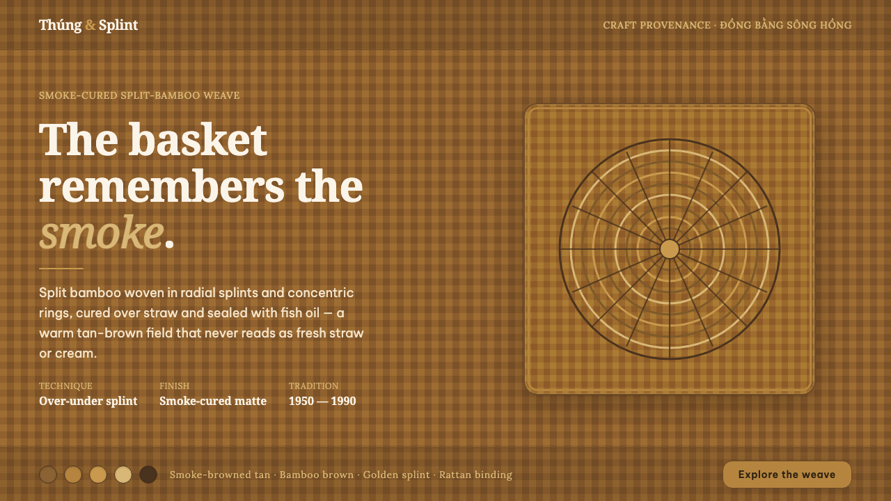 Vietnamese Bamboo BasketryThe basket remembers the smoke. Tan-brown woven ground, concentric splint rin…
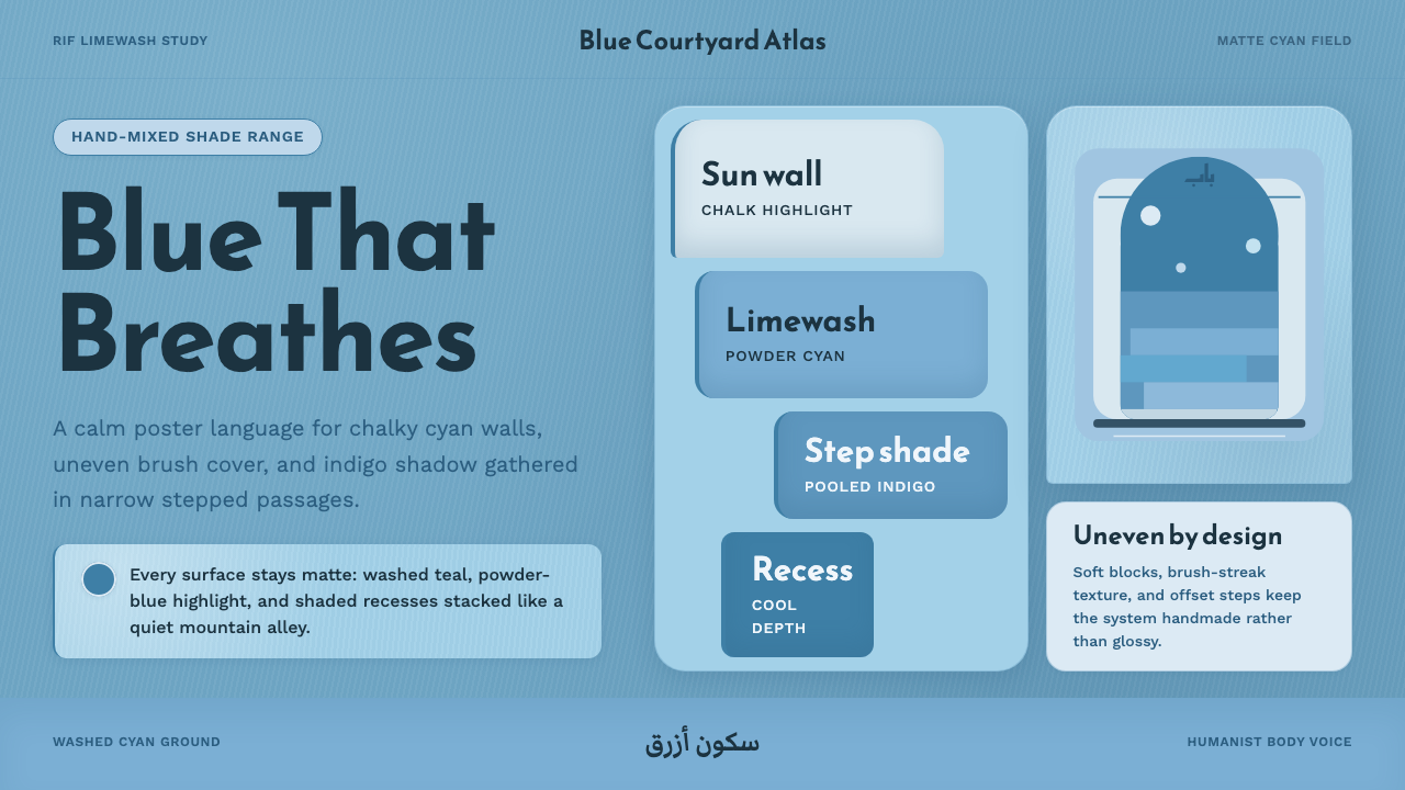 Chefchaouen Blue MedinaCalm becomes architecture. Chalky cyan, Reem Kufi type, and offset steps hold…
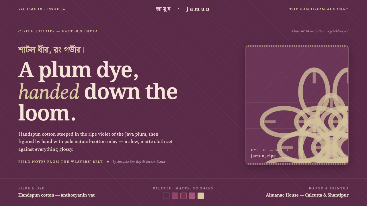 Indian Jamun Violet HandloomHandspun, never glossy. Jamun-violet dyed cotton figured with pale natural-th…