What is Bohus Stickning?
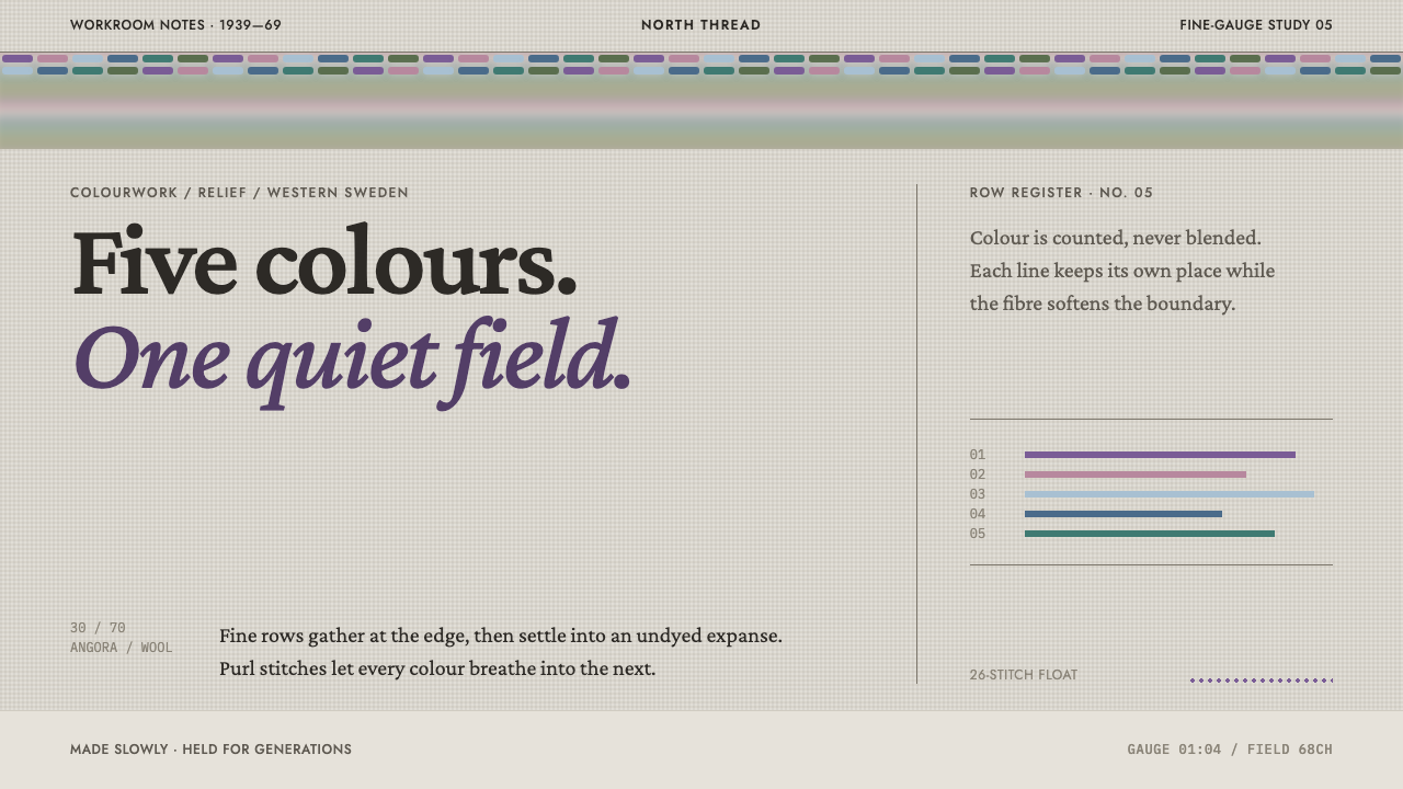
Bohus Stickning is colourwork at rest: a dense crown of small stepped motifs set above a broad, unbroken field of undyed wool, with every edge softened by a halo.
Bohus Stickning in brief
Bohus Stickning is a design language drawn from the knitwear made by the Bohus Stickning cooperative in Bohuslän, on the west coast of Sweden, between 1939 and 1969. Its signature composition is a yoke: a dense band of small, stepped motifs worked across the top of the garment, and below it a broad field of undyed wool that is left almost entirely quiet. The design system keeps that structure literally, placing a concentrated pattern band across the top of the page and a calm, open surface underneath it.
Colour in this style arrives in discrete rows. A single row of the original knitting could carry as many as five colours, but each row is a step, and the eye reads the colours as a sequence of small stages rather than as a smooth ramp. Purl stitches were set inside the pattern on purpose, interrupting the flat surface of the fabric, and the angora in the yarn put a soft halo around every edge, so that neighbouring hues seem to bleed into each other a little. The overall impression is of richness delivered with restraint: many colours, but each one placed and held.
The calm part of the composition matters as much as the busy part. The undyed field below the yoke is not an unfinished area; it is half of the design. It gives the dense band somewhere to rest, lets the pattern read clearly, and gives the whole garment, and so the whole page, a feeling of ease. A layout in this style is a short passage of detail followed by a long breath of space.

Where does Bohus Stickning come from?
Bohus Stickning began in 1939 in Bohuslän, western Sweden, when Emma Jacobsson set up a knitting enterprise to give the wives of stonecutters paid work. It was a relief project in the plain sense: the point was to get unemployed families an income. Over the thirty years until it closed in 1969, the enterprise turned that modest purpose into the finest colourwork Sweden has produced. The garments it made are still recognised by their combination of extreme fineness and unusual colour.
The look came directly from the material and the method. The yarn was a blend of fine wool and angora, roughly seven parts wool to three parts rabbit hair, and it was knitted at a very fine gauge, so the stitches are small and the motifs can be detailed. A single row could hold up to five colours, and the strands carried behind the work could float across as many as twenty-six stitches. Purl stitches were deliberately placed within the pattern, breaking the smooth surface of the knit so that the colours blur along the angora's fuzzy halo. That glow is the quality for which these garments are remembered.
The structure of the garment was as deliberate as its surface. Patterns were concentrated in a yoke, narrowing in rings downward from the neckline, and the rest of the body was left in undyed wool. The patterned portion occupies only a small part of the sweater, and the plain area is treated as an equal half of the design. Everything the system later borrows comes from these two decisions: a dense band of detail above, and a wide field of calm below.
The enterprise belongs to two traditions at once. It was one of the Swedish relief-work craft cooperatives, organisations that used traditional handwork to provide income, and it also belongs to mid-century Scandinavian textile design, with its taste for clean structure and quiet colour. The key figures attached to the style in the source record are Emma Jacobsson, Anna-Lisa Mannheimer Lunn, Kerstin Olsson, Annika Malmström-Bladini and Karin Ivarsson, which reflects how the style was shaped by several hands rather than a single author.
What defines the Bohus Stickning look?
The yoke band
The pattern is concentrated in a dense band across the top, in the manner of a yoke narrowing in rings from the neckline. The motifs inside it are small and stepped, repeating closely so the band reads as a single textured crown. In layout terms, this is the one place where detail is allowed to be dense, and the band acts as both a header and a signature for the page.
The calm undyed field
Below the band the surface is an unbroken field of undyed wool. It is not empty; it is half of the design, and it gives the pattern its meaning by contrast. The field is warm, soft and light, and it holds body text, data and photographs without competing with the band above. Anything placed here should be allowed to breathe, since the calm is what the style is selling.
Stepped colour rows
Colour changes in discrete rows, one step at a time, with no smooth blending. A single row could hold up to five hues, and the eye reads the sequence as a series of distinct stages. For a screen design this means avoiding gradients and instead moving between colours in clean steps, so that the transitions between areas look woven rather than airbrushed.
The angora halo
Angora in the yarn puts a soft fuzzy halo around every colour boundary, so edges are never hard cuts. The effect is that neighbouring hues appear to bleed together a little, giving the surface a glowing, slightly dreamy quality. In design, this translates into edges that leave room to soften, with narrow transitional tones between adjacent colours, not blurred shadows or hard outlines.
Broken surface
Purl stitches were placed inside the pattern on purpose, interrupting the smooth plane of the knit. This breaks up the regularity of the surface and lets colours bleed together along the fuzz. In a layout, it argues for a little irregularity inside the pattern band: small interruptions in the rhythm, so that it feels worked by hand and not generated by a perfect repeat.
Fine scale
The knitting was done at a very fine gauge, so the stitches and therefore the motifs are small. The detail in the band is delicate, closer to embroidery than to bold graphic pattern. A design in this style keeps its ornament at a small scale and lets the surrounding calm field provide the contrast, instead of enlarging the motifs to fill the page.
Restrained palette
Five haloed hues crown the top, and the field below stays in the natural colour of undyed wool. The hues are chosen to sit together softly, with none shouting. The restraint is structural: because the base is neutral and light, the few colours in the band have room to be noticed, and the overall page reads as gentle even when the pattern is rich.

Who shaped Bohus Stickning?
Emma Jacobsson set up Bohus Stickning in Bohuslän in 1939, with the aim of giving the wives of unemployed stonecutters a way to earn money. The enterprise she began ran until 1969 and became the source of the finest colourwork knitting made in Sweden. Her role in the story is that of founder: the person who turned a relief project into a craft house with a distinct identity, which the design system treats as the origin of the style.
Anna-Lisa Mannheimer Lunn is named in the source record alongside the cooperative's founder as one of the key figures of the style. The record gives no individual biography for her, but her place on the list places her within the circle of people credited with shaping Bohus knitwear. Credit lists like this matter in a cooperative craft, where garments were worked by many hands and the identity of the house was collective.
These three names complete the roster of key figures that the source record attaches to the style, alongside Emma Jacobsson and Anna-Lisa Mannheimer Lunn. The record does not separate their contributions, so the honest reading is collective: Bohus Stickning is credited to several people, which suits an enterprise founded as a cooperative. The design system takes the same view and treats the style as a shared language, not as one person's signature.
The women who took up the needles in 1939 are the real workforce behind the style. Their hands carried the strands, set the purl stitches and placed up to five colours in a single row at a very fine gauge. Their anonymity is part of the cooperative story: the garments are known by the house that made them, but the quality of the surface, the evenness of the rows and the glow of the halo are the work of these knitters.
How do you use Bohus Stickning today?
Bohus Stickning is a style about proportion: a small, dense passage of ornament and a large quiet field. Applying it well means respecting that ratio. It suits subjects that want to feel gentle, crafted and unhurried, and it works best when the pattern band is genuinely compact, the calm field is genuinely open, and the colours move in steps. It is a poor match for layouts that need ornament everywhere or that depend on a strong gradient.
For presentation slides, a cover can put a narrow stepped-motif band across the top edge and leave the rest of the slide as a calm, light field for the title and subtitle. Content slides can repeat the band as a slim header, so each slide begins with a small crown of pattern and then opens into space for text. Data slides work well when charts use a few distinct hues in clean steps, set on the open field, with the pattern band reserved as the only decorative element.
For web interfaces, the hero is the natural home of the band: a patterned strip at the top of the page with a broad quiet area beneath for the headline and the main call to action. Pricing tiers can each take one hue from the palette, applied as a thin stepped strip above the card, with the card body left calm. Dashboards should keep the body in the neutral field and use stepped, not smooth, colour scales for heat or progress, so the data reads as woven rather than airbrushed.
For editorial and marketing work, the style suits textile, fashion, craft, Scandinavian lifestyle, heritage, wellness and slow-travel subjects. A lookbook or article can open with a pattern band as a masthead and then set the story in a generous undyed field, with images placed in soft, light surrounds. Long-form text is comfortable here because the calm field is designed to be read in, and the pattern band can reappear at the end as a quiet sign-off.
The most common mistake is to spread the pattern across the whole page. Once the motifs fill the calm field, the proportion that defines the style is gone, and what remains is just a busy pattern. Other frequent errors are using smooth gradients where the style calls for discrete steps, adding more than a handful of saturated hues, and drawing hard outlines where a soft halo belongs. Keep the band compact, the field calm and the edges gentle.

Bohus Stickning — FAQ
What was Bohus Stickning?
Bohus Stickning was a knitting cooperative in Bohuslän, western Sweden, founded in 1939 by Emma Jacobsson to give the wives of stonecutters paid work. It ran until 1969 and is remembered for the finest colourwork knitting Sweden has produced: very fine gauge, angora-blend yarn, and up to five colours in a single row. The design system takes its visual structure from the sweaters, especially the dense patterned yoke above a broad field of undyed wool.
How do you translate the angora halo into a screen design?
The halo is a soft zone around each colour boundary, caused by the fuzz of the angora. On a screen, the faithful translation is not a blur or a drop shadow. It is a narrow transitional tone between adjacent colours, so that edges have a little room to soften and neighbouring hues seem to bleed together. Keep the rows themselves as distinct steps, and let only the edges carry the halo.
Why does the style leave so much of the page empty?
Because the empty area is half of the design, not a gap in it. On the original sweaters the pattern occupies only the yoke, and the undyed body below is deliberately left plain. That contrast is what lets the dense band read clearly, and it gives the garment its calm. On a page, the open field plays the same role: it lets the pattern band stand out and gives body text and data somewhere comfortable to live.
Why does the style use stepped colour rather than gradients?
Because knitting is built from discrete stitches in discrete rows, and colour in the original work changes one row at a time. The eye reads the result as a sequence of distinct steps, not a smooth blend. Using gradients would break that logic and make the page look airbrushed. Stepped colour keeps the look woven, and it also reads clearly in charts and progress indicators, where distinct bands are easier to compare than smooth ramps.
What is Bohus Stickning good for, and where does it struggle?
It is good for gentle, crafted, unhurried subjects: textiles, fashion, wellness, heritage, slow travel, and products that want to feel considered. It struggles with very dense, information-heavy interfaces, where the large calm field can feel wasteful, and with urgent or high-energy marketing, where its softness reads as hesitant. It also depends on having room: on a very small screen the band and the field are hard to give their proper proportion.
Related design styles
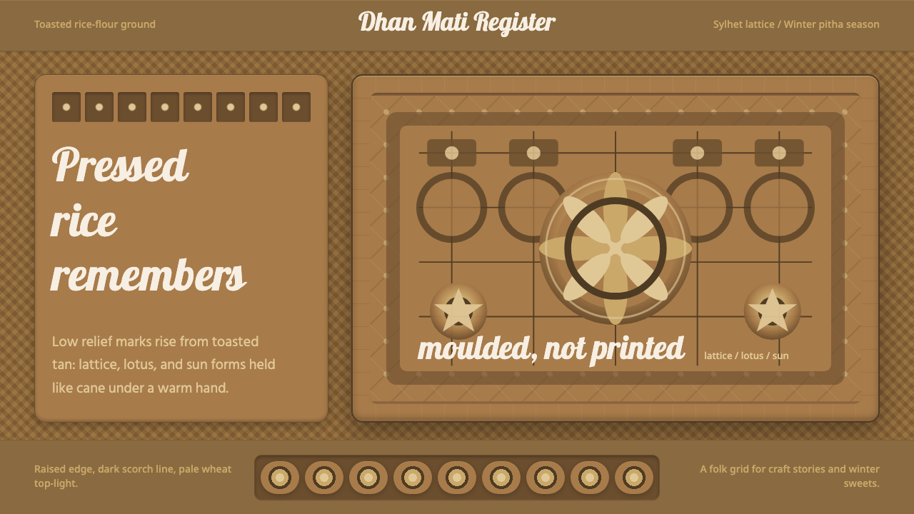 Bangladeshi Nakshi Pitha MotifsWarm relief, never print. Galada type and tan lattice press rice-flour craft…
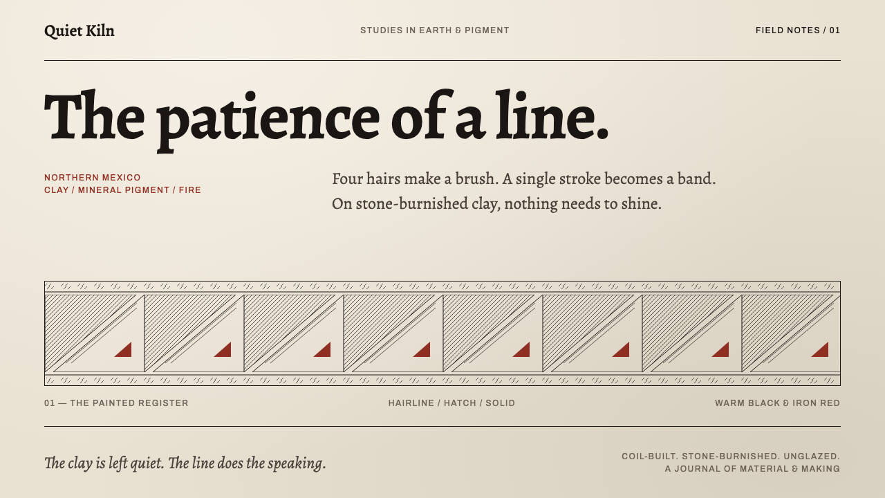 Mata Ortiz PotteryThe line does the speaking. Hairline black and iron-red hatching band a burni…
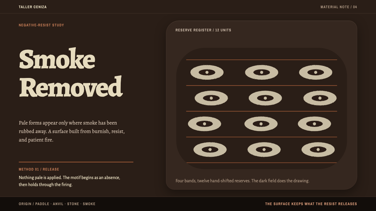 Chulucanas CeramicsSmoke becomes ornament. Bone-cream reserves break a burnished black field in…
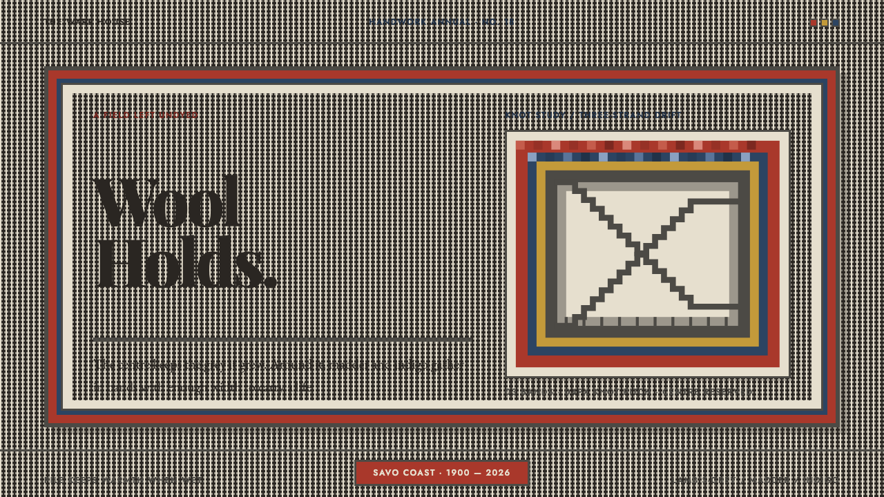 Finnish RyijyWool holds its ground. Lamb's-grey centres meet stepped madder and indigo ban…
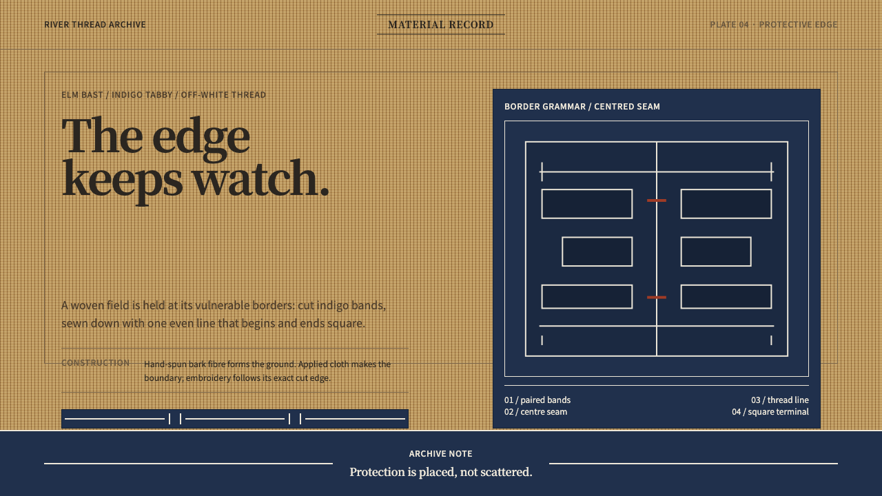 Ainu Attus RobeProtection is cut, not painted. Indigo bands and square-ended thread hold elm…
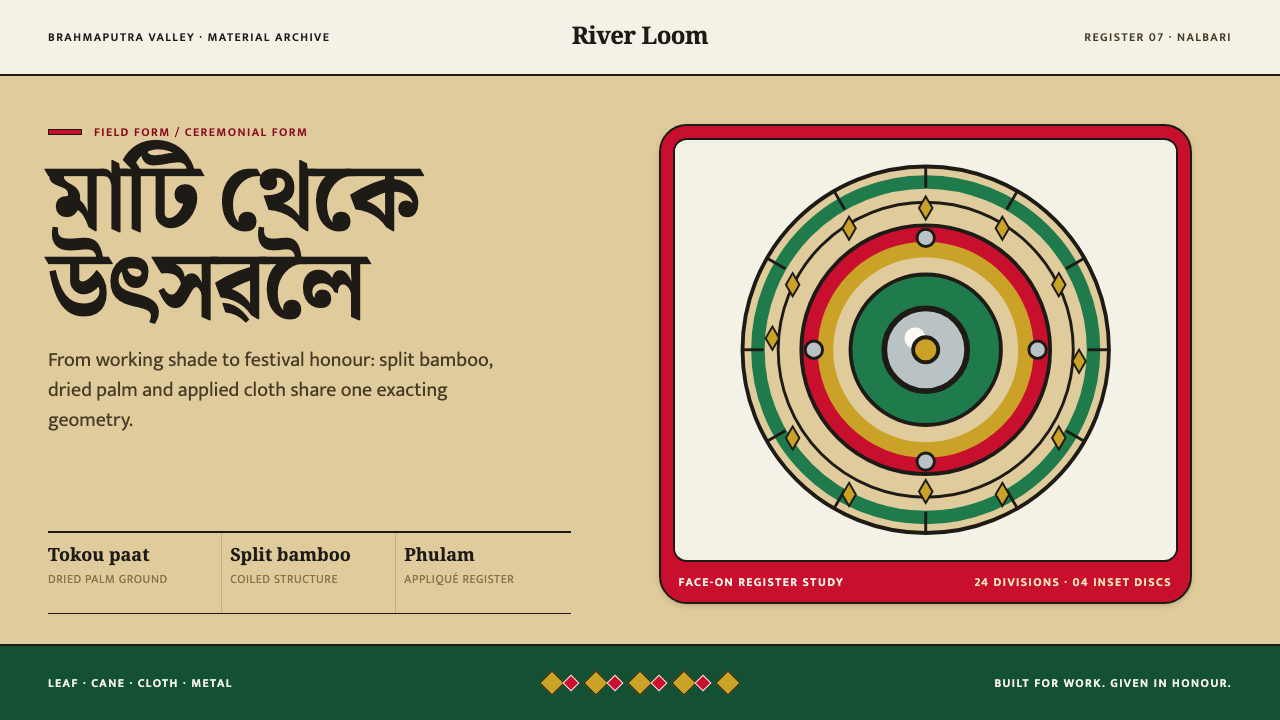 Assamese JapiWork becomes ceremony. Straw-gold rings carry green appliqué, festival red an…