What is Mata Ortiz Pottery?
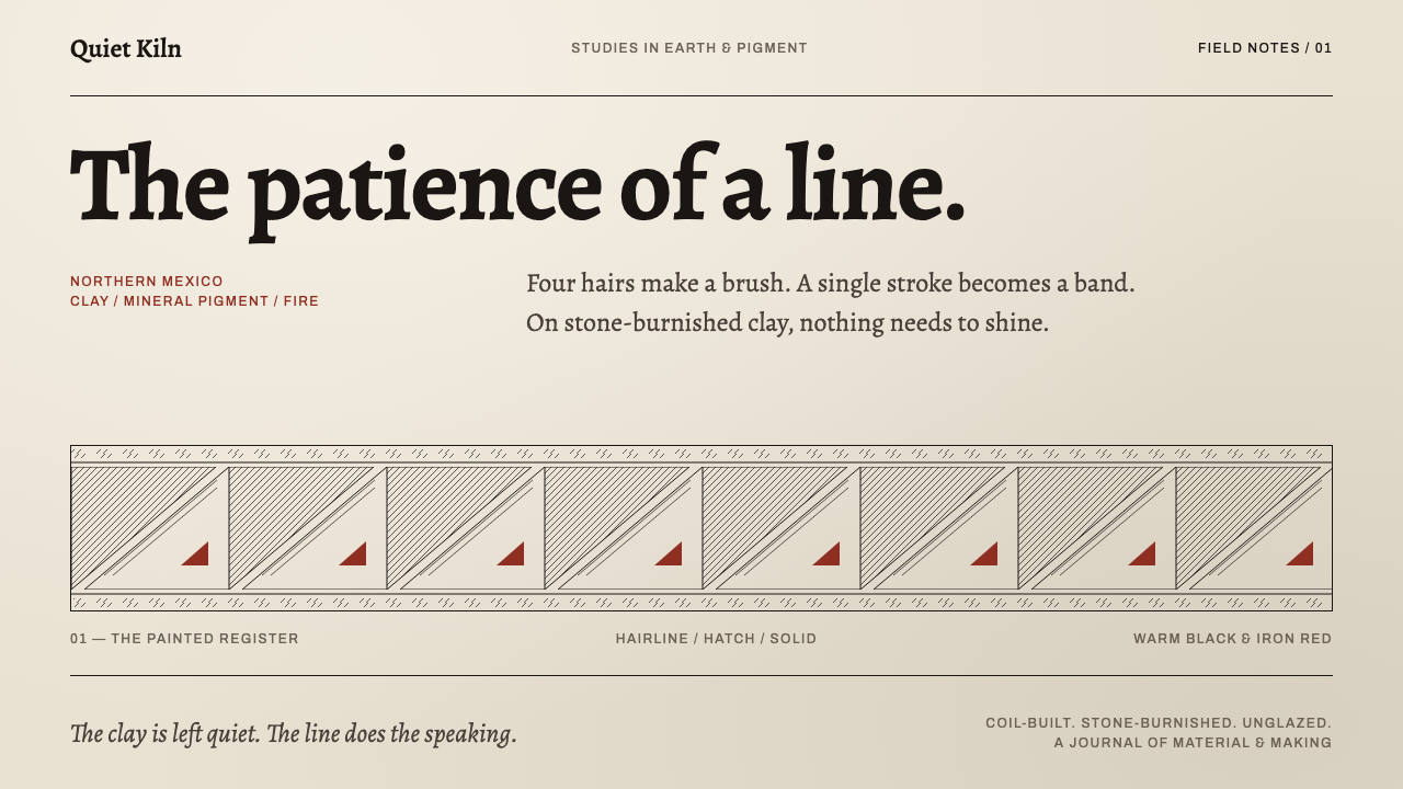
At Mata Ortiz the line does the speaking — a brush of human hair drawing hairline, hatch and solid around a burnished curved wall, with quiet clay left bare above and below.
Mata Ortiz Pottery in brief
Mata Ortiz Pottery is the visual language of the hand-built ceramics of Juan Mata Ortiz, a village in the state of Chihuahua in northern Mexico, in the Casas Grandes and Paquimé valley. The pots are coil-built without a wheel, burnished with a smooth stone, and painted with a brush made of four or five human hairs. Behind them lies a story of revival: Juan Quezada Celado reverse-engineered a dead ceramic tradition from potsherds, then taught it to everyone around him.
The style takes that brush as its design system. Line weight carries the whole vocabulary, and it comes in three strengths: hairline, hatch and solid. These are banded into registers that wrap a curved wall, with quiet unpainted clay left above and below. Nothing floats and nothing glazes. Every mark is a stroke laid by hand on a surface that has been polished by hand, and the design never pretends to be anything else.
In tonal terms the system is earthy and spare. The ground is burnished clay in warm, quiet tones; the linework is a hairline black and an iron-red hatching; and a second branch, the blackware, is a deep, smoky, graphite-like black whose matte pattern shows only when the light catches it. The mood is patient, exact and calm. It is a style for people who value restraint and craftsmanship over spectacle.

Where does Mata Ortiz Pottery come from?
The story belongs to northern Mexico and to the Casas Grandes and Paquimé valley, in the years between the 1950s and the 1990s. The ceramic tradition of that valley had gone dead. What remained were potsherds, fragments of pots that had once carried a rich painted geometry. The village of Juan Mata Ortiz in Chihuahua was where those fragments were picked up and read again as instructions, and the date of the rediscovery is given as the 1970s.
Juan Quezada Celado is the central figure. His work was reverse engineering: from the fragments he had to work out the clay, the way of building a pot, the polishing and the painting, with no living teacher to ask. The pots he arrived at are coil-built without a wheel, burnished with a stone and painted with a brush made from a few human hairs, which is why the lines can be so fine and so continuous. Then came the second half of the story. He taught the method to everyone around him, and a recovered craft became a village practice, carried by families and neighbours.
A second branch grew in the 1980s: the blackware associated with Lydia Quezada. It is a reduction-fired ware, and the account of its beginning is an accident in a sealed kiln chamber, which smoked the pots to a deep, graphite-like black. The shine of the burnishing remains, but the painted pattern turns matte, so that it is almost invisible except where light slides across the surface. This quieter, nearly monochrome sibling gives the style its dark mode, and it is not a variation on the painted ware so much as a different way of making the same line speak.
The style sits on a longer visual line. The record names the Casas Grandes and Paquimé revival, Mimbres-derived geometry, and the wider field of Mexican folk-art ceramics. Mimbres-derived geometry gives the patterns their clarity and their love of repeated, disciplined forms, while folk-art ceramics gives the practice its hand-made, family-scale character. Spencer MacCallum also appears among the key figures. Taken together, these threads explain why Mata Ortiz can feel at once ancient and contemporary: its forms are old, but its method was reconstructed within living memory.
What defines the Mata Ortiz Pottery look?
Line Weight as Vocabulary
Everything the system says, it says through line weight. Three strengths carry the whole language: a hairline, a hatch of closely packed strokes, and a solid filled shape. They are easy to tell apart at a glance, and they form a clear hierarchy without any change of typeface, colour or ornament. When an element needs emphasis, the answer is to give it a heavier line, not a louder colour.
The Hair-Thin Brush
A brush made of four or five human hairs can draw a line so fine that a great many strokes fit side by side within the width of a hand. This is what permits the dense, continuous hatching that fills a band. In interface terms, it argues for hairline rules and thin, confident strokes that stay crisp and continuous, and against thick borders and heavy outlines that would smother the pattern.
Registers That Wrap a Curve
Pattern is organised into bands, or registers, that run around a curved wall. Each register has its own character: one may be dense hatching, another a row of solid shapes, another a pair of hairlines. The bands stack with consistent logic and never overlap, and the curvature means the pattern is meant to be read as a continuous loop. On a flat page this translates into horizontal strips that feel like they could continue beyond the edge.
Quiet Clay Above and Below
Above and below the pattern band, the clay is left unpainted. This is not empty space waiting to be filled; it is part of the design, the rest that makes the band legible. The unpainted clay also keeps the object honest, since it shows what the pot is made of. In layout, generous plain margins above and below a pattern strip are what make that strip feel precious instead of busy.
Burnished, Never Glazed
The surface is polished by hand with a stone, not coated with a glassy glaze. Burnishing gives a soft, satin sheen that sits inside the clay instead of on top of it, and there are no wet-looking highlights or reflections. The system therefore avoids glossy gradients, glows and floating shadows, and prefers a flat, quietly lustrous ground where line is the only event.
Black and Iron-Red
The painted ware works with two pigments: a deep black for hairlines and an iron-red for hatching, with solid shapes drawn from the same two pigments. They sit on a warm burnished ground, and the range is intentionally narrow. The pairing reads like a limited printing palette with a tactile warmth, and it lets a design produce variety by changing the weight and spacing of lines instead of the number of hues.
Blackware: Matte Pattern on a Dark Gloss
The blackware branch inverts the mood. The ground is a smoky, graphite-like black with a deep sheen, and the pattern is matte, so it appears only when light moves across the surface. This is a subtle, low-contrast way to build a pattern and works well when a dark treatment is needed. The rule is to let the pattern emerge from changes in finish, not from bright colour.

Who shaped Mata Ortiz Pottery?
The central figure of the Mata Ortiz story. Working from potsherds, he reverse-engineered a lost ceramic tradition, working out the clay, the coil building, the stone burnishing and the hair-brush painting for himself. His further achievement was teaching it to everyone around him, which turned a personal rediscovery into a village craft. The date of his rediscovery is given as the 1970s, and the whole style traces back to that act.
Lydia Quezada is associated with the reduction-fired blackware that appeared from the 1980s. According to the account of its beginnings, an accident in a sealed kiln chamber smoked the pots to a deep, graphite-like black. Her name marks the second great branch of Mata Ortiz, in which the painted line recedes into the finish and the pattern appears only in the light. It is the origin of this system's dark mode.
One of three Quezada names in the list of key figures, Nicolás Quezada shares the family name of the circle in which the revived craft was passed on. His presence in the record reflects how the method spread: not through a school or a factory, but from hand to hand within a family and a village. The design reading is one of lineage, a hand following a hand, with the same disciplined line being carried forward.
Spencer MacCallum is the one name in the key-figure list that is not a Quezada. His inclusion signals that the Mata Ortiz story is about circulation and recognition as well as about making: a craft revived in a small village reached a wider audience. The forms and the linework themselves come from the potters, and the design system takes its vocabulary from them.
How do you use Mata Ortiz Pottery today?
Mata Ortiz Pottery is well suited to work that values craft, patience and restraint. Its principles are structural: let line weight carry meaning, band the pattern, and leave the ground quiet. Applying it well means designing with three strengths of line and a lot of plain space, not with ornament or colour.
For presentation slides, a cover can be built around a single pattern band running across the middle of the frame, drawn in hairlines, hatching and a few solid shapes, with the title set in the plain clay-toned field above or below it. Content slides can use thin horizontal registers as section dividers. Data slides suit the line-weight vocabulary directly: a hairline for reference values, hatching for estimates and ranges, and solid fill for actuals, so that a chart can be read without a heavy legend.
For web interfaces, the style fits ceramics and craft marketplaces, galleries and museums, portfolio sites, tea, coffee and slow-food brands, and any product that wants a handmade, trustworthy tone. Use hairline rules as dividers and focus outlines, hatched fills for loading, empty or disabled states, and solid fills for primary actions. Keep cards flat with no shadows, give the clay-toned background generous room, and let one pattern band act as the page's signature rather than repeating it everywhere. The blackware variation provides a calm dark theme in which pattern is expressed through finish and subtle contrast.
For editorial and marketing work, the style supports exhibition catalogues, artist and maker profiles, packaging for handmade goods and long reads about craft. A pattern band can open a chapter or frame a pull quote, and photographs of pots should be shot against plain grounds so the lines are what the eye sees. Captions can be set small and quiet, in keeping with the hair-thin line. The style's restraint makes it one of the few that can carry a great deal of text without losing its identity.
The most common mistake is adding what the pottery never had: glossy glaze highlights, soft shadows, gradients or three-dimensional lighting effects. Another is crowding the clay ground with ornament, which removes the quiet that makes the pattern band readable. A third is making the lines thick and uniform, which erases the hairline-hatch-solid hierarchy and leaves a generic geometric border. Finally, avoid padding the design with stock desert-craft cliches. The strength of Mata Ortiz is its precise, hand-drawn line, and every other choice should defer to it.

Mata Ortiz Pottery — FAQ
What is reduction-fired blackware?
It is the second great branch of Mata Ortiz, associated with Lydia Quezada and with the 1980s. According to the account of its beginning, an accident in a sealed kiln chamber smoked the pots to a deep, graphite-like black. The burnished surface keeps a quiet sheen, while the painted pattern is matte, so it shows up only when light passes across the pot. As a design idea, it means building a dark, calm surface in which pattern emerges through finish rather than through bright colour.
Why does the style use hairline, hatch and solid?
Because those are the three things a hair-thin brush does best. A brush of four or five human hairs can lay a single fine line, pack many of them into a hatch, or fill a shape completely. Using only those three strengths gives the style a complete hierarchy with no need for extra colour, typeface or decoration. It also keeps every mark tied to the physical gesture of painting, which is the source of the style's honesty.
Why is so much of the surface left unpainted?
Because the unpainted clay is part of the design. The pattern band is read against quiet areas above and below, and the bare burnished clay shows the viewer what the object is actually made of. Filling that space would remove both the rest and the honesty. In layout terms, generous plain margins around a pattern strip are what keep the strip precious and give the pattern its authority.
Can the Mata Ortiz style be used for a dark theme?
Yes, and the blackware branch is the model. Use a deep, smoky black ground with a quiet sheen, and draw the pattern in a matte finish so it appears through changes of surface rather than through bright colour. Keep the same line-weight hierarchy and the same banded registers. A dark version that starts to rely on glows, neon accents or high-contrast white lines has moved away from the style.
Where does the style struggle?
It struggles where the product calls for loudness, speed or dense decoration: entertainment, high-energy marketing, and interfaces that rely on bright colour coding. It is also hard to apply in contexts that need many hues to separate categories, since its vocabulary is mostly line weight. It is strongest for craft, culture, education and slow commerce, where patience and precision are values in their own right.
Related design styles
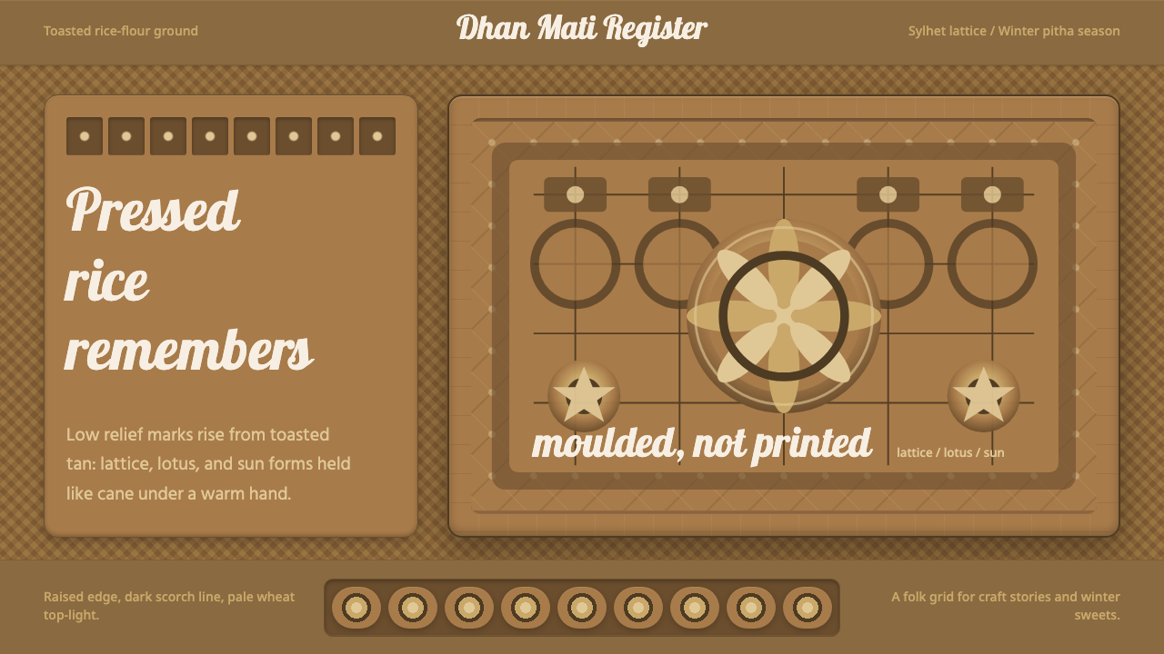 Bangladeshi Nakshi Pitha MotifsWarm relief, never print. Galada type and tan lattice press rice-flour craft…
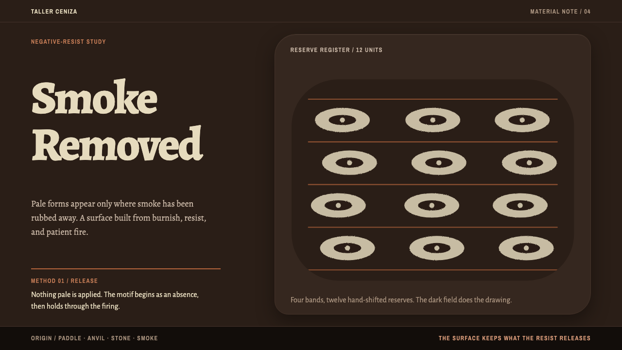 Chulucanas CeramicsSmoke becomes ornament. Bone-cream reserves break a burnished black field in…
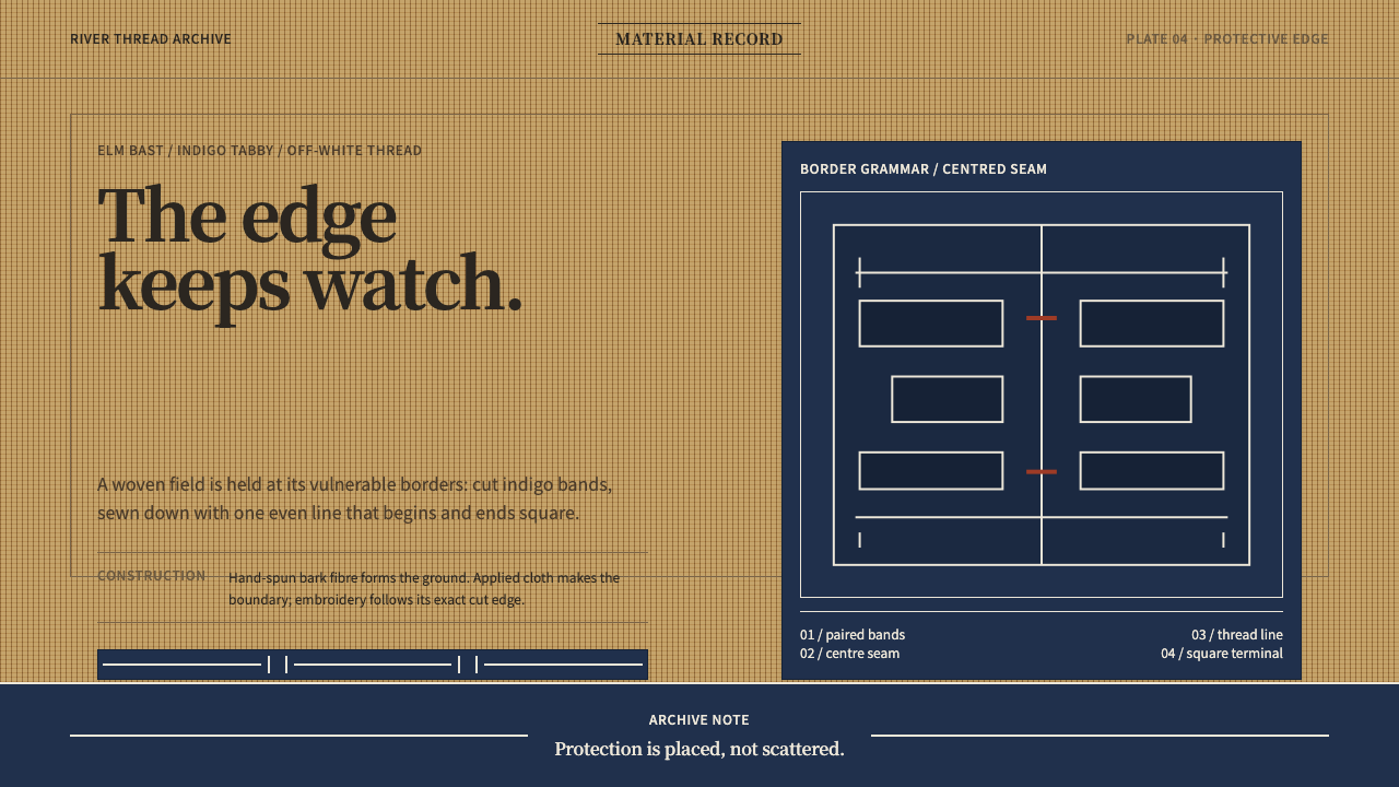 Ainu Attus RobeProtection is cut, not painted. Indigo bands and square-ended thread hold elm…
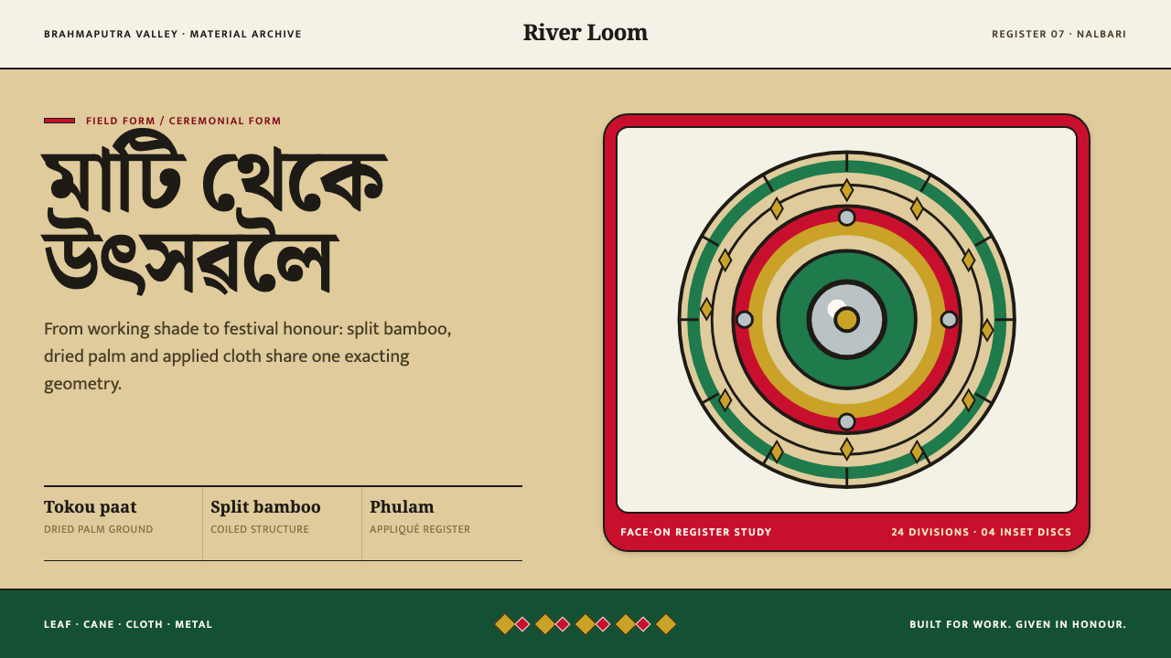 Assamese JapiWork becomes ceremony. Straw-gold rings carry green appliqué, festival red an…
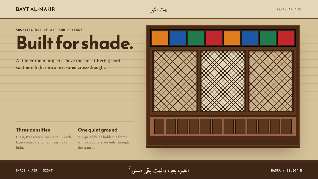 Basra ShanasheelClimate craft becomes ornament. Dark timber lattice projects over sun-paled I…
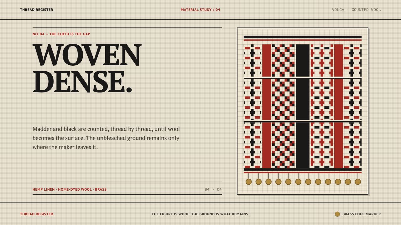 Erzya PangaDensity is the ornament. Madder and black stepped stitches crowd unbleached l…