What is Chulucanas Ceramics?
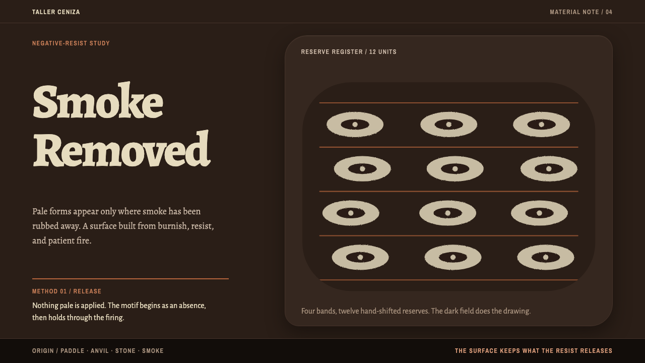
Chulucanas Ceramics makes ornament by subtraction — a burnished black field from which bone-cream shapes are removed, laid out in swelling horizontal registers.
Chulucanas Ceramics in brief
Chulucanas ware is made backwards from the way most decoration works. The potter paddles a round body out of Piura desert clay, burnishes it with a river stone, slips it bone-white and bisque-fires it. Liquid clay is then painted over the whole surface as a resist and rubbed away exactly where black is wanted. The pot is smoked with mango leaves two to four times, and when the hardened resist peels off, the pattern stands there as a pale negative in a glossy black field.
Chulucanas Ceramics is the design system that carries this logic onto a page. The background is the fired vessel wall: a warm reduction black with a rolling burnished sheen. Every light shape is understood as something removed from the black, not something painted onto it, and those shapes are laid in horizontal registers around forms that swell rather than square off.
The look is dark, warm and handmade. Rosettes, zigzag bands, stepped diamonds and dot grids repeat around the form but never align with machine precision, because a hand-rubbed resist always wanders a little. Right angles are foreign here; everything is a beaten arc. The mood is firelight on polished earth: rich, quiet and slow.
Where does Chulucanas Ceramics come from?
Chulucanas is a town in Morropón Province in Piura, northern Peru, a desert region whose clay gives the ware its body. The reference dates the modern revival of the craft to roughly 1950–1990, and traces its technical lineage back to the Vicús culture, around 400 BC. Its movements list begins with the Vicús and Tallán ceramic revival: the modern potters of Chulucanas did not invent their method from scratch but reconnected with much older ways of working the same Piura earth.
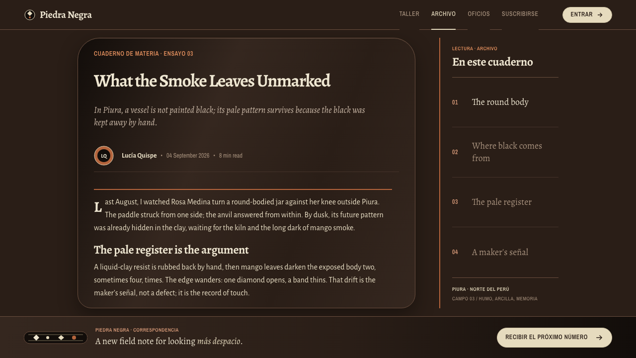
The technical heart of the craft is negative-resist smoke firing. The body is formed with a paddle and an anvil stone, burnished with a river stone until it holds a polish, then slipped white and bisque-fired. A coat of liquid clay is painted over everything as a resist. Wherever the potter wants black, the resist is rubbed away by feel, so the edges come out slightly soft and fuzzy. Smoked in a bed of mango leaves, the exposed slip takes up their carbon and turns black, while the resist keeps the rest pale. When the hardened resist peels away, the design is revealed.
The reference names two key figures, Gerásimo Sosa Alache and Juana Sosa, in connection with the modern revival. It gives no further biography for either, so the honest summary is that their names stand for a craft passed through families and a community of potters rather than a single studio. What the system takes from this is a stance: authority comes from repetition and practice, not from a flawless surface, and the slight wobble of the hand is part of the work's value.
The third movement the reference lists is the Peruvian denominación de origen craft. A denominación de origen ties a product's name to its place of origin and to the way it is made, which makes Chulucanas ware a place-bound craft, not a generic ceramic look. For a designer the implication is practical: the style comes with a place, a method and a community attached, and a faithful use of it says so. The best versions of the system carry the logic of the process, not just the colours of the finished pot.
What defines the Chulucanas Ceramics look?
Reduction-Black Field
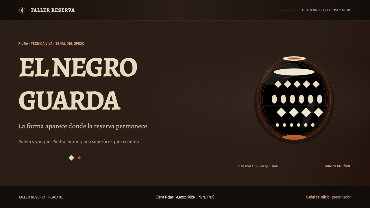
The ground is the fired wall of a pot, a warm black rather than a cold or blue one, the black of smoke-reduced clay. It is deep but never flat or dead: the warmth shows the earth underneath. Because the whole page is this surface, contrast and rhythm are built by taking light away from it rather than by laying colour on top. A page in this system should feel like looking at one continuous vessel wall.
Burnished Sheen
A slow, broad sheen rolls across the black, an oblique oily gleam of the kind that mango resin leaves on a burnished surface. It is a soft highlight that moves across the form, not a hard reflection. On screen that means large, gentle shifts of light that suggest curvature, used sparingly. It is what stops the black from reading as a blank dark mode and makes the page feel like a made object with a body.
Subtractive Light
Every light shape is a reserve, something left behind when the resist is rubbed away, never something painted on. In design terms bone-cream areas are cut out of the black, so they should have slightly soft, hand-rubbed edges instead of razor-sharp vector contours. The mental model governs choices: when you want emphasis, ask what could be taken away from the black, not what could be added over it.
Horizontal Registers
Decoration lies in bands that circle the vessel. Each register holds its own motif and is separated from the next by plain black. In a layout this becomes full-width horizontal sections, each with a repeating pattern strip and its own content, stacking from top to bottom like the zones of a pot from shoulder to foot. The registers organise the page and keep the pattern from spilling over the whole field.
Swelling Forms
Contours bulge outward the way a beaten vessel does. Containers, cards, badges and image masks are rounded and full, widest near the middle, and corners are arcs rather than angles. Right angles read as foreign. This does not mean everything must be a circle: the shapes are fuller than a plain rounded rectangle and give a sense of volume held from inside. Stacked registers can themselves narrow and widen, hinting at a pot's silhouette.
Imperfect Repetition
Rosettes, zigzag bands, stepped diamonds and dot grids repeat around the form, but never to machine precision. Spacing drifts a little, size varies a little, and a dot may sit slightly off its row, because a hand-rubbed resist wanders. The irregularity is small and consistent, enough to feel made by a person, never enough to look broken. It should not interfere with legibility or alignment of actual content.
Bone-Cream Type
Text is set in the same bone-cream as the reserves, a warm pale tone rather than pure white, which keeps contrast high without glare on the dark ground. Reading text stays plain and generous, with ornament kept off the lines that people must read. Headings can sit in a register of their own, but a motif should never run behind running text. The pattern decorates the vessel; the writing is the thing inside it.
Who shaped Chulucanas Ceramics?
Sosa Alache is one of the two key figures the reference names for the modern revival, with no further biography given. What can be said is limited to what the work shows: a craft in which the potter's hand decides where black and pale meet. For the design system his name stands for the primacy of process, in which a pattern is the record of a series of decisions made by touch.
Juana Sosa is the second key figure in the reference, again without further biography. With Gerásimo Sosa Alache she represents the continuity of a craft within a community, the sense that Chulucanas ware is a shared practice and not a brand. A faithful use of the system credits the potters of Chulucanas collectively and avoids presenting the look as anonymous or invented.
The reference traces the technical lineage to Vicús, around 400 BC, and lists the Vicús and Tallán ceramic revival among the movements behind the style. These ancient potters of the Piura region are the deep root of the method, and the modern craft is explicitly a revival of their work. In design terms they are a reminder that this look has a very long past, and that its legitimacy comes from continuity with that past.
The craft lives in the town of Chulucanas and its surrounding province as a recognised place-based tradition under the Peruvian denominación de origen system. The potters are the living authors of the style: they paddle, burnish, slip, paint the resist, rub, smoke and peel. Any design that borrows the look should keep this chain of hand operations in mind, since the whole aesthetic is the visible trace of it.
How do you use Chulucanas Ceramics today?
Chulucanas Ceramics is one of the more natural styles for dark interfaces, because its black is a material rather than a mode. It works wherever a design wants depth, warmth and craft at the same time. The main discipline is subtractive: decide what light you want, then think of it as something taken out of the dark.
For presentation slides, a cover can be a full black field with the title in bone-cream, a single register of pattern across the lower third and a faint broad sheen crossing the slide. Content slides stack as registers, each holding a heading and its content, separated by plain black. For data slides, draw marks in bone-cream on the black, make bars full and slightly swollen rather than rectangular, and reserve a single reserve-style highlight for the key series.
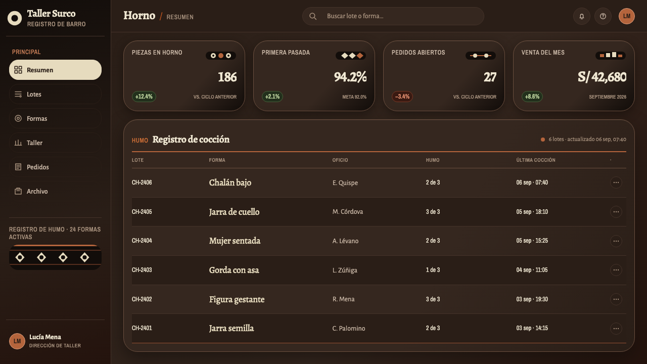
For web interfaces, the style suits craft commerce, ceramics and homeware shops, galleries, hospitality and cultural storytelling. Product cards become full, rounded vessels of content; pricing tiers can be stacked registers; section dividers are pattern strips; hover states shift the sheen slightly instead of changing colour. Keep body text in bone-cream on plain black, with motifs only in headers, dividers and footers, and always check contrast on the real screen.
For editorial and marketing work, pattern bands work well between chapters, and photography of clay, smoke, mango leaves and burnished pots suits the mood. Long articles can use one register as a recurring chapter mark. A short caption naming Chulucanas, the potters and the method turns the page from a skin into a story. Tell people how the ware is made, since the process is the most persuasive thing the style has.
The most common mistake is to treat the black as a generic dark mode and add neon, glassy gradients or cold blue-black, which destroys the earth warmth. The second is pattern filling the whole field like wallpaper; the decoration lives in registers. The third is crisp, perfectly aligned vector ornament, which loses the hand, and the fourth is square boxes with sharp corners that fight the swelling forms. When in doubt, take light away from the black instead of adding something over it.
Chulucanas Ceramics — FAQ
What is negative-resist smoke firing?
It is the technique at the heart of Chulucanas ware. A white-slipped, bisque-fired pot is coated in liquid clay, and the coating is rubbed away where black is wanted. The pot is then smoked with mango leaves, two to four times. The exposed slip turns black, the resist keeps the rest pale, and when the resist peels off the pattern appears as a pale negative in a glossy black field.
Can the style be used on a light background?
The reference system is dark, because the black is the fired vessel wall and the light shapes are reserves cut out of it. A light inversion with bone-cream as the ground and black as the motif is possible, but it reads more like the pale slipped pot before smoking and loses the sheen and depth. If a light version is needed, keep the registers, the swelling forms and the imperfect repetition so that the logic survives.
Does the imperfect repetition hurt usability?
Not if it is confined to decoration. Pattern strips, borders and dividers can wander slightly, but the grid that holds real content, text, controls, tables and forms, must stay precisely aligned. The irregularity is small and consistent, like a hand-rubbed edge. If a user would be slowed by it, it has been applied in the wrong place.
What products suit this style?
Craft and ceramics commerce, homeware, galleries and museums, hospitality, cultural storytelling and any brand that wants to feel handmade, warm and deep. It struggles with dense data tools and anything that requires a lot of neutral, dense UI, because its character depends on large dark surfaces, generous registers and a sense of volume.
How should the craft be credited?
Name Chulucanas, Piura and Peru, and the potters who keep the tradition. The ware belongs to Peru's denominación de origen system, which ties a product's name to its place and method, so a faithful use names the place and describes the process rather than calling it a generic ceramic look. Credit any photography of the pottery to its makers.
Related design styles
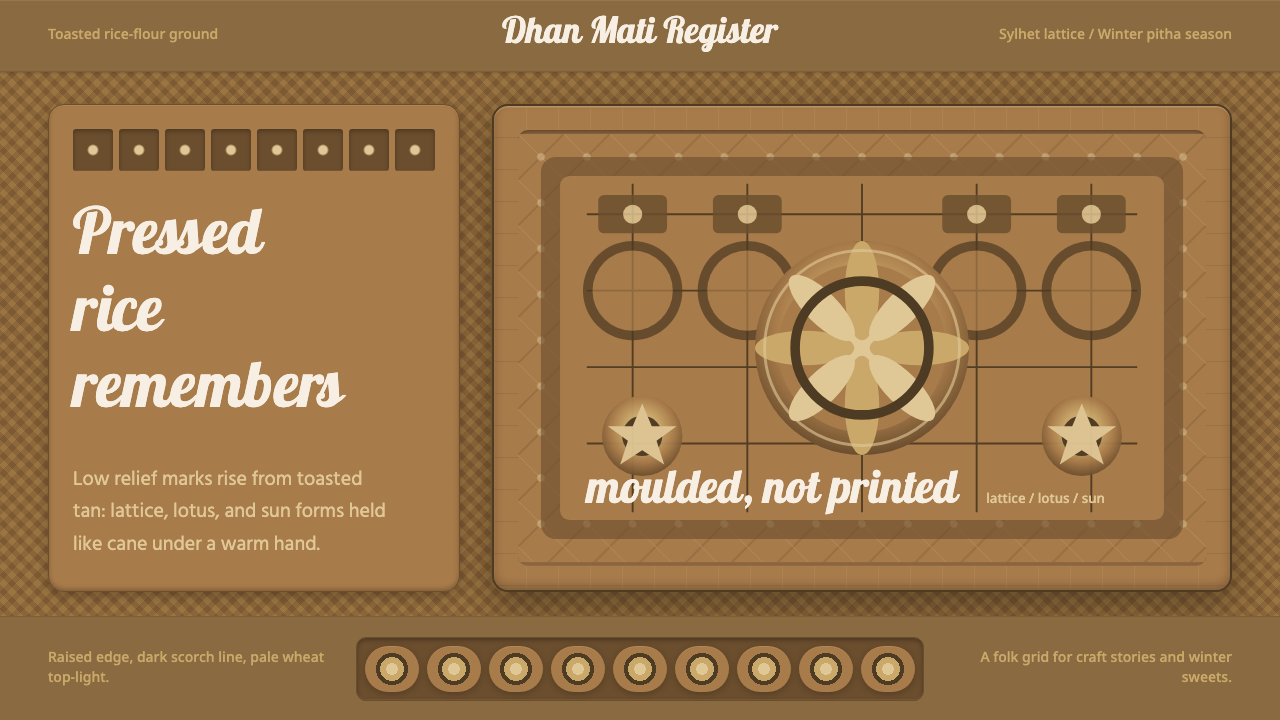 Bangladeshi Nakshi Pitha MotifsWarm relief, never print. Galada type and tan lattice press rice-flour craft…
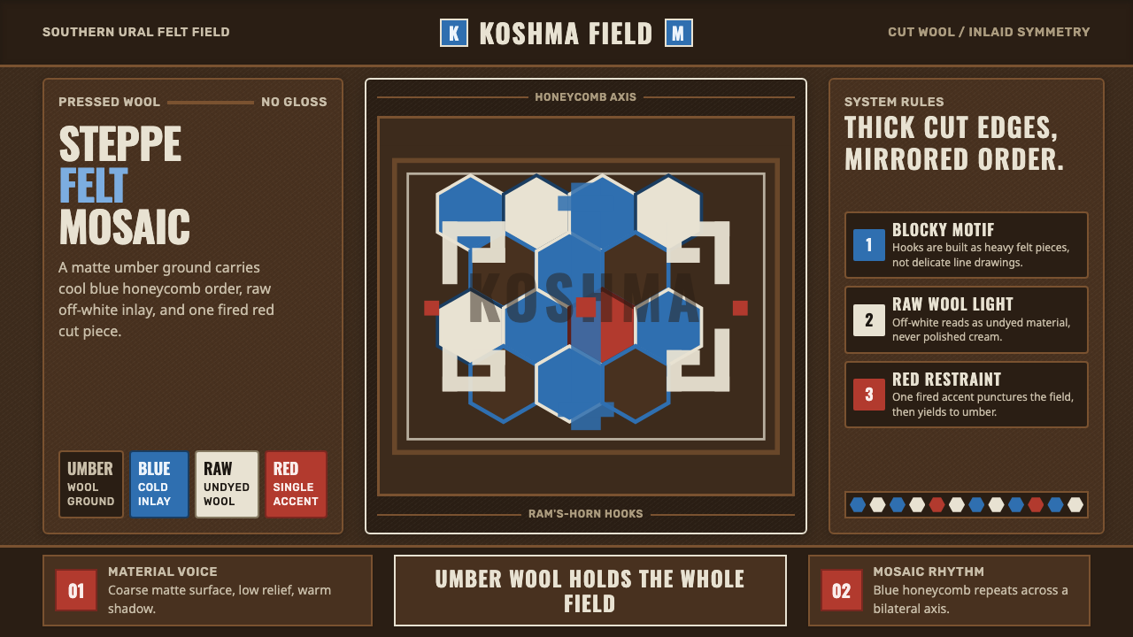 Bashkir Honeycomb Felt OrnamentSteppe craft feels weighty. Umber felt holds blue honeycomb and raw-wool hook…
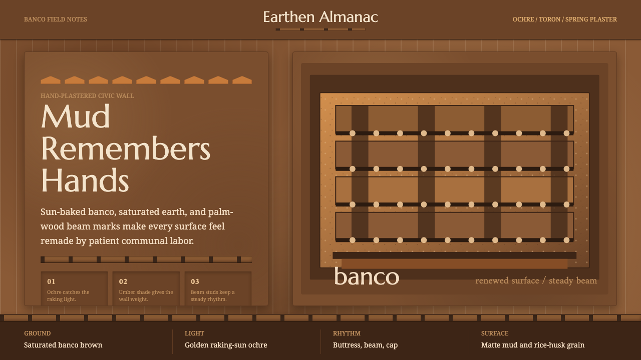 Djenné Mud MosqueBuilt from renewal. Banco brown, ochre caps, and toron grids feel hand-plaste…
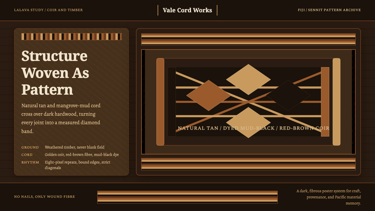 Fijian Magimagi LashingStructure becomes ornament. Tan coir diamonds bind mud-black timber in a stri…
 Paraguayan Ñandutí Spider-Web LacePatient lace in sunlight. Terracotta ground, Cormorant serif, indigo radial s…
 Uyghur Kashgar DoppaVelvet carries the blaze. Emerald borders, gold thread, and badam symmetry gl…