What is Seurat — Grande Jatte Pointillism?什么是 Seurat — Grande Jatte Pointillism?
Seurat turned painting into physics — millions of same-size dots of pure color, placed so your retina does the mixing.修拉把绘画变成了物理学——数百万颗等大的纯色圆点,让你的视网膜来完成调色。
Seurat — Grande Jatte Pointillism in briefSeurat — Grande Jatte Pointillism 速览
Seurat — Grande Jatte Pointillism is a visual style derived from Georges Seurat's 1886 masterwork 'A Sunday on La Grande Jatte,' in which every stroke of pigment is replaced by a small, uniform dot of unmixed color. Neighboring dots of complementary hues — spring green beside magenta-pink, cobalt beside gold-cream — are placed close enough that the viewer's eye merges them into a third color at the correct viewing distance. This technique, which Seurat called Chromoluminarism and critics named Pointillism, transforms painting from a craft of blending into a science of optical mixing.修拉《大碗岛的星期日下午》点彩风格,是一套从乔治·修拉1886年旷世之作中提炼的视觉语言。在这件作品里,每一笔颜料都被替换成一颗等大的纯色圆点。相邻的互补色圆点——春绿紧挨品红,钴蓝紧挨金米黄——彼此靠近到一定程度,使观者在合适的观看距离上,由视网膜将它们融合成第三种颜色。修拉称这套技法为「色光主义」,评论界将其命名为「点彩派」;它把绘画从调色的手艺,变成了光学混色的科学。
The resulting aesthetic is one of serene, almost crystalline suspension. Forms are rendered as crisp profile silhouettes against layered horizontal planes; the surface shimmers with a fine, even grain that gives every area — whether deep shadow or bright sky — a consistent tactile energy. Figures feel monumental yet weightless, frozen in the kind of Sunday stillness that belongs to neither work nor play. The palette is warm but never hot: cream and pale sage underpin everything, with accents of magenta, cerulean, and golden amber.由此产生的美学,是一种宁静而近乎晶体般悬止的感觉。形体以清晰的侧影轮廓呈现于层叠的横向平面之上;画面表面因细密均匀的点粒而微微闪烁,无论深暗阴影还是明亮天空,每一个区域都具有同等的触感张力。人物感觉既庄重又无重量,被凝固在一种不属于劳作、也不属于嬉戏的周日静谧之中。调色板温暖而不炽热:奶油色与淡鼠尾草绿奠定底调,以品红、天蓝和琥珀金作为强调。
As a design language, Seurat Pointillism carries a distinctive set of visual principles: a dot-matrix or grain-field texture as a fundamental surface quality; a restricted, scientifically balanced palette where optical mixing does the heavy lifting; strong silhouette over interior modeling; and a measured, unhurried geometry borrowed from the horizontal banding of river, lawn, and sky. It is simultaneously rigorous and sensuous — the only nineteenth-century painting method that feels, in retrospect, like a computational rendering algorithm.作为设计语言,修拉点彩风格携带着一套独特的视觉原则:点阵或颗粒肌理作为根本的表面质感;经科学平衡的有限色板,让视觉混色承担主要工作;以轮廓剪影取代内部建模;以及从河流、草坪与天空的水平分层中借来的、从容不迫的几何感。它同时严谨而感官丰富——十九世纪唯一一种在回望时像极了计算机渲染算法的绘画方法。
See the Seurat — Grande Jatte Pointillism design system查看 Seurat — Grande Jatte Pointillism 完整设计系统
Where does Seurat — Grande Jatte Pointillism come from?Seurat — Grande Jatte Pointillism 从何而来?
Georges Seurat was born in Paris in 1859 and trained at the École des Beaux-Arts under Henri Lehmann, a student of Ingres. By the early 1880s he had grown dissatisfied with the intuitive spontaneity of Impressionism, which he felt relied too heavily on the artist's momentary perception rather than on any systematic understanding of how color and light actually work. He immersed himself in the color science of his era: Eugène Chevreul's law of simultaneous contrast (1839), which showed that adjacent colors influence each other's perceived hue; Ogden Rood's 'Modern Chromatics' (1879), which described how spinning discs of colored pigment mix optically rather than chemically; and Charles Henry's psychophysical research linking color directions to emotional states. These texts gave Seurat the theoretical scaffolding for what he called a 'scientific' method of painting.乔治·修拉1859年生于巴黎,在安格尔的学生亨利·莱曼门下就读于巴黎美术学院。1880年代初,他已对印象派的直觉式自发性感到不满——他认为印象派过于依赖画家的瞬时感知,而非对色彩与光线实际运作机制的系统理解。他深入研读了那个时代的色彩科学:欧仁·谢弗勒尔1839年的「同时对比」定律,揭示了相邻色彩如何相互影响彼此的感知色相;奥格登·鲁德1879年的《现代色彩学》,描述了旋转的有色颜料圆盘如何发生光学而非化学的混色;以及查尔斯·亨利将色彩方向与情绪状态相联结的心理物理学研究。这些文本为修拉提供了他称之为「科学」绘画方法的理论框架。
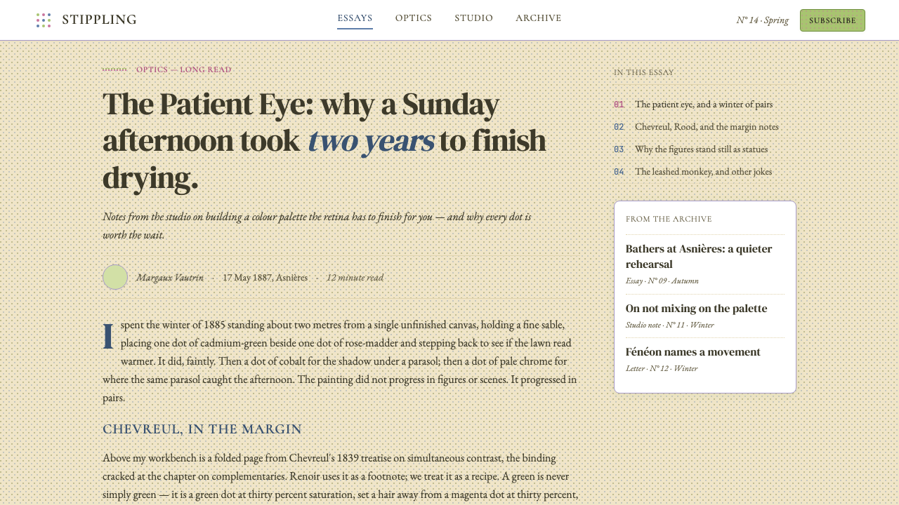
The Grande Jatte canvas — measuring roughly two by three meters — was prepared over two years. Seurat made dozens of preliminary oil sketches on the island of La Grande Jatte, a narrow strip of land in the Seine at Asnières on the northwestern outskirts of Paris, where Parisian bourgeoisie and working-class families spent Sunday afternoons. The final painting, exhibited at the eighth and last Impressionist exhibition in May 1886 and then at the Salon des Indépendants later that year, was met with derision from some critics but electrified the young Paul Signac and the poet-critic Félix Fénéon, who coined the term 'Neo-Impressionism' and became the movement's most eloquent champion.《大碗岛》那张大约两米乘三米的画布,历时两年精心制作。修拉在大碗岛——塞纳河上阿涅尔附近的一条狭长地块,位于巴黎西北郊,是巴黎中产阶级和工人家庭度过周日下午的去处——完成了数十幅预备性油画素描。最终作品于1886年5月在第八届也是最后一届印象派画展展出,随后又在当年晚些时候的独立沙龙展出。部分评论家以嘲弄接待了这件作品,但它使年轻的保罗·西涅克和诗人评论家费利克斯·费内翁深受震撼——费内翁创造了「新印象主义」一词,并成为这一运动最雄辩的倡导者。
Seurat refined his method into what he called Chromoluminarism or Divisionism: the systematic separation of color into its component hues and their application as discrete, uniform points. The dots are not purely mechanical — their size and density vary according to the area of the composition — but their uniformity across the entire surface is what gives the painting its distinctive woven, shimmering quality. Seurat also developed a systematic border technique, painting a frame of complementary-colored dots around the edge of the canvas to mediate between the painting's palette and the white of the wall, a detail that most reproductions lose entirely.修拉将自己的方法精炼为他所称的色光主义或分色主义:将颜色系统地分解为各组成色相,并将其以离散的均匀点形式施敷。这些圆点并非纯机械性的——其尺寸和密度因画面区域而异——但它们在整个画面上的均匀一致,赋予了这幅画那种独特的编织般闪烁的质感。修拉还发展出一套系统的边框技法:在画布边缘绘制一圈互补色圆点,以调和画面色板与墙面白色之间的关系——这一细节在大多数复制品中完全消失了。
Seurat died in 1891 at thirty-one, leaving behind only seven monumental canvases and an enormous archive of drawings. His colleague Paul Signac carried Neo-Impressionism into the twentieth century, writing 'D'Eugène Delacroix au Néo-Impressionnisme' (1899), which codified the movement's principles for a new generation. Signac's influence extended to Henri-Edmond Cross, whose late work became looser and more decorative, and — crucially — to the young Henri Matisse and André Derain, whose encounters with the Neo-Impressionist palette in the summer of 1904 and 1905 at Collioure catalyzed the invention of Fauvism. Seurat's dot grammar thus sits at the root of nearly every twentieth-century color experiment in Western painting.修拉于1891年去世,年仅三十一岁,留下七幅巨型画作和大量素描存档。他的同事保罗·西涅克将新印象主义带入二十世纪,并于1899年撰写《从德拉克罗瓦到新印象主义》,为新一代人系统阐述了这一运动的原则。西涅克的影响延伸至亨利-埃德蒙·克罗斯,后者晚期作品变得更为松散与装饰性;更关键的是,他影响了年轻的亨利·马蒂斯与安德烈·德兰——这两位画家于1904年和1905年夏天在科利乌尔与新印象主义色板的相遇,催化了野兽派的诞生。修拉的点阵语法,由此矗立在西方绘画几乎所有二十世纪色彩实验的根源之处。
What defines the Seurat — Grande Jatte Pointillism look?Seurat — Grande Jatte Pointillism 的视觉特征是什么?
Dot-Field Texture点阵肌理
The surface of any Seurat-derived composition is defined by a uniform field of small, discrete marks — dots, dabs, or closely spaced stipples — that read as a continuous texture at a distance while revealing their component units up close. This grain is not a filter applied over color areas but the primary means by which color itself is built. The texture is even and consistent across the entire surface: shadow, highlight, sky, and skin all share the same granular weave, unifying the composition at the level of material.任何修拉衍生构图的表面,都由一片均匀的小型离散笔触——圆点、短笔或密集点刺——所定义;远观读作连续肌理,近看则显露其组成单元。这种颗粒感不是叠加在色彩区域之上的滤镜,而是色彩本身得以构建的基本手段。肌理在整个画面上均匀一致:阴影、高光、天空与皮肤,全部共享同一粒状织体,从材质层面统一了整个构图。
Optical Color Mixing视觉混色
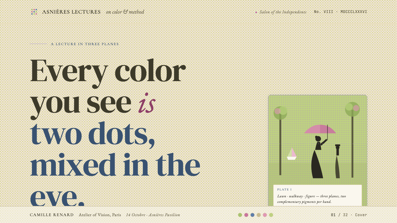
Adjacent dots of different hues are chosen so that the viewer's visual system blends them into an intermediate tone — a phenomenon Seurat understood through Chevreul's simultaneous contrast law and Rood's additive mixing theory. In practice, this means greens are never made by mixing blue and yellow pigment; instead, blue dots and yellow dots are laid side by side. The resulting color is perceived as brighter and more luminous than any mixed pigment equivalent, because additive mixing of light is inherently brighter than subtractive pigment mixing.相邻不同色相的圆点经过选择,使观者的视觉系统将其融合为一种中间色调——这一现象是修拉通过谢弗勒尔的同时对比定律和鲁德的加色混合理论所理解的。在实践中,这意味着绿色永远不由蓝色与黄色颜料混合而成;而是将蓝色圆点与黄色圆点并排铺设。由此感知到的颜色比任何混合颜料都更明亮、更发光,因为光的加色混合本质上比颜料的减色混合更为明亮。
Warm, Scientifically Balanced Palette温暖而科学平衡的色板
The Grande Jatte palette is anchored by a warm cream-and-sage ground, with complementary pairs deployed across the surface: orange-reds against blue-greens in the shadowed grass, magenta-pinks against cool cobalt in the figures' clothing, and golden amber against violet in the ambient light. Each hue is relatively low in saturation at the level of individual dots but rises in perceived vibrancy through optical mixing. The palette is restrained yet luminous — never garish, never muddy.《大碗岛》的色板以温暖的奶油色与鼠尾草绿为底调,互补色对遍布画面:阴影草地上的橙红对蓝绿,人物服装上的品红对冷钴蓝,环境光中的金琥珀对紫色。每种色相在单个圆点层面的饱和度相对较低,却通过视觉混色在感知上升为鲜亮的活力。色板克制而发光——既不艳俗,也不浑浊。
Silhouette and Profile Geometry剪影与侧影几何
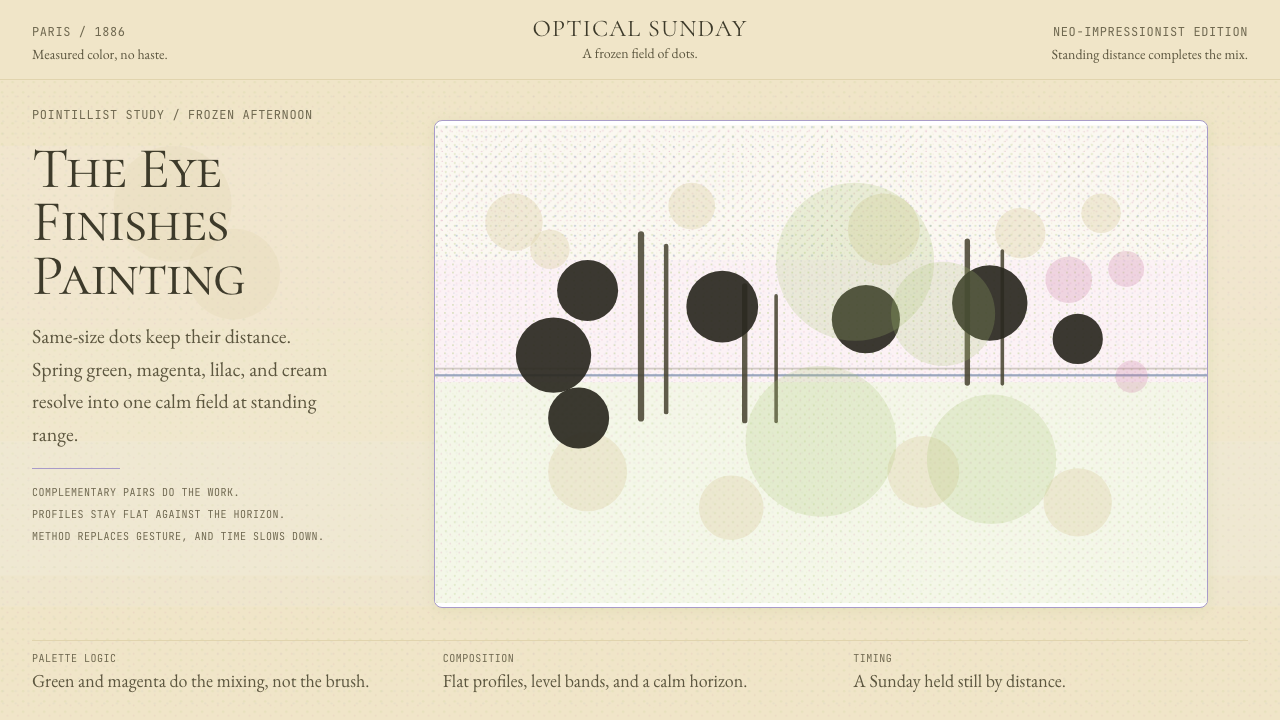
Figures in the Grande Jatte are rendered primarily as profile silhouettes — seen from the side, their outlines crisp and readable against the shimmering dot-field behind them. Interior modeling is minimal; what defines a figure is its outer contour, not its internal shading. This gives the composition an almost Egyptian or bas-relief quality: the people are iconic rather than naturalistic, archetypes of Sunday leisure rather than specific individuals. Applied as a design principle, this means shapes should be defined by clean outer edges rather than interior gradients or highlights.《大碗岛》中的人物主要以侧影剪影呈现——从侧面观看,其轮廓在身后闪烁的点阵上清晰可辨。内部建模极少;定义人物的是外轮廓,而非内部明暗。这赋予了构图一种近乎埃及浮雕的质感:人物是图像性的而非写实性的,是周日休闲的原型而非具体个人。作为设计原则,这意味着形体应由清晰的外轮廓而非内部渐变或高光来定义。
Horizontal Banding and Layered Planes横向分层与平面叠加
The composition of the Grande Jatte is organized into three distinct horizontal bands — a near-ground strip of shadow, a middle-ground spread of sunlit lawn, and a luminous water-and-sky backdrop. This tripartite division creates a stable, measured spaciousness that feels neither crowded nor empty. The planes recede through atmospheric lightening rather than perspective foreshortening. As a design structure, this translates into layouts built from strong horizontal registers: a dark base, a light middle field, a pale upper register — each containing its own visual information at a different tonal key.《大碗岛》的构图被组织成三个清晰的水平带状区域——前景的阴影地带、中景阳光照耀的草坪、以及明亮的水面与天空背景。这种三分结构营造出一种稳定、从容的开阔感,既不拥挤也不空洞。各平面通过大气远近的明暗变化而退远,而非通过透视缩短。作为设计结构,这转化为由强横向区块构建的版面:深暗的底部、明亮的中间区域、浅淡的上部——每个区块在不同的调性层次上承载着各自的视觉信息。
Measured Stillness静止的度量感
Unlike Impressionist works that capture motion or flickering atmosphere, the Grande Jatte is conspicuously still. Every figure is caught in a pose of suspension, and the overall composition has a quality of held breath — a Sunday afternoon where time appears to have stopped. In design terms, this translates to generous spacing, deliberate asymmetric balance, and a resistance to diagonal energy or visual urgency. Elements rest rather than move; the composition invites contemplation rather than scanning.不同于捕捉动感或闪烁大气的印象派作品,《大碗岛》是刻意静止的。每个人物都被凝固在一种悬止的姿态中,整体构图具有一种屏息凝神的质感——一个下午时间似乎停住的周日。在设计语言中,这转化为充裕的间距、刻意的非对称平衡,以及对对角线动能或视觉紧迫感的抵制。元素处于静止而非运动;构图邀请凝视而非扫视。
Shadow as Complementary Hue阴影作为互补色
In Seurat's system, shadows are never simply darkened versions of a surface color. Because he was applying Chevreul's contrast law consistently, the shadow areas of green grass are filled with cool violet and blue dots; the shadows under trees shift toward deep indigo and plum. This gives the painting's dark areas a richness and visual complexity that flat dark tones would destroy. As a design principle, it suggests that shadow and depth should be handled through hue shift rather than simple darkening — violet shadows against warm grounds, cool blue shadows against orange-leaning surfaces.在修拉的体系中,阴影永远不仅仅是表面色彩的加深版本。因为他在一致地运用谢弗勒尔的对比定律,绿草的阴影区域充满了冷紫与蓝色圆点;树木投影下方转向深靛蓝与梅紫。这赋予了画面暗部以丰富度和视觉复杂性——单调的暗色调会将其摧毁。作为设计原则,这提示阴影与深度应通过色相偏移而非简单加深来处理:温暖底调上用紫色阴影,橙调表面上用冷蓝阴影。
See the Seurat — Grande Jatte Pointillism design system查看 Seurat — Grande Jatte Pointillism 完整设计系统
Who shaped Seurat — Grande Jatte Pointillism?谁塑造了 Seurat — Grande Jatte Pointillism?
Seurat was the originator and theorist of Pointillism. Born in Paris in 1859, he fused the new color science of Chevreul, Rood, and Henry into a rigorously systematic painting method, producing a body of work that included seven large canvases and hundreds of oil sketches and drawings before his death in 1891 at thirty-one. Beyond the Grande Jatte, his major works include 'Bathers at Asnières' (1884), 'Le Chahut' (1890), and 'The Circus' (1891), each demonstrating a distinct application of his color and compositional principles. His brief career produced one of the most consequential technical innovations in the history of Western painting.修拉是点彩派的创始人与理论家。他1859年生于巴黎,将谢弗勒尔、鲁德与亨利的新色彩科学融合为一套严格系统的绘画方法,在1891年三十一岁去世之前,留下七幅大型画作及数百幅油画素描与素描。除《大碗岛》外,其重要作品还包括《阿涅尔浴场》(1884年)、《康康舞》(1890年)和《马戏团》(1891年),每一幅都展示了其色彩与构图原则的独特运用。他短暂的职业生涯,产出了西方绘画史上影响最深远的技术革新之一。
Signac met Seurat in 1884 at the founding of the Société des Artistes Indépendants, became his closest artistic ally, and outlived him by forty-four years — long enough to ensure that Neo-Impressionism achieved lasting influence. His theoretical tract 'From Eugène Delacroix to Neo-Impressionism' (1899) remains the movement's definitive written statement. After Seurat's death, Signac's own style evolved toward larger, looser mosaic-like strokes and increasingly saturated color, influencing the young Matisse and helping seed Fauvism and early twentieth-century color abstraction.西涅克于1884年在独立艺术家协会成立之时结识修拉,成为其最亲密的艺术盟友,并比他多活了四十四年——足够长的时间来确保新印象主义获得持久影响。他的理论著作《从德拉克罗瓦到新印象主义》(1899年)至今仍是这一运动最权威的文字陈述。修拉去世后,西涅克自身的风格演化为更大、更松散的马赛克状笔触和日益饱和的色彩,影响了年轻的马蒂斯,并有助于播下野兽派和二十世纪初色彩抽象的种子。
Fénéon was the critic who named and championed Neo-Impressionism. Writing in the avant-garde journal 'La Vogue' in 1886, he coined the term 'Neo-Impressionism' to describe Seurat's and Signac's work at that year's Salon des Indépendants, providing the movement with both its identity and its intellectual framework. His criticism was itself a form of art: compressed, precise, and syntactically inventive. As an editor at the Revue Blanche through the 1890s, he continued to link the visual arts to Symbolist poetry, anarchist politics, and the broader project of fin-de-siècle cultural renewal.费内翁是为新印象主义命名并为其鼓与呼的评论家。1886年,他在前卫刊物《时尚》上撰文,创造了「新印象主义」一词来描述修拉与西涅克当年在独立沙龙展出的作品,为这一运动提供了身份认同与知识框架。他的批评本身就是一种艺术:凝练、精确而句法富于创造性。在整个1890年代担任《白色评论》编辑期间,他持续将视觉艺术与象征主义诗歌、无政府主义政治以及世纪末文化更新的宏大计划相联结。
Cross adopted Divisionism in the early 1890s under Signac's influence and developed it in a direction distinct from Seurat's — warmer, more loosely structured, and increasingly decorative. His large canvases of the Mediterranean coast, painted from the mid-1890s onward, use Seurat's optical mixing principle but apply it with mosaic-like patches rather than tight uniform dots, producing a more overtly sensuous and patterned surface. It was Cross's work specifically that Matisse encountered and was transformed by during the summer of 1904 at Saint-Tropez, making Cross a crucial though often under-credited link between Pointillism and Fauvism.克罗斯在1890年代初受西涅克影响采用了分色主义,并将其发展为一个与修拉截然不同的方向——更温暖、结构更松散、装饰性更强。他从1890年代中期起创作的地中海海岸大型画作,运用修拉的光学混色原则,但以马赛克状的色块而非紧密均匀的圆点来施敷,产生了一种更为明显感官化和图案化的画面。正是克罗斯的作品,马蒂斯在1904年夏天于圣特罗佩与之相遇并深受触动,使克罗斯成为点彩派与野兽派之间一个关键而常被低估的链接。
Rood was an American physicist whose 1879 treatise 'Modern Chromatics' — translated into French in 1881 as 'Théorie Scientifique des Couleurs' — provided Seurat with the scientific foundation for optical mixing. Rood distinguished between additive mixing of colored light (which produces brighter, more luminous results) and subtractive mixing of pigments (which tends toward gray), and demonstrated the effect using rotating color discs. The irony is that Rood himself reportedly disliked what Seurat and Signac did with his research — but without his book, the Grande Jatte as we know it could not have been conceived.鲁德是一位美国物理学家,其1879年的著作《现代色彩学》——1881年译为法文《色彩科学理论》——为修拉提供了视觉混色的科学基础。鲁德区分了有色光的加色混合(产生更明亮、更发光的结果)与颜料的减色混合(倾向于灰色),并通过旋转色盘演示了这一效果。讽刺的是,据说鲁德本人并不喜欢修拉与西涅克对其研究成果的运用——但没有他的著作,我们所知道的《大碗岛》就根本无从构想。
How do you use Seurat — Grande Jatte Pointillism today?今天怎么用 Seurat — Grande Jatte Pointillism?
Seurat Pointillism translates into contemporary design work as a system of tactile texture, scientifically calibrated color, and composed stillness. Applying it correctly requires understanding what the original technique was actually doing: building luminous color through optical mixing rather than direct pigment application, organizing composition through horizontal planes and silhouette rather than through diagonal energy or interior modeling, and treating the surface itself as a material presence rather than a neutral carrier.修拉点彩风格作为当代设计语言,是一套触感肌理、科学校准的色彩与从容静态的构图系统。正确应用它,需要理解原始技法实际上在做什么:通过视觉混色而非直接涂抹颜料来构建发光的色彩,通过横向平面和轮廓剪影而非对角线动能或内部建模来组织构图,并将画面表面本身视为材质存在而非中性承载物。
For presentation slides, the style works especially well on covers and section dividers. A cover in this mode might use a warm cream ground with a large profile silhouette in warm terracotta or deep sage, the background broken into a fine dot-field that gives the flat color areas a gentle shimmer. Section content slides benefit from the horizontal-banding principle: a pale upper zone for the headline, a cream middle field for body text or diagrams, and an optional deeper lower band as an anchor. Data visualization in this style takes on a pointillist quality — scatter plots where individual data points are styled as dots of varying warm hues, or bar charts where bars are rendered with a subtle grain rather than as perfectly flat fills.在演示文稿中,这种风格尤其适合封面页与章节分隔页。此风格的封面可以使用温暖的奶油底色,配以赤陶色或深鼠尾草绿的大型侧影剪影,背景铺设精细的点阵使平面色彩区域呈现轻柔闪烁。章节内容页从横向分层原则中受益:浅淡的上方区域用于标题,奶油色中间区域用于正文或图表,可选的较深下方色带作为视觉锚点。此风格的数据可视化呈现出点彩质感——散点图中各数据点设计为不同暖色调的圆点,柱状图中的柱条以微妙的颗粒感渲染而非完全平面的填充。
For web interfaces and dashboards, the Seurat vocabulary offers a distinctive alternative to both flat material design and soft-shadow neumorphism. The core move is replacing flat fills with a fine halftone or grain texture that adds depth without introducing explicit light-sourcing. Navigation and card components remain structurally clean; the texture lives at the surface level, not in the shadows or depth effects. Color choices follow the complementary-pair logic: a warm cream or pale sage base, with magenta-pink and cobalt used as accent and interactive-state colors, and deep violet-indigo reserved for shadow states. Pricing tables and comparison grids benefit from the horizontal-register approach: each tier presented as a distinct tonal band rather than a card floating on a neutral ground.对于网页界面与仪表板,修拉语汇在平面材料设计与柔阴影拟物设计之外,提供了一种独特的替代方案。核心做法是以细腻的半调或颗粒肌理取代平面填充,在不引入明确光源方向的情况下增添深度感。导航和卡片组件保持结构上的清晰;肌理存在于表面层级,而非阴影或深度效果中。色彩选择遵循互补色对逻辑:温暖的奶油色或淡鼠尾草绿作为底色,品红与钴蓝用作强调和交互状态色,深紫靛蓝保留给阴影状态。定价表和对比表格从横向区块方法中受益:每个层级呈现为独特的色调带状区域,而非漂浮在中性底面上的卡片。
For editorial and marketing materials, the style's poster-like silhouette quality and warm palette suit long-form article headers, event posters, and brand campaigns where a sense of cultured leisure is the desired register. A feature article header might use a profile figure rendered in warm amber against a shimmering blue-green dot-ground, with the title set in a serif with generous spacing — the measured unhurriedness of the style carried into the typography. Marketing pages work well when they adopt the tripartite horizontal structure: a hero section that is almost purely visual, a body section organized in a light open grid, and a footer that anchors in a deeper warm tone. The dot-field texture used sparingly on section backgrounds prevents the layout from feeling sterile.对于编辑与营销材料,这种风格海报式的轮廓剪影质感和温暖色板,适合长文章标题图、活动海报以及品牌活动——其中有教养的悠闲感是期望传达的基调。一篇特稿的标题图可以使用温琥珀色侧影人物,配以闪烁的蓝绿色点阵背景,标题以宽松间距的衬线字体排印——这种风格的从容不迫被延续进了排版之中。营销页面在采用三分横向结构时表现出色:以视觉为主的英雄区块、以浅开放网格组织的正文区块、以及以更深暖色调锚定的页脚。在区块背景上节制地使用点阵肌理,能防止版面感觉过于冷漠。
A common mistake when applying this style is reproducing the dot texture as a purely decorative filter — adding a halftone overlay to an otherwise conventional design and calling it Pointillism. Authentic application of the Seurat principle means using the texture as the primary structural means by which color is built, not as a garnish. A second frequent error is choosing colors that are already premixed rather than working through complementary adjacency: placing a flat sage-green panel beside a flat cream panel misses the point entirely — the interaction should happen at the level of individual marks. The style also requires patience with spacing; the measured stillness that makes the original compelling becomes restless and fragmented if the dot density or element spacing is too tight.应用这种风格时最常见的错误,是将点状肌理作为纯装饰性滤镜复制——在一个其他方面都是传统设计的作品上叠加半调覆层,称之为点彩派。修拉原则的真实应用,意味着将肌理作为色彩得以构建的主要结构手段,而非点缀。第二个常见错误是选择已经预混好的颜色,而非通过互补色邻接来工作:将一片平面鼠尾草绿色块置于一片平面奶油色旁边,完全错过了要点——互动应在单个笔触的层级发生。这种风格还需要在间距上保持耐心;使原作引人入胜的那种从容静止,如果圆点密度或元素间距过紧,就会变得躁动而碎片化。
See the Seurat — Grande Jatte Pointillism design system查看 Seurat — Grande Jatte Pointillism 完整设计系统
Seurat — Grande Jatte Pointillism — FAQSeurat — Grande Jatte Pointillism · 常见问题
Is Pointillism the same as Divisionism?点彩派和分色主义是同一回事吗?
They overlap but are not identical. Divisionism is the broader theoretical principle — the systematic separation, or division, of color into its component hues and the reliance on the viewer's optical system to perform the mixing. Pointillism is a specific application of Divisionism in which the divided color marks are small, uniform dots. Seurat preferred the term Chromoluminarism to describe his own method; his colleague Paul Signac used Divisionism as the preferred theoretical label. The term Pointillism was coined by critics, initially with a dismissive intent, but it stuck and is now the most commonly used name for the style.两者有重叠,但并非完全相同。分色主义是更宽泛的理论原则——将色彩系统地分解(即「分割」)为其组成色相,并依赖观者的视觉系统来完成混色。点彩派是分色主义的一种具体应用,其中被分割的色彩笔触是小型、均匀的圆点。修拉更倾向于用「色光主义」来描述自己的方法;他的同事西涅克则使用「分色主义」作为首选的理论标签。「点彩派」这个词由评论家创造,最初带有贬义,但它流传了下来,现在是这种风格最常用的名称。
Can this style work on dark backgrounds?这种风格能用在深色背景上吗?
The original Grande Jatte palette is built on a light, warm ground — cream, pale sage, and golden afternoon light. A dark inversion is possible but requires careful adaptation. On a dark ground, the optical mixing principle still operates, but the hue choices must shift: complementary pairs built around deep teal and warm amber, or deep indigo and rose-gold, can produce a luminous effect against a near-black or deep charcoal field. The dot-field texture often gains in drama on a dark ground. What does not translate well is the measured, Sunday-afternoon stillness of the original — dark grounds carry more nocturnal or cinematic energy, which may or may not serve the design's intent.原版《大碗岛》的色板建立在浅暖底色上——奶油色、淡鼠尾草绿以及金色的午后阳光。深色反转版本是可能的,但需要仔细调整。在深色底面上,视觉混色原则仍然有效,但色相选择必须相应偏移:围绕深青色与暖琥珀色,或深靛蓝与玫瑰金构建的互补色对,可以在近黑或深炭灰色底面上产生发光效果。点阵肌理在深色底面上通常获得更强的戏剧性。而不容易移植的,是原作那种从容的周日午后静谧感——深色底面携带着更多夜间或电影式的能量,这可能符合也可能不符合设计意图。
How is Seurat Pointillism different from other textured or grainy design styles?修拉点彩风格与其他有肌理或颗粒感的设计风格有何不同?
Contemporary grainy or noisy textures — popular in logo design and brand identity since the mid-2010s — apply a texture over colors that are already chosen and fully mixed. The grain functions as a material quality, suggesting a worn, organic, or analogue surface. Seurat Pointillism is structurally different: the texture is not applied over the color but is the means by which color is constructed. This distinction changes how one must think about color selection: in a grainy brand aesthetic, you choose your green and then add grain; in a Seurat-derived application, you arrive at your green by choosing which blue-leaning and yellow-leaning marks to place adjacent to each other. The visual result may look superficially similar from a distance, but the logic and the craft are fundamentally different.当代颗粒感或噪点肌理——自2010年代中期以来在标志设计和品牌视觉识别中颇为流行——将纹理叠加在已经选好并完全混合的颜色之上。颗粒感作为一种材质质感发挥作用,暗示磨损的、有机的或模拟感的表面。修拉点彩派在结构上截然不同:肌理不是叠加在颜色之上,而是构建色彩的手段本身。这一区别改变了人们思考色彩选择的方式:在颗粒感品牌美学中,你先选好你的绿色,然后添加颗粒;在修拉衍生的应用中,你通过选择将哪些偏蓝和偏黄的笔触相邻排列来获得你的绿色。远观的视觉结果可能表面上相似,但逻辑与工艺在根本上是不同的。
What kinds of projects suit this style well, and where does it struggle?哪类项目适合这种风格?它在哪里表现欠佳?
Seurat Pointillism works well in contexts where sensory richness, cultured leisure, and a sense of scientific artistry are valued: museum and gallery interfaces, cultural institutions, luxury travel and hospitality, premium editorial publications, and any brand that wants to position itself as thoughtful and analytically rigorous while remaining visually warm. It is less suited to urgent or transactional contexts — e-commerce checkout flows, emergency communications, productivity tools that need to minimize visual complexity, or any interface where the grain texture might impair readability at small sizes. The style's connotations are resolutely European, leisurely, and fin-de-siècle; it carries those associations whether the designer intends them or not.修拉点彩风格在感官丰富度、有教养的悠闲感以及科学艺术感受到重视的场景中表现出色:博物馆与画廊界面、文化机构、奢华旅行与酒店业、高端编辑出版物,以及任何希望将自己定位为深思熟虑且分析严谨、同时保持视觉温度的品牌。它不太适合紧迫或交易性的场景——电商结账流程、紧急通讯、需要最小化视觉复杂度的生产力工具,或者任何颗粒纹理可能在小尺寸下损害可读性的界面。这种风格的联想意义是坚定地欧洲式的、悠闲的、世纪末的;无论设计者是否有意为之,它都携带着这些联想。
Must the texture be literal dots, or can other mark shapes carry the Pointillist spirit?肌理必须是字面意义上的圆点吗?还是其他笔触形状也能承载点彩精神?
Seurat himself used dots, dabs, and short strokes interchangeably across different canvases and different areas of the same canvas; the uniform round dot is the canonical form associated with the Grande Jatte but is not the only possible expression of the Divisionist principle. In design applications, the spirit of the style — optical color mixing through adjacent marks of different hue — can be carried by square pixels in a mosaic-grid layout, by short horizontal dashes arranged in tonal fields, or by a fine grain where the individual grains resolve into regions of mixed color. What is essential is that the texture is the color-building mechanism, not a decorative overlay, and that the palette it builds follows the warm, complementary-pair logic of the original.修拉本人在不同画作以及同一画作的不同区域中,混用了圆点、短笔触和短线条;均匀的圆点是与《大碗岛》相关的经典形态,但并非分色主义原则唯一可能的表达。在设计应用中,这种风格的精神——通过不同色相的相邻笔触实现视觉混色——可以由马赛克网格版面中的方形像素、排列成色调区域的短横线,或个别颗粒融解为混色区域的细腻颗粒感来承载。关键在于:肌理是构建色彩的机制,而非装饰性叠加;并且它所构建的色板遵循原作温暖的互补色对逻辑。
Related design styles相关设计风格
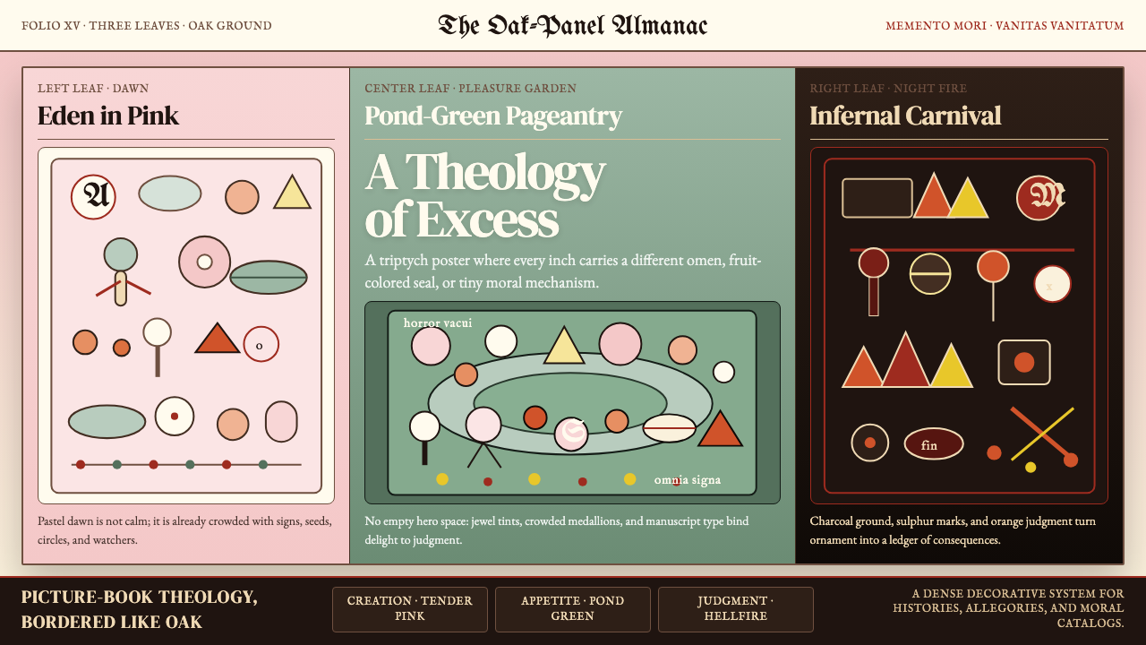 Bosch — Garden of Earthly DelightsHorror vacui becomes doctrine. Pink, green, and hellfire panels swarm with se…恐空即教义。粉、池绿与地狱橙三联画挤满衬线符记。
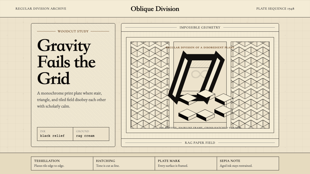 M.C. Escher ImpossibleImpossible calm. Ink-black tessellations and hatching fold cream paper into p…不可能的冷静:墨黑镶嵌与排线,让奶油纸折成悖论。
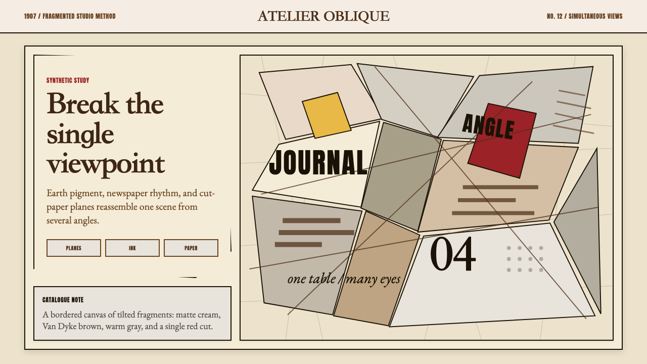 Picasso CubismSingle sight is shattered. Cream collage paper fractures brown-gray planes wi…单一视角被击碎:奶油拼贴纸上,褐灰棱面被一刀红色刺穿。
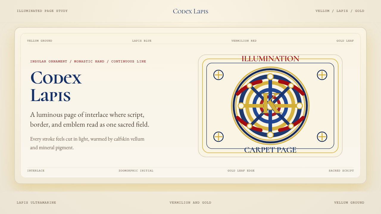 Book of Kells Celtic (800)Sacred and precise. Vellum cream, lapis, vermilion, and gold knotwork.神圣而精密。奶油羊皮底上铺陈青金石、朱砂与金色缠结纹。
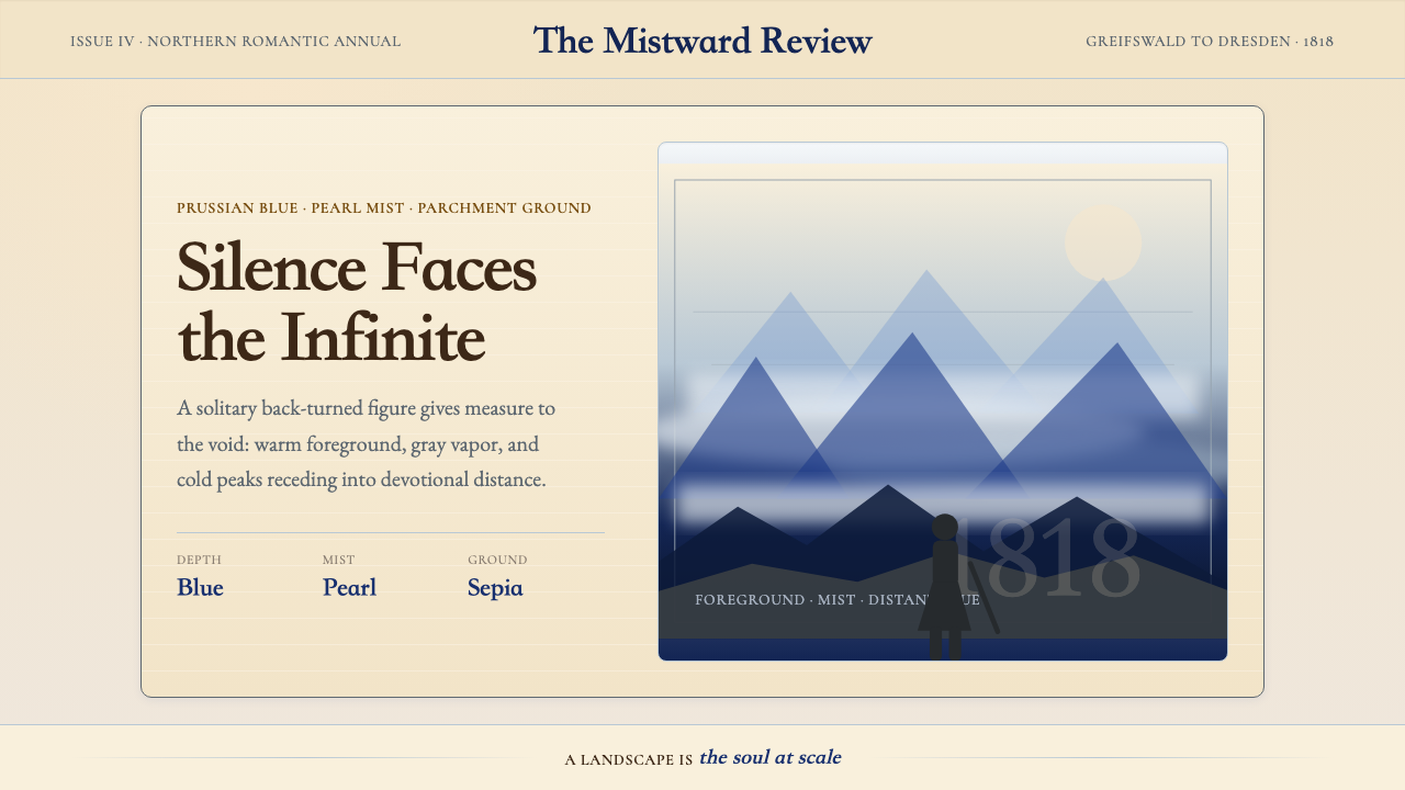 Caspar David FriedrichSilence becomes vast. Prussian blue depth, pearl mist, and parchment framing…寂静变得辽阔:普鲁士蓝纵深、珍珠雾与羊皮纸框层层后退。
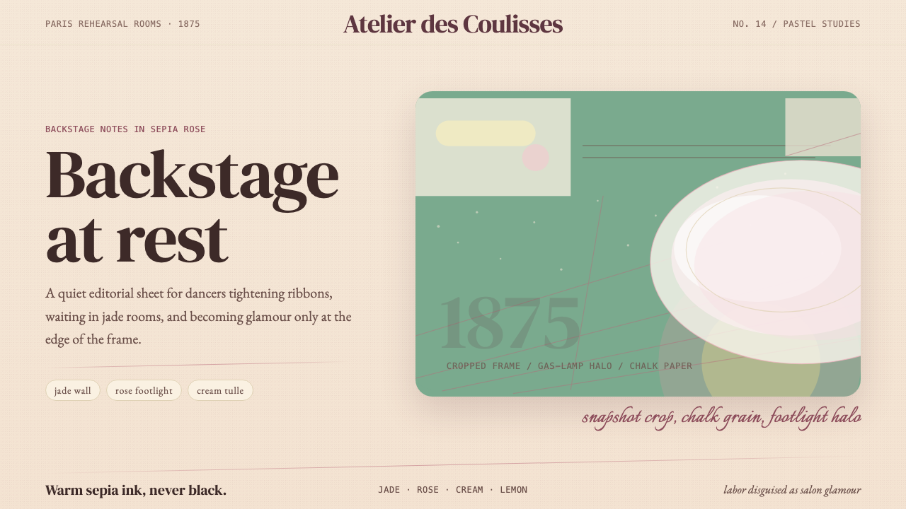 Degas Ballet PastelsBackstage glamour is labor. Jade walls, rose footlights, cropped serifs on cr…后台华丽即劳动。玉墙、玫瑰脚灯与裁切衬线落在奶油纸上。