What is Bosch — Garden of Earthly Delights?什么是 Bosch — Garden of Earthly Delights?
Hieronymus Bosch packed every inch of a three-panel oak triptych with naked figures, monstrous hybrids, and jewel-toned fruit — and made horror vacui into a theological argument.博斯将赤裸人形、异形怪兽与宝石色果实塞满三联橡木祭坛画的每一寸,把恐空变成了一场神学辩论。
Bosch — Garden of Earthly Delights in briefBosch — Garden of Earthly Delights 速览
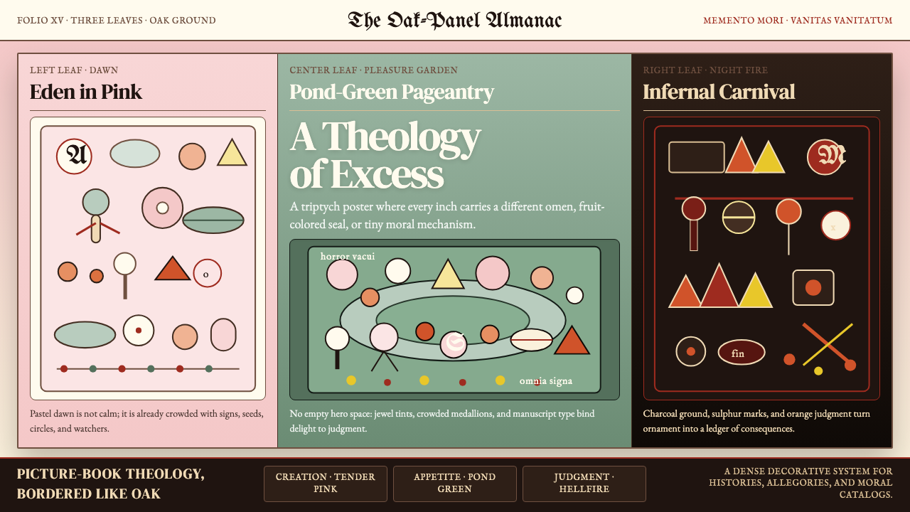
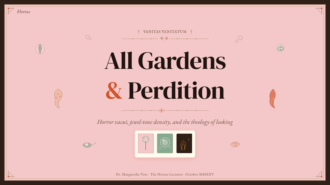
The Garden of Earthly Delights is a Flemish triptych painted by Hieronymus Bosch around 1495 to 1505, now housed in the Museo del Prado in Madrid. Its three oak panels — Eden at dawn on the left, a teeming pleasure garden in the centre, and a nightmarish infernal carnival on the right — form a single continuous moral panorama read left to right. When the outer wings are folded shut, a grisaille painting of the Earth on the third day of Creation appears: a grey, mist-wrapped sphere floating in silence, utterly unlike the chromatic explosion within.《人间乐园》是约 1495 至 1505 年间博斯绘制的一幅尼德兰三联祭坛画,现藏于马德里普拉多博物馆。三块橡木板——左联是伊甸园的初晨,中联是人丁兴旺的乐园,右联是噩梦般的地狱嘉年华——构成一幅从左向右阅读的连续道德全景。当外翼合拢时,露出的是一幅灰色底绘:创世第三日的地球,一个灰蒙蒙的、包裹在雾气中的球体,静默漂浮,与内部的色彩爆炸形成绝对对比。
As a design aesthetic, the Bosch triptych insists that density is itself a visual principle. Every segment of pictorial space contains a separate micro-narrative: a half-transparent pink sphere shelters a couple; an owl perches inside a glass globe; a figure is swallowed by a giant bird reading from a book. There is no compositional centre that commands the eye. The viewer is meant to wander, discover, and be perpetually surprised — horror vacui not as a failure of restraint but as doctrine. The visual texture is simultaneously jewel-like and unsettling: pastel flesh tones collide with sulfurous yellows, deep pool-greens, and hellfire oranges.作为一种设计美学,博斯三联画坚持认为密度本身就是视觉原则。画面空间的每一个片段都包含独立的微叙事:半透明粉色气泡庇护着一对男女;猫头鹰栖于玻璃球内;一个人物被一只正在读书的巨鸟吞入腹中。画面没有统御视线的构图中心。观者被要求游走、发现、持续惊讶——恐空不是克制的失败,而是一种教义。视觉质感同时是宝石感与不安感的混合:粉嫩肤色与硫磺黄、深池绿和地狱橙相互碰撞。
Unlike the rational grids of modernism or the unified palettes of branding traditions, the Bosch aesthetic is plural, local, and relentlessly strange. Its unity comes not from repetition or reduction but from a consistent density of invention and from the overarching three-part moral structure — paradise, transgression, and consequence — that gives the chaos its shape.与现代主义的理性网格或品牌传统的统一色板不同,博斯美学是多元的、局部性的、不可遏制的奇异。它的统一性不来自重复或简化,而来自持续的发明密度,以及赋予混沌以形状的三段式道德结构——乐园、逾越与后果。
See the Bosch — Garden of Earthly Delights design system查看 Bosch — Garden of Earthly Delights 完整设计系统
Where does Bosch — Garden of Earthly Delights come from?Bosch — Garden of Earthly Delights 从何而来?
Hieronymus Bosch was born around 1450 in 's-Hertogenbosch, a prosperous cathedral city in the Duchy of Brabant, part of the Burgundian-Habsburg Low Countries. His real surname was van Aken, suggesting Flemish artisan ancestry. He spent his entire career in his hometown — unusual for an artist of his era — and was a member of the prestigious Brotherhood of Our Lady, a religious confraternity that commissioned devotional works and provided both social standing and patronage networks. The city's Latin name, Sylva Ducis ('the Duke's forest'), eventually gave him his adopted surname.博斯约生于 1450 年,故乡是布拉班特公国的繁荣主教城市斯海尔托亨博斯,彼时隶属勃艮第-哈布斯堡尼德兰。他的本姓是范阿肯(van Aken),暗示了尼德兰工匠的家族背景。他的整个职业生涯都在故乡度过——这对那个时代的艺术家来说并不寻常——并且是享有盛名的圣母兄弟会成员,该宗教团体既是祈祷作品的委托方,也为他提供了社会地位与赞助网络。这座城市的拉丁名 Sylva Ducis(公爵之林)最终给了他那个被采用的姓氏。
The Garden of Earthly Delights was most likely commissioned by Engelbrecht II of Nassau, a powerful nobleman and art collector, sometime before 1504. Philip I of Castile saw the triptych in Brussels around 1504, and it eventually entered the collection of Philip II of Spain, who kept it not in a chapel but in his private apartments — reportedly meditating on it at length. The work was transferred to the Prado in 1939 when the museum became the repository for Spanish royal collections. The precise theological program of the triptych remains one of art history's great unresolved debates: interpretations range from a straightforward moral warning against carnal sin to an alchemical allegory, a Adamite sect manifesto, and a dream-logic vision with no single authoritative reading.《人间乐园》极有可能是在 1504 年之前由强大贵族与艺术收藏家恩格尔布雷希特二世委托创作的。卡斯蒂利亚的腓力一世约在 1504 年于布鲁塞尔见到了这幅三联画;它最终进入西班牙腓力二世的收藏,后者并未将其陈于礼拜堂,而是置于私人寝宫,据说他时常对此画长时间沉思。1939 年该作转入普拉多博物馆,由此成为西班牙王室收藏的公共遗产。三联画确切的神学纲领至今仍是艺术史上最大的悬案之一:诠释从直白的戒色警示,到炼金术寓言、亚当派教义宣言,以及无唯一权威解读的梦境逻辑,众说纷纭。
Bosch worked within the Flemish painting tradition established by Jan van Eyck and Rogier van der Weyden — the precise rendering of detail, the jewel-like local color, the ability to give each figure individual presence. But where his predecessors used this technical mastery in service of decorous religious narrative, Bosch bent it toward systematic fantasy. His monsters are not crude or cartoonish; they are painted with the same careful hand as his saints, which makes them more disturbing. He drew on visual traditions including the drolleries of illuminated manuscripts, moralizing proverb collections, alchemical diagrams, and possibly the carnivalesque popular imagery of the kermesse fairs.博斯在扬·范艾克与罗吉尔·范德魏登所确立的尼德兰绘画传统中成长——精确的细节描绘、宝石般的局部色彩、赋予每个人物以个体存在感的能力。但前辈们以这种技艺服务于端庄的宗教叙事,博斯却将其弯折向系统性的幻想。他的怪兽并非粗陋或漫画式的;它们与他笔下的圣人同样出于严谨的画手,这正是它们令人更加不安的原因。他汲取了多种视觉传统:彩饰手抄本中的滑稽边饰、道德化的谚语图集、炼金术图解,或许还有嘉年华集市狂欢图像的民间传统。
The devotio moderna movement — a lay religious reform emphasizing personal meditation on sin, temptation, and salvation — shaped the spiritual climate in which Bosch worked. 's-Hertogenbosch was a centre of this movement. The triptych's subject matter — the seductions of pleasure, the transience of earthly enjoyment, and the inevitable horror of its consequences — fits naturally into a devotio moderna context of directed moral contemplation. Pieter Bruegel the Elder, working a generation later in Antwerp and Brussels, carried forward Bosch's interest in moral panoramas dense with figures, updating the imagery from hallucinatory theology to Flemish peasant comedy.虔信现代运动——一场强调个人对罪、诱惑与救赎进行默想的平信徒宗教改革——塑造了博斯所处的精神气候,斯海尔托亨博斯正是这一运动的中心城市。三联画的主题——欢乐的诱惑、俗世享乐的短暂性与其必然后果的恐怖——自然契合虔信现代运动有方向性的道德默想情境。下一代艺术家老彼得·勃鲁盖尔在安特卫普和布鲁塞尔继承了博斯对充满人物的道德全景的兴趣,将幻觉神学的图像更新为尼德兰农民喜剧的语言。
What defines the Bosch — Garden of Earthly Delights look?Bosch — Garden of Earthly Delights 的视觉特征是什么?
Horror Vacui Density恐空密度
Every area of pictorial space is occupied. There is no compositional breathing room — not because the artist lacked discipline, but because the absence of space is the argument. Each creature, fruit, vessel, or fragment of landscape contains its own meaning. The density creates a visual experience closer to reading than to perceiving: the eye must stop, examine, and move on, processing micro-narratives one at a time. In a design context, this principle translates to layered storytelling where no area is inert or merely decorative.画面空间的每一处都被占据。没有构图上的呼吸空间——不是因为画家缺乏自律,而是因为空间的缺席本身就是论点。每一只生物、每一枚果实、每一件器皿或每一片风景碎片,都包含各自的含义。这种密度创造出一种更接近阅读而非感知的视觉体验:目光必须停驻、审视、再移动,逐一处理微叙事。在设计语境中,这一原则转化为分层叙事:画面的任何区域都不是惰性的或纯粹装饰性的。
Jewel-Toned Local Color宝石色局部主义
Bosch employs color in a pre-atmospheric, medieval-Flemish mode: each element carries its own saturated local tone with no aerial perspective to fade distant passages. Pastel pinks and flesh tones describe Eden's innocence; deep pool-greens and cool blues populate the pleasure garden; sulfurous yellows, hellfire oranges, and deep blacks dominate the infernal right panel. Colors do not blend or modulate into one another — they abut, collide, and compete. The overall effect is jewel-box richness: brilliant, dense, and utterly without subtlety in atmospheric terms.博斯以前大气、中世纪尼德兰式的方式运用色彩:每个元素携带自身饱和的局部色调,没有大气透视使远景褪色。粉嫩色与肤色描绘伊甸园的纯真;深池绿与冷蓝调充斥乐园;硫磺黄、地狱橙与深黑支配地狱右联。色彩不融合、不调和,而是紧邻、碰撞、竞争。整体效果如珠宝盒般丰富——光辉、浓密,在大气处理上毫无含糊。
Hybrid Morphology杂交形态学
Bosch's figures are rarely pure examples of any single category. A fish sprouts legs and walks; a fruit swells to human scale and shelters figures inside; a musical instrument becomes an instrument of torture. These hybrids obey an internal visual logic: the transformations are fantastical but rendered with naturalistic precision, as if the artist had witnessed them. The hybrid form is the style's primary unit of meaning — it literalises metaphors, makes moral abstractions into physical things, and ensures that every figure demands interpretation rather than passive recognition.博斯的形象很少是任何单一类别的纯粹例子。鱼长出双腿行走;果实膨胀至人体尺度并在内部庇护人形;乐器变成刑具。这些杂交体服从内在的视觉逻辑:变形是幻觉性的,却以博物学式的精确描绘,仿佛画家曾亲眼目睹。杂交形态是这种风格的基本意义单元——它将比喻字面化,将道德抽象转化为有形之物,并确保每个人物都需要阐释而非被动辨认。
Three-Panel Moral Sequence三联道德序列
The triptych structure is not merely compositional — it is argumentative. Left panel: divine order and the creation of Eve. Centre panel: the consequence of desire unrestrained, rendered as abundance tipping into absurdity. Right panel: the logical endpoint of the centre, rendered as punishment and inversion — music becomes torture, the warmth of the fire becomes the fire of hell. This three-act structure gives the visual density a narrative spine. Applied to design, the principle suggests that complex information can be organized into progressive revelations where each section modifies the meaning of the last.三联画结构不只是构图手段,它是论辩性的。左联:神圣秩序与夏娃的创造。中联:不受约束的欲望之后果,以丰裕滑向荒诞来呈现。右联:中联的逻辑终点,以惩罚与颠覆呈现——音乐变为酷刑,火焰的温暖变为地狱之火。这种三幕结构赋予视觉密度以叙事脊梁。应用于设计,这一原则表明复杂信息可以被组织成渐进式揭示,每个部分修正前一部分的含义。
Decentered Gaze去中心视线
Classical Western composition directs the viewer's eye through a hierarchy of focal points — a vanishing point, a principal figure, a dominant value contrast. Bosch's triptych refuses this hierarchy. There is no single place to stand in the painting. Dozens of scenes occur simultaneously at equal visual weight. This decentered gaze is not a compositional error; it is a theological statement: in the moral world Bosch depicts, there is no privileged vantage point. The viewer is implicated, not positioned as a safe outside observer. In contemporary design, this principle can be used deliberately to create immersive environments where exploration is required.西方古典构图通过焦点层级——消失点、主要人物、主导明暗对比——引导观者目光。博斯的三联画拒绝这种层级。画中没有单一的立足之处。数十个场景以相同的视觉分量同时发生。这种去中心视线不是构图失误;它是神学声明:在博斯描绘的道德世界中,没有特权视角。观者是被牵连其中的,而非作为安全的旁观者被定位于外。在当代设计中,这一原则可以被有意运用,以创造需要主动探索的沉浸式环境。
Micro-Narrative Accumulation微叙事积累
Where most pictorial traditions use a single central story supported by peripheral detail, Bosch organizes his surface as a field of equivalent micro-narratives. No single story is primary. The cumulative effect of these parallel stories — each one strange, each one morally charged — produces an experience of overwhelming abundance that mirrors the triptych's theological theme: pleasure so excessive it becomes its own punishment. This accumulative storytelling strategy is the style's most directly applicable contemporary technique.大多数绘画传统以单一中心故事为主、以周边细节为辅;博斯则将画面组织为等价微叙事的场域。没有任何一个故事处于首位。这些并行故事的累积效果——每一个都奇异,每一个都充满道德含义——产生一种令人压倒的丰裕体验,与三联画的神学主题形成镜像:欢乐过盛以至于成为自身的惩罚。这种积累式叙事策略是该风格最可直接应用于当代的技法。
Precise Naturalism in Service of Fantasy服务于幻想的精确自然主义
Bosch's monsters are disquieting precisely because they are painted with the same careful observation as his realistic figures. The feathers on a hybrid bird-demon are anatomically specific; the glass vessels are rendered with the same precision as a Jan van Eyck still life. This technical discipline applied to impossible subjects creates a category of disturbing credibility — the viewer's instinct to trust painted observation is turned against them. In design, this principle corresponds to using realistic rendering conventions for surreal or unexpected content, increasing cognitive dissonance and memorability.博斯的怪兽令人不安,恰恰是因为它们与他的写实人物以同等细心的观察来描绘。杂交鸟魔的羽毛具有解剖学上的准确性;玻璃器皿以与扬·范艾克静物画相当的精度描绘。这种应用于不可能主题的技术自律创造出一种令人不安的可信度——观者信任绘画观察的本能被反转利用。在设计中,这一原则对应于将写实的呈现惯例用于超现实或意外的内容,从而增强认知失调感与记忆度。
See the Bosch — Garden of Earthly Delights design system查看 Bosch — Garden of Earthly Delights 完整设计系统
Who shaped Bosch — Garden of Earthly Delights?谁塑造了 Bosch — Garden of Earthly Delights?
Born around 1450 in 's-Hertogenbosch, Bosch spent his entire career in his native city — an unusual choice in an era when successful Flemish painters typically sought metropolitan patronage in Bruges, Ghent, or Brussels. He was a member of the Brotherhood of Our Lady from around 1488, and the confraternity both commissioned and displayed his work. His paintings entered major European collections within his lifetime: Philip I of Castile saw the Garden of Earthly Delights around 1504. Bosch died in 1516 and was buried in the chapel of the Brotherhood he had served for decades. Despite — or perhaps because of — his provincial situation, he produced the most hallucinatory and theologically complex body of painted work in northern Europe.约生于 1450 年的博斯将整个职业生涯都留在故乡斯海尔托亨博斯——在成功的尼德兰画家通常前往布鲁日、根特或布鲁塞尔寻求大都市赞助的时代,这是一个不寻常的选择。他约从 1488 年起成为圣母兄弟会成员,该团体既委托又展示他的作品。他的绘画在生前就已进入欧洲主要收藏:卡斯蒂利亚的腓力一世约在 1504 年见到《人间乐园》。博斯于 1516 年辞世,葬于他服务数十年的兄弟会礼拜堂。尽管——或许正因为——身处外省,他创作出了北欧最幻觉化、神学上最复杂的绘画全集。
Count Engelbrecht II of Nassau was a prominent military commander and art patron in the Burgundian-Habsburg court, and is the most plausible identified commissioner of the Garden of Earthly Delights. The triptych later passed to his nephew Henry III of Nassau, through whose estate it eventually came to William of Orange and then, via Philip II, into the Spanish royal collection. Engelbrecht's patronage network connected the prosperous provincial culture of 's-Hertogenbosch directly to the highest levels of Burgundian aristocratic taste, making it possible for Bosch's singular vision to survive and be collected rather than treated as heretical or merely eccentric.拿骚伯爵恩格尔布雷希特二世是勃艮第-哈布斯堡宫廷中举足轻重的军事指挥官与艺术赞助人,也是《人间乐园》最有据可查的委托人。三联画后来传给他的侄子拿骚的亨利三世,经由其遗产辗转流至奥兰治亲王,再经腓力二世进入西班牙王室收藏。恩格尔布雷希特的赞助网络将斯海尔托亨博斯富庶的外省文化直接连接至勃艮第贵族品味的最高层,使博斯的独特视野得以留存并进入收藏,而非被视为异端或仅仅是古怪之物。
Philip II acquired the Garden of Earthly Delights in 1591 from the estate of William of Orange and chose not to relegate it to a storeroom or chapel but to hang it in his private quarters at El Escorial, where contemporaries reported he meditated on it privately. His reception of the triptych as a devotional and contemplative object — rather than as erotica, curiosity, or heretical imagery — was decisive for its preservation and its subsequent art-historical seriousness. Philip II was also the patron who brought the painting physically to Spain, beginning the chain of custody that led to its current home in the Prado.腓力二世于 1591 年从奥兰治亲王的遗产中获得《人间乐园》,并没有将其束之高阁或置于礼拜堂,而是悬挂于他在埃斯科里亚尔的私人寝宫——同时代人记载他曾私下对此画沉思。他将这幅三联画视为祈祷与冥想之物——而非情色作品、奇物或异端图像——这一接受方式对其保存及其后来在艺术史上受到严肃对待至关重要。腓力二世也是将这幅画实体带至西班牙的赞助人,开启了最终通向其现址普拉多博物馆的保管链。
Working a generation after Bosch, Bruegel is the most direct inheritor of Bosch's appetite for dense, morally-freighted panoramas populated by dozens of equally-weighted figures. His canvases — including Netherlandish Proverbs, The Triumph of Death, and Children's Games — share Bosch's decentered compositional strategy and his fascination with moral taxonomy rendered as visual catalogue. Where Bosch's imagery tends toward the hallucinatory and theological, Bruegel's is rooted in observed Flemish peasant life; both share the conviction that the surface of the world, looked at hard enough, reveals its moral structure.勃鲁盖尔比博斯晚一代,是博斯对充满道德重量的密集全景——由数十个等量人物充斥的画面——的最直接继承者。他的画作——包括《尼德兰谚语》《死亡的胜利》《儿童游戏》——与博斯共享去中心的构图策略,以及对以视觉目录形式呈现道德分类学的迷恋。博斯的图像趋向幻觉化与神学化,勃鲁盖尔的则根植于对尼德兰农民生活的观察;两人共同持有一种信念:世界的表面,若凝神审视,便会揭示其道德结构。
The Brotherhood of Our Lady was a prestigious religious confraternity based in the cathedral of 's-Hertogenbosch, with membership drawn from the city's civic and merchant elite. Bosch joined around 1488 and remained a member until his death. The Brotherhood commissioned altarpieces, devotional sculptures, and liturgical objects, and provided Bosch with a stable patronage context outside the major Flemish art markets. The confraternity's emphasis on personal piety, meditation on sin and salvation, and the devotio moderna movement's spiritual disciplines almost certainly shaped the moral and theological content of Bosch's most ambitious works.圣母兄弟会是斯海尔托亨博斯大教堂中一个享有盛誉的宗教团体,成员来自城市的市民与商人精英。博斯约于 1488 年加入,直至去世。兄弟会委托祭坛画、祈祷雕塑与礼仪器物,并在尼德兰主要艺术市场之外为博斯提供了稳定的赞助背景。该团体对个人虔诚、对罪与救赎的默想,以及虔信现代运动的精神训练的重视,几乎可以确定地塑造了博斯最雄心勃勃的作品中的道德与神学内容。
How do you use Bosch — Garden of Earthly Delights today?今天怎么用 Bosch — Garden of Earthly Delights?
The Bosch aesthetic is one of the most demanding historical styles to apply well precisely because its power comes from sustained, disciplined accumulation — not from surface decoration. Borrowing a single motif (a half-transparent sphere, a hybrid creature) without committing to the density principle produces kitsch rather than the original's overwhelming moral weight. Designers who work with this style must be willing to treat every available surface as meaningful rather than neutral.博斯美学是最难良好应用的历史风格之一,恰恰因为其力量来自持续的、有纪律的积累——而非表面装饰。借用单一母题(半透明气泡、杂交生物)而不投入密度原则,产生的是媚俗,而非原作令人压倒的道德重量。使用这种风格的设计师必须愿意将每一处可用表面视为有意义的,而非中性的。
For presentation slides, the Bosch approach works most forcefully on editorial covers and storytelling decks where visual impact rather than information efficiency is the primary goal. A cover slide can carry the style's horror vacui density: layered surreal illustration fills the entire field, with title text appearing as if carved into the texture rather than placed on top of it. Section-break slides can use the triptych's three-panel structure — left context, centre argument, right consequence — as an explicit compositional logic. Data slides, however, should resist the style: Bosch's decentered gaze makes quantitative comparison difficult. Reserve the visual richness for framing and narrative moments; use restraint at the data layer.对于演示文稿,博斯手法在编辑封面和叙事型幻灯片上最为有力,此类场景以视觉冲击而非信息效率为首要目标。封面幻灯片可以承载这种风格的恐空密度:分层的超现实插图铺满整个画面,标题文字仿佛是刻入质感之中,而非叠放其上。分节幻灯片可以使用三联画的三面板结构——左联背景、中联论点、右联后果——作为明确的构图逻辑。然而数据幻灯片应该抵制这种风格:博斯的去中心视线使定量比较变得困难。将视觉丰富性保留给框架与叙事时刻;在数据层保持克制。
For web interfaces, the Bosch palette and density principle are best applied in editorial contexts — longform articles, cultural institution sites, immersive storytelling microsites — rather than in transactional product interfaces. A dark background loaded with jewel-toned illustration and medieval-manuscript-style ornamental borders creates an atmosphere of depth and discovery appropriate to cultural heritage, publishing, and arts organisations. Navigation and interactive controls should be clean against this richness rather than competing with it; the illustration carries the ambient meaning while typography remains legible. Dashboard and SaaS interfaces should avoid this style entirely — the decentered gaze is antithetical to scannable hierarchy.对于网页界面,博斯的色板与密度原则最适合应用于编辑性语境——长篇文章、文化机构网站、沉浸式叙事微型网站——而非交易性产品界面。深色背景承载宝石色调插图与中世纪手抄本风格的装饰边框,为文化遗产、出版与艺术机构营造深度与探索的氛围。导航与交互控件应在这种丰富性中保持清晰,而非与之竞争;插图承载环境意义,而排版保持易读。仪表板与 SaaS 界面应完全回避这种风格——去中心视线与可扫描的层级结构背道而驰。
For editorial and marketing work, the style is strongest in limited, high-contrast deployments: a poster where a single Bosch-derived hybrid creature occupies the full field, with sparse typography anchored at the bottom; a book cover where the triptych's jewel-like color palette structures the composition but the density is controlled; a social card that takes one micro-scene from the visual vocabulary and gives it space to breathe. Marketing copy paired with this aesthetic should match the style's register — layered meaning, moral undertone, a slight sense of menace beneath the surface richness — rather than defaulting to corporate optimism.对于编辑与营销内容,这种风格在有限、高对比度的部署中最为强劲:一张海报,一只源于博斯的杂交生物占据全幅,稀疏的文字锚定于底部;一个书籍封面,三联画宝石般的色板结构构图,但密度受到控制;一张社交媒体卡片,从视觉词汇中取一个微叙事,给予它呼吸的空间。与这种美学搭配的营销文案应当匹配这种风格的调性——分层含义、道德底色、表面丰富之下隐隐的威胁感——而非退回到企业式乐观主义。
A common mistake when referencing this style is treating it as license for undisciplined clutter. Bosch's density is organized — morally, theologically, compositionally — even when it appears chaotic. Random accumulation of unrelated imagery produces visual noise, not the triptych's overwhelming coherence. A second frequent error is using the style's medieval color palette — pinks, greens, oranges — without committing to the flatness and the lack of atmospheric perspective that gives the original its jewel-box quality. Soft gradients and drop shadows immediately dissolve the effect. If the Bosch aesthetic is to be invoked, commit to its density, its precision, and its conviction that every inch carries meaning.引用这种风格时,常见的错误是将其视为无纪律堆砌的许可。博斯的密度是有组织的——在道德上、神学上、构图上——即使它看起来混乱。不相关图像的随机积累产生的是视觉噪音,而非三联画令人压倒的连贯性。第二个常见错误是使用这种风格的中世纪色板——粉色、绿色、橙色——却不投入原作赋予宝石盒品质的平面性与无大气透视感。柔和渐变与投影阴影会立即消解效果。若要唤起博斯美学,就必须投入其密度、其精确,以及其每一寸都承载意义的信念。
See the Bosch — Garden of Earthly Delights design system查看 Bosch — Garden of Earthly Delights 完整设计系统
Bosch — Garden of Earthly Delights — FAQBosch — Garden of Earthly Delights · 常见问题
Is the Bosch triptych style the same as general surrealism?博斯三联画风格与一般超现实主义相同吗?
They share a surface vocabulary of impossible combinations and dreamlike imagery, but their underlying logic is different. Bosch's imagery is theological and moral — every hybrid creature and fantastical scene can, at least in principle, be interpreted within a Christian allegorical framework of sin, temptation, and punishment. Surrealism, which emerged in the 1920s, draws on psychoanalytic ideas about the unconscious and dreams; its imagery is meant to bypass rational interpretation, not to encode a fixed theological program. Bosch's triptych is more like an extremely dense illustrated text than a free-associative dream. The difference matters for design: Bosch references tend toward weight, moral seriousness, and encyclopedic completeness; surrealist references tend toward lightness, wit, and deliberate logical rupture.两者共享不可能组合与梦境图像的表面词汇,但其内在逻辑不同。博斯的图像是神学与道德性的——每一只杂交生物和奇幻场景,至少在原则上,都可以在罪、诱惑与惩罚的基督教寓言框架内得到诠释。兴起于 1920 年代的超现实主义汲取关于无意识与梦境的精神分析理念;其图像旨在绕过理性诠释,而非编码固定的神学纲领。博斯的三联画更像一部极度密集的图解文本,而非自由联想的梦境。这一区别对设计有意义:博斯参照倾向于分量感、道德严肃性与百科全书式的完整性;超现实主义参照倾向于轻盈感、机智与有意的逻辑断裂。
How do you apply horror vacui density without making a design illegible?如何在不让设计变得难以辨读的情况下应用恐空密度?
The key is Bosch's own solution: maintain locally clear rendering within globally dense composition. Each micro-scene in the triptych is individually legible — a specific figure doing a specific thing — even though the overall field is overwhelming. In design, this means that each element within a dense composition must have crisp definition: clear edges, unambiguous silhouettes, no detail merging into adjacent detail. Color zoning also helps: Bosch uses the left-to-right panel transition from pink to green to orange-black to help the eye navigate. In a design context, distinct color temperature zones can perform the same function. The failure mode is when density comes from layering low-contrast elements, which produces mud rather than richness.关键在于博斯自身的解决方案:在整体密集的构图中保持局部清晰的描绘。三联画中的每个微叙事单独来看都是易读的——一个具体人物在做具体的事——即使整体画面是令人压倒的。在设计中,这意味着密集构图中的每个元素都必须有清晰的定义:清晰的边缘、明确的轮廓、没有细节融入相邻细节。色彩分区同样有帮助:博斯利用三联画从左到右粉色到绿色再到橙黑色的面板过渡来帮助眼睛导航。在设计语境中,明确的色温分区可以实现同样的功能。失败模式是当密度来自低对比度元素的叠加时,产生的是泥浆而非丰富感。
Is this style appropriate for digital product interfaces?这种风格适合用于数字产品界面吗?
Rarely, and only in specific contexts. The Bosch aesthetic is fundamentally unsuited to interfaces that require rapid scanning, clear affordances, or predictable information architecture. Its decentered gaze, moral density, and horror vacui composition create an experience of immersion and discovery, which is valuable in cultural, editorial, or experiential contexts but counterproductive in transactional or analytical ones. The style works well for microsites, cultural institution landing pages, editorial headers, immersive introductions, and splash screens. It should be avoided for navigation systems, data dashboards, form interfaces, settings panels, and any context where the user needs to quickly locate a specific piece of information. When in doubt, confine the Bosch visual richness to decorative framing elements and keep the functional UI layer clean.很少,且仅在特定语境中适用。博斯美学从根本上不适合需要快速扫描、清晰可供性或可预期信息架构的界面。其去中心视线、道德密度与恐空构图创造的是沉浸与发现的体验,这在文化、编辑或体验性语境中有价值,但在交易性或分析性语境中适得其反。这种风格适合微型网站、文化机构落地页、编辑页头、沉浸式导语与启动画面。应避免用于导航系统、数据仪表板、表单界面、设置面板,以及任何用户需要快速定位特定信息的场景。如有疑问,将博斯的视觉丰富性限制在装饰性框架元素中,并保持功能性 UI 层的简洁。
What is the difference between Bosch's color palette and conventional medieval illumination?博斯的色板与常规中世纪彩饰手抄本有何区别?
Both traditions employ saturated local color without atmospheric perspective, and both use gold or bright grounds as a base. But Bosch works at a scale and with an ambition that illuminated manuscripts rarely approached: his panels are large enough to sustain the kind of micro-narrative density that would be illegible at manuscript scale. More significantly, Bosch's color does moral work that illumination does not: the progression from the delicate pinks of Eden to the fire-oranges and deep blacks of hell is a theological argument made entirely through color temperature and saturation. Manuscript illumination tends to distribute its jewel tones evenly for decorative effect; Bosch organizes his into a directed moral sequence. This makes his palette more structurally complex and harder to borrow as mere decoration.两种传统都使用无大气透视的饱和局部色彩,都以金色或明亮底面为基础。但博斯的工作尺度与雄心是彩饰手抄本很少企及的:他的板面足够大,可以承载在手抄本尺度下无法辨读的微叙事密度。更重要的是,博斯的色彩承担着彩饰所没有的道德功能:从伊甸园娇嫩粉色到地狱火焰橙与深黑的渐进,是完全通过色温与饱和度构成的神学论点。手抄本彩饰倾向于均匀分布宝石色调以获得装饰效果;博斯则将其组织成有方向的道德序列。这使得他的色板在结构上更为复杂,更难以作为纯粹装饰借用。
Can the Bosch style work in a minimal or restrained layout?博斯风格能在极简或克制的版面中起作用吗?
It can, but the result is not really the Bosch aesthetic — it is a quotation from it. Taking a single hybrid creature or a single jewel-toned detail and placing it in generous white space produces an elegant, editorial effect, but this is using the triptych as a source of motifs rather than as a visual system. The Bosch aesthetic as a system requires density; stripped of density, what remains is just medieval-Flemish illustration style, which is a different and less specific reference. This is not a criticism of restrained quotation — it can be highly effective — but designers should be honest with themselves about whether they are working with the style or merely sampling from it. For the full system, commit to the accumulation. For a light touch, credit the source and simplify deliberately.可以,但结果并非真正的博斯美学——而是对它的引用。取一只杂交生物或一个宝石色调细节,将其置于充裕的留白中,会产生优雅的编辑效果,但这是将三联画作为母题来源使用,而非作为视觉系统。博斯美学作为系统需要密度;剥去密度,剩下的只是中世纪尼德兰插图风格,那是一个不同且不那么特定的参照。这不是对克制引用的批评——它可以非常有效——但设计师应该对自己诚实:他们是在运用这种风格,还是仅仅在从中采样。若要完整系统,就要投入积累。若要轻描淡写,就明确承认来源并有意简化。
Related design styles相关设计风格
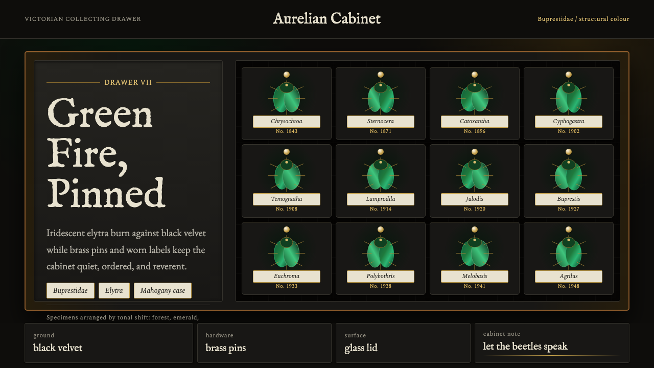 Beetle Specimen CabinetGreen burns in darkness. Emerald elytra grids glow under brass keylines and b…暗处燃起绿光。翡翠鞘翅格阵在黄铜线与黑绒底上发亮。
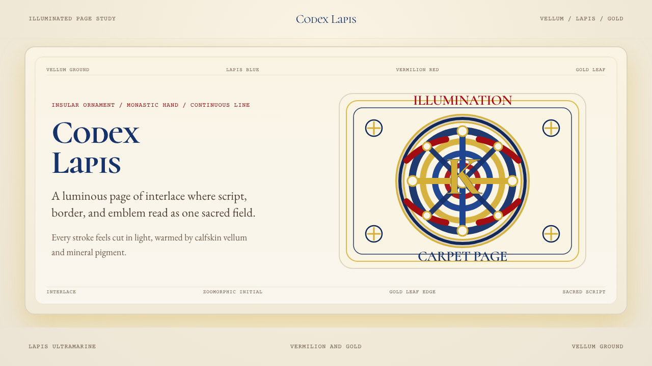 Book of Kells Celtic (800)Sacred and precise. Vellum cream, lapis, vermilion, and gold knotwork.神圣而精密。奶油羊皮底上铺陈青金石、朱砂与金色缠结纹。
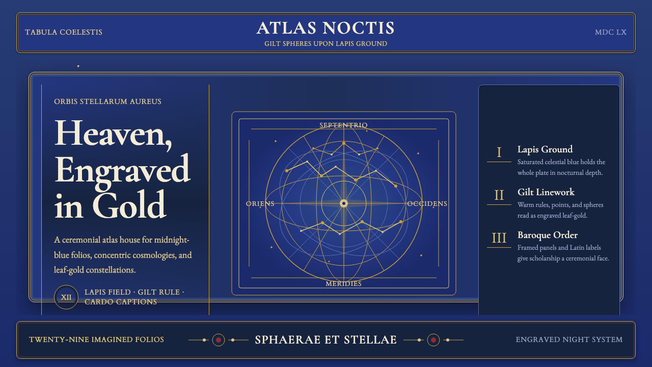 Cellarius Celestial AtlasCelestial luxury on lapis. Gilt serif type, star fields, and concentric chart…青金夜空里的天体奢华:鎏金衬线、星点与同心星图线。
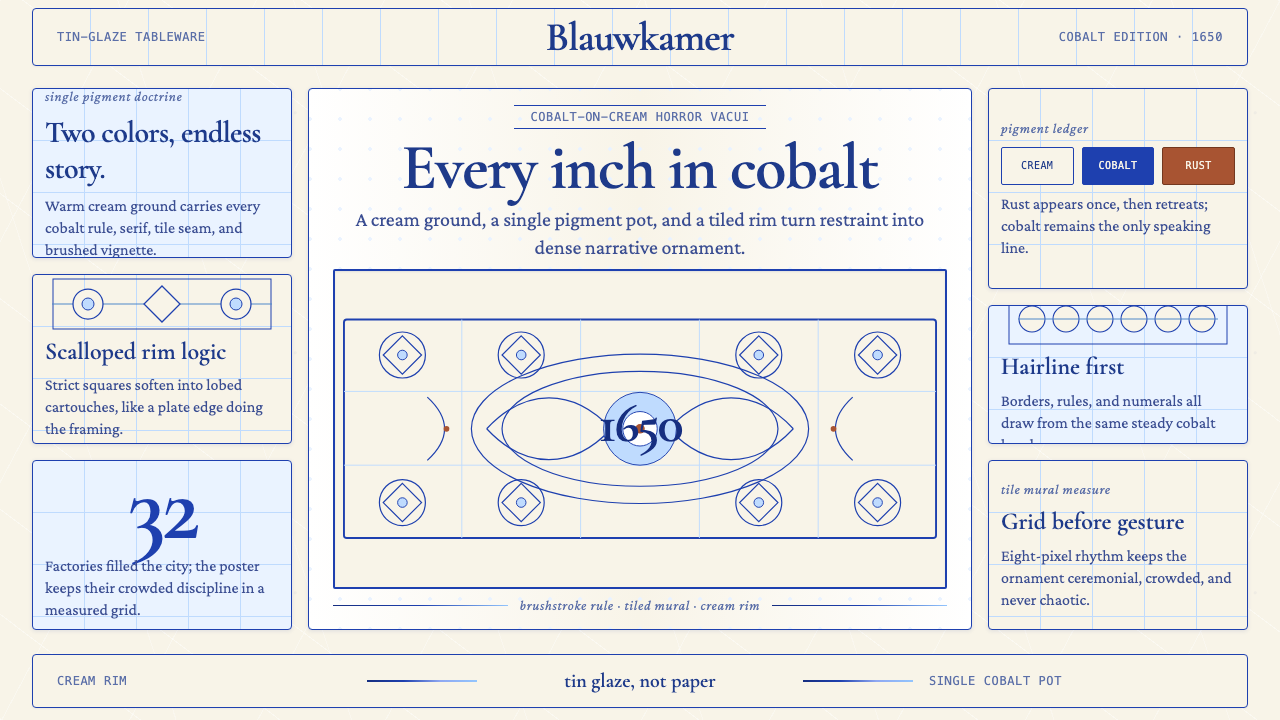 Delft Blue PotteryRestrained, yet every inch speaks. Cobalt hairlines crowd a cream tile grid.克制却寸土必描。钴蓝细线铺满米白瓷砖网格。
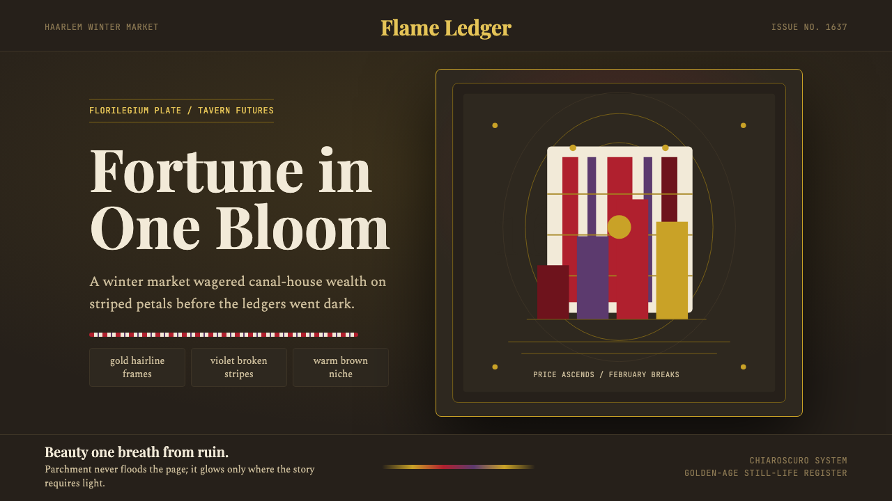 Dutch Tulip ManiaSpeculation burns in shadow. Flame red petals, violet stripes, gold frames on…投机在暗处燃烧:暖棕壁龛中,火红花瓣、紫纹与金框发光。
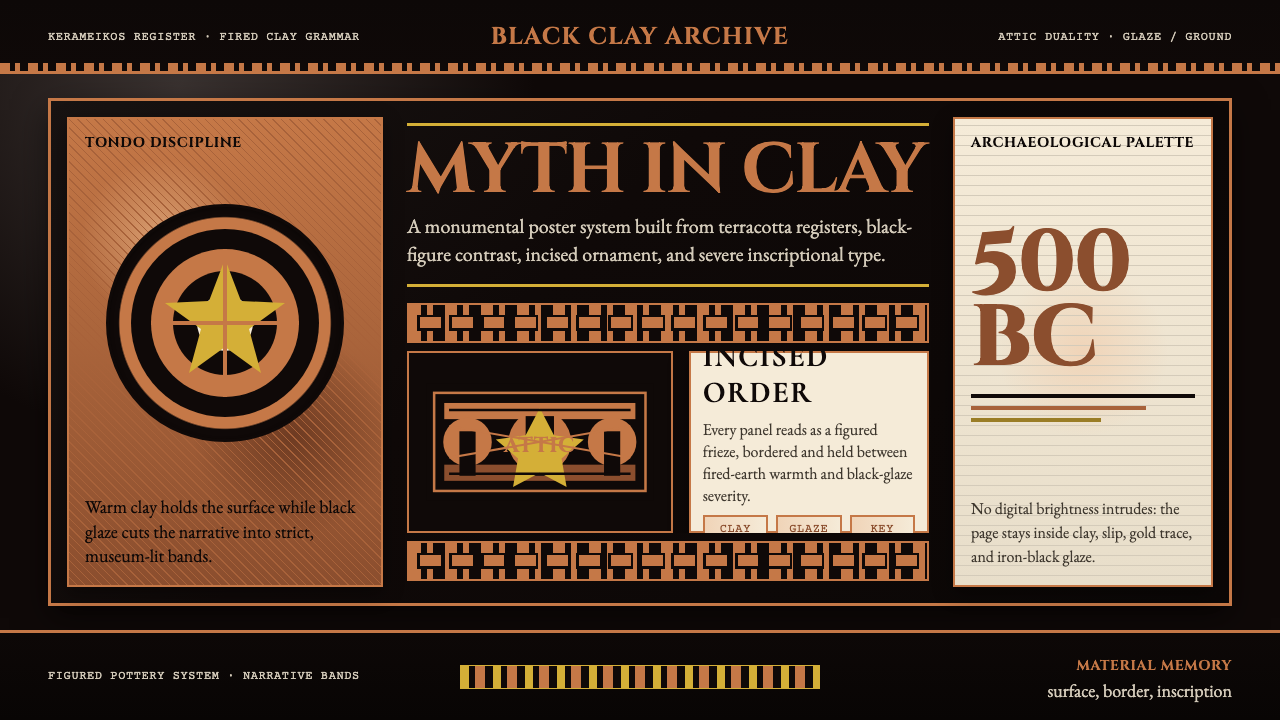 Greek Vase Attic (500 BC)Archaeological severity. Jet-black glaze, terracotta bands, and meander borde…考古般克制:黑釉底、赤陶饰带与回纹边框构成陶瓶式秩序。