What is Senegalese Sous-Verre?什么是 Senegalese Sous-Verre?
Senegalese sous-verre turns the painter's process inside out — building every image backwards through glass, highlights first and bold black contours last, in colors as saturated and joyful as a West African market at midday.塞内加尔玻璃背画把画师的工序彻底翻转——在玻璃背面逆序构建每一幅画,先点高光、最后才落粗黑轮廓,色彩饱满热烈,如同正午西非集市的喧嚣与光芒。
Senegalese Sous-Verre in briefSenegalese Sous-Verre 速览
Senegalese sous-verre — the name comes directly from the French for 'under glass' — is a West African folk painting tradition in which artists work on the reverse side of a flat glass pane, applying pigments in the exact opposite order from conventional painting. Highlights and fine interior details go on first; mid-tones and flat color fields follow; the defining black contour lines come last. When the glass is turned face-forward, the image appears fully formed, with colors locked behind a transparent surface that gives the work its distinctive luminous depth.塞内加尔玻璃背画(sous-verre,法语「玻璃之下」)是一种西非民间绘画传统,画师在平板玻璃的背面作画,上色顺序与常规绘画完全相反:先点高光与细部,再铺中间色与平涂色块,最后才以纯黑勾勒轮廓线。将玻璃翻转正面朝前,画面便完整呈现——色彩被锁在透明表面之下,赋予作品独特的发光深度。
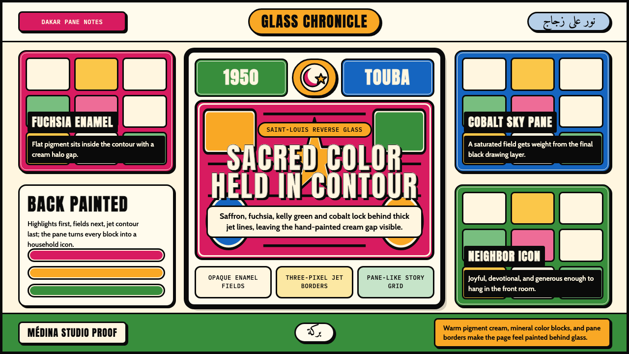
The aesthetic is simultaneously sacred and exuberant. Flat, opaque enamel pigments — fuchsia, saffron yellow, kelly green, cobalt blue, vermilion — fill each shape completely, with no blending or gradation. Thick, jet-black outlines separate every color region, functioning like the lead lines of a stained-glass window but without any actual structural armature. Each color field sits fractionally inside its outline, leaving a faint halo gap that is the unmistakable signature of the hand-painted form. The result has a stained-glass radiance but a warmth and narrative intimacy that is entirely its own.这种美学兼具神圣性与欢腾感。不透明的珐琅颜料——洋红、藏红黄、草绿、钴蓝、朱砂红——将每块形状填满,不作混色或过渡。粗重的纯黑轮廓线将每个色域隔开,功能有如彩绘玻璃窗的铅条,却无须任何结构支撑。每块色域都略微内缩于轮廓线之内,留下一道若隐若现的光晕间隙——这是手工绘制的不可磨灭的印记。最终效果兼具彩窗的光辉与温暖叙事的亲密感,独树一帜。
The tradition encompasses a wide range of subject matter. Its most prominent images are devotional portraits of Cheikh Amadou Bamba, the founder of the Mouride Sufi brotherhood, whose image became ubiquitous in Senegalese homes and taxis from the mid-twentieth century onward. Alongside these sacred icons, painters produced Quranic verse panels, scenes of Wolof daily life, Serer wrestling matches, Lebu fishermen hauling nets, and the elaborate social ceremonies — baptisms, weddings, political celebrations — that structure community life. The tradition holds popular and spiritual registers with equal ease.这一传统涵盖极为广泛的题材。最具代表性的是穆里德苏菲教派创始人谢赫·阿马杜·班巴的肖像,自二十世纪中叶起,他的画像几乎遍布塞内加尔家家户户与出租车厢。除宗教圣像外,画师还创作古兰经铭文板、沃洛夫族市井日常、塞雷尔族摔跤场面、莱布族渔夫拉网图,以及洗礼、婚礼、政治庆典等构成社区生活骨架的仪式场景。这一传统以同等自在的姿态游走于世俗与神圣之间。
See the Senegalese Sous-Verre design system查看 Senegalese Sous-Verre 完整设计系统
Where does Senegalese Sous-Verre come from?Senegalese Sous-Verre 从何而来?
The technique of painting on the back of glass reached Senegal through multiple overlapping channels during the colonial era. Reverse glass painting had long traditions in China, southern Europe, and the Ottoman world, and its arrival in West Africa is linked both to trade networks along the trans-Saharan and Atlantic routes and to the direct presence of European missionaries and traders in coastal cities. The Saint-Louis workshop tradition — the earliest documented center — took shape in the 1920s in a city that had been the administrative capital of French West Africa since the eighteenth century. There, Senegalese artists absorbed the technique and immediately transformed it: the European devotional subjects and the Indian chromolithograph prints that may have served as early models were set aside in favor of local Islamic iconography and Wolof narrative.玻璃背面绘画技法在殖民时代通过多条交汇渠道传入塞内加尔。反面玻璃画在中国、南欧及奥斯曼世界均有悠久传统;其进入西非既与跨撒哈拉及大西洋贸易网络相关,也与欧洲传教士和商人在沿海城市的直接存在密不可分。最早有记载的创作中心——圣路易工坊传统——在1920年代成形于这座自十八世纪便是法属西非行政首府的城市。塞内加尔画师在此习得技法,随即对其进行了根本性改造:欧洲宗教题材与印度彩色石印版画——或许充当过早期参照模板——很快被本土伊斯兰图像志与沃洛夫叙事所取代。
The decisive turn came with the mass production of devotional imagery centered on Cheikh Amadou Bamba (1853–1927), the Sufi mystic who founded the Mouride brotherhood and became the most important religious figure in modern Senegalese history. Bamba's encounters with French colonial authorities — his exile to Gabon in 1895 and then to Mauritania in 1902 — transformed him into a symbol of spiritual resistance, and demand for his portrait was enormous. Sous-verre painters provided affordable, portable sacred images for a population with limited access to photography and no tradition of religious oil painting. By the 1940s and 1950s, the Dakar workshops in the Médina and Plateau neighborhoods had become the primary production centers, with painters working in informal ateliers and selling through market stalls.决定性的转折来自以谢赫·阿马杜·班巴(1853—1927年)为中心的宗教图像大规模生产。这位苏菲神秘主义者创立了穆里德兄弟会,成为现代塞内加尔历史上最重要的宗教人物。班巴与法国殖民当局的对峙——1895年被流放至加蓬、1902年再被流放至毛里塔尼亚——使他成为精神抵抗的象征,对其肖像的需求极为旺盛。玻璃背画师为那些无从获得摄影图像、也没有宗教油画传统的大众,提供了价格亲民、便于携带的圣像。至1940至50年代,达喀尔梅迪纳与高原区(Plateau)的工坊已成为主要生产中心,画师们在非正式工作室内创作,通过集市摊位销售作品。
The peak of production ran roughly from the 1950s through the 1990s, a period during which the tradition simultaneously served popular devotional need, became a recognized art form, and attracted the attention of collectors, ethnographers, and eventually international curators. Artists such as Mor Gueye, Babacar Lô, and Souleymane Keita developed recognizable individual styles within the shared visual vocabulary of the form, producing works that ranged from small domestic devotional pieces to large-format narrative panels. The tradition was never organized into a formal school or guild; transmission was workshop-based and familial, with techniques passing from established painters to apprentices and relatives.生产高峰大致延续自1950年代至1990年代。这一时期,这一传统同时服务于大众宗教需求、跻身公认艺术形式,并吸引了收藏家、民族志学者乃至国际策展人的目光。莫尔·盖伊(Mor Gueye)、巴巴卡尔·洛(Babacar Lô)、苏莱曼纳·凯塔(Souleymane Keita)等画师在这一共同视觉语汇内发展出各自可辨识的个人风格,创作了从小幅家用圣像到大尺寸叙事画板的系列作品。这一传统从未组织为正式学校或行会;知识传承依赖工坊与家族,技艺在资深画师与学徒、亲属之间口耳相传。
In the decades after Senegalese independence in 1960, sous-verre underwent a complex double movement: as a popular devotional medium it remained deeply embedded in everyday life, while simultaneously being framed by cultural institutions and the international art market as a distinctive African modernism worthy of museum attention. This dual status — folk craft and fine art — is not a contradiction but an accurate description of a tradition whose practitioners have always moved freely between the sacred domestic interior and the gallery wall. Contemporary artists working in the tradition continue to expand its subjects, incorporating political commentary, urban experience, and engagement with the wider world of image-making.1960年塞内加尔独立后数十年间,玻璃背画经历了一种复杂的双重运动:作为大众宗教媒介,它依然深嵌于日常生活;与此同时,文化机构与国际艺术市场也将其定位为值得博物馆关注的独特非洲现代主义。这种双重身份——民间工艺与纯艺术——并不矛盾,而是对一个传统的准确描述:其创作者始终在神圣的家庭内室与画廊白墙之间自由穿行。当代延续这一传统的艺术家仍在不断拓展题材,将政治评论、城市经验与更广泛的图像世界对话融入其中。
What defines the Senegalese Sous-Verre look?Senegalese Sous-Verre 的视觉特征是什么?
Reverse-order construction逆序构建
The defining technical discipline of sous-verre is that the painter works in the inverse of normal pictorial sequence. What will appear in front — highlights, white details, fine interior linework — must be painted first, directly onto the glass surface. Color masses follow, and the bold black outlines that hold the composition together are applied last of all. This reversal demands that the artist hold the completed image fully in mind before making a single mark, since corrections require painting over areas already committed to glass.玻璃背画最核心的技术规律是:画师以与常规绘画完全相反的顺序作业。最终呈现在画面前方的部分——高光、白色细节、内部细线——必须最先直接涂在玻璃面上;色块随后铺设;最后才落下那道将整个构图凝聚在一起的粗黑轮廓。这种逆序要求画师在落笔之前便将完成的画面完整地保存在脑海中,因为一旦涂于玻璃便难以修改。
Saturated flat color饱和平涂色
Color in sous-verre is applied as opaque, fully saturated fields with no internal gradation, shading, or blending. Fuchsia, saffron, kelly green, cobalt blue, and vermilion are characteristic hues, chosen for their intensity under the glass surface. Because each color must be laid down before neighboring colors are added, there is no optical mixing between regions; instead, the black contour line performs the work of separation. The palette reads as festive, warm, and assertive — closer in spirit to folk textile than to academic painting.玻璃背画的色彩以不透明、高饱和度的平涂色块呈现,内部无渐变、无阴影、无混色。洋红、藏红黄、草绿、钴蓝与朱砂红是代表性色调,以其在玻璃表面下的强烈光感而著称。由于每块颜色须在相邻色块加入前先行铺设,色域之间不发生光学混色;分隔的任务由黑色轮廓线来承担。整体色调热烈、温暖、强势——在气质上更接近民间纺织品,而非学院绘画。
Bold black contour粗黑轮廓
Thick black outlines drawn in the final stage of painting are the visual signature of the style. They separate every color region, define every figure, and hold the entire composition in a web of firm, decisive lines. The line quality is confident and fluid — not mechanical, but not hesitant either. This approach shares a visual logic with leaded stained glass and with cloisonné enamelwork, both traditions in which a rigid barrier between color zones is a structural necessity. In sous-verre, the contour has no structural function; it is purely visual, and its boldness is a deliberate aesthetic choice.在绘画最后阶段勾勒的粗黑轮廓线是这种风格的视觉标志。它们将每个色域隔开,勾勒出每个人物,以一张坚定有力的线网将整个构图托住。线条质感自信而流动——既非机械,亦不迟疑。这种处理方式与铅条彩绘玻璃及景泰蓝珐琅工艺具有相似的视觉逻辑——在那些传统中,色域之间的刚性隔断是结构必需。在玻璃背画中,轮廓线没有结构功能;它纯粹是视觉性的,其粗重感是一种经过选择的审美决定。
The halo gap光晕间隙
Because each color field is painted before the surrounding outline is applied, the color inevitably sits just inside the contour rather than touching it flush. This produces a characteristic thin gap — a sliver of light or bare glass — between the edge of each color mass and its surrounding black line. Far from being a flaw, this halo gap is recognized as the authentic mark of hand-painted sous-verre; it is absent in photomechanical reproductions of the style. In composition, it gives each color shape a subtle luminous breathing room and emphasizes the layered, time-based nature of the process.由于每块色域在其周围轮廓线落笔之前便已铺设,颜色不可避免地内缩于轮廓之内,而非与之齐平相接。这产生了一道特征性的细隙——一道光缝或裸露玻璃——在每块色块边缘与其周围黑线之间若隐若现。这道光晕间隙非但不是缺陷,反而被视为手工玻璃背画的真实印记;照相机械复制版本中并无此特征。在构图层面,它赋予每块色形微妙的发光呼吸感,也强调了这一创作过程的层次性与时间性。
Frontal, hieratic figures正面庄严的人物形象
The dominant figure convention in sous-verre is frontal and hieratic: subjects face directly toward the viewer, occupy the center of the composition, and are often framed by decorative borders or inscriptions. This posture carries devotional weight — in sacred portraiture, direct gaze conveys spiritual authority and the intimacy of a personal encounter. It also reflects a broader West African aesthetic preference for figures that address the viewer rather than being observed from a distance. Even in secular narrative scenes, human figures tend toward a composed, frontally oriented dignity rather than the dynamic foreshortening of Western academic painting.玻璃背画中占主导的人物表现方式是正面庄严式:人物直视观者,占据构图中心,通常由装饰性边框或铭文环绕。这种姿态承载着宗教意涵——在圣像肖像中,直视的目光传达精神权威与个人照面的亲密感。它也反映了西非更广泛的美学偏好:人物应主动与观者对话,而非被远距观察。即便在世俗叙事场景中,人物也倾向于一种沉静的、正面朝向的庄重感,而非西方学院绘画的动态透视缩短。
Decorative framing and inscription装饰性边框与铭文
Sous-verre compositions are frequently bordered by ornamental bands that echo the geometric and floral vocabularies of West African textile, architecture, and leatherwork. Within the image field, Arabic calligraphic inscriptions — Quranic verses, the names of religious figures, blessings — are often integrated as formal visual elements rather than added as captions. The text becomes part of the pattern, its cursive letterforms weaving among figurative and geometric motifs. This integration of word and image reflects the central role of literacy and scripture in Mouride devotional culture and the broader Islamic artistic tradition of treating calligraphy as a supreme visual art.玻璃背画的构图常以装饰性图案带为边框,呼应西非纺织品、建筑与皮革工艺中的几何和植物纹样语汇。在画面内部,阿拉伯书法铭文——古兰经节选、宗教人物名讳、祝福语——往往作为形式性视觉元素融入其中,而非以说明文字形式附加其外。文字成为图案的一部分,其草体字形与具象及几何母题交织缠绕。这种文字与图像的融合,折射出识字与经文在穆里德信仰文化中的核心地位,也体现了伊斯兰艺术传统将书法视为最高视觉艺术的更广理念。
Luminous surface quality发光的表面质感
Glass as the painting support is not neutral; it transforms the optical behavior of the pigments. Colors viewed through a transparent surface have an interior glow that cannot be achieved on paper, canvas, or board. The effect is particularly vivid when the painting is held toward a light source — the glass functions almost like a back-lit panel, amplifying saturation and giving the image a quality of radiance that aligns naturally with its sacred subjects. This luminous quality is fundamental to the style's emotional register and is irreproducible by photographic or digital means.玻璃作为画面载体并非中性存在;它从根本上改变了颜料的光学表现。透过透明表面观看的色彩拥有一种内在的发光感,在纸张、画布或木板上无法企及。这种效果在画作朝向光源时尤为生动——玻璃几乎如同背光面板,放大饱和度,赋予画面一种光辉气质,与其神圣题材天然契合。这种发光品质是这种风格情感基调的根本要素,无法通过摄影或数字手段复制。
See the Senegalese Sous-Verre design system查看 Senegalese Sous-Verre 完整设计系统
Who shaped Senegalese Sous-Verre?谁塑造了 Senegalese Sous-Verre?
Mor Gueye was among the most celebrated sous-verre painters of Dakar's Médina neighborhood, working from the mid-twentieth century through the height of the tradition's commercial and artistic vitality. His paintings of Cheikh Amadou Bamba were known for the intensity of their saturated color fields and the assured quality of his contour work — lines that combined decisive weight with a fluid, almost calligraphic rhythm. His work circulated widely beyond Senegal, entering collections in France and elsewhere, and helped establish sous-verre as a form worthy of serious attention outside its devotional context.莫尔·盖伊是达喀尔梅迪纳区最受推崇的玻璃背画师之一,活跃于二十世纪中叶至这一传统商业与艺术活力顶盛时期。他描绘谢赫·阿马杜·班巴的作品以饱和色域的强烈感和轮廓线的确定质量著称——那些线条融合了果断的力度与流动的、近乎书法的节奏。他的作品广泛流通至塞内加尔之外,进入法国及其他地方的收藏,并推动玻璃背画在宗教语境之外赢得认真对待的地位。
Babacar Lô extended the formal range of sous-verre beyond its most iconic devotional subjects, producing large-scale narrative panels depicting Wolof ceremonies, wrestling matches, and scenes of urban Dakar life. His compositional ambition — organizing multiple figures across horizontal formats with a control of spatial rhythm unusual in the folk tradition — pushed the form toward something closer to mural painting while retaining the opaque enamel palette and black contour vocabulary that define sous-verre at any scale. His work is frequently cited in scholarship on the intersection of West African folk art and modernism.巴巴卡尔·洛将玻璃背画的形式范围延伸至最标志性的宗教题材之外,创作了描绘沃洛夫仪式、摔跤比赛与达喀尔都市生活场景的大幅叙事画板。他在构图上的抱负——以民间传统中少见的空间节奏控制,将多个人物组织于横向构图之中——将这一形式推向了更接近壁画的领域,同时保留了在任何尺度上定义玻璃背画的不透明珐琅色板与黑色轮廓语汇。他的作品在研究西非民间艺术与现代主义交汇的学术著作中频繁被引用。
Souleymane Keita represents the generation of sous-verre painters who worked during the period of greatest international visibility for the form, from the 1970s through the 1990s. His practice was notable for the refinement of his decorative border systems — geometric and arabesque bands that frame the central image with a density and precision drawn equally from Senegalese textile traditions and Islamic ornamental geometry. His work brought attention to the ways in which sous-verre participates in a much broader West African and Islamic visual culture, rather than standing apart as an isolated folk curiosity.苏莱曼纳·凯塔代表了这一形式国际能见度最高时期——1970至1990年代——活跃的玻璃背画师世代。他的创作以装饰性边框体系的精致著称——几何与阿拉伯式图案带以极高的密度与精确度框住中心画面,其渊源同时汲取自塞内加尔纺织传统与伊斯兰装饰几何。他的工作使人们注意到玻璃背画如何参与一个更宏大的西非与伊斯兰视觉文化,而非作为孤立的民间奇珍另立门户。
Though not a painter himself, Cheikh Amadou Bamba (1853–1927) is the indispensable figure in the cultural history of sous-verre. As the founder of the Mouride Sufi brotherhood and the most revered spiritual authority in modern Senegal, his image generated the most sustained demand in the tradition's history. His biography — his refusal of accommodation with French colonial power, his exiles, his eventual return and the recognition of Touba as a holy city — is the primary narrative content of devotional sous-verre painting. Understanding his significance is prerequisite to understanding why this tradition became so central to Senegalese visual life.谢赫·阿马杜·班巴(1853—1927年)本人不是画师,却是玻璃背画文化史中不可或缺的人物。作为穆里德苏菲兄弟会创始人与现代塞内加尔最受崇敬的精神权威,他的形象创造了这一传统历史上最为持续的需求。他的生平——拒绝与法国殖民权力妥协、数度流亡、最终归来及图巴被确立为圣城——是宗教玻璃背画的首要叙事内容。理解他的重要性,是理解为何这一传统成为塞内加尔视觉生活核心的前提。
The anonymous and collective dimension of sous-verre is as important as its named masters. Saint-Louis — Senegal's oldest colonial city and the documented origin of the workshop tradition — supported a community of painters whose individual identities were often subsumed in the workshop output. These painters established the visual conventions, the standard subject repertoire, and the production rhythms that would define sous-verre for generations. Their collective contribution represents the folk tradition at its most generative: a shared visual language refined across hundreds of hands rather than credited to any single author.玻璃背画的匿名性与集体维度,与那些有名有姓的大师同样重要。圣路易——塞内加尔最古老的殖民城市,也是工坊传统有记录的发源地——孕育了一个画师群体,他们的个人身份往往消融于工坊的集体产出之中。正是这些画师确立了玻璃背画的视觉惯例、标准题材库与生产节律,奠定了这一传统几代人的基础。他们的集体贡献代表了民间传统最具生命力的状态:一套共同的视觉语言,经由数百双手的打磨精进,而非归功于任何单一作者。
How do you use Senegalese Sous-Verre today?今天怎么用 Senegalese Sous-Verre?
Sous-verre is a style of bold clarity, warm spirituality, and exuberant color — qualities that translate well into digital design when the underlying logic is understood rather than simply imitated. The core principle is that every element is flat, clearly bounded, and saturated; there is no atmospheric depth, no soft falloff, no gradual transition. Applying this to a digital context means working with hard edges, fully opaque fills, and black or very dark outlines that give the design its structural definition. A surface that looks like it glows from within, rather than one lit from above, is the right target.玻璃背画是一种追求大胆清晰、温暖精神性与欢腾色彩的风格——这些特质在数字设计中有很好的转化空间,前提是理解其底层逻辑而非仅仅模仿其外表。核心原则是:每个元素都是平涂的、清晰界定的、饱和的;没有大气深度,没有柔和的光衰,没有渐进过渡。将此转化为数字语境,意味着使用硬边、完全不透明的填充色,以及赋予设计结构定义的黑色或深色轮廓。目标是一个看起来从内部发光的表面,而非从上方打光的表面。
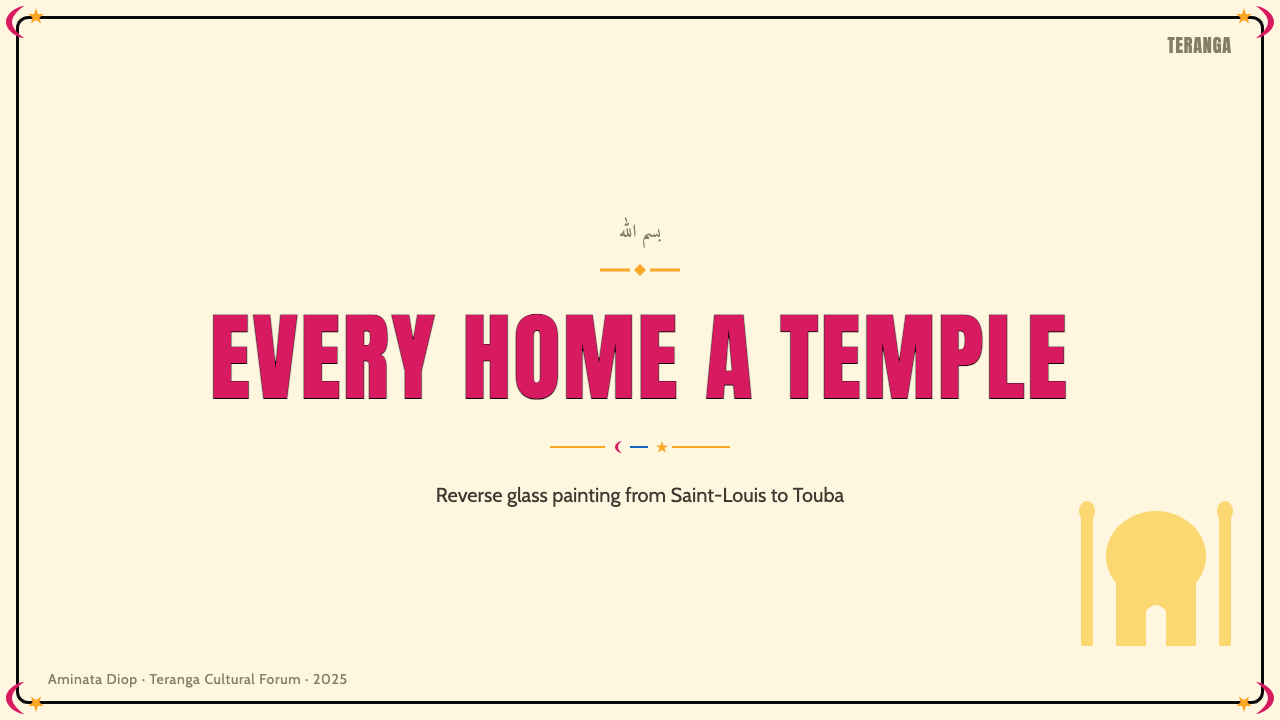
For presentation slides, sous-verre works particularly well as a framework for cover pages and section dividers that need to carry both visual impact and cultural warmth. A cover built in this style would use a large, centrally composed figure or icon — rendered in flat saturated color against a light background, bounded by a bold dark outline — with title text treated as part of the visual pattern rather than layered over it. Section slides can deploy the decorative border vocabulary: a geometric band running along one or two edges, drawn in one of the accent colors, signals a transition while maintaining the style's sense of ceremonial structure. Data slides benefit from the tradition's comfort with bold, pure-hue color fields; chart bars or segments in fuchsia, saffron, and cobalt gain presence and legibility without any three-dimensional styling.在演示文稿中,玻璃背画特别适合作为封面页与章节分隔页的视觉框架,这些页面需要同时承载视觉冲击力与文化温度。以这种风格构建的封面,会使用一个大型居中人物或图标——以平涂饱和色块在浅色背景上呈现,由粗深轮廓界定——标题文字作为视觉图案的组成部分处理,而非叠加于其上。章节页可以运用装饰性边框语汇:沿一两条边缘延伸的几何图案带,以强调色之一绘制,在标示转换的同时维持这种风格的仪式性结构感。数据页受益于这一传统对粗重纯色色域的驾轻就熟:洋红、藏红黄与钴蓝的图表柱条或扇区,无需任何三维造型便拥有足够的存在感与可读性。
For web interfaces, the style suits contexts where warmth, cultural richness, and legibility must coexist — a landing page for a creative studio, a cultural institution, a festival, or a social platform with an African or diasporic audience. The approach centers on a contained color palette of three or four saturated hues applied as flat fills, hard-bordered card components that echo the contour logic of the paintings, and typography that is either bold and assertive for headlines or cleanly neutral for body text — never decorative for its own sake. Dashboards and pricing pages can adopt the hierarchical simplicity of the devotional icon: one primary figure or number, large and centered, surrounded by secondary information arranged with the same frontal dignity.在网页界面中,这种风格适合温暖感、文化丰富性与可读性需要共存的场景——创意工作室、文化机构、节日活动,或面向非洲及海外侨民受众的社交平台的落地页。方法的核心是:由三到四种饱和色调组成的受控色板,以平涂色块填充;呼应画作轮廓逻辑的硬边卡片组件;以及标题处粗重有力、正文处干净中性的字体排版——绝不为装饰而装饰。仪表板与定价页面可以借鉴宗教圣像的层级简洁性:一个主要的人物或数字,大而居中,周围以同等正面庄严的姿态排列次要信息。
For editorial and marketing work, sous-verre offers a way to bring festive, saturated color into layouts without the visual noise that heavy illustration often introduces. An editorial spread using this vocabulary would employ flat color blocks as background fields rather than photography, with any figurative content reduced to the style's characteristic bold-outline, flat-fill treatment. Marketing materials — event posters, social cards, campaign headers — are the natural home of the style's poster-like directness. A single icon or portrait, full-bleed or centered in a saturated color field, with a bold text treatment integrated into the image rather than floating above it, captures the devotional intensity of the tradition while functioning perfectly as contemporary visual communication.在编辑与营销工作中,玻璃背画提供了一种将热烈饱和的色彩引入版面的方式,而不会带入大量插图通常伴随的视觉噪音。采用这一语汇的编辑跨页会以平涂色块作为背景色域,而非摄影图像;任何具象内容均以这种风格标志性的粗轮廓、平填色处理呈现。营销物料——活动海报、社交媒体卡片、活动头图——是这种风格海报式直接感的天然归宿。一个单一图标或肖像,满版出血或居中置于饱和色域中,文字处理融入画面而非浮于其上,便能捕捉这一传统的宗教感染力,同时完美发挥当代视觉传播的功能。
A common mistake when applying sous-verre is to pile on multiple saturated colors simultaneously, producing visual confusion rather than the clarity the tradition achieves. Authentic sous-verre images are organized: one or two color fields dominate any given region, the black contour does the work of separation, and the palette is consistent across the piece. In digital application, choose a lead color and one or two supporting hues, then let the dark outline — whether expressed as a border, a shadow, or a stroke — do the work of organizing the surface. Equally common is importing the color palette while abandoning the flatness: adding gradients, drop shadows, or texture to a sous-verre-derived composition breaks the visual logic entirely, because the style's luminous quality comes from the absence of those effects, not despite it.应用玻璃背画时最常见的错误,是将多种饱和色同时堆砌,产生视觉混乱,而非这一传统所实现的清晰。真实的玻璃背画是有组织的:任何区域内由一到两种色域主导,黑色轮廓承担分隔的工作,色板在整件作品中保持一致。在数字应用中,选定一种主导色与一两种辅助色,然后让深色轮廓——无论表现为边框、投影还是描边——来完成组织表面的工作。同样常见的错误是引入色板的同时抛弃平涂性:向玻璃背画衍生构图中添加渐变、投影阴影或纹理,会从根本上破坏其视觉逻辑——因为这种风格的发光品质恰恰来自这些效果的缺席,而非不顾其缺席依然存在。
See the Senegalese Sous-Verre design system查看 Senegalese Sous-Verre 完整设计系统
Senegalese Sous-Verre — FAQSenegalese Sous-Verre · 常见问题
Is sous-verre a uniquely Senegalese tradition, or does it exist elsewhere in West Africa?玻璃背画是塞内加尔独有的传统,还是在西非其他地方也存在?
Reverse glass painting exists in several West African countries — most notably in Senegal, Côte d'Ivoire, and Guinea — but the Senegalese tradition is by far the most developed, most prolific, and most internationally recognized. What makes the Senegalese version distinctive is its deep integration with Mouride Sufi devotional culture, which gave it a specific iconographic program, a sustained popular market, and a spiritual weight that comparable traditions elsewhere have not developed to the same degree. The Saint-Louis and Dakar workshops produced work at a scale and with a consistency that makes the Senegalese tradition the reference point for the form across the region.反面玻璃绘画在西非多个国家均有存在——最显著的是塞内加尔、科特迪瓦和几内亚——但塞内加尔传统在发展程度、产量与国际认知度上均遥遥领先。塞内加尔版本的独特之处在于它与穆里德苏菲信仰文化的深度融合:这种融合赋予了它特定的图像学纲领、持续的大众市场,以及其他地方同类传统所未能达到的精神分量。圣路易与达喀尔工坊以如此规模与一致性的产出,使塞内加尔传统成为这一形式在整个地区的参照基点。
How does sous-verre relate to other African art traditions that also use bold outline and flat color?玻璃背画与其他同样使用粗轮廓和平涂色的非洲艺术传统有何关系?
The visual logic of bold outline plus saturated flat fill appears across many African artistic traditions — in kente and kanga textile design, in the geometric decoration of West African architecture, in the beadwork of East and Southern Africa, and in the painted surfaces of Ndebele houses in South Africa. These traditions share a fundamental preference for color as flat field rather than modeled volume, and for a strong demarcating line that defines each element clearly. Sous-verre belongs to this broader aesthetic culture while being shaped by its own specific technical constraints and its particular relationship with Islamic visual traditions. The connections are genuine but should not be flattened into a single 'African aesthetic'; each tradition has its own history, function, and formal logic.粗轮廓加饱和平涂色的视觉逻辑见于众多非洲艺术传统——肯特布与坎加纺织设计、西非建筑几何装饰、东非与南部非洲的串珠工艺,以及南非恩德贝勒族的彩绘墙面。这些传统共享一种根本性的偏好:以平面色域而非塑造体量来处理色彩,以强劲的界定线清晰勾勒每个元素。玻璃背画归属于这一更宏观的美学文化,同时又被其特有的技术约束及其与伊斯兰视觉传统的特定关系所塑造。这些关联是真实的,但不应被压平为单一的「非洲美学」;每一种传统都有其自身的历史、功能与形式逻辑。
Can this style work effectively in dark-mode or low-light interface contexts?这种风格能在深色模式或低光界面场景中有效运作吗?
Dark mode presents an interesting challenge for sous-verre. The historic tradition is a light-ground one — white or pale backgrounds maximize the luminous effect of the glass and the intensity of the saturated pigments. However, the style's core vocabulary of saturated flat color and bold outline adapts reasonably well to dark grounds, because the colors are already maximally saturated and the black contours simply merge with the dark background. The effective approach is to treat the dark ground as the equivalent of the unlit glass — a neutral field — and let the saturated color fields carry the luminous quality. The greater risk is choosing colors that become too aggressive or difficult to read at high saturation against a deep background; muting just slightly while increasing fill area tends to preserve legibility while retaining the style's spirit.深色模式对玻璃背画而言是一个有趣的挑战。这一传统历来以浅色底面为基础——白色或淡色背景最大化了玻璃的发光效果与饱和颜料的强度。然而,这种风格的核心语汇——饱和平涂色与粗黑轮廓——对深色底面的适应性相当不错,因为色彩本已达到最大饱和度,而黑色轮廓只需与深色背景融为一体即可。有效的做法是将深色底面视同未点亮的玻璃——一个中性色域——让饱和色块承载发光品质。更大的风险在于:某些颜色在高饱和度下映衬于深色背景时会变得过于刺激或难以辨读;在保持色块面积的前提下略微降低饱和度,往往能在保持可读性的同时保留风格精神。
What distinguishes an authentic sous-verre-derived design from a surface-level imitation?真正从玻璃背画汲取的设计与表面模仿之间,核心区别是什么?
Surface imitation typically takes the color palette — the fuchsia, saffron, and cobalt — and applies it to a layout while retaining gradients, soft shadows, or textural treatments that belong to other visual systems. Authentic sous-verre-derived design commits to the underlying logic: every color region is flat and fully opaque, edges are hard and defined, outlines are present and decisive, and there is no atmospheric depth. The luminous quality comes from the combination of pure saturated color and firm boundary, not from the addition of glow effects. Additionally, authentic application respects the tradition's compositional habits: central, frontally oriented focal elements; decorative framing as part of the design rather than afterthought; and a color palette where one or two dominant hues organize the surface with supporting accents placed deliberately rather than broadcast everywhere.表面模仿通常只是取用色板——洋红、藏红黄与钴蓝——将其套用于版面,同时保留渐变、柔和阴影或属于其他视觉体系的肌理处理。真正从玻璃背画汲取的设计则承诺践行其底层逻辑:每个色域平涂且完全不透明,边缘硬朗而清晰,轮廓在场且果断,不存在大气深度。发光品质来自纯饱和色与硬质边界的结合,而非叠加发光效果所赋予。此外,真正的应用还尊重这一传统的构图习惯:居中且正面朝向的焦点元素;装饰性边框作为设计的有机组成部分而非后期附加;色板中一到两种主导色组织表面,辅助强调色经过审慎放置,而非随意散布各处。
Is it appropriate to apply this style in commercial contexts given its sacred origins?鉴于玻璃背画的神圣起源,将其应用于商业场景是否合适?
Sous-verre has always operated simultaneously as sacred and commercial: the workshop tradition was from its beginnings a market-oriented practice, producing devotional images at scale for popular consumption. Painters sold their work in stalls, it appeared on household walls and on the dashboards of sept-place taxis, and it circulated widely as affordable popular art. The tradition has no history of being restricted to ritual use only. Commercial application is entirely consistent with how the form has always been used — as long as it does not reproduce or mock specific sacred imagery, particularly the portrait of Cheikh Amadou Bamba, without understanding the significance of that subject. Borrowing the visual vocabulary of flat color, bold outline, and frontal composition is a legitimate form of creative engagement with the tradition; specific devotional content is another matter.玻璃背画向来同时在神圣与商业两个维度上运作:工坊传统从一开始便是面向市场的实践,大规模生产供大众消费的宗教图像。画师在摊位上出售作品,画挂在家庭墙壁上,出现在共乘出租车的仪表台上,以亲民的大众艺术形式广泛流通。这一传统历来不存在仅限于仪式使用的约束。商业应用与这种形式一直以来的使用方式完全一致——只要不在不理解其意义的情况下复制或嘲弄特定神圣图像,尤其是谢赫·阿马杜·班巴的肖像。借用平涂色彩、粗黑轮廓与正面构图的视觉语汇,是与这一传统进行创造性对话的正当方式;特定的宗教内容则是另一回事。
Related design styles相关设计风格
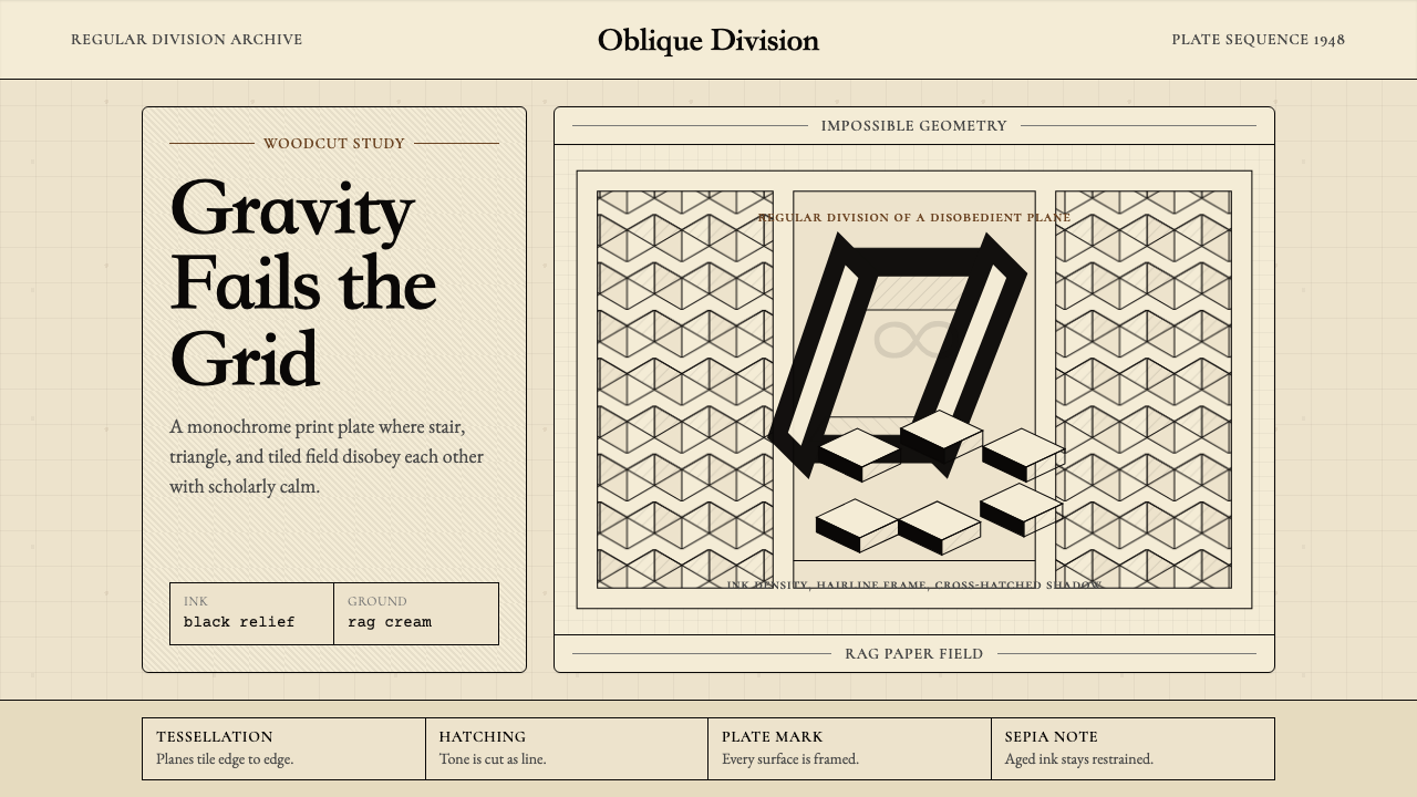 M.C. Escher ImpossibleImpossible calm. Ink-black tessellations and hatching fold cream paper into p…不可能的冷静:墨黑镶嵌与排线,让奶油纸折成悖论。
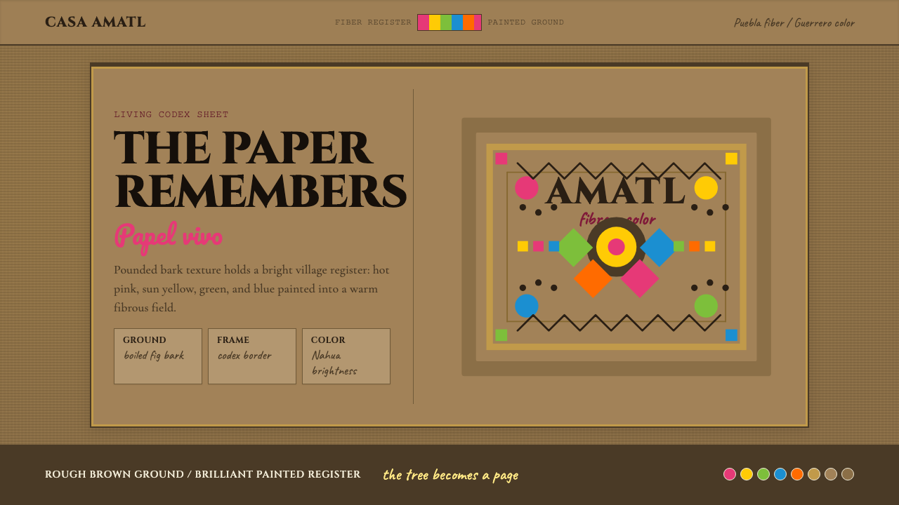 Mexican Amate Bark PaperLiving craft, not nostalgia. Bark-brown fiber carries hot pink and sun-yellow…活的手艺,不是怀旧。树皮棕纤维承载粉红与日黄几何。
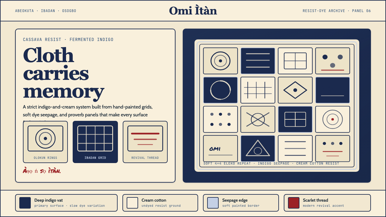 Yoruba Adire IndigoMemory lives in cloth. Deep indigo grids on cream cotton carry hand-painted p…布承载记忆:奶油棉布上的深靛蓝方格与手绘谚语纹。
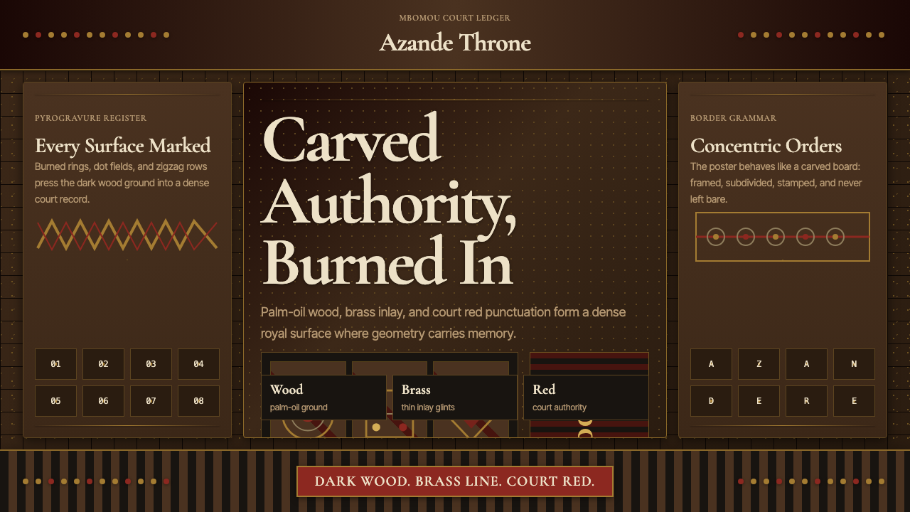 Central African Azande ThroneDense court gravity. Dark wood grids, brass dots, and court red cover every s…宫廷感厚重:深木网格、黄铜点阵与宫廷红铺满表面。
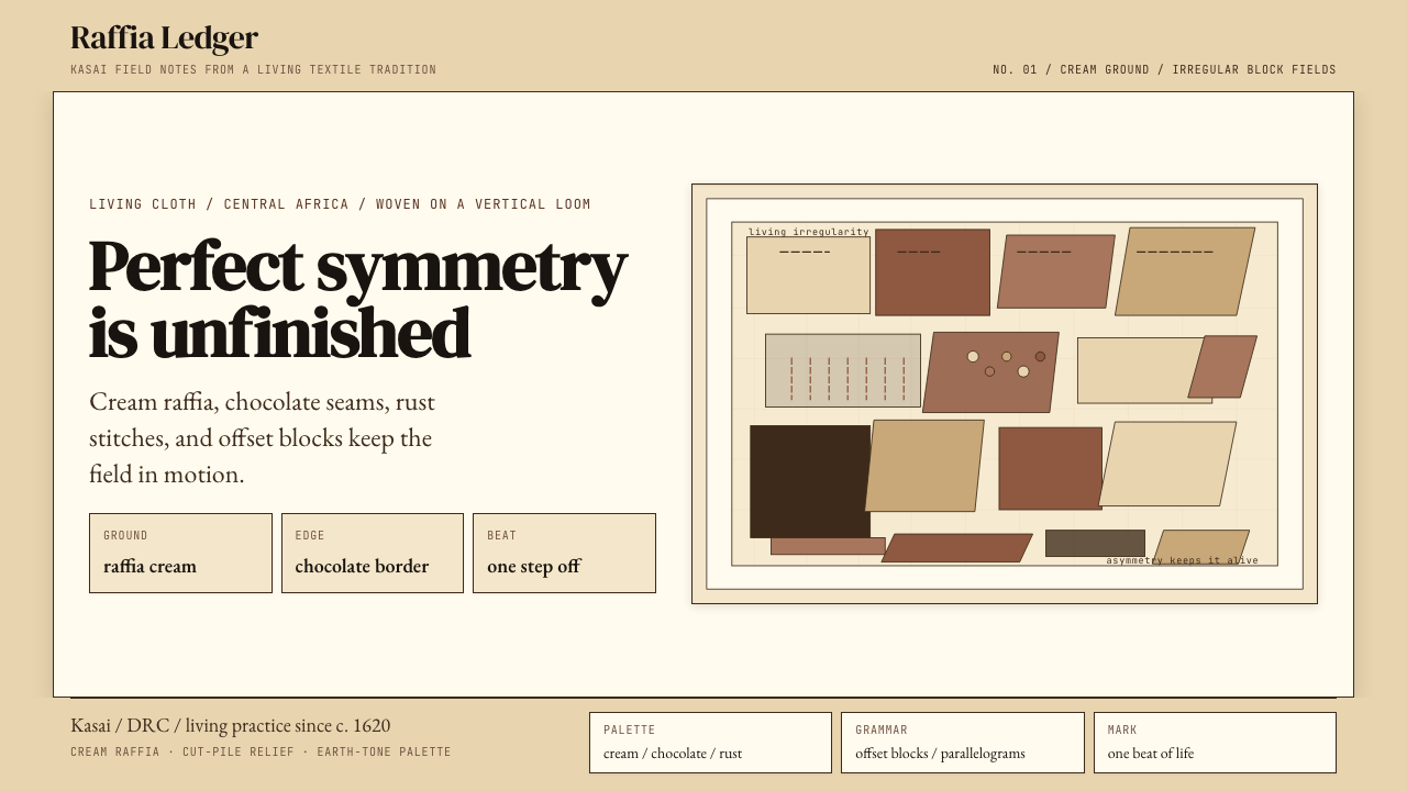 Kuba Raffia Cloth (Congo)Deliberate asymmetry lives. Cream raffia, chocolate seams, and rust blocks.不对称才有生命。奶油拉菲亚底配棕、赭、铁锈块面。
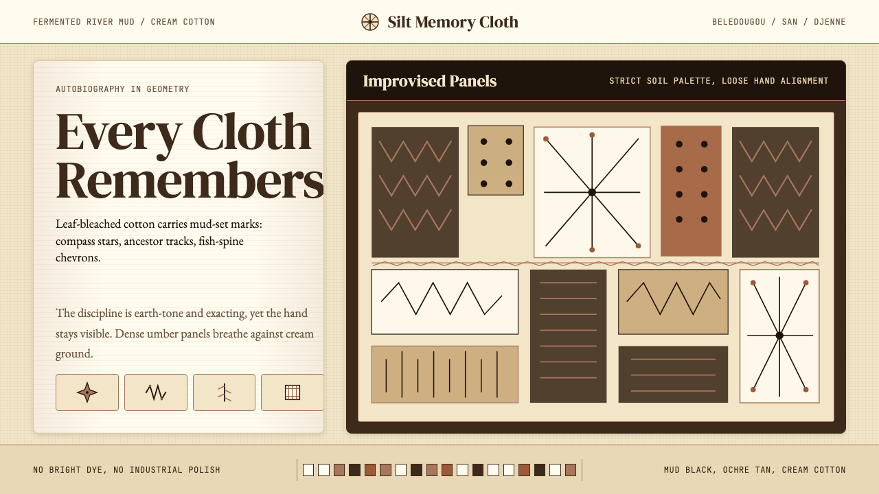 Mali Bògòlanfini (Bambara Mud-Cloth)Autobiography in geometry. Deep umber motifs breathe across cream cotton.几何写成自传:深赭纹样在米白棉布上呼吸。