What is Soviet Cosmic Mosaic?
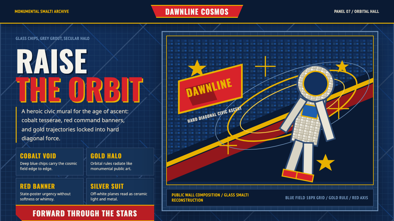
Soviet cosmic mosaics turned space flight into scripture — glass and ceramic tesserae assembled into monumental murals that treated the cosmonaut as a secular saint.
Soviet Cosmic Mosaic in brief
Soviet Cosmic Mosaic is a design system drawn from the monumental glass-and-ceramic smalti murals that clad Palaces of Culture, metro stations, and exhibition pavilions across the USSR, especially after Yuri Gagarin's historic 1961 spaceflight. These were not small decorative accents — they were wall-sized public artworks, often several stories tall, meant to be seen from a distance and to dominate the architecture around them.
The visual language is built from small faceted tesserae — individual chips of colored glass or ceramic set into mortar — which means every surface in this system is inherently textured rather than flat. Deep cosmic-blue tesserae form the void of space behind a heroic cosmonaut figure, hot red flags and gold stars punctuate the composition, and silver picks out the sheen of a spacesuit, all held together by visible grey grout lines that catch the eye almost as much as the color fields themselves.
Aesthetically, this is socialist-realist propaganda art scaled to architectural size: monumental, built on hard diagonal compositions that drive the eye upward and outward, and utterly sincere in its heroism — there is no irony, no restraint, no acknowledgment that the imagery might be read as anything other than triumphant. Radiating orbital lines frame the central figure the way a halo frames a religious icon, replacing sacred iconography with a secular, state-sponsored one.

Where does Soviet Cosmic Mosaic come from?
The tradition of monumental Soviet mosaic art descended directly from the state-sponsored public art programs of Socialist Realism, the officially mandated artistic doctrine adopted in the USSR from the 1930s onward, which demanded that art serve the ideological education of the masses through accessible, heroic, and optimistic imagery. Mosaic was an ideal medium for this program: durable enough to survive decades of weather on an exterior wall, and capable of enormous scale at relatively modest material cost compared to painted murals, which faded and required maintenance.
The specific cosmic-themed variant of this tradition took off after April 12, 1961, when cosmonaut Yuri Gagarin became the first human to orbit the Earth aboard Vostok 1. The flight was an immense propaganda victory for the Soviet state during the Cold War space race, and the state moved quickly to commemorate it in permanent public art across the country — in the entrance halls of Palaces of Culture (worker recreation centers built in nearly every Soviet city and industrial town), on the platforms of newly built metro stations, and most spectacularly at the VDNKh exhibition grounds in Moscow, where the Cosmos pavilion became a permanent shrine to Soviet space achievement.
These murals were the work of state monumental-art studios and socialist-realist muralists, artists trained and employed within the Soviet cultural bureaucracy rather than working as independent studio artists in the Western sense. Their brief was never purely aesthetic — it was to produce imagery that would instill pride, discipline, and faith in the socialist project in ordinary citizens passing through these public spaces daily. The scale and permanence of mosaic meant this messaging was built directly into the fabric of Soviet cities, encountered on the way to work rather than sought out in a museum.
The style persisted from roughly 1950 through 1990, spanning the entire second half of the Cold War, with its peak concentrated in the decades immediately following Gagarin's flight when space achievement was the Soviet Union's most potent propaganda asset. As the space race cooled and the USSR's economic and political fortunes declined through the 1970s and 1980s, the triumphalist confidence of these murals became, in retrospect, a monument to a very specific and passing historical moment of state optimism.
What defines the Soviet Cosmic Mosaic look?
Color
Deep, saturated cosmic blue dominates as the field color, representing the void of space itself. Hot red appears for flags and ideological symbols, gold marks stars and orbital elements, and silver renders the metallic sheen of spacesuits and spacecraft. Grey grout lines run between every tessera, functioning as a constant, understated fifth color that structures the entire surface.
Faceted Texture
Every surface is built from small, individually placed tesserae rather than continuous flat color. This means light catches each chip at a slightly different angle, producing a shimmer and depth that flat digital color cannot replicate without deliberately introducing texture, grain, or a visible grid of facets across every color field.
Grout Line
The grey lines between tesserae are not incidental — they draw the eye across the composition almost like a secondary drawing laid over the color fields. In an authentic system, grout lines should be visible and structural, subtly outlining major forms rather than disappearing into a smooth gradient.
Diagonal Composition
Hard diagonal lines organize the composition, driving the eye upward and outward in a direction that suggests ascent, launch, or forward momentum. This is a deliberate departure from the static, centered symmetry of classical monumental art — the diagonal implies motion and progress, values central to the Soviet propaganda program.
The Heroic Figure
A single cosmonaut or worker figure typically occupies the compositional center, rendered at monumental, larger-than-life scale and posed with calm, upright confidence rather than dynamic action. The figure is a type rather than a specific individual portrait — representing the ideal of Soviet achievement rather than documenting a particular person's likeness.
Radiating Orbit
Concentric or radiating lines emanate from behind the central figure, evoking orbital paths or rays of light. Functionally, this device operates exactly like a halo in religious iconography — it marks the figure as elevated, singular, and worthy of reverence, translating a sacred visual device into secular state propaganda.
Scale and Permanence
These works were conceived at architectural scale — often spanning full building facades or entire station platforms — and built from materials chosen specifically for durability against weather and time. Any digital or print application of this style should retain a sense of monumental weight rather than shrinking the imagery to a small decorative accent, which would betray the scale the aesthetic depends on.

Who shaped Soviet Cosmic Mosaic?
The Soviet cosmonaut who became the first human to journey into outer space and orbit the Earth on April 12, 1961, aboard Vostok 1. His flight was the direct historical trigger for the explosion of cosmic-themed monumental art across the USSR, and his likeness — or an idealized figure representing him — became the central heroic subject of countless mosaic murals in the following decades.
Institutional workshops within the Soviet cultural bureaucracy responsible for producing large-scale public art across the USSR, staffed by trained artists working to state commissions rather than independent creative direction. These studios industrialized the production of monumental mosaic, allowing near-identical thematic programs to appear in cities across the entire union.
The broader community of artists trained in Socialist Realism who applied its doctrines — accessible heroism, optimistic narrative, rejection of abstraction — to the specific medium of architectural mosaic. Their collective output over four decades established a remarkably consistent visual vocabulary despite spanning an enormous geographic and temporal range.
How do you use Soviet Cosmic Mosaic today?
Soviet Cosmic Mosaic is a maximalist, high-drama style, and applying it well means committing fully to its monumental confidence rather than softening it into a generic space or retro-futurism theme. The style depends on faceted texture, hard diagonals, and reverent scale — remove any one of these and the result reads as generic space-age decoration rather than this specific propaganda tradition.
For presentation slides, a cover page benefits from the deep cosmic-blue field with a single centered figure or symbol treated at monumental scale, framed by radiating lines that echo an orbital halo. Content slides should keep the faceted texture as a background treatment behind key statements, used sparingly enough that body text remains legible against the grout-line pattern. Data visualizations can render bars or charts as if built from tesserae, with gold used for standout figures and red reserved for critical alerts or highlights.
For web interfaces, this style suits products with a bold, maximalist brand identity — gaming, entertainment, cultural or historical archives, or brands deliberately playing with retro-futurist space nostalgia. Dashboards should be used cautiously, since the faceted texture and heavy color saturation can overwhelm dense data; the style works better for hero sections, landing pages, and brand moments than for information-dense interfaces.
For editorial and marketing work, the style suits features on space history, Cold War culture, or maximalist visual storytelling. Section breaks can use the radiating orbital motif as a recurring divider, and photography should favor high-contrast, monumental framing — a single figure against a deep blue field — over busy, cluttered compositions that dilute the heroic scale.
A common mistake is flattening the mosaic texture into a smooth gradient or solid color fill, which removes the single most distinctive visual signature of the style. Another mistake is softening the color palette or adding pastel tones for approachability — the deep cosmic blue and hot red-gold contrast are load-bearing, and diluting them collapses the monumental, reverent mood the style depends on.

Soviet Cosmic Mosaic — FAQ
Why is texture so important to this style, and can it be faked digitally?
The faceted, tessera-based texture is the single most distinctive physical property of Soviet cosmic mosaics — it is what separates them from painted propaganda posters using the same iconography. In digital applications, this texture needs to be deliberately introduced, whether through a visible grid pattern, subtle grain, or an actual tessellated background treatment, rather than left as flat color, or the result loses the specific mosaic identity and becomes generic space-propaganda imagery.
Is this style specifically about Gagarin, or space themes generally?
Gagarin's 1961 flight is the specific historical event that triggered the explosion of this genre, and much of the surviving imagery directly commemorates it or uses a cosmonaut figure clearly modeled on that moment. But the broader tradition extends to Soviet space achievement generally through the 1950–1990 period, including satellites, space stations, and the broader ideology of scientific-technical progress under socialism.
How does this differ from generic retro space-age or atomic-age design?
Generic retro-futurist space design (often associated with 1950s American mid-century atomic-age imagery) tends toward playful, consumer-facing optimism — pastel colors, googie architecture, cheerful illustration. Soviet cosmic mosaic is state propaganda art: monumental in scale, built from faceted physical materials rather than flat illustration, and reverent rather than playful in tone, closer to religious iconography than to advertising.
What role does the color red play compared to the dominant blue?
Blue is the field — it represents the cosmic void and dominates the overall area of any composition. Red is reserved and punctuational, appearing on flags, banners, or ideological symbols embedded within the scene. Using red as a dominant field color rather than an accent inverts the intended hierarchy and shifts the mood away from this style's specific cosmic-reverent tone toward a more generic hot political-poster look.
Related design styles
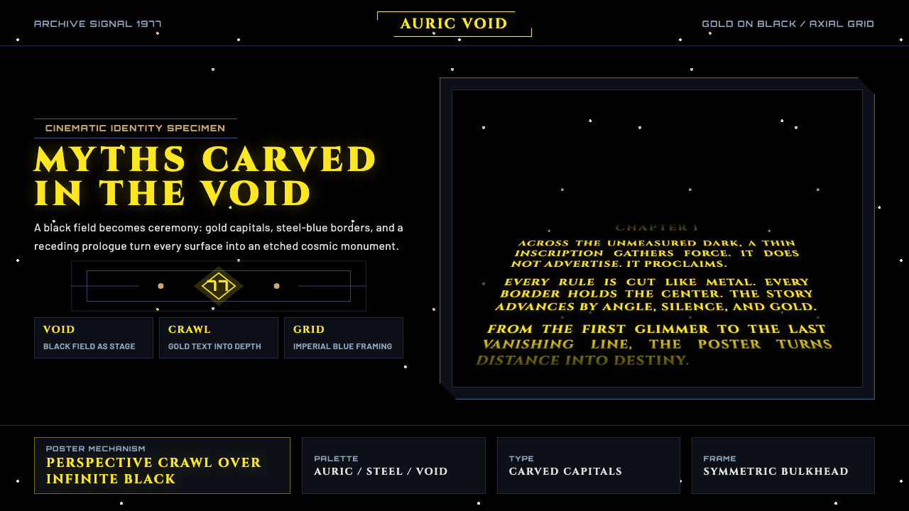 Star Wars (1977)Myth carved into space. Gold Cinzel capitals recede through black, held by st…
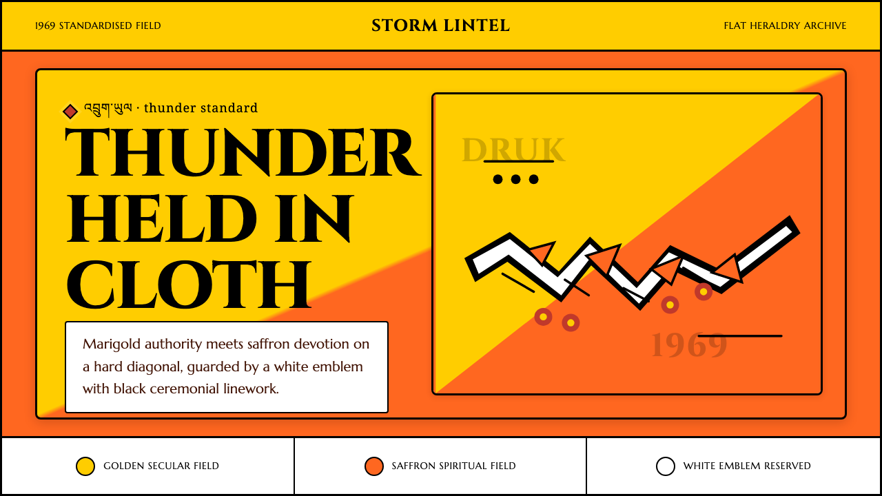 Bhutan Thunder Dragon FlagHeraldry hits like thunder. Marigold and saffron split hard around a white em…
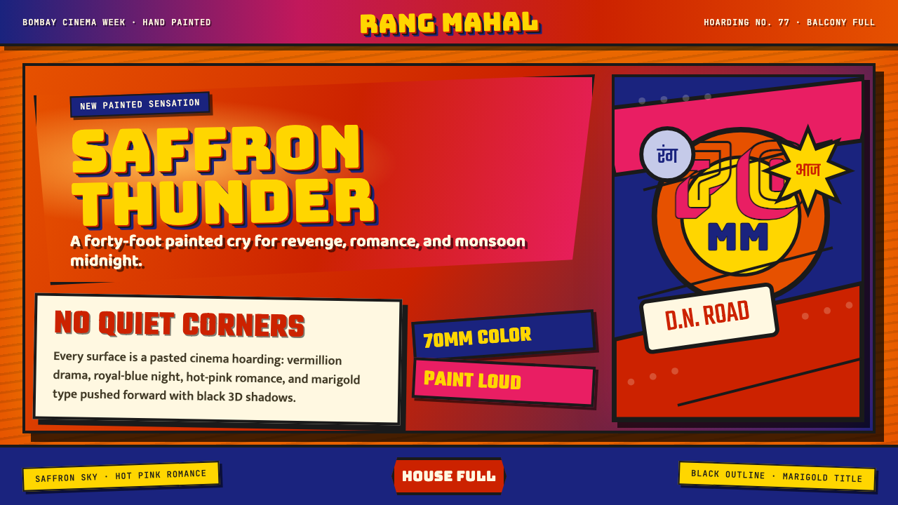 Bollywood Poster Art (1970s)Subtlety is unaffordable. Saffron fields, Bungee shadows, diagonal hoarding d…
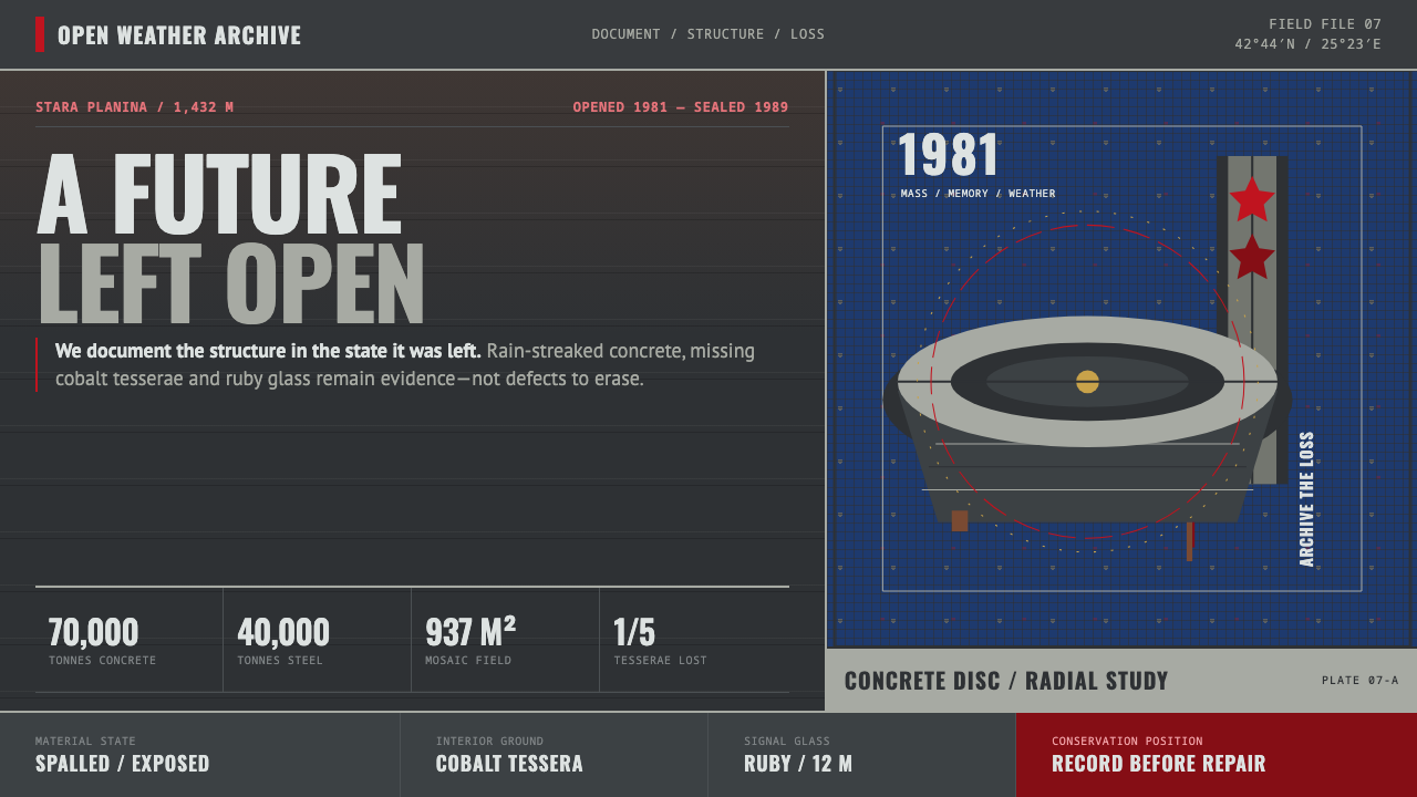 Buzludzha MonumentMonumentality without repair. Stained concrete frames cobalt tesserae, ruby g…
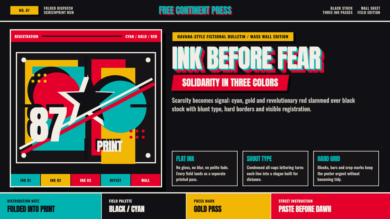 Cuban OSPAAAL Tricontinental PosterUrgency from scarcity. Cyan, gold and red slam over black in blunt silkscreen…
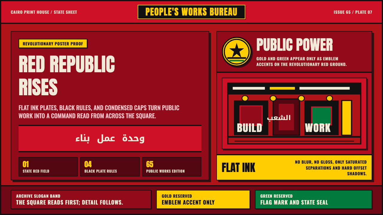 Egyptian Political PosterState power shouts. Red poster grids, black keylines, kufic type, gold-green…