Design style guide设计风格指南
What is Gutai (Yoshihara, 1954)?什么是 Gutai (Yoshihara, 1954)?
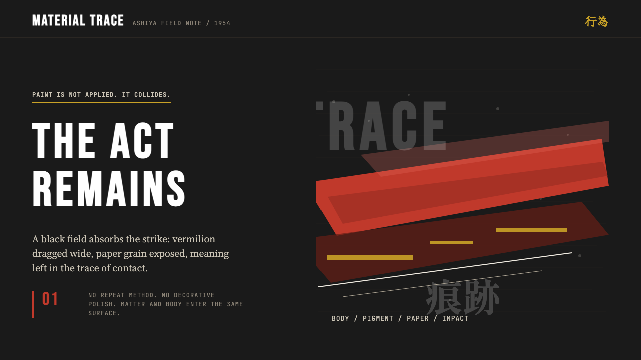
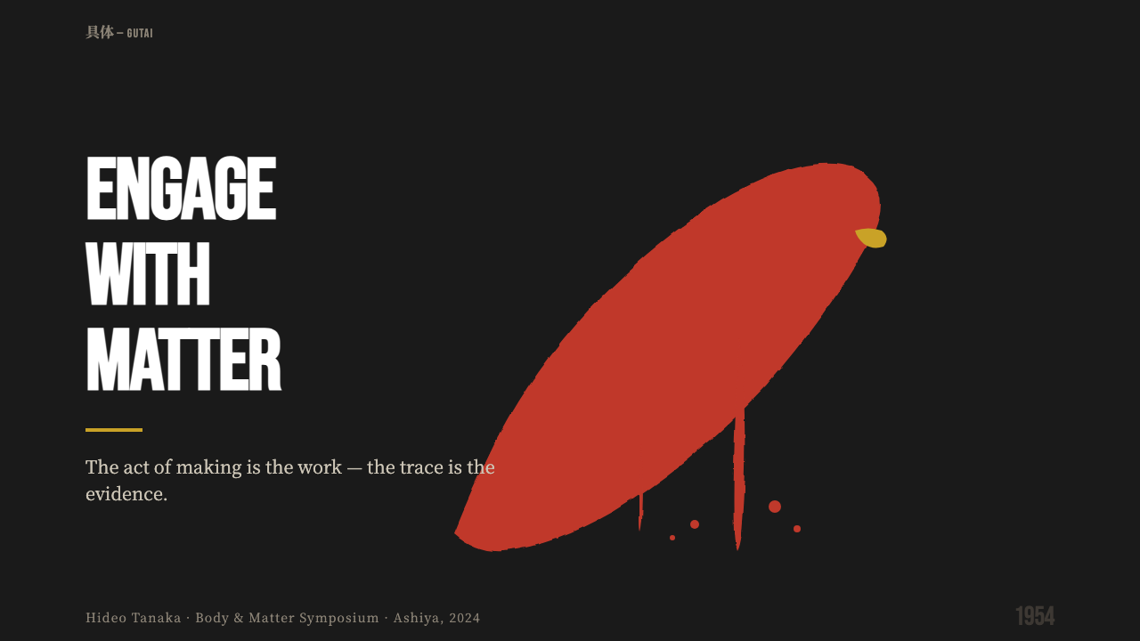
Gutai turned painting into a collision — bodies through paper, feet through pigment, paint fired from cannons — and left only the raw trace of the act behind.具体美术协会把绘画变成一场冲撞——身体穿透纸面、双脚拖过颜料、颜料从炮管里射出——只留下动作本身的原始痕迹。
Gutai (Yoshihara, 1954) in briefGutai (Yoshihara, 1954) 速览
Gutai — the word means 'concrete' or 'embodied' in Japanese — was a radical postwar collective founded in 1954 in Ashiya, Japan, by the painter and critic Jirō Yoshihara. Where most postwar art movements still treated the canvas as a window or a field of symbolic meaning, Gutai insisted on something far more physical: the artwork is the record of a real encounter between a human body and real material. No mediation, no illusion, no second-guessing — only the mark that survived the act.具体(Gutai,日语意为「具体的」或「有形的」)是战后最激进的艺术团体之一,由画家兼评论家吉原治良于1954年在日本芦屋创立。当时大多数战后艺术运动仍把画布当作窗口或象征意义的场域,而具体小组坚持一种远为物质性的立场:作品是人体与真实材料之间真实遭遇的记录。没有中介,没有幻觉,没有事后修改——只有动作存活下来的痕迹。
The visual language that emerged from this conviction is unmistakable. Gutai work features deep, absorptive black grounds — the dense black of sumi ink, of darkness that seems to have weight — against which single gestural marks appear in fierce contrast. A single sweep of vermilion, a violent horizontal drag, a burst of raw pigment: each stroke is left exactly as it landed, neither corrected nor refined. Asymmetry is absolute; the empty half of a composition is as deliberate as the marked half. And every surface carries evidence of process: the grain of hand-made paper, the cracking of thick dried pigment, the irregularity of a gesture made at speed.由这一信念生长出的视觉语言辨识度极高。具体作品以深沉、吸光的黑色为底——墨黑,带着重量感的黑暗——单一的姿势性痕迹在其上以强烈对比显现。一抹朱红的单笔挥洒,一道暴力的横向拖拉,一团生颜料的迸发:每一笔都保留着它落下时的原样,既不修正,也不精炼。不对称是绝对的;构图中空白的一半与留有痕迹的一半同样出于刻意。每一个表面都携带着过程的证据:和纸的纤维纹理、厚重干燥颜料的龟裂、以速度完成的手势所留下的不规则性。
Unlike Abstract Expressionism, with which it is sometimes superficially compared, Gutai was not primarily interested in psychological interiority or romantic self-expression. The group's manifesto, written by Yoshihara in 1956, demanded that material and gesture become inseparable from meaning — that the thing itself, not what it represented or symbolized, was the work. This distinction matters when applying the style: Gutai aesthetics are about material truth, not emotional confession.与有时被浅层相提并论的抽象表现主义不同,具体美术协会并非主要关注心理内在性或浪漫式自我表达。吉原治良于1956年撰写的团体宣言要求物质与姿势和意义不可分割——事物本身,而非它所代表或象征的东西,才是作品。这一区别在运用这种风格时至关重要:具体的美学关乎物质真相,而非情感告白。
See the Gutai (Yoshihara, 1954) design system →查看 Gutai (Yoshihara, 1954) 完整设计系统 →
Where does Gutai (Yoshihara, 1954) come from?Gutai (Yoshihara, 1954) 从何而来?
Japan in 1954 was a country still absorbing the shock of defeat, occupation, and the atomic bombings of Hiroshima and Nagasaki. The cultural landscape was turbulent: traditional aesthetic values felt compromised by their association with wartime nationalism, while Western modernism arrived simultaneously as liberating and as another form of cultural imposition. It was in this charged atmosphere — in the small port city of Ashiya, between Osaka and Kobe in the Kansai region — that Jirō Yoshihara gathered around him a group of mostly young painters and declared that they would make art unlike anything that had come before.1954年的日本,仍在消化战败、占领以及广岛、长崎原子弹爆炸的冲击。文化景观动荡不安:传统审美价值观因与战时民族主义的关联而显得受损,而西方现代主义的到来则同时被感受为解放与另一种文化强加。正是在这种充满张力的氛围中——在大阪与神户之间、关西地区的小港城芦屋——吉原治良召集了一批大多年轻的画家,宣告他们将创作出前所未有的艺术。
Yoshihara was an unusual figure for a avant-garde leader: a successful businessman from a wealthy family, already in his forties, with a refined knowledge of both Western modernism and Japanese ink traditions. His patronage gave the group financial stability, but his vision gave it intellectual coherence. The Gutai manifesto of 1956 announced a direct challenge to what he called the 'corpse' of traditional painting — the deadness of conventions inherited without examination. The group's demand was for a living art, one in which the material itself was allowed to assert its own nature rather than being bent to the artist's preconceived image.吉原治良是一个不寻常的前卫领袖:出身富裕家庭的成功商人,彼时已年届四十,对西方现代主义和日本水墨传统均有深厚了解。他的赞助给了团体财务上的稳定,而他的愿景赋予了团体思想上的凝聚力。1956年的具体宣言宣告了对他所称的传统绘画「僵尸」的直接挑战——那种未经审视便承袭下来的惯例的死气沉沉。团体的要求是一种活着的艺术,在其中,材料本身被允许坚持它自身的本性,而非被强行弯曲以服从艺术家预先构想的图像。
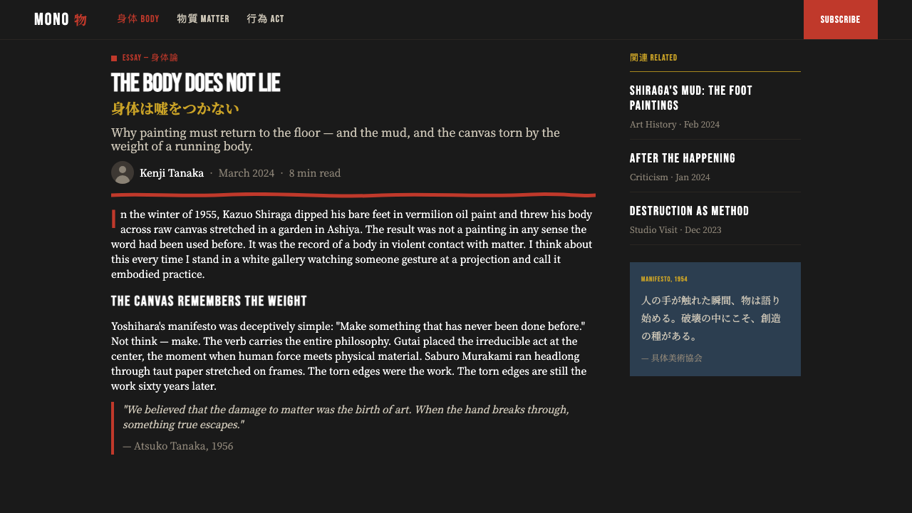
The early performances and works of the Gutai Art Association were sensational in the most literal sense. Saburo Murakami ran through panels of paper stretched on wooden frames, breaking through them with his body. Kazuo Shiraga wrestled with mud in a pit, his body leaving its traces in the material. Atsuko Tanaka wore a dress made of electric light bulbs that lit and flashed around her body. Shozo Shimamoto fired paint-filled bottles at canvas from above. These were not stunts — they were rigorous investigations of what happened when a material was pushed to its limits by a human body operating at the edge of control.具体美术协会早期的行动与作品在最字面的意义上都是轰动性的。村上三郎在绷于木框上的纸面上奔跑,用身体撞破它们。白发一雄在泥坑中与泥土搏斗,身体的痕迹留在材料里。田中敦子穿着一件由电灯泡制成的裙子,灯泡在她身体周围亮起、闪烁。嶋本昭三从高处把装满颜料的瓶子砸向画布。这些不是噱头——它们是对一种情形的严肃探究:当一种材料被在控制边缘运作的人体推至极限时,会发生什么。
Gutai achieved international visibility through its contact with the French critic Michel Tapié, who visited Japan in 1957 and recognized in the group's work a kinship with the Informel movement in Europe. Tapié's advocacy brought Gutai into dialogue with international contemporary art, and the group exhibited in Paris, New York, and across Europe through the late 1950s and 1960s. The collective continued until Yoshihara's death in 1972, after which it dissolved — honoring his centrality to the whole enterprise. Yoshihara had insisted from the beginning: 'Do not imitate others. Do something no one has done before.'具体美术协会通过与法国评论家米歇尔·塔皮耶的接触获得了国际能见度。塔皮耶于1957年访问日本,在团体的作品中认出了与欧洲不定形艺术运动的亲缘关系。塔皮耶的倡导使具体进入与国际当代艺术的对话,团体在整个1950至1960年代在巴黎、纽约及欧洲各地举办展览。集体一直延续到吉原治良于1972年去世,此后随之解散——这本身也是对他在整个事业中核心地位的致敬。吉原治良从一开始就坚持:「不要模仿他人。去做前无古人的事。」
What defines the Gutai (Yoshihara, 1954) look?Gutai (Yoshihara, 1954) 的视觉特征是什么?
Sumi-Black Ground墨黑底色
The defining ground of Gutai aesthetics is a deep, absorptive black that recalls the density of sumi ink — not the decorative darkness of a night sky, but a blackness that seems to pull light into itself. This ground is never flat in the decorative sense; it carries weight, grain, and occasional surface variation. Against it, any mark reads with maximum intensity. The effect is confrontational: the viewer is given no neutral zone in which to rest.具体美学的定义性底色是一种深沉、吸光的黑色,令人联想到墨汁的浓度——不是夜空那种装饰性的黑暗,而是一种似乎能把光线吸入自身的黑色。这种底色绝非平面装饰意义上的均匀;它携带着重量、纹理和偶尔的表面变化。在它的映衬下,任何痕迹都以最大强度显现。效果是对抗性的:观者被剥夺了任何可以停歇的中性区域。
Single-Gesture Marks单笔姿势性痕迹
Where most design traditions build up imagery through multiple layers and refinements, Gutai aesthetics are built on the principle of the irreversible single act. A mark is made — a sweep, a drag, a burst — and it stands as made. There is no correction layer, no second pass. This irreversibility is not a limitation but a discipline: every element must justify its existence in the moment of its making. The visual result is a quality of directness and inevitability that cannot be faked through revision.大多数设计传统通过多层叠加与精修来构建图像,而具体美学的基础原则是不可逆的单一行动。一个痕迹被留下——一抹、一拖、一迸——就原样保留。没有修正图层,没有第二遍。这种不可逆性不是局限,而是一种纪律:每个元素都必须在它被制造的那一刻证明自身存在的必要。视觉上的结果是一种直接性与必然性的品质,这种品质是无法通过事后修改伪造的。
Vermilion as Violent Accent朱红作为暴力性强调
Against the deep black ground, a single fierce accent — most characteristically vermilion, the traditional red of Japanese seals and lacquer — carries enormous visual energy. This color is not decorative; it is the trace of a specific act, a specific moment of impact. Used sparingly, it reads as both formal event and physical record. The contrast between the weight of the black and the violence of the red defines the emotional register of the entire composition.在深黑底色的映衬下,单一的猛烈强调色——最具代表性的是朱红,日本印章与漆器的传统红色——承载着巨大的视觉能量。这种颜色不是装饰;它是特定动作、特定冲撞瞬间的痕迹。节制地使用,它既被读作形式事件,也被读作物质记录。黑色的重量与红色的暴力之间的对比,定义了整个构图的情感基调。
Radical Asymmetry and Empty Space彻底的不对称与空白
Gutai compositions refuse centered balance and decorative distribution of elements. A mark lands where the act placed it — often to one extreme of the field — and the remainder of the composition is left deliberately, conspicuously empty. This empty space is not passive background; it is the silence against which the gesture registers as an event. The asymmetry is so absolute that it reads not as imbalance but as evidence of a real, unrepeatable occurrence.具体美术协会的构图拒绝居中平衡和元素的装饰性分布。痕迹落在动作将其置于的地方——常常在画面的某一极端——其余构图则被刻意、显眼地留空。这片空白不是被动的背景;它是沉默,姿势正是在这沉默中作为一个事件被感知。不对称是如此彻底,以至于它被读作的不是失衡,而是一次真实的、不可重复的发生的证据。
Material Surface as Evidence材料表面作为证据
Gutai aesthetics never smooth over the evidence of process. The grain of hand-made paper, the cracking of thick pigment as it dries, the variation in ink density where a brush or body pressed harder — all of this is preserved, not erased. In digital or print applications, this translates to textures that read as authentic and time-marked rather than digitally generated: rough paper grain, cracking paint effects, ink blooms. The surface must tell the truth of how it was made.具体美学从不抹去过程的证据。手工纸的纤维纹理、厚重颜料干燥时的龟裂、笔刷或身体在某处用力较重时墨色密度的变化——这一切都被保留,而非消除。在数字或印刷应用中,这转化为那些读起来真实、带有时间感而非数字生成的质感:粗粝的纸张纹理、颜料龟裂效果、墨水晕染。表面必须如实陈述它是怎样被制作的。
Dark Drama Over Decoration黑暗戏剧性而非装饰
The overall visual register of Gutai-derived design is deliberately dramatic, even confrontational. This is not achieved through ornamentation or decorative complexity — there are no flourishes, no patterns, no gradients, no layered effects for their own sake. The drama comes entirely from contrast: deep black against fierce red, vast emptiness against a single charged mark, quiet surface grain against violent gesture. Every element earns its place by contributing to that essential tension.具体派生设计的整体视觉基调是刻意戏剧性的,甚至具有对抗性。这不是通过装饰或装饰性复杂度实现的——没有花饰,没有图案,没有渐变,没有为了自身存在的分层效果。戏剧性完全来自对比:深黑对猛烈的红,巨大的空虚对单一的紧张痕迹,安静的表面纹理对暴力的手势。每个元素都通过对那种本质张力的贡献来赢得自身的位置。
Process Visibility过程的可见性
In conventional design, the process that produced the artifact is hidden; the artifact presents itself as a finished, timeless object. Gutai aesthetics invert this: the process is the point, and the artifact exists only to make the process visible. A Gutai-derived composition announces how it was made — the direction of the gesture, the speed at which it was applied, the pressure that varied along its length. Nothing is post-processed into anonymity.在传统设计中,产生制品的过程是被隐藏的;制品将自身呈现为一件完成的、超时间的对象。具体美学颠覆了这一点:过程才是核心,制品的存在只是为了让过程可见。一个具体派生的构图宣告了它是如何被制作的——手势的方向、施加时的速度、沿其长度变化的压力。没有任何东西被后期处理成匿名状态。
See the Gutai (Yoshihara, 1954) design system →查看 Gutai (Yoshihara, 1954) 完整设计系统 →
Who shaped Gutai (Yoshihara, 1954)?谁塑造了 Gutai (Yoshihara, 1954)?
Yoshihara founded the Gutai Art Association in 1954 and served as its central organizing intelligence until his death in 1972, after which the group dissolved. A successful businessman and deeply read critic, he provided both financial support and intellectual vision: his 1956 manifesto set the terms for everything that followed, insisting that authentic material encounter — not inherited convention — was the only legitimate basis for art. He was unusual among avant-garde leaders in that he did not impose a style but rather a set of demands: make something no one has done before, let the material assert its own nature.吉原治良于1954年创立具体美术协会,并作为其核心组织者一直活跃至1972年去世,团体随之解散。身为成功的商人与博学的评论家,他同时提供了经济支持与思想愿景:他的1956年宣言为此后一切设定了条件,坚持认为真实的物质遭遇——而非承袭的惯例——是艺术唯一合法的基础。他在前卫领袖中是不寻常的:他强加的不是一种风格,而是一套要求——做前无古人的事,让材料坚持它自身的本性。
Shiraga is among the most internationally recognized of the Gutai members, known for paintings made by suspending himself from a rope above the canvas and applying paint exclusively with his feet. The resulting works are swirling, violent accumulations of pigment that bear the unmistakable trace of a body operating at its physical limits. His process was not a performance trick but a rigorous method for removing the hand's habitual control and forcing a different kind of encounter between body and material. His paintings, now in major museum collections worldwide, defined the visual intensity most closely associated with the Gutai aesthetic.白发一雄是具体美术协会中国际知名度最高的成员之一,以用绳子将自身悬挂于画布上方、仅用双脚施加颜料而创作的绘画著称。由此产生的作品是颜料的漩涡式、暴力性堆积,带有身体在生理极限下运作时留下的无可否认的痕迹。他的过程不是表演噱头,而是一种严格的方法——去除手的惯性控制,强迫身体与材料之间发生另一种遭遇。他的画作现收藏于全球主要博物馆,定义了与具体美学最紧密相关的视觉强度。
Murakami's most famous works involved running at full speed through panels of paper stretched on wooden frames, breaking through them with his body. The shredded paper surrounding the hole was the work — not a representation of an act but the literal record of it. His piece at the First Gutai Art Exhibition in 1955 established the group's radical proposition with maximum economy: the artwork required a body, a material, and a single irreversible act. Nothing else.村上三郎最著名的作品涉及以全速奔向绷于木框上的纸面,用身体撞破它们。围绕破洞的撕裂纸张就是作品——不是对一个动作的再现,而是它字面意义上的记录。他在1955年第一届具体美术展上的作品以最大的简洁建立了团体的激进命题:作品需要一个身体、一种材料和一次不可逆的行动。没有其他。
Tanaka occupied a singular position within Gutai, working not with paint and canvas but with electric light and textile. Her most celebrated work — a dress made entirely of painted electric light bulbs connected by colored cables — was worn in performance, turning her own body into a blinking, glowing circuit. She later made large paintings in which sinuous colored lines traced the paths of electric wiring, translating the live energy of the performance works into a sustained painted record. Her work extended the Gutai principle of material encounter into new territories: the material was electricity, warmth, and the body as conduit.田中敦子在具体美术协会内占据独特位置,她的创作材料不是颜料和画布,而是电光与纺织品。她最著名的作品——一件完全由彩绘电灯泡通过彩色电缆连接而成的裙子——在行动中被穿戴,将她自己的身体变成一个闪烁、发光的回路。她后来创作了大型绘画,其中蜿蜒的彩色线条描摹电线的走向,将行动作品中的活的能量转译为持续的绘画记录。她的工作将具体的物质遭遇原则延伸至新的领域:材料是电力、热量,以及作为导体的身体。
Shimamoto was among the most experimental of the Gutai members, developing techniques that removed the artist's hand from direct contact with the canvas entirely. He fired paint-filled bottles at canvas from overhead, shot paint through cannons, and poured pigment through perforated sheets. Each method was a deliberate investigation into what happened when the act of application was made violent, imprecise, and unrepeatable. His work pushed the group's central question — what is left when you remove all artistic convention from the encounter between material and maker — to its most extreme formulation.嶋本昭三是具体美术协会中最具实验精神的成员之一,他发展出将艺术家的手完全从与画布的直接接触中移除的技法。他从上方把装满颜料的瓶子砸向画布,用炮管射出颜料,通过打孔的薄板倾倒颜料。每一种方法都是对一个问题的刻意探究:当施加的行为被做成暴力的、不精确的、不可重复的,会发生什么。他的工作把团体的核心问题——当你从材料与制作者的遭遇中去除所有艺术惯例,剩下什么——推至最极端的表述。
How do you use Gutai (Yoshihara, 1954) today?今天怎么用 Gutai (Yoshihara, 1954)?
Gutai aesthetics translate into designed artifacts with surprising directness, but they require an honest commitment to what the style is actually doing. The visual power of Gutai-derived work comes from genuine tension: a deep, absorptive dark ground; a single mark of fierce chromatic energy; and the vast empty space that makes both register as events. Attempting to use this vocabulary decoratively — as a stylistic skin over conventional composition — will produce work that reads as imitation rather than resonance.具体美学转译为设计制品有着令人意外的直接性,但它要求对这种风格实际上在做什么的诚实承诺。具体派生作品的视觉力量来自真实的张力:一块深沉、吸光的暗色底;一道猛烈色彩能量的单一痕迹;以及使两者都作为事件被感知的巨大空白。试图装饰性地使用这套视觉语言——作为覆盖在常规构图上的风格外皮——将产生读起来像模仿而非共鸣的作品。
For presentation slides, Gutai is most effective on cover pages and chapter dividers where confrontational visual impact is appropriate. A cover built on a near-black ground with a single asymmetric gestural mark in a fierce warm tone — positioned to one side, leaving the majority of the field empty — creates an immediate sense of seriousness and controlled intensity. Body content slides should not attempt to extend the full aesthetic; instead, they can borrow the palette's dark discipline: deep backgrounds, restrained text, perhaps a single warm-tone line or rule to mark hierarchy. Data slides are more challenging — the style's asymmetry and unpredictability sit uneasily with the regularity that data visualization requires. Use Gutai framing on section-break slides and return to a cleaner, more neutral ground for charts and tables.在演示文稿中,具体风格在封面页和章节分隔页上最为有效——那些对抗性视觉冲击是合适的场合。一个建立在近黑色底面上的封面,配以偏向一侧的单一不对称姿势性痕迹(以猛烈的暖色调呈现),将大部分画面留空——这创造出一种立即的严肃感和受控的强烈感。正文内容幻灯片不应试图延伸完整的美学;相反,可以借用这个色板的暗色纪律:深色背景、克制的文字,或许用单一的暖色调线条标示层级。数据幻灯片更具挑战性——这种风格的不对称性与不可预测性与数据可视化通常所需的规律性相处不安。在章节分隔幻灯片上使用具体框架,在图表和表格上回归更干净、更中性的底色。
For web interfaces, Gutai is best suited to contexts where dramatic first impression outweighs navigational clarity: portfolio landing pages, creative agency homepages, cultural institution sites, or any surface where the brand's positioning is boldness and visual authority. A Gutai-informed dashboard would be an unusual choice — the style's deliberate spatial tension resists the density of information that dashboards typically require. Where it does appear in UI, it should be reserved for hero sections, full-bleed feature statements, or modal moments where the interface steps briefly outside its operational register.对于网页界面,具体风格最适合戏剧性的第一印象胜过导航清晰度的场景:作品集登陆页、创意机构主页、文化机构网站,或任何品牌定位在大胆与视觉权威的界面。具体风格的仪表板会是一个不寻常的选择——这种风格刻意的空间张力抵制仪表板通常所需的信息密度。在界面中出现时,应将其保留给英雄区段、全出血特性声明,或界面短暂走出其运营基调的模态时刻。
For editorial and marketing work, the style supports striking campaigns for cultural brands, arts organizations, luxury goods, or any context where aesthetic seriousness is a brand value. A Gutai-derived editorial spread works by severe editorial discipline: one large gestural image occupying most of the spread, with text confined to a narrow column and set in a quiet, restrained typeface. The image does the work; the text explains. Marketing pages built in this aesthetic communicate authority and distinctiveness but should be tested carefully — the confrontational quality can read as excluding rather than inviting in mass-market contexts.对于编辑与营销工作,这种风格支持文化品牌、艺术机构、奢侈品或任何以审美严肃性为品牌价值的场景的醒目活动。具体派生的编辑跨页通过严格的编辑纪律发挥作用:一张大型姿势性图像占据大部分跨页,文字被限制在狭窄的栏里,以安静、克制的字体排印。图像做工作;文字解释。以这种美学构建的营销页面传达权威与独特性,但应仔细测试——那种对抗性品质在面向大众市场的场景中可能被解读为排除性而非邀请性。
A common mistake when working with Gutai aesthetics is over-complicating the mark. The visual logic depends on singularity: one ground, one mark, one act. Introducing multiple gestural elements, or varying the color accent across several points in the composition, immediately collapses the tension the style depends on. Similarly, softening the contrast — lightening the ground, reducing the intensity of the accent color, adding intermediate tones — dismantles the all-or-nothing confrontation that gives the style its power. Work in Gutai's register should feel as if it could not have been composed any other way, as if the arrangement was determined by the act rather than by the designer.在运用具体美学时,一个常见错误是过度复杂化痕迹。视觉逻辑依赖于单一性:一块底色,一道痕迹,一次行动。引入多个姿势性元素,或在构图的几个点上变化强调色,会立即瓦解这种风格所依赖的张力。同样,软化对比——减轻底色、降低强调色的强度、添加中间色调——会拆解赋予这种风格力量的全有或全无的对抗性。在具体基调下工作的作品应该感觉像是无法以任何其他方式构成——好像排布是由动作而非设计师决定的。
See the Gutai (Yoshihara, 1954) design system →查看 Gutai (Yoshihara, 1954) 完整设计系统 →
Gutai (Yoshihara, 1954) — FAQGutai (Yoshihara, 1954) · 常见问题
Is Gutai the same as Abstract Expressionism?具体和抽象表现主义是同一回事吗?
They share a historical moment — both emerged in the early postwar years — and both placed great emphasis on gesture and physical engagement with material. But their intentions were fundamentally different. Abstract Expressionism, especially in its American form, was largely concerned with psychological depth and the romantic self: the painting as a record of the artist's inner state. Gutai was not interested in the inner state at all. Yoshihara's manifesto explicitly rejected the idea that a painting should express the artist's personality. What mattered was the encounter between the body and the material — not what the artist felt, but what the material did when a human body acted upon it. The distinction matters visually: Abstract Expressionist work often has a quality of sustained emotional development, building across the canvas in layers. Gutai work is typically singular and abrupt — the mark happened, and that is all.它们共享一个历史时刻——都出现在战后早期——也都非常强调手势和与材料的身体性接触。但它们的意图从根本上是不同的。抽象表现主义,尤其是其美国形式,主要关注心理深度和浪漫式自我:绘画作为艺术家内在状态的记录。具体对内在状态根本不感兴趣。吉原治良的宣言明确拒绝了绘画应当表达艺术家个性的观念。重要的是身体与材料之间的遭遇——不是艺术家的感受,而是当人体作用于材料时,材料做了什么。这种区别在视觉上是有意义的:抽象表现主义作品常常具有持续情感发展的品质,在画布上逐层积累。具体作品通常是单一而突然的——痕迹发生了,仅此而已。
Can Gutai aesthetics work in light-background contexts?具体美学能用于浅色背景的场景吗?
The historical Gutai palette was predominantly dark — sumi black, deep earth tones, the dense darkness of pigment-saturated surfaces. A light-ground inversion is possible, but it fundamentally changes the emotional register. On a pale or white ground, a gestural mark reads as expressive mark-making rather than as rupture or eruption; the confrontational quality diminishes considerably. If a light ground is required by the project, the accent color should be pushed toward its maximum intensity to compensate — a color so saturated and directional that it still reads as an event rather than a decoration. Be aware that the result will feel closer to gestural expressionism than to authentic Gutai: powerful, but different in kind.历史上的具体色板主要是深色的——墨黑、深沉的土色调、颜料饱和表面的浓密黑暗。浅色底面的反转版本是可能的,但它从根本上改变了情感基调。在浅色或白色底面上,一道姿势性痕迹被读作表现性的笔触,而非断裂或爆发;对抗性品质会大幅减弱。如果项目需要浅色底面,强调色应被推向其最大强度来弥补——一种饱和度极高、方向感极强的颜色,使其仍被读作一个事件而非一种装饰。请注意,结果会感觉更接近姿势性表现主义而非真实的具体:有力量,但在性质上是不同的。
How should texture be handled in digital applications of this style?在这种风格的数字应用中,应当如何处理质感?
Texture is not optional in Gutai-derived work — it is load-bearing. The grain of the ground, the irregularity of the gestural mark, the evidence of process in the surface: these are what distinguish authentic Gutai-derived aesthetics from merely dark-background design. In digital contexts, this means working with actual photographic or scanned textures rather than procedurally generated ones. A scan of hand-made paper, ink applied to rough card and photographed, or actual paint marks captured at high resolution will carry a quality of material authenticity that synthetic filters cannot reproduce. The textures should be subtle enough not to compete with the gestural mark, but present enough to read as genuinely material.在具体派生作品中,质感不是可选项——它是承重结构。底色的纹理、姿势性痕迹的不规则性、表面过程的证据:这些是区分真实的具体派生美学与仅仅是深色背景设计的因素。在数字场景中,这意味着使用真实的摄影或扫描质感,而非程序生成的质感。手工纸的扫描件、涂抹在粗糙卡纸上并被拍摄的墨水,或以高分辨率捕捉的实际颜料痕迹,将携带合成滤镜无法复制的材料真实性品质。质感应当足够微妙,不与姿势性痕迹竞争,但又足够存在,被读作真实的物质性。
What kinds of brands or projects should avoid this style?哪些类型的品牌或项目应该避免这种风格?
Gutai's visual register is confrontational, severe, and deliberately unpredictable. This makes it poorly suited to any context where warmth, accessibility, or reassurance are primary values. Consumer goods brands that depend on everyday approachability — food, family products, health and wellness services — will find the style alienating rather than inviting. Corporate contexts that require communicating stability and institutional reliability are similarly mismatched: the style's deliberate asymmetry and its embrace of the irreversible and unpredictable undermine exactly the qualities those brands need to project. Children's products and educational platforms for broad audiences should also avoid the aesthetic — the dramatic darkness and confrontational intensity are calibrated for an audience that brings existing visual sophistication to the encounter.具体的视觉基调是对抗性的、严峻的、刻意不可预测的。这使它不适合任何以温暖感、可及性或安慰为主要价值的场景。依赖日常亲和力的消费品品牌——食品、家庭产品、健康与保健服务——会发现这种风格是排斥性的而非邀请性的。需要传达稳定性和机构可靠性的企业场景同样不匹配:这种风格刻意的不对称以及它对不可逆与不可预测的接纳,恰恰破坏了那些品牌需要投射的品质。儿童产品和面向广大受众的教育平台也应避免这种美学——戏剧性的黑暗与对抗性的强度是为已经具备视觉成熟度的受众校准的。
How does Gutai relate to contemporary Japanese design aesthetics like wabi-sabi?具体与侘寂等当代日本设计美学有何关联?
Both Gutai and wabi-sabi are grounded in an appreciation of material process and imperfection, and both reject decorative idealization. But their emotional registers are nearly opposite. Wabi-sabi tends toward quietness, restraint, and a meditative acceptance of impermanence — the worn surface, the asymmetric vessel, the faded patina. Gutai is confrontational, energetic, and rooted in violence as much as in acceptance: materials are not allowed to age quietly, they are forced into encounter with a body at speed. Wabi-sabi aesthetics recede and invite contemplation; Gutai aesthetics advance and demand a response. In practice, the two are rarely mixed successfully — their underlying emotional logic points in opposite directions, and blending them typically produces work that commits fully to neither.具体与侘寂都植根于对材料过程与不完美的欣赏,都拒绝装饰性的理想化。但它们的情感基调几乎是相反的。侘寂倾向于安静、克制,以及对无常的冥想性接纳——磨损的表面、不对称的器皿、褪去的包浆。具体是对抗性的、充满能量的,与其说植根于接纳,不如说同样植根于暴力:材料不被允许安静地老化,而是被强迫与高速运动的身体发生遭遇。侘寂美学退后、邀请沉思;具体美学向前、要求回应。在实践中,两者很少被成功地混合——它们的底层情感逻辑指向相反的方向,将它们混合通常会产生对两者都未完全承诺的作品。
Related design styles相关设计风格
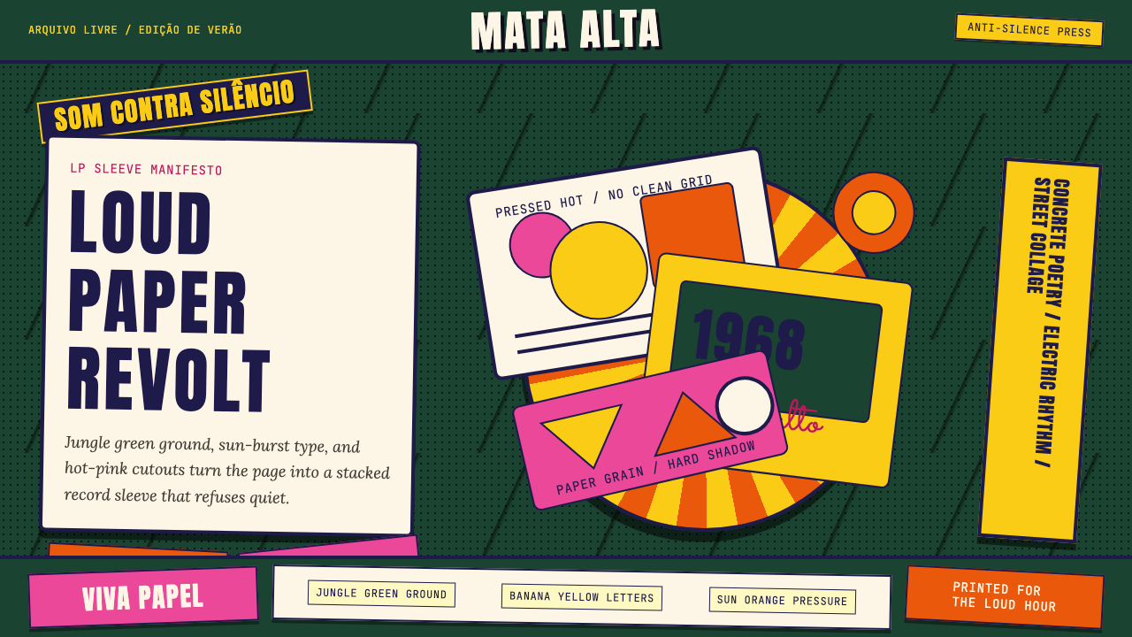 Brazilian Tropicália (1968)Art must be loud. Jungle green, banana yellow Anton type, and hard-shadow col…艺术必须喧哗:丛林绿、香蕉黄Anton字与硬阴影拼贴爆发。
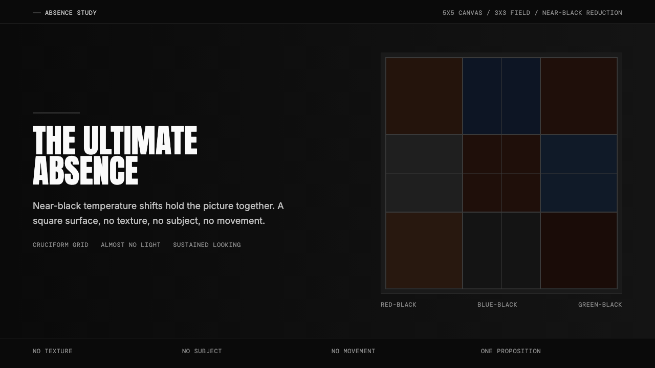 Ad Reinhardt Black Painting (1953)Austere absence. Near-black grid shifts reveal structure on sustained looking.苦行式缺席。近黑网格只在持续凝视中显形。
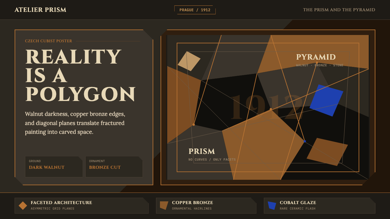 Czech Cubism (Prague 1912)Reality is faceted. Walnut ground, Cinzel capitals, and bronze diagonals cut…现实是多面体。胡桃木底、Cinzel 大写与青铜斜线切开平面。
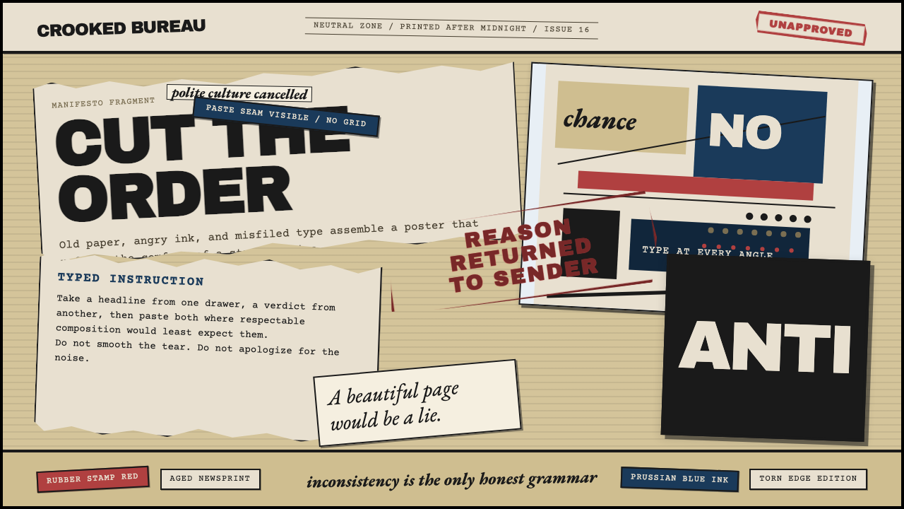 Dadaism (Zürich 1916)Chaos is the grammar. Aged newsprint, stamp red, Prussian blue, and tilted ty…混乱即语法:旧报纸底、印章红、普鲁士蓝与倾斜字体相撞。
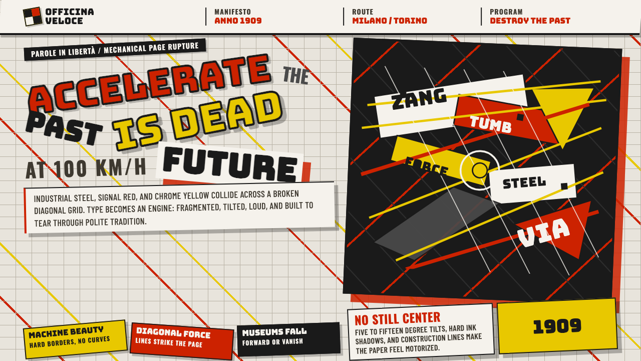 Italian Futurism (Marinetti 1909)Speed murders tradition. Signal red and chrome yellow slash a broken diagonal…速度杀死传统:信号红与铬黄斩开破碎斜向网格。
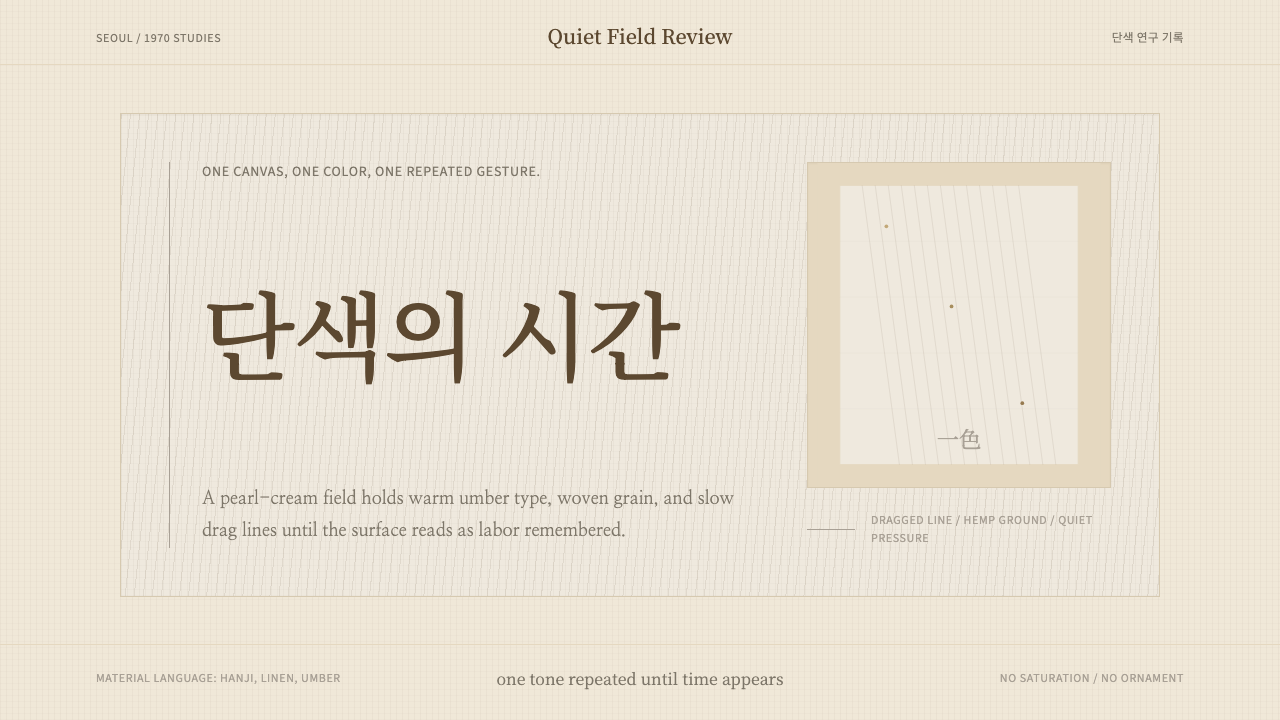 Korean Dansaekhwa MonochromeLabor becomes stillness. Umber serif type and drag lines on pearl cream.劳作化为静默。珍珠米底、褐色衬线和拖痕线条。