What is Breaking Bad (2008)?
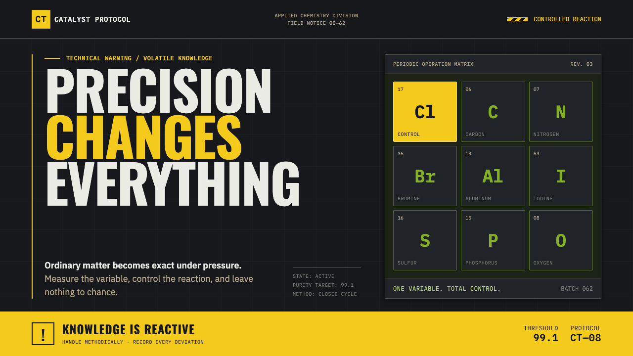
Breaking Bad makes precision feel dangerous — hazard yellow, laboratory green, and elemental tiles cutting through an asphalt-dark world.
Breaking Bad (2008) in brief
Breaking Bad is a dark visual system drawn from the 2008–2013 AMC series and its Albuquerque setting. Its language combines the controlled order of chemistry with the pressure of industrial hazard signage: dense technical letterforms, boxed symbols, severe dark fields, and a warning color that arrives with the force of an alarm. The atmosphere is not sleek futurism. It is practical, worn, and exposed to heat, dust, chemical residue, and risk.
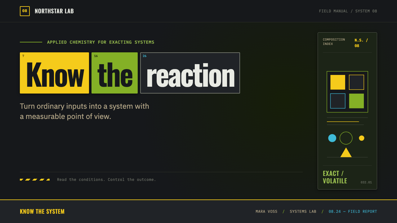
The defining device is the periodic-table tile. A two-letter fragment can be isolated inside a square, turning ordinary language into a molecular-looking mark. This creates an immediate tension between science and identity: a word becomes a formula, while a formula becomes a logo. Used with restraint, the tile gives headings, names, labels, and navigation a compact technical authority.
Its palette behaves like a danger system rather than a decorative collection. Asphalt black supplies weight and concealment; hazmat canary yellow interrupts it with urgency; toxic laboratory green adds chemical unease; methylamine blue appears rarely, making its appearance feel valuable and consequential. Grain, dust, and sun-scorched flatness keep the system from becoming sterile. Every polished surface should feel as if it has survived a harsh environment.
Where does Breaking Bad (2008) come from?
The visual world belongs to Breaking Bad, broadcast by AMC from 2008 to 2013, with its pilot airing on January 20, 2008. Its setting in Albuquerque, New Mexico matters because the visual language is inseparable from a landscape of severe light, open ground, dry air, roadside industry, and desert exposure. Darkness in this system is never merely cinematic black; it is set against the memory of sun, dust, and heat.
The source material identifies prestige-TV visual language, hazard and industrial signage, scientific poster design, and the neo-Western as the movements surrounding the system. These influences explain its unusual mix of exactness and menace. Scientific notation supplies classification, containment, and repeatable structure. Hazard signage supplies urgency and saturation. The neo-Western contributes exposed terrain, moral heat, and the feeling that every object has been left outdoors too long.
The visual grammar is built around transformation. A chemistry-teacher-turned-kingpin world asks ordinary systems to carry illicit pressure: a label becomes evidence, a vessel becomes a threat, a pair of letters becomes an element, and a plain desert horizon becomes a scene of consequence. The design language reflects that shift by keeping its components legible, bounded, and purposeful rather than ornamental.
Vince Gilligan, Michael Slovis, Robb Wilson King, and Bryan Cranston are named among the key figures associated with this source world. Together, those names anchor the article’s focus on a visual identity shaped through serial television rather than a detached graphic trend. The result is a style that feels authored by narrative stakes: technical information is never neutral, and a bright accent never arrives without warning.
What defines the Breaking Bad (2008) look?
Hazard Color
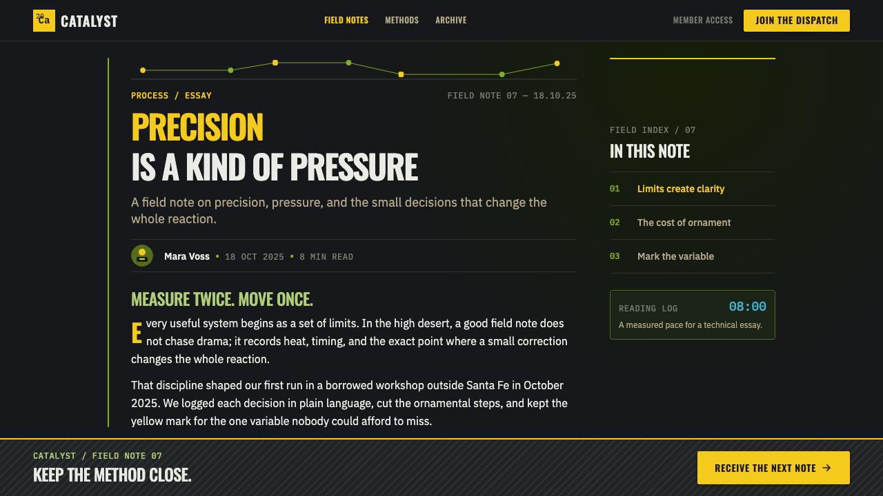
Use one screaming warning color at a time against asphalt black. Hazmat yellow is the clearest alarm; toxic green suggests contamination and laboratory light. Methylamine blue should remain scarce, so it reads as a controlled reveal rather than background decoration.
Element Tiles
Box a two-letter symbol into a compact periodic-table-like square. The tile works best as a selective interruption within a larger word or name, preserving readability while adding a molecular rhythm. Repeating it everywhere weakens the device’s forensic precision.
Condensed Type
Typography should feel compressed, industrial, and label-ready. Narrow stencil-like capitals create the impression of equipment markings, inventory codes, or warning placards. Hierarchy comes from contrast, spacing, and containment, not from decorative display treatments.
Asphalt Darkness
Black is a material condition, not an empty backdrop. It should feel dense, practical, and slightly contaminated, like pavement, soot, or a night laboratory. Allow muted grit beneath clean shapes so the composition retains physical danger.
Technical Containment
Rules, boxes, labels, and measured separations give the style its discipline. Information appears classified rather than freely floating. Even expressive elements should look processed through a system of handling, storage, testing, or warning.
Desert Grain
The desert influence flattens scenes into heat, dust, and abrasion. Add restrained grain to avoid digital perfection, but keep forms intelligible. Texture is evidence of exposure, not a nostalgic overlay or a substitute for visual structure.
Who shaped Breaking Bad (2008)?
Gilligan is listed among the key figures for the Breaking Bad source world. Within this style, that association matters because the visual system is inseparable from narrative escalation: ordinary technical language is made to feel increasingly charged, secretive, and dangerous.
Slovis is named as a key figure in the approved source material. The system’s visual lessons center on the contrast between severe darkness and sun-scorched exposure, allowing warning color, laboratory atmosphere, and environmental grit to carry narrative pressure.
King is among the listed key figures. The style’s language of placards, contained symbols, technical surfaces, and industrial wear demonstrates how setting can become an information system rather than a passive background.
Cranston is named among the key figures for this world. The source premise of a chemistry teacher turned kingpin gives the visual language its central contradiction: order, expertise, and scientific legibility become vehicles for instability and threat.
How do you use Breaking Bad (2008) today?
For presentation covers, treat the composition like a hazard placard at dusk. Start with a deep asphalt field, one dominant warning accent, a tightly set title, and a selective element tile. Keep the image area sparse and exposed. The cover should suggest controlled evidence, not a generic science theme.
On content and data slides, use technical containment to organize material. Section labels, ruled compartments, symbols, and sharply separated text groups work well for processes, risks, milestones, or analytical findings. Charts should remain legible first; color one critical series or state rather than turning every category into an alert. A data slide gains power when it looks inspected, classified, and ready for consequence.
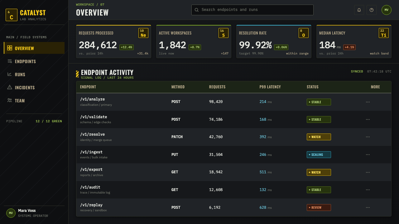
For web interfaces, this system is strongest in dashboards, monitoring tools, pricing pages, and products that need a sense of precision under pressure. Use the dark ground to establish focus, reserve warning color for actions or status changes, and let boxed labels establish hierarchy. A periodic-table tile can support identity in a wordmark or key navigation point, but it should not become a substitute for clear interaction design.
Editorial and marketing layouts benefit from the style’s desert-industrial atmosphere. Pair short, forceful headlines with narrow blocks of explanatory text, then use grain and exposed negative space to hold tension. Product pages can frame features as controlled substances, field reports, or lab findings, provided the metaphor clarifies value rather than making the copy theatrical.
The common mistake is to treat this as a black-and-yellow theme. The real system depends on restraint, classification, and environmental texture. Filling every panel with hazard stripes, green glow, boxed letters, and aggressive accents produces parody. Choose one warning color, give it a specific job, keep methylamine blue rare, and make every technical mark earn its place.
Breaking Bad (2008) — FAQ
Is this style simply a science or laboratory aesthetic?
No. Chemistry supplies the symbols, containers, and exactness, but the larger emotional register is danger. The system combines scientific poster logic with industrial warning language and a sun-scorched neo-Western environment. A clean laboratory interface without grit, darkness, or narrative pressure will feel too neutral.
How should the element tile be used in a logo or heading?
Use it to isolate a meaningful two-letter fragment within a readable word. The square should create a deliberate interruption, not force every letter into a scientific costume. Its strength comes from contrast between ordinary language and the contained symbol, so a single well-placed tile is usually more memorable than repeated motifs.
Can methylamine blue become the main accent color?
It can, but the approved visual grammar treats it as rare and precious. Making it dominant changes the balance from alarm toward revelation or specialized knowledge. If blue leads, reduce the role of yellow and green so the interface still has one clear source of urgency.
Where does the style work poorly?
It struggles when a product needs softness, reassurance, abundance, or effortless friendliness. The dark field, technical containment, and warning saturation can make ordinary actions feel consequential. It is better suited to systems involving analysis, monitoring, scarcity, risk, transformation, or high-stakes decision-making than to experiences built around calm comfort.
Related design styles
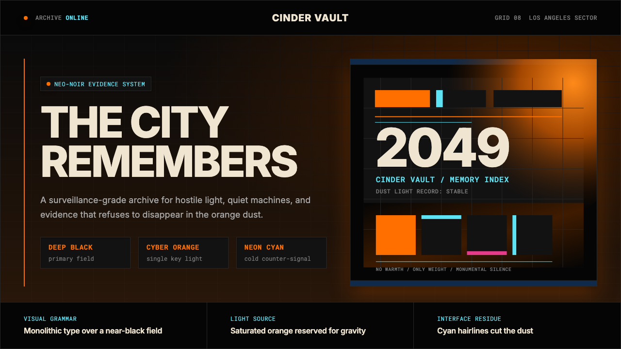 Blade Runner 2049Noir with tectonic weight. Orange dust, cyan hairlines, and monumental Inter…
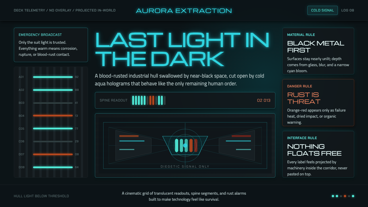 Dead Space IshimuraLast light in the dark. Near-black rust cut by aqua holographic panels.
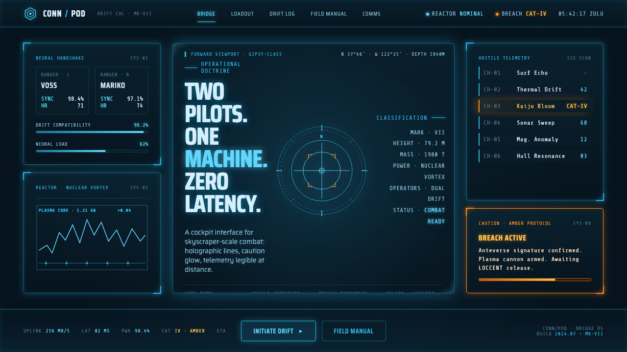 Pacific Rim Jaeger HUDTwo pilots, one machine. Faded Corsair-cyan holograms on near-black steel, am…
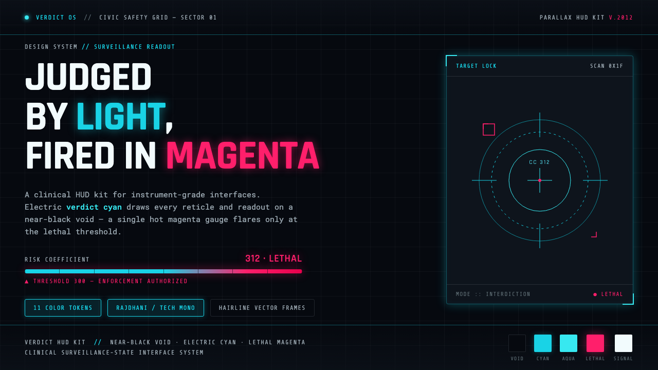 Psycho-PassA surveillance HUD. Cyan reticles on a near-black void; magenta flares only a…
 Bitcoin Maximalist OrangeOnly signal, zero spectacle. Orange mono data grids on terminal black enforce…
 Grime London Pirate Radio (2003)Pirate signal, flat and urgent. Yellow blocks, mono FM numerals, hard flyer g…