What is Latent Space?
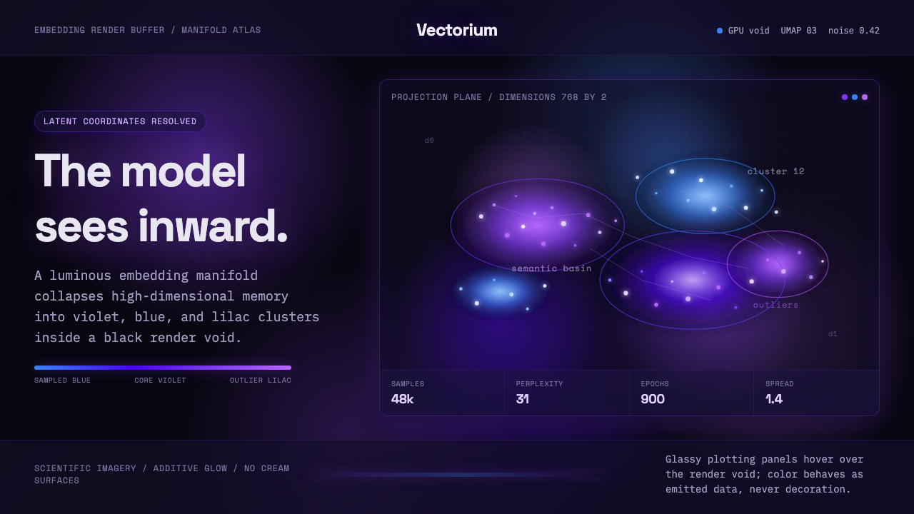
Latent Space turns the hidden mathematics of a generative model into a cosmic scientific image — violet-blue intelligence gathering shape inside a black GPU void.
Latent Space in brief
Latent Space is a contemporary visual language derived from machine-learning embedding and manifold visualization. Its defining image is a luminous cloud of violet and blue points suspended in an absolute black render field. The points gather into islands, filaments, cavities, and uncertain borders, suggesting that an invisible high-dimensional structure has briefly become perceptible.
The style borrows its visual grammar from t-SNE and UMAP scatter plots, which collapse complex, high-dimensional data into spatial arrangements that people can inspect. It does not reproduce those plots as neutral charts. Instead, it amplifies their clusters and discontinuities through additive glow, atmospheric depth, and fields of Perlin and Gaussian noise. Scientific evidence becomes speculative imagery without losing its analytical identity.
At its core, Latent Space proposes a viewpoint: the audience is not looking at an artificial intelligence from outside, but standing inside its representational world. Embeddings become stars, dimensions become implied directions, and manifolds become luminous terrain. The aesthetic therefore feels simultaneously computational, scientific, and sublime — less like an interface placed over a model than a direct encounter with what the model might perceive internally.
Where does Latent Space come from?
Latent Space emerged from the global, internet-native culture of machine-learning research, open-source visualization, and representation-learning education. Between roughly 2018 and 2024, embedding plots became increasingly familiar beyond specialist research settings. Images once encountered mainly in technical explanations began circulating through model demonstrations, educational media, experimental interfaces, and public discussions of artificial intelligence.
The underlying visual grammar came from embedding and manifold plots, especially the clustered scatter fields associated with t-SNE and UMAP. These methods made high-dimensional relationships visible by arranging data as points in a reduced space. Dense neighborhoods suggested similarity; gaps suggested separation; bridges and isolated islands invited interpretation. Although such projections were analytical devices rather than literal pictures of a model, their spatial ambiguity made them unusually powerful cultural images.
The generative-AI surge of 2023 changed the meaning of this imagery. Public attention shifted from isolated machine-learning techniques toward the internal representations of large generative systems. Embeddings, latent dimensions, and manifolds became part of a broader vocabulary for explaining how models organize language, images, and concepts. Visualization practitioners responded by giving the scatter plot greater atmosphere and drama: black render fields replaced neutral chart grounds, while violet-blue glow and procedural noise suggested immense computational depth.
The resulting style belongs neither entirely to scientific data visualization nor entirely to science fiction. It preserves recognizable evidence of clustering, projection, and dimensional reduction, yet presents those structures with the theatrical intensity of GPU-rendered imagery. This hybrid identity is essential. Latent Space does not merely decorate artificial intelligence with futuristic effects; it builds its spectacle from the actual conceptual tools used to discuss representation learning.
What defines the Latent Space look?
Color
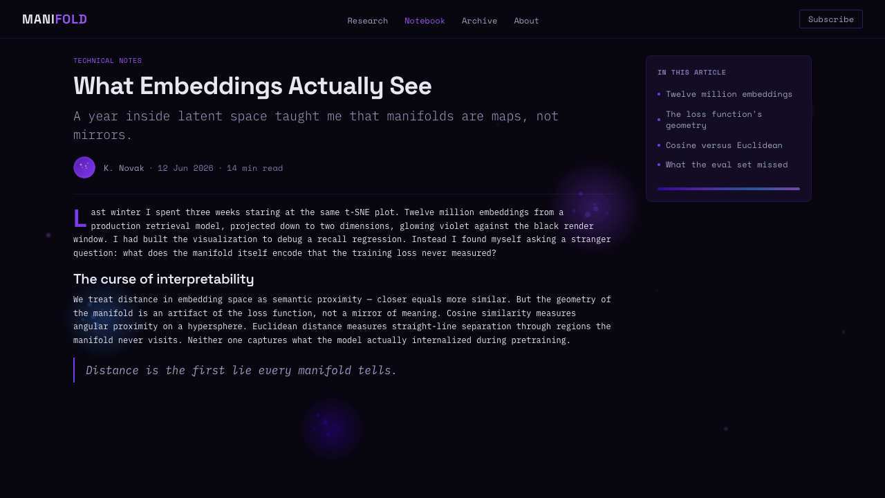
The palette moves through violet, indigo, electric blue, and related cool luminous tones. These hues appear brightest where points overlap or clusters become dense, allowing color to communicate concentration as well as atmosphere. Warm accents are unnecessary and can weaken the impression of a coherent computational field. Black is not an empty margin but the environmental ground from which every visible relationship emerges.
Typography
Typography should feel precise, technical, and subordinate to the visualization. Clear contemporary letterforms, restrained headings, compact labels, and disciplined metadata support the impression of a research instrument without turning the page into a fictional control panel. Hierarchy comes from contrast in scale, brightness, and placement. Text remains sharply legible rather than inheriting the blur and glow of the point cloud.
Point Clouds
Points are the fundamental visual unit. Their distribution should vary from sparse peripheral dust to intensely packed cores, producing a sense that density has semantic meaning. Uniformly scattered particles read as decoration; convincing latent imagery contains neighborhoods, voids, outliers, bridges, and nested formations. Individual points remain visible at the edges while dense regions merge into luminous masses.
Glow and Black
Additive glow establishes both depth and computational energy. It should accumulate around meaningful structures rather than coat every element equally. The surrounding black must remain deep and uninterrupted, giving the luminous manifold enough negative space to appear suspended. Cream and pure white grounds contradict the central metaphor: this is a rendered void illuminated by data, not a diagram printed on paper.
Noise and Uncertainty
Perlin and Gaussian noise disturb the field with controlled irregularity. Noise softens rigid boundaries, varies local density, and prevents the manifold from resembling a diagram assembled from perfect shapes. It should imply probabilistic structure rather than visual damage. The strongest compositions balance recognizable clusters with uncertainty at their edges, making the image appear generated, measured, and still open to interpretation.
Spatial Composition
Composition is organized as a field rather than a conventional stack of panels. A dominant cluster may anchor the view, while secondary islands, trails, and isolated points imply continuation beyond the frame. Depth emerges through overlap, relative brightness, density, and selective softness instead of literal perspective scenery. Interface elements should orbit or frame the manifold, never imprison it inside heavy containers.
Who shaped Latent Space?
Researchers associated with t-SNE and UMAP established the reduced-space scatter plot as a recognizable way of examining high-dimensional relationships. Their work supplied Latent Space with its essential visual syntax: points as observations, neighborhoods as similarity, gaps as separation, and projected space as an interpretive model. The style inherits both the explanatory power and the ambiguity of these projections.
Machine-learning visualization practitioners translated analytical outputs into images that could circulate through research tools, demonstrations, and public-facing explanations. By working with density, interaction, motion, and GPU rendering, they expanded the embedding plot beyond the static chart. Their contribution is the bridge between diagnostic visualization and the immersive violet-blue field now associated with generative-model interiors.
Representation-learning educators gave embeddings, dimensions, and manifolds a public vocabulary. Their explanations helped audiences understand that models organize information through relational structures rather than storing concepts as isolated files. Latent Space turns that educational metaphor into an environment: concepts appear as neighborhoods, similarity becomes distance, and abstraction becomes terrain. The style depends on this interpretive framework to remain more than luminous decoration.
How do you use Latent Space today?
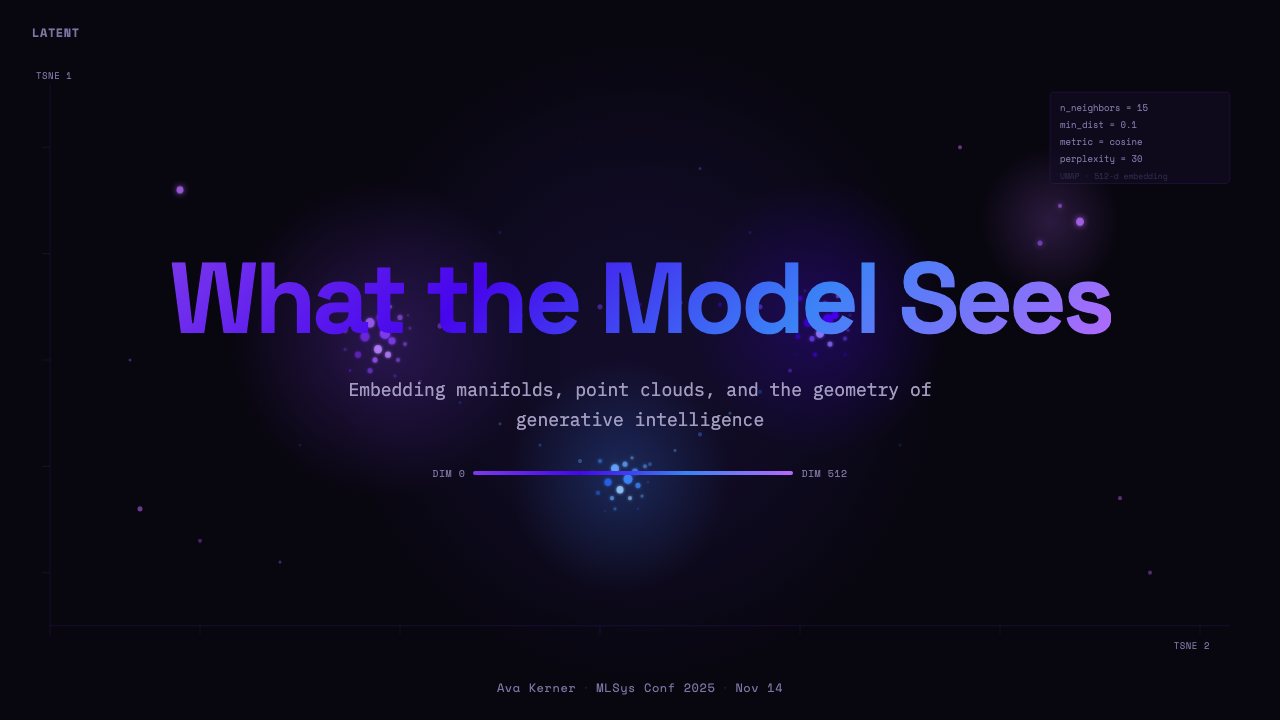
For presentation covers, use a single dominant manifold as the visual event. Let it emerge asymmetrically from a deep black field, leaving a calm region for the title and minimal metadata. Content slides should retain the void while reducing visual intensity: smaller clusters can mark sections, relationships, or conceptual groups, while crisp text occupies stable zones untouched by glow. The result should feel like a guided observation of model structure, not a decorative space poster.
Data slides are the style's most natural application because the aesthetic already originates in visualization. Scatter plots, network relationships, similarity maps, and model comparisons can use density and cool luminous color to make structure legible. Preserve explanatory labels, legends, and caveats; atmosphere must never disguise what the data actually supports. When an image is metaphorical rather than analytical, identify it through context instead of allowing scientific appearance to imply false measurement.
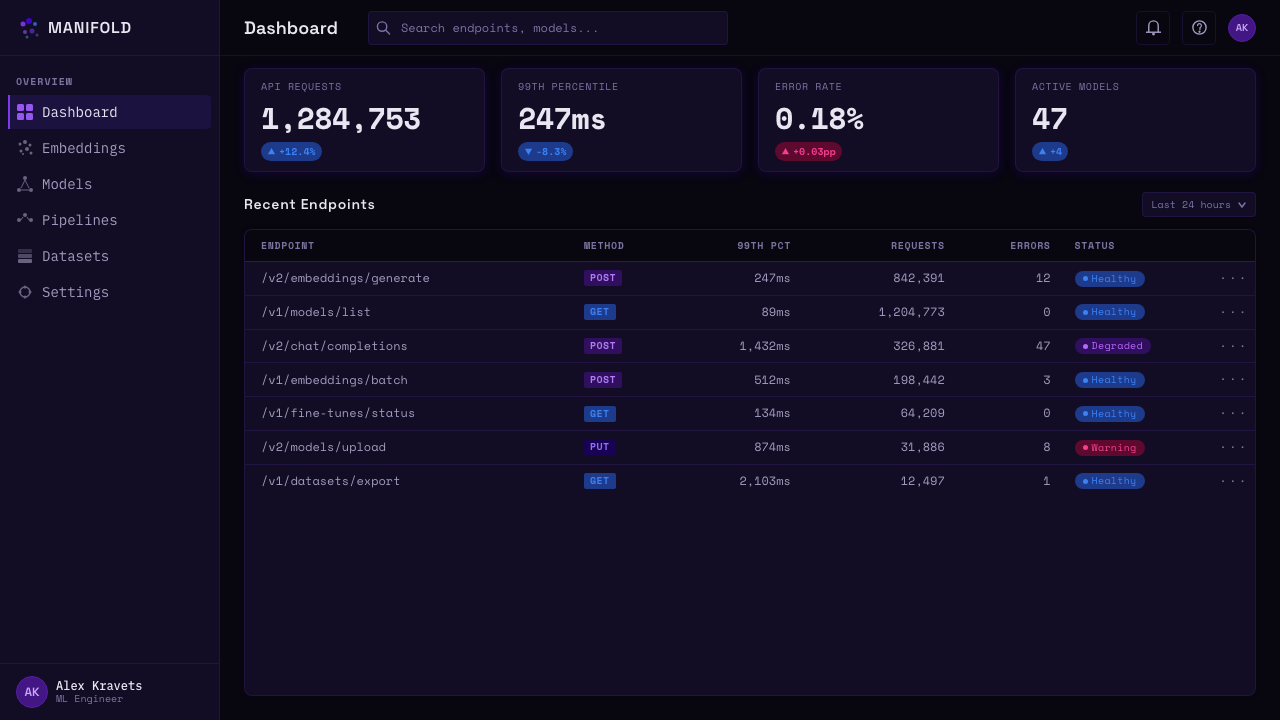
For web dashboards and analytical interfaces, the black render void can function as a continuous workspace containing the primary model view. Controls, filters, and metrics should remain restrained, sharp, and visually quieter than the manifold. On pricing pages, use the style more selectively: luminous clusters can distinguish product capabilities or model tiers, while the plans themselves require clear comparison and stable reading order. Glow should direct attention toward decisions, not reduce the contrast of essential information.
Editorial and marketing layouts benefit from the style's ability to make abstract AI subjects tangible. An article opening may pair a large point-cloud image with a concise proposition about embeddings or representation learning; later sections can crop into distinct neighborhoods as recurring chapter markers. Marketing pages can alternate immersive black visual passages with disciplined explanatory blocks, using the manifold to express discovery, intelligence, and scale without resorting to robot imagery or generic circuitry.
The most common mistake is treating Latent Space as a particle-effects theme. Random dots, universal blur, excessive glow, and ornamental data labels produce spectacle without meaning. Start with a plausible spatial structure: decide where neighborhoods form, where separation matters, and which outliers deserve attention. Then apply noise and light to reveal that structure. If every point shines equally and every region is equally dense, the image ceases to describe a model and becomes an undifferentiated star field.
Latent Space — FAQ
Is Latent Space a literal picture of what a model sees?
No. It is an interpretive visualization derived from embedding and manifold plots. Dimensionality-reduction methods arrange high-dimensional relationships in a space people can inspect, but the resulting geometry is a projection rather than a direct internal photograph. The style deliberately intensifies that projection through glow, depth, and noise. Its claim is metaphorical but informed: it offers a visual model of relational structure, not an unmediated view into machine consciousness.
Why must the background remain black?
Black carries the central spatial metaphor. It reads as an unbounded GPU render void and allows additive violet-blue light to define form through accumulation. A light or cream ground turns the manifold into an ordinary printed scatter plot and removes the sense of entering a computational interior. Black also gives sparse peripheral points meaning: they can fade toward uncertainty without disappearing into a conventional page surface.
How is Latent Space different from a generic futuristic AI aesthetic?
Its imagery begins with a specific conceptual source: embedding, dimensionality reduction, clustering, and manifold structure. Generic AI visuals often rely on circuitry, grids, robot faces, or arbitrary streams of light. Latent Space instead makes relational organization visible through neighborhoods, gaps, bridges, and outliers. Even when rendered dramatically, the composition should retain the logic of a scatter field that could plausibly communicate something about representation.
Can the style be used for real scientific data?
Yes, but analytical integrity must come before atmosphere. Real plots need readable labels, clear explanations of projection, consistent visual encoding, and explicit distinction between observed structure and interpretive styling. Glow can reinforce density, but it should not invent clusters or hide outliers. Noise belongs in the rendering only when it does not falsify the data. A visually compelling manifold remains a chart when evidence is involved, and it should be judged accordingly.
When does Latent Space become difficult to use?
It struggles when long-form reading, warmth, familiarity, or low visual intensity is the primary requirement. The black field and luminous density can fatigue readers if applied continuously, while the scientific tone may feel distant in products centered on intimacy or everyday comfort. It also becomes misleading when decorative clusters are presented beside serious metrics without clarification. The strongest applications reserve the immersive manifold for moments of explanation, orientation, or emphasis and keep routine interaction calm.
Related design styles
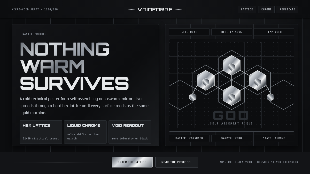 Nanopunk Grey GooColdness self-replicates. Chrome gradients and hex lattices spread across a b…
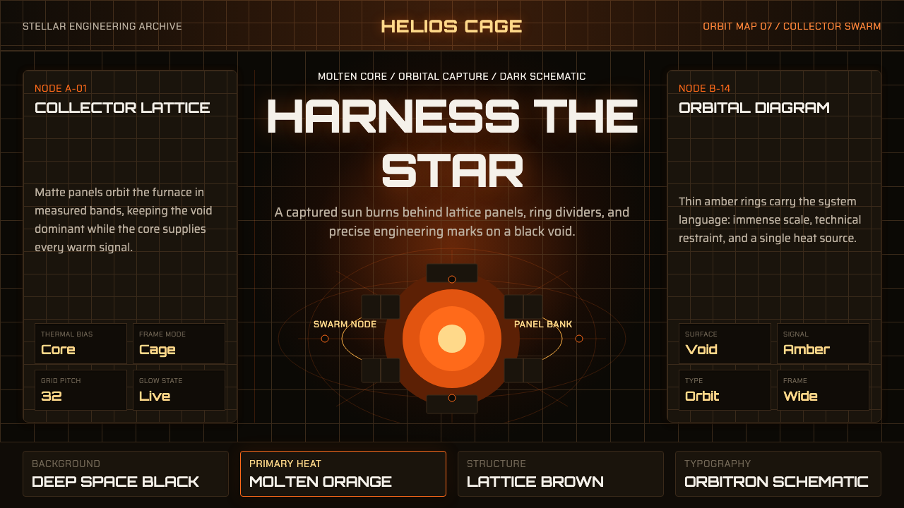 Dyson Sphere MegastructureCold void, captive heat. Molten orange core caged by brown lattice and orbita…
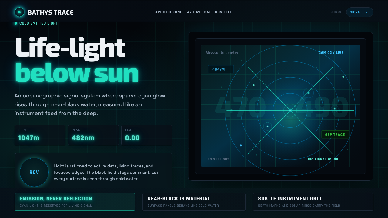 Abyssal BioluminescenceDark carries the signal. Electric cyan pins and Exo 2 readouts surface from a…
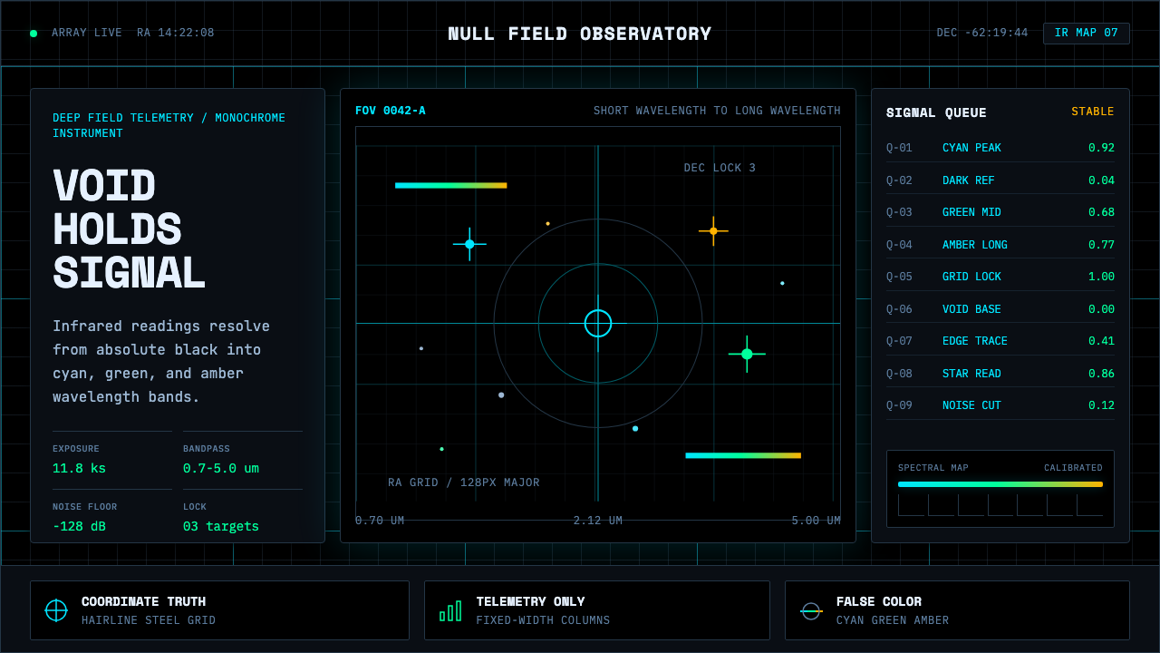 Deep Space ObservatoryTrust the void. Cyan telemetry and amber wavelength bars lock to a steel grid.
 Orbital Debris SalvageThe data does the decorating. Orange live locks cut through black mono teleme…
 CERN CollisionData, not spectacle. Cyan tracks on black wireframes make every subsystem col…