What is Orbital Debris Salvage?
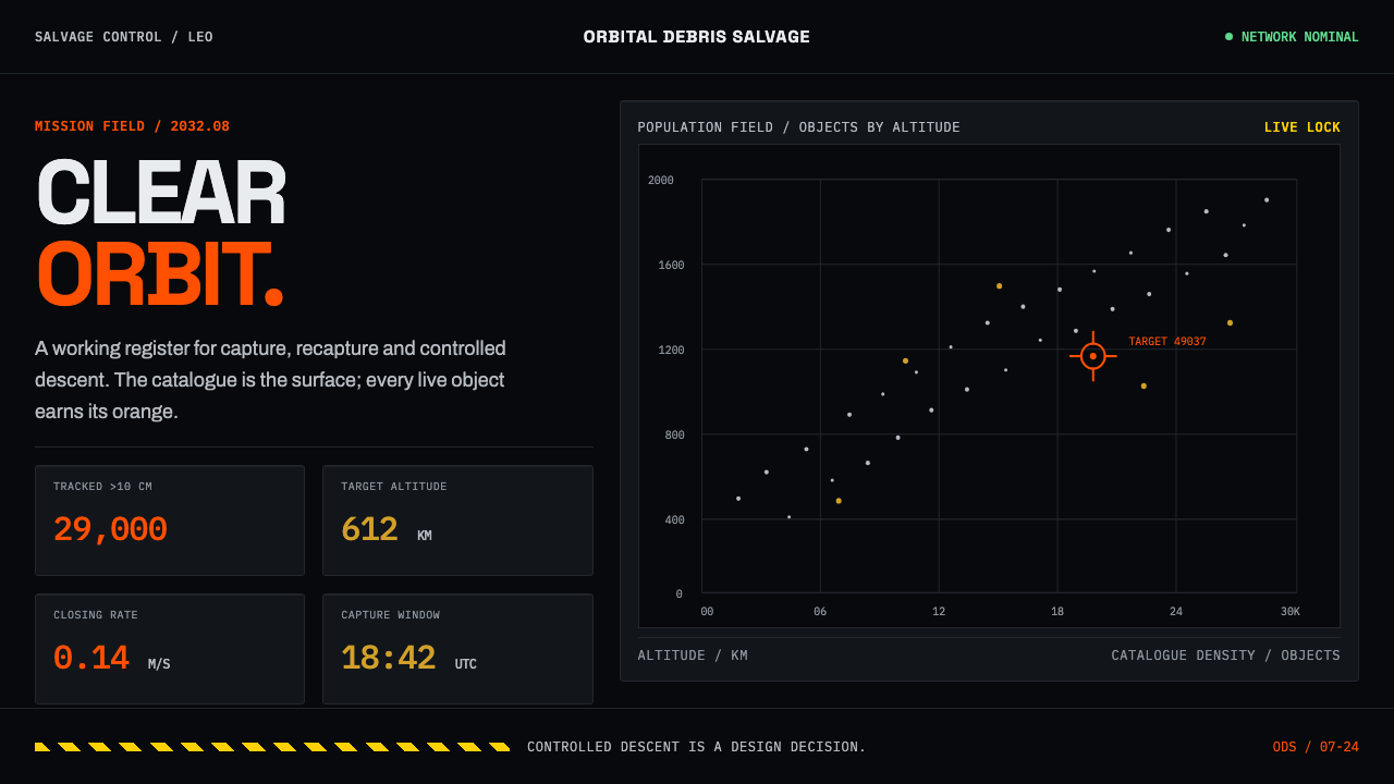
Orbital Debris Salvage is the working look of clearing low Earth orbit: black telemetry fields, hard-edged instrument panels, and a single warning orange reserved for what truly matters.
Orbital Debris Salvage in brief
Orbital Debris Salvage is a design style drawn from active debris removal, the engineering field that sets out to capture dead satellites, spent rocket stages and fragments in low Earth orbit and bring them down. It is unusual among historical styles because nobody designed it on purpose. It accumulated out of thermal blankets, hazard signage and flat-black population plots: the incidental graphics of an industry that cares about function and has no budget for charm.
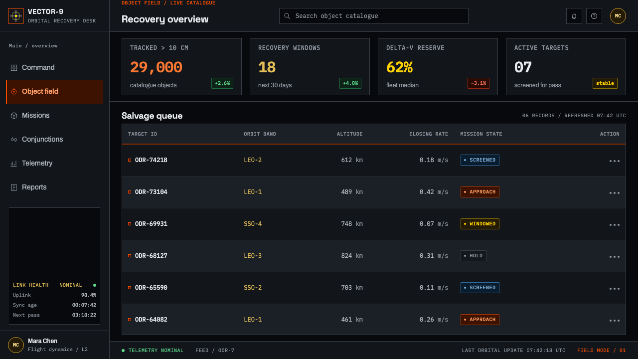
On screen the result reads as a dark instrument interface. A near-black field carries everything. International orange, the colour of hazard signage, is reserved for anything that demands a decision; a metallic gold borrowed from thermal insulation film marks material and hardware. Every number that has a unit sits in a monospaced column, so values align and can be compared at a glance. Panels are hard-edged hardware, ruled with hairlines and marked with small corner ticks, never softened into friendly cards.
The organising idea is that the data does the decorating. Flux, altitude shells and conjunction risk are already visually rich, and the style's only job is to stay out of their way. There is no ornament, no rounded corner and no flattering gradient, only the plots, readouts and warnings that a mission operator would actually watch.
Where does Orbital Debris Salvage come from?
The look begins with a population problem. Around 29,000 objects larger than ten centimetres are tracked and catalogued in orbit, and in the plots that show them each object is only a bare, bright point on black. Behind those plots stands Donald J. Kessler, whose name is attached to the warning that collisions between orbiting objects can feed further collisions. That scenario, often called the Kessler syndrome, is the reason removal missions exist at all, and the dot-on-black plot is its standard portrait.
Removal then became a field of hardware. ESA's Clean Space programme, the company ClearSpace SA and the company Astroscale are the names most closely tied to it. ClearSpace-1 is remembered for a four-arm claw meant to close around its target; Astroscale's approach is a magnetic docking plate, a fitting that lets a servicing spacecraft latch on by magnetism. Neither object was styled for effect. Their appearance is dictated by the mechanics of capture, and that blunt mechanical honesty is exactly the register the system borrows.
Three older graphic traditions supply the rest. Thermal blanket film gives the gold, the colour of material on space hardware. Hazard-colour signage, standardised internationally under ISO, gives the orange: a colour that already means 'look here' on machinery and in workshops, so a viewer reads its urgency without being taught. And the modernism of the NASA Graphics Standards Manual gives the attitude, the belief that an agency's graphics should be systematic, rule-bound and unsentimental, treated as part of the engineering rather than as decoration laid over it.
The style is honest about its timeframe. It records hardware that was in build around 2018 and extrapolates it into a near-term window of roughly 2028 to 2035, so it sits between documentary and speculation. Its region is low Earth orbit, below about two thousand kilometres, and its institutions are global agency programmes rather than any one country. That is why it has no national accent: its vocabulary comes from standards bodies and shared instruments, and a population plot looks the same whoever draws it.
What defines the Orbital Debris Salvage look?
Colour
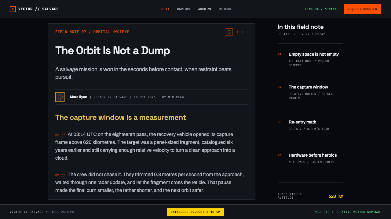
A near-black ground holds the whole interface. International orange appears only where something matters: a locked target, a rising risk, a warning. Kapton gold, the amber of thermal insulation film, belongs to material and hardware references rather than to status. Because orange is rationed, its appearance always carries information; a screen with orange everywhere would have lost the style's single loudest word.
Monospaced Type
Monospaced type is the system's voice. Any figure that has a unit, an altitude, a velocity, a probability, a timestamp, is set in a fixed-width column so digits stack under digits and change is visible. Labels stay small and quiet, and headings do not shout. The aim is to read a panel the way an operator reads a console: by scanning columns, not by admiring letterforms.
Panels as Hardware
Panels are hard-edged, ruled with hairlines and marked with small ticks at the corners, like the bezels of rack equipment or the registration marks on a drawing. Corners are not rounded to be friendly. Structure is shown by thin lines rather than fills or shadows, which keeps the dark field uncluttered and makes every panel feel machined rather than styled.
Data as Decoration
Population plots, flux curves, altitude shells and conjunction-risk tables are the visual content. A cloud of catalogued objects rendered as bare point sources on black is already a striking image, and the style relies on it instead of adding illustration. Where a page needs visual interest, the answer is a better plot, not an ornament.
Hazard-Colour Logic
The orange comes from hazard-colour signage, so it arrives with a pre-learned meaning: caution, attention, do not ignore. The style honours that by using it as a semantic signal and never as a brand wash. Selected rows, live tracking locks and risk thresholds earn orange; navigation chrome and decoration do not.
Material Honesty
Gold stands for the physical skin of spacecraft, the insulating film wrapped round hardware, so it appears where the interface is talking about material. It never signals luxury or premium status, which is how the same colour would behave in a retail context. The system keeps its references literal: each colour points back to an object that exists.
Restraint as Rule
No rounded corners, no soft gradients, no decorative icons, no mascots. The restraint inherits the tradition of systematic modernism that the NASA manual represents: a rule is stated once and obeyed everywhere. The result is cold by design, and the coldness is the point, because it makes a warning look like a warning.
Who shaped Orbital Debris Salvage?
Kessler's name is attached to the idea that collisions between orbiting objects can multiply into an ever-growing cloud of fragments. He is the intellectual root of the field: without that scenario there is little argument for removal missions, and the population plot that illustrates it is the style's founding image.
The European Space Agency's Clean Space programme stands for the institutional side of debris removal: a public agency treating orbital cleanliness as an engineering and environmental responsibility. It represents the agency-programme register of the style, sober, documented and standards-minded.
ClearSpace SA is the company behind ClearSpace-1, whose four-arm claw is one of the two hardware images the style is built around. A claw designed to close on a target is shaped by mechanics alone, and that function-first silhouette informs the system's hard edges and its refusal of softness.
Astroscale is the company associated with the magnetic docking plate, the other defining hardware image. A plate that lets a servicing spacecraft latch on by magnetism is a plain, rule-bound part, and its plainness is the template for the system's panels.
How do you use Orbital Debris Salvage today?
Orbital Debris Salvage suits any content where the honest move is to show instrument readings and let them speak. Its dark field, rationed orange and ruled panels make technical material feel credible, so it is strongest when there is real data to put in the panels. Used as a skin over empty content, it produces the look of mission control without any of its meaning.
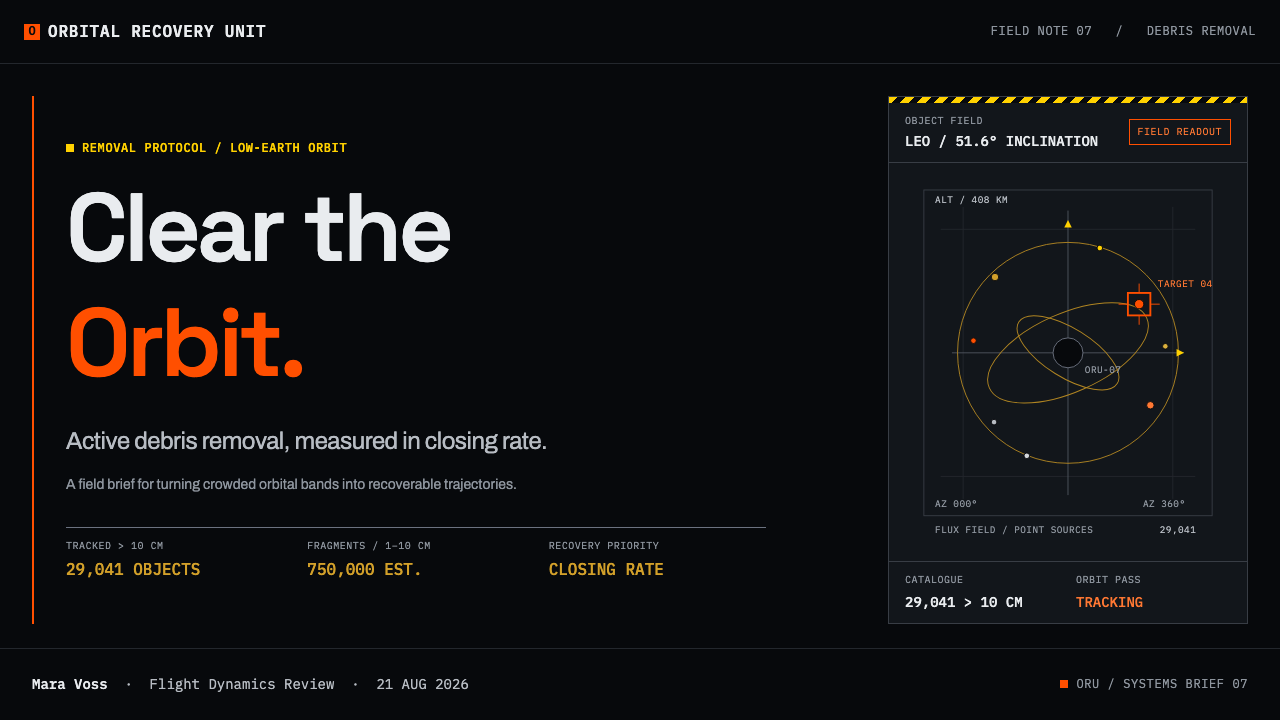
For presentation slides, the cover works best as a near-black field with a single title block in monospaced type and one orange marker, a small lock-on bracket or a corner tick, to give the eye a place to land. Content slides should read like instrument pages: a ruled panel, a column of aligned values, one highlighted row. Data slides are the style's home ground. A scatter of bare points, an altitude-shell chart or a risk table can fill the slide on its own, with orange limited to the one value the audience must remember.
For web interfaces, dashboards, monitoring tools, status pages and developer consoles fit naturally. Build the layout from hairline-ruled, hard-edged panels, set every number that has a unit in monospaced columns, and reserve orange for alerts, selected items and thresholds. Pricing pages are harder: the style's severity suits technical tiers that compare quantities such as limits and usage, and suits a consumer plan that sells reassurance much less. Keep controls rectangular and navigation quiet.
For editorial and marketing work, the style serves science and engineering stories, space-sector explainers, research reports and launch announcements. A report page can use a dark field with a narrow text measure, monospaced captions for figures and a gold rule for sources and materials. The tone should be factual and specific: tables, units and sourced numbers do more here than adjectives.
A common mistake is spreading orange across the page as a decorative brand colour, which drains the signal of meaning, since if everything is flagged then nothing is. A second is softening the panels with rounded corners and glow effects, which turns a debris console into a gaming skin. A third is using the gold for premium accents. Keep orange for what matters, gold for material, and let the plots carry the page.
Orbital Debris Salvage — FAQ
Is Orbital Debris Salvage a real historical style?
It is a documented visual register rather than a named movement. Nobody founded it. It formed in the working graphics of debris-removal programmes, in thermal blankets, hazard signage and population plots, and its closest named relatives are ISO hazard-colour signage and the modernism of the NASA Graphics Standards Manual. Its timeframe is partly extrapolated: it covers hardware in build around 2018 and projects into roughly 2028 to 2035.
Why is orange the single signal colour?
International orange does the job that hazard signage gives it everywhere else: it tells a viewer to pay attention. On a near-black field it is also the loudest possible voice, so scarcity is part of the design. Each orange mark has to justify itself, and the moment it is spread across decoration the whole warning system stops working.
Can it work on a light background?
The style is fundamentally dark. The near-black field is how bare point plots and orange signals get their contrast, so a light version changes the character. If you need one, for print for example, keep the ruled panels, the monospaced columns and the rationed orange, but expect a drawing-sheet feel rather than a console feel.
How is it different from generic sci-fi HUD styling?
Sci-fi interface styling is usually ornamental, with glows, scanlines and decorative frames added to look advanced. Orbital Debris Salvage is the reverse: every element refers to a real instrument, sign or material, and decoration is not allowed. Where a HUD style adds visual noise, this style removes everything that is neither data nor structure.
What kinds of products does it suit?
It suits products with real quantities in them: telemetry, monitoring, logistics, risk and engineering reports. It suits warm consumer contexts, hospitality or any product that wants to feel soft much less. The austerity that is a strength for data becomes a liability when comfort is the goal.
Related design styles
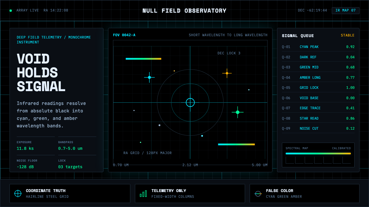 Deep Space ObservatoryTrust the void. Cyan telemetry and amber wavelength bars lock to a steel grid.
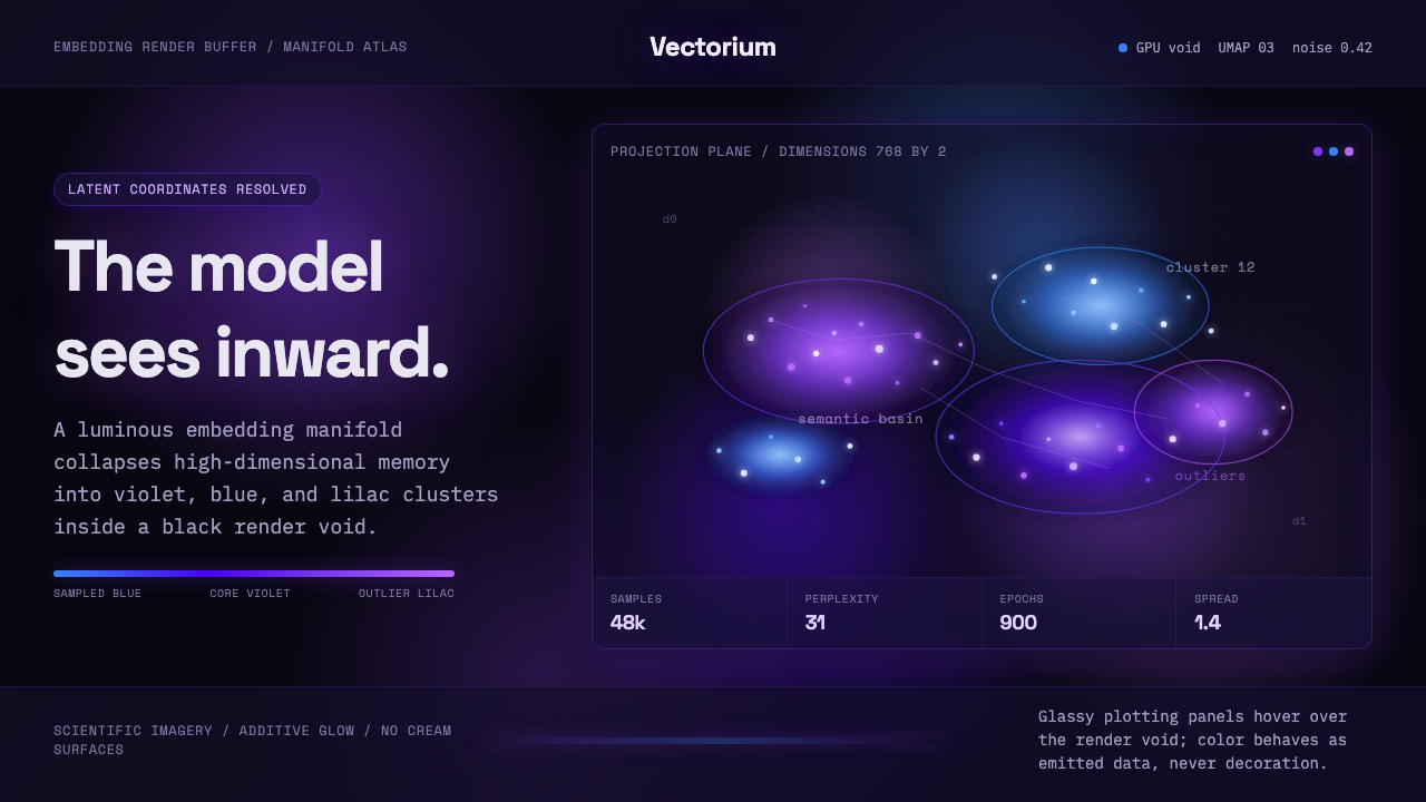 Latent SpaceSees the model from inside. Violet-blue point clouds glow on a black GPU void.
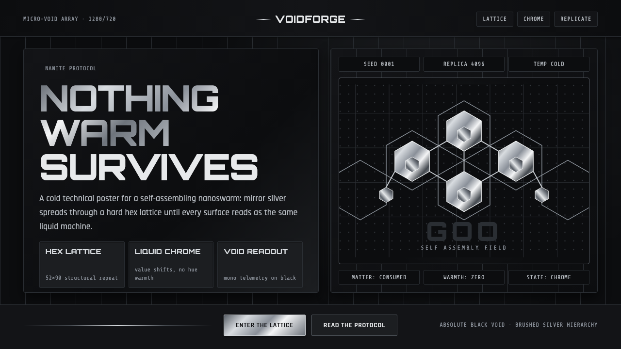 Nanopunk Grey GooColdness self-replicates. Chrome gradients and hex lattices spread across a b…
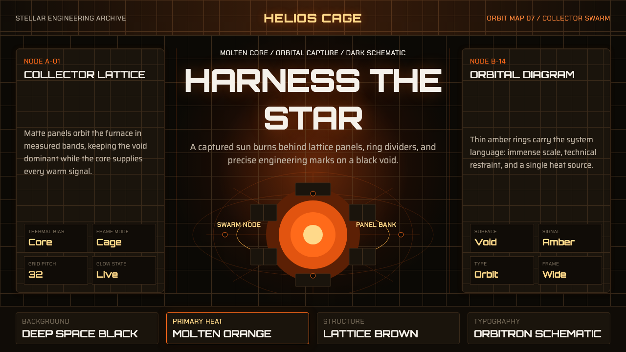 Dyson Sphere MegastructureCold void, captive heat. Molten orange core caged by brown lattice and orbita…
 Fencing PisteTurns darkness into signal. Rajdhani HUD type frames a white piste and red-gr…
 Abyssal BioluminescenceDark carries the signal. Electric cyan pins and Exo 2 readouts surface from a…