What is Vertical Farm Tower?
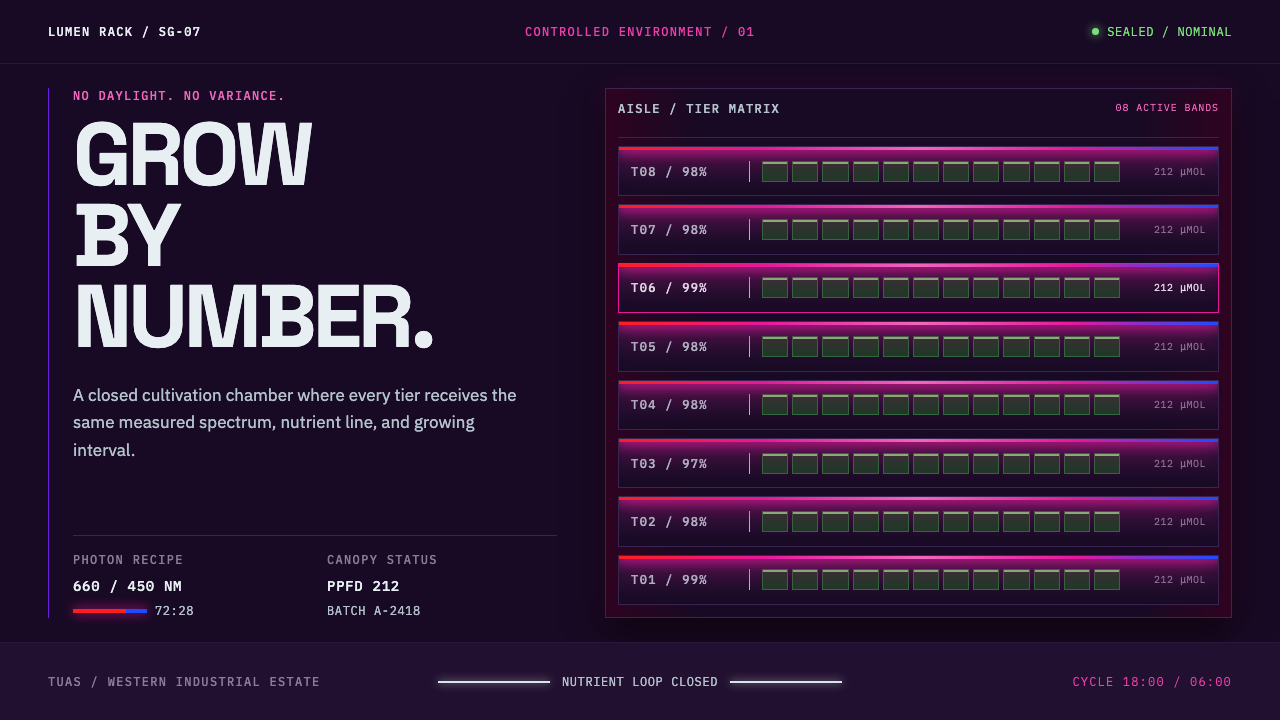
In a sealed room with no windows, two kinds of LED light stack up tier after tier and add together into magenta: the look of food grown by engineering rather than by weather.
Vertical Farm Tower in brief
The Vertical Farm Tower style takes its look from the indoor farms that Singapore has built inside its industrial estates. Behind a roller shutter in Tuas sits a sealed room with no windows: eight tiers of hydroponic trays, white nutrient piping, and a linear LED bar above every tier. There is no sunlight, no soil and no pastoral mood. What remains is a precisely lit machine for turning water, nutrients and electricity into food.
The visual identity is built from a few physical facts. The light bars run in a deep red and a blue, and the eye adds the two together and reads magenta. Around that light is a near-black aisle, hard horizontal bands of illumination, metal surfaces lit only at their edges, and machine-readable labels on every tray. The style is cold, exact and strangely beautiful, and its beauty is a by-product of its function, not a decision about decoration.
As a design language it is dark, structural and technical. It favours repeated horizontal tiers, thin lines and tight, label-like type over soft shapes and organic imagery. It tells viewers that what they are looking at is infrastructure: measured, monitored and optimised. For subjects like food technology, climate engineering, logistics, hardware and operations software, it provides a vocabulary that feels credible because it is derived from a working system.
Where does Vertical Farm Tower come from?
The style grows out of a national problem. Singapore imports more than ninety percent of what it eats, and as a small city-state it has almost no farmland to change that. Its answer, beginning in the 2010s and running through the food-security push known as '30 by 30', has been to grow food inside industrial units, stacking crops vertically and controlling every variable. The era given for the style, the 2010s to now, reflects that continuing campaign, and it includes the opening in 2026 of what is described as the world's tallest indoor vertical farm.
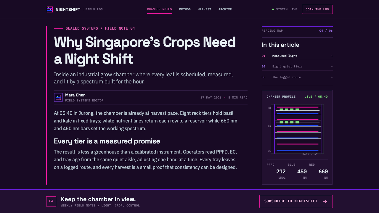
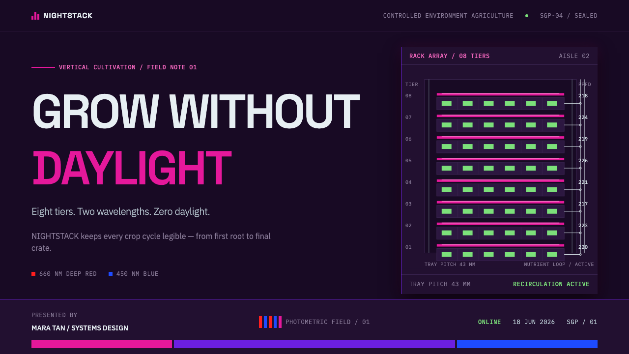
The geography is just as specific. The setting is Tuas and the western industrial estates of Singapore, the part of the island given over to factories, warehouses and logistics. A vertical farm there looks like any other industrial unit from the street: a roller shutter, a loading bay. Inside, the room is sealed against the outside climate. Trays of crops sit in stacked tiers, fed by hydroponic nutrient lines, and each tier carries its own linear LED bar overhead. The architecture is a rack, not a field.
The colour comes straight from the science. In controlled-environment agriculture, growers choose light by what plants use, not by what looks pleasant. Plants absorb red and blue light most readily, so horticultural LEDs are tuned to those two bands and dispense with the rest of the spectrum. When a person stands in front of the result, the red and blue combine in the eye and read as magenta. The style's signature colour is therefore not a branding choice at all; it is the visible trace of a lighting recipe, and that is what makes it feel authentic.
Three technical movements stand behind the look: controlled-environment agriculture, hydroponics and LED horticultural lighting. The people and organisations associated with it include the Singapore Food Agency, which sets the national food-security direction, and operators such as Sustenir Agriculture, Panasonic Factory Solutions Asia Pacific and Greenphyto. The design system turns this industrial reality into an interface language, one that borrows the logic of the room itself, with dark ground, bands of light, edge-lit surfaces and a label on everything.
What defines the Vertical Farm Tower look?
Ground: the near-black aisle
The ground is a near-black, the colour of a windowless corridor between racks. It is deep without being pure black, so light can sit on it convincingly. Everything is defined against this darkness, and text is kept bright and unambiguous on top of it. The effect is of a space where nothing exists except what is lit on purpose.
Magenta from two bands of light
The signature colour is magenta, produced the way the farm produces it: a deep red and a blue added together. It is used as light, thin and hard-edged, not as a broad fill. Because the colour is functional, the style uses it sparingly and consistently, as the marker of whatever is active, selected or being measured, and not as an all-purpose accent.
Tiers and hard horizontal light
The composition is a vertical stack of horizontal tiers, each with its own bar of light running across. Content is organised in rows that repeat with minimal variation, the way trays repeat on a rack. The light itself is hard and linear, with no glow spreading into the dark. Every band has a clear start and finish, so the layout reads as engineered rather than atmospheric.
Surfaces lit only at their edges
Metal shelves and panels catch light along their edges and sink into shadow in the middle. In interface terms this means thin edge highlights on cards and containers, with interiors left dark and flat. There is no soft drop shadow or gradient fill, because in the real room, light comes from a narrow bar and falls only where it reaches. It is a rim, not a glow.
Pipes and labels: the machine layer
White nutrient piping crosses the room as thin, straight lines, and every tray carries a machine-readable code. The style borrows both: fine white rules to connect or divide, and small technical labels, identifiers and figures in tidy, tabular type. Information looks logged, not told. Everything seems to have been counted by a system, which is exactly the impression of trust the style wants.
No pastoral, no daylight
The style refuses the usual imagery of agriculture: no green leaves, no sun, no wood, no hand-drawn warmth. Food is presented as the output of an engineered system. That refusal is what gives the look its identity, because most agritech design reaches for soft greens and organic shapes. This one is closer to a data centre than to a meadow.
Who shaped Vertical Farm Tower?
The Singapore Food Agency is the national body most associated with the country's food-security direction and the '30 by 30' push that makes local indoor farming a policy priority. In the story of this style it stands for the demand side of the look: the reason these farms exist at all is a national decision that a city-state with little land should learn to grow more of its own food, and should do it vertically.
Sustenir Agriculture is a Singapore-based controlled-environment farming operator and one of the names tied to the country's indoor-farm scene. It represents the commercial layer of the style, where light recipes, tray handling and climate control have to turn a profit. For a designer it illustrates a useful point: the look is not an art direction invented for marketing, it is the working appearance of a business.
Panasonic Factory Solutions Asia Pacific is the industrial-technology company named among the key figures, and it points to the manufacturing heritage that sits behind the look. Equipment makers brought factory logic, such as standardised racks, repeatable processes and traceable parts, into farming. That logic is why the tiers repeat so evenly and why every unit seems to belong to a numbered series.
Greenphyto is another Singapore vertical-farming company listed among the key figures of the style. Alongside the other names, it completes a picture of a small ecosystem of operators, equipment makers and agencies rather than a single inventor. The style belongs to that ecosystem as a shared industrial look, and it has no single author in the way a design movement usually does.
How do you use Vertical Farm Tower today?
The Vertical Farm Tower style fits subjects that are technical, measured and infrastructural: food technology, climate and energy, logistics, hardware, monitoring software and operations. It works when the idea is that a system is running and can be trusted. It is a poor fit for warm, personal or nostalgic subjects, because nothing in the vocabulary is warm, personal or nostalgic.
For presentation slides, a cover works as a near-black field with a single hard band of magenta light and a short title in clean, label-like type. Content slides can be organised as tiers: horizontal rows with a thin rule or edge light between them, one idea per row. Data slides are a natural match, since charts rendered as lit bars on a dark ground look like instruments, and a small identifier on each series reinforces the logged, machine-read feeling.
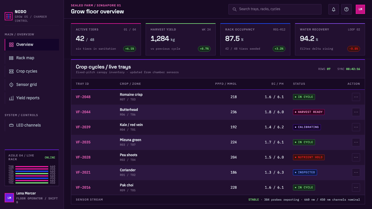
For web interfaces, the style is at its best in dashboards, monitoring consoles, status pages and developer tools. Use the dark ground throughout, thin edge highlights on cards, and magenta only for the active or selected state. Pricing pages can present plans as stacked tiers, each a row with a precise label and a figure. Keep spacing tidy and consistent, avoid rounded softness, and let tabular numbers align so that readings look like readings.
For editorial and marketing work, the style suits infrastructure reporting, sustainability and food-security analysis, product pages for agritech and lighting hardware, and launch material for industrial software. Long text should sit in high-contrast type on the dark ground with generous line spacing. Photography, if used, should show real equipment, racks and light, and not stock images of leaves or hands. Captions and credits can adopt the same label-style identifiers.
A common mistake is to treat magenta as a neon glow. The real light is hard and linear, so bloom, blur and spreading halos turn the style into generic cyberpunk. Others include filling large areas with magenta, adding green plant imagery, placing the style on a light background, or softening the type until it loses its technical edge. Finally, avoid decorative detail that has no function; in this system, every line and label should look as though a sensor, a pipe or a tray needed it.
Vertical Farm Tower — FAQ
Why is a farm style magenta instead of green?
Because the colour comes from the lighting, not from the plants. Indoor farms use LED bars tuned to the red and blue bands that plants absorb best, and the eye combines the two into magenta. Green is what the crop looks like in daylight, but in a sealed room under these lights, the dominant visible colour is magenta. The style takes the room's real appearance rather than the usual agricultural cliché.
Is this a dark-mode-only style?
In practice, yes. The identity depends on a near-black aisle, hard bands of light and surfaces lit at their edges, and all three need darkness to read. A light-ground version would lose the sense of light itself, and magenta on white tends to look like a generic accent colour. If a light context is unavoidable, use a dark panel for the key content and keep the rest minimal.
How is it different from cyberpunk or neon styles?
Cyberpunk uses glow for drama. This style uses light for function. Its light is hard, linear and confined to a tier, with no bloom spreading into the dark, and its colour has a physical reason. The result feels closer to a clean laboratory or data hall than to a rainy neon street, with lots of discipline, tidy labels and very little ornament.
What kinds of content suit the Vertical Farm Tower style?
It suits anything that benefits from a sense of engineered reliability: dashboards, monitoring and observability tools, food and climate technology, logistics, hardware and infrastructure reporting. It is strongest when the content is data-heavy and organised in repeated rows. It is weakest for warm consumer storytelling, personal brands or anything that depends on a handmade feel.
Does the style need pictures of plants or farms?
No, and it usually looks better without them. The style communicates through light, structure and labelling, and leafy stock imagery pulls it back toward the generic agritech look it deliberately avoids. If imagery is needed, use real photographs of racks, trays and light bars, or abstract renderings of tiers, and keep the framing technical rather than pastoral.
Related design styles
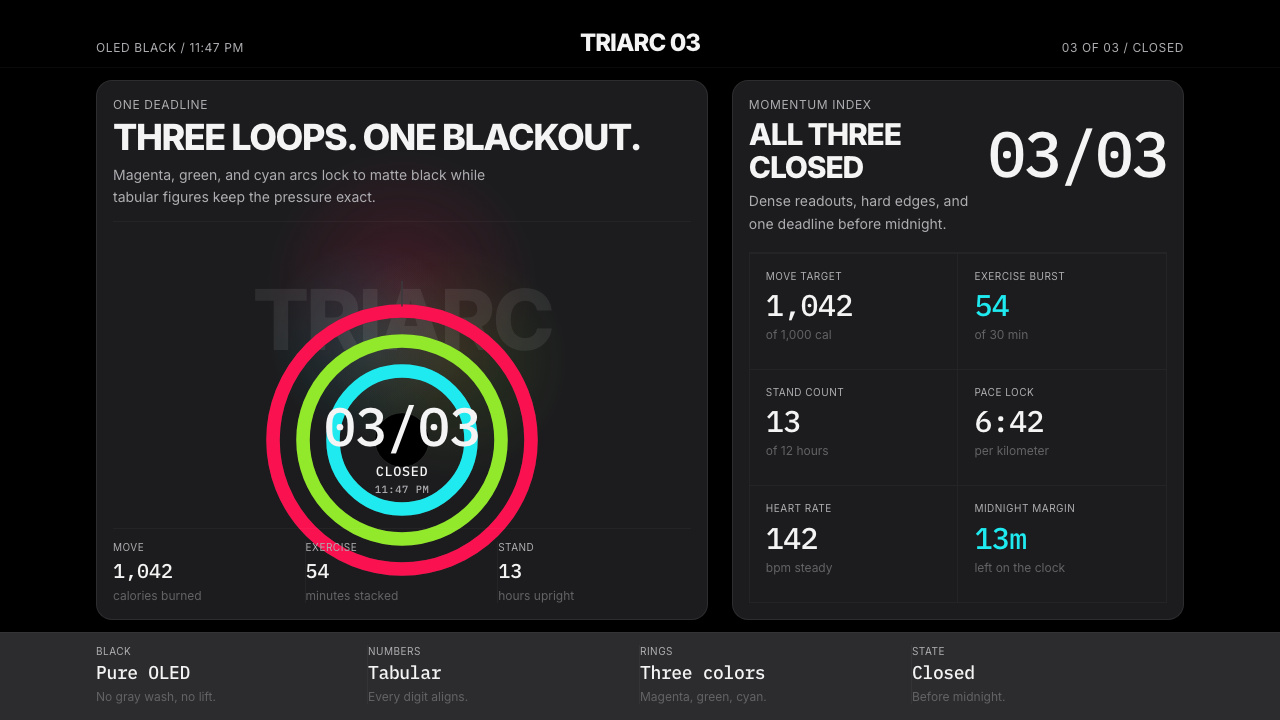 Apple Fitness Rings Closed (2024)Midnight feels exact. Magenta, green, and cyan rings lock onto OLED black.
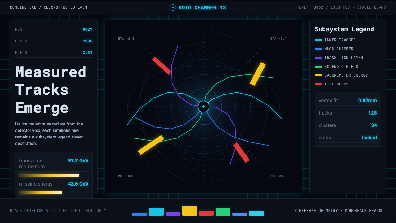 CERN CollisionData, not spectacle. Cyan tracks on black wireframes make every subsystem col…
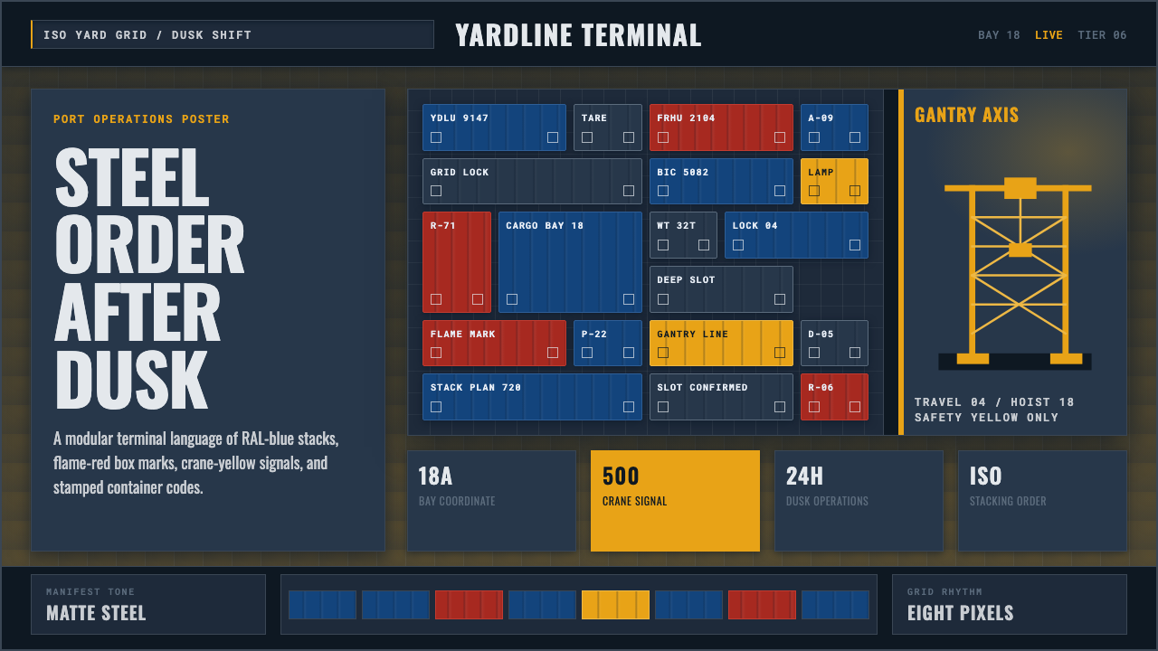 Container PortIndustrial dusk, standardized. Slate grid, RAL-blue stacks, and crane-yellow…
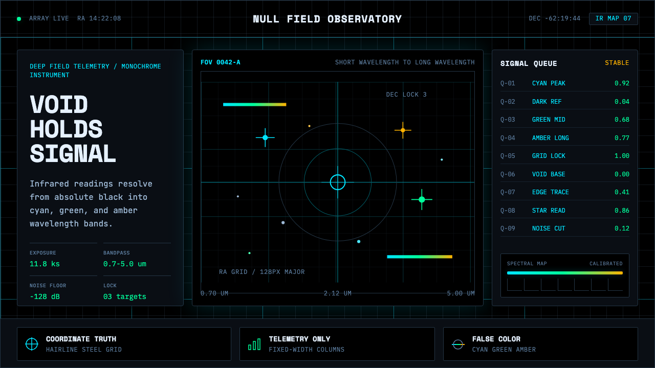 Deep Space ObservatoryTrust the void. Cyan telemetry and amber wavelength bars lock to a steel grid.
 F1 Formula One LiverySpeed is legible. Ferrari red and papaya speed-lines cut through black teleme…
 Fencing PisteTurns darkness into signal. Rajdhani HUD type frames a white piste and red-gr…