What is The Wandering Earth?
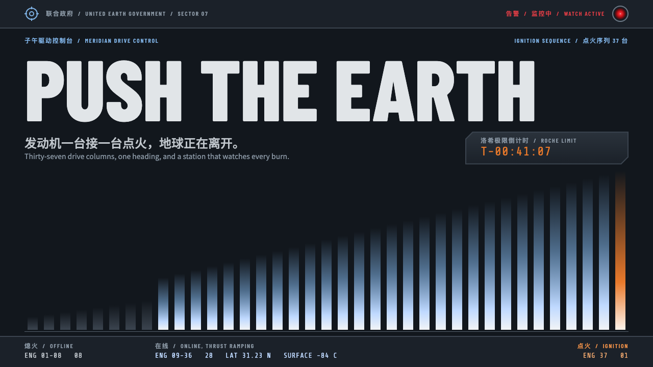
The Wandering Earth's control-room interface is heavy industry on screen: chamfered gunmetal panels, stencilled labels, and one orange ignition in a field of steel.
The Wandering Earth in brief
The Wandering Earth style is a dark interface system drawn from the United Earth Government control rooms in the 2019 Chinese science-fiction film. Panels are gunmetal, with chamfered corners and thick borders, set against near-black. Text is steel-silver, and labels are narrow, stencilled condensed capitals that look like markings sprayed on a ship's hull.
Its character is heavy industry rather than consumer electronics. Nothing is soft, rounded or friendly. Surfaces feel like machined metal, and information is laid out like a plant control board where each module has a clear job. The effect is weight, scale and consequence, appropriate to a story about moving an entire planet.
Colour is rationed with discipline. Jupiter orange marks the one thing that matters on screen, a pale engine-plume blue carries beams, graph lines and glowing edges, and a red reserved for the station AI MOSS appears only on alerts and on the AI's single lens. The system also treats bilingual Chinese and English warnings, countdowns and engine-count grids as native components.

Where does The Wandering Earth come from?
The source of the look is the film The Wandering Earth, released in February 2019 and directed by Frant Gwo. It is adapted from the 2000 novella by Liu Cixin, one of the best-known names in Chinese hard science fiction. The story imagines humanity building giant engines to push Earth out of the solar system, and its interfaces had to suggest an effort of planetary scale carried out by institutions and machines, not by gadgets.
That premise shaped the visual language. The United Earth Government spaces are built around control-room logic: big boards, clear status, bold marking systems and equipment that looks built to survive. The interface grew from these places and chose weight and legibility over decoration. Its chamfered corners and stencilled numbers echo industrial signage, shipyards and heavy plant, which gave the film a grounded identity distinct from Western space-opera screens.
The design then expanded in The Wandering Earth 2, released in 2023, which deepened the UEG world and made its screens and insignia more elaborate. Wu Jing, who leads the cast of the first film, and Qu Chuxiao, also a member of that cast, are among the names tied to the story. The station AI MOSS carries a notable lineage as well, belonging to the long tradition of calm, single-eyed machine minds that began with HAL 9000.
The style belongs to several overlapping currents: Chinese hard science fiction, heavy-industry sci-fi design, and the lineage of station AIs. Together they give it a distinct position among screen languages. It is not the clean future of consumer technology but a rugged, institutional future, where interfaces are tools for large collective decisions and every colour has a job to do.
What defines the The Wandering Earth look?
Chamfered gunmetal panels
Panels have cut corners rather than rounded ones, with thick borders and a dark metallic tone. The geometry suggests plate steel and bolted armour, and it is the clearest visual mark of the system.
Near-black ground, silver text
The base is almost black and body text is a cool steel-silver, giving strong contrast without glare. Information reads clearly in dim control-room conditions and feels serious rather than flashy.
Stencilled condensed labels
Headings and identifiers use narrow, stencil-like capitals, similar to numbers sprayed on a bulkhead. They save space, feel industrial, and pair naturally with bilingual labelling.
One orange ignition
Jupiter orange is reserved for the single most important button, progress bar or moment of ignition. Surrounded by steel greys, it carries the full weight of the action it marks.
Plume-blue beams and telemetry
A pale blue-white, like an engine plume, draws beams, chart lines and glowing edges. It describes energy and data flow, and it keeps the orange and red free to mean action and alarm.
Red for MOSS and alerts
Red appears only on warnings and on the AI's lens, so it always signals either danger or the machine's attention. Keeping it rare is what lets an alert interrupt the whole screen.
Bilingual native components
Chinese and English alerts, a countdown to the Jupiter Roche limit and a grid showing engines online are part of the system itself. They make the style especially fitting for bilingual sites and mission-style data screens.

Who shaped The Wandering Earth?
Director of The Wandering Earth, whose film established the world these interfaces belong to.
Author of the 2000 novella that the film adapts, and a leading name in Chinese hard science fiction.
Lead actor of the first film, tied to the story's public identity.
A cast member of the first film.
How do you use The Wandering Earth today?
In slides, the style is a strong choice for mission briefings, launch announcements, game pitches and hard science-fiction presentations. A cover can be a near-black slide with a chamfered gunmetal frame, a stencilled title and one orange element such as a countdown. Content slides benefit from panel modules with thick borders, and data slides can use plume-blue chart lines against the dark field, with orange marking the key number.
On the web, it suits mission dashboards, countdown pages, game interfaces and bilingual science-fiction sites. Build the layout from heavy panels with cut corners, use narrow stencilled headings, and place status grids and gauges where the user needs to monitor something. The orange belongs on the single primary action, while red appears only when something is actually wrong.
For editorial and marketing work, it fits film and book campaigns, hard sci-fi publications, industrial technology launches and large-scale infrastructure stories. Copy should be short and declarative, with the authority of a control-room announcement. Bilingual headlines and captions are a natural fit, with each language set in matching condensed type.
The most common mistake is to soften it. Rounded corners, glassy gradients or friendly illustrations destroy the heavy-industry character. A second mistake is to spend the orange and red on decoration, so that alerts no longer feel urgent. A third is to use wide, light type for headings; the stencilled condensed capitals are central to the look. Keep it hard-edged, dark and rationed.

The Wandering Earth — FAQ
What is the Wandering Earth UEG interface style?
It is a dark, heavy-industry interface language taken from the United Earth Government control rooms in the 2019 film: chamfered gunmetal panels, steel-silver text, stencilled condensed labels, and carefully rationed orange, blue and red.
What do the colours mean?
Jupiter orange marks the single most important action or ignition moment, a pale plume blue carries beams, graph lines and glowing edges, and red is kept for alerts and the MOSS AI lens. Each colour has one job.
Is it suitable for bilingual websites?
Yes. Bilingual Chinese and English warnings are native components of the system, and the narrow stencilled capitals are designed to sit alongside each other, so the style suits sites that present both languages together.
What products does it fit best?
Mission dashboards, countdowns, data wall screens, game interfaces and hard science-fiction sites. It works wherever the product wants the weight and seriousness of a control room rather than a friendly consumer feel.
Who is the AI in the design?
MOSS is the station AI from the film. Its single red lens inspired the red accent in the interface, and it belongs to the lineage of calm machine intelligences that began with HAL 9000.
Related design styles
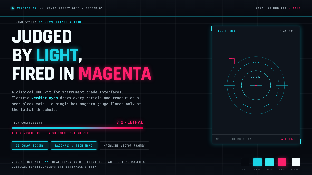 Psycho-PassA surveillance HUD. Cyan reticles on a near-black void; magenta flares only a…
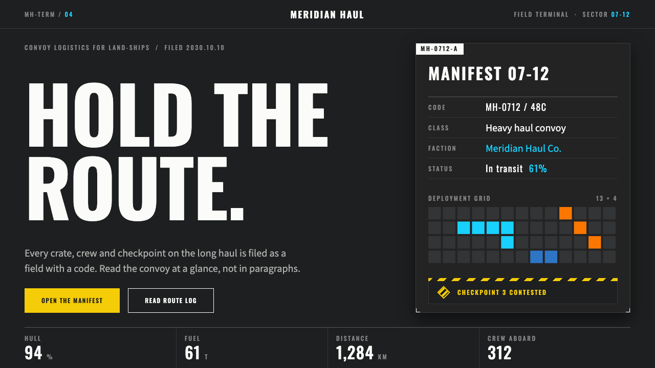 ArknightsEvery color has one job. Charcoal panels, wide-tracked caps, hazard yellow on…
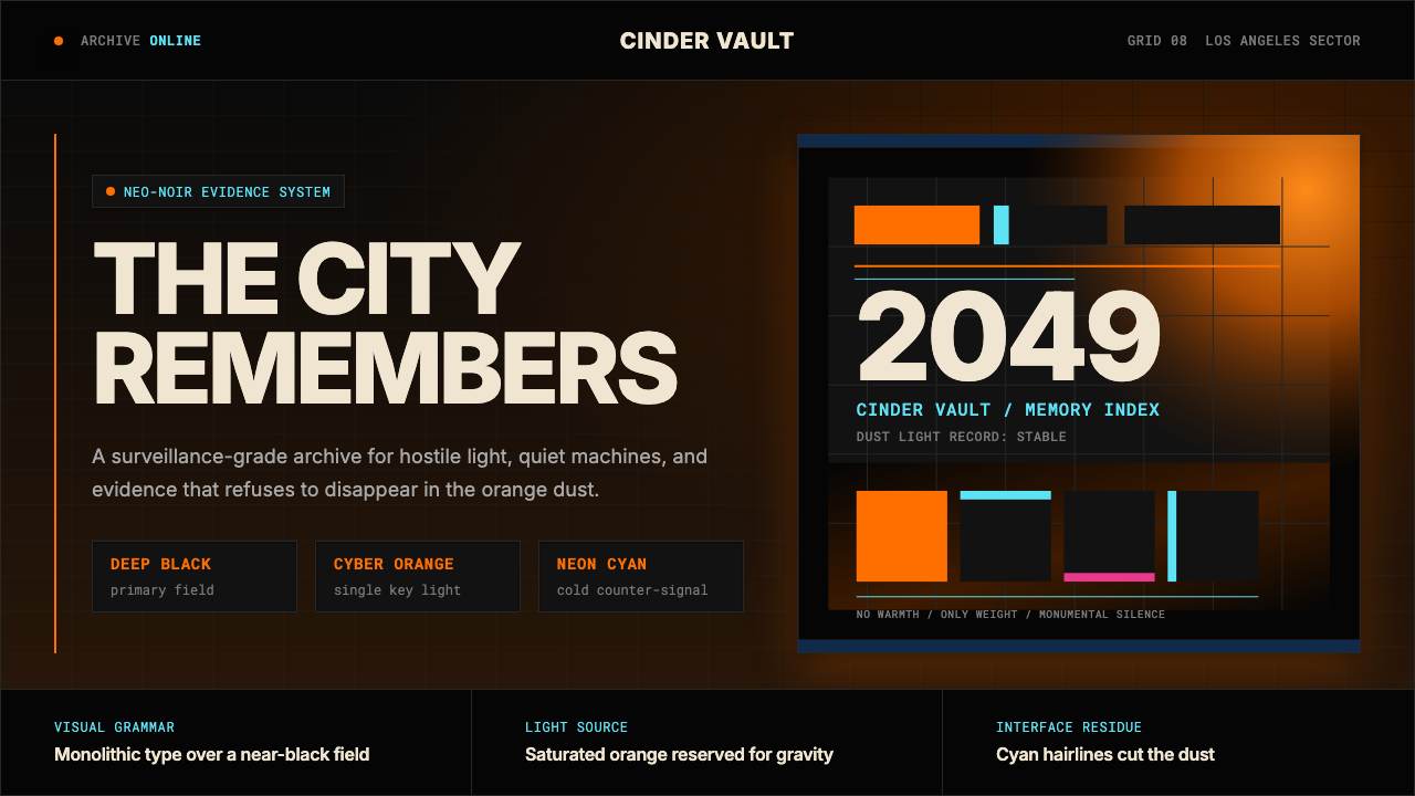 Blade Runner 2049Noir with tectonic weight. Orange dust, cyan hairlines, and monumental Inter…
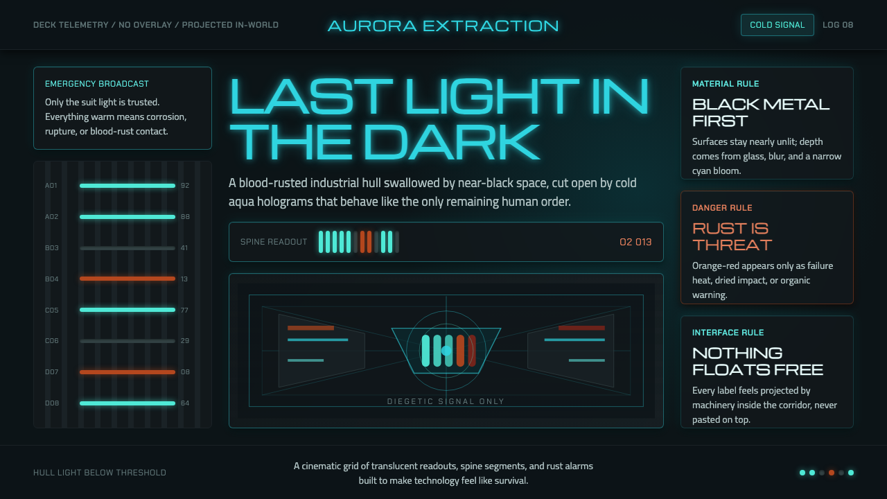 Dead Space IshimuraLast light in the dark. Near-black rust cut by aqua holographic panels.
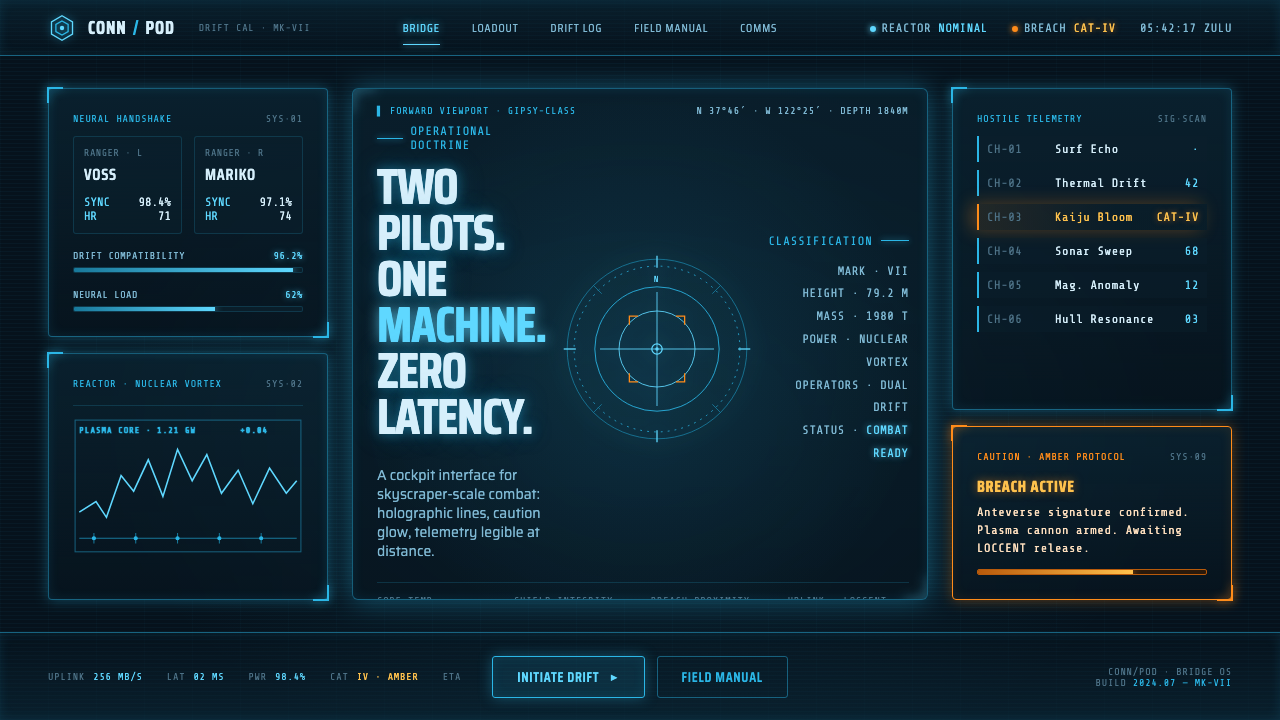 Pacific Rim Jaeger HUDTwo pilots, one machine. Faded Corsair-cyan holograms on near-black steel, am…
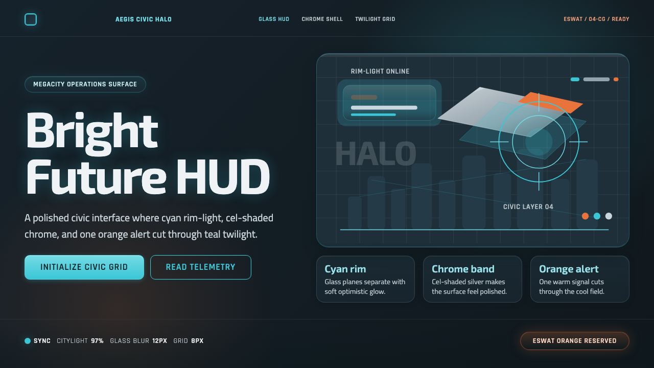 Appleseed (Olympus)Polished future, not noir. Cyan HUD glow and chrome panels float over teal tw…