What is Cli-Fi 2050?
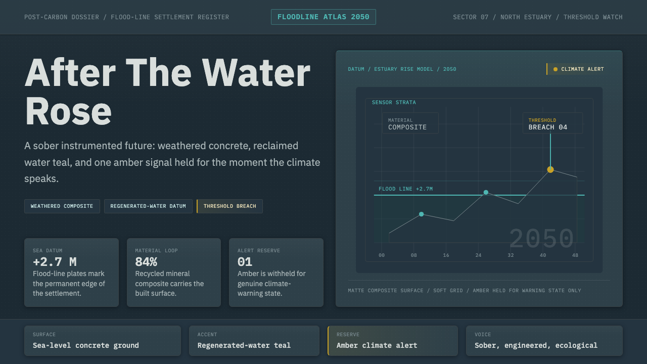
Cli-Fi 2050 imagines the design language of a world that adapted to the flood rather than escaped it — sober concrete, recycled composite, and a single amber warning that never stops watching the water level.
Cli-Fi 2050 in brief
Cli-Fi 2050 is the pragmatic, post-carbon branch of climate-fiction design — a visual system for a near-future flood-line settlement built by people who took climate change seriously enough to engineer around it, rather than either ignoring it or fantasizing their way past it. It sits inside the broader climate-fiction genre but deliberately avoids that genre's most familiar visual shorthand: lush vertical gardens, solar-powered green utopias, sunlit renewable abundance rendered as triumphant spectacle. This is the other branch of the same genre — muted, engineered, and unglamorous by design.
Visually, the system reads as weathered concrete and recycled composite surfaces in desaturated blue-gray tones, with a muted water teal standing in for anything related to the sea, flooding, or climate monitoring. Warmth and high saturation are almost entirely absent from the palette; the one deliberate exception is a single amber accent, reserved exclusively for alerts and climate-data warnings, so that the color itself functions as a piece of information rather than as decoration layered on top of the system.
The mood is sober rather than dystopian or triumphant, and that distinction matters more than any single surface detail. Nothing about the system suggests collapse, ruin, or abandonment, and nothing suggests a fully solved utopia either — it is the visual register of adaptation: infrastructure and interface design built by an engineering culture that expects sea levels to keep rising and plans accordingly, rendered with the same unglamorous competence as a working sea wall rather than the drama of either disaster or salvation.
Where does Cli-Fi 2050 come from?
The term climate fiction, commonly abbreviated cli-fi, entered circulation as a genre label roughly around 2007, distinguishing a wave of speculative fiction that treated climate change itself as the central subject and driver of plot, rather than as incidental scenery inside a more conventional science-fiction or disaster story. Over the following decade and a half, as climate change moved from scientific projection toward lived, reported experience, the genre grew from a niche literary label into a recognizable mode spanning fiction, film, games, and design speculation.
Within that genre, two visual registers diverged sharply from one another. One, often nicknamed solarpunk, imagines an optimistic, plant-covered future powered by renewable abundance, rendered in sunlit greens and organic ornament, closer to a garden than a machine. Cli-Fi 2050 belongs to the other register entirely: adaptation rather than utopia, imagining the built environment of a settlement that has already weathered rising water and kept functioning, using whatever engineered materials were on hand rather than staging an idealized green transformation for its own sake.
That aesthetic borrows directly from real-world eco-material design — the visible use of weathered concrete, recycled composites, and regenerated materials that has become common in contemporary sustainable architecture and product design, where the honesty of a material's origin, reclaimed or recycled or repurposed, is treated as a visible virtue in the finished surface rather than something to sand down or disguise behind a glossy coat.
It also draws on a specific strand of industrial software design exemplified by systems like IBM's Carbon Design System — utilitarian, data-dense interface languages built around muted, engineered color palettes and functional clarity rather than decorative flourish. Cli-Fi 2050 fuses that engineered-software sensibility with the material honesty of eco-architecture, producing a design language for a future that reads as competent rather than glamorous: built by people who took the climate seriously enough to plan for it decades ahead of the flood line actually arriving.
What defines the Cli-Fi 2050 look?
Color palette
The dominant field is a desaturated concrete blue-gray, echoing weathered structural material rather than any decorative color choice. A muted water teal appears wherever the system references the sea, flooding, or climate monitoring specifically, and warm or highly saturated hues are almost entirely absent, keeping the overall impression cool, engineered, and restrained.
Amber alert accent
A single amber accent is reserved exclusively for climate-data warnings, threshold breaches, and alert states — it never appears as decoration or as a general call-to-action color. Because it is used nowhere else in the system, its scarcity is precisely what gives it authority: when amber appears, it means something has crossed a monitored line.
Material honesty and texture
Surfaces show visible weathering and material grain — the texture of poured concrete, the slight irregularity of recycled composite — rather than a glossy, synthetic, or seamless finish. This visible material honesty signals durability and considered engineering rather than concealment, standing in deliberate contrast to any polished, brand-new surface finish.
Mood and tone
The register sits deliberately between dystopia and utopia — sober rather than despairing, competent rather than triumphant. Nothing in the system dramatizes collapse, and nothing stages a fully solved future either; the emotional pitch is closer to a well-run engineering department than to either a disaster film or a green-tech advertisement.
Typography
Lettering favors a tight, modern, functional sans register geared toward legibility of dense readouts rather than expressive character. Hierarchy is built through scale and spacing decisions rather than through decorative flourish, echoing the same engineered-software sensibility that shapes the rest of the system.
Data-forward layout
The interface reads like an environmental monitoring instrument as much as a settlement's public face — readouts, thresholds, and status indicators are treated as first-class visual elements rather than hidden behind a decorative layer. This blending of habitat and instrument panel is central to the style's identity: the built environment and the data about that environment share one visual language.
Who shaped Cli-Fi 2050?
The literary and speculative-fiction tradition that gave the genre its name and its habit of treating a changed climate as the central premise of a story world rather than as background scenery. Their worldbuilding conventions — settlements defined by a flood line, infrastructure that has been retrofitted rather than replaced, a tone of hard-won competence — are the direct narrative source for Cli-Fi 2050's visual register.
Architects and product designers working with recycled composites, regenerated concrete, and reclaimed structural material provide the real-world material vocabulary this style draws on. Their practice of leaving a material's recycled or repurposed origin visible in the finished surface, rather than disguising it, is what gives Cli-Fi 2050 its sense of honest, load-bearing texture.
IBM's open-source design system is a real-world reference point for the style's data-dense, engineered visual sensibility: a utilitarian palette, restrained color use, and interface components built for legibility under heavy information load rather than for decorative appeal. Cli-Fi 2050 channels that same instrument-panel discipline into the design of an imagined settlement.
A broader design movement concerned with what infrastructure, products, and interfaces look like after a society has committed to reducing carbon dependence — favoring durability, repairability, and material transparency over novelty and disposability. Cli-Fi 2050 is this movement's speculative extension into a specific imagined decade, giving the abstract idea of post-carbon design a concrete flood-line setting.
How do you use Cli-Fi 2050 today?
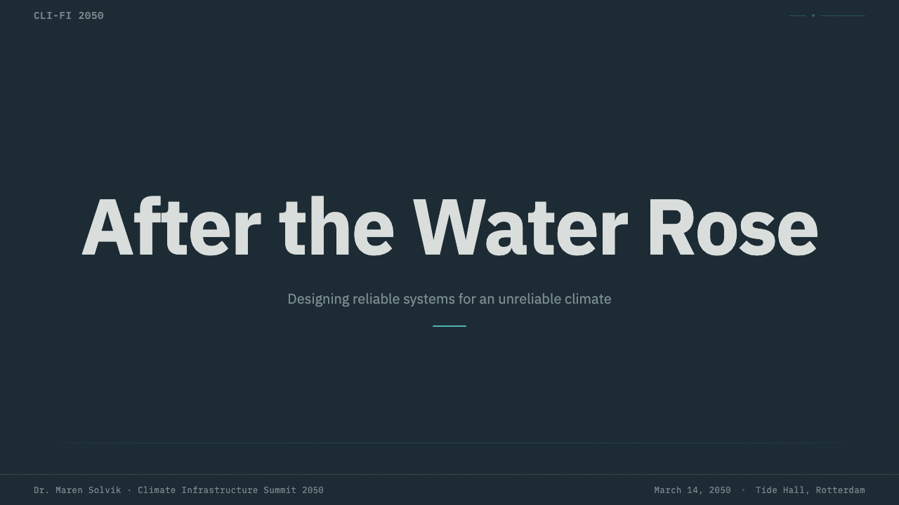
On a presentation cover slide, Cli-Fi 2050 reads strongest as a near-empty concrete-blue-gray field with a single line of restrained, functional type and, if a data point belongs on the cover at all, one small amber indicator rather than a full chart. Content slides should treat information the way an instrument panel treats a readout — grouped, labeled, and legible at a glance — with the muted teal reserved for any subject matter that is literally about water, climate, or environmental systems. Data slides are where the style is most at home: line charts, threshold markers, and status readouts in blue-gray and teal, with amber used only where a line has actually crossed a warning threshold, so the color still carries real informational weight rather than becoming a generic highlight.
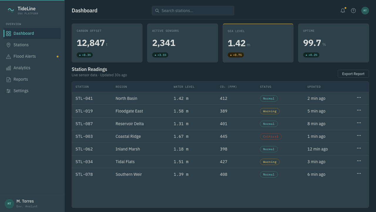
In web interfaces, the style suits dashboards, monitoring tools, and any product whose subject matter is genuinely about infrastructure, sustainability, or environmental data — the muted, engineered palette reinforces a sense of serious, trustworthy measurement rather than marketing enthusiasm. On a pricing page, the approach works best when kept restrained: plan tiers differentiated through structure and spacing rather than color, with the amber accent held in reserve for genuine account-level alerts, such as a usage threshold, rather than spent on promotional badges or upsell banners.
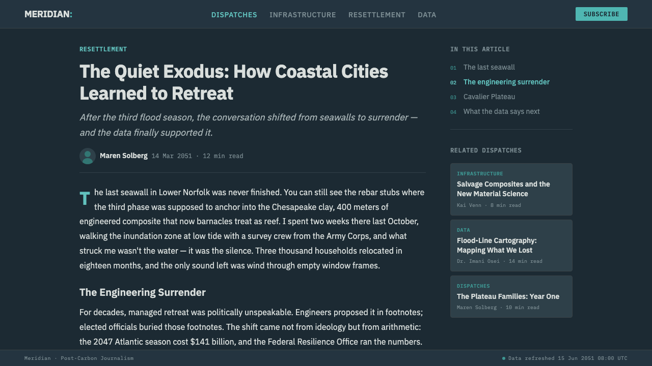
For editorial and long-form content, Cli-Fi 2050 supports serious, reported, non-sensational treatments of climate and infrastructure topics particularly well — the sober palette avoids both alarmist dystopian framing and greenwashed utopian framing, which makes it a credible register for analysis rather than advocacy. In marketing contexts, it is best suited to products that are themselves about resilience, adaptation, or environmental monitoring; using the style purely for its moody blue-gray aesthetic, disconnected from any actual climate or infrastructure subject matter, tends to read as an empty costume rather than a considered choice.
A common mistake is treating the amber accent as a general-purpose highlight color to be sprinkled wherever a design needs visual interest. The entire logic of the palette depends on amber staying rare and meaningful — the moment it starts decorating buttons, badges, or headings that have nothing to do with an actual alert, the system loses the specific credibility that makes it work, and it collapses into a generic dark-mode dashboard with an orange accent.
Another frequent misstep is leaning too far toward either extreme the style deliberately avoids: rendering the concrete and composite surfaces as crumbling ruins, which pushes the mood into disaster fiction, or polishing every surface to a glossy, showroom finish, which erases the visible material honesty that gives the style its credibility. The target is the narrow, deliberate middle register of competent, weathered, still-functioning infrastructure — neither ruin nor showroom.
Cli-Fi 2050 — FAQ
Is Cli-Fi 2050 the same as solarpunk?
No, they are the two diverging visual registers within the same broader climate-fiction genre. Solarpunk imagines an optimistic future powered by renewable abundance, rendered in sunlit greens and organic ornament. Cli-Fi 2050 imagines adaptation rather than utopia — the muted, engineered visual language of a settlement that has already weathered rising water using recycled and regenerated materials, without staging a fully solved green transformation. Where solarpunk is a garden, Cli-Fi 2050 is a well-run engineering department.
Why is there only one accent color instead of a fuller palette?
Restricting the palette to a muted structural base plus a single reserved amber accent is what lets that accent carry real informational weight. If the system used several bright accent colors the way a typical consumer product might, amber would just be one bright color among several, and a viewer would have no way to tell an alert apart from a decorative highlight. Scarcity is the mechanism that makes the color legible as a warning rather than as a design flourish.
Does this style suit optimistic or hopeful climate messaging?
It can, but the optimism has to be earned rather than staged. Cli-Fi 2050's hopefulness lives in its competence — the sense that people planned ahead and built something that works — rather than in bright colors or triumphant imagery. It suits messaging built around resilience, preparedness, and durable engineering. It is a poor fit for messaging that wants to feel celebratory or abundant, which is better served by the sunlit register of solarpunk-adjacent visual language instead.
What kinds of products or topics does Cli-Fi 2050 not suit?
It struggles wherever the sober, engineered mood is disconnected from the actual subject matter — a lighthearted consumer app, a children's product, or a purely decorative lifestyle brand will feel misjudged wearing a palette built for infrastructure and climate monitoring. It also struggles as a purely aesthetic borrow for products that have nothing to do with sustainability or adaptation, since viewers who recognize the register will read the mismatch as tonal confusion rather than as a considered design choice.
How does Cli-Fi 2050 avoid feeling like generic dark-mode design?
The difference lies in discipline rather than in any single visual trick: the amber accent must stay reserved for genuine alerts, the surfaces must carry visible material texture rather than flat synthetic panels, and the content itself should generally connect to infrastructure, climate, or environmental systems. A dark interface with an orange highlight color is not automatically Cli-Fi 2050; the style depends on the whole system — palette restraint, material honesty, and subject matter — working together rather than on any one ingredient alone.
Related design styles
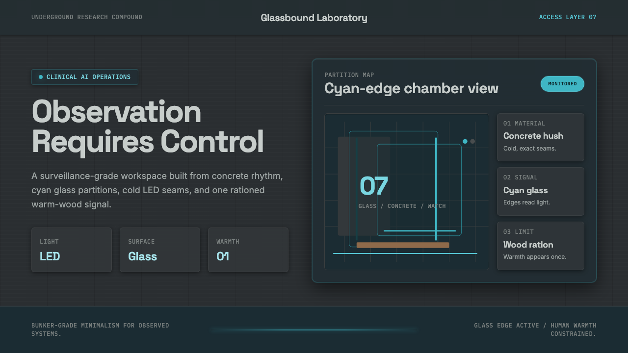 Ex MachinaClinical control, made visible. Concrete gray, cyan glass, LED seams, one woo…
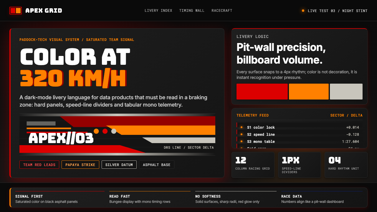 F1 Formula One LiverySpeed is legible. Ferrari red and papaya speed-lines cut through black teleme…
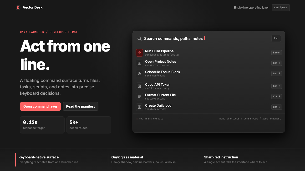 Raycast Spotlight Launcher (2023)Obsidian confidence. Sharp red cuts through Inter rows and mono shortcut chip…
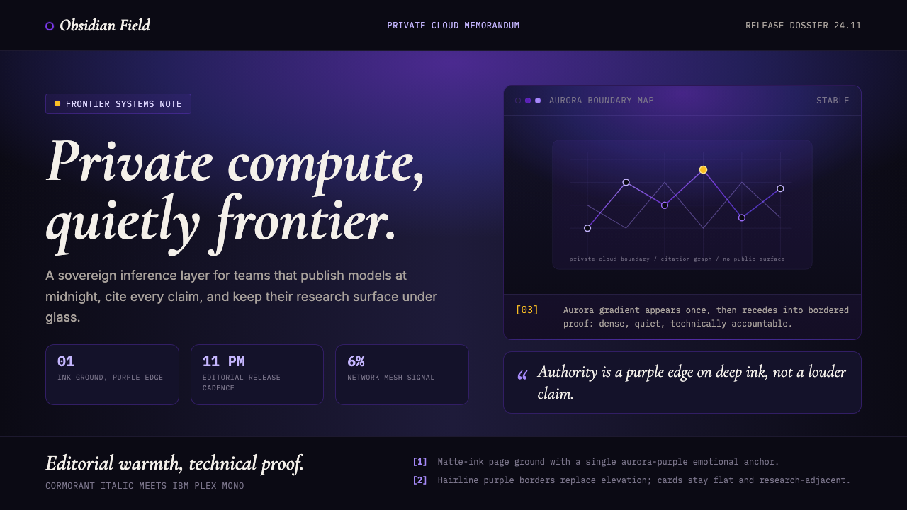 Sky App Private Cloud (2024)Quietly frontier. Aurora purple on matte ink, italic serif meets mono proof.
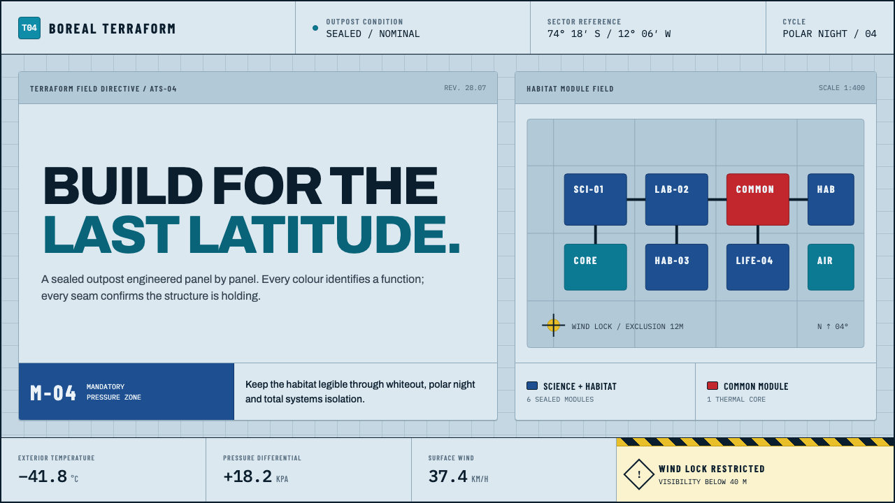 Arctic Terraform StationEvery colour carries a duty. Sky-blue panels, coded modules and hard seams en…
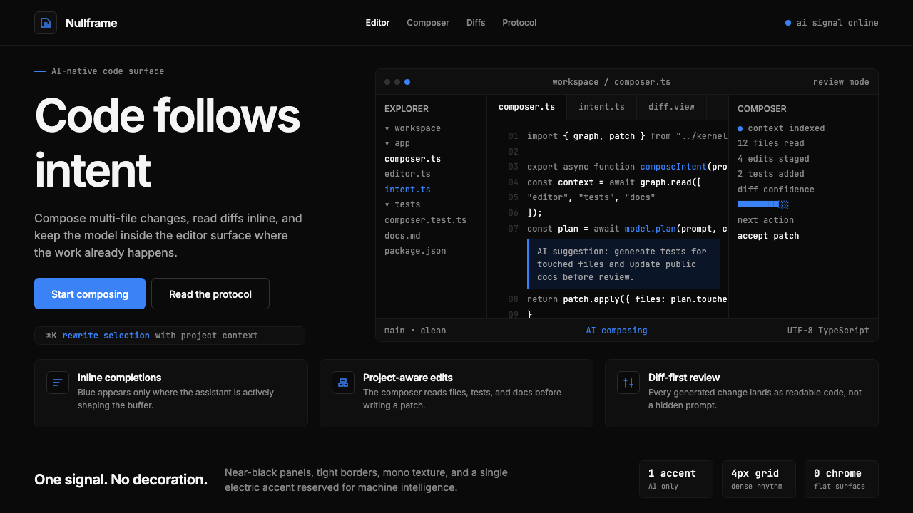 Cursor IDEAI-first code editor. Pure dark surfaces, off-white text, electric blue reser…