Design style guide设计风格指南
What is Sky App Private Cloud (2024)?什么是 Sky App Private Cloud (2024)?
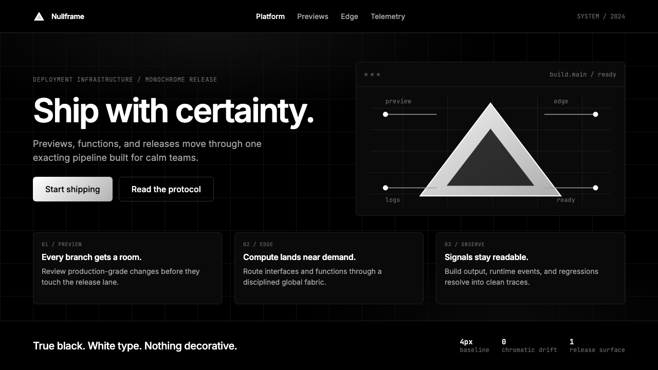
Sky App Private Cloud is the design language that frontier AI labs converged on in 2024 — deep matte-ink pages, a single aurora-purple gradient as the sole emotional moment, and editorial italic type paired with monospace technical authority.Sky App私有云是2024年前沿AI实验室不约而同选择的视觉语言——深邃的墨色页面、一道极光紫渐变作为唯一的情感高潮,加上编辑风格意大利体与等宽字体的权威对比。
Sky App Private Cloud (2024) in briefSky App Private Cloud (2024) 速览
Sky App Private Cloud (2024) is a contemporary design system that crystallized across frontier artificial intelligence laboratories during 2024, synthesizing the visual conventions that major AI labs — operating from San Francisco, Paris, Toronto, and London — had independently arrived at for their model-release landing pages, research communications, and developer documentation. It is the aesthetic of a midnight announcement: matte-black or near-black background, one dramatic gradient moment in aurora purple or indigo, dense typographic hierarchies, and a discipline that treats every visual decision as a form of intellectual credibility.Sky App私有云(2024)是一套在2024年间于前沿人工智能实验室中凝结成形的当代设计系统,综合了旧金山、巴黎、多伦多和伦敦等地的主要AI实验室在各自的模型发布着陆页、研究传播和开发者文档中独立演化出的视觉惯例。这是一种午夜发布公告的美学:近黑的磨砂底面,一道戏剧性的极光紫或靛蓝渐变,密集的文字层级,以及一种将每一个视觉决策都视为智识可信度的自律。
The system is organized around a fundamental tension that defines much of frontier-lab communication: the collision between humanist warmth and machine precision. On one side, editorial italic serif type — drawn from the tradition of literary magazines and academic journals — signals that the work being described has been considered by human minds and carries intellectual weight. On the other side, monospace technical type signals that the claims being made are grounded in verifiable, reproducible computation. Neither typeface alone would carry the system; together they create a voice that is simultaneously authoritative and approachable.这套系统围绕一种根本性的张力而组织,这种张力定义了前沿实验室传播的大部分面貌:人文温度与机器精准的碰撞。一方面,编辑风格的意大利体衬线字——源自文学杂志和学术期刊的传统——暗示所描述的工作经由人类心智的审慎考量,承载着思想重量。另一方面,等宽技术字体则表明所提出的主张以可验证、可复现的计算为基础。仅凭任一字体都无法撑起整个系统;两者并置,才创造出一种既具权威又平易近人的声音。
What distinguishes Sky App Private Cloud from generic dark-mode UI design is its restraint in the use of color and gradient. Where ordinary dark interfaces pile up gradients, glow effects, and particle animations, this system allows itself exactly one gradient — the aurora sweep across a hero section or a primary call-to-action — and holds the rest of the composition in strict achromatic discipline. That singular gradient becomes the system's emotional center of gravity, more powerful for its rarity.将Sky App私有云与普通深色模式界面设计区分开来的,是它在色彩与渐变使用上的克制。普通深色界面往往堆砌渐变、光晕效果和粒子动画,而这套系统只允许自己使用一道渐变——跨越主视觉区或主要行动号召的极光扫过——其余部分则保持严格的消色差秩序。正因为稀少,那道唯一的渐变才成为整个系统情感上的重心。
See the Sky App Private Cloud (2024) design system →查看 Sky App Private Cloud (2024) 完整设计系统 →
Where does Sky App Private Cloud (2024) come from?Sky App Private Cloud (2024) 从何而来?
The origins of the Sky App Private Cloud aesthetic lie in a convergence that happened largely without coordination. Between 2022 and 2024, as large language model development accelerated and frontier AI labs began releasing products to the public, their design teams — working independently at organizations like Anthropic, Mistral, Cohere, and several others — arrived at strikingly similar visual conclusions. The shared substrate was a set of conditions: audiences of technically sophisticated developers and researchers, a need to signal both intellectual seriousness and approachability, and the constraint that a design language had to work under the scrutiny of communities that distrust visual excess.Sky App私有云美学的起源在于一场在很大程度上没有协调的汇聚。2022至2024年间,随着大型语言模型开发提速,前沿AI实验室开始向公众发布产品,各自独立工作的设计团队——包括Anthropic、Mistral、Cohere等机构——得出了惊人相似的视觉结论。共同的基底是一套共享条件:技术背景深厚的开发者和研究者构成的受众,既需要传达智识严肃性又需要传达亲切感,以及一套设计语言必须在不信任视觉过度的社区审视下运作的约束。
The deep-ink background emerged as a practical and symbolic choice. Practically, dark backgrounds reduce eye strain during long reading sessions on backlit screens — a genuine consideration for developer documentation consumed at night or in code editors set to dark mode. Symbolically, darkness signals focus and concentration: it is the background of a terminal window, a research paper rendered in night-mode, a model training run visualized in a monitoring dashboard. The matte quality — avoiding reflective or glassy surfaces — further reinforced the sense of substance over spectacle.深墨色背景作为一种实用与象征的双重选择浮现出来。从实用角度,深色背景能减轻在背光屏幕上长时间阅读的眼部疲劳——这对在夜晚或深色模式代码编辑器中消费开发者文档的用户而言是切实的考量。从象征角度,暗色传递专注与沉浸:它是终端窗口的底色,是以夜间模式呈现的研究论文,是模型训练运行在监控仪表板上的可视化。磨砂质感——回避反光或玻璃质表面——进一步强化了重实质、轻奇观的感受。
The aurora-purple gradient had its own genealogy. Purple had long been associated with technical creativity and intellectual exploration — a thread running from early computing culture through to the distinctive brand palettes of developer tools. By 2024, purple-to-indigo gradients had become a shorthand for AI capability and frontier ambition, partly because they occupied a unique position in the visible spectrum: unlike red or blue, purple carries no strong pre-existing cultural association outside of technology, making it available as a fresh signal. The gradient form — rather than a flat color — was chosen because it implied movement, possibility, and the continuous improvement that defines a product in active development.极光紫渐变有其自身的谱系。紫色长期以来与技术创造力和智识探索相关联——这条线索从早期计算机文化一路延伸至开发者工具的独特品牌色板。到2024年,紫色到靛蓝的渐变已成为AI能力与前沿野心的简码,部分原因在于它在可见光谱中占据独特位置:与红色或蓝色不同,紫色在科技领域之外没有强烈的既有文化联想,这使它成为一种可用的新鲜信号。渐变形式——而非单一平色——之所以被选择,是因为它暗示运动、可能性以及定义了一款持续开发中产品的持续进步。
The typographic system reflected a deliberate attempt to solve a communication problem specific to frontier AI labs: how to speak to both engineers and executives in the same document. Italic serif type borrowed from the visual register of long-form editorial journalism — the kind associated with serious intellectual publications — to signal that the ideas presented deserved sustained attention. Monospace type, by contrast, borrowed from the culture of terminal interfaces and code editors, confirming that behind the editorial voice lay an infrastructure of verifiable technical fact. Key figures in this visual consolidation included Aaron Levy and Will McAuliffe from Anthropic's design team, Mike Abbink who brought editorial typographic sensibility to technical communication, and Adam Wathan whose work in the post-Vercel marketing-engineering tradition helped normalize the dark-mode premium aesthetic across the developer community more broadly.字体系统反映了一次有意识的尝试,旨在解决前沿AI实验室特有的传播问题:如何在同一份文件中同时向工程师和高管发言。意大利体衬线字借用了长篇编辑新闻写作的视觉语域——那种与严肃知识性出版物相关联的语域——以此表明所呈现的想法值得持续关注。等宽字体则借用了终端界面和代码编辑器的文化,确认在编辑声音背后存在着可验证技术事实的基础设施。这一视觉整合中的关键人物包括来自Anthropic设计团队的Aaron Levy和Will McAuliffe、为技术传播带来编辑排版感性的Mike Abbink,以及Adam Wathan——他在后Vercel营销工程传统中的工作,帮助在更广泛的开发者社区中将深色模式高端美学正常化。
What defines the Sky App Private Cloud (2024) look?Sky App Private Cloud (2024) 的视觉特征是什么?
Matte-Ink Background磨砂墨色底面
The defining ground of the system is a very deep, non-reflective background — neither pure black nor a named neutral, but a dark tone with enough warmth or coolness to absorb the gradient that rests on top of it. The matte quality is essential: any shine, gloss, or reflective surface effect would shift the register from focused to flashy, undermining the intellectual seriousness the system projects. This background is not the absence of design; it is a deliberate choice that makes every subsequent element — type, gradient, structural lines — read with exceptional clarity against the dark field.这套系统的决定性底面是一种极深、无反射的背景——既非纯黑,也非某种具名中性色,而是一种具有足够冷暖倾向以吸收上方渐变的暗色调。磨砂质感至关重要:任何光泽、高光或反射性表面效果都会将语域从专注转向炫目,破坏系统所投射的智识严肃性。这种背景不是设计的缺席,而是一种刻意的选择,让每一个后续元素——字体、渐变、结构线条——在深色底面上以超凡的清晰度呈现。
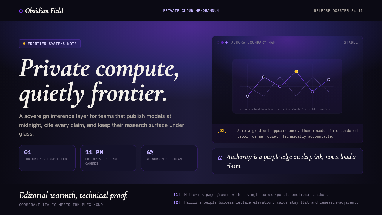
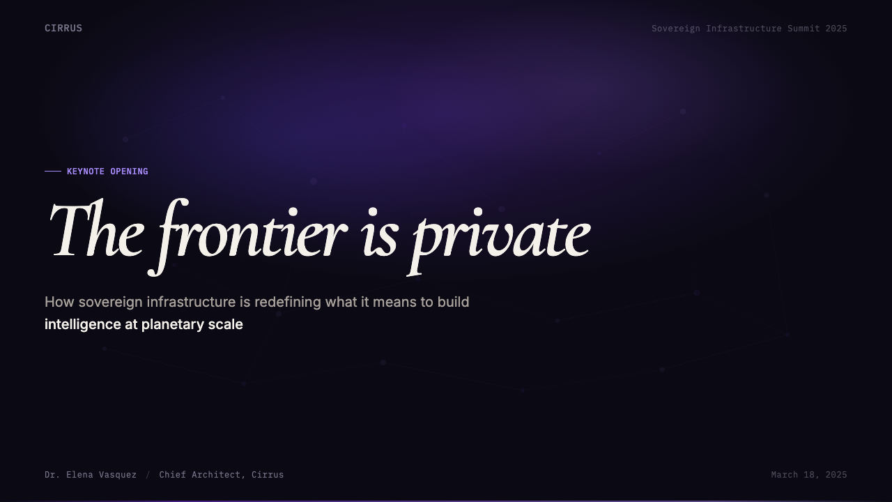
Singular Aurora Gradient唯一极光渐变
The aurora-purple-to-indigo gradient is the system's only concession to spectacle, and its singular use is what gives it power. Applied once — typically across a hero section, a primary headline, or a central call-to-action element — it functions as the emotional apex of the entire composition. Every other element in the layout holds to achromatic or near-achromatic values, which means the gradient reads as a genuine moment of revelation rather than ambient decoration. The transition from one cool, deep hue to another carries connotations of depth, intelligence, and the invisible computational processes that underpin frontier AI systems.极光紫到靛蓝的渐变是整套系统对奇观唯一的让步,而正是它的唯一性赋予了它力量。仅使用一次——通常横跨主视觉区、主标题或核心行动号召元素——它充当整个构图情感上的顶点。版面中所有其他元素都保持消色差或近消色差的调性,这意味着这道渐变被读为真实的启示时刻,而非环境装饰。从一种冷调深色过渡到另一种,承载着深度、智识以及支撑前沿AI系统的不可见计算过程的内涵。
Editorial Italic Serif编辑风格意大利体衬线
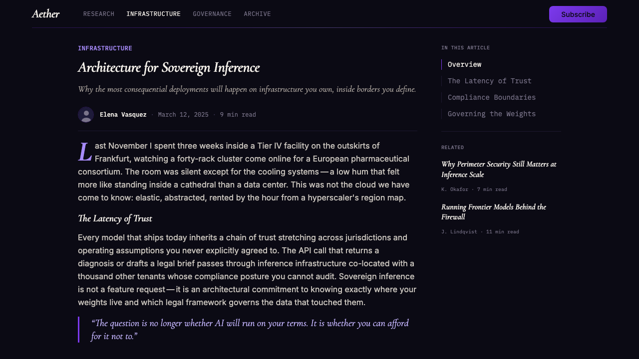
Italic serif type, drawn from the tradition of literary and academic publishing, serves as the humanist voice of the system. It appears on headlines, pull quotes, and primary statements of value — the sentences that synthesize what a model or product can do at the highest level of abstraction. The italic angle implies movement and considered thought, while the serif construction implies historical depth and permanence. Against the dark background, italic serif type in a warm, near-white tone creates a contrast that feels like a handwritten annotation on a dark notebook page: intimate, considered, and slightly urgent.源自文学和学术出版传统的意大利体衬线字,充当整个系统的人文声音。它出现在标题、引用语和主要价值陈述上——那些在最高抽象层面综合一个模型或产品能力的句子。斜体角度暗示运动和深思熟虑,而衬线构造则暗示历史深度和永久性。在深色底面上,暖调近白的意大利体衬线字创造出一种对比,感觉像是在黑色笔记本页面上手写的批注:亲密、审慎,带着一丝紧迫。
Monospace Technical Authority等宽字体技术权威
Monospace type — the letterform of code editors and terminals — appears alongside the editorial italic to anchor claims in technical reality. It is used for code samples, model names, benchmark citations, API references, and any content that the reader should understand as precisely rendered rather than paraphrased. The monospace register signals that the numbers cited are exact, the interfaces described are real, and the product can withstand the scrutiny of a technically sophisticated audience. In the overall typographic hierarchy, monospace body text and labels occupy the middle stratum — denser and cooler than the italic headlines above them, more detailed and specific than the structural navigation around them.等宽字体——代码编辑器和终端的字形——与编辑风格意大利体并置,将主张锚定在技术现实中。它用于代码示例、模型名称、基准引用、API参考,以及任何读者应理解为精确呈现而非转述的内容。等宽语域表明:所引用的数字是确切的,所描述的接口是真实的,产品能够经受技术背景深厚的受众的审视。在整体字体层级中,等宽正文和标签占据中间层——比上方的意大利体标题更密集、更冷静,比周围的结构性导航更详细、更具体。
Achromatic Structural Discipline消色差结构自律
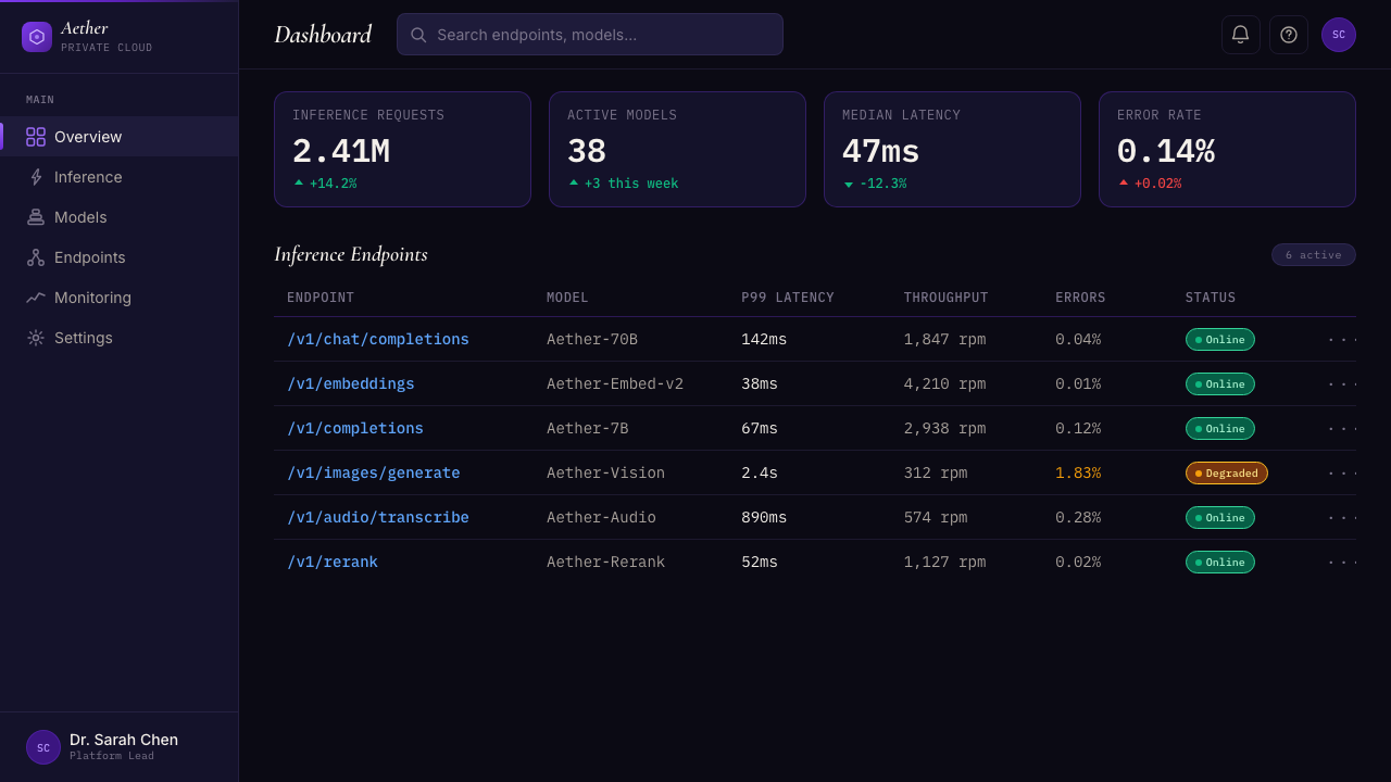
Outside of the singular gradient, the system operates in a strict achromatic register: the background, body type, dividers, secondary labels, and interface chrome are all drawn from a range of near-whites, warm grays, and cool grays set against the deep ink ground. This discipline is not minimalism for its own sake but a structural decision that ensures the gradient retains its visual weight. Any additional accent color — even a subtle one — would compete with the aurora moment and dilute the system's most powerful communication device. The achromatic field also creates the conditions for high-density information display: benchmark tables, technical comparisons, and capability charts can be presented without any element dominating another.在唯一渐变之外,这套系统在严格的消色差语域中运作:背景、正文、分割线、次级标签和界面框架,全部取自一系列近白色、暖灰色和冷灰色,对比深墨底面。这种自律不是为了极简而极简,而是一种结构性决策,确保渐变保持其视觉重量。任何额外的强调色——即使是细微的——都会与极光时刻竞争,稀释整个系统最强大的传播装置。消色差底面同样为高密度信息展示创造了条件:基准测试表格、技术比较和能力图表可以在没有任何元素压倒其他元素的情况下呈现。
Citation-Dense Information Architecture引用密集的信息架构
Sky App Private Cloud layouts carry a characteristic informational weight: they are dense with citations, footnotes, benchmark references, and technical annotations in a way that signals the claims on the page are substantiated. This is not clutter — the grid and typographic hierarchy organize the density into clearly differentiated strata — but it is a deliberate counter to the convention of sparse landing pages. The implicit argument is that a product confident in its capabilities does not need to hide behind empty space; it can afford to show its working. Headers introduce sections, pull statistics stand as large typographic objects, and fine technical detail occupies a clearly subordinate but always-present layer below.Sky App私有云的版面承载着一种特征性的信息重量:它密布引用、脚注、基准参考和技术注释,这种方式表明页面上的主张是有据可查的。这不是杂乱——网格和字体层级将密度组织成清晰分层——但它是对稀疏着陆页惯例的刻意反驳。隐含的论点是:一个对自身能力有信心的产品不需要躲在空白背后;它能够展示自己的工作过程。标题引入各节,突出统计数据作为大型排印对象独立存在,精细的技术细节占据一个清晰的从属层,始终存在于下方。
Structural Edge, No Glow结构性边缘,无光晕
One of the defining refusals of the system is the suppression of glow effects and diffuse light halos — visual devices common in entertainment-oriented dark interfaces. Where borders appear — around code blocks, data cards, or modal containers — they are rendered as precise, low-contrast lines rather than glowing outlines. Where depth is indicated, it is through stacking and z-order rather than ambient illumination. This decision preserves the seriousness of the visual register: glow implies magic and spectacle; a clean edge implies precision and confidence. The system communicates that it does not need theatrical lighting to make its case.这套系统最具决定性的拒绝之一是对光晕效果和漫射光圈的抑制——这些是面向娱乐的深色界面中常见的视觉装置。边框出现的地方——代码块、数据卡片或模态容器周围——以精确的低对比度线条而非发光轮廓呈现。深度通过堆叠和层叠顺序而非环境照明来表示。这一决策保护了视觉语域的严肃性:光晕暗示魔法和奇观;清晰的边缘暗示精准与自信。整套系统传达出一个信息:它不需要戏剧性灯光来支持自己的主张。
See the Sky App Private Cloud (2024) design system →查看 Sky App Private Cloud (2024) 完整设计系统 →
Who shaped Sky App Private Cloud (2024)?谁塑造了 Sky App Private Cloud (2024)?
Aaron Levy was part of the Anthropic design team during the period when the Sky App Private Cloud aesthetic consolidated. Working on product and brand communication for one of the most closely watched AI laboratories, Levy and his collaborators faced the specific challenge of building a visual language that could carry both the philosophical weight of Anthropic's safety-focused mission and the technical credibility required to be taken seriously by a developer audience. The design choices made during this period — the deep-ink backgrounds, the editorial typographic pairing, the disciplined single-gradient system — reflected those dual demands.Aaron Levy是Anthropic设计团队的成员,在Sky App私有云美学整合成形的时期参与其中。在为最受关注的AI实验室之一开展产品与品牌传播工作时,Levy及其合作者面临着一个具体挑战:构建一套视觉语言,既能承载Anthropic以安全为中心的使命的哲学重量,又能赢得开发者受众所要求的技术可信度。这一时期做出的设计选择——深墨色背景、编辑风格字体配对、自律的单一渐变系统——反映了这双重需求。
Will McAuliffe contributed to the visual identity work at Anthropic during the same formative period, helping to articulate the principles that would come to define frontier-lab aesthetics more broadly. His work helped establish the expectation that a serious AI product's visual language should be as rigorous and considered as its technical outputs — that the design of a model-release announcement or a safety paper's landing page is a form of intellectual communication, not merely marketing presentation.Will McAuliffe在同一形成时期为Anthropic的视觉识别工作做出贡献,帮助阐明了后来更广泛定义前沿实验室美学的原则。他的工作帮助确立了一种期望:一个严肃AI产品的视觉语言应当与其技术产出一样严格和审慎——模型发布公告或安全论文着陆页的设计,是一种智识传播形式,而不仅仅是营销展示。
Mike Abbink brought a background in editorial typography and type design to the frontier-AI design conversation. The distinctive use of italic serif type — drawing on the long tradition of print publishing's authority register — as a counterpoint to technical monospace owes much to typographers like Abbink who understood how letterform choices carry cultural associations and what it means to deploy editorial type in a digital-native context. His work represents the broader influence of print-journalism typographic thinking on a generation of digital product designers.Mike Abbink为前沿AI设计对话带来了编辑排版和字体设计的背景。意大利体衬线字的独特使用——借鉴了印刷出版权威语域的悠久传统——作为技术等宽字体的对位,这在很大程度上要归功于像Abbink这样的字体设计师:他们理解字形选择如何携带文化联想,以及在数字原生语境中部署编辑字体意味着什么。他的工作代表了印刷新闻排版思维对一代数字产品设计师的广泛影响。
Adam Wathan, founder of Tailwind CSS and the design-engineering firm behind it, played a central role in normalizing the premium dark-mode marketing aesthetic across the developer community. Through Tailwind's own marketing site — and through the influence of Tailwind UI's component library — Wathan's post-Vercel marketing-engineering approach demonstrated that technical products could be simultaneously beautiful and credible. His work established many of the conventions that the Sky App Private Cloud system later refined: the full-bleed dark hero, the high-contrast typographic hierarchy, and the idea that a developer tool's marketing site could be a piece of craft design.Tailwind CSS的创始人Adam Wathan及其背后的设计工程公司,在整个开发者社区中将高端深色模式营销美学正常化方面发挥了核心作用。通过Tailwind自身的营销网站——以及Tailwind UI组件库的影响——Wathan的后Vercel营销工程方法证明了技术产品可以同时兼具美感和可信度。他的工作确立了Sky App私有云系统后来所精炼的许多惯例:满版深色主视觉区、高对比度排版层级,以及开发者工具营销网站可以成为一件精心设计作品的理念。
The Paris-based Mistral AI team contributed a distinct European inflection to what was emerging as a shared frontier-lab aesthetic. Operating in a design culture with deeper roots in editorial and luxury publishing, Mistral's visual choices helped confirm that the deep-ink, editorial-italic, aurora-gradient system was not merely a Silicon Valley convention but a genuinely cross-regional convergence. The fact that similar visual decisions emerged independently in San Francisco, Paris, Toronto, and London validated the aesthetic as a response to shared communication conditions rather than imitation of a single originator.总部位于巴黎的Mistral AI团队为正在浮现的共同前沿实验室美学注入了一种独特的欧洲韵味。在编辑和奢侈出版根基更深的设计文化中运作,Mistral的视觉选择帮助确认了深墨色、编辑意大利体、极光渐变系统并非仅仅是硅谷惯例,而是真正跨地区的汇聚。旧金山、巴黎、多伦多和伦敦各自独立做出相似视觉决策这一事实,证明了这种美学是对共同传播条件的回应,而非对单一发起者的模仿。
How do you use Sky App Private Cloud (2024) today?今天怎么用 Sky App Private Cloud (2024)?
Sky App Private Cloud is most naturally suited to contexts where technical authority and intellectual credibility are primary communication goals: model-release announcements, research-paper landing pages, developer documentation hubs, API marketing sites, and any product positioning itself at the frontier of a technical category. The system performs well when the audience brings skepticism and will reward — rather than resent — visual density. It is not a warm or inviting aesthetic; it is an impressive and rigorous one, and the distinction matters for product fit.Sky App私有云最自然地适用于技术权威和智识可信度是主要传播目标的场景:模型发布公告、研究论文着陆页、开发者文档中心、API营销网站,以及任何将自身定位于技术类别前沿的产品。当受众带着怀疑态度到来,并会奖励——而非抗拒——视觉密度时,这套系统表现出色。这不是一种温暖或邀请型的美学;它是一种令人印象深刻且严格的美学,这种区别对于产品契合度至关重要。
For presentation slides, the system translates well when applied with discipline. Cover slides benefit from the full-bleed dark background with the aurora gradient placed as the sole hero element behind a bold typographic statement — one short sentence in editorial italic, a supporting detail line in monospace. Avoid filling the cover with multiple graphic elements; the system's power comes from restraint. Content slides should use a strict grid with generous margins, present data in tables rather than decorated charts, and reserve the gradient exclusively for slides marking major transitions or conclusions. A common error is applying the aurora gradient as a background texture on multiple slides — this immediately collapses the singular emotional weight that makes the gradient effective.对于演示文稿,有自律地应用这套系统效果显著。封面页受益于满版深色背景,极光渐变作为唯一的主视觉元素置于大胆排印陈述的背后——编辑意大利体呈现的一个简短句子,等宽字体呈现的一行支撑细节。避免在封面上填充多个图形元素;这套系统的力量来自克制。内容页应使用带有充裕边距的严格网格,以表格而非装饰性图表呈现数据,将渐变专门保留给标记重大过渡或结论的幻灯片。一个常见错误是将极光渐变作为背景纹理应用于多张幻灯片——这会立即瓦解使渐变有效的那种唯一性情感重量。
For web interfaces, the system is best applied to documentation portals, pricing pages with technical tiers, and dashboard landing pages where density and credibility matter more than conversion-optimized friendliness. The approach: set the darkest background tone for the full page, introduce structure through subtle variations in surface depth rather than heavy borders, use the gradient only in the primary hero area, and allow white-text body copy at appropriate scale to carry the information load. Navigation should be typographic, with no icon decoration beyond functional indicators. Data-heavy sections — benchmark tables, capability comparisons — should be presented in monospace or structured tabular form, with column headers in a clearly subordinate type size.对于网页界面,这套系统最适合应用于文档门户、带技术层级的定价页面,以及密度和可信度比转化优化友好度更重要的仪表板着陆页。方法如下:为整个页面设置最深的背景色调,通过表面深度的微妙变化而非粗重边框引入结构,仅在主视觉区使用渐变,并允许适当大小的白色正文承载信息负载。导航应为字体性,除功能性指示符外无图标装饰。数据密集的部分——基准测试表格、能力比较——应以等宽字体或结构化表格形式呈现,列标题使用明显从属的字号。
For editorial and marketing work — pitch decks, research reports, investor presentations, or long-form product announcements — the system provides a strong structural vocabulary. Section breaks can be marked with a fine horizontal rule and a large numeral or section label in the editorial italic. Pull quotes or key statistics should be set at dramatically larger scale than surrounding body text, using the editorial italic to create typographic anchors that guide a reader through a long document. Marketing pages work well with alternating full-width sections: a dark section carrying the primary value proposition, followed by a lighter section at the near-white end of the gray range for detailed specifications or social proof.对于编辑和营销内容——宣传材料、研究报告、投资者演示或长篇产品公告——这套系统提供了强有力的结构词汇。章节分隔可以用细水平线和一个大数字或编辑意大利体的章节标签来标记。引用语或关键统计数据应以比周围正文大得多的尺度呈现,使用编辑意大利体创造字体锚点,引导读者穿过长篇文档。营销页面适合使用交替的全宽区块:承载主要价值主张的深色区块,接着是灰色范围近白端的较浅区块,用于详细规格或社会证明。
A persistent mistake when applying Sky App Private Cloud is treating the aurora gradient as a repeatable element — using it on buttons, card borders, section backgrounds, and decorative dividers simultaneously. This flattens what should be a singular moment of visual intensity into ambient wallpaper. The gradient must be earned: every other element in the layout should hold in achromatic discipline so that when the aurora appears, it commands full attention. A second common error is using the editorial italic for body text rather than for headlines and high-level statements — the italic weight and angle that makes it powerful at display scale becomes tiring and illegible at reading scale.应用Sky App私有云时持续出现的错误,是将极光渐变视为可重复元素——同时将其用于按钮、卡片边框、区块背景和装饰性分割线。这会将本应是视觉强度的单一时刻拉平为环境壁纸。渐变必须赢得:版面中所有其他元素都应保持消色差的自律,这样当极光出现时,它才能赢得全部注意力。第二个常见错误是将编辑意大利体用于正文而非标题和高层次陈述——在展示尺度上赋予它力量的斜体字重和角度,在阅读尺度上会变得疲乏且难以辨读。
See the Sky App Private Cloud (2024) design system →查看 Sky App Private Cloud (2024) 完整设计系统 →
Sky App Private Cloud (2024) — FAQSky App Private Cloud (2024) · 常见问题
Is Sky App Private Cloud only suited to AI products?Sky App私有云只适合AI产品吗?
Not exclusively, though that is its strongest natural context. The system's core values — technical credibility, intellectual seriousness, information density — translate well to any technical product where the audience is sophisticated and skeptical: developer tools, infrastructure platforms, security products, research publication sites, and high-stakes B2B software. It performs less well for consumer products where the audience is non-technical, for products in categories where warmth and approachability are primary values, and for brands that need to communicate joy, playfulness, or sensory richness. The key question is whether the product's values align with the aesthetic's register: if the product is trying to impress a critical, technically literate audience, Sky App Private Cloud is a strong choice; if it is trying to delight a broad consumer audience, it will likely feel alienating.不完全是,尽管那是它最强的自然语境。这套系统的核心价值——技术可信度、智识严肃性、信息密度——能够很好地转移到任何受众成熟且持怀疑态度的技术产品上:开发者工具、基础设施平台、安全产品、研究发布网站,以及高风险B2B软件。它在受众非技术型的消费者产品、温暖感和亲切感是主要价值的产品类别,以及需要传达喜悦、趣味或感官丰富性的品牌上表现较差。关键问题是产品的价值观是否与美学的语域相符:如果产品试图打动批判性、技术上精通的受众,Sky App私有云是一个强有力的选择;如果它试图让广大消费者受众感到愉悦,则可能会让人感到疏离。
How does this system differ from generic dark mode design?这套系统与通用深色模式设计有何不同?
Generic dark mode design uses a dark background primarily to reduce eye strain or to follow a platform convention, and typically adds color through multiple accent hues, gradient backgrounds, glow effects, and icon-heavy navigation. Sky App Private Cloud uses darkness as a deliberate communication choice — it signals focus and technical seriousness — and then imposes strict discipline on everything else. The singular gradient, the editorial-italic headline treatment, the suppression of glow and ambient light effects, and the citation-dense information architecture are all choices that go beyond 'dark mode' into something more specific. The simplest diagnostic: if a dark interface has multiple accent colors, glowing borders, or icon-driven navigation, it is generic dark mode. If it has one gradient and everything else is achromatic, it is something closer to this system.通用深色模式设计使用深色背景主要是为了减轻眼部疲劳或遵循平台惯例,并通常通过多种强调色、渐变背景、光晕效果和图标密集导航添加色彩。Sky App私有云将黑暗作为一种刻意的传播选择使用——它表示专注和技术严肃性——然后对其他一切施加严格的自律。唯一渐变、编辑意大利体标题处理、对光晕和环境光效果的抑制,以及引用密集的信息架构,都是超越「深色模式」进入更具体领域的选择。最简单的诊断标准:如果一个深色界面有多种强调色、发光边框或图标驱动的导航,它是通用深色模式。如果它只有一道渐变,其他一切都是消色差的,那它更接近这套系统。
Can this aesthetic work for a company that is not a frontier AI lab?这种美学能用于非前沿AI实验室的公司吗?
Yes, but the alignment between the aesthetic and the company's actual positioning needs to be genuine. The system signals a specific set of values — frontier ambition, technical depth, intellectual seriousness — and audiences will evaluate whether the product behind the design lives up to them. For a developer infrastructure company, a cybersecurity firm, or a research-adjacent B2B product, the system can be applied authentically and effectively. For a company that does not operate at the frontier of a technical category, or whose primary audience is not technically sophisticated, using the system can feel aspirational in a way that undermines trust: the design promises more than the product delivers. The most successful applications of this aesthetic are those where the visual seriousness matches the actual technical depth of the offering.可以,但美学与公司实际定位之间的契合需要是真实的。这套系统传达一套特定的价值观——前沿野心、技术深度、智识严肃性——受众会评估设计背后的产品是否名副其实。对于开发者基础设施公司、网络安全公司或研究相邻的B2B产品,这套系统可以真实有效地应用。对于不在技术类别前沿运营、或主要受众并不具备技术背景的公司,使用这套系统可能会给人一种有志向却难以实现的感觉,从而破坏信任:设计所承诺的超过产品所能兑现的。这种美学最成功的应用,是视觉上的严肃性与产品实际技术深度相匹配的情形。
What is the right way to handle the aurora gradient across different screen sizes?如何在不同屏幕尺寸上正确处理极光渐变?
The aurora gradient should be treated as a full-width or full-bleed element at every screen size, never cropped or contained within a bordered card or module. On larger screens, the gradient hero section can be given significant vertical height, allowing the full sweep from purple to indigo to resolve at an unhurried pace. On smaller screens, that vertical height must be compressed, which means the gradient needs to be applied at a steeper angle or a shorter sweep to maintain the sense of a complete tonal journey within the constrained space. The critical thing to preserve at all sizes is the singularity: the gradient should appear once and once only, with the rest of the layout — regardless of screen size — holding in the achromatic register around it.极光渐变在任何屏幕尺寸下都应被视为全宽或满版元素,永不被裁切或容纳在带边框的卡片或模块内。在较大屏幕上,渐变主视觉区可以被赋予相当大的垂直高度,让从紫色到靛蓝的完整扫过以从容的节奏完成。在较小屏幕上,垂直高度必须压缩,这意味着渐变需要以更陡的角度或更短的扫过来应用,以便在受限空间内保持完整色调旅程的感觉。在任何尺寸下都必须保护的关键点是唯一性:渐变应该出现且仅出现一次,无论屏幕尺寸如何,版面的其余部分都应在其周围保持消色差语域。
How should this system handle imagery and photography?这套系统应该如何处理图像和摄影?
Photography and representational imagery sit uneasily in Sky App Private Cloud, for the same reason they sit uneasily in most high-discipline dark-mode systems: naturalistic imagery imports warmth, texture, and visual noise that competes with the achromatic rigor of the rest of the layout. Where imagery must appear — team photographs, product screenshots, data visualizations — it should be presented with a dark overlay or treatment that integrates it into the overall dark register, never as a full-color, full-contrast window into a different visual world. Diagram illustrations and abstract technical visualizations are far more compatible with the system than photography: they can be drawn from the same achromatic palette with the gradient used as a selective accent, maintaining visual coherence with the surrounding typographic layout.摄影和具象图像在Sky App私有云中处于一种不协调的位置,原因与它们在大多数高自律深色模式系统中不协调的原因相同:自然主义图像带入了温度、质感和视觉噪音,与版面其余部分的消色差严格性相竞争。在必须出现图像的地方——团队照片、产品截图、数据可视化——应以深色叠加或处理来呈现,使其融入整体深色语域,而非作为通往另一个视觉世界的全彩、全对比度窗口。图表插图和抽象技术可视化比摄影与这套系统更为兼容:它们可以从相同的消色差色板中绘制,以渐变作为选择性强调,与周围的排版版面保持视觉连贯。
Related design styles相关设计风格
 Cursor IDEAI-first code editor. Pure dark surfaces, off-white text, electric blue reser…以 AI 为核心的代码编辑器:近乎纯黑背景、柔白文字、唯一的电光蓝色专为 AI…
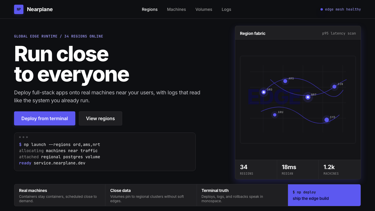 Fly.io Edge-Compute PurpleEdge-cloud with discipline. Electric purple nodes, Inter type, and terminal b…克制的边缘云:深黑底、电紫节点、Inter 字体与终端块。
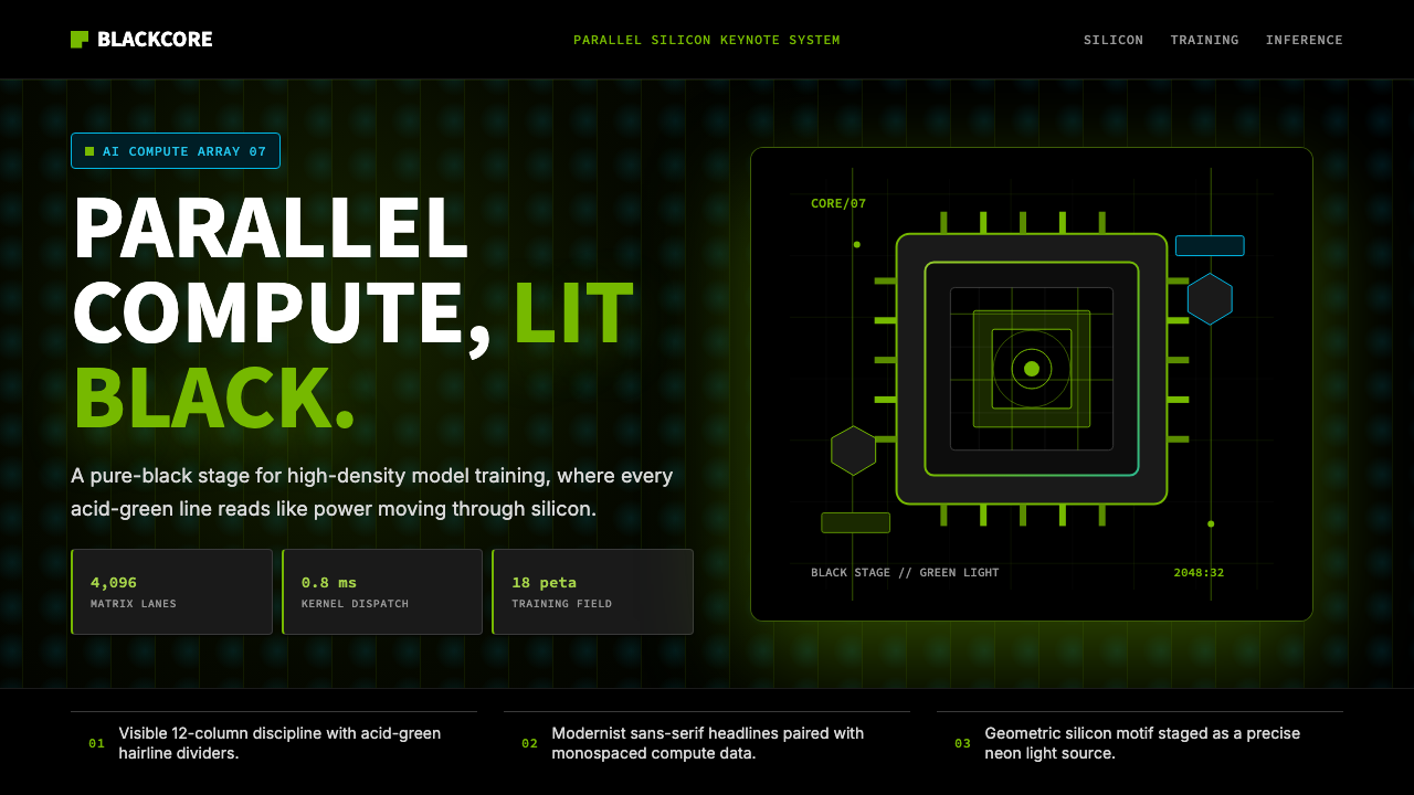 NVIDIA GPU Green-BlackPure black turns compute theatrical. Acid green hairlines and chip geometry s…纯黑让算力成舞台。酸绿细线与芯片几何制造光感。
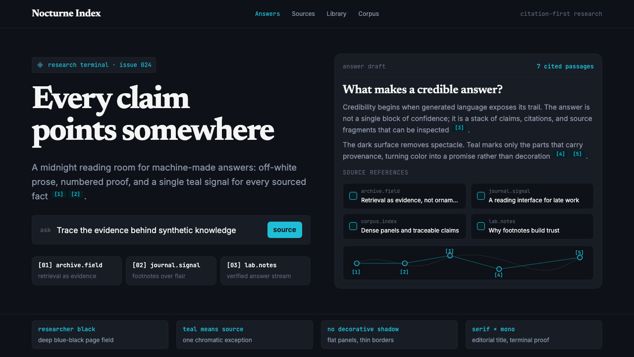 Perplexity AISerious search after midnight. Teal citations cut through black panels and de…午夜研究感:青绿色引用穿过黑色面板与密集衬线排版。
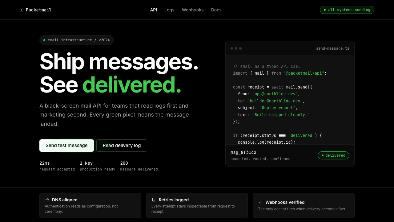 Resend 2024Clean code becomes brand. Pure black, JetBrains Mono, and one green delivered…品牌像 clean code:纯黑、JetBrains Mono、唯一送达绿。
 Vercel 2024Developer luxury by subtraction. Pure black, white Inter, rigid grid, triangu…以删减塑造开发者奢侈感:纯黑白、Inter 字体与刚性网格构成三角发布符号。