About Doraemon
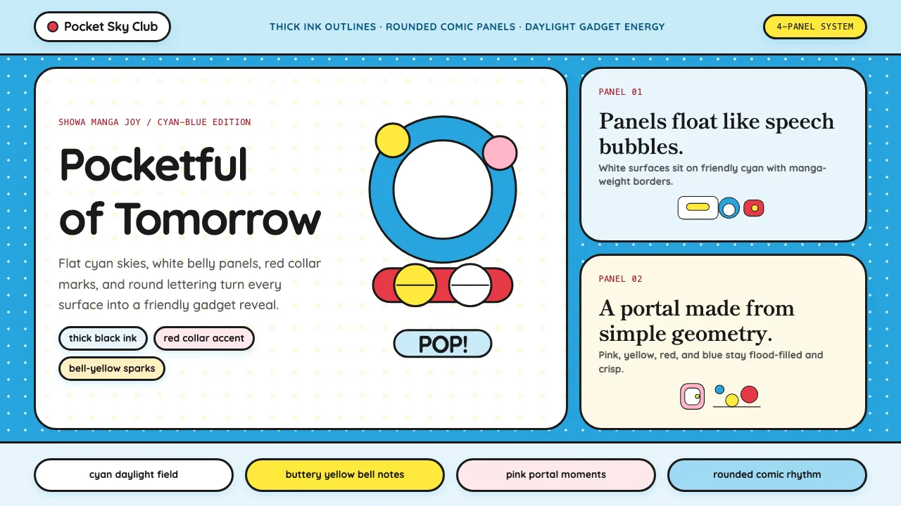
Doraemon's visual language is pure Showa-era manga joy — thick black outlines, flood-fill primary colors, and relentlessly rounded geometry drawn from the character's circle-constructed body. Every element radiates kindergarten warmth: cyan-blue skies, white belly surfaces, red collar accents, and pink Anywhere Door portals.
This system translates half a century of children's manga craft into interface tokens — soft corners everywhere, bold outlines on every component, a bright daylight palette that never dips into darkness, and typography with the chubby hand-drawn quality of comic lettering.
- Origin
- Tokyo, Japan
- Era
- 1969 manga debut; anime since 1973; current visual ~2005–present
- Key figures
- Fujiko F. Fujio · Motoo Abiko · Shin-Ei Animation · Wasabi Mizuta
- Movements
- Showa-era kids' manga · Japanese children's entertainment · Asian soft-power cultural export
Doraemon design spec
Colors
Typography
The other 11 sections — buttons, cards, spacing, motion, techniques and more — open once you unlock. Download the DESIGN.md or send it to your AI in one click. Unlock once, yours forever.
Sign up nowStyles similar to Doraemon
Also inspired by film, games & music, with a close feel.
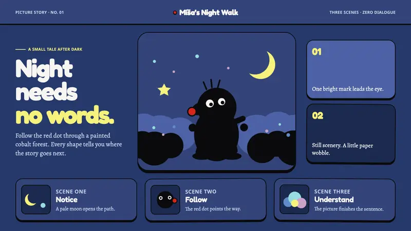 Krtek AnimationWordless wonder. Cobalt gouache stages black paper forms, guided by one red dot.
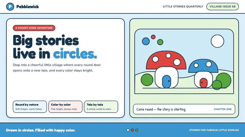 The Smurfs (Peyo, 1958)Joy comes full circle. Sky blue, candy red and soft ink outlines build a flat comic world.
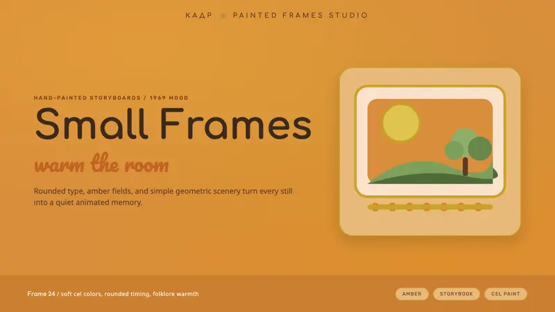 Soyuzmultfilm AnimationStorybook warmth feels alive. Matte amber-ochre, orange-olive accents, rounded Cyrillic type.
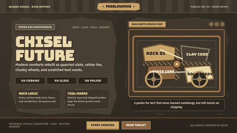 StonepunkPrimitive tech, proudly heavy. Dark quarry slabs, limestone tan, and sketched chisel type.