Design style guide设计风格指南
What is Svelte Compiler Orange?什么是 Svelte Compiler Orange?
Svelte Compiler Orange is the visual identity that made a compile-time JavaScript framework feel like an invitation — warm, loud, and disarmingly direct.Svelte 编译器橙是让一个编译型 JavaScript 框架读起来像一封邀请函的视觉身份——温暖、响亮、毫不掩饰地直接。
Svelte Compiler Orange in briefSvelte Compiler Orange 速览
Svelte Compiler Orange is the design language built around the Svelte JavaScript framework — a visual identity that pairs saturated, warm orange with confident italic typography and treats code samples as first-class visual content. Where many developer tools adopt a cool, neutral palette to signal seriousness, Svelte went the other direction: bold, human, and immediately recognizable.Svelte 编译器橙是围绕 Svelte JavaScript 框架构建的设计语言——一套将饱和暖橙与自信斜体字排印配对、并把代码示例作为核心视觉内容的视觉身份体系。许多开发者工具选择冷静中性的色板来传递严肃感,Svelte 却走向了反面:大胆、人性化,辨识度极高。
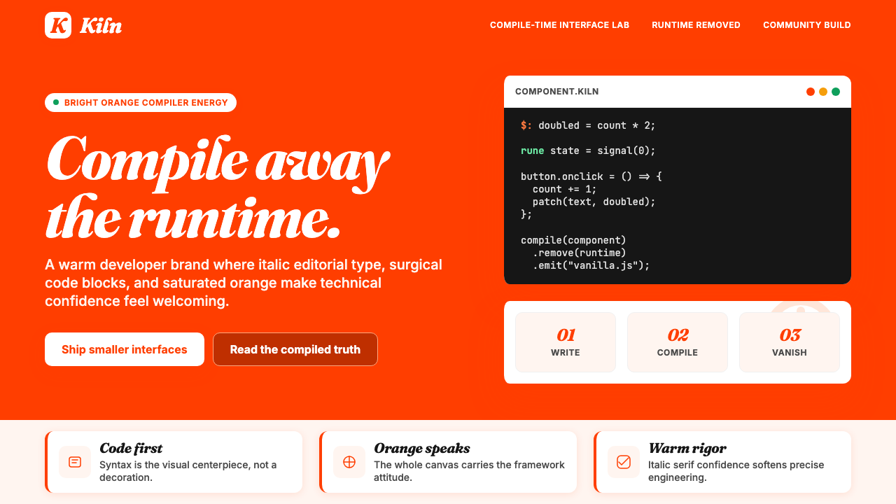
The system is built on contrast and clarity. Bright orange floods hero sections and calls to action against fields of near-white or lightly tinted off-white, while large italic headlines make declarations rather than descriptions. Code blocks are styled with the same care as any other visual element — syntax-highlighted, generously spaced, and placed prominently rather than buried in documentation footnotes.这套系统建立在对比与清晰之上。明亮的橙色占领主视觉区和行动号召区,背靠接近白色或略带色调的暖白底面;大号斜体标题发出宣言,而非描述。代码块被当作任何其他视觉元素一样精心对待——语法高亮、留白慷慨、置于显眼位置,而非淹没在文档注脚里。
What distinguishes this aesthetic from generic developer-tool branding is its editorial confidence. Rich Harris, the framework's creator, came from data journalism at The Guardian and The New York Times, and that background shows in the design: every composition makes an argument. The orange does not merely decorate — it communicates warmth and energy in an ecosystem that often defaults to grey.这套美学与通用开发者工具品牌的区别,在于它的编辑自信。框架创造者 Rich Harris 有在《卫报》和《纽约时报》做数据新闻的背景,这一点在设计中清晰可见:每个构图都在表达一个立场。橙色不是装饰——它在一个习惯灰色的生态系统里传递温暖与能量。
See the Svelte Compiler Orange design system →查看 Svelte Compiler Orange 完整设计系统 →
Where does Svelte Compiler Orange come from?Svelte Compiler Orange 从何而来?
Svelte was created by Rich Harris in 2016 while he was working as a graphics editor at The Guardian and later at the New York Times, building interactive data visualizations for news stories. The framework emerged from frustration with the performance cost of runtime-heavy tools: rather than shipping a virtual DOM diffing engine to the browser, Svelte compiles components into minimal, surgical vanilla JavaScript at build time. The brand identity needed to communicate this radical simplicity in a market crowded with frameworks announcing themselves through complexity.Svelte 由 Rich Harris 于 2016 年创造,彼时他在《卫报》担任图形编辑,随后又在《纽约时报》为新闻报道制作交互式数据可视化。这个框架源于对运行时庞重工具的性能成本的不满:Svelte 不向浏览器发送虚拟 DOM 差异算法引擎,而是在构建时将组件编译为精简、精准操作 DOM 的原生 JavaScript。品牌视觉需要在一个充斥着以复杂性自我标榜的框架的市场里,将这种激进的简洁清晰地传达出来。
The first public version of Svelte arrived with minimal visual polish, but by the time Svelte 3 launched in April 2019 — the release that brought the celebrated reactive declaration syntax using the dollar-label shorthand — the orange identity was firmly in place. The Svelte 3 announcement post, with its declarative headline and warm color treatment, spread widely and established the aesthetic association: orange meant Svelte, and Svelte meant a different way of thinking about reactivity.Svelte 的第一个公开版本视觉上相当朴素,但到 2019 年 4 月 Svelte 3 发布时——正是那个带来了广受赞誉的美元标签响应式声明语法的版本——橙色身份已经牢固确立。Svelte 3 的发布公告,以其宣言式标题和温暖的色彩处理,广泛传播,建立起了一种美学联想:橙色意味着 Svelte,而 Svelte 意味着对响应式编程的一种不同思考方式。
The framework's visual language stayed remarkably consistent through Svelte 4 and into Svelte 5, which introduced runes — a new reactivity primitive — in 2024. SvelteKit, the full-stack application framework built on top of Svelte, reached version one point zero in December 2022 and brought the brand to a wider audience of developers building production applications. Through all these releases, the orange-on-off-white palette and the bold italic headline style remained the stable signals of the Svelte ecosystem.这个框架的视觉语言在 Svelte 4 到 Svelte 5 的演变中保持着令人瞩目的一致性——后者于 2024 年引入了 runes,一种新的响应式原语。建立在 Svelte 之上的全栈应用框架 SvelteKit 于 2022 年 12 月发布一点零版本,将这个品牌带到了更广泛的生产应用开发者群体面前。贯穿所有这些版本,橙色叠暖白的色板和大胆斜体的标题风格始终是 Svelte 生态系统的稳定识别信号。
Rich Harris joined Vercel in late 2021, which provided the framework with institutional backing and a distributed contributor community spanning time zones from London to Southeast Asia. The connection to Vercel also aligned Svelte visually with a broader movement in developer tooling toward friendly, expressive branding — a deliberate departure from the enterprise-grey aesthetic that had dominated the previous decade. Key community contributors including Tan Li Hau, Simon Holthausen, and Brittney Postma helped shape both the technical direction and the community voice that reinforced the brand's warmth.Rich Harris 于 2021 年底加入 Vercel,为框架带来了机构支持,也催生了一个横跨伦敦到东南亚各时区的分布式贡献者社区。与 Vercel 的关联,也让 Svelte 在视觉上契合了开发者工具领域一股更宏观的潮流——走向友善、富有表现力的品牌塑造,有意识地告别过去十年占主导的企业灰美学。Tan Li Hau、Simon Holthausen、Brittney Postma 等关键社区贡献者,帮助塑造了技术方向与社区声音,进一步强化了这个品牌的温度感。
What defines the Svelte Compiler Orange look?Svelte Compiler Orange 的视觉特征是什么?
Color色彩
The defining hue is a warm, saturated orange — not the aggressive neon of alert states, nor the muted terracotta of craft aesthetics, but something closer to a ripe citrus at full sun: inviting and energetic simultaneously. This orange is deployed at full intensity against backgrounds that lean toward off-white or a very lightly warmed white, creating generous contrast without harshness. Dark charcoal or near-black anchors body text and structural elements, keeping the orange from feeling untethered. Secondary surfaces use minimal tint variations of the same warmth family rather than introducing entirely new hues.定义性色调是一种温暖、饱和的橙——不是警示状态那种咄咄逼人的霓虹橙,也不是工艺美学里静谧的赤陶橙,而是更接近阳光下成熟柑橘的那种橙:兼具邀请感与能量感。这种橙色以全强度铺设在偏暖白或极浅暖白的背景上,制造出慷慨的对比而不失温和。深炭灰或接近黑色的色调锚定正文与结构元素,防止橙色飘浮失重。次级表面使用同一暖色系的极小色调变化,而非引入全新色相。
Typography字体排印
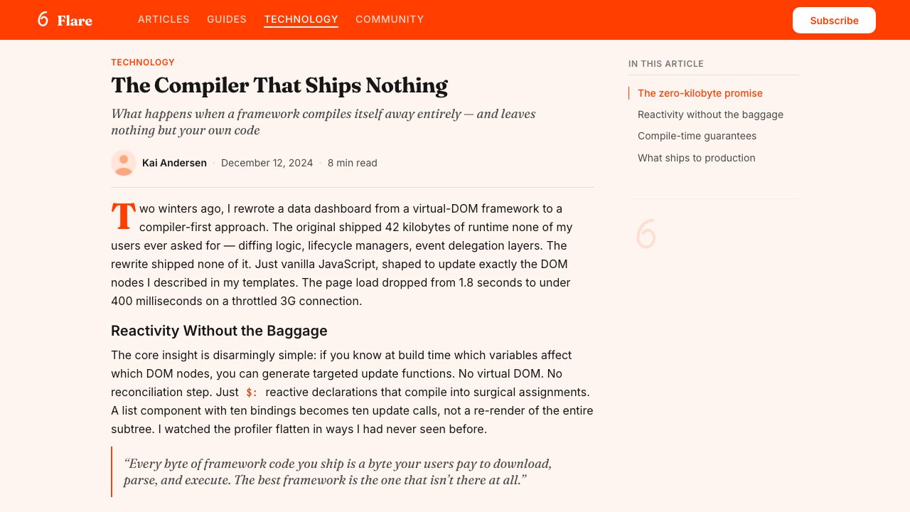
Headlines lean into italic weight with editorial boldness — the slant is not timid or decorative but assertive, carrying the personality of a strong byline rather than a polished corporate masthead. The typeface family used for display has bracketed serifs that recall historical newspaper headline faces, giving the tech-forward content an unexpected warmth and weight of authority. Body text and interface labels shift to clean sans-serif forms for readability and technical precision. The pairing of a characterful italic serif at large scales with a utilitarian sans at small scales is the typographic heart of the system.标题以编辑性的大胆倾斜表达——斜角不是胆怯或装饰性的,而是充满自信,携带着强劲署名行的个性,而非光滑企业报头的打磨感。用于展示级别的字体家族带有括号形衬线,让人联想到历史上报纸标题字体,赋予技术性内容意外的温暖与权威感。正文和界面标签转向简洁无衬线字体,保障可读性与技术精准性。在大尺寸上使用个性斜体衬线、在小尺寸上使用实用无衬线的搭配,是这套系统的排印核心。
Code as Visual Content代码即视觉内容
Unlike systems that treat code samples as supplementary documentation, this aesthetic positions code blocks as primary visual objects. Syntax highlighting uses a palette calibrated to the warm overall tone — ambers, soft teals, and quiet reds against a lightly tinted dark background — making code feel designed rather than generated. Code regions are given wide horizontal margins, generous line spacing, and careful typographic rhythm so that a developer reading a page absorbs the code's structure at a glance, the way a reader absorbs a pull quote.不同于将代码示例视为补充文档的系统,这套美学将代码块定位为核心视觉对象。语法高亮使用与整体暖调相协调的色板——琥珀色、柔和青绿和静谧红,铺设在略带色调的深背景上——让代码感觉是被设计过的,而非自动生成的。代码区域获得宽阔的水平留白、慷慨的行间距和精心的排版节奏,让阅读页面的开发者能一眼吸收代码结构,就像读者一眼吸收引用段落一样。
Warmth in Negative Space留白中的温度
Backgrounds are not pure white but carry a very slight warmth — a near-imperceptible tint that keeps the composition from feeling clinical. This subtle temperature difference between the background and the orange accent prevents the palette from reading as a high-contrast alarm signal; instead, the two values feel harmonically related, like different intensities of the same light source. The warmth in the negative space is the detail that separates this system from aggressive tech-brand orange treatments.背景不是纯白,而是携带着极轻微的暖意——一种几乎不可察觉的色调,防止整体构图显得临床冷淡。背景与橙色强调色之间的这种微妙温度差,防止整个色板被读成高对比度的警告信号;两个色值反而感觉是和谐相关的,像同一光源的不同强度。留白中的温度,是这套系统与咄咄逼人的科技品牌橙处理区别开来的细节。
Declarative Headline Register宣言式标题语气
The copywriting register that accompanies the visual system is inseparable from its impact. Headlines make claims — 'Cybernetically enhanced web apps,' 'Write less code' — rather than describing features. This directness mirrors the design philosophy of the framework itself: compile away the unnecessary, keep only what matters. The italic display type is matched to copy that leans forward with conviction, creating a unity between verbal and visual tone that distinguishes the system from frameworks that dress cautious marketing language in bold fonts.配合视觉系统的文案语气与其效果密不可分。标题发出断言——「Cybernetically enhanced web apps」「写更少的代码」——而非描述功能。这种直接性与框架本身的设计哲学互为镜像:编译掉不必要的,只保留重要的。斜体展示字体与充满信念向前倾斜的文案相互匹配,创造出语言与视觉语气的统一——这让这套系统区别于那些用粗体字包裹谨慎营销语言的框架。
Interactive Emphasis交互强调
Interactive elements — buttons, links, selected states — use the orange at full saturation as a clear signal of action. Hover states and focus rings are treated with the same warmth rather than shifting to a contrasting cool color, keeping the interaction layer within the palette's emotional temperature. This consistency means that a user navigating through a Svelte site feels the orange as a reliable guide rather than a sporadic decoration. Disabled states and muted elements pull back to pale warm tints, maintaining the family relationship even in reduced-emphasis contexts.交互元素——按钮、链接、选中状态——以全饱和橙色作为行动的清晰信号。悬停状态和焦点圆环以同样的温暖处理,而非切换到对比性冷色,将交互层保持在色板的情感温度之内。这种一致性意味着,在 Svelte 站点中导航的用户会把橙色感知为可靠的引导,而非偶发的装饰。禁用状态和弱化元素退回到浅暖色调,即使在低强调语境下也维持着家族关系。
Community-Forward Tone社区导向气质
The overall visual register resists the severity that characterizes many low-level infrastructure tools. Illustration, when it appears, uses rounded shapes and the same warm palette rather than isometric diagrams or circuit-board motifs. Documentation diagrams explain through clarity and generosity of space rather than density of information. The effect is a developer tool that signals expertise without gatekeeping — the design says 'this is sophisticated but it will not punish you for learning it slowly.'整体视觉基调刻意抵制许多底层基础设施工具特有的严肃感。插图(若出现)使用圆润形态和相同暖色调,而非等距示意图或电路板母题。文档示意图通过清晰度和空间慷慨来解释,而非依靠信息密度。效果是一个传递专业感而不设门槛的开发者工具——设计在说:「这很复杂,但不会因为你学得慢而惩罚你。」
See the Svelte Compiler Orange design system →查看 Svelte Compiler Orange 完整设计系统 →
Who shaped Svelte Compiler Orange?谁塑造了 Svelte Compiler Orange?
Harris created Svelte in 2016 while building data visualizations for The Guardian and later the New York Times, drawing on his experience as a graphics journalist to prioritize clear, direct communication over architectural elegance for its own sake. His public writing and conference talks — delivered with the same declarative confidence as the framework's own marketing — helped establish the community culture that the visual identity reflects. His move to Vercel in late 2021 gave the project long-term institutional backing while keeping the founder's voice central to the brand.Harris 于 2016 年在为《卫报》和后来的《纽约时报》制作数据可视化期间创造了 Svelte,他作为图形新闻记者的背景让他把清晰直接的传达置于纯粹的架构优雅之上。他的公开写作和演讲——以与框架营销相同的宣言式自信呈现——帮助建立了视觉身份所反映的社区文化。2021 年底加入 Vercel,在维持创始人声音居于品牌核心的同时,为项目带来了长期的机构支持。
A prominent contributor to the Svelte core and one of the most active voices in community education, Tan Li Hau has written extensively about Svelte's reactivity model and internal compiler mechanics. His work on documentation and tutorials helped translate the framework's technical confidence into approachable learning materials that align with the brand's direct, warm register. His contributions demonstrate how the visual and verbal identity of the system extends beyond the framework itself into the community's educational output.Tan Li Hau 是 Svelte 核心的重要贡献者之一,也是社区教育中最活跃的声音之一。他大量撰写了关于 Svelte 响应式模型和内部编译器机制的文章。他在文档和教程方面的工作,帮助将框架的技术自信转化为与品牌直接、温暖基调相符的易学习材料,展示了这套视觉和语言身份如何超越框架本身延伸至社区的教育产出。
Holthausen has been a key contributor to Svelte's language tooling and compiler internals, working on the technical foundations that allow the framework's compile-time philosophy to be maintained as the codebase grows in complexity. His work represents the engineering discipline that the visual identity implicitly promises: that the simplicity presented to developers on the surface is backed by rigorous implementation beneath. The Svelte 5 runes system, which he contributed to significantly, is a case study in making a technically demanding change feel simple and inevitable.Holthausen 是 Svelte 语言工具和编译器内部的核心贡献者,致力于支撑框架编译时哲学在代码库日益复杂的情况下得以维持的技术基础。他的工作代表了视觉身份所隐性承诺的工程纪律:呈现给开发者的表面简洁,背后有严谨实现作为支撑。他大量贡献的 Svelte 5 runes 系统,是一个让技术上高难度的变化感觉简单而自然的案例研究。
A community educator and developer advocate who has been influential in broadening Svelte's audience beyond its initial core of web performance specialists. Postma's conference presentations and online tutorials have consistently modeled the same accessible confidence that the visual identity projects — demonstrating that the framework's warmth and directness are not just surface qualities but reflect a genuine commitment to developer experience. Her work helped the brand reach audiences who might have been intimidated by a more austere technical aesthetic.社区教育者和开发者倡导者,在将 Svelte 受众从最初的 web 性能专家核心圈扩展出去方面颇具影响力。Postma 的演讲和在线教程,始终如一地呈现了视觉身份所投射的那种平易自信——展示框架的温暖与直接不只是表面特质,而是对开发者体验的真诚承诺。她的工作帮助品牌触达了可能因更严峻技术美学而望而却步的受众。
How do you use Svelte Compiler Orange today?今天怎么用 Svelte Compiler Orange?
Svelte Compiler Orange translates most naturally to contexts where technical credibility and human warmth need to coexist — developer documentation sites, open-source project landing pages, technical course platforms, and any product whose audience skews toward builders and makers. The core visual move is straightforward: flood the hero with warm orange, pull back to near-white for content areas, use the bold italic display type for claims rather than descriptions, and treat any code samples with the same visual care as headline content.Svelte 编译器橙最自然地适用于技术可信度与人文温度需要共存的场景——开发者文档站、开源项目落地页、技术课程平台,以及任何受众偏向建造者与创作者的产品。核心视觉操作是直接的:主视觉区用暖橙色铺满,内容区退回暖白,用粗体斜体展示字体发出断言而非描述,并以与标题内容相同的视觉精心程度处理任何代码示例。
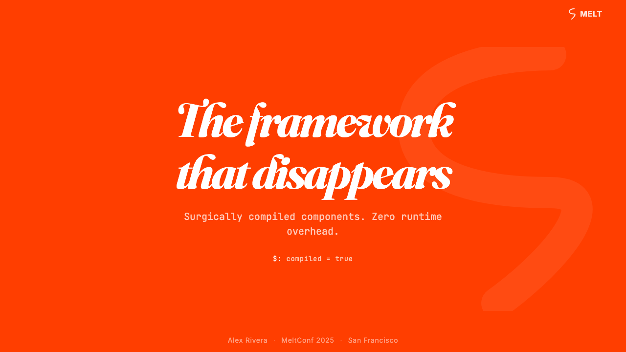
For presentation slides, the system works exceptionally well on cover pages that need to announce a technical topic without feeling cold. A cover might use a full warm-orange background with the title set in large, confident italic type against it — pure saturation as a stage. Content slides benefit from restraint: a warm off-white field, one orange accent used for a single key term or a highlighted data point, and generous blank space that lets the content breathe. Data slides can incorporate the orange as a primary series color in charts, with supporting series in the same warm-neutral family, making the visualization feel integrated with the surrounding slide design rather than imported from a separate tool.对于演示文稿,这套系统在需要宣告技术主题而不失去温度感的封面页上表现尤为出色。封面可以使用全暖橙背景,在其上以大号自信斜体字呈现标题——以纯饱和度为舞台。内容页则受益于克制:暖白底面,一处橙色强调用于单个关键词或突出数据点,以及慷慨的空白让内容呼吸。数据页可以将橙色作为图表的主系列色,辅助系列使用同一暖中性色系,让可视化感觉与周围幻灯片设计融为一体,而非从另一个工具导入的。
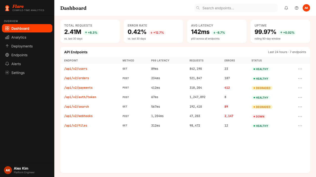
For web interfaces, the system suits developer dashboards, API documentation pages, and SaaS pricing pages where hierarchy matters more than atmosphere. The approach: use near-white as the primary background, reserve the orange for primary calls to action, active navigation items, and interactive highlights. Keep secondary interface elements in warm neutrals rather than cold greys to preserve the overall temperature. Navigation should be typographic and confident — wordmarks and category labels in a legible weight — rather than icon-dominated. For marketing and editorial contexts, the style's poster-like boldness supports strong information hierarchy: alternate full-width feature blocks between orange-on-white and dark-on-white, use the italic display type for section headers that announce rather than label.对于网页界面,这套系统适合开发者仪表板、API 文档页以及层级比氛围更重要的 SaaS 定价页。方法:以暖白作为主要背景,将橙色保留给主要行动号召、活跃导航项和交互高亮。次级界面元素保持暖中性色而非冷灰,维持整体温度。导航应该是字体性和自信的——以清晰字重呈现的文字标识与分类标签——而非图标主导。对于营销和编辑场景,这种风格的海报式大胆感支持强劲的信息层级:在橙底白字与深色白底之间交替使用全宽特性区块,用斜体展示字体呈现宣告而非标注的段落标题。
In editorial design — long-form articles, newsletters, or documentation — the italic headline style and warm palette support a voice of authority without formality. Section headers can carry the orange as an accent color rather than as a full flood, allowing the orange to punctuate rather than dominate. Pull quotes work well in the italic face at a large size against the warm off-white ground. Code samples should always receive the full visual treatment — syntax-highlighted, well-spaced, given their own breathing room — rather than being treated as secondary content folded into prose.在编辑设计中——长文章、新闻简报或文档——斜体标题风格和暖色调支持一种权威而不失亲近的声音。段落标题可以将橙色作为点缀而非全面铺设,让橙色成为标点符号而非主角。引用段落在暖白底面上以大号斜体呈现效果出色。代码示例应始终获得完整的视觉处理——语法高亮、间距宽松、拥有独立呼吸空间——而非作为折叠进散文的次级内容对待。
A common mistake when applying this system is reaching for the orange too liberally and turning a warm, focused identity into a high-saturation noise problem. The orange works because it is used decisively, not continuously. Backgrounds, body text, and supporting UI should be overwhelmingly neutral; the orange earns its energy by appearing against that restraint. A second common error is using a cold, default sans-serif for display text instead of the characteristic italic serif, which strips the system of its editorial warmth and leaves only generic tech-brand orange. The warmth of the backgrounds — not pure white but lightly tempered — is also easy to miss; using stark white instead collapses the palette's temperature coherence and makes the orange read as a warning color rather than an invitation.应用这套系统时最常见的错误,是过于频繁地使用橙色,将一套温暖聚焦的视觉身份变成高饱和度噪声。橙色之所以有效,是因为它被决断性地使用,而非连续不断地出现。背景、正文和辅助界面元素应该以压倒性的中性色为主;橙色正是在那种克制之中才能焕发能量。第二个常见错误是在展示文字上使用冷淡的默认无衬线字体,而非标志性的斜体衬线字体——这会剥除系统的编辑温度,只剩下通用科技品牌橙。背景的温度——非纯白而是略带调和——也很容易被忽视;用纯冷白代替会瓦解色板的温度连贯性,让橙色被读成警告色而非邀请色。
See the Svelte Compiler Orange design system →查看 Svelte Compiler Orange 完整设计系统 →
Svelte Compiler Orange — FAQSvelte Compiler Orange · 常见问题
Is Svelte Compiler Orange only appropriate for developer-focused products?Svelte 编译器橙只适合面向开发者的产品吗?
Not necessarily. The system's warmth and directness transfer to any product that values editorial confidence and clear communication. It works well for educational platforms, technical publications, maker communities, and creative tools aimed at people who build things. It struggles in contexts that require luxury, softness, or cultural specificity — high-end retail, wellness, food, or any brand that depends on sensory richness. The key question is whether the product benefits from the energy and authority that saturated orange communicates; if so, the system can travel well beyond its framework origins.不一定。这套系统的温度感与直接性,能迁移到任何重视编辑自信和清晰传达的产品上。它在教育平台、技术出版物、创客社区以及面向建造者的创意工具上表现出色。它在需要奢华感、柔软感或文化特殊性的场景中则力不从心——高端零售、健康养生、食品,以及任何依赖感官丰富性的品牌。关键问题是:这个产品是否能从饱和橙所传达的能量与权威感中受益?如果答案是肯定的,这套系统就能很好地超越其框架起源而广泛应用。
How is this different from a generic orange tech brand?这和一般的橙色科技品牌有什么区别?
The difference is in three details that are easy to miss. First, the background warmth: this system uses an off-white or lightly tinted near-white rather than stark white, which keeps the orange from reading as a warning signal. Second, the typography: the characteristic bold italic serif display face brings editorial weight and personality that a generic rounded sans-serif cannot. Third, the restraint: the orange appears at decisive moments and then withdraws, rather than being applied continuously across navigation, cards, borders, and backgrounds simultaneously. Remove any of these three elements and the system collapses into generic tech-brand territory.区别在于三个容易被忽视的细节。第一,背景温度:这套系统使用暖白或略带色调的接近白色,而非冷白,这防止了橙色被读成警告信号。第二,字体排印:标志性的大号粗体斜体衬线展示字体,带来通用圆润无衬线字体无法给予的编辑分量与个性。第三,克制:橙色出现在决断性的时刻,然后退场,而非同时连续铺满导航、卡片、边框和背景。移除这三个元素中的任何一个,这套系统就会坍塌回通用科技品牌领域。
Can this style work in dark mode?这种风格能用在深色模式下吗?
Yes, with care. In a dark variant, the near-white background inverts to a deep warm charcoal or near-black that still carries temperature — not a cold neutral. The orange retains its full saturation as an accent against the dark ground and continues to function as the primary action color. Body text moves to a warm off-white rather than pure white to preserve the palette's family coherence. The italic serif display type remains unchanged. The main risk in dark mode is allowing the orange to flood too much surface area — on a dark ground, a large orange block reads more aggressively than on a light one, so the restraint principle becomes even more important.可以,但需要谨慎。在深色变体中,接近白色的背景反转为深暖炭灰或接近黑色,但仍保有温度感——不是冷中性色。橙色在深底面上保持全饱和度作为强调色,继续充当主要行动色。正文移向暖白而非纯白,以维持色板的家族一致性。斜体衬线展示字体保持不变。深色模式下的主要风险,是允许橙色铺满过多表面——在深底面上,大面积橙色区块读起来比在浅底面上更具攻击性,因此克制原则变得更加重要。
What makes the italic headline style essential to this system?斜体标题风格为什么对这套系统至关重要?
The italic is load-bearing, not decorative. It signals that the system draws from editorial and journalistic traditions — the voice of a reporter making a claim rather than a brand making a pitch. Without the italic, and without the bracketed-serif face that carries it, the orange becomes just another tech-brand accent color applied over a generic sans-serif grid. The italic also creates a natural tension with the code samples, which are set in upright monospaced forms. This contrast between the slanted, humanist headline register and the upright, mechanical code register gives the pages their characteristic visual rhythm and communicates the framework's central idea: that human expressiveness and machine precision can coexist.斜体是承重墙,不是装饰。它传递出这套系统汲取自编辑与新闻传统——记者发表断言的声音,而非品牌进行推销的声音。没有斜体,没有承载它的括号衬线字体,橙色就只是另一种叠加在通用无衬线网格上的科技品牌强调色。斜体还与代码示例形成自然张力——后者以直立等宽字体呈现。这种倾斜的、人文主义标题基调与直立的、机械性代码基调之间的对比,赋予页面标志性的视觉节奏,并传递框架的核心理念:人的表达力与机器的精准性可以共存。
How does this system handle imagery and illustration?这套系统如何处理图像与插图?
Photography and illustration are used sparingly and treated as supporting elements rather than heroes. When illustration appears, it favors soft, rounded shapes in the warm palette rather than sharp geometric or isometric diagrams, preserving the system's overall temperature. Photographs of people — contributors, speakers, community members — are often displayed in warm-toned treatments, sometimes with a tinted overlay that keeps them within the palette. Abstract decorative illustration tends toward flowing or particle-like forms that suggest energy and motion without introducing hard geometric rigidity. The result is that visual variety is achieved through content and typography rather than through a proliferation of illustration styles.摄影和插图被克制地使用,作为支撑元素而非主角。当插图出现时,它偏向暖色调中的柔和圆润形态,而非锋利的几何形或等距示意图,维护系统整体的温度感。人物照片——贡献者、演讲者、社区成员——通常以暖调处理,有时附以染色叠层,将其保持在色板范围内。抽象装饰性插图倾向于流动或粒子状形态,传递能量与动感而不引入硬边几何刚性。结果是视觉变化通过内容和排版而非插图风格的增殖来实现。
Related design styles相关设计风格
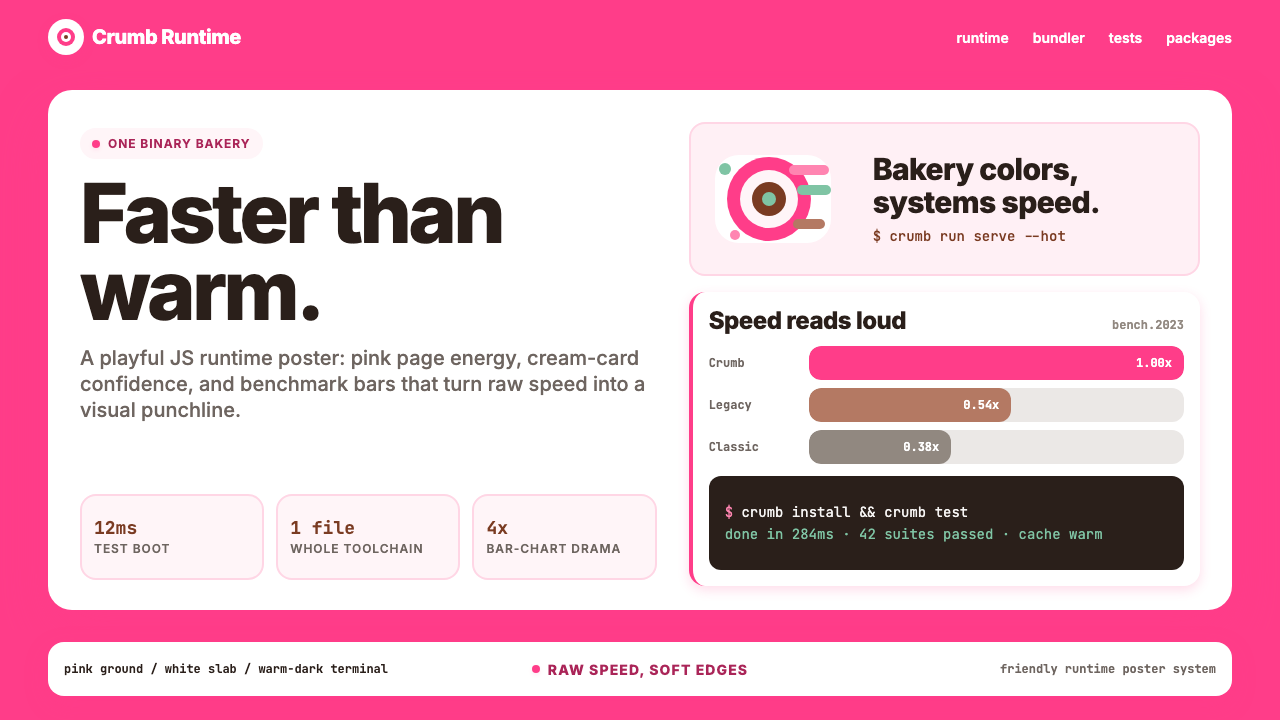 Bun JS Runtime Pink 2023Dev speed gets bakery-bright. Hot pink grounds white slabs, mono bars, and wa…开发速度像烘焙店一样明亮:热粉底、白卡片、等宽基准条与暖黑终端。
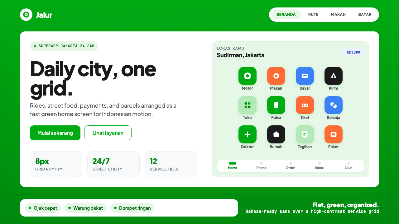 Gojek SuperappCity speed, ordered. Electric green tile grid turns rides, food, and pay into…城市速度被整理:亮绿瓷砖网格串起出行、餐食与支付。
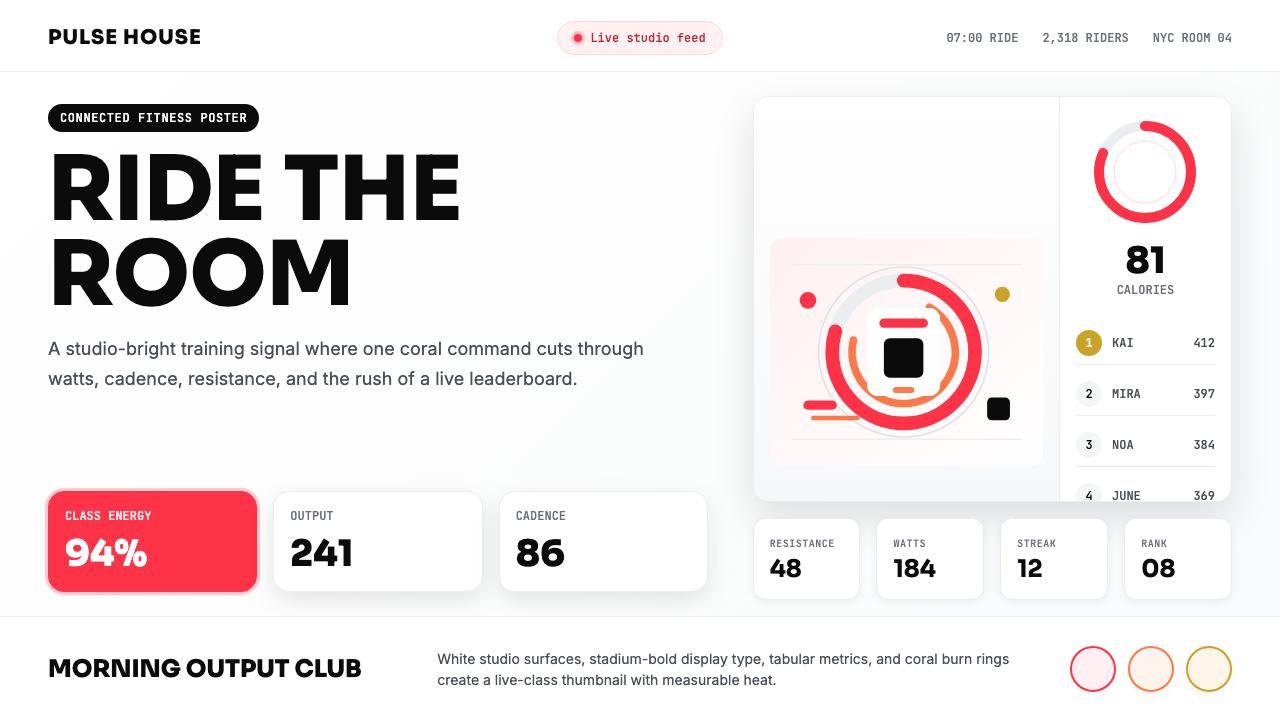 Peloton Fitness Coral (2020)Studio-bright urgency. Coral rings, Sora caps, and leaderboard grids drive th…明亮而紧迫:珊瑚红圆环、Sora 大写与排行榜网格点燃热量。
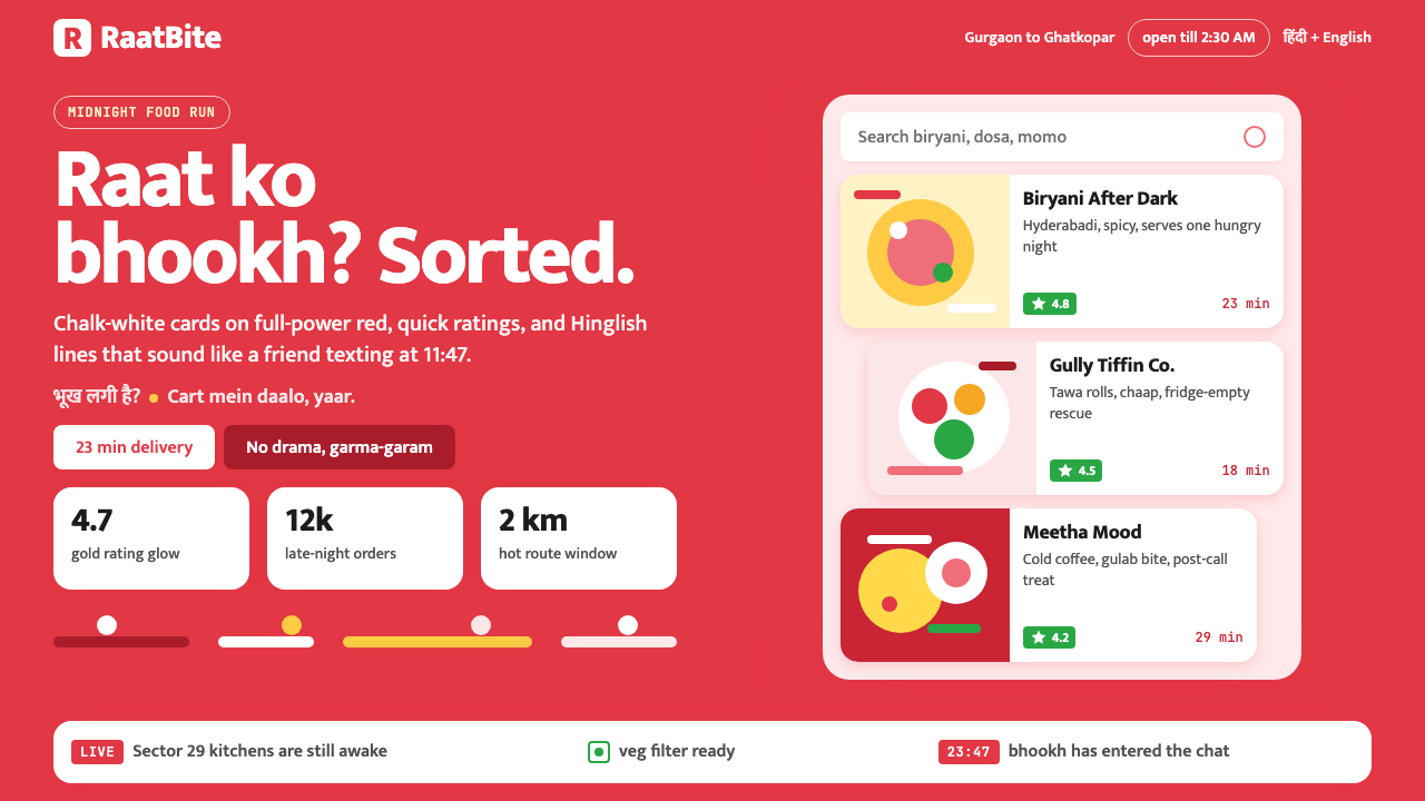 Zomato India DeliveryOwns the midnight scroll. Saturated red, Mukta Hinglish, white cards and gold…午夜外卖很会说话:饱和红、Mukta双语字和白卡金星撑起深夜滚动。
 Discord 2024Blurple cozy. Charcoal grounds, illustrated characters — every surface says '…刻意去企业化的语音聊天:blurple 蓝紫、深炭灰底、俏皮插画角色——每个界…
 Adobe Creative CloudUnified, not uniform. Red anchor, white space, and saturated app tiles organi…统一而不单一:红色锚点、留白与高饱和应用方块组织整套工具。