What is Mob Wife Aesthetic?什么是 Mob Wife Aesthetic?
Mob Wife Aesthetic is the unapologetic maximalist counter-movement that declared fur, gold, and leopard print the only honest response to a decade of beige minimalism.黑帮妻子美学是一场毫不掩饰的极繁主义反潮流——它宣告皮草、金饰与豹纹,才是对十年米白极简主义的唯一诚实回应。
Mob Wife Aesthetic in briefMob Wife Aesthetic 速览
Mob Wife Aesthetic is a maximalist visual style that surfaced on TikTok in January 2024, rapidly spreading across fashion, interior design, and digital media. Named and popularized by creator Kayla Trivieri as a direct antidote to Clean Girl minimalism, it draws its vocabulary from the Italian-American screen glamour of the 1990s — specifically the wardrobes and attitudes of characters like Carmela Soprano from The Sopranos and Karen Hill from Goodfellas. The defining mood is unapologetic opulence: heavy gold jewelry, fur-trimmed coats, deep crimson lacquer, leopard print, and an overall refusal to be subtle.黑帮妻子美学是一种极繁主义视觉风格,于2024年1月在TikTok上浮出水面,迅速蔓延至时尚、室内设计与数字媒体领域。这一名称由创作者Kayla Trivieri提出,将其定位为「干净女孩」极简主义的直接解药。它的视觉词汇来自九十年代的美国意裔荧幕奢华——尤其是《黑道家族》中卡梅拉·索普拉诺与《好家伙》中凯伦·希尔的着装与气场。这种风格的核心情绪是毫不掩饰的富贵:沉甸甸的金饰、镶皮草大衣、深红指甲油、豹纹,以及对含蓄的彻底拒绝。
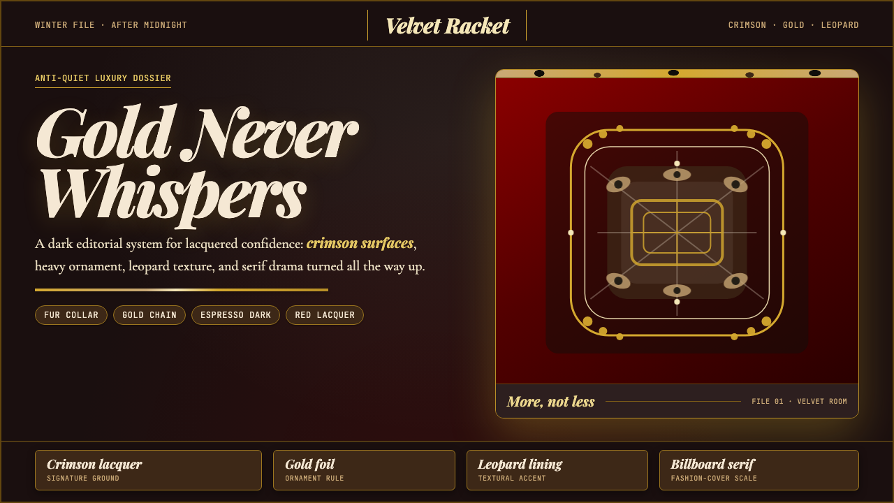
As a design language, the aesthetic translates that cultural energy into a coherent visual system built on dark, jewel-toned and lacquered surfaces, gold-foil ornamental detail, dramatic Didone serif typography set at bold, commanding scales, and richly layered photographic texture. The palette runs toward deep reds, near-blacks shot through with warmth, burnished golds, and animal print patterns. Every compositional decision pushes toward more presence, not less — a foundational inversion of the restraint-as-virtue principle that dominated digital design in the preceding decade.作为设计语言,这套美学将那股文化能量转化为一套连贯的视觉系统:以深邃的珠宝色调与漆面质感为底色,辅以金箔装饰线条,搭配在大胆、夺目尺度上使用的戏剧性Didone衬线字体,以及层次丰富的摄影质感。色板以深红、带有温度的近黑、磨砂金与动物纹为轴心。每一个构图决定都在推向更强的存在感,而非更少——这是对过去十年数字设计中「克制即美德」原则的根本性颠覆。
Though it arrived as a fashion and lifestyle moment, Mob Wife Aesthetic carries genuine design system coherence. It is not mere nostalgia or pastiche; it is a deliberate reclamation of glamour as a legitimate expressive register, one that has found traction in luxury branding, editorial photography, hospitality visual identity, and high-end digital product interfaces where warmth, richness, and cultural specificity are desired rather than avoided.尽管这股风潮以时尚与生活方式的形式到来,黑帮妻子美学却具有真实的设计系统内聚力。它不是单纯的怀旧或拼贴;它是对「奢华」作为合法表达语域的刻意复权——在奢侈品牌、编辑摄影、餐饮业视觉识别,以及那些将温度感、厚重感与文化特异性视为优势而非负担的高端数字产品界面中,这套语言已经找到了真实的落地场景。
See the Mob Wife Aesthetic design system查看 Mob Wife Aesthetic 完整设计系统
Where does Mob Wife Aesthetic come from?Mob Wife Aesthetic 从何而来?
The immediate origin is a single TikTok moment. In early January 2024, creator Kayla Trivieri posted a video framing Mob Wife Aesthetic as the deliberate rejection of the Clean Girl trend that had dominated aspirational lifestyle content since roughly 2022. Clean Girl — characterized by slicked-back buns, bare skin, neutral earth tones, and a studied nonchalance about visible effort — had by late 2023 begun to feel culturally exhausted. Trivieri's reframe was immediate and viral: instead of quiet, loud; instead of neutral, saturated; instead of restraint, excess. The video sparked a naming moment that crystallized a visual sensibility many creators had been building toward independently.这股风潮的直接起点是一个TikTok时刻。2024年1月初,创作者Kayla Trivieri发布了一个视频,将「黑帮妻子美学」定位为对「干净女孩」趋势的刻意反叛——后者自2022年前后主导着生活方式内容的aspirational想象:发髻梳得一丝不苟、皮肤素净、中性大地色、对「看起来费力」的刻意回避。到2023年底,「干净女孩」在文化上已开始显得精疲力竭。Trivieri的重新定框立刻引爆网络:以嘈杂代替安静,以饱和代替中性,以过剩代替克制。这条视频触发了一个命名时刻,将许多创作者此前各自摸索的视觉感性结晶成了一个可识别的符号。
The deeper source is the Italian-American popular culture of the 1990s, particularly the prestige television and film that dramatized organized-crime-adjacent New Jersey and New York communities. The Sopranos (1999–2007) is the central reference — not for its subject matter but for its visual production design. Carmela Soprano's home, wardrobe, and personal presentation embodied a specific strain of aspirational working-class luxury: designer labels worn at maximum visibility, gold jewelry layered heavily, interior spaces decorated with theatrical abundance. Lorraine Bracco, Aida Turturro, and Edie Falco each brought versions of this aesthetic to screen. Martin Scorsese's Goodfellas (1990) is a parallel touchstone, particularly in its costuming and the visual grammar of Karen Hill's apartment and wardrobe.这股美学的更深根源,是九十年代的美国意裔流行文化,尤其是那些戏剧化呈现新泽西与纽约有组织犯罪毗邻社区的高质量影视作品。《黑道家族》(1999—2007年)是核心参照——不在于题材,而在于视觉制作设计。卡梅拉·索普拉诺的家居、衣橱与个人形象,体现了一种特定的向往性工薪阶层奢华:设计师标签以最大可见度示人,金饰层层叠戴,室内空间以戏剧性的丰盈装点。洛雷恩·布拉科、艾达·图尔图罗与艾迪·法尔科各自将这套美学的不同版本带上荧幕。马丁·斯科塞斯的《好家伙》(1990年)是另一块基石,尤其在服装造型与凯伦·希尔公寓和衣橱的视觉语法上。
These screen references themselves were grounded in a real subculture. Italian-American communities in New York and New Jersey had developed a distinct visual identity over the postwar decades — one that absorbed Mediterranean influences (gold jewelry as tangible wealth, rich fabrics as status markers) and filtered them through American consumer abundance. This was a community aesthetic that did not share mainstream Anglo-American anxieties about visible display of prosperity. Where WASP taste codes demanded understatement, this tradition demanded statement.这些荧幕参照本身扎根于一个真实的亚文化。战后数十年间,纽约和新泽西的意裔美国社区发展出了独特的视觉身份认同——它吸收了地中海影响(金饰作为有形财富,厚重面料作为地位标志),并将其过滤进美国消费文化的丰裕之中。这是一套不共享主流盎格鲁-美国人对「可见繁荣」之焦虑的社区美学。在WASP品味密码要求低调的地方,这个传统要求的是显声夺势。
The naming as an internet aesthetic microgenre in January 2024 placed Mob Wife in explicit dialogue with the taxonomy of TikTok aesthetics that had been proliferating since roughly 2020 — Cottagecore, Dark Academia, Coastal Grandmother, Quiet Luxury. Each of these named styles functioned as a shorthand for a coherent mood board, a recognizable visual grammar, and an implied set of consumer choices. Mob Wife Aesthetic's particular cultural timing gave it additional resonance: it arrived as Quiet Luxury (the understated, old-money aesthetic popularized by shows like Succession) was reaching peak cultural saturation, making the maximalist counter-position feel urgent and energizing rather than merely retro.2024年1月,这套视觉被命名为互联网美学微类型,使「黑帮妻子」进入了自2020年前后一直在增殖的TikTok美学分类对话——农舍核、暗黑学院、海岸祖母、静谧奢华……这些命名风格,每一个都是一张心情板的速记、一套可识别的视觉语法与一套隐含的消费选择。黑帮妻子美学的文化时机赋予了它额外的共鸣:它到来时,「静谧奢华」(由《继承之战》等剧集普及的低调旧钱美学)正达到文化饱和的顶点,使得这种极繁主义的反向立场感觉迫切且充满活力,而不仅仅是复古怀旧。
What defines the Mob Wife Aesthetic look?Mob Wife Aesthetic 的视觉特征是什么?
Color Palette色彩系统
The palette anchors in deep crimson and lacquered burgundy — colors that read simultaneously as expensive and dangerous. These darks are countered by burnished gold and warm champagne tones that recall jewelry and candlelight rather than sunshine or neon. Near-blacks carry undertones of warmth rather than cool neutrality. Animal print — most characteristically leopard — functions not as a color but as a texture pattern that introduces a second layer of visual complexity over the base palette. Highly saturated emerald green and chocolate brown appear as occasional accent alternatives for brands wanting the maximalist opulence without the red-and-gold literalism.色板以深酒红与漆面勃艮第为锚点——这些颜色同时散发出昂贵与危险的气息。这些深色由磨砂金与温暖香槟色来对抗,令人联想到珠宝与烛光而非阳光或霓虹。近黑色调带有温暖的底色,而非冷中性。动物纹——最典型的是豹纹——不作为颜色,而作为纹理图案,在底色之上引入第二层视觉复杂度。高饱和度祖母绿与巧克力棕作为偶尔出现的强调色替代方案,适合那些追求极繁奢华但不想完全依赖红金字面解读的品牌。
Typography字体排印
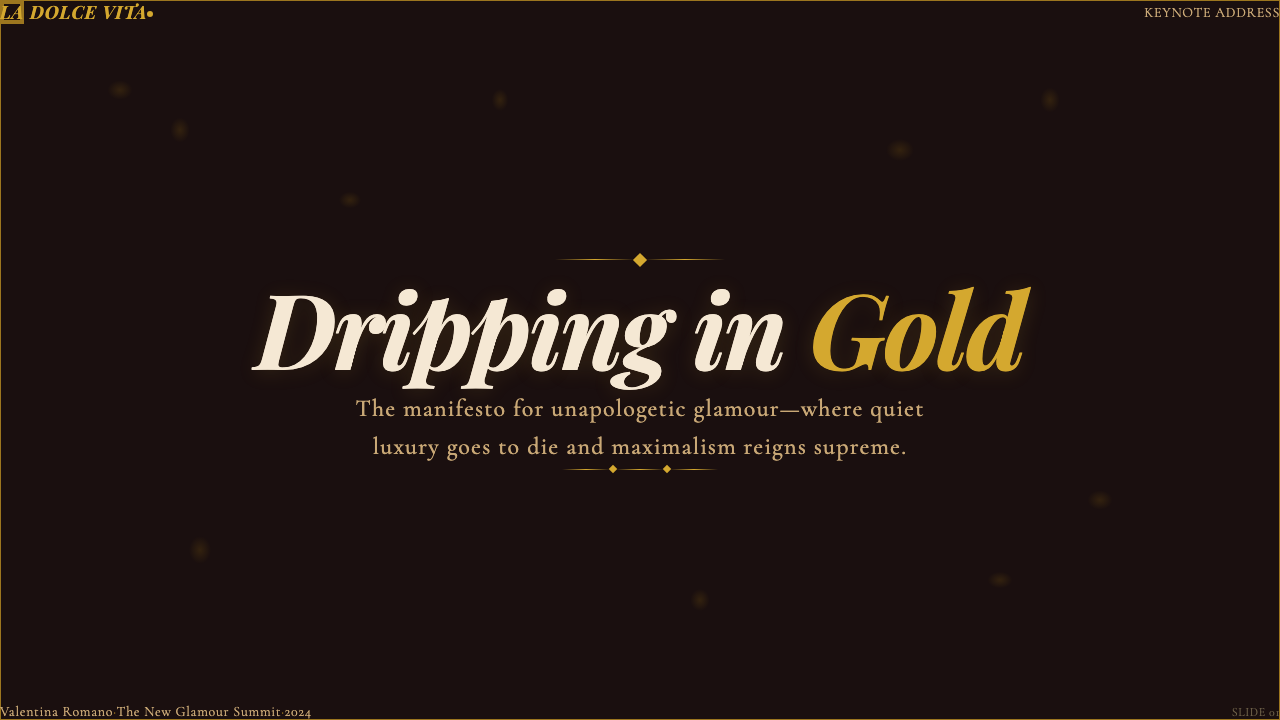
The typographic backbone is the Didone serif — a category of typeface characterized by extreme contrast between thick strokes and hair-thin hairlines, vertical axis stress, and unbracketed serifs. This style of letterform was the prestige print typography of nineteenth-century Europe, appearing on opera programs, luxury goods catalogs, and society announcements. At large display sizes, Didone type has an almost sculptural quality: the hairlines catch light like jewelry, and the stroke contrast creates visual drama without relying on color. Body text may soften to a transitional or humanist serif to maintain readability while staying within the ornate register.排印骨架是Didone衬线体——这类字体以粗笔画与发丝细笔画之间的极端对比、垂直轴重心与无过渡衬线为特征。这种字体风格是十九世纪欧洲的奢华印刷排版,出现在歌剧节目单、奢侈品目录与社交公告上。在大号展示尺寸下,Didone字体几乎有雕塑般的品质:发丝细线像珠宝一样折射光线,笔画对比制造出视觉张力,而无需依赖色彩。正文可以软化为过渡性或人文主义衬线体,在保持可读性的同时维持华丽的格调。
Texture and Surface质感与表面
Where Bauhaus insists on flatness, Mob Wife Aesthetic insists on richness. Photographic and illustrative textures — the sheen of satin, the grain of aged velvet, the pattern repeat of fur, the glint of faceted stone — are applied as surface layers that deepen visual weight. Gold-foil ornamental borders, decorative cartouche frames, and engraving-style line patterns recall the material culture of luxury print: jewelry catalogues, casino interiors, vintage Italian fashion magazines. The goal is not to simulate a specific material but to evoke the sensory experience of being surrounded by expensive things.包豪斯坚持平面性,黑帮妻子美学则坚持丰富感。摄影或插画质感——缎面的光泽、陈年丝绒的颗粒感、皮草的纹路、切割宝石的闪烁——被叠加为表面层,加深视觉重量。金箔装饰边框、花式卡纸徽章(cartouche)外框与雕刻风格的线条图案,让人联想到奢华印刷的物质文化:珠宝目录、赌场内饰、复古意大利时装杂志。目标不是模拟某种具体材质,而是唤起被昂贵事物包围的感官体验。
Composition and Density构图与密度
Mob Wife layouts embrace density. Negative space is not eliminated but is filled with intent — a large headline, a decorative border, a secondary texture, a gold ornamental divider. The compositional logic is closer to editorial luxury magazine spreads or film poster design than to the minimal breathing-room layouts of contemporary digital defaults. Hierarchy remains readable — the eye is guided — but the path is lined with richness rather than emptiness. Layering is deliberate: type sits over texture, ornament frames the image, the background itself is patterned rather than flat.黑帮妻子的版式拥抱密度。留白并非消失,而是被有意填充——一行大标题、一道装饰边框、一层次级质感、一条金色装饰分割线。构图逻辑更接近奢华编辑杂志的跨页展开或电影海报设计,而非当代数字设计默认的极简呼吸感版面。层级依然清晰可读——视线被引导——但路径是以丰富感而非空旷感来铺陈的。分层是刻意的:文字置于质感之上,装饰框定图像,背景本身也是有纹路的,而非平坦。
Ornament and Decoration装饰与纹样
Ornament is not incidental — it is structural. Decorative borders, cartouche frames, laurel-and-scroll motifs, diamond-point dividers, and engraving-style line fillers all carry compositional weight. They define zones, separate sections, and signal register. The decorative tradition being cited is predominantly nineteenth-century European commercial printing — the visual language of theater broadsheets, perfume packaging, and jewelry house stationery — filtered through the Italian-American vernacular. Unlike kitsch, which applies ornament randomly, Mob Wife Aesthetic uses decoration with consistent visual grammar: gold ornament at corners and borders, pattern texture at background, sculptural typography at the center.装饰不是附属品——它是结构性的。装饰边框、卡纸徽章外框、月桂与卷草母题、菱形分割线与雕刻风格的线条填充,都承载着构图重量。它们划定区域、分隔段落、标示语域。所援引的装饰传统主要是十九世纪欧洲商业印刷的视觉语言——剧院传单、香水包装与珠宝品牌信纸——经由意裔美国白话文化过滤。与随意堆砌装饰的媚俗(kitsch)不同,黑帮妻子美学以一贯的视觉语法运用装饰:金色装饰置于角落与边框,纹理图案置于背景,雕塑感文字置于中心。
Photography and Imagery摄影与图像
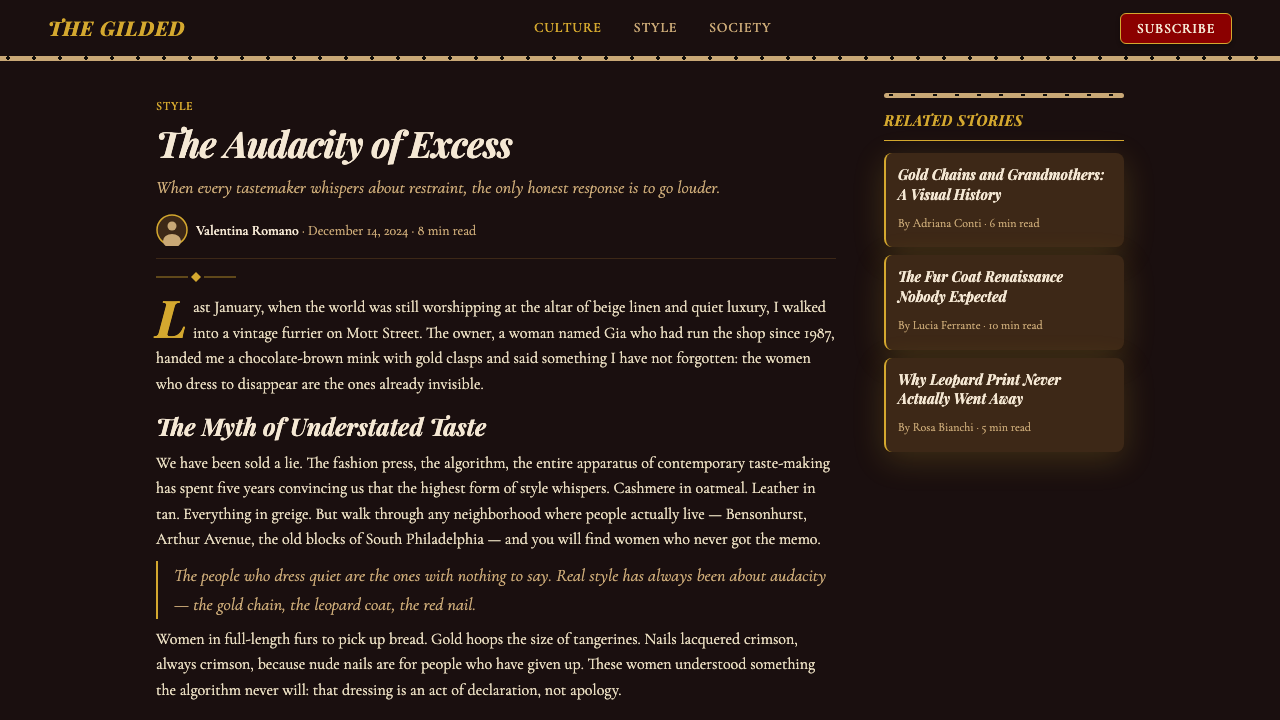
Photography in this aesthetic tends toward high-drama, low-key lighting — the kind of chiaroscuro that makes a woman in a fur coat look like a Renaissance portrait or a 1960s Italian film still. Shadows are used expressively rather than documentarily. Subjects are often photographed against dark, richly textured backgrounds. Post-processing favors warm color grading that deepens reds and golds while desaturating cooler tones. Close-cropped details — a jeweled hand, a flash of satin lining, a leopard-print cuff — function as visual luxe signals without requiring full-figure fashion photography.这套美学中的摄影倾向于戏剧性的低调打光——那种明暗对照法(chiaroscuro),让身着皮草大衣的女性看起来如同文艺复兴肖像画或1960年代意大利电影剧照。阴影是表现性的而非记录性的。拍摄对象往往以深邃、富有质感的背景衬托。后期处理偏向温暖的色彩调级,深化红色与金色,同时让较冷的色调退去饱和度。近裁剪的细节——一双戴满珠宝的手、一闪缎衬里、一截豹纹袖口——在不需要全身时装摄影的情况下,依然能作为视觉奢华信号有效传递。
Attitude and Register气场与语域
The emotional register of Mob Wife Aesthetic is confidence without apology. Copy and caption voice — when the design system extends to written content — tends toward direct, declarative, slightly theatrical. There is no hedging, no quiet understatement, no ironic self-deprecation. The tone is that of someone who arrived in a fur coat and is not taking it off. This attitudinal quality shapes decisions at every level: a headline is not a suggestion, it is an announcement; a price is not listed, it is displayed; a brand is not present, it is presiding.黑帮妻子美学的情感语域是毫不道歉的自信。文案与说明文字——当设计系统延伸至书写内容时——倾向于直接、陈述性、略带戏剧感。没有回旋,没有静默的轻描淡写,没有反讽式的自我调侃。语气是那种穿着皮草大衣进场、而且绝对不打算脱下来的人的语气。这种气场品质在每个层面塑造决策:标题不是建议,是公告;价格不是列出,是展示;品牌不是在场,是在主持。

See the Mob Wife Aesthetic design system查看 Mob Wife Aesthetic 完整设计系统
Who shaped Mob Wife Aesthetic?谁塑造了 Mob Wife Aesthetic?
The TikTok creator credited with naming and framing Mob Wife Aesthetic in January 2024. Trivieri's video positioned the style as a conscious counter-movement to Clean Girl minimalism, providing the critical vocabulary that allowed a diffuse visual sensibility to coalesce into a nameable, shareable, replicable aesthetic genre. Her role was less that of inventor than of articulator — giving language to a mood that had been building in adjacent corners of the internet. The naming moment transformed a loose cluster of visual references into a design system that brands, stylists, and creators could deliberately apply.TikTok创作者,于2024年1月命名并定义「黑帮妻子美学」。Trivieri的视频将这种风格定位为对「干净女孩」极简主义的自觉反运动,提供了关键词汇,使一种分散的视觉感性凝聚为一个可命名、可传播、可复制的美学类型。她的角色与其说是发明者,不如说是阐释者——为一种在互联网各个角落积累已久的情绪赋予了语言。这个命名时刻将一簇松散的视觉参照转化为一套品牌、造型师与创作者可以刻意应用的设计系统。
Falco's portrayal of Carmela Soprano in The Sopranos (1999–2007) is the single most cited visual reference for Mob Wife Aesthetic. Carmela — deeply religious, relentlessly domestic, and immaculately presented — embodied a particular vision of Italian-American feminine aspiration: designer suits, heavy gold jewelry, impeccable nails, and a home decorated with theatrical abundance. The production design of the Soprano household, combined with Falco's costuming across eight years of television, created an enduring visual archive that Mob Wife creators consistently return to as their primary source material.法尔科在《黑道家族》(1999—2007年)中对卡梅拉·索普拉诺的诠释,是「黑帮妻子美学」中被援引最多的单一视觉参照。卡梅拉——虔诚、顾家、衣着无可挑剔——体现了一种特定的意裔美国女性向往图景:设计师套装、沉甸甸的金饰、完美的指甲,以及以戏剧性丰盈装饰的家居。索普拉诺家的制作设计,加上法尔科八年电视生涯的服装造型,创造了一份持久的视觉档案,「黑帮妻子」创作者们持续将其作为首要素材来源。
Bracco's performance as Karen Hill in Martin Scorsese's Goodfellas (1990) provides the cinematic vocabulary for the Mob Wife Aesthetic's relationship to aspirational working-class luxury. Karen's wardrobe across the film — from the early dating scenes through the peak-prosperity sequences — traces an arc of accumulation that mirrors the aesthetic's own logic: more jewelry, more fur, more visible wealth, with each upgrade framed not as excess but as rightful arrival. The film's visual grammar of close-cropped luxe detail and chiaroscuro lighting is a recurring reference in Mob Wife editorial photography.布拉科在马丁·斯科塞斯《好家伙》(1990年)中对凯伦·希尔的演绎,为「黑帮妻子美学」与向往性工薪阶层奢华的关系提供了电影词汇。凯伦在整部影片中的服装造型——从早期约会场景到巅峰繁荣的段落——描绘了一条积累的弧线,与这套美学自身的逻辑相映成趣:更多珠宝、更多皮草、更多可见的财富,每一次升级都被定格为正当的到达,而非过度。影片中近裁剪奢华细节与明暗对照打光的视觉语法,是「黑帮妻子」编辑摄影中反复出现的参照。
Turturro's role as Janice Soprano in The Sopranos offers a complementary register within the aesthetic's reference universe — louder, more confrontational, and more overtly theatrical than Carmela's restrained version of the same tradition. Janice's styling pushed the leopard print, layered gold, and dramatic makeup toward their most maximalist expressions, making her character a particularly useful reference for design applications that want to reach the bolder end of the Mob Wife spectrum rather than its more polished, aspirational center.图尔图罗在《黑道家族》中饰演的贾妮丝·索普拉诺,在这套美学的参照宇宙中提供了一种互补的语域——比卡梅拉对同一传统更克制的版本更喧闹、更具对抗性、也更公然戏剧化。贾妮丝的造型将豹纹、叠戴金饰与戏剧性妆容推向了最极繁的表达,使她的角色成为那些希望触及「黑帮妻子」谱系更大胆一端——而非其更精致、更带向往感的中心——的设计应用的特别有用参照。
Though operating in a different context, Versace's design philosophy of the 1980s and 1990s is the nearest high-fashion parallel to Mob Wife Aesthetic's visual logic. Versace believed that beauty should announce itself — that gold, print, and dramatic silhouette were not guilty pleasures but confident declarations. The Versace Medusa emblem, the baroque print, the plunging neckline cut in silk — all express a value system in which visible luxury is virtue. Mob Wife Aesthetic, operating entirely outside haute couture, shares this fundamental premise: wealth and glamour are not things to be hidden.尽管活跃于不同语境,范思哲在1980至1990年代的设计哲学,是「黑帮妻子美学」视觉逻辑在高级时装领域最近似的对应物。范思哲相信美丽应当自我宣告——金色、印花与戏剧性廓形不是有罪的愉悦,而是自信的宣言。范思哲的美杜莎徽章、巴洛克印花、以丝绸裁出的深V领口——所有这些都表达了同一套价值体系:可见的奢华即美德。「黑帮妻子美学」在完全脱离高级定制语境的情况下,共享着这一根本前提:财富与魅力不是需要遮掩的东西。
How do you use Mob Wife Aesthetic today?今天怎么用 Mob Wife Aesthetic?
Mob Wife Aesthetic is among the most distinctive and directive styles available in contemporary design work, precisely because it has strong opinions about everything — surface, type, color, density, and attitude. Applying it well requires committing to its logic rather than borrowing its surface tokens. The system does not accommodate minimalist editing; reducing it to one or two elements while preserving a clean layout produces not a tasteful hybrid but an incoherent result. The question to ask is not which elements to include but how far into the logic to go.「黑帮妻子美学」是当代设计实践中最具特色与指向性的风格之一,恰恰是因为它对一切都有强烈主张——表面、字体、色彩、密度与气场。正确应用它,需要遵从它的逻辑,而非只借用其表面符号。这套系统不接纳极简化的编辑:在保留干净版面结构的同时只提取一两个元素,产生的不是品位融合,而是语义混乱。正确的问题不是「选哪些元素」,而是「要走多深进入这套逻辑」。
For presentation slides, the aesthetic delivers particular power on cover and section-break pages. A cover should be treated as a luxury poster: a deep jewel-toned or near-black background, a large Didone display headline in gold or cream, and at least one ornamental border or decorative framing element. Photography — if used — should be dramatically lit and tightly cropped to a face or detail rather than a wide scene. Content slides benefit from the same orientation but pulled back: a dark background with warm-toned text, a subtle texture or pattern at the background layer, and gold dividers or ornamental rules between sections rather than plain lines. Data slides should treat chart elements as graphic objects — bars in deep crimson or burnished gold against a near-black field — rather than the default pastels of presentation software.在演示文稿中,这套美学在封面页与章节分隔页上发挥最大效力。封面应被当作奢华海报处理:深邃的珠宝色调或近黑背景,以金色或奶油色呈现的大号Didone展示标题,以及至少一道装饰边框或华丽的框架元素。摄影(若使用)应戏剧性打光,紧裁至面部或细节,而非宽幅场景。内容页从相同基调出发但稍作收敛:深色背景配温暖色调文字,背景层铺以细腻质感或图案,段落之间以金色分割线或装饰横线取代普通线条。数据页应将图表元素作为图形对象处理——在近黑底面上以深酒红或磨砂金呈现柱条——而非演示软件默认的柔和色板。
For web interfaces, Mob Wife Aesthetic is most coherently applied to contexts where luxury positioning and cultural specificity are explicit goals: hospitality brands, high-end e-commerce, premium services, and editorial or cultural institutions. Dashboard and pricing page applications should anchor the background in deep, warm-toned darks, use gold or cream for primary text and pricing numbers, and reserve crimson or animal-print texture for accent and differentiation. Navigation should be typographic and bold — wordmarks set in Didone or similarly high-contrast serif, with ornamental separators between sections. Component shadows should be warm rather than cool-neutral, suggesting candlelight rather than fluorescent overhead.对于网页界面,「黑帮妻子美学」最连贯地适用于奢华定位与文化特异性是明确目标的场景:餐饮酒店品牌、高端电商、高级服务,以及编辑类或文化机构。仪表板与定价页面应以深邃温暖的暗色调锚定背景,以金色或奶油色承载主要文字与价格数字,将酒红或动物纹质感保留给强调与区分。导航应具字体性且大胆——以Didone或类似高对比度衬线体设置品牌文字,段落之间以装饰分隔符衔接。组件投影应偏暖而非冷中性,暗示烛光而非头顶荧光灯。
For editorial and marketing work, the style produces its strongest results in full-page or full-screen applications — situations where the density and richness of the system can breathe at scale. A Mob Wife editorial spread uses the full page as a surface: background texture extends to the edges, decorative borders frame the entire field, and the headline is set so large it becomes a compositional element as much as a textual one. Marketing pages work well with alternating full-width blocks — deep crimson with gold type, then near-black with cream text, with leopard or velvet texture underlying each — creating a rhythm of opulence that rewards sustained attention. Email design in this mode should commit fully to the dark palette and rich ornament; a single isolated Mob Wife element against a standard white email background will read as accidental rather than intentional.对于编辑与营销内容,这种风格在全页或全屏应用中产生最强效果——那种能让系统的密度与丰富感在足够尺度上自由呼吸的情景。「黑帮妻子」编辑跨页将整页作为表面:背景质感延伸至边缘,装饰边框框定整个版面,标题被设得如此之大,以至于它既是文本元素,也是构图元素。营销页面适合交替的全宽区块——深酒红底金色文字,继以近黑底奶油色文字,每块之下铺有豹纹或丝绒质感——制造出值得持续凝视的奢华节律。这种模式下的电子邮件设计应完全提交于深色色板与华丽装饰;将单个孤立的「黑帮妻子」元素置于标准白色邮件背景上,读起来是意外而非刻意。
The most common mistake when applying Mob Wife Aesthetic is treating it as a color choice rather than a system commitment. Adding gold typography to a clean, light-background layout does not produce a Mob Wife design — it produces a confused one. The style requires its surface richness, its typographic drama, and its ornamental confidence to operate together. A secondary error is over-literal reference: using fur-coat imagery and cigarette iconography as visual shorthand produces costume rather than design. The correct approach is to abstract the underlying values — unapologetic density, tactile richness, sculptural typography, declarative presence — and apply them as structural principles rather than as props from a specific era or setting.应用「黑帮妻子美学」时最常见的错误,是将其视为颜色选择而非系统承诺。在干净的浅色版面上添加金色字体,产生的不是「黑帮妻子」设计,而是一个语义混乱的设计。这种风格需要其表面丰富感、字体戏剧性与装饰自信共同运作。次要错误是过于字面的参照:使用皮草大衣图像和香烟图标作为视觉速记,产生的是戏装而非设计。正确做法是抽象出其底层价值——毫不道歉的密度、触觉上的丰富感、雕塑性字体与宣言式存在感——并将其作为结构性原则来应用,而非作为某个特定时代或环境的道具。
See the Mob Wife Aesthetic design system查看 Mob Wife Aesthetic 完整设计系统
Mob Wife Aesthetic — FAQMob Wife Aesthetic · 常见问题
Is Mob Wife Aesthetic just a trend, or does it have lasting design value?「黑帮妻子美学」只是一个潮流,还是具有持久的设计价值?
The naming is recent, but the underlying visual logic is not. The combination of dark jewel-toned grounds, gold ornament, high-contrast Didone typography, and rich surface texture has been a recurring mode in luxury design for over a century — appearing in Art Deco interiors, Italian fashion house identity, Hollywood golden-age poster design, and French perfume packaging. What the 2024 TikTok moment did was give a specific cultural framing and popular name to something with deep precedent. Designers who understand the style's historical depth can apply it well beyond the fashion moment that named it.这个命名是新近的,但其底层的视觉逻辑并不是。深邃珠宝色调底面、金色装饰、高对比度Didone排版与丰富表面质感的组合,作为奢华设计的一种反复出现的模式已存在超过一个世纪——出现在装饰艺术(Art Deco)室内、意大利时装品牌识别、好莱坞黄金时代海报设计与法国香水包装中。2024年TikTok时刻所做的,是为一件有深厚先例的事物赋予了特定的文化框架与大众化名称。理解这种风格历史深度的设计师,可以在为其命名的那场时尚风潮之外广泛应用它。
How do I keep Mob Wife Aesthetic from looking like a costume or parody?如何避免「黑帮妻子美学」看起来像戏装或戏谑?
The difference between authentic application and parody lies in structural commitment versus prop selection. Parody borrows the most recognizable surface tokens — leopard print, a fur-coat image, a gold script font — and places them in a design that is otherwise neutral or modern. The result reads as costume. Authentic application, by contrast, starts from the underlying values: unapologetic density, tactile surface richness, sculptural typography, declarative presence. Every element — background, type, ornament, photography — is chosen in service of those values. The leopard and fur may or may not appear; what must appear is the logic they represent.真实应用与戏谑之间的差异在于结构性承诺与道具选取之间的区别。戏谑借用最可辨识的表面符号——豹纹、皮草大衣图像、金色花体字——并将其置于一个其他方面保持中性或现代的设计中,结果读起来像戏装。真实应用则相反,从底层价值出发:毫不道歉的密度、触觉上的表面丰富感、雕塑性字体、宣言式存在感。每一个元素——背景、字体、装饰、摄影——都服务于这些价值的选择。豹纹与皮草可能出现也可能不出现;必须出现的是它们所代表的逻辑。
Can Mob Wife Aesthetic work on a light background?「黑帮妻子美学」能用在浅色背景上吗?
It can, but it requires care. The aesthetic's natural home is dark — deep crimson, near-black with warm undertones, richly textured backgrounds. A light-background variant is possible when the other system elements are fully committed: Didone typography at bold display scale, heavy gold ornamental borders, high-density composition, and rich photographic imagery. Cream or aged ivory reads better than pure white, as the warmth connects to the gold palette. Pure white backgrounds tend to strip the warmth from the gold and reduce the system to looking merely decorative rather than genuinely opulent. Think of a light variant as a daytime version of the same character — the jewelry is still on; the coat is draped over the chair.可以,但需要谨慎处理。这套美学的自然家园是深色——深酒红、带温暖底色的近黑、质感丰富的背景。当其他系统元素完全到位时,浅色背景变体是可行的:大胆展示尺度的Didone字体、厚重的金色装饰边框、高密度构图与丰富的摄影图像。奶油色或陈年象牙色比纯白读起来更好,因为其温度感与金色色板相连。纯白背景容易剥去金色的温度,使整套系统看起来仅仅是装饰性的,而非真正奢华的。可以把浅色变体想象成同一个角色的白天版本——珠宝仍然戴着;皮草大衣搭在椅背上。
How does Mob Wife Aesthetic differ from Art Deco?「黑帮妻子美学」与装饰艺术(Art Deco)有何不同?
They share visual ancestry — both use gold ornament, jewel-toned palettes, high-contrast typography, and a commitment to surface richness. The key differences are in geometry, source culture, and emotional register. Art Deco is rigidly geometric: its ornament is based on chevrons, sunbursts, stepped forms, and angular symmetry. Mob Wife Aesthetic's ornament is more organic — cartouche curves, leopard-print organic randomness, fur texture — and asymmetry is felt rather than architecturally constructed. Art Deco also has a coolness: it is glamour that has been resolved into order. Mob Wife Aesthetic is glamour that refuses order — the gold is layered, not arranged; the texture is abundant, not curated.两者共享视觉渊源——都使用金色装饰、珠宝色调、高对比度排版,以及对表面丰富感的承诺。关键差异在于几何感、源文化与情感语域。装饰艺术是严格几何化的:其装饰基于人字形、旭日纹、阶梯形与棱角分明的对称。「黑帮妻子美学」的装饰更有机——卡纸徽章的曲线、豹纹的有机随机性、皮草质感——非对称感是被感受到的,而非建筑性地构建出来的。装饰艺术也带有一种冷静:它是已被解析为秩序的魅力。「黑帮妻子美学」是拒绝秩序的魅力——金色是叠加的,不是排列的;质感是充盈的,不是精选的。
Are there contexts where Mob Wife Aesthetic is clearly the wrong choice?有没有「黑帮妻子美学」明显不适用的场景?
Several. The style struggles in contexts where simplicity, clinical clarity, or institutional neutrality are core values: healthcare interfaces, financial tools that emphasize analytical transparency, government or civic communications, and children's educational products. It also works against brands whose equity depends on restraint — any positioning built on the idea that quality speaks quietly will be undercut by a system that insists quality should shout. Finally, accessibility considerations place real limits: the dark, richly layered surfaces with fine ornamental detail can reduce legibility at standard text sizes, and the dense, high-contrast compositions can cause difficulty for users with visual processing differences. These are solvable but require deliberate effort rather than assuming the style's defaults will accommodate all users.确实存在。这种风格在以简洁、临床清晰度或机构中立性为核心价值的场景中表现吃力:医疗界面、强调分析透明度的金融工具、政府或公民传播,以及儿童教育产品。它也对抗那些品牌资产依赖于克制的品牌——任何以「品质静静言说」为定位构建的形象,都会被一套坚持「品质应当高声呼喊」的系统所削弱。最后,无障碍访问的考量带来真实限制:深色、层次丰富的表面与精细的装饰细节会降低标准字号文字的可读性,而密集的高对比度构图可能给有视觉处理差异的用户带来困难。这些问题可以解决,但需要刻意努力,而非假设这种风格的默认设定能容纳所有用户。
Related design styles相关设计风格
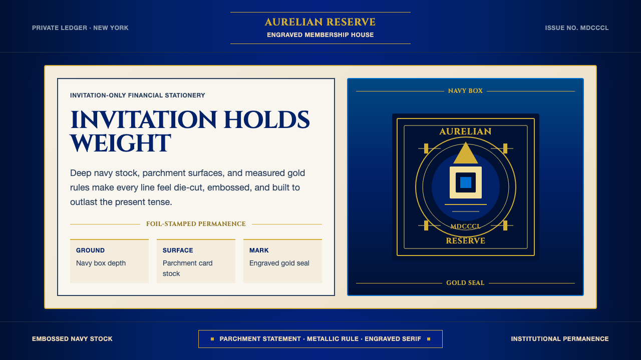 American Express CenturionInstitutional luxury. Deep navy, parchment panels, and gold rules feel engrav…机构级奢华:深海军蓝、羊皮纸面与金线呈现雕版质感。
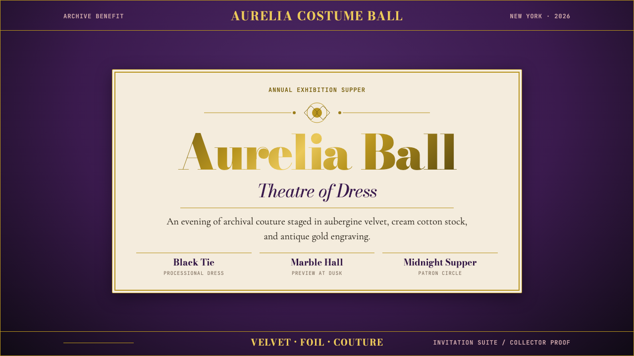 Met GalaTheatrical reverence. Aubergine velvet, cream stock, and Bodoni gold foil fra…戏剧化的敬意:茄紫天鹅绒、奶油纸与金箔 Bodoni 围合仪式感。
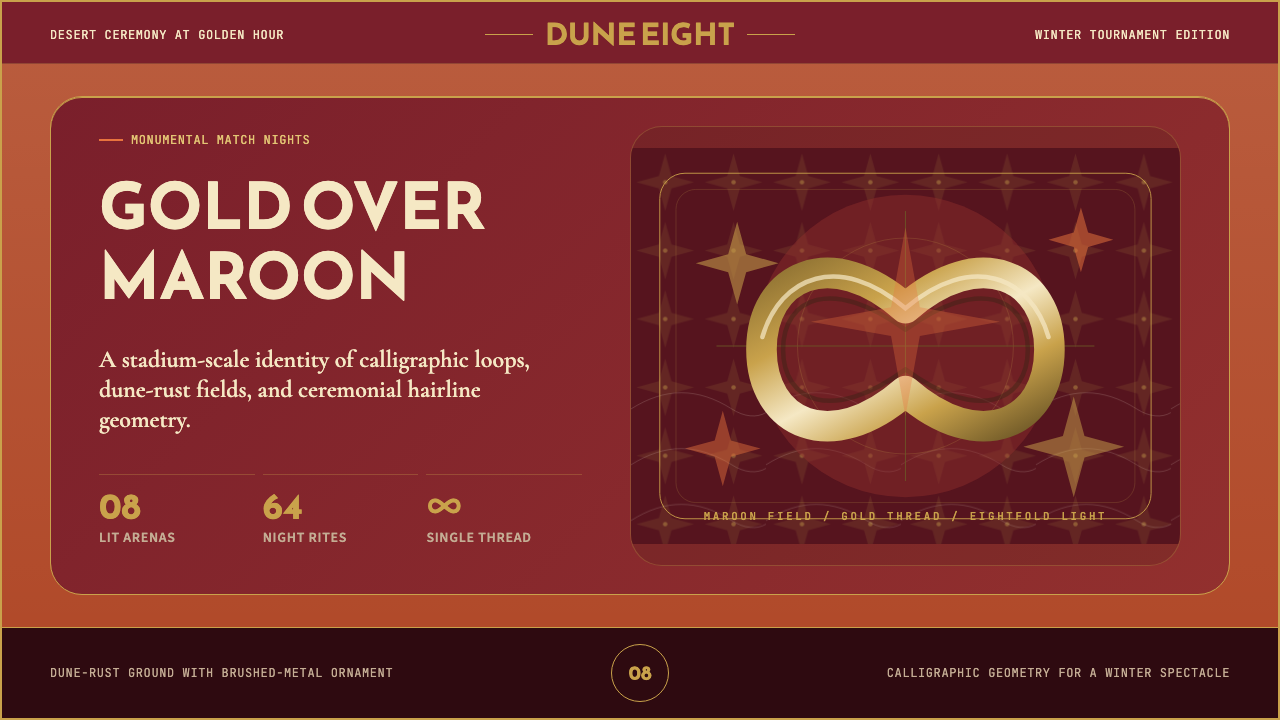 Qatar World Cup 2022Desert spectacle in gold. Maroon fields, Reem Kufi scale, and eightfold star…金色沙漠盛典。栗色场域、Reem Kufi巨字与八角星几何。
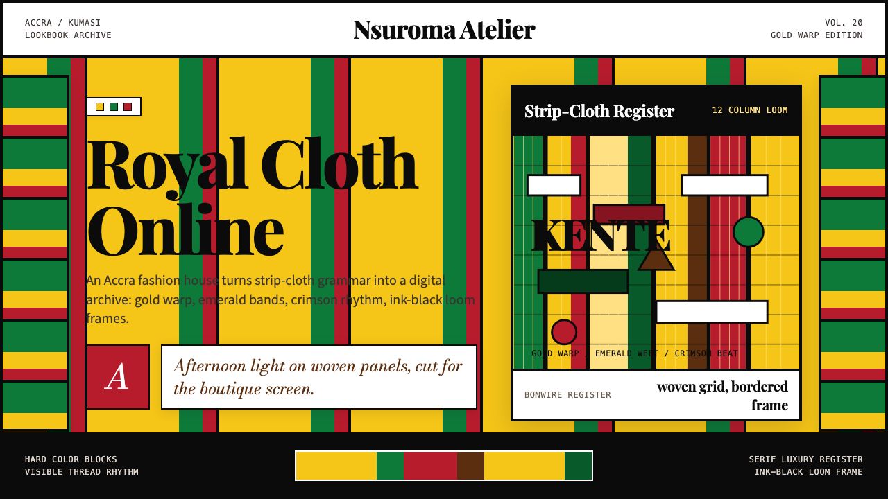 Ghana Kente Fashion 2020Royal cloth, digitized. Kente-gold grid, emerald bands, crimson stripes, seri…王室织布数字化:肯特金网格、翡翠绿带与绯红条纹托起衬线权威。
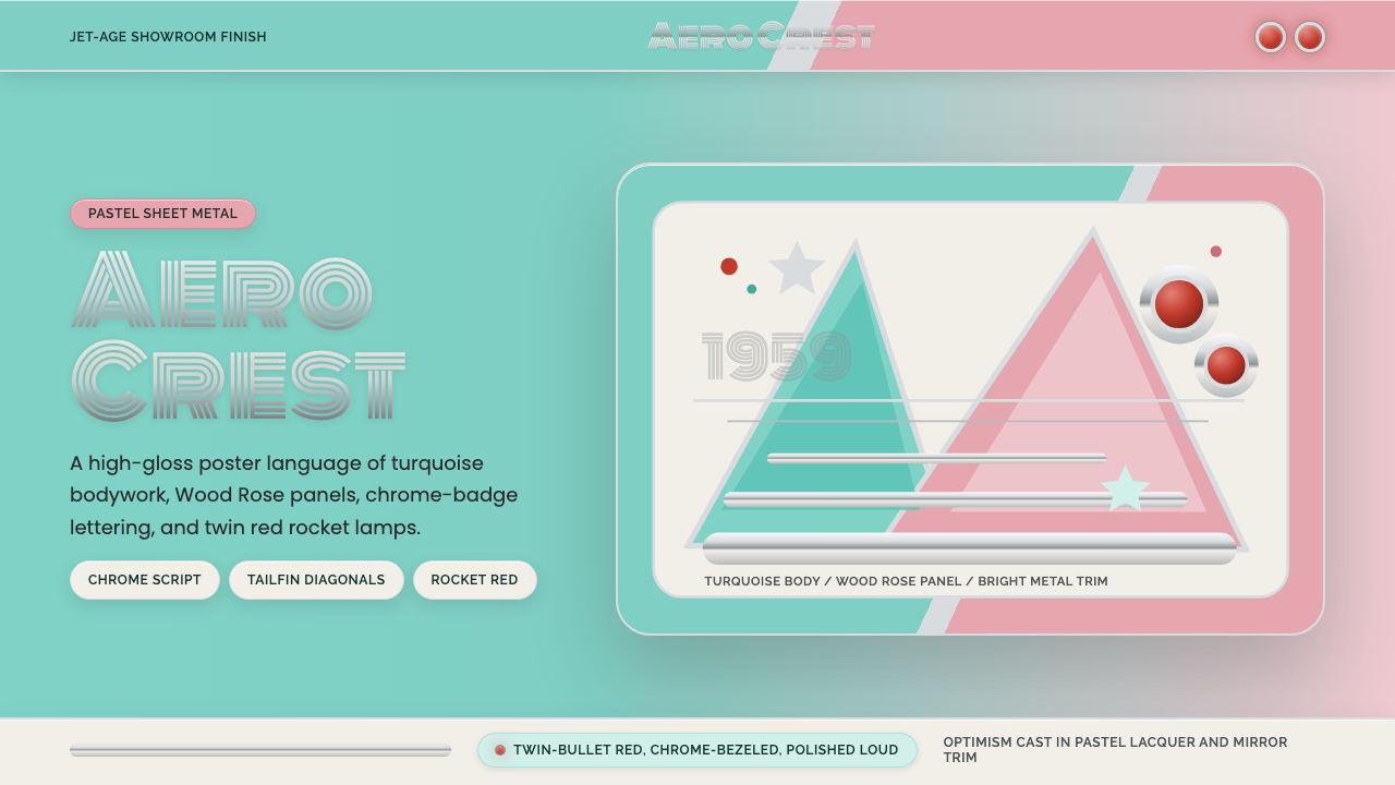 Cadillac TailfinShowroom optimism. Pastel aqua, Wood Rose panels, chrome Monoton, and rocket…展厅式乐观:湖绿粉彩、玫瑰木粉、镀铬 Monoton 与火箭红点。
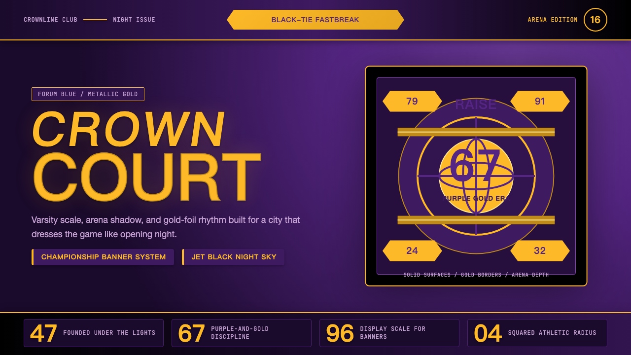 Los Angeles LakersShowtime royalty. Forum Blue and metallic gold turn varsity type into arena g…Showtime 王权:论坛蓝与金属金,让校队字型化作球馆魅力。