What is American Express Centurion?什么是 American Express Centurion?
American Express Centurion translates 170 years of institutional financial prestige into a visual language of deep navy, engraved serif letterforms, and metallic gold — a system that feels stamped and embossed rather than designed on screen.美国运通百夫长将170年机构金融声望凝练为深邃海军蓝、雕版衬线字体与金属金色的视觉语言——每一个界面都像是烫印与压凹而成,而非在屏幕上渲染。
American Express Centurion in briefAmerican Express Centurion 速览
American Express Centurion is a luxury financial design system rooted in the visual grammar of nineteenth-century engraving, bank note typography, and prestige correspondence. Its defining palette — a deep, authoritative navy offset by parchment-warm panels and thin gold rules — reads as permanent rather than fashionable. Every surface within the system carries the implied tactile weight of embossed card stock, hot-stamped seals, and formally printed statement paper.美国运通百夫长是一套植根于十九世纪雕版印刷、钞票排印与正式往来信函视觉语法的奢华金融设计系统。其核心色板——以羊皮纸暖调面板与细金线衬托的深邃、权威海军蓝——传递一种恒久感而非流行感。系统中的每一个界面都隐含着压印卡纸、烫金印章与正式印制对账单的触觉重量。
The visual identity pivots on two anchors: the Blue Box, a precise square enclosure that signals institutional containment and order, and the helmeted Centurion gladiator portrait, a heraldic symbol of enduring authority. These marks resist the restlessness of contemporary brand refreshes. They are meant to communicate that the institution existed before the viewer was born and will persist after — a quality sometimes called permanence signaling, and one that luxury financial brands prize above novelty.整套视觉识别围绕两个锚点旋转:蓝色方盒(Blue Box)——一个传递机构秩序与边界感的精准正方形——以及头戴头盔的百夫长角斗士剪影,一个宣示恒久权威的纹章式符号。这两个标志抵抗当代品牌焕新的浮躁冲动,意在传达:这家机构在观者出生之前便已存在,在观者身后仍将延续——这种品质有时被称为「永久性信号」,是奢华金融品牌最为珍视的属性,胜过一切新颖感。
What distinguishes this system from generic luxury design is specificity of reference. The aesthetic deliberately cites engraved banknotes, copper-plate invitation printing, and classical Roman iconography rather than the glossy minimalism favored by consumer fintech. The result is a design language that earns trust by looking expensive in an older, more credentialed sense of the word — less about visual freshness and more about institutional depth.使该系统有别于泛化奢华设计的,是其参照的高度具体性。这套美学刻意援引雕版钞票、铜版请柬印刷与古典罗马图像志,而非消费金融科技惯用的光滑极简主义。结果是一套靠「昂贵感」赢得信任的设计语言——这种昂贵感是更古老、更有资历意义上的昂贵,更多关乎机构纵深,而非视觉新鲜。
See the American Express Centurion design system查看 American Express Centurion 完整设计系统
Where does American Express Centurion come from?American Express Centurion 从何而来?
American Express was founded in 1850 in Buffalo, New York, by Henry Wells, William Fargo, and John Butterfield as an express mail and package delivery company — a rival to the U.S. Post Office in an era when private courier services competed openly. The company's first financial product, the American Express Money Order (1882), was itself a trust artifact: a printed document whose value depended entirely on the institution's reputation for reliability. This origin in guaranteed paper instruments — documents whose authority derived from the issuing body rather than the bearer — is embedded in the visual culture the brand would later develop.美国运通由亨利·威尔斯、威廉·法戈与约翰·巴特菲尔德于1850年在纽约州水牛城创立,最初是一家快递与包裹递送公司——在私人快递机构公开竞争邮政业务的年代,它是美国邮政的劲敌。公司的第一款金融产品——美国运通汇票(1882年)——本身就是一种信任制品:一张印刷文件,其价值完全依赖于发行机构的可信声誉。这种起源于担保纸质凭证的历史——文件的权威来自发行机构而非持有人——深深嵌入了品牌日后发展的视觉文化之中。
The charge card launched in 1958 introduced the now-iconic Green Card and established American Express as a financial services company rather than a courier. The brand's visual identity in this period was functional but unremarkable. The transformation came in the early 1960s when the company engaged the San Francisco design firm Landor Associates. Landor refined the Centurion figure — a profile portrait of a helmeted Roman soldier — and established the Blue Box as the primary mark. The choice of a Roman centurion was deliberate: Roman imagery in mid-century American financial culture connoted discipline, legal authority, and civilizational permanence. The blue square framing it imposed geometric order on heraldic symbolism.1958年推出的记账卡引入了如今标志性的绿卡,使美国运通从快递公司转型为金融服务机构。这一时期品牌的视觉识别实用却平平无奇。真正的转变发生在1960年代初,当公司委托旧金山的朗涛设计顾问公司(Landor Associates)进行品牌梳理。朗涛精炼了百夫长形象——一个头戴头盔的罗马士兵侧面剪影——并确立蓝色方盒为核心标志。选择罗马百夫长并非偶然:在二十世纪中叶的美国金融文化中,罗马意象意味着纪律、法律权威与文明的永恒感。蓝色方形框架则将几何秩序强加于纹章符号之上。
The Centurion Card itself — the legendary black card with no spending limit issued by invitation only — launched in the United Kingdom in 1999 and in the United States in 2000. The card's existence had been rumored for years before its formal release; cardholders passing the physical object across a table generated the kind of status theater that no advertising campaign could replicate. This mythology became inseparable from the visual identity: the system had to look worthy of the object's reputation, and so the design language doubled down on materiality, engraved texture, and gold.百夫长卡本身——那张无消费上限、仅凭邀请持有的传奇黑卡——于1999年在英国、2000年在美国正式推出。这张卡的存在被传言多年,早于正式发行;持卡人将实体卡片横置于桌面的动作,所制造的身份剧场是任何广告活动都无法复制的。这种神话叙事与视觉识别相互融合:整套设计系统必须在视觉上配得上实体的声誉,于是设计语言在质感、雕刻纹理与金色上更加坚定地加码。
The subsequent evolution of the visual identity, including significant work by Pentagram in the 2010s and ongoing refinements through the early 2020s, modernized the system for digital environments without abandoning its core grammar. The challenge was translating embossed card stock and hot-stamped gold foil — inherently physical sensations — into screen-based surfaces. The solution was to treat texture and material quality as atmospheric references rather than literal simulations: a color palette that implies metal without using gradients, a typographic hierarchy that implies engraving without being illegible on screen, and a compositional logic that implies formal print layout without being rigid on responsive displays.此后的视觉识别演进——包括Pentagram在2010年代的重要操刀,以及2020年代初期的持续精炼——在不放弃核心语法的前提下,将系统现代化以适应数字环境。挑战在于如何将压印卡纸与烫金箔这些本质上属于物理感知的体验转译至屏幕界面。解决方案是将质感与材质品质作为氛围参照而非字面模拟:一套暗示金属感而不依赖渐变的色板,一套暗示雕刻质感而在屏幕上仍清晰可读的排印层级,以及一套暗示正式印刷版式而在响应式界面上不失灵活的构图逻辑。
What defines the American Express Centurion look?American Express Centurion 的视觉特征是什么?
Color Palette色板
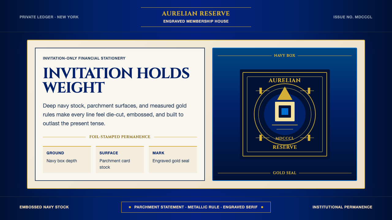
The system is anchored by a deep, saturated navy that reads as institutional and permanent rather than digital or fashionable. Against this ground, parchment-toned panels introduce warmth without softness — the warmth of aged paper and formal stationery rather than the warmth of hospitality brands. Metallic gold, applied as a thin rule, border, or accent element, completes the triad: it is used sparingly as a premium signal, never as a background fill. The combination deliberately evokes the visual register of engraved invitations, bank certificates, and diplomatic correspondence.系统以一种深邃、饱和的海军蓝为锚定色,传递机构的恒久感而非数字感或时尚感。在这一底色之上,羊皮纸调色块引入温度而非柔软——那是陈年纸张与正式信笺的温度,而非款待型品牌的暖意。金属金色以细线、边框或点缀元素的形式出现,构成三元组的第三角:它被节制地用作高端信号,从不用作背景填充。三者的组合刻意唤起雕版请柬、银行证书与外交信函的视觉语域。
Typography字体排印
Engraved serif letterforms sit at the core of the typographic system. The serifs are fine and formal — the kind associated with copper-plate printing and formal proclamation documents — rather than the humanist serifs of editorial publishing or the geometric serifs of modernist revivals. Headline type is set with generous letterspacing, evoking the deliberate pace of formal engraving. Body text is dense and compact, as if economizing on precious paper. Scale contrast is pronounced: a principal headline commands its field through sheer size and weight, while supporting copy recedes to secondary hierarchy without color differentiation.雕版衬线字体是排印系统的核心。这里的衬线细而正式——是铜版印刷与正式公告文件所关联的那种衬线——而非编辑出版业所用的人文主义衬线,也非现代主义复兴风格的几何衬线。标题字体以充裕的字距排列,唤起正式雕刻那种沉稳的节奏感。正文紧密而紧凑,仿佛在名贵纸张上精打细算。尺度对比鲜明:主标题以纯粹的字号与字重统辖视野,辅助文字退至次级层级,无需色彩区分。
Gold Rule and Border Work金线与边框
Thin gold rules — horizontal lines, border frames, and dividing elements — serve as the system's primary structural device. They are characteristically hairline-thin: fine enough to suggest the precision of engraved printing rather than the bluntness of digital decoration. A gold border enclosing a text block transforms a screen element into something that reads like a formal enclosure or certificate panel. Used consistently, these rules create a sense of architectural framing — each section of a layout is not merely positioned but formally declared.细金线——水平线、边框与分割元素——是系统最主要的结构手段。它们特征性地纤细如发丝:细到足以暗示雕版印刷的精度,而非数字装饰的粗钝感。一道金色边框将文字区块围合,使屏幕元素转变为读起来像正式信封或证书面板的存在。持续使用之下,这些线条营造出建筑式的框架感——版面中的每一个区块不仅仅是被定位,而是被正式宣示。
Centurion Heraldry百夫长纹章
The helmeted Centurion portrait functions as a heraldic emblem rather than a logo in the contemporary sense. It is rendered as a flat silhouette or profile rather than a detailed illustration — close in logic to the cameos and intaglios of classical antiquity, where recognizable profile portraits carried authority across coin and seal. When applied at large scale, the Centurion anchors a composition with symbolic weight. When reduced to its smallest reproduction size, it retains legibility as a silhouette, which is characteristic of well-designed heraldic marks across centuries of formal identity practice.头戴头盔的百夫长剪像作为纹章徽记而非当代意义上的标志发挥功能。它以平面剪影或侧面像的形式呈现,而非精细插画——逻辑上接近古典时代的浮雕与凹雕,在那里,可辨识的侧面像在硬币与印章上承载权威。大尺寸运用时,百夫长以象征性的重量锚定构图;缩至最小复制尺寸时,它仍作为剪影保持清晰——这是历经数百年正式识别实践的优良纹章设计的典型特质。
Engraved Texture Atmosphere雕版质感氛围
Rather than using literal texture overlays or skeuomorphic surfaces, the system implies physical engraving through compositional choices: compressed spacing, deliberate geometric framing, and the consistent application of hairline rules that read as if incised rather than rendered. This atmospheric approach to texture means the design works equally well in print and on screen without requiring different treatments for different media. The engraved quality is an attitude rather than an effect — a restraint and precision in every element that collectively produces the sensation of something labored over rather than quickly produced.系统并非通过字面的纹理叠加或拟物化界面来呈现质感,而是通过构图选择暗示物理雕刻:压缩的间距、刻意的几何框架,以及持续使用的发丝细线——读起来像是刻凿而非渲染。这种对质感的氛围性处理方式意味着设计在印刷与屏幕两种媒介上同样有效,无需针对不同媒介进行不同处理。雕版质感是一种态度而非一种效果——每个元素的克制与精准,共同产生某种经过深思熟虑而非匆忙生产的感觉。
Composition and White Space构图与留白
Layouts are formal and centered or near-centered, contrasting with the asymmetric dynamism of Bauhaus or Swiss International Style. The formality references classical document design: a centered title, a formal border, a signature field at the base. White space and parchment space are used generously, but not in the open, airy manner of contemporary minimalism — rather in the way that formal paper documents preserve margins as marks of seriousness and quality. Every element earns its position through hierarchy, not through visual energy.版面正式且居中或近居中,与包豪斯或瑞士国际主义风格的非对称动感形成对比。这种正式感援引经典文件设计:居中标题、正式边框、底部签名区。白色空间与羊皮纸空间被慷慨使用,但并非当代极简主义那种开放通透的方式——而更像正式纸质文件以边距彰显严肃性与品质的方式。每一个元素通过层级而非视觉能量来赢得其所在位置。
Dark Mode as Default Register深色模式作为默认基调
Unlike most design systems where dark mode is an optional inversion, the Centurion system treats deep navy as its primary ground — the canonical reading experience is light on dark rather than dark on light. Parchment type and gold rules read as illuminated against the navy field, producing a quality closer to candlelit formal correspondence than to digital screen text. This default dark register reinforces the premium signal: dark backgrounds in physical contexts (velvet card boxes, black card surfaces, dark-lined envelopes) have long been associated with luxury packaging.与大多数将深色模式视为可选反转的设计系统不同,百夫长系统将深邃海军蓝作为首要底色——标准阅读体验是深底浅字,而非浅底深字。羊皮纸字色与金色线条在海军蓝底面上如被照亮,产生一种接近烛光正式信函而非数字屏幕文字的质感。这种默认深色基调强化了高端信号:在实体语境中(丝绒卡片盒、黑色卡面、深色内衬信封),深色背景与奢华包装的关联由来已久。
See the American Express Centurion design system查看 American Express Centurion 完整设计系统
Who shaped American Express Centurion?谁塑造了 American Express Centurion?
Wells co-founded American Express in 1850 and served as its first president. His background in express freight and the western expansion of commerce established the company's foundational identity as a trustworthy guarantor of value in transit — a premise that would later transfer seamlessly to financial instruments. Wells also co-founded Wells Fargo in the same year, demonstrating an instinct for building institutional credibility at scale. The documentary and contractual culture of early American Express — the signed money order, the guaranteed delivery receipt — planted the seeds of the brand's later visual grammar of formality and permanence.威尔斯于1850年共同创立美国运通并出任首任总裁。他在快递货运与西部商业扩张领域的背景,确立了公司作为可靠价值传递担保人的根本身份——这一前提后来无缝转移至金融票据领域。威尔斯同年还共同创立了富国银行,展现出在规模上构建机构公信力的直觉。早期美国运通的文件与合同文化——签名汇票、保证交付收据——为品牌日后发展出的正式感与恒久感视觉语法埋下了种子。
William Fargo, co-founder of American Express, brought the operational discipline of the express freight business to the company's early structure. His tenure helped establish American Express as a nationwide network of reliable agents, each operating under the authority of the central institution. This federated trust model — where local agents represented and reinforced the central brand — established a kind of distributed prestige that later design systems would need to encode visually. The institutional marks, borders, and formal typography that would come to define American Express's visual identity are in part visual solutions to the problem of signaling consistent authority across geographies.美国运通联合创始人威廉·法戈将快递货运业务的运营纪律带入公司早期架构。他任职期间帮助将美国运通建立为全国性的可靠代理人网络,每位代理在中央机构权威的授权下运营。这种联合信任模式——本地代理人代表并强化中央品牌——确立了一种分布式声望,日后的设计系统需要在视觉上将其编码。那些最终定义美国运通视觉识别的机构标志、边框与正式排印,在一定程度上正是解决如何跨地域一致传递权威感这一问题的视觉方案。
Walter Landor, founder of Landor Associates, is the designer most responsible for establishing the visual grammar of American Express as it is recognized today. Working with the company in the early 1960s, Landor refined the Centurion figure into a precise, reproducible silhouette and established the Blue Box as the enclosing mark. Landor's methodology — treating brand identity as a system of interrelated elements rather than a single mark — gave American Express a visual language capable of expanding across cards, checks, traveler's cheques, correspondence, and eventually digital interfaces. The Centurion portrait's longevity across six decades is itself a testament to the quality of the original design decision.朗涛设计顾问创始人沃尔特·朗涛,是最终确立今日所认知的美国运通视觉语法的设计师。1960年代初与公司合作期间,朗涛将百夫长形象精炼为一个精准、可复制的剪影,并确立蓝色方盒为围合标志。朗涛的方法论——将品牌识别视为相互关联元素的系统而非单一标志——赋予美国运通一套能够跨越信用卡、支票、旅行支票、信函乃至最终数字界面扩展的视觉语言。百夫长剪像历经六十余年的持久生命力,本身就是最初设计决策质量的明证。
Pentagram, the international design partnership, has undertaken significant identity work for American Express in the contemporary period, particularly in adapting the brand's visual language for digital environments and premium card programs. Their challenge was to preserve the institutional weight and tactile references of a system built for physical media while making it function on screens, in apps, and across the full spectrum of digital customer touchpoints. Pentagram's work demonstrates the difficulty and the discipline of evolving a prestige brand identity without diluting the qualities — formality, permanence, material richness — that make it valuable in the first place.国际设计合伙机构Pentagram在当代时期为美国运通承担了重要的识别工作,尤其是将品牌视觉语言适配至数字环境与高端卡片项目。他们面临的挑战是:在为物理媒介建立的系统中,保留机构分量与触觉参照,同时使其在屏幕、应用程序以及完整数字客户触点范围内有效运作。Pentagram的工作揭示了在不稀释声誉品牌识别核心价值的前提下演进它的难度与自律——那些使其有价值的品质:正式感、恒久感、材质丰富性。
The Centurion Card — colloquially known as the Black Card — was not designed by a single named designer but emerged from the accumulated mythology around American Express's most exclusive product tier. Its launch in 1999 required the design team to create a physical artifact that could live up to years of rumor and aspiration. The solution was radical material restraint: a card made of anodized titanium (later transitioning to other premium materials), virtually blank except for the embossed Centurion figure and the minimum required text. The card's design teaches a lesson that the broader visual system learned well — that conspicuous absence of decoration is itself the most powerful luxury signal.百夫长卡——俗称黑卡——并非出自某位具名设计师之手,而是从围绕美国运通最顶级产品层级积累多年的神话叙事中生长而来。1999年发行时,设计团队需要创造一件能够承载多年传言与憧憬的实体制品。解决方案是彻底的材质克制:一张阳极氧化钛金属卡(后转换为其他高端材质),几乎空白,仅有压印的百夫长剪像与最少量的必要文字。这张卡的设计教给了更广泛的视觉系统一个它吸收得很好的教训——刻意缺失装饰本身,就是最强大的奢华信号。
How do you use American Express Centurion today?今天怎么用 American Express Centurion?
The American Express Centurion system is most effective when applied to contexts where institutional authority, exclusivity, and long-term trust are the primary values to communicate. This is a narrower brief than many design systems: it is not appropriate for brands seeking approachability, warmth, or technological progressiveness. Where it excels — luxury financial services, premium membership programs, high-value professional services, private banking communications, and any context positioning itself as the credentialed option in a crowded market — it excels precisely because it refuses the visual strategies of every other category.美国运通百夫长系统在机构权威、排他性与长期信任是首要传达价值的场景中最为有效。这比许多设计系统更为具体的定位:它不适合寻求亲和力、温度感或技术进步性的品牌。它所擅长的领域——奢华金融服务、高端会员计划、高价值专业服务、私人银行传播,以及任何在拥挤市场中将自身定位为有资质选项的场景——正是因为它拒绝了所有其他品类的视觉策略,才能在这些领域卓越发挥。
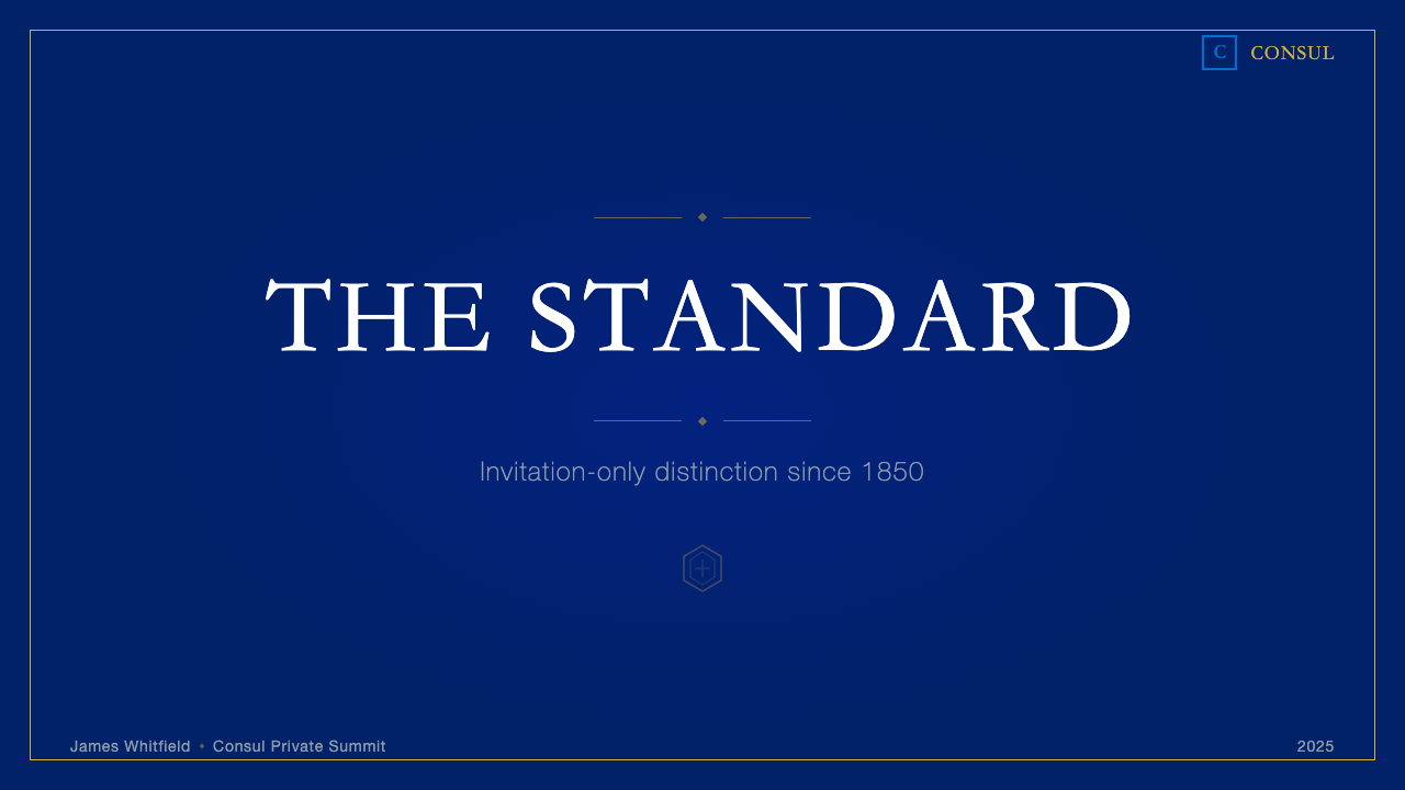
For presentation slides, the system rewards commitment. A cover slide built on deep navy with parchment-toned headline type and a gold rule beneath the title produces a distinctively formal opening — appropriate for a high-stakes pitch or a premium product reveal, less appropriate for a casual internal review. Content slides should treat the gold rule as the single decorative element: one horizontal line can demarcate sections without introducing visual clutter. Data visualizations adopt the palette's logic — navy backgrounds, gold or parchment data series, with navy-on-parchment or reversed treatments for emphasis. The engraved-serif typographic hierarchy should be maintained consistently across all slides, resisting the temptation to introduce friendlier sans-serif type for subheadings.在演示文稿中,这套系统回报承诺。一张以深海军蓝为底、羊皮纸调标题字、标题下方一道金线的封面幻灯片,营造出显著正式的开场——适合高风险商业提案或高端产品发布,不适合随意的内部评审。内容页应将金线作为唯一装饰元素:一条水平线足以划分章节而不引入视觉杂乱。数据可视化采用色板逻辑——海军蓝背景,金色或羊皮纸调数据系列,以海军蓝底羊皮纸字或反色处理作强调。雕版衬线字体的排印层级应在所有幻灯片中保持一致,抵制为副标题引入更具亲和力的无衬线字体的诱惑。
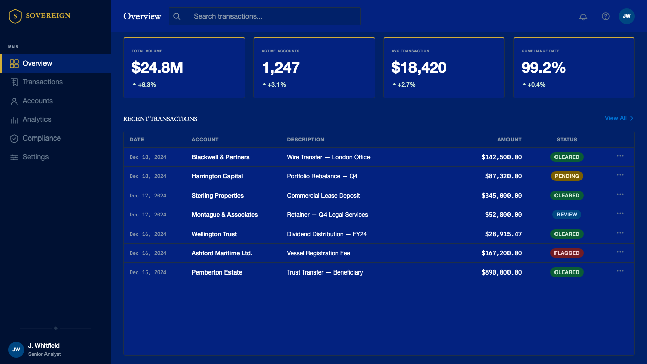
For web interfaces, the system maps well onto premium dashboard experiences, private client portals, and exclusive membership landing pages. The approach: establish deep navy as the primary surface color, use parchment-toned text and interface elements for primary content, and deploy gold rules as architectural dividers between page sections. Card components should have defined borders rather than soft shadows — the border is structural, not decorative. Navigation typography should be formal and letterspaced rather than compact and approachable. Call-to-action elements work best in parchment or gold against the navy ground, never in a bright contrasting accent color that would break the tonal unity. For pricing and tier comparison pages, the system's association with exclusivity makes it powerful: the highest tier naturally reads as the canonical option when the surrounding design language suggests institutional gravity.在网页界面上,系统与高端仪表板体验、私人客户门户及独享会员落地页的匹配度最高。方法如下:以深海军蓝为首要界面色,以羊皮纸调文字与界面元素承载主要内容,以金线作为页面分区的建筑式分割线。卡片组件应有明确边框而非柔和阴影——边框是结构性的,而非装饰性的。导航排印应正式且有充裕字距,而非紧凑且平易近人。行动号召元素在海军蓝底面上以羊皮纸色或金色呈现效果最佳,绝不使用会破坏色调统一的明亮对比色。对于定价与等级比较页面,系统与排他性的天然关联使其尤为有力:当周围设计语言传递机构重量感时,最高等级自然被读取为标准选项。
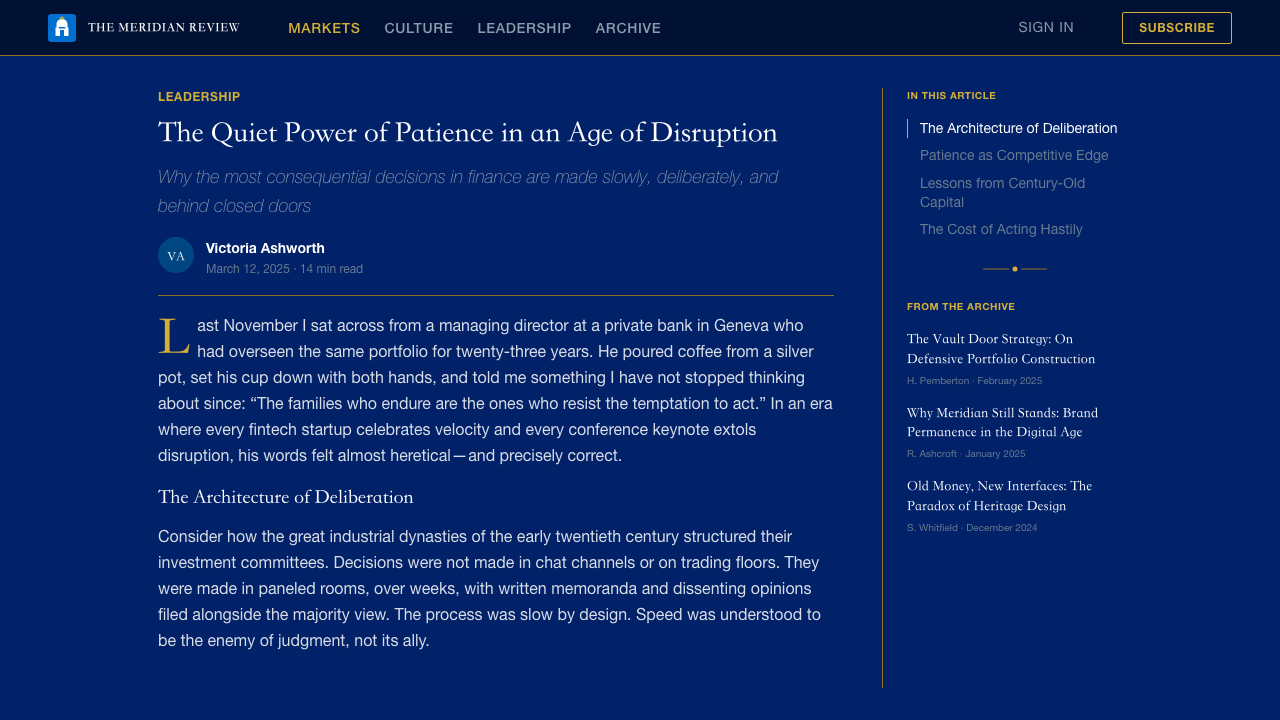
For editorial and marketing work — luxury brand campaigns, annual reports, premium service brochures, and invitation-format communications — the system's roots in formal print culture give it particular authority. Editorial layouts should use a formal column structure with generous margins, body text set in engraved serif at a reading-comfortable size, and section openers treated as formal announcements with generous leading and centered or near-centered alignment. Headlines deserve their own field — not competing with imagery but framed by it. Marketing materials translate the card's material restraint into print: a full bleed navy background, a single centered Centurion mark, and minimal text set in gold or parchment against the dark ground. This approach works for printed invitations, events signage, and packaging inserts.对于编辑与营销内容——奢华品牌活动、年度报告、高端服务宣传册与请柬形式的传播——系统植根于正式印刷文化的渊源赋予它特别的权威感。编辑版面应采用正式列式结构,留有充裕边距,正文以阅读舒适尺寸的雕版衬线体排列,章节开头作为正式声明处理,给予充裕行距与居中或近居中对齐。标题值得拥有独立的视野——不与图像竞争,而是被图像框托。营销物料将卡片的材质克制转译至印刷:满版海军蓝底,单一居中的百夫长标志,以金色或羊皮纸色在深色底面上排列最少量的文字。这种方式适用于印刷请柬、活动指引牌与包装内页。
A common mistake when applying this system is treating the gold as a primary color and using it at full coverage for backgrounds, large blocks, or extended text. Gold in the Centurion system is an accent and structural element — it reads as precious precisely because it is scarce. Covering a large surface in gold produces the opposite of the intended luxury effect, reading as ostentatious rather than restrained. A related error is mixing the Centurion aesthetic with contemporary fintech visual conventions — flat illustration, rounded sans-serif type, bright accent colors, or casual photography — which produces a tonal incoherence that undermines both styles. Applying this system requires wholesale commitment to its formal vocabulary; selective borrowing of individual elements weakens the institutional authority the system is designed to project.应用这套系统时最常见的错误,是将金色视为主色并大面积用于背景、大色块或长段文字。百夫长系统中的金色是强调与结构性元素——正是因为稀少才读起来珍贵。大面积金色覆盖产生与预期奢华效果相反的结果,读起来是炫耀而非克制。一个相关错误是将百夫长美学与当代金融科技的视觉惯例混用——扁平插画、圆角无衬线字体、明亮强调色或随意摄影风格——产生破坏两种风格的音调不一致感。应用这套系统需要对其正式词汇的全盘承诺;选择性借用个别元素会削弱系统设计用于传递的机构权威感。
See the American Express Centurion design system查看 American Express Centurion 完整设计系统
American Express Centurion — FAQAmerican Express Centurion · 常见问题
Is this system appropriate for digital-native financial products, or only for traditional banking?这套系统适合数字原生金融产品吗,还是只适合传统银行?
It is suited to any financial or professional services product where longevity, trust, and exclusivity are the primary signals — regardless of whether the product is digital-native. Several digital wealth management platforms, private lending services, and invitation-only fintech products have adopted variations of this aesthetic precisely because it creates immediate visual distance from the casual, approachable register of mass-market financial apps. The key question is not whether the brand is old or new but whether its value proposition depends on making clients feel they have been selected rather than acquired. If it does, the Centurion grammar is a strong fit.它适合任何将持久性、信任与排他性作为首要信号的金融或专业服务产品——无论产品是否为数字原生。若干数字财富管理平台、私人借贷服务与仅限邀请的金融科技产品已采用这一美学的变体,正是因为它能立即在视觉上与大众市场金融应用的随意亲和基调拉开距离。关键问题不在于品牌是老是新,而在于其价值主张是否依赖于让客户感到自己是被筛选而非被获取的。若是,百夫长语法是强力匹配。
How does the Centurion system handle color on light-background implementations?百夫长系统在浅色背景版本中如何处理色彩?
Light-background implementations flip the ground from deep navy to the parchment or cream tone, with navy type and gold rules reading against the warm light field. This variant is most appropriate for formal documents, printed correspondence, and long-form editorial reading experiences where the dark-ground version would create reading fatigue. The gold rule retains its accent role in either implementation. What changes is not the palette but the ground: the tonal hierarchy — deep, warm, and metallic — remains consistent. The light-ground variant reads as formal correspondence; the dark-ground variant reads as premium packaging and card surfaces. Both are canonical within the system.浅色背景版本将底色从深海军蓝翻转为羊皮纸或奶油调,海军蓝字体与金线在温暖的浅色底面上呈现。这一变体最适合正式文件、印刷信函与长篇编辑阅读体验——深底版本在这些场景会造成阅读疲劳。金线在任何版本中都保持其强调角色。变化的不是色板而是底色:色调层级——深邃、温暖与金属感——保持一致。浅底版本读起来像正式信函;深底版本读起来像高端包装与卡片表面。两者在系统内都是标准版本。
Why does this system use centered composition when most contemporary design systems favor grid-based asymmetry?为何这套系统采用居中构图,而大多数当代设计系统青睐网格式非对称构图?
The centered composition is not a design failure or an inherited legacy — it is a deliberate claim. Centering in formal document design (certificates, proclamations, invitations, diplomas) signals that the content is addressed to the reader personally and authoritatively, not optimized for scanning or visual energy. It is a posture of declaration rather than navigation. Contemporary asymmetric grid systems are optimized for efficiency and information hierarchy across long pages of varied content; the Centurion system is optimized for formal moments of singular authority — a cover, a headline, a principal mark. The two approaches have different use cases rather than one being superior.居中构图不是设计失误或历史遗留——它是一种刻意的主张。正式文件设计中的居中(证书、公告、请柬、文凭)传递的信号是:内容是以权威的方式个人化地致给读者,而非为浏览或视觉能量而优化。这是一种宣告的姿态,而非导航的姿态。当代非对称网格系统针对长页面多样内容的高效信息层级而优化;百夫长系统则针对单一权威的正式时刻而优化——一个封面、一个标题、一个主要标志。两种方法有不同的使用场景,而非一优一劣。
Can the Centurion aesthetic work for non-financial brands?百夫长美学能用于非金融品牌吗?
Yes, but context determines appropriateness. The aesthetic transfers well to luxury hospitality (private clubs, premier hotel programs), legal services positioning themselves as established firms rather than accessible startups, premium professional associations, and invitation-format cultural institutions. It is poorly suited to consumer retail, technology products, healthcare, or any brand where warmth and accessibility are primary values. The system's core communication is: 'We have been doing this for a long time, at the highest level, for a small number of people who understand the difference.' A brand whose value proposition matches that statement can borrow the grammar legitimately. One whose proposition diverges from it will read as aspirational pretense rather than earned authority.可以,但场景决定适用性。这套美学能良好迁移至奢华款待业(私人会所、顶级酒店计划)、将自身定位为老牌机构而非易于接触的初创公司的法律服务、高端专业协会与请柬形式的文化机构。它不适合消费零售、科技产品、医疗健康,或任何以温度感与可及性为首要价值的品牌。这套系统的核心传播是:「我们已经在最高水准上为少数能辨别差异的人做这件事很长时间了。」一个价值主张与这一陈述匹配的品牌可以合理借用这套语法。一个主张与之背离的品牌,读起来将是渴望姿态而非实至名归的权威。
How do you apply this system without it reading as dated or stuffy?如何应用这套系统而不让它读起来过时或沉闷?
The system reads dated when it is applied as historical recreation rather than as contemporary practice rooted in historical values. The distinction is in the editing: authentic application identifies which elements carry essential meaning — the navy ground, the gold rule, the serif hierarchy — and executes those with precision and restraint, while allowing contemporary proportions, generous spacing, and clean digital rendering to provide the modern sensibility. Stuffy results usually come from over-application: too much border work, too many gold elements, too small a type size, and too little breathing room. The Centurion card itself is the best guide — it is almost entirely blank. Maximum authority with minimum means.当系统被作为历史再现而非植根于历史价值的当代实践来应用时,它才会读起来过时。区别在于剪辑:真正的应用识别出哪些元素承载核心意义——海军蓝底色、金线、衬线层级——并以精准与克制执行这些元素,同时让当代比例、充裕间距与清洁的数字渲染提供现代感。沉闷的结果通常来自过度应用:过多的边框装饰、过多的金色元素、过小的字号与过少的呼吸空间。百夫长卡本身是最好的指南——它几乎是一张空白。以最少的手段传递最大的权威。
Related design styles相关设计风格
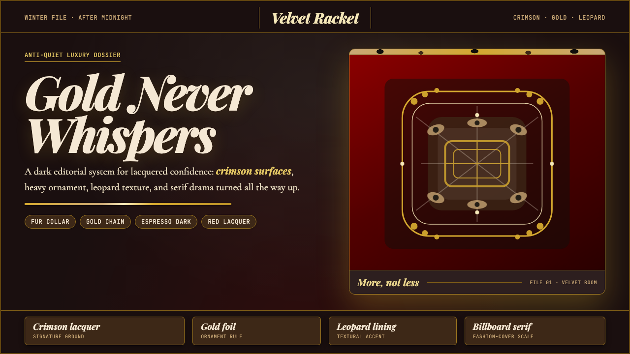 Mob Wife AestheticGlamour refuses restraint. Crimson lacquer, gold foil, leopard texture, billb…奢华拒绝克制:酒红漆面、金箔、豹纹与巨幅 Didone。
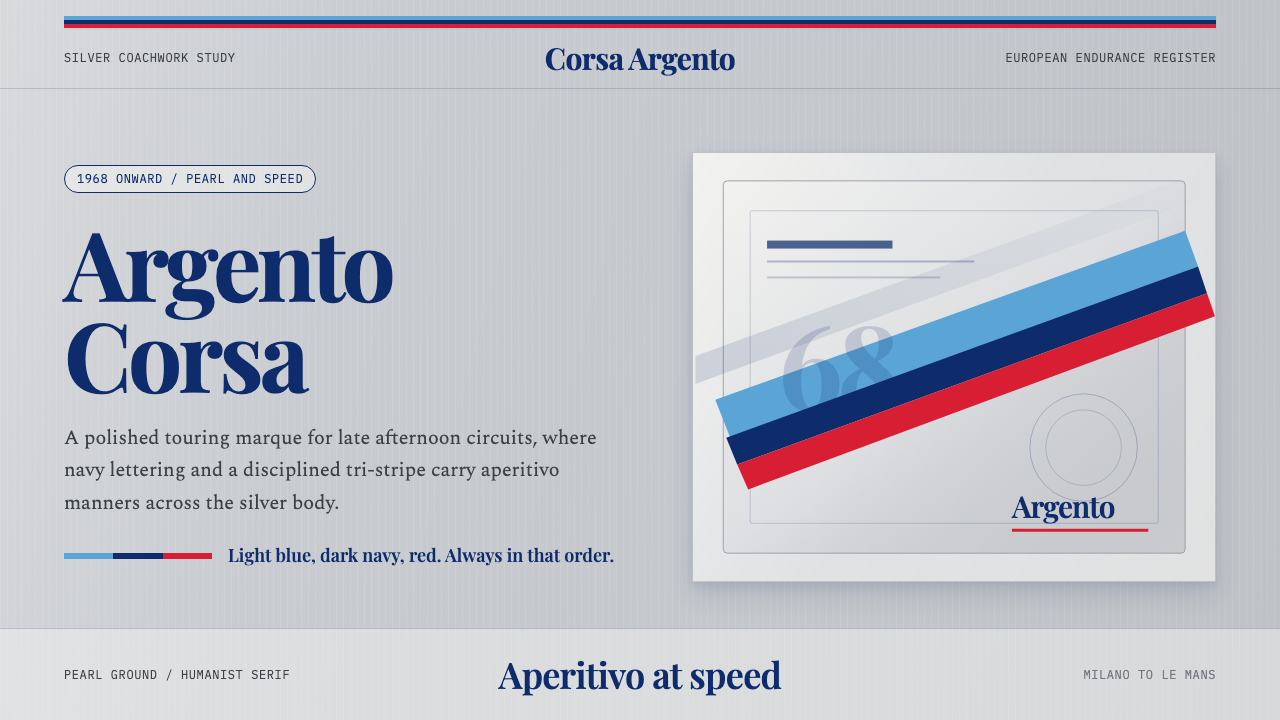 Martini Racing StripesAperitivo elegance at speed. Silver ground, Playfair serif, and a blue-navy-r…速度中的餐前酒优雅:银灰底、Playfair衬线与蓝深蓝红三色带。
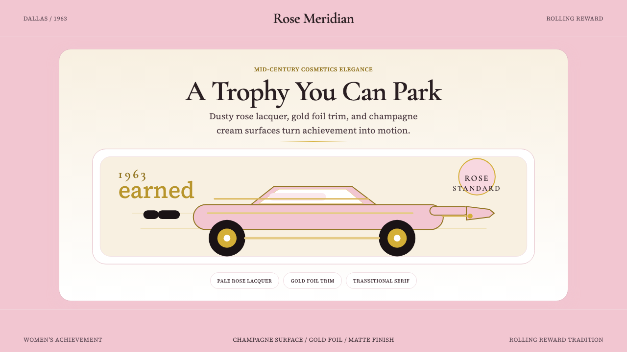 Mary Kay Pink Cadillac (1963)Earned elegance in pale rose. Champagne cream, gold foil, and serif ornament…淡玫瑰中的成就感。香槟奶油、金箔与衬线让奖赏可见。
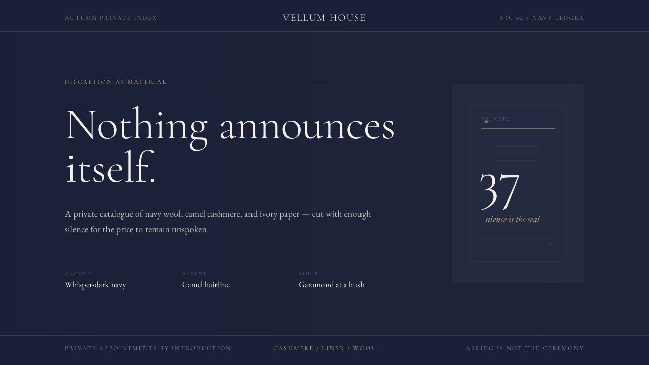 Quiet Luxury / Old MoneyLuxury refuses to raise its voice. Navy fields, camel hairlines, and thin Gar…奢华拒绝扬声:海军蓝底、驼色发丝线与纤细Garamond低语。
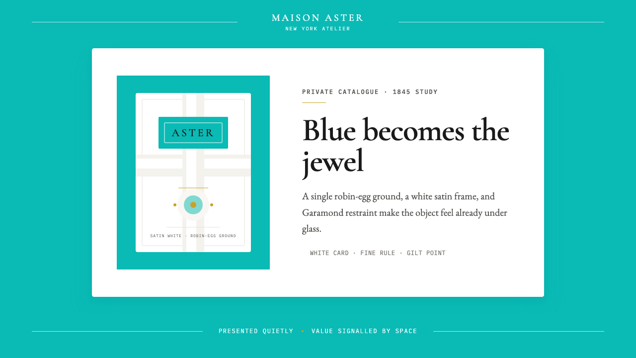 Tiffany Robin-Egg BlueBlue is the luxury signal. Robin-egg ground, white satin rules, Garamond rest…蓝色即奢华信号:知更鸟蛋蓝铺底,白缎细线与Garamond克制成章。
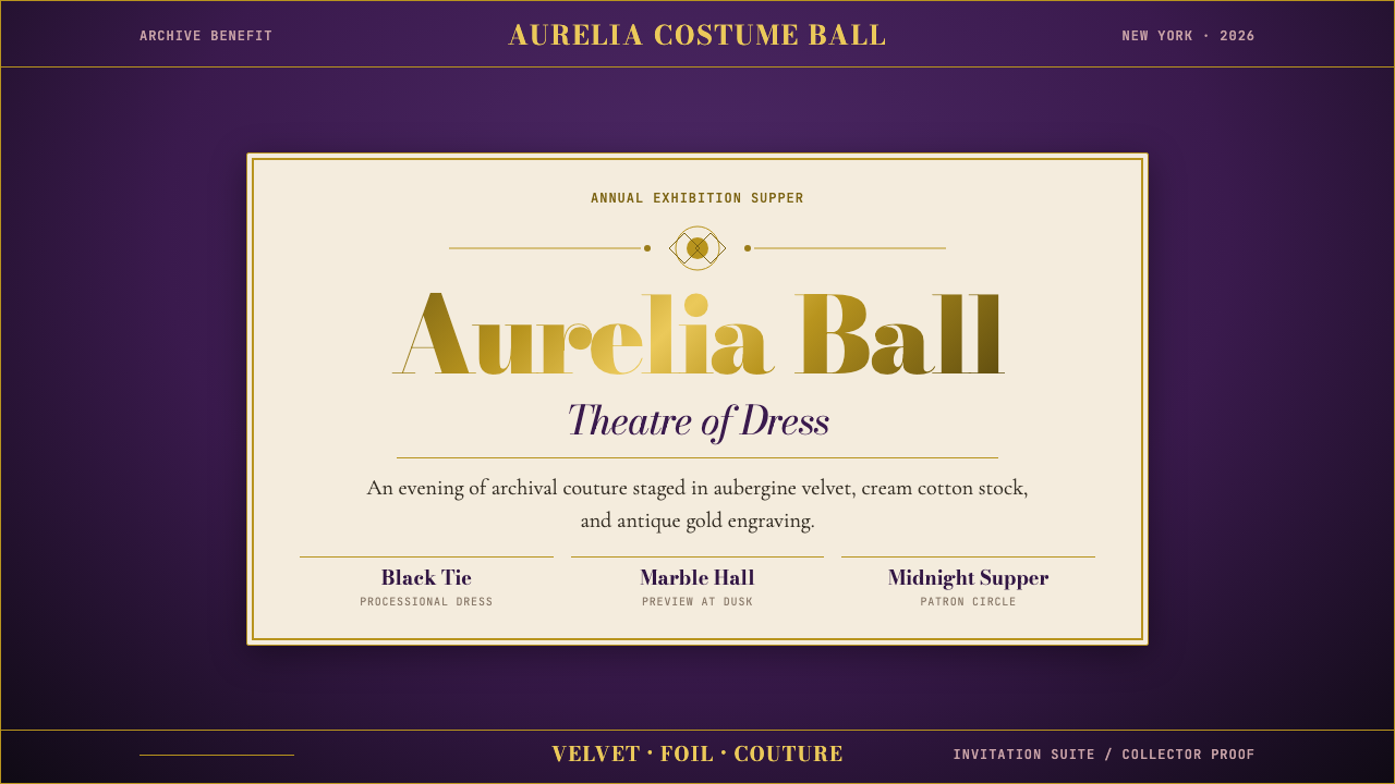 Met GalaTheatrical reverence. Aubergine velvet, cream stock, and Bodoni gold foil fra…戏剧化的敬意:茄紫天鹅绒、奶油纸与金箔 Bodoni 围合仪式感。