What is Mary Kay Pink Cadillac (1963)?什么是 Mary Kay Pink Cadillac (1963)?
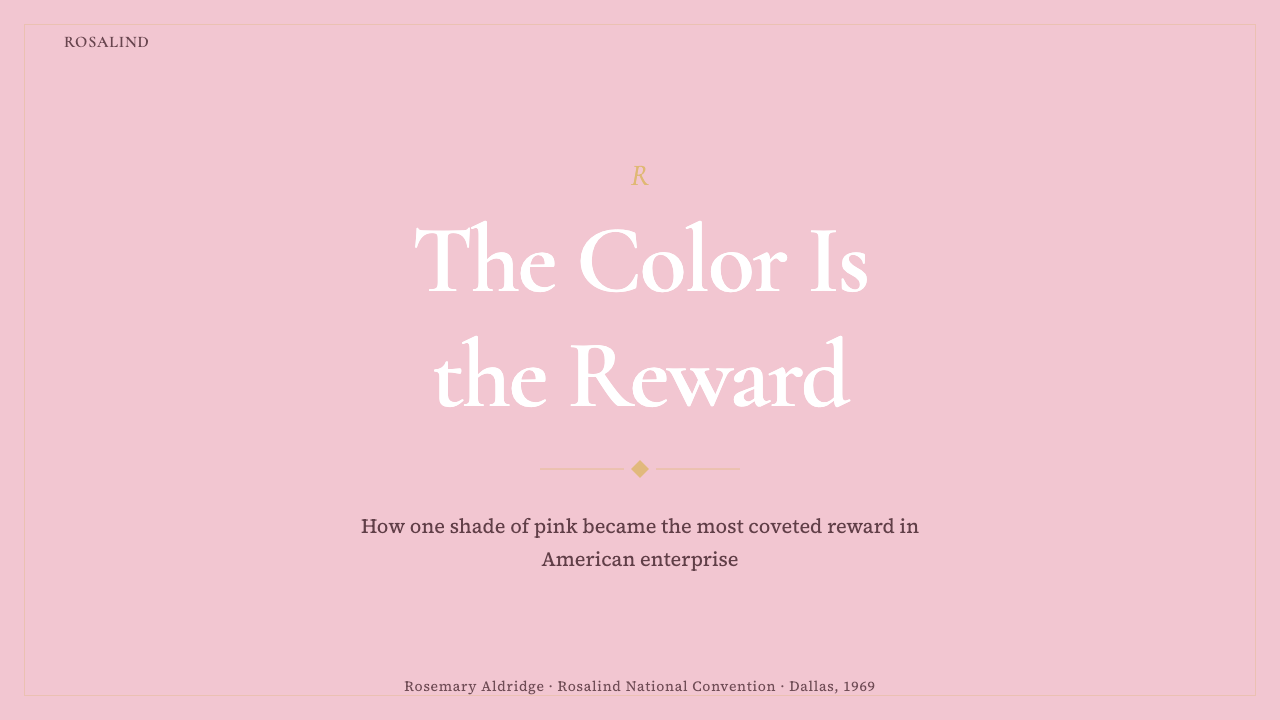
A pale dusty rose painted onto a rolling trophy in 1968 became one of the most recognized corporate colors in American business history — proof that a single shade can carry the weight of earned achievement.1968年喷涂在一辆流动奖杯上的灰玫瑰粉,成为美国商业史上最具辨识度的企业色彩之一——足以证明一个色调能承载多少成就的重量。
Mary Kay Pink Cadillac (1963) in briefMary Kay Pink Cadillac (1963) 速览
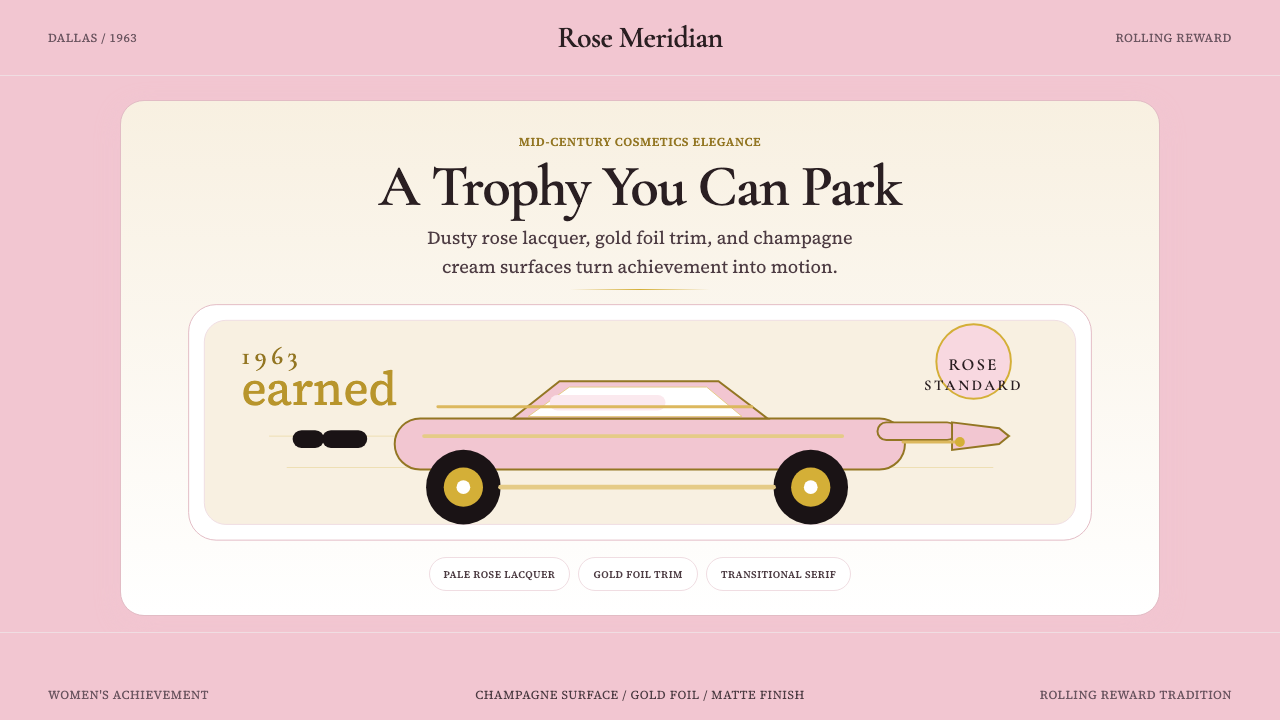
Mary Kay Pink Cadillac is a design language built around a single act of recognition: rewarding women who had earned their success. The visual system that grew from this act — a specific pale, dusty rose paired with champagne cream, warm gold ornament, and transitional serif letterforms — translates the emotional weight of achievement into tangible form. It is glamour made legible, aspiration made visible.玫琳凯粉色凯迪拉克是一套建立于认可行为之上的设计语言:奖励那些凭实力赢得成功的女性。由此生长出的视觉体系——一种特定的灰淡玫瑰粉,与香槟奶油、暖金装饰、过渡衬线字体相搭配——将成就的情感重量转化为可感知的实体形式。那是被具象化的魅力,被视觉呈现的理想。
The palette reads as feminine without drifting into the saccharine. The rose is muted rather than vivid, carrying a sense of maturity and sophistication that separates it from confectionery pinks. Champagne cream grounds the composition and prevents the rose from reading as naïve. Gold foil and gilt ornament elevate the register toward the celebratory — the language of award certificates, cosmetics counters, and the inside of a luxury automobile.这套色板传达出女性气质,却绝不流于甜腻。玫瑰色是柔和而内敛的,而非鲜艳刺目,透出一种成熟与精致,使其有别于糖果般的粉红。香槟奶油色铺底,令玫瑰色不显幼稚。金箔与镀金装饰将格调提升至庆典层面——奖状、化妆品柜台、豪华轿车内饰的共同语言。
The typographic character of the system leans on transitional serifs: letterforms with moderate contrast between thick and thin strokes, slightly bracketed serifs, and an upright stance that projects authority while retaining elegance. This is not a casual style and not a corporate-minimalist one — it occupies the specific register of mid-century American prestige, where beauty and achievement were understood as mutually reinforcing values.这套体系的字体气质依托于过渡衬线字形:笔画粗细对比适中、衬角略带弧度、笔形直立,在传递权威感的同时保留了优雅。这不是休闲风格,也不是企业极简主义——它占据的是二十世纪中叶美国式声望的特定音域,在那个年代,美丽与成就被视为相互强化的价值。
See the Mary Kay Pink Cadillac (1963) design system查看 Mary Kay Pink Cadillac (1963) 完整设计系统
Where does Mary Kay Pink Cadillac (1963) come from?Mary Kay Pink Cadillac (1963) 从何而来?
Mary Kay Ash founded Mary Kay Inc. in Dallas, Texas, in 1963 with a five-thousand-dollar investment and the explicit goal of creating a company that would give women unlimited opportunity. She was forty-five years old, had spent two decades watching male colleagues promoted over her despite superior performance, and had arrived at the conviction that the direct-sales model — where compensation was tied directly to results, not to seniority or internal politics — was the mechanism that could make equal opportunity real rather than theoretical.1963年,玫琳凯·艾施以五千美元的启动资金在德克萨斯州达拉斯创立了玫琳凯公司,明确以为女性创造无限机会为目标。彼时她四十五岁,用了二十年时间亲眼目睹能力不如自己的男性同事不断获得晋升,最终确信:直销模式——报酬直接与业绩挂钩,而非与资历或内部政治挂钩——是将机会平等从理论变为现实的机制。
The pink Cadillac program was inaugurated in 1969, the year after Mary Kay Ash received her first company car: a pink Cadillac Coupe de Ville whose color she had personally chosen from a General Motors paint chart by matching a compact she used. That first car was not a planned marketing initiative but a personal expression — a woman who had spent her career being told to be less visible choosing the most visible automobile in the most visible color she could find. When it became the symbol of the company's achievement culture, it was retroactively understood as inspired branding, but it began as a statement of presence.粉色凯迪拉克计划于1969年启动,即玫琳凯·艾施获得第一辆公司用车的翌年:那是一辆凯迪拉克豪华轿车,粉色由她本人从通用汽车色卡中亲自挑选,参照的是她日常使用的一个化妆粉盒的颜色。那辆最初的轿车并非一项预先策划的营销举措,而是一次个人表达——一位职业生涯中不断被要求降低存在感的女性,选择了她能找到的最显眼颜色中最显眼的一辆汽车。当它成为公司成就文化的象征之后,人们回望时将其理解为天才的品牌运作,但它起初不过是一个关于「我在这里」的宣告。
The specific shade — a dusty, pale rose rather than a vivid bubblegum pink — was a deliberate choice that carried meaning. Pale rose in the mid-twentieth-century American cosmetics register was the color of refinement: powder compacts, evening sachets, the lining of jewelry boxes. It was aspirational without being aggressive, feminine without being girlish. When paired with the specific prestige of the Cadillac nameplate — the definitive symbol of American automotive luxury from the 1950s onward — the combination communicated exactly what Mary Kay Ash intended: this was a reward for women who had worked and won.这一特定色调——灰淡的玫瑰粉,而非鲜艳的糖果粉——是一个承载着意义的刻意选择。在二十世纪中叶的美国化妆品语境中,淡玫瑰色是精致的颜色:粉盒、晚间香囊、珠宝盒的内衬。它具有向往感,却不咄咄逼人;传递女性气质,却不显幼稚。与凯迪拉克品牌所承载的声望相结合——那是五十年代起美国汽车奢华的明确象征——这一组合精准地传递了玫琳凯·艾施的意图:这是奖给那些拼搏并赢得胜利的女性的奖赏。
The design language that accumulated around the car and the brand drew on the visual vocabulary of mid-century American cosmetics packaging. Gold foil was the material of prestige at the cosmetics counter — on perfume boxes, on compact cases, on the caps of lipstick tubes. Transitional serifs were the letterforms of authority: pharmaceutical brands, department stores, and the certificates that hung on the walls of professional offices. Champagne cream, rather than stark white, softened the palette toward warmth and luxury. Together, these elements formed a coherent system that was recognizable as an idiom before it was ever formally codified — a design language assembled from objects and surfaces that American women of the mid-century already associated with achievement and care.围绕那辆汽车与品牌积累而成的设计语言,汲取自二十世纪中叶美国化妆品包装的视觉词汇。金箔是化妆品柜台的声望材料——香水盒上、粉盒盖上、口红管帽上皆有其身影。过渡衬线字体是权威的字形:制药品牌、百货公司、悬挂在专业人士办公室墙上的证书,均如此选择。香槟奶油色而非冷白色,令色板偏向温暖与奢华。这些元素共同构成了一套连贯的体系——在被正式编码之前,它早已作为一种惯用语言存在着,是从美国中产女性长期以来与成就和关怀相关联的物品与表面上汇聚而成的设计语言。
What defines the Mary Kay Pink Cadillac (1963) look?Mary Kay Pink Cadillac (1963) 的视觉特征是什么?
Signature Rose标志玫瑰粉
The central color of the system is a pale, dusty rose — muted rather than vivid, with enough grey in it to feel sophisticated rather than sweet. It reads differently from confectionery pinks and bubblegum tones; closer to the rose of a vintage powder compact or the blush of satin evening wear. Used as a dominant field color, it commands attention without aggression. Used as an accent on a cream ground, it becomes refined and ceremonial.整套体系的核心色是一种灰淡的玫瑰粉——柔和而非鲜艳,含有足够的灰调,令其透出精致而非甜蜜。它有别于糖果粉与泡泡糖色调,更接近复古粉盒的玫瑰色,或缎面晚礼服的腮红色。用作主体底色时,它无声地吸引目光;用作香槟奶油底上的点缀时,它则显得优雅而富有仪式感。
Champagne Cream Ground香槟奶油底色
White is absent from the canonical palette; champagne cream takes its place. The distinction matters: cream is warmer, softer, and carries associations with luxury materials — ivory, parchment, the pages of a well-made book. Against a cream ground, the rose and gold elements read as coordinated and intentional rather than placed on a neutral field. Cream also functions as a foil to the gold ornament, giving metallic elements something warm to reflect.标准色板中没有纯白;香槟奶油色取而代之。这一区别至关重要:奶油色更温暖、更柔和,与象牙、羊皮纸、精装书页等奢华材质形成关联。在奶油色底上,玫瑰色与金色元素显得协调而有意为之,而非浮于中性底面。奶油色也充当金色装饰的陪衬,为金属感元素提供一个温暖的反射背景。
Gold and Gilt Ornament金箔与镀金装饰
Metallic gold is the system's elevation mechanism — the element that lifts the palette from pleasant to prestigious. It appears as foil on packaging, as gilded rules and dividers, as the color of award typography, and as the accent on serif letterforms. The gold used is warm rather than cold — closer to aged gilt than to polished chrome — which keeps it compatible with the cream ground and the rose. Ornamental flourishes, small floral motifs, and fine-line borders all appear in this gold register.金色金属感是这套体系的提升机制——将色板从悦目抬升至尊贵的元素。它以金箔形式出现在包装上,以镀金线条与分隔符出现在版面中,以奖状排版的色调存在,以衬线字形的点缀呈现。所用金色是暖金而非冷金——更接近岁月沉淀的旧金,而非抛光钢铬——使其与奶油底色和玫瑰色和谐相融。装饰性花饰、小型花卉母题与细线边框,皆在这一金色调域中出现。
Transitional Serif Typography过渡衬线排版
The typographic register is formal and authoritative: transitional serif letterforms with moderate thick-to-thin stroke contrast, slightly bracketed serifs, and upright posture. This places the style in the tradition of cosmetics-counter prestige, department-store signage, and the award certificates that mid-century American professionals recognized as markers of legitimate achievement. Italic cuts are used sparingly for names and quotes, adding warmth without sacrificing formality.排版格调正式而权威:过渡衬线字形,笔画粗细对比适中,衬角略带弧度,字形直立。这使该风格置于化妆品柜台声望、百货公司标识、以及二十世纪中叶美国职场人士视为合法成就标志的奖状传统之中。斜体字型被用于人名与引言,在不牺牲正式感的前提下增添温度。
Cosmetics-Counter Ornament化妆品柜台装饰语汇
Where Bauhaus would leave an edge bare, the Mary Kay Pink Cadillac system adds a fine line, a small floral motif, or a gilt rule. Ornament is restrained rather than exuberant — it signals category (prestige cosmetics, luxury awards) rather than functioning as decoration for its own sake. Borders are thin and precise. Dividers are hairlines in gold. Floral motifs, when present, are simplified and symmetrical. The cumulative effect is ceremonial rather than baroque.包豪斯会将边缘留白的地方,玫琳凯粉色凯迪拉克体系会加上一条细线、一个小型花卉母题或一道镀金分隔线。装饰是克制的而非奔放的——它在标示品类(高端化妆品、奢华奖赏)而非纯粹为了装饰而装饰。边框细而精准。分隔线是金色发丝线。花卉母题(若出现)是简化而对称的。累积而成的效果是仪式感的,而非巴洛克式的。
Warm Metallic Surfaces暖金属感表面
The style favors surfaces that evoke luxury materials without literally reproducing them: the warmth of brushed gold rather than mirror chrome, the softness of satin rather than the hardness of lacquer. In two-dimensional applications, this translates to a preference for warm gradients within gold elements (where gradients are used, they are subtle and warm rather than cool or high-contrast) and a general avoidance of anything that reads as industrial or synthetic.这套风格偏爱能唤起奢华材质联想的表面,而非字面复现材质:是拉丝金而非镜面铬的温度,是缎面的柔软而非漆面的坚硬。在二维应用中,这体现为对金色元素内部暖渐变的偏好(若使用渐变,则应细腻且偏暖而非冷调或高对比),以及对任何显得工业感或合成感事物的普遍回避。
Achievement as Visual Language成就作为视觉语言
The underlying communicative logic of the system is aspirational recognition. Every element is chosen to communicate that something has been earned and is worth celebrating: the gold signals value, the cream signals refinement, the rose signals distinction, the serif signals authority. This is not a style that flatters the viewer into purchasing — it is a style that honors the viewer for having already performed. That distinction gives the aesthetic its particular gravity and separates it from generic luxury branding.这套体系的底层传达逻辑是有抱负的认可。每一个元素的选择都是为了传达:某件事情已被赢得,值得庆祝——金色传递价值,奶油色传递精致,玫瑰色传递卓越,衬线字传递权威。这不是一种通过奉承观者来促成购买的风格——它是一种因观者已然完成某件事而向其致敬的风格。正是这一区别赋予了这套美学其特有的分量,使其有别于泛化的奢华品牌。
See the Mary Kay Pink Cadillac (1963) design system查看 Mary Kay Pink Cadillac (1963) 完整设计系统
Who shaped Mary Kay Pink Cadillac (1963)?谁塑造了 Mary Kay Pink Cadillac (1963)?
Mary Kay Ash (1918–2001) founded Mary Kay Inc. in Dallas in 1963 after a twenty-five-year career in direct sales, during which she had repeatedly been passed over for promotion in favor of male colleagues she had trained. Her founding vision — a company structured to reward women's work with direct, visible, and publicly celebrated recognition — produced one of the most distinctive corporate visual cultures in American business history. She personally selected the pink for the first company Cadillac by matching a shade from a General Motors paint chart to her powder compact, establishing the brand's central color not through a design committee but through a private act of personal expression.玫琳凯·艾施(1918—2001年)在经历了二十五年直销职业生涯后,于1963年在达拉斯创立玫琳凯公司。在此期间,她多次目睹自己亲手培训的男性同事在晋升中优先于她。她的创业愿景——一家以直接、可见且公开庆祝的方式奖励女性工作的公司——催生了美国商业史上最具特色的企业视觉文化之一。她亲自通过将通用汽车色卡上的色调与自己的粉盒比对,为第一辆公司凯迪拉克选定了那抹粉色——建立品牌核心色彩的方式不是通过设计委员会,而是一次私人的、个人表达的行为。
Mel Ash, Mary Kay Ash's husband and business partner in the early years of the company, provided essential financial and operational support during the founding period. He died of a heart attack just one month after the company's launch in 1963, leaving Mary Kay Ash to build the enterprise alone. His early involvement is a reminder that the company's origins were collaborative even as its public identity became inseparable from a single founder's vision and personality.梅尔·艾施是玫琳凯·艾施的丈夫,也是公司创立初期的商业伙伴,在创业阶段提供了关键的财务与运营支持。公司成立仅一个月后,他便因心脏病去世,留下玫琳凯·艾施独自建设这份事业。他在早期的参与提醒人们:即便这家公司的公众形象已与一位创始人的愿景和个性密不可分,其起源仍是一段协作的历程。
Richard Rogers, Mary Kay Ash's son, served as the company's first president and was instrumental in structuring the business systems that allowed the direct-sales model to scale. His operational contributions provided the infrastructure within which his mother's vision of recognition and reward could function at the scale of tens of thousands of Beauty Consultants. The company's ability to sustain and systematize the pink Cadillac program as a genuine achievement symbol, rather than allowing it to dilute into a marketing gimmick, depended partly on the organizational discipline he helped establish.理查德·罗杰斯是玫琳凯·艾施的儿子,担任公司首任总裁,在构建使直销模式得以规模化运营的商业体系方面发挥了关键作用。他在运营层面的贡献,为母亲关于认可与奖励的愿景在数万名美容顾问规模上得以实现提供了基础设施。公司之所以能够将粉色凯迪拉克计划维持为一种真正的成就象征,而非让其退化为营销噱头,在一定程度上有赖于他帮助建立的组织纪律。
The Cadillac Coupe de Ville and its successors were designed by General Motors' storied styling department, whose mid-century language of tailfins, chrome ornament, and sweeping body lines became the visual vocabulary of American automotive aspiration. By adopting the Cadillac specifically — and a custom pale rose version of it — Mary Kay Ash was entering a dialogue with a design language that already carried immense cultural freight in postwar America. The choice was not incidental; the Cadillac's visual authority was borrowed and redirected toward a new form of publicly recognized achievement.凯迪拉克轿车及其后继车型由通用汽车著名的造型部门设计,其二十世纪中叶的设计语言——尾翼、镀铬装饰、流线型车身——成为美国汽车向往感的视觉词汇。玫琳凯·艾施选择凯迪拉克,并将其涂以定制的淡玫瑰色,是在与一套在战后美国已承载巨大文化分量的设计语言展开对话。这一选择并非偶然;凯迪拉克的视觉权威被借用并重新导向了一种新形式的公开认可的成就。
The collective design culture of mid-twentieth-century American cosmetics — Estée Lauder's gold and white, Elizabeth Arden's pink and gold, Max Factor's theatrical glamour — formed the visual context within which the Mary Kay aesthetic was read and understood. These companies had established an idiom in which pale rose, warm gold, and refined serif typography signified legitimate prestige in the beauty industry. Mary Kay Ash drew on this shared vocabulary and extended it from the retail cosmetics counter to the achievement award, finding the precise register where the two contexts — beauty and business success — could be held together credibly.二十世纪中叶美国化妆品包装的集体设计文化——雅诗兰黛的金白配色、伊丽莎白·雅顿的粉金配色、蜜丝佛陀的戏剧性魅力——构成了玫琳凯美学被理解和解读的视觉背景。这些公司已在美容行业建立了一套约定俗成的语言:淡玫瑰色、暖金色与精致衬线排版,意味着正当的声望。玫琳凯·艾施汲取这套共同词汇,并将其从零售化妆品柜台延伸至成就奖赏,找到了将美容与商业成功两种语境可信地并置在一起的精确音域。
How do you use Mary Kay Pink Cadillac (1963) today?今天怎么用 Mary Kay Pink Cadillac (1963)?
The Mary Kay Pink Cadillac design language is most powerful when it is understood as a system of recognition rather than decoration. Its rose, cream, and gold palette was constructed to communicate that something has been earned and deserves public celebration. The most effective applications channel this logic directly: they use the style to honor an audience, not merely to appeal to one. When the communicative purpose aligns with the aesthetic's built-in grammar of achievement, the result feels authoritative and emotionally resonant rather than merely pretty.玫琳凯粉色凯迪拉克设计语言最有力量的时刻,是被理解为一套认可体系而非装饰体系的时刻。它的玫瑰色、奶油色与金色色板,是为了传达某件事情已被赢得且值得公开庆祝而构建的。最有效的应用直接承接这一逻辑:用这种风格来尊重受众,而非仅仅取悦受众。当传达目的与这套美学内置的成就语法契合时,结果便会是权威的、在情感上共鸣的,而非仅仅是漂亮的。
For presentation slides, the system works best when the visual hierarchy reinforces a sense of occasion. Cover slides benefit from a strong centered or symmetrically weighted composition — the rose as the dominant field color, the title in gilt or cream serif type, a fine gold border framing the content. This is a deliberate departure from the asymmetric boldness of Bauhaus-influenced approaches; the Mary Kay system is comfortable with symmetry because symmetry carries ceremonial weight. Content slides should keep the cream ground and use gold rules or hairline borders as section dividers rather than plain lines. Data visualizations — charts, graphs, comparison tables — benefit from a restrained palette within the slide, allowing the rose and gold to punctuate key figures rather than saturating the entire composition.在演示文稿中,这套体系在视觉层级强化仪式感时效果最佳。封面适合采用强中心或对称加权构图——玫瑰色作为主体底色,标题以金色或奶油色衬线字体呈现,细金边框环绕内容。这是对包豪斯影响下的非对称大胆风格的刻意背离;玫琳凯体系对对称是自在的,因为对称承载着仪式性的分量。内容页应保持奶油底色,以金色线条或发丝边框作为段落分隔,而非普通直线。数据可视化——图表、折线图、对比表格——在单张幻灯片内应使用克制的色板,让玫瑰色与金色点缀关键数字,而非饱和整个构图。
For web and digital UI, the style is best suited to contexts where prestige, recognition, and achievement are the primary emotional registers: awards platforms, membership tiers, beauty brand e-commerce, loyalty program dashboards, and certification or recognition pages. The cream-and-rose palette works well as a light-mode foundation; gold can be applied to interactive highlights, premium tier labels, and achievement badges. Navigation and body text should stay in dark warm tones rather than pure black, which can feel too austere against the warmth of the cream ground. Card components look best with subtle warm shadows and fine border lines rather than the hard-shadow treatment appropriate to more geometric styles.对于网页与数字界面,这种风格最适合声望、认可与成就是主要情感基调的语境:奖励平台、会员等级、美妆品牌电商、忠诚度计划仪表板,以及认证或荣誉页面。奶油与玫瑰色搭配适合作为浅色模式的基础;金色可应用于交互高亮、高级等级标签与成就徽章。导航与正文应保持深暖色调,而非纯黑——纯黑在奶油底的温度中会显得过于严苛。卡片组件最适合配以细腻的暖阴影与细边框线,而非适合更几何化风格的硬边投影。
For editorial and marketing materials — printed certificates, event programs, packaging inserts, email campaigns celebrating milestones — the system is in its most native territory. A certificate or recognition document done in this language should use a cream stock (or cream-tinted digital ground), serif type for names and titles, a fine gold border, and the rose as a controlled accent on seals, ribbons, or initial capitals. Marketing pages celebrating product launches or achievement milestones can use the rose as a full-bleed background for hero sections, with cream and gold typography. Printed collateral — inserts, brochures, thank-you cards — benefits from the warmth of the full palette at close reading distance, where the subtle muting of the rose and the warmth of the cream become tactile associations with quality.对于编辑与营销材料——印刷证书、活动节目册、包装内页、庆祝里程碑的邮件营销——这套体系处于最本原的领地。以这套语言制作的证书或荣誉文件,应使用奶油色纸张(或奶油调数字底),人名与标题采用衬线字体,配以细金边框,玫瑰色作为受控点缀出现在印章、丝带或首字母上。庆祝产品发布或成就里程碑的营销页面,可以玫瑰色作为主视觉区的全出血背景,搭配奶油色与金色排版。印刷品——插页、宣传册、感谢卡——在近距离阅读时能充分展现完整色板的温度,玫瑰色微妙的柔和感与奶油色的暖意在此成为与品质相关联的触感记忆。
A common mistake is treating the rose as interchangeable with any other pink. The specific quality of the color — its dusty, muted, slightly greyed character — is what separates it from candy pinks and hot pinks and gives it the sophistication the system depends on. Saturating or brightening the rose toward a more vivid or youthful tone collapses the visual register from prestige to playful and undermines the aesthetic's authority. Similarly, substituting cool white for champagne cream, or using a cold-toned gold rather than a warm gilt, quietly shifts the system's emotional temperature in ways that erode its essential character. The palette should always read warm, mature, and earned.一个常见的错误是将这抹玫瑰色视为任何其他粉色的可替代物。这个颜色的特定质感——灰淡的、柔和的、略带灰调的特性——正是将其与糖果粉和亮粉区分开来、赋予它这套体系所依赖的精致感的所在。将玫瑰色饱和化或提亮向更鲜艳或年轻的色调,会将视觉音域从声望跌落至玩趣,动摇这套美学的权威感。同样,以冷白色替换香槟奶油色,或使用冷金而非暖金,会悄然将这套体系的情感温度在不经意间侵蚀掉。这套色板应当始终呈现出温暖、成熟、有所赢得的质感。
See the Mary Kay Pink Cadillac (1963) design system查看 Mary Kay Pink Cadillac (1963) 完整设计系统
Mary Kay Pink Cadillac (1963) — FAQMary Kay Pink Cadillac (1963) · 常见问题
Is this style only appropriate for beauty or women-focused brands?这种风格只适合美妆或女性向品牌吗?
Not necessarily, though that is its most natural register. The underlying grammar of the style — pale rose, champagne cream, warm gold, refined serif — communicates achievement, prestige, and care. These values can be relevant in any context where recognition and earned status are being communicated: professional awards, membership programs, luxury service brands, celebratory publishing, and heritage institutions. The style reads as feminine in the mid-century American sense, which means some product contexts will find it tonally misaligned. But applied to the right communicative purpose, it can work well beyond its origin category.不一定,尽管那是它最自然的音域。这套风格的底层语法——淡玫瑰色、香槟奶油色、暖金色、精致衬线——传达的是成就、声望与关怀。这些价值观在任何传达认可与成就感的语境中都可能是相关的:专业奖项、会员计划、奢华服务品牌、庆典出版物与传统机构。这种风格在二十世纪中叶美国语境下带有女性气质,这意味着某些产品语境会发现它在基调上不匹配。但应用于正确的传达目的,它完全可以超越其起源品类发挥作用。
How does this style differ from generic luxury or premium design?这种风格与泛化的奢华或高端设计有何区别?
Generic luxury design typically pursues neutrality — quiet palettes, minimal typography, and an absence of specificity that allows the brand to feel universally aspirational. The Mary Kay Pink Cadillac system is the opposite: it is highly specific in its color temperature, its ornamental grammar, and its historical associations. That specificity is its strength when the context aligns, but it also makes the style recognizable as a particular idiom rather than a neutral luxury signal. It communicates achievement culture, mid-century American femininity, and cosmetics-counter prestige — and it does so explicitly rather than abstractly.泛化的奢华设计通常追求中性——安静的色板、极简排版,以及一种使品牌感觉普遍有向往感的无特指性。玫琳凯粉色凯迪拉克体系恰恰相反:它在色彩温度、装饰语法与历史联想上高度特指。这种特指性在语境契合时是优势,但也使这种风格成为一种特定惯用语,而非中性的奢华信号。它传达的是成就文化、二十世纪中叶美国女性气质与化妆品柜台声望——且是明确地而非抽象地传达。
Can this style work in dark-mode or dark-background layouts?这种风格能在深色模式或深色背景版面中使用吗?
A dark inversion is possible but requires significant recalibration. On a deep background — a rich burgundy or a very dark warm neutral — the rose can shift to function as a highlight element rather than a field color, and the gold becomes more visually dominant. Cream type replaces dark type. The ornamental elements that read as refined on a light ground can read as theatrical on a dark one, so restraint becomes even more important. The core risk in a dark version is that the palette drifts toward the look of a nightclub or a Las Vegas venue rather than a cosmetics counter; keeping the gold warm and the ornament sparse prevents this.深色反转是可行的,但需要大幅重新校准。在深色背景上——浓郁的酒红色或非常深的暖中性色——玫瑰色可以转为高光元素而非底色功能,金色则在视觉上变得更为主导。奶油色字体替代深色字体。在浅色底上显得精致的装饰元素,在深色底上可能显得戏剧化,因此克制变得更加重要。深色版本的核心风险是色板向夜店或赌城场所的感觉漂移,而非化妆品柜台;保持金色的暖调与装饰的稀疏能有效防止这种情况。
How should photography be treated within this design system?在这套设计体系中,摄影图像应当如何处理?
Photography in the Mary Kay Pink Cadillac system should feel warm, luminous, and aspirational rather than documentary or editorial-cool. Skin tones are central — portraits that emphasize warmth and confidence align with the system's communicative purpose. Color treatment should warm the image slightly, pulling toward peachy and rose tones and away from cool blues or high-contrast desaturation. Product photography benefits from cream or soft-focus backgrounds that allow the rose and gold packaging to read clearly. Hard-cropped, diagrammatic photography typical of geometric styles is tonally incorrect here; soft focus, warm light, and compositional breathing room are more appropriate.玫琳凯粉色凯迪拉克体系中的摄影图像,应当呈现出温暖、明亮、充满向往感的质感,而非纪录片式或编辑冷调。肤色处于核心地位——强调温度与自信的人像与这套体系的传达目的高度契合。色彩处理应将图像微微提暖,偏向蜜桃与玫瑰色调,远离冷蓝或高对比度去饱和。产品摄影适合奶油色或柔焦背景,使玫瑰色与金色包装清晰呈现。几何化风格中常见的硬裁剪、示意图式摄影,在基调上与这套体系不合;柔焦、暖光与构图上的呼吸空间更为适切。
What is the most common way designers misapply this style?设计师误用这种风格最常见的方式是什么?
The most common failure is brightening or intensifying the rose toward a more vivid pink, which collapses the system's sophistication. The dusty, greyed quality of the canonical rose is doing structural work — it holds the palette in the register of maturity and earned achievement rather than playfulness or youth. A second common mistake is over-ornamenting: adding flourishes, borders, and decorative elements so liberally that the composition becomes cluttered and the ceremony becomes noise. The ornament in this system should be sparse enough that each element reads clearly. A third mistake is applying the style to contexts where recognition and achievement are not the actual communicative purpose — using it as generic 'feminine luxury' rather than as a language specifically built around the act of honoring someone who has earned something.最常见的失误是将玫瑰色提亮或加深,使其偏向更鲜艳的粉红,从而令整套体系的精致感崩塌。标准玫瑰色的灰淡、柔和质感承担着结构性功能——它将色板固定在成熟与成就的音域,而非玩趣或年轻感。第二个常见错误是过度装饰:过于自由地添加花饰、边框与装饰元素,使构图杂乱,仪式感变为噪音。这套体系中的装饰应当足够稀疏,使每个元素都能清晰被读取。第三个错误是将这种风格应用于认可与成就并非真正传达目的的语境——将其用作泛化的「女性奢华」,而非一套专门围绕荣耀已赢得之人这一行为而构建的语言。
Related design styles相关设计风格
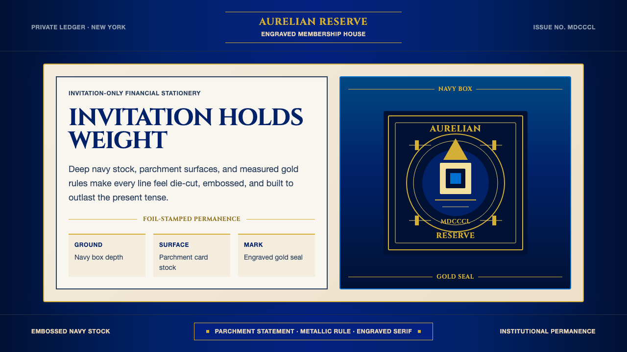 American Express CenturionInstitutional luxury. Deep navy, parchment panels, and gold rules feel engrav…机构级奢华:深海军蓝、羊皮纸面与金线呈现雕版质感。
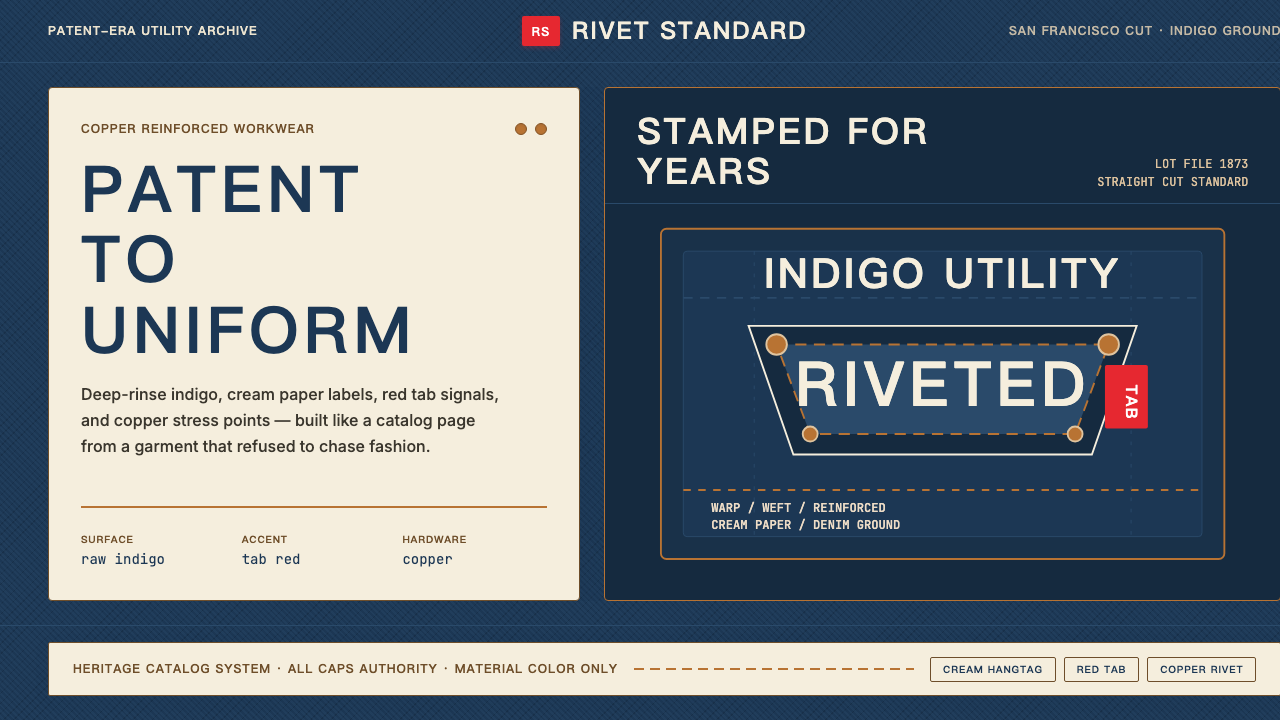 Levi's 501Utility becomes permanent. Indigo ground, cream hangtag panels, red tab and c…实用成为恒久。靛蓝底、奶油吊牌、红标与铜铆钉。
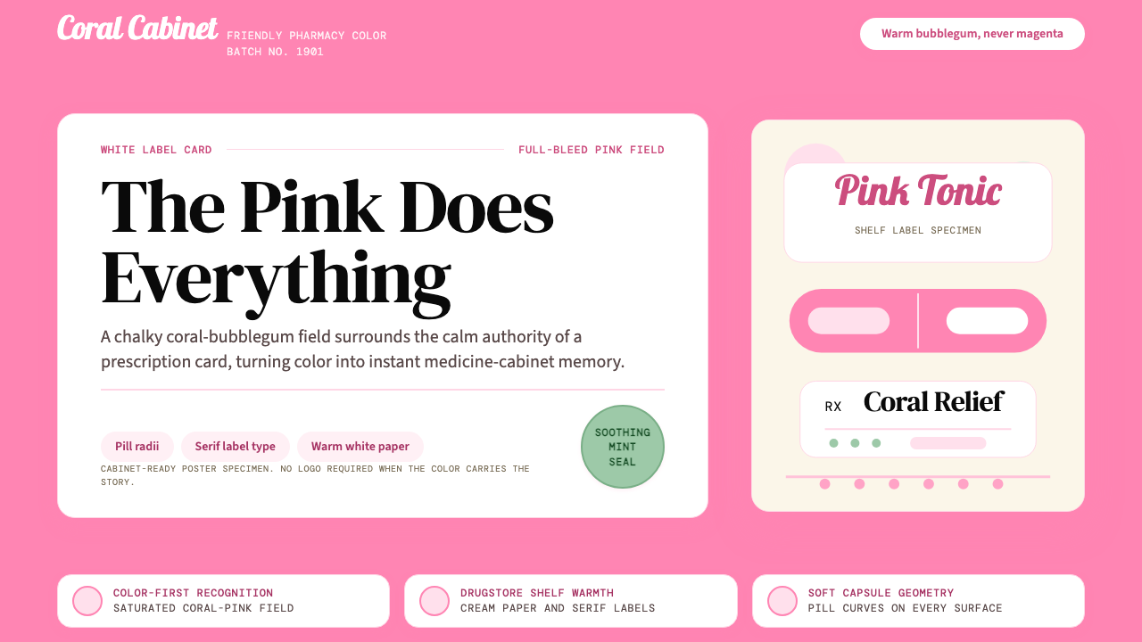 Pepto-Bismol Pink (1901)Color is the cure. Bubblegum pink floods the field; white label cards and pil…颜色就是招牌:泡泡糖粉铺满画面,白色标签卡和药丸弧度稳住信任。
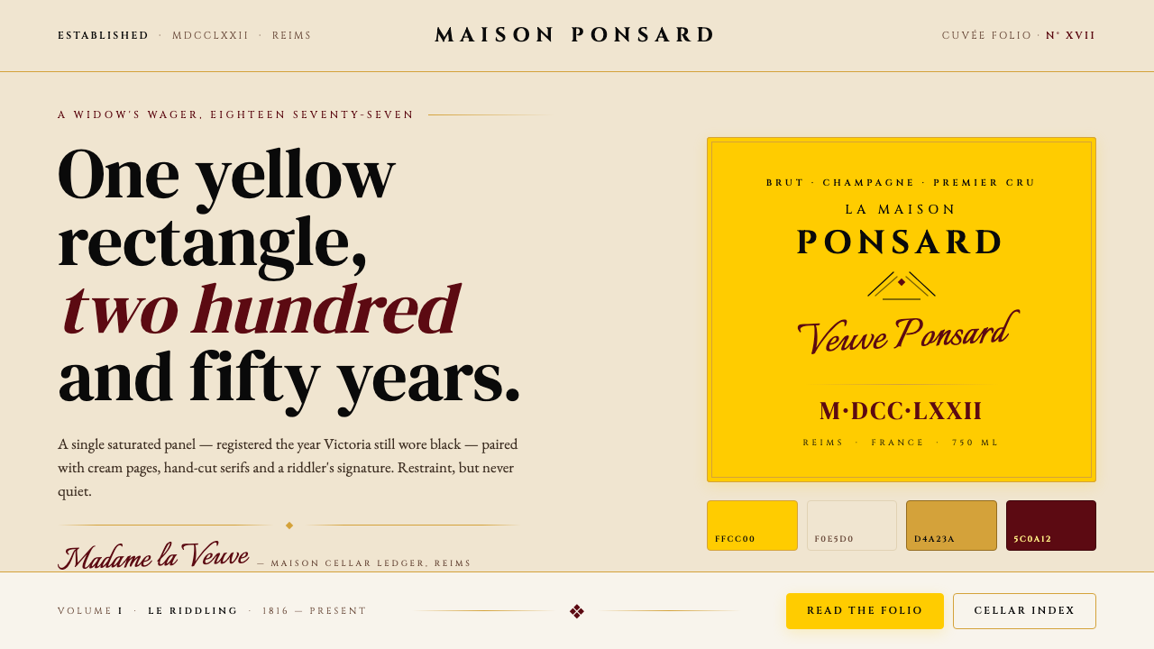 Veuve Clicquot (Yellow-Label)One audacious yellow rectangle, 250 years. Pantone yellow on cream, Cinzel se…1877 年那块大胆的明黄:饱和 Pantone 黄 + 暖奶油 + Cinz…
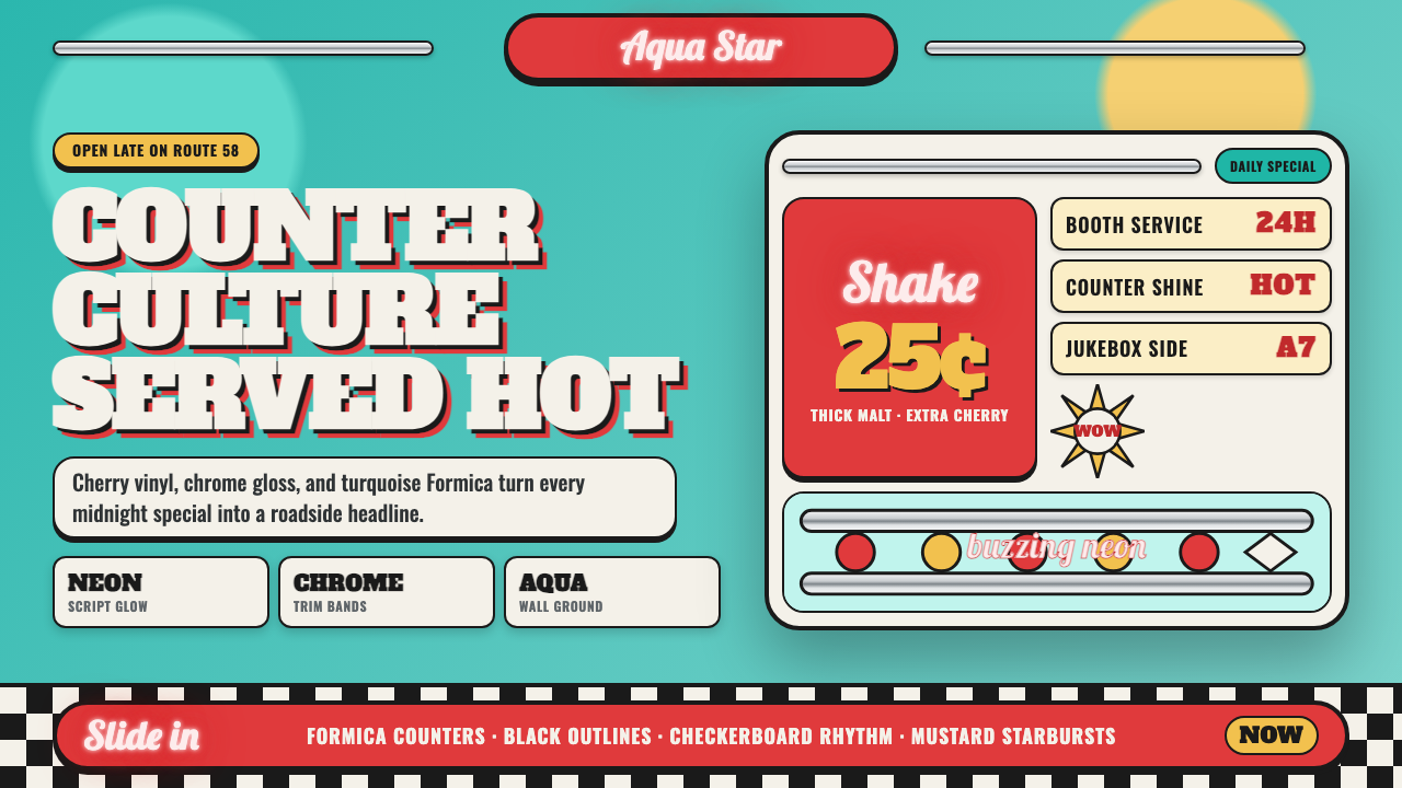 1950s Diner AquaRoadside optimism shouts. Aqua walls, cherry vinyl, chrome bands, and neon sc…公路乐观主义在叫卖:湖水蓝墙、樱桃红皮革、镀铬条与霓虹手写体发光。
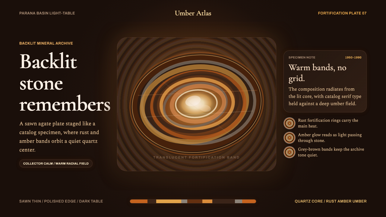 Banded Agate SliceCollector-calm glow. Rust and amber rings orbit a quartz core on near-black b…收藏级静光:近黑棕底上,锈红与琥珀环带围绕石英核心。