Design style guide设计风格指南
What is Qatar World Cup 2022?什么是 Qatar World Cup 2022?
Qatar 2022 fused calligraphic infinity loops, hammered-gold surfaces, and desert-dune geometry into the most ornate and geopolitically charged visual identity in World Cup history.卡塔尔2022将书法无限循环、锤纹金箔肌理与沙丘几何融为一体,铸就了世界杯历史上最华丽、也最具地缘政治张力的视觉身份。
Qatar World Cup 2022 in briefQatar World Cup 2022 速览
Qatar World Cup 2022 is the visual identity system built around the twenty-second FIFA World Cup, hosted in Qatar from November to December 2022. It is distinguished by a deep burgundy drawn from the Qatari flag, an emblem shaped like a calligraphic figure-eight that evokes both an Arabic infinity symbol and the profile of a stadium bowl, and a supporting decorative language built from eight-pointed star geometry and desert-dune organic curves. The system was created by Lisbon-based studio Brandia Central and deployed across eight purpose-built or renovated stadiums, tens of thousands of wayfinding surfaces, broadcast graphics, and a merchandise ecosystem that reached a global audience of billions.卡塔尔2022世界杯视觉识别系统,是围绕2022年11至12月在卡塔尔举办的第二十二届国际足联世界杯而构建的整套品牌体系。它以卡塔尔国旗的深栗色为基调,以一个形如阿拉伯书法「∞」的徽标为核心——这个符号既唤起无限循环的意象,又隐喻球场剖面的弧线——辅以八角星几何与沙丘有机曲线构成的装饰语言。这套系统由里斯本设计公司Brandia Central创作,覆盖了八座专建或改建球场、数万处导视面、广播图形,以及面向全球数十亿受众的授权商品生态。
Unlike the clean international minimalism that had come to dominate major sporting event branding — the smooth gradients and logotype-driven identities of recent Olympic Games — Qatar 2022 chose deliberate richness. It embraced texture, layering, and ornament as cultural affirmations rather than visual failures to be corrected. The system was read by its designers and commissioners as an argument: that Arab aesthetic tradition, with its geometric complexity and calligraphic fluidity, belongs on the world stage alongside Helvetica-clean Swiss rationalism or Scandinavian restraint.与近年来主导大型赛事品牌的国际简约主义——那些平滑渐变与字标驱动的奥运会形象——不同,卡塔尔2022选择了刻意的丰富性。它将纹理、叠层与装饰视为文化肯定,而非需要纠正的视觉瑕疵。这套系统被其设计者与委托方解读为一种论点:阿拉伯美学传统,以其几何的复杂性与书法的流动性,有资格与瑞士理性主义的Helvetica式清洁或斯堪的纳维亚的克制并立于世界舞台。
Visually, the identity operates in two registers simultaneously. At large scales — stadium facades, ceremonial banners, broadcast title sequences — it is monumental and almost architectural, with gold and burgundy deployed in saturated masses and the emblem reproduced at sizes that dwarf the human figure. At intimate scales — credential lanyards, hospitality menus, referee equipment — the same geometry becomes intricate and jewel-like, recalling the craft traditions of Islamic tilework and Arabic manuscript illumination that the system explicitly references.在视觉上,这套识别系统同时运行于两种尺度。在大尺度场合——球场外立面、仪式性横幅、电视转播片头——它是纪念碑式的、近乎建筑的,金色与栗色以饱和色块大面积铺陈,徽标以令人体相形见绌的尺寸复现。在私密尺度上——证件挂绳、贵宾菜单、裁判装备——同样的几何变得精巧而珠宝般,召唤出这套系统明确援引的工艺传统:伊斯兰瓷砖艺术与阿拉伯手抄本彩饰。
See the Qatar World Cup 2022 design system →查看 Qatar World Cup 2022 完整设计系统 →
Where does Qatar World Cup 2022 come from?Qatar World Cup 2022 从何而来?
The formal origin of the Qatar 2022 visual identity is the emblem launched in September 2019, three years before the tournament began. FIFA and the Supreme Committee for Delivery and Legacy — the Qatari government body overseeing the tournament's construction and operations — commissioned Brandia Central to create an identity that would simultaneously function as international event graphics and as a cultural statement about Qatar's place in the global imagination. The brief was explicit: the emblem should draw on Islamic visual tradition without reducing it to stereotype, and it should be legible both in Arabic script contexts and in Latin-script broadcast environments.卡塔尔2022视觉识别系统的正式起点,是2019年9月发布的徽标——比赛事本身早了整整三年。国际足联与负责统筹赛事建设和运营的卡塔尔政府机构「交付与遗产最高委员会」,委托Brandia Central创作一套既能承担国际赛事视觉功能、又能成为卡塔尔文化宣言的识别体系。委托书措辞明确:徽标应汲取伊斯兰视觉传统,但不能将其简化为刻板印象;它必须在阿拉伯文书写语境与拉丁文字广播环境中同样清晰可辨。
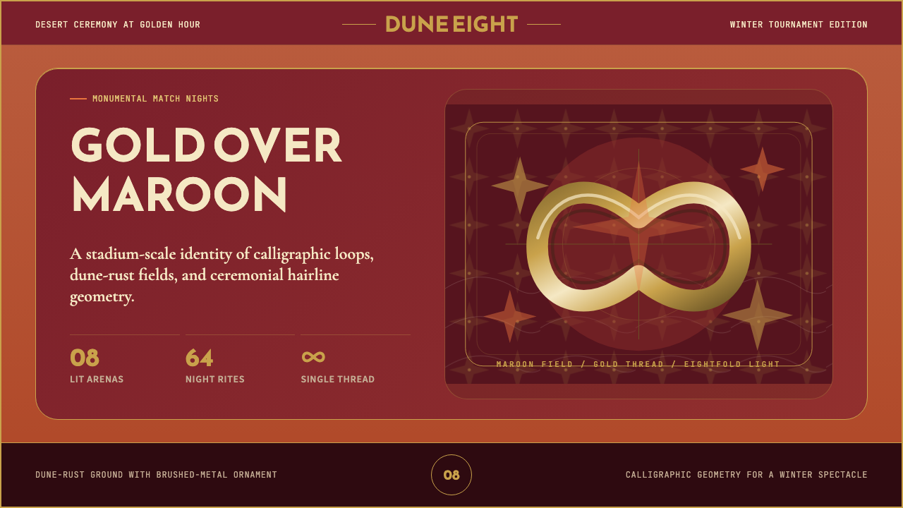
The emblem's form encodes multiple symbolic layers. The central loop traces an Arabic calligraphic gesture that the designers described as representing the number eight — for the eight host cities — while also reading as an infinity symbol and as the silhouette of a stadiums' structural arc when viewed in section. Below and flanking the central form, a base element was interpreted as a trophy, a traditional Qatari headdress (the gahfiya), or stadium seating tiers depending on the viewer's cultural frame. This deliberate polyvalence — the ability of a single mark to carry different meanings for different audiences — is a characteristic ambition of major international event design, and the Qatar emblem executes it with more cultural specificity than most.徽标的造型内嵌多重象征层次。中心循环线条描摹了设计师所称的阿拉伯书法「8」字笔势——代表八座举办城市——同时也可被读作无限符号,或球场结构弧线的剖面轮廓。徽标下方与两侧的底座元素,则可被不同文化背景的观者分别解读为奖杯、卡塔尔传统头饰(盖菲雅)或球场看台层级。这种刻意的多义性——同一标志对不同受众承载不同意义的能力——是大型国际赛事设计的共同抱负;卡塔尔徽标以比多数案例更强的文化特殊性实现了这一抱负。
The color language was anchored in burgundy — specifically the maroon of the Qatari national flag, a color that carries a distinct weight in Gulf state heraldry. It has historical associations with pearl-diving cultures and with the ruling Al Thani dynasty's identity. Around this primary maroon, the palette assembled gold (in reference to the Gulf's oil wealth and the material register of Islamic ceremonial arts) and a white that appears most prominently in typographic contexts. Sand and warm neutral tones enter the system as secondary textures rather than structural colors, evoking the desert landscape and the vernacular earth-tone architecture of traditional Qatari buildings.色彩语言锚定于栗色——即卡塔尔国旗的深红栗,一种在波斯湾国家纹章学中承载独特分量的颜色。它与采珠文化和执政的阿勒萨尼王朝的身份认同有着深厚的历史关联。以栗色为主轴,调色板集结了金色(援引波湾的石油财富与伊斯兰礼仪艺术的材质传统)以及主要出现于文字语境中的白色。沙色与暖中性调以辅助肌理而非结构色的方式进入系统,唤起沙漠景观与卡塔尔传统建筑的泥土色调。
The organizational context matters for understanding the identity's visual ambition. Qatar 2022 was the first World Cup held in the Middle East and the first in a Muslim-majority country. The Al Thani government had campaigned for the tournament across fourteen years and invested what independent economists estimated at over two hundred billion dollars in infrastructure, including the construction of entirely new stadiums in a country that had hosted no major international football before. The visual identity was consciously designed to hold this weight — to be the aesthetic face of a geopolitical and cultural argument that Qatar was making about Arab modernity, Gulf soft power, and the universal hospitality of Islam. Every design decision, from the choice of calligraphic script style to the decision to use the Reem Kufi typeface for wayfinding, was embedded in this larger argument.理解这套识别系统的视觉野心,必须理解其组织背景。卡塔尔2022是首届在中东举办的世界杯,也是首届在穆斯林占多数的国家举办的世界杯。阿勒萨尼政府历经十四年游说才获得主办权,并投入独立经济学家估计超过两千亿美元的基础设施费用,包括在此前从未举办过任何重大国际足球赛事的土地上全新建造多座球场。视觉识别系统被有意设计为承载这种重量——成为卡塔尔就阿拉伯现代性、海湾软实力和伊斯兰待客之道所发出的地缘政治与文化论点的美学面孔。从书法脚本风格的选择,到在赛事导视中使用Reem Kufi字体的决定,每一个设计抉择都嵌套在这个更宏大的论点之中。
What defines the Qatar World Cup 2022 look?Qatar World Cup 2022 的视觉特征是什么?
Color Architecture色彩架构
The palette is hierarchical and culturally coded. Qatari maroon — a deep burgundy — functions as the primary structural color, covering stadium seating, credential systems, and large-scale environmental graphics. Gold operates as the ceremonial register, appearing in the emblem's metallic treatments, in ceremonial banners, and in broadcast highlight sequences. White serves typographic clarity, and sand-tone neutrals provide textural warmth in secondary applications. The system deliberately refuses the clean tonal neutrality of much international sports branding in favor of a palette with explicit cultural heritage weight.调色板具有层级结构,且携带文化编码。卡塔尔栗色——一种深栗——作为主要结构色,覆盖球场座位、证件体系与大型环境图形。金色担任礼仪寄存器,出现于徽标的金属处理、仪式横幅与广播高光片段。白色服务于文字清晰度,沙色中性调在次要应用中提供肌理温度。这套系统刻意拒绝大多数国际体育品牌的清洁色调中性,转而选用一套承载明确文化传承分量的色彩。
Calligraphic Emblem Form书法徽标造型
The central emblem is structured as a continuous calligraphic gesture — a flowing figure-eight loop whose proportions derive from Arabic script writing conventions rather than from the geometric construction logic of most Western sports marks. The stroke weight varies through the loop, mimicking the thick-thin rhythm of a calligrapher's broad-nibbed pen, and the terminals taper into the pointed endings characteristic of Naskh and Thuluth script traditions. This choice of calligraphic logic over geometric logic is the identity's most culturally legible design decision.核心徽标构建为一笔连续的书法笔势——一个流动的「8」字环圈,其比例源自阿拉伯书法书写惯例,而非多数西方体育标志所依据的几何建构逻辑。笔画粗细在环圈中随走势变化,模拟书法家宽嘴笔的粗细节奏,收笔处渐细为纳斯赫体与苏鲁斯体传统中特有的尖挑。在几何逻辑之上选择书法逻辑,是这套识别系统最具文化辨识度的设计决断。
Eight-Pointed Star Geometry八角星几何
Beyond the emblem, the secondary decorative language of Qatar 2022 is built on the eight-pointed star — the Rub el Hizb and related geometric forms found throughout Islamic architectural ornament, from Moroccan zellij tilework to Anatolian muqarnas vaulting. In the Qatar system, this geometry is used as a watermark layer beneath color fields, as a structural scaffold for repeating surface patterns on merchandise and signage, and as a motif that connects the contemporary mega-event to centuries of Arab mathematical and decorative tradition. The star appears at multiple scales simultaneously, creating a fractal-like visual depth that rewards closer inspection.徽标之外,卡塔尔2022的次级装饰语言建立在八角星之上——即遍布伊斯兰建筑装饰的鲁布·希兹布及相关几何形,从摩洛哥瓷砖拼花到安纳托利亚蜂巢拱顶。在卡塔尔系统中,这一几何被用作色彩场下方的水印层,用作商品与标识上重复表面图案的结构脚手架,也作为将这场当代超级赛事与阿拉伯数学与装饰传统数百年积淀相联结的母题。星形在多种尺度上同时出现,创造出一种类分形的视觉深度,经得起近距离审视。
Metallic Surface Treatment金属表面处理
A defining textural signature of the identity is the treatment of gold as a physical surface quality rather than a flat color value. Across print applications, the gold appears as brushed or hammered metal, with directional catch-light suggesting the micro-texture of worked sheet metal. This treatment is intentional: it references the material culture of Gulf goldsmithing and traditional Islamic metalwork, where hammered and engraved surfaces on ewers, trays, and incense burners communicated prestige and craft excellence. Applied to event graphics, it gives the identity a haptic quality — even on a flat printed surface, the eye perceives the suggestion of physical texture.这套识别系统定义性的肌理签名,在于将金色处理为物质性表面质感,而非平涂色值。在印刷应用中,金色呈现为拉丝或锤纹金属,带有方向性高光,暗示金属板材经手工锤击后的微纹理。这一处理是有意为之的:它援引波湾金器锻造与传统伊斯兰金属工艺的物质文化——那些水壶、托盘与熏香炉上经锤击与雕刻的表面,曾是彰显地位与工艺卓越的语言。应用于赛事图形,它赋予识别系统一种触感品质——即使在平面印刷表面上,视觉也能感知到物质肌理的暗示。
Wayfinding Typography导视字体排印
The tournament's wayfinding typography was built around Reem Kufi, an Arabic type revival designed by Khaled Hosny. Reem Kufi is a geometric Kufic typeface — rooted in the angular monumental script tradition of early Islamic inscriptions on coins, tombstones, and architectural friezes — adapted for screen and signage legibility at contemporary viewing distances. Its choice was as culturally deliberate as the emblem's calligraphic structure: it placed an authentically Islamic type tradition at the visual front of an event communicating to a global audience, rather than defaulting to the Arabic versions of international humanist sans-serifs that typically appear in multilingual wayfinding.赛事导视排印围绕Reem Kufi字体构建,这是由哈立德·侯斯尼设计的阿拉伯字体复兴作品。Reem Kufi是一款几何库法体——根植于伊斯兰早期钱币、墓碑与建筑饰带上角质纪念碑铭文传统——并针对当代观视距离下的屏幕与标识可读性进行了适配。这一选择与徽标书法结构同样具有文化审慎性:它将一个真实的伊斯兰字体传统置于这场面向全球受众的赛事视觉前沿,而非沿用多语言导视中惯常出现的国际人文无衬线字体的阿拉伯文版本。
Dune and Desert Organic Forms沙丘与沙漠有机形态
Alongside the geometric rigor of the star patterns and emblem, Qatar 2022 introduces a counterpoint of organic flowing curves drawn from desert dune formations. These undulating forms appear in stadium silhouettes, in the sweeping curve of the emblem's tail, and in graphic elements that soften the overall system. They provide breathing room against the density of geometric pattern and connect the identity to the specific physical landscape of the Arabian Peninsula — the ergs of rolling sand that surround Doha — in a way that purely geometric systems could not.与星形图案和徽标的几何严谨性并置,卡塔尔2022引入了一组源自沙丘形态的有机流动曲线作为对位。这些起伏的形态出现于球场轮廓、徽标弧尾的舒展曲线,以及柔化整体系统的图形元素中。它们在几何纹样的密度之间制造呼吸空间,并以纯几何系统无法企及的方式,将这套识别与阿拉伯半岛具体的物质地景——环绕多哈的连绵沙丘——相连接。
Bilingual Visual Integration双语视觉整合
The system was designed from the outset for bilingual Arabic–English operation rather than treating Arabic as a typographic afterthought. In typographic hierarchies, Arabic and English carry equivalent visual weight; neither is subordinated to the other by size or placement. The emblem itself communicates in neither script exclusively — its calligraphic form is legible as a meaningful mark to Arabic readers while functioning as a purely abstract logo to international audiences. This bilingual parity was not merely a FIFA regulatory requirement but a central design intention of the identity's commissioners.这套系统从一开始就为阿拉伯语与英语的双语并行运作而设计,而非将阿拉伯语视为排印上的事后添加。在字体层级中,阿拉伯语与英语承载同等的视觉分量,没有任何一方在尺寸或位置上从属于另一方。徽标本身不独属于任何一种文字——其书法形态对阿拉伯文读者而言是一个可辨识的有意义标志,对国际受众而言则作为纯粹抽象的标识运作。这种双语对等不仅仅是国际足联的规范性要求,更是委托方核心的设计意图。
See the Qatar World Cup 2022 design system →查看 Qatar World Cup 2022 完整设计系统 →
Who shaped Qatar World Cup 2022?谁塑造了 Qatar World Cup 2022?
The Lisbon-based brand consultancy that created the complete Qatar 2022 visual identity, including the emblem, color system, typographic framework, and the principles governing its application across environmental, digital, broadcast, and merchandise contexts. Founded in Portugal, the studio had prior experience with national and major institutional identity projects across Southern Europe and Latin America. Their appointment to a Gulf-state mega-event commission was notable — it brought a non-Arabic design perspective into dialogue with cultural material that required deep research and close collaboration with Qatari cultural advisors. The studio's central creative achievement was embedding genuine calligraphic logic into the emblem's construction rather than approximating it geometrically.创作卡塔尔2022完整视觉识别系统的里斯本品牌咨询公司,涵盖徽标、色彩体系、字体框架,以及其在环境、数字、广播与授权商品语境中的应用原则。这家葡萄牙工作室此前在南欧与拉丁美洲积累了大量国家级和重要机构识别项目的经验。受命承接波湾大国级赛事委托意义非凡——它将一个非阿拉伯的设计视角带入了需要深度研究与卡塔尔文化顾问紧密协作的文化素材之中。工作室最核心的创作成就,是将真实的书法逻辑嵌入徽标的建构中,而非用几何方式近似模拟。
Secretary General of the Supreme Committee for Delivery and Legacy, and the Qatari government official most visibly associated with the tournament's overall vision. Al Thawadi was the central spokesperson for Qatar's bid through fourteen years of campaigning and controversy, and he served as the primary client-side voice shaping what the World Cup's identity should communicate culturally and politically. His public statements consistently framed the tournament as an opportunity to demonstrate Arab hospitality, Islamic values of welcome, and Qatar's capacity to organize an event of global complexity — all values the visual identity was tasked with expressing.交付与遗产最高委员会秘书长,是与赛事整体愿景最紧密相关的卡塔尔政府官员。阿勒萨瓦迪是卡塔尔申办工作历经十四年游说与争议中最重要的代言人,也是塑造世界杯视觉识别应当传达何种文化与政治信息的客户端核心声音。他的公开表态始终将赛事定位为展示阿拉伯待客之道、伊斯兰欢迎价值观以及卡塔尔组织全球复杂赛事能力的机会——这些也正是视觉识别系统被赋予表达的价值观。
Egyptian type designer and software developer who created Reem Kufi, the geometric Kufic Arabic typeface adopted for Qatar 2022 tournament wayfinding. Hosny is a figure in the open-source Arabic typography movement, and Reem Kufi is distributed as an open-source font. Its selection for the World Cup brought a typeface rooted in the angular epigraphic traditions of early Islamic inscriptions into a contemporary mass-visibility context — one of the highest-profile deployments of a geometric Kufic revival in modern event design. Hosny's work represents a broader project of reviving and adapting historically significant Arabic script traditions for contemporary digital and wayfinding use.埃及字体设计师与软件开发者,创作了卡塔尔2022赛事导视所采用的几何库法阿拉伯字体Reem Kufi。侯斯尼是开源阿拉伯字体运动的重要人物,Reem Kufi以开源字体形式发布。它被选用于世界杯,将一种根植于伊斯兰早期碑铭刻字传统的字体带入当代大规模可见语境——这是现代赛事设计中几何库法体复兴字体曝光度最高的应用案例之一。侯斯尼的工作代表了一个更宏观的项目:将具有历史意义的阿拉伯书法传统复兴并适配于当代数字与导视用途。
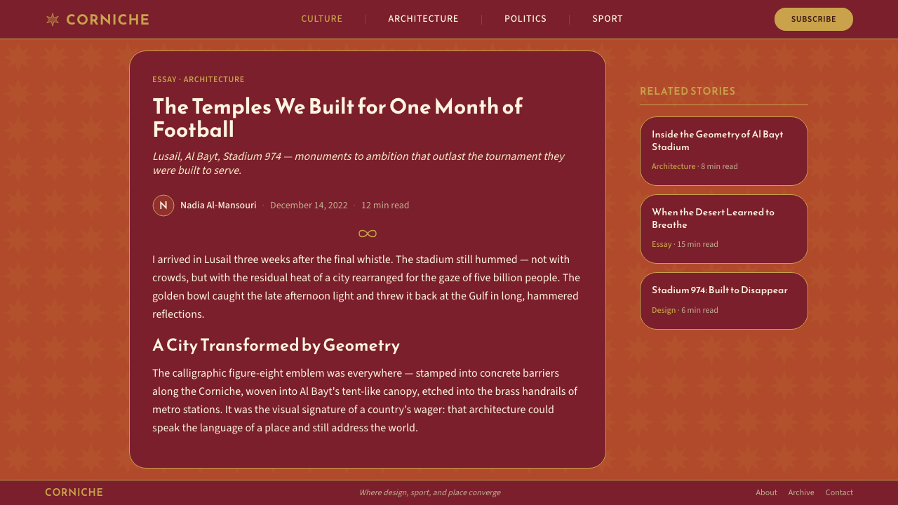
Norman Foster's London-based architectural practice designed the Al Bayt Stadium — one of the eight Qatar 2022 venues — whose tent-like structure directly inspired the silhouette motifs in the identity system. Al Bayt's swooping fabric canopy, modeled on the bayt al sha'ar (the traditional Bedouin tent), provided the curvilinear counterpoint to the identity's geometric patterns and became one of the tournament's most photographed architectural symbols. The dialogue between the architectural forms of the venues and the visual language of the brand is tighter in Qatar 2022 than in most World Cup identities.诺曼·福斯特的伦敦建筑事务所设计了卡塔尔2022八座场馆之一的阿尔拜特球场——其帐篷般的结构直接启发了识别系统中的轮廓母题。阿尔拜特那道弧形织物华盖,以传统贝都因帐篷(bayt al sha'ar)为原型,为识别系统的几何纹样提供了流线型对位,也成为本届赛事被拍摄最多的建筑符号之一。建筑形态与品牌视觉语言之间的对话,在卡塔尔2022中比多数世界杯识别系统都更为紧密。
The Qatari government body responsible for delivering the infrastructure and operational systems for Qatar 2022, and the primary client organization for the visual identity commission. Established in 2011, two years after Qatar won the bid, the Supreme Committee oversaw the construction of eight stadiums, an expanded metro system, hundreds of kilometers of new road infrastructure, and the complete hospitality and wayfinding ecosystem for which the visual identity was designed. Their identity brief was unusual in the degree to which it specified cultural authenticity requirements — not merely visual preferences — reflecting the political stakes attached to the tournament's self-presentation.负责承交卡塔尔2022基础设施与运营体系的卡塔尔政府机构,也是视觉识别委托的主要客户组织。2011年卡塔尔赢得申办权两年后成立的最高委员会,监督了八座球场的建设、扩展的地铁系统、数百公里新建道路基础设施,以及整套为其设计视觉识别的赛事接待与导视生态系统。他们的识别委托书不同寻常之处,在于对文化真实性要求的明确程度——不仅仅是视觉偏好——折射出这场赛事自我呈现所承载的政治分量。
How do you use Qatar World Cup 2022 today?今天怎么用 Qatar World Cup 2022?
Qatar 2022's visual language is applicable beyond sports event design, but it demands a careful understanding of what makes it work: the system succeeds because it operates through authentic cultural grammar, not merely through the surface effects of gold color and geometric pattern. Borrowing the surface effects without that underlying logic produces decoration, not design. The most valuable insight the system offers contemporary designers is not its palette but its demonstration that ornamental complexity can be structurally rigorous.卡塔尔2022的视觉语言可以应用于体育赛事设计之外,但这需要深入理解是什么使其奏效:这套系统的成功源于真实的文化语法运作,而非金色与几何图案的表面效果。借用表面效果而缺乏底层逻辑,产生的是装饰,而非设计。这套系统为当代设计师提供的最有价值的洞见,不是其色彩,而是它证明了装饰性复杂度可以同时具有结构严谨性。
For presentation slides, the Qatar aesthetic works well on high-stakes ceremonial or institutional contexts — launch decks, annual reports, cultural institution presentations — where visual richness signals investment and authority. A cover page benefits from the deep burgundy field with a gold-treated central emblem or wordmark; supporting geometry in the eight-pointed star form can function as a full-bleed background watermark. Content slides should reduce the color range dramatically: burgundy for headings, near-black or very dark neutral for body, with gold as a single accent reserved for data callouts or key statistics. The common mistake is filling content slides with the same density of decoration as the cover — the rich surface pattern belongs to ceremonial contexts, not information-dense ones.在演示文稿中,卡塔尔美学适合高规格的仪式性或机构性语境——发布演示、年度报告、文化机构演讲——在这些场合视觉丰富性传递着投入感与权威感。封面适合以深栗色底铺陈,配以金色处理的核心标志或文字标识;八角星形的辅助几何可作为满版背景水印。内容页应大幅削减色彩范围:栗色用于标题,近黑色或非常深的中性调用于正文,金色作为单一强调仅保留给数据标注或关键数据。常见错误是在内容页上复制与封面相同密度的装饰——丰富的表面纹样属于仪式性语境,而非信息密集的场合。
For web interfaces and dashboards, the system translates best when treated as an art direction reference rather than a literal template. Pull the color hierarchy — primary rich dark, secondary gold as accent, white or near-white for readable fields — and use the geometric vocabulary sparingly as a motif in non-interactive areas. Navigation bars, section dividers, and background tiles can carry a low-opacity star pattern; interactive elements — buttons, inputs, data visualizations — should remain clean to preserve usability. The metallic gold should appear in typographic accents or static hero elements only; hover and active states work better with tonal shifts within the primary dark.对于网页界面与仪表板,这套系统最适合作为美术指导参考而非字面模板。提取色彩层级——主色调为深浓正色,金色为次级强调,白色或近白色用于可读区域——并将几何词汇克制地作为非交互区域的母题使用。导航栏、章节分隔与背景瓷砖可承载低不透明度的星形图案;交互元素——按钮、输入框、数据可视化——应保持干净以维护可用性。金属金色只应出现于文字强调或静态英雄区域;悬停与激活状态更适合在主色深色内做色调偏移。
For editorial and marketing work, the Qatar 2022 register is especially effective for content celebrating cultural specificity, heritage brands, or events with ceremonial weight. Feature story layouts can use a full burgundy cover field with reversed-out gold or white type, then transition to a light-background interior treatment where the geometric motifs appear as subtle structural dividers. Marketing pages for luxury, cultural institution, or government communications can adopt the layered metallic richness of the system directly — provided the design is produced at sufficient quality that the metallic treatments read as material rather than as flat screen color.对于编辑与营销内容,卡塔尔2022的语调在颂扬文化特殊性、传承品牌或具有仪式分量的活动内容中尤为有效。专题故事版式可使用满版栗色封面配反白或金色字体,再过渡到浅底内页,让几何母题以精微的结构性分隔符出现。奢侈品、文化机构或政府传播的营销页面可直接采用这套系统的叠层金属丰富感——前提是设计制作质量足够高,金属处理能呈现为材质感而非平面屏幕色。
The most common misapplication is treating the identity as a generic 'Middle Eastern aesthetic' shorthand — deploying the geometric patterns, the gold, and the calligraphic gesture in contexts unrelated to any actual cultural engagement with the traditions they reference. The Qatar system works because it is specific: specific calligraphic tradition, specific flag color, specific architectural heritage, specific typeface choice. Designers applying it as a generic 'richness' or 'luxury' signal, detached from its cultural roots, produce work that reads as pastiche at best and as appropriation at worst. The productive application is to use the system as a model for how to develop culturally grounded visual density rather than as a set of transferable surface effects.最常见的误用,是将这套识别当作通用「中东美学」的速记符号——在与它所援引的文化传统毫无实质关联的语境中,堆砌几何图案、金色与书法姿态。卡塔尔系统奏效,恰恰因为它是特定的:特定的书法传统、特定的旗帜色彩、特定的建筑遗产、特定的字体选择。将其作为脱离文化根基的通用「丰富感」或「奢华」信号使用,创作出的作品在最好的情况下是拼贴,在最差的情况下是文化挪用。有益的应用方式,是将这套系统作为如何发展文化扎根的视觉密度的模型,而非一套可转移的表面效果。
See the Qatar World Cup 2022 design system →查看 Qatar World Cup 2022 完整设计系统 →
Qatar World Cup 2022 — FAQQatar World Cup 2022 · 常见问题
Is Qatar 2022's visual style specific to sports events, or can it work in other contexts?卡塔尔2022的视觉风格是体育赛事专属的,还是可以应用于其他语境?
It is not sports-specific. The visual grammar of Qatar 2022 — calligraphic emblem forms, geometric star patterns, layered metallic surfaces, and a palette anchored in a strong national color — belongs to the broader tradition of Gulf-state ceremonial design, which predates and will outlast any single sporting event. These conventions appear in the visual identity of Qatari, UAE, Saudi, and Bahraini government institutions, in luxury hospitality design across the Gulf, and in the ceremony design of major Islamic commemorations. Designers working with any of these institutional or cultural contexts can draw on the system productively.它并不专属于体育赛事。卡塔尔2022的视觉语法——书法徽标形态、几何星形图案、叠层金属表面,以及锚定于强烈国家色的调色板——属于波湾国家礼仪设计的宏观传统,这一传统早于任何单一体育赛事存在,也将在其之后延续。这些惯例出现于卡塔尔、阿联酋、沙特与巴林政府机构的视觉识别中,出现于整个波湾地区的奢华接待设计中,也出现于重大伊斯兰纪念活动的仪式设计中。在上述任何机构或文化语境中工作的设计师,都可以从这套系统中有益地汲取。
How does Qatar 2022's approach to ornament differ from 'maximalism' in contemporary design?卡塔尔2022对装饰的处理方式,与当代设计中的「最大主义」有何不同?
Contemporary maximalism tends to accumulate visual elements for expressive or ironic effect — layering patterns, typefaces, and colors in ways that deliberately exceed readability or compositional harmony. Qatar 2022's ornamental density is structurally different: every decorative element has a cultural source, a geometric logic, and a hierarchical place within the system. The eight-pointed star pattern does not appear because it is visually busy but because it carries specific resonance in Islamic geometric tradition. The discipline of the system is invisible from a distance but rigorous in practice — knowing which forms to include is as important as knowing which to exclude. This is structured richness, not accumulated excess.当代最大主义倾向于为表达性或反讽效果而堆积视觉元素——以刻意超越可读性或构图和谐的方式叠加图案、字体与色彩。卡塔尔2022的装饰密度在结构上截然不同:每一个装饰元素都有文化来源、几何逻辑,以及在系统内部的层级位置。八角星图案的出现,不是因为它视觉繁忙,而是因为它在伊斯兰几何传统中承载着特定的共鸣。这套系统的自律从远处不可见,但在实践中是严格的——知道该纳入哪些形态,与知道该排除哪些形态同等重要。这是结构化的丰富,而非堆积的过剩。
Why was a Portuguese studio chosen to design the identity rather than an Arab or Gulf-based one?为什么选择葡萄牙工作室而非阿拉伯或波湾本地机构来设计这套识别系统?
FIFA's selection process for major event identities typically involves an international pitch, and Brandia Central won the commission on the strength of their work and their proposed creative direction. The selection was not uncontroversial — it drew commentary from design critics who noted the choice of a European studio to represent Arab cultural heritage. The studio addressed this by conducting extensive research trips to Qatar, working with Qatari cultural advisors throughout the process, and grounding every design decision in documented cultural references rather than generalized 'Middle Eastern' aesthetics. The resulting identity is generally regarded as a culturally literate outcome, though the debate it sparked about who should tell whose visual story remains alive in design discourse.国际足联对重大赛事识别系统的遴选流程通常涉及国际竞标,Brandia Central凭借其作品实力与所提出的创意方向赢得委托。这一选择并非没有争议——有设计评论人对选用欧洲工作室代表阿拉伯文化遗产表达了质疑。工作室的应对之策,是对卡塔尔进行深度田野调研,在整个过程中与卡塔尔文化顾问紧密合作,并将每一个设计决定建立在有据可查的文化参考之上,而非泛化的「中东」美学。最终的识别系统普遍被视为具有文化素养的成果,尽管它所激发的关于谁有资格讲述谁的视觉故事的讨论,至今仍在设计话语中未息。
How does the Qatar 2022 identity handle the tension between Islamic decorative tradition and a global audience unfamiliar with its grammar?卡塔尔2022识别系统如何处理伊斯兰装饰传统与不熟悉其语法的全球受众之间的张力?
The system resolves this tension through the layered reading principle: every element communicates at two levels simultaneously. To an audience familiar with Islamic visual grammar, the eight-pointed star is a Rub el Hizb, the script is recognizable as Kufic in the geometric tradition, and the calligraphic emblem reads as a culturally embedded mark. To an audience unfamiliar with that grammar, the same emblem reads as an elegant abstract logo, the star patterns as sophisticated decorative geometry, and the overall register as ceremonial richness. This dual legibility is not accidental — it is a core design strategy. The mark does not require cultural knowledge to function, but it rewards it.这套系统通过分层阅读原则化解这一张力:每个元素同时在两个层面上传达意义。对熟悉伊斯兰视觉语法的受众而言,八角星是鲁布·希兹布,文字可辨认为几何传统中的库法体,书法徽标则是一个承载文化底蕴的标志。对不熟悉这套语法的受众而言,同样的徽标是一个优雅的抽象标识,星形图案是精致的装饰几何,整体调性是礼仪性的丰富感。这种双重可读性并非偶然——它是核心设计策略。这个标志的运作不需要文化知识的前提,但文化知识能让观者从中获得更多。
Can this visual language be applied to digital products, or is it fundamentally a print and environmental system?这套视觉语言可以应用于数字产品吗,还是它本质上是印刷与环境媒介的体系?
The system was designed with broadcast graphics and digital applications in mind alongside print and environmental design, so it has genuine digital DNA. The metallic treatments translate to screen through carefully managed highlight and shadow ranges rather than literal screen-rendered metallics, which tend to look synthetic. The geometric patterns work well as SVG elements in web contexts, where they can animate subtly without becoming distracting. The primary challenge for digital applications is color: the deep burgundy and metallic gold can look heavy or muddy on lower-quality screens. The solution used in Qatar's own digital properties was to lighten the neutral grounds, increase the contrast between color fields, and treat the gold as a typographic accent rather than a background fill in screen contexts.这套系统在设计之初就将广播图形与数字应用纳入考量,与印刷和环境设计并置,因此它确实具有数字基因。金属处理在屏幕上通过精心管理的高光与阴影范围来呈现,而非字面上的屏幕渲染金属——后者往往看起来是合成的。几何图案在网络语境中作为SVG元素表现良好,可以在不造成干扰的前提下进行细微动画。数字应用最主要的挑战在于色彩:深栗色与金属金色在低质量屏幕上可能显得厚重或混浊。卡塔尔自有数字产品所采用的解决方案,是加亮中性底调、增大色彩区域间的对比,并在屏幕语境中将金色处理为文字强调而非背景填充色。
Related design styles相关设计风格
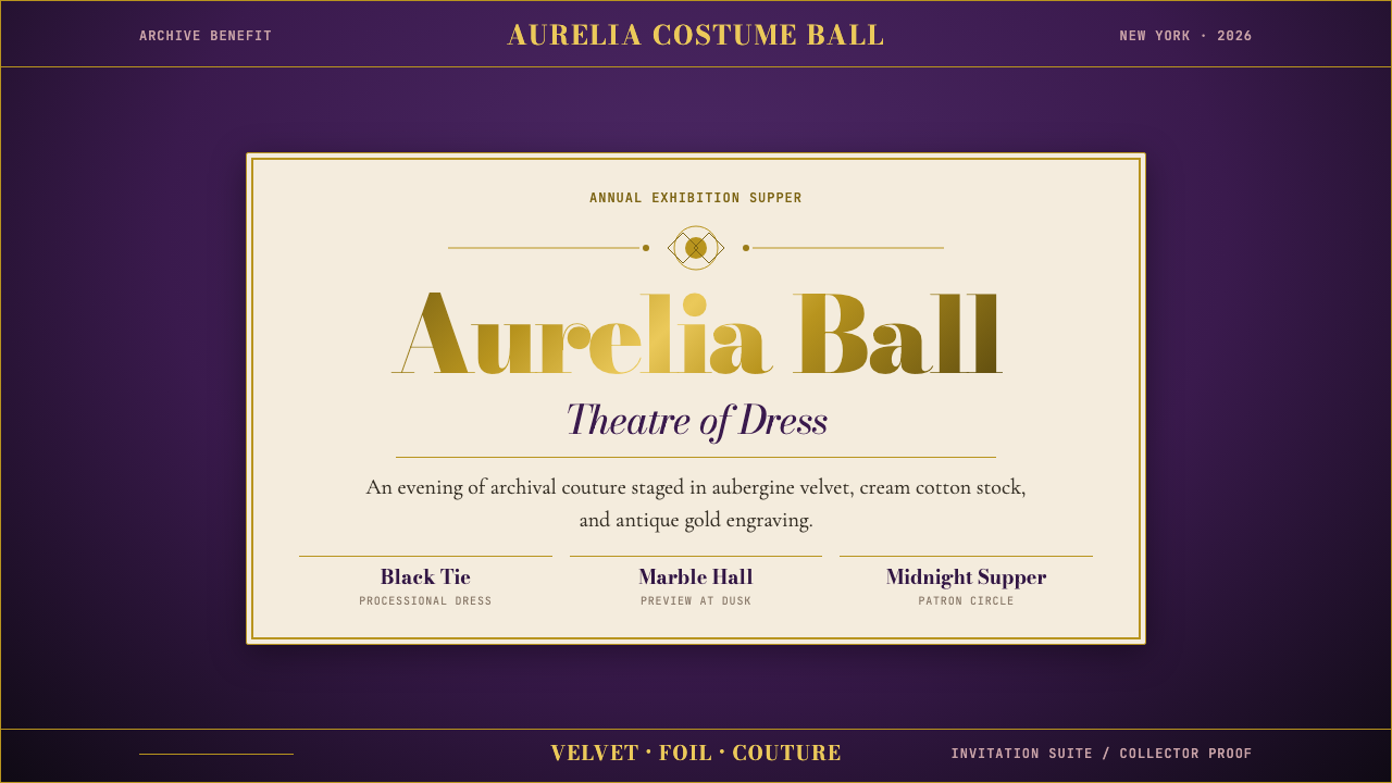 Met GalaTheatrical reverence. Aubergine velvet, cream stock, and Bodoni gold foil fra…戏剧化的敬意:茄紫天鹅绒、奶油纸与金箔 Bodoni 围合仪式感。
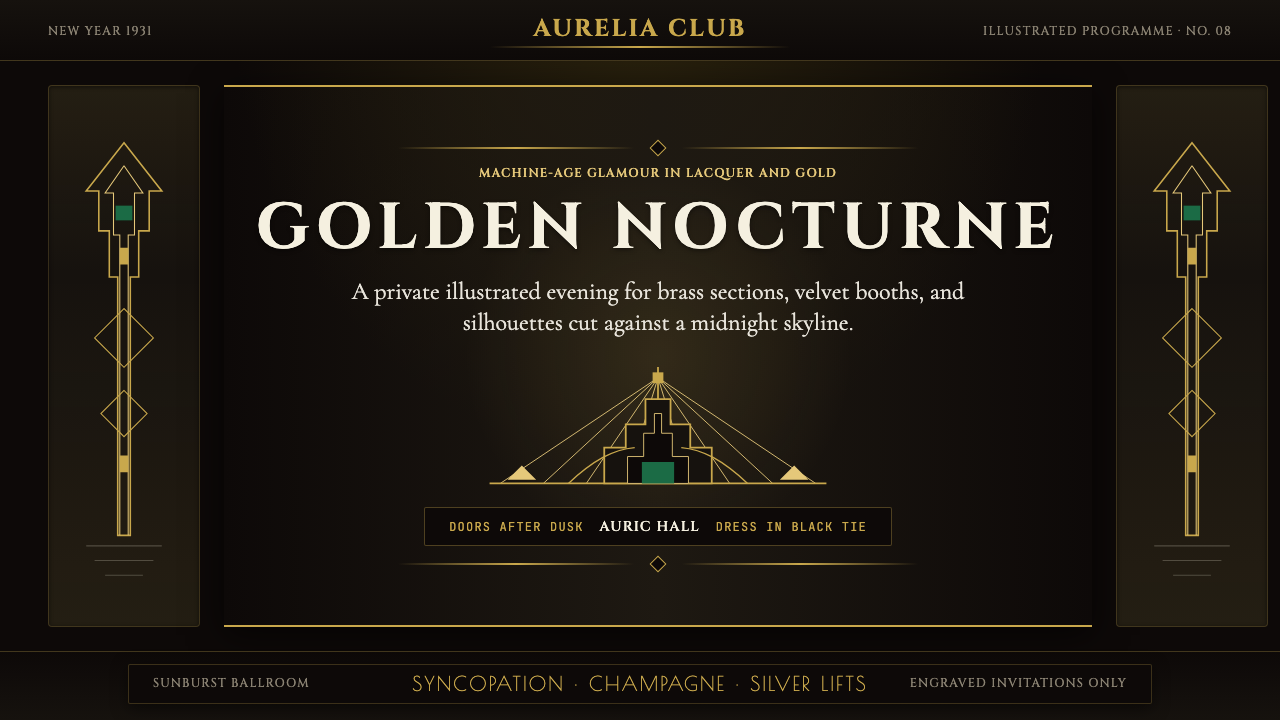 Art Deco Jazz AgeJazz Age glamour. Sunburst rays, stepped ziggurats, gold on black — Chrysler…爵士时代的流光奢华:太阳光芒、阶梯几何、金色撞黑底——克莱斯勒大厦门厅的 CS…
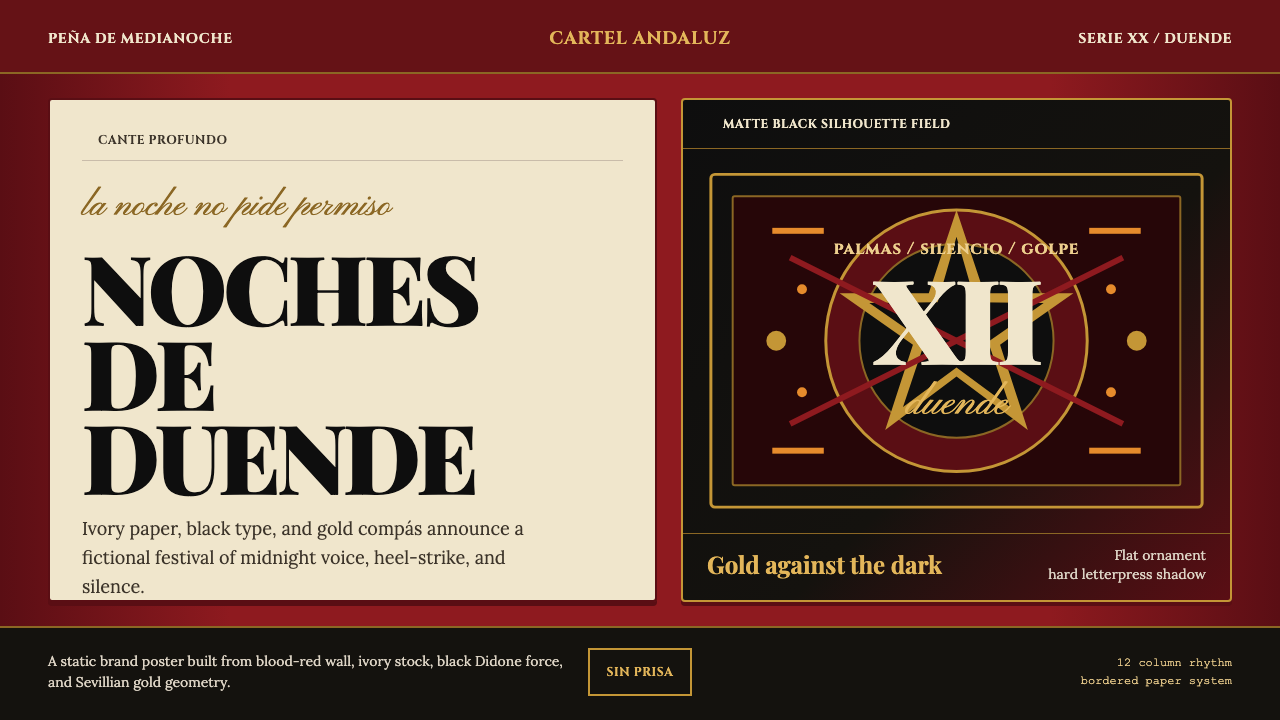 Spanish Flamenco PosterPassion printed as ritual. Blood red, ivory paper, Didone type, and flat gold…激情如仪式印成:血红墙、象牙纸、Didone字与金色节拍。
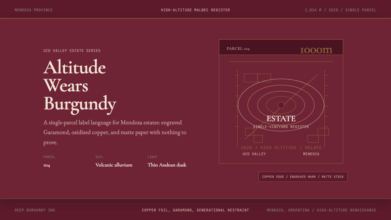 Argentine Malbec WineAltitude turned austere. Burgundy panels, engraved Garamond, oxidized copper.高海拔变得克制。酒红面板、雕刻衬线与氧化铜。
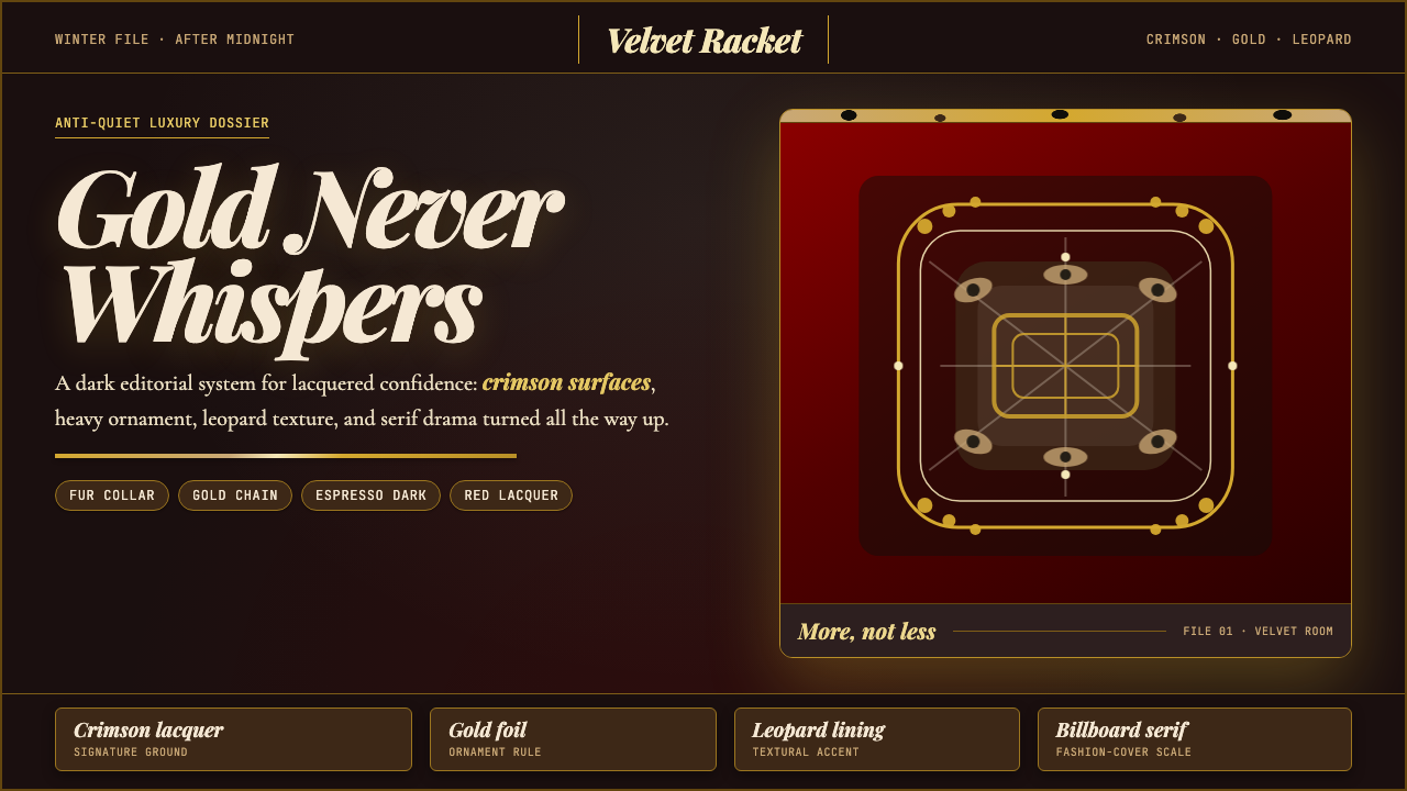 Mob Wife AestheticGlamour refuses restraint. Crimson lacquer, gold foil, leopard texture, billb…奢华拒绝克制:酒红漆面、金箔、豹纹与巨幅 Didone。
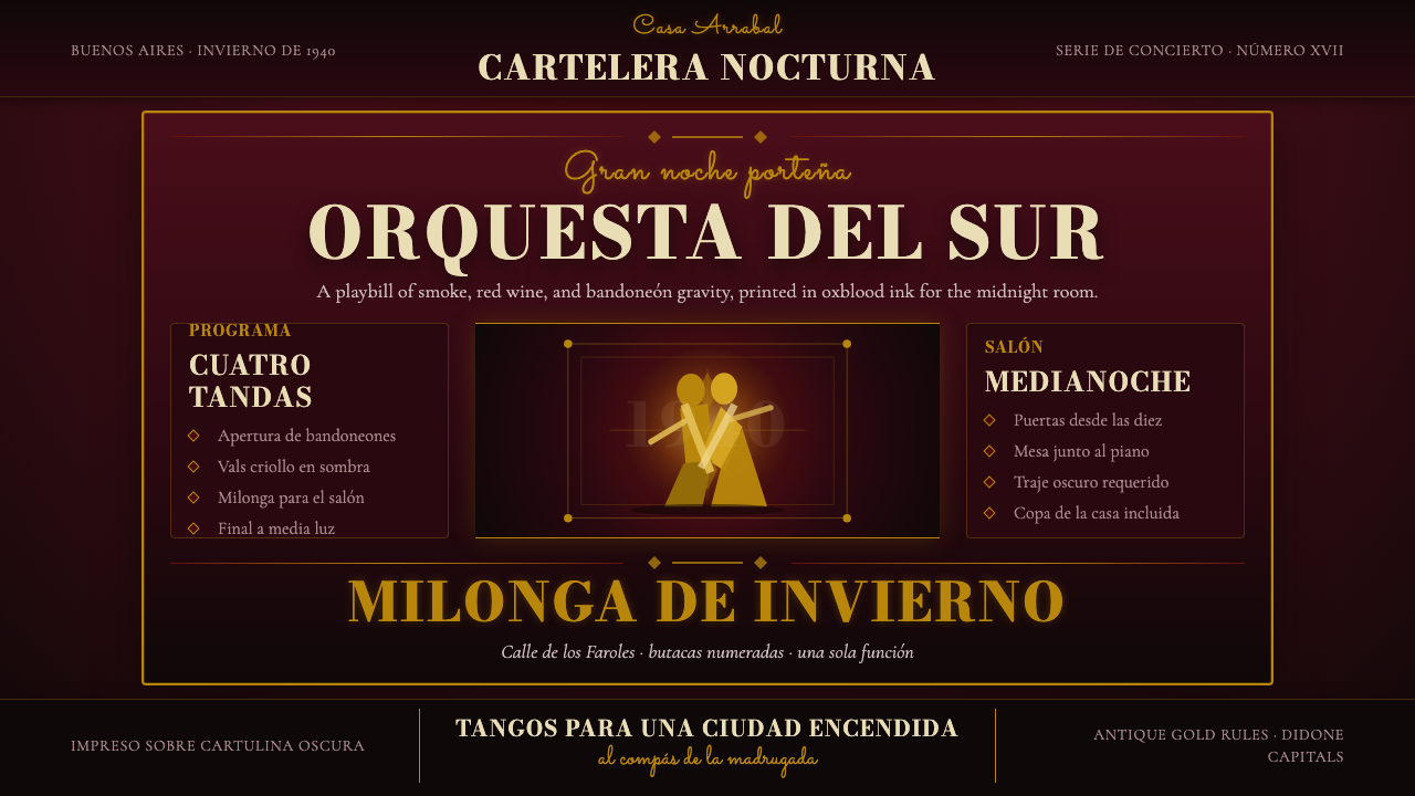 Argentine Tango Poster (1940)Nocturnal drama in ink. Oxblood ground, antique gold rules, Bodoni capitals.暗夜戏剧感:氧血红底、古金线框与Bodoni大写。