What is Argentine Malbec Wine?什么是 Argentine Malbec Wine?
Born in the shadow of the Andes, Argentine Malbec wine branding weaponizes restraint — deep burgundy ink, oxidized copper foil, and engraved letterforms pressed into uncoated paper that speaks of altitude, volcanic soil, and generational stewardship.诞生于安第斯山脉阴影之下,阿根廷马尔贝克葡萄酒品牌将克制变为武器——深勃艮第墨色、氧化铜箔与雕刻感字形,压印在诉说着海拔、火山土壤与家族百年传承的无涂层纸张上。
Argentine Malbec Wine in briefArgentine Malbec Wine 速览
Argentine Malbec wine branding is a visual system forged from the landscape of Mendoza's high-altitude valleys. It draws on deep burgundy as its dominant tone — not the aggressive crimson of a mass-market label, but the mature, darkened hue of an aged Malbec at rest in the glass. Against this ground, oxidized copper foil and engraved Garamond estate marks create a surface that feels less printed than pressed, less designed than inherited.阿根廷马尔贝克葡萄酒品牌美学,是一套从门多萨高海拔山谷地景中锻造而成的视觉系统。它以深勃艮第色为主导基调——不是大众市场酒标上那种攻击性的鲜红,而是一瓶陈年马尔贝克在杯中静置时呈现的成熟、深沉的色调。在这一底色之上,氧化铜箔与雕刻感加拉蒙字体构成的庄园标志,营造出一种不像是印刷、更像是压印出来的表面——不像是设计出来的,更像是继承下来的。
This aesthetic emerged as a deliberate counter-statement to the cartoon labels and fruit-forward imagery that flooded wine shelves in the 1990s and early 2000s. Where those labels shouted, Malbec estate branding whispers. Every element earns its place through restraint: a single engraved vineyard map, a minimal estate seal, a typeface chosen for its historical weight rather than its legibility at a glance. The design does not explain the wine — it presupposes that a wine of this character requires no explanation.这种美学作为一种对抗性宣言出现,反对的是1990年代至2000年代初期涌上酒架的卡通酒标与果味导向图像。那些酒标在喊叫,而马尔贝克庄园品牌在低语。每一个元素都通过克制来争取自己的位置:一幅单独的雕刻葡萄园地图,一枚极简的庄园印章,一款以历史分量而非速读性取胜的字体。这套设计不向你解释这瓶酒——它预设了一瓶具备这种性格的酒不需要解释。
The system channels the visual language of the great Mendoza estates — Catena Zapata, Bodega Norton, Achaval-Ferrer — and translates it into a transferable design vocabulary. Thick uncoated stock replaces the glossy label; tactile impression replaces color contrast as the primary differentiator. In digital contexts, this translates to a palette built around warm near-blacks, aged parchment tones, and the controlled use of a single metallic or oxidized accent. The result is an aesthetic of quiet confidence: a design that knows exactly what it is.这套系统汲取了门多萨顶级庄园——卡特纳萨帕塔、诺顿酒庄、阿查瓦尔-费雷尔——的视觉语言,并将其转化为可被移植的设计词汇。厚实无涂层纸张取代了光滑标签,触觉压印取代了色彩对比,成为主要的差异化手段。在数字语境中,这套语言转化为一个由温暖近黑色、陈旧羊皮纸色调,以及对单一金属感或氧化感强调色的节制使用所构建的色板。最终呈现出一种沉静自信的美学:一套完全清楚自己是什么的设计。
See the Argentine Malbec Wine design system查看 Argentine Malbec Wine 完整设计系统
Where does Argentine Malbec Wine come from?Argentine Malbec Wine 从何而来?
Malbec's story in Argentina begins with French emigration and agrarian ambition. The grape — known in its homeland of Cahors, France, as Côt or Auxerrois — arrived in Argentina in 1853 when the agronomist Michel Pouget carried cuttings to Mendoza at the invitation of the provincial governor. The vine adapted with startling success to the high desert plateau east of the Andes: the thin air, intense ultraviolet radiation, and dramatic diurnal temperature swings produced a fruit with a density and aromatic complexity that the original French plantings rarely achieved. By the early twentieth century, Malbec had become the backbone of Argentine wine production, though primarily for the domestic market and with little attention to label design beyond utilitarian identification.马尔贝克在阿根廷的故事,始于法国移民与农业雄心。这个葡萄品种——在其故乡法国卡奥尔被称为Côt或Auxerrois——于1853年由农学家米歇尔·普热应门多萨省长邀请,携插穗带入阿根廷。这种葡萄藤在安第斯山脉东侧的高原沙漠上适应得出人意料地好:稀薄的空气、强烈的紫外线辐射,以及昼夜温差的剧烈起伏,造就了一种果实,其密度与芳香复杂度是法国原产地种植所鲜少达到的。到二十世纪初,马尔贝克已成为阿根廷葡萄酒生产的主干,尽管主要面向国内市场,酒标设计也几乎没有超出实用性识别的范畴。
The transformation of Malbec into a globally recognized prestige wine — and the birth of the visual system that defines it today — began in earnest in the 1990s. The pivotal figure was Nicolás Catena Zapata, who had spent time at UC Davis studying viticulture and returned to Mendoza convinced that the Uco Valley's high altitudes, rising above a thousand meters, could produce world-class wine. Catena invested in single-vineyard identification, minimal intervention winemaking, and — crucially — label design that communicated permanence and seriousness to export markets. The Catena Zapata pyramid label, with its Andean architectural reference and engraved gravitas, set the visual standard that other estates began to follow. By the late 1990s and into the 2000s, Argentine wine exports surged, and with them came a coherent aesthetic language: dark, earthy, precise, and unhurried.将马尔贝克转变为全球公认的高端葡萄酒——以及今日定义其形象的视觉系统的诞生——认真开始于1990年代。关键人物是尼古拉斯·卡特纳萨帕塔,他曾在加州大学戴维斯分校研习葡萄栽培学,回到门多萨后确信乌科谷超过一千米的高海拔地带能够出产世界级葡萄酒。卡特纳在单一葡萄园识别、最小干预酿酒工艺,以及——至关重要地——向出口市场传达永恒与严肃感的酒标设计上进行了大量投入。卡特纳萨帕塔的金字塔酒标,以其安第斯建筑参照与雕刻般的庄重感,确立了其他庄园开始效仿的视觉标准。到1990年代末和2000年代,阿根廷葡萄酒出口激增,随之而来的是一套连贯的美学语言:深沉、质朴、精准、从容不迫。
The wine renaissance of this era produced a generation of winemakers who treated design as an extension of winemaking philosophy. Susana Balbo, trained as an oenologist and one of the first women to lead a major Argentine winery, approached her label design with the same rigor she applied to her wines: nothing decorative that did not also communicate. Roberto de la Mota, consulting for estates across Mendoza and the broader Cuyo region, helped articulate a house style built around terroir transparency — the label as a statement of place rather than of brand personality. Laura Catena, continuing her father's legacy while also publishing academic research on high-altitude viticulture, reinforced the intellectual seriousness of the movement's self-presentation.这一时代的葡萄酒复兴培育了一代将设计视为酿酒哲学延伸的酿酒师。苏萨娜·巴尔博,受训于葡萄酒学专业,也是第一批领导主要阿根廷酒庄的女性之一,她以对待葡萄酒同样的严谨态度处理酒标设计:凡不能传达信息的装饰,一概不要。罗伯托·德拉莫塔,为门多萨及库约地区众多庄园担任顾问,帮助阐明了一种以风土透明度为核心的酒庄风格——酒标作为地域的陈述,而非品牌个性的表演。劳拉·卡特纳在延续父亲遗产的同时,也发表了高海拔葡萄栽培的学术研究,进一步强化了这场运动自我呈现中的知识分子严肃性。
The visual identity that coalesced from these efforts draws on a specific set of material and historical references. The engraved letterform echoes the tradition of French grand cru estate typography — Bordeaux chateau labels with their centuries-old typefaces — but filtered through an Argentine lens that emphasizes the Andean landscape rather than European heritage. The use of oxidized or aged metallic foils speaks of time, of cellaring, of the patience that altitude-grown wine demands. The choice of thick uncoated paper over laminated stock is a rejection of the visual noise of commercial wine shelves in favor of tactile honesty. This was not an aesthetic of nostalgia but of aspiration: Argentina making the case, through visual form, that its wines deserved a place among the world's finest.从这些努力中凝聚而成的视觉身份,汲取了一套具体的材料与历史参照。雕刻感字形呼应了法国顶级酒庄字体排印的传统——波尔多城堡酒标上那些沿用数百年的字体——但经过阿根廷视角的过滤,强调的是安第斯山地景而非欧洲传统。氧化或陈旧金属箔的使用,诉说的是时间、窖藏,以及高海拔葡萄酒所要求的耐心。选择厚实无涂层纸张而非覆膜纸,是对商业酒架视觉噪音的拒绝,转而选择触觉上的诚实。这不是一种怀旧的美学,而是一种进取的美学:阿根廷通过视觉形式主张,其葡萄酒值得在世界最优质的行列中占有一席之地。
What defines the Argentine Malbec Wine look?Argentine Malbec Wine 的视觉特征是什么?
Color Palette色彩体系
The dominant tone is a deep burgundy — a near-black red that reads as dignified rather than aggressive, evoking the color of an aged Malbec held up to candlelight. Against this, aged parchment or warm off-white grounds provide breathing room without suggesting clinical brightness. The accent is oxidized copper or antique gold: not the harsh gleam of commercial foil, but a muted, weathered metallic warmth. A very limited range of earthy secondary tones — slate, volcanic grey, dry earth brown — may appear, but the system never uses more than two or three values at once. Saturation throughout is low to medium; the palette deliberately avoids the high-contrast primary colors associated with mass-market wine labels.主导色调是深勃艮第色——一种近黑的红,读来庄严而非攻击性,令人联想到一瓶陈年马尔贝克在烛光下呈现的色泽。与之相对,陈旧羊皮纸色或温暖的近白色底面提供了呼吸空间,而不至于显得临床式的明亮。强调色是氧化铜或古旧金:不是商业箔纸的刺目光泽,而是低调、风化的金属温度。有限的几种大地色系次要色——板岩色、火山灰、干土棕——可能出现,但这套系统从不同时使用超过两三个色值。整体饱和度低至中等;色板刻意回避与大众市场酒标相关的高对比度三原色。
Typography字体排印
Engraved or letterpress-feeling serif typefaces are the typographic foundation. The model is classical French estate typography — the kind found on Bordeaux chateau labels — with the character that comes from metal type pressed into heavy paper rather than digitally rendered on a smooth surface. Display text is set with generous letterspacing, giving each character room to breathe and reinforcing the sense that nothing here was designed in haste. Body text, where it appears, is set at a small measure with quiet authority. Italics carry the weight of provenance notes, vineyard names, and vintage information. Modern sans-serif type is conspicuously absent; its presence would dissolve the aesthetic.具有雕刻感或活字印刷感的衬线字体是排印的基础。范本是法国古典庄园字体——波尔多城堡酒标上的那种字体——带有金属活字压入厚纸时产生的质感,而非在光滑表面数字渲染的效果。展示文字以宽阔的字间距排布,给每个字符以呼吸空间,强化了没有任何东西是仓促设计的感受。正文(若出现)以窄行宽、静谧的权威感排布。斜体承载产地注释、葡萄园名称与年份信息的分量。现代无衬线字体明显缺席——其出现将瓦解整套美学。
Surface and Materiality表面与材质感
Uncoated, heavyweight paper stock is as much a design decision as any typographic choice. Where glossy labels catch light uniformly, uncoated stock absorbs it differently depending on angle, creating a living surface that changes under different lighting conditions. In digital applications, this material logic translates into textured grounds — subtle paper grain, faint aged vellum tones — applied with restraint so they read as atmosphere rather than decoration. The system's attitude toward surface is always one of honest materiality: the design should feel as though it could be touched and found to have substance.无涂层、重磅纸张的选择与任何字体决定同等重要。光滑标签均匀地反射光线,而无涂层纸张根据角度以不同方式吸收光线,营造出一种在不同光照条件下会变化的活的表面。在数字应用中,这种材质逻辑转化为带纹理的底面——微妙的纸张颗粒感、隐约的陈旧牛皮纸色调——以克制的方式运用,使其读来像是氛围而非装饰。这套系统对表面的态度始终是诚实的材质感:设计应该感觉像是可以被触摸,并被发现具有实质的东西。
Ornament and Illustration装饰与插图
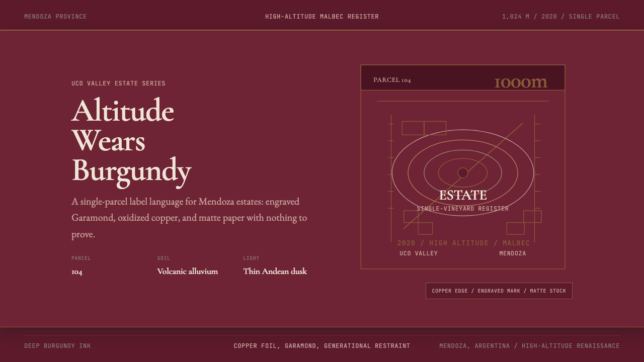
When figurative elements appear, they are engraved in style — thin cross-hatched lines evoking the tradition of intaglio printmaking rather than digital illustration. Common motifs include vineyard topographic maps rendered as fine-line engravings, Andean mountain silhouettes, and estate seals with heraldic geometry. Crucially, these illustrations are not decorative additions — they carry specific information about place, elevation, and identity. The distinction between ornament and information is taken seriously: anything that could be removed without loss of meaning should not be there.当具象元素出现时,它们采用雕刻风格——细腻的交叉阴影线条,令人联想到凹版印刷的传统,而非数字插图。常见母题包括以精细线条雕刻表现的葡萄园地形图、安第斯山脉剪影,以及带有纹章几何图形的庄园印章。至关重要的是,这些插图不是装饰性的添加——它们承载着关于地点、海拔与身份的具体信息。装饰与信息之间的区别被认真对待:任何去掉也不损失意义的东西,就不应该在那里。
Composition and Hierarchy构图与层级
Composition is formally centered or near-centered — a marked contrast to the asymmetric dynamism of modernist design systems. The estate name anchors the center or upper register, the vintage occupies a quiet secondary position, and the appellation or vineyard designation appears below in a smaller but equally deliberate typeface. White or parchment space is used generously; crowding is treated as a quality signal in the wrong direction. The hierarchy communicates that the wine's name and its place of origin are the only things that truly matter, and everything else is supporting annotation.构图是正式居中或接近居中的——与现代主义设计系统的非对称动感形成鲜明对比。庄园名称锚定中心或上部区域,年份占据一个安静的次要位置,产区或葡萄园名称以更小但同样刻意的字体出现于下方。白色或羊皮纸空间被慷慨地运用;拥挤被视为朝错误方向的品质信号。层级传达的信息是:葡萄酒的名称与其产地,是唯一真正重要的东西,其他一切都是辅助性注释。
Restraint as Aesthetic Principle克制作为美学原则
More than any single visual element, the defining quality of this aesthetic is its confidence in subtraction. Every decision — fewer colors, heavier paper, more space, quieter illustration — is a decision to let the wine speak rather than the design. This restraint is not minimalism in the contemporary sense; it is not about achieving a sleek, tech-inspired simplicity. It is the restraint of something that does not need to compete for attention because it already knows what it is worth. The aesthetic is aristocratic without being arrogant, classical without being archaic.比任何单一视觉元素都更重要的,是这套美学在减法上的自信——这是其定义性品质。每一个决定——更少的色彩、更厚的纸张、更多的空间、更安静的插图——都是让葡萄酒而非设计来发言的决定。这种克制并非当代意义上的极简主义;它不是关于实现一种光滑的、受科技启发的简洁。它是某种不需要争夺注意力的东西的克制,因为它已经知道自己的价值。这套美学是贵族式的,却不傲慢;是古典的,却不陈旧。
Altitude and Terroir as Visual Language海拔与风土作为视觉语言
What sets Argentine Malbec branding apart from European estate aesthetics is its explicit reference to landscape and geography. The Andes are not a backdrop — they are a protagonist. Labels frequently reference elevation in meters, locate the estate on a small map of Mendoza's sub-appellations, or name specific vineyard parcels with the precision of a land survey. In digital or presentation contexts, this translates to a design language that treats geographical specificity as a prestige signal: the more precisely a wine can name its place, the more serious it is. Maps, topographic lines, and elevation data appear as visual elements rather than purely informational footnotes.使阿根廷马尔贝克品牌区别于欧洲庄园美学的,是其对地景与地理的明确参照。安第斯山脉不是背景——它是主角。酒标频繁以米为单位标注海拔,在门多萨子产区的小地图上标记庄园位置,或以土地测量般的精确度命名特定葡萄园地块。在数字或演示语境中,这转化为一种将地理特殊性视为高端信号的设计语言:一款葡萄酒能越精确地命名其产地,就越严肃。地图、地形线与海拔数据作为视觉元素出现,而非纯粹的信息性脚注。
See the Argentine Malbec Wine design system查看 Argentine Malbec Wine 完整设计系统
Who shaped Argentine Malbec Wine?谁塑造了 Argentine Malbec Wine?
Nicolás Catena Zapata is the central figure in the transformation of Argentine Malbec from a domestic wine into a global prestige product. After studying viticulture at UC Davis in the 1980s, he returned to Mendoza convinced that the Uco Valley's extreme altitudes could produce Malbec of world-class quality. His investments in high-altitude single-vineyard wine — and in the architectural, engraved label design that communicated this ambition visually — established the visual and winemaking template that the entire Argentine prestige wine industry followed. The Catena Zapata label, with its Andean pyramid motif and classical typography, became the reference against which all subsequent Argentine premium labels defined themselves.尼古拉斯·卡特纳萨帕塔是将阿根廷马尔贝克从国内葡萄酒转变为全球高端产品的核心人物。1980年代在加州大学戴维斯分校研习葡萄栽培学后,他回到门多萨,确信乌科谷的极端海拔能够出产世界级品质的马尔贝克。他在高海拔单一葡萄园葡萄酒上的投入——以及在以建筑感、雕刻感酒标设计来视觉化传达这种雄心上的投入——确立了整个阿根廷高端葡萄酒产业随后效仿的视觉与酿酒模板。卡特纳萨帕塔酒标,以其安第斯金字塔图案与古典字体,成为此后所有阿根廷精品酒标据以定义自身的参照系。
Laura Catena, daughter of Nicolás, extended the family winemaking legacy while also providing the intellectual articulation that gave the aesthetic its authority. Her academic research on high-altitude viticulture — published alongside her wine work — positioned Argentine Malbec within a serious discourse of terroir science rather than pure marketing. Through her Zuccardi and Catena Institute of Wine projects, she helped establish the language of single-parcel, elevation-specific wine identification that became a cornerstone of the visual system: the idea that a wine's label should function as a precise geographical document.劳拉·卡特纳,尼古拉斯之女,在延续家族酿酒遗产的同时,也提供了赋予这套美学权威性的知识分子表述。她关于高海拔葡萄栽培学的学术研究——与她的葡萄酒工作并行发表——将阿根廷马尔贝克置于严肃的风土科学话语中,而非纯粹的市场营销。通过她的苏卡地与卡特纳葡萄酒研究所项目,她帮助确立了单一地块、特定海拔葡萄酒识别的语言,这一语言成为视觉系统的基石:一款葡萄酒的酒标应当作为精确的地理文献来发挥作用。
Susana Balbo, one of the first female oenologists to lead a major Argentine winery, brought a rigorous, no-decoration-for-its-own-sake philosophy to both winemaking and label design. Her Susana Balbo Wines labels exemplify the principle that restraint is not poverty but precision: a clean typographic hierarchy, the producer's name as primary identifier, and the grape variety and vintage as secondary — with nothing present that does not need to be. Her influence reinforced the idea that the design vocabulary of Argentine Malbec should reflect the same discipline applied in the winery itself.苏萨娜·巴尔博,最早领导主要阿根廷酒庄的女性葡萄酒学家之一,将一种严格的、不为装饰而装饰的哲学带入酿酒与酒标设计两个领域。她的苏萨娜巴尔博葡萄酒酒标,例证了克制不是贫乏而是精确的原则:清晰的字体层级,生产者名称作为主要识别符,葡萄品种与年份作为次要标注——没有任何不必要存在的东西。她的影响强化了这样一种理念:阿根廷马尔贝克的设计词汇,应当反映酒庄本身所运用的同等纪律。
Roberto de la Mota, consulting winemaker for estates across Mendoza and beyond, articulated a winemaking philosophy centered on terroir transparency that directly informed the visual identity of the wines he worked with. His approach — letting the specific geography of each vineyard express itself rather than imposing a house style across the range — pushed label design toward greater geographical specificity. The estates he consulted for frequently feature vineyard maps, elevation notations, and parcel names as primary visual elements, because de la Mota's winemaking philosophy made these facts the wine's most important story.罗伯托·德拉莫塔,为门多萨及更广泛地区众多庄园担任顾问酿酒师,阐述了一种以风土透明度为核心的酿酒哲学,这种哲学直接影响了他所参与酒款的视觉身份。他的方法——让每个葡萄园的特定地理特征自我表达,而非在产品线上强加一种统一的酒庄风格——推动酒标设计走向更大的地理特殊性。他所顾问的庄园,频繁以葡萄园地图、海拔标注与地块名称作为主要视觉元素,因为德拉莫塔的酿酒哲学使这些事实成为这款酒最重要的故事。
The founding team of Achaval-Ferrer — established in Mendoza in 1998 — represented the internationalist ambition of the Argentine wine renaissance. By bringing together an Argentine businessman, an Italian winemaking consultant, and a focus on single-vineyard parcels in Luján de Cuyo, they produced wines that required a label language capable of speaking to sophisticated European and American collectors. The Achaval-Ferrer labels, with their restrained typography and estate-mark gravity, helped define the visual register of Argentine Malbec for the export market at the moment when that market was being created.1998年在门多萨创立的阿查瓦尔-费雷尔创始团队,代表了阿根廷葡萄酒复兴的国际主义雄心。通过汇聚一位阿根廷商人、一位意大利酿酒顾问,以及对卢汉德库约单一葡萄园地块的专注,他们出产的葡萄酒需要一种能够向欧美成熟藏家发言的酒标语言。阿查瓦尔-费雷尔的酒标,以其克制的字体排印与庄园标志的庄重感,在出口市场被创建的那一刻,帮助为阿根廷马尔贝克定义了面向该市场的视觉基调。
How do you use Argentine Malbec Wine today?今天怎么用 Argentine Malbec Wine?
Argentine Malbec wine branding translates most naturally into contexts that need to communicate premium quality, geographical authenticity, and patient craftsmanship — without the cold authority of Swiss modernism or the exuberance of tropical lifestyle branding. The system works because its visual vocabulary is deeply specific to what it represents: a wine from a precise elevation, in a precise valley, made by people who have committed decades to a single type of grape. Applying it correctly means preserving that specificity rather than borrowing only the surface color palette.阿根廷马尔贝克葡萄酒品牌美学最自然地适用于那些需要传达高端品质、地理真实性与耐心工艺的语境——而不需要瑞士现代主义的冷峻权威,也不需要热带生活方式品牌的热情奔放。这套系统之所以奏效,是因为其视觉词汇对它所代表的对象高度专属:一款来自精确海拔、精确山谷、由几十年专注于单一葡萄品种的人们所酿制的葡萄酒。正确应用它,意味着保留这种特殊性,而非只借用表面色板。
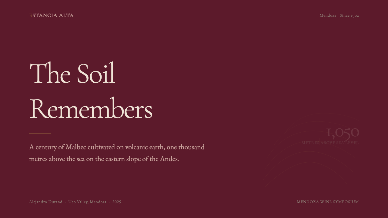
For presentation decks, the aesthetic performs exceptionally well on both covers and content slides. A cover built in this language works with a near-black or deep burgundy full-bleed ground, a centered or near-centered estate-style title in a serif typeface with generous letterspacing, and a single subdued metallic or warm off-white accent for the subtitle or date. Content slides should resist the impulse toward bullet points in favor of a single strong typographic statement per page, with supporting text set at a quieter scale below. Data slides take on an engraved, cartographic quality — charts styled with thin ruled lines, muted fills drawn from the earthy palette, and axis labels set in a small, spaced serif rather than a modern sans. The overall effect is a deck that feels like a document you would keep, not a deck you swipe through.对于演示文稿,这套美学在封面与内容页上都表现出色。用这种语言构建的封面,以近黑或深勃艮第色全出血底面为基础,以具有宽阔字间距的衬线字体居中或近居中排布庄园风格的标题,以单一低调的金属感或温暖近白色作为副标题或日期的强调。内容页应抵制罗列要点的冲动,转而每页只呈现一个有力的排印陈述,辅助文字在其下方以较安静的尺度排布。数据页呈现出雕刻式、地图式的品质——图表以细直线规格化,填充色取自大地色系色板中的低饱和色,坐标轴标签以小号、宽间距的衬线字体而非现代无衬线字体排布。整体效果是一套感觉值得收藏而非快速划过的文稿。
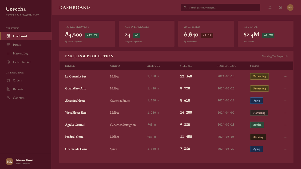
For web interfaces — particularly product pages, pricing tiers, and dashboard welcome screens — the system rewards discipline. A near-black or deep burgundy header with parchment-toned body background, serif headings, and restrained use of a single warm metallic accent for primary calls to action will establish the correct register immediately. Navigation should be typographic, with generous spacing and no icon clutter. Card components work well with a faint border and a very subtle paper-texture ground rather than drop shadows. Pricing tiers benefit from the system's innate hierarchy: the premium tier presented in the dark ground with lighter type, the standard tier on parchment — the visual weight does the communication work that tier labels alone cannot.对于网页界面——特别是产品页、定价等级与仪表板欢迎页——这套系统奖励纪律。近黑或深勃艮第色的页头,配以羊皮纸色调的正文背景、衬线字体标题,以及对单一温暖金属感强调色的克制使用(仅用于主要行动号召),将立即确立正确的基调。导航应当是字体性的,字间距宽阔,无图标混乱。卡片组件以淡淡的边框和极微妙的纸张纹理底面效果最佳,而非投影。定价等级得益于这套系统固有的层级感:高端等级以深色底面配浅色文字呈现,标准等级置于羊皮纸底面——视觉重量完成了单靠等级标签无法完成的传达工作。
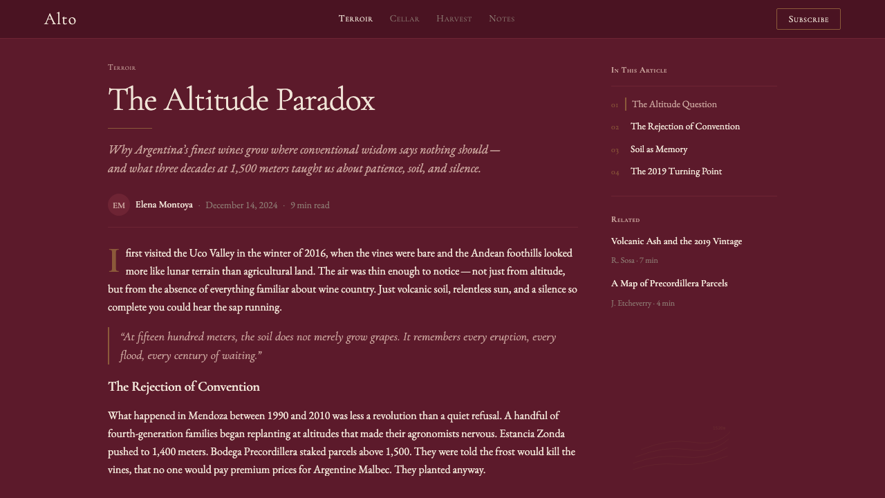
For editorial layouts and marketing materials, the style supports long-form content that wants to feel authoritative. A Malbec-aesthetic article page uses a narrow single column of body text at a comfortable reading size, with ample margin space reserved for pull quotes or provenance annotations set in italics. Section breaks are marked by a thin horizontal rule — not a decorative divider, not a color block, just a line. Marketing campaign visuals work well with full-bleed photography of the Andean landscape treated as a near-monochrome base, with the editorial typographic system laid over it in parchment or oxidized gold. The effect is cinematic in scale but restrained in execution.对于编辑版面与营销材料,这种风格支持想要显得权威的长篇内容。马尔贝克美学的文章页面,以舒适阅读尺寸的单栏正文为核心,两侧留有充裕的页边空白,用于放置以斜体排布的引文或产地注释。段落分隔以细水平线标记——不是装饰性分割线,不是色块,只是一条线。营销活动视觉,以近单色处理的安第斯地景全出血摄影为底层,将编辑字体系统以羊皮纸色或氧化金色叠加其上。效果在规模上是电影感的,在执行上是克制的。
The most common mistake when applying this aesthetic is to import only its color signature while retaining modern design conventions — a deep burgundy background with a geometric sans-serif typeface and rounded corners on card components, for instance. This hybrid reads as inconsistent because it borrows the palette without the underlying logic: the system's authority comes not from the color alone but from the combination of classical typography, material-referencing surfaces, and the confidence of generous negative space. A second common error is over-using the metallic or copper accent as if it were an interactive color — the system breaks down if the accent appears on more than one or two elements per composition. Reserve it for the single most important element on the screen or page.应用这套美学时最常见的错误,是只移植其色彩特征,同时保留现代设计惯例——例如深勃艮第背景配以几何无衬线字体和圆角卡片组件。这种混搭读来不一致,因为它借用了色板而没有借用底层逻辑:这套系统的权威感不仅来自色彩,而是来自古典字体排印、材质参照表面与慷慨留白之自信的组合。第二个常见错误是过度使用金属感或铜色强调,仿佛它是一种交互色——如果强调色在一个构图中出现超过一两处,系统就会崩溃。将它保留给页面或屏幕上最重要的单一元素。
See the Argentine Malbec Wine design system查看 Argentine Malbec Wine 完整设计系统
Argentine Malbec Wine — FAQArgentine Malbec Wine · 常见问题
How is Argentine Malbec branding different from French Bordeaux label design?阿根廷马尔贝克品牌与法国波尔多酒标设计有何不同?
The visual DNA overlaps considerably — both use classical serif typography, engraved illustration, restrained palettes, and the authority of negative space. The critical difference is geographical self-consciousness. Bordeaux labels often foreground the chateau as an institution, its architecture and heraldic history. Argentine Malbec labels foreground the land: elevation figures, vineyard maps, sub-appellation coordinates. This reflects a different prestige logic — Bordeaux derives authority from centuries of classified estates; Argentina derives it from the specificity and extremity of its high-altitude terroir. The result is that Malbec labels tend to feel more geological, more landscape-oriented, and more explicitly scientific in their geographical claims.两者的视觉基因相当接近——都使用古典衬线字体、雕刻感插图、克制的色板,以及留白所带来的权威感。关键区别在于地理自觉性。波尔多酒标常将城堡作为机构来突显,强调其建筑与纹章历史。阿根廷马尔贝克酒标则突显土地:海拔数字、葡萄园地图、子产区坐标。这反映了不同的高端逻辑——波尔多的权威来自数百年的列级庄园;阿根廷的权威来自其高海拔风土的特殊性与极端性。由此,马尔贝克酒标往往感觉更具地质感、更以地景为导向,在地理主张上也更明确地带有科学色彩。
Can this aesthetic work for a non-wine product or brand?这套美学能用于非葡萄酒产品或品牌吗?
Yes, but only when the underlying values align. The Argentine Malbec aesthetic communicates: altitude-earned quality, geographical precision, patient craftsmanship, and the quiet confidence of something that does not need to compete for attention. These values transfer well to other premium craft products — specialty coffee, single-origin chocolate, aged spirits, artisanal olive oil — and to professional services that want to signal expertise without showmanship: law firms, independent financial advisory practices, bespoke architecture studios. The aesthetic struggles for brands that need approachability, warmth, or mass-market accessibility; its register is inherently exclusive and its visual temperature inherently cool.可以,但前提是底层价值观对齐。阿根廷马尔贝克美学传达的是:以海拔为代价赢得的品质、地理精确性、耐心工艺,以及某种不需要争夺注意力的东西的沉静自信。这些价值观可以很好地迁移到其他高端手工产品——精品咖啡、单一产地巧克力、陈年烈酒、手工橄榄油——以及那些希望传达专业而非炫技的专业服务:律师事务所、独立理财顾问机构、定制建筑工作室。这套美学对那些需要亲切感、温度或大众市场可及性的品牌则力不从心;其基调本质上是排他的,其视觉温度本质上是冷静的。
What is the right way to handle typography in a digital application of this style?在这种风格的数字应用中,如何正确处理字体排印?
The challenge in digital contexts is that the engraved, letterpress quality of the original style comes from physical impression on uncoated paper — a quality that digital rendering cannot directly replicate. The correct approach is to choose a classical serif typeface with strong historical credibility rather than a fashionable contemporary serif. Wide letterspacing in headlines is essential; it signals deliberateness. Body text should be set at a comfortable reading size with generous line height — the aesthetic is never cramped. Avoid bold weights in body text; the style's authority comes from restraint rather than emphasis. The one place where weight is appropriate is in a single large typographic display element — an estate name, a year, a provenance line — where the size alone provides the hierarchy.数字语境中的挑战在于,原始风格的雕刻感、活字印刷质感来自无涂层纸张上的物理压印——这是数字渲染无法直接复制的品质。正确的做法是选择一款具有强烈历史公信力的古典衬线字体,而非时髦的当代衬线字体。标题中的宽字间距至关重要,它传递刻意感。正文应以舒适的阅读尺寸、宽阔的行高排布——这套美学绝不局促。避免在正文中使用粗体字重;这种风格的权威感来自克制而非强调。唯一适合用重量的地方,是单一的大型排印展示元素——庄园名称、年份、产地一行——在那里,尺寸本身就提供了层级。
How should the oxidized copper or metallic accent be used, and what should it never touch?氧化铜或金属感强调色应如何使用,以及绝对不应该用在哪里?
The metallic accent should be reserved for one element per composition that carries the highest prestige signal: the estate name on a label, the primary call-to-action button on a web page, the section title on a deck cover. Its power comes from scarcity. Once it appears on secondary elements — navigation links, data labels, decorative borders — it loses its semantic weight and the composition flattens into visual noise. It should never appear on interactive states like hover or focus by default; in those cases, a subtle typographic shift or opacity change signals interaction without cheapening the accent. It should also never appear on error states, system messages, or any utilitarian interface element — those should be handled by the neutral parchment-and-near-black palette.金属感强调色应保留给每个构图中承载最高高端信号的单一元素:酒标上的庄园名称,网页上的主要行动号召按钮,文稿封面上的节标题。它的力量来自稀缺性。一旦它出现在次要元素上——导航链接、数据标签、装饰边框——它就失去了语义分量,构图也随之扁平化为视觉噪音。默认情况下,它不应出现在悬停或聚焦等交互状态上;在这些情况下,微妙的字体变化或不透明度变化可以传达交互,而不会使强调色廉价化。它也不应出现在错误状态、系统消息或任何功能性界面元素上——这些应由中性的羊皮纸与近黑色色板来处理。
Does Argentine Malbec wine branding work in a dark-mode or dark-background application?阿根廷马尔贝克葡萄酒品牌美学在深色模式或深色背景应用中有效吗?
The deep burgundy or near-black ground is in fact the canonical dark application of this system — unlike, say, Bauhaus, which was fundamentally conceived on a light ground. A dark-first approach works naturally here: near-black or deep burgundy field, parchment or warm off-white type, and the oxidized copper accent. The inversion that should be approached with care is a light-on-dark layout where the background is very dark but the accent is pushed too bright — the moment the copper reads as a saturated orange rather than a weathered metal, the entire aesthetic collapses. The trick is to ensure that even in a dark application, the metallic accent retains its quality of being muted, aged, and non-competitive with the type.深勃艮第或近黑色底面,实际上是这套系统的规范深色应用——与包豪斯等从根本上在浅色底面上构思的系统不同。深色优先的方式在这里是自然的:近黑或深勃艮第底面,羊皮纸或温暖近白色文字,加上氧化铜强调色。需要谨慎处理的反转,是深色背景上的浅色布局中,强调色被推得过于明亮的情况——一旦铜色读来像是饱和的橙色而非风化的金属,整套美学就会崩溃。关键是确保即使在深色应用中,金属感强调色也保持其低调、陈旧、不与文字竞争的品质。
Related design styles相关设计风格
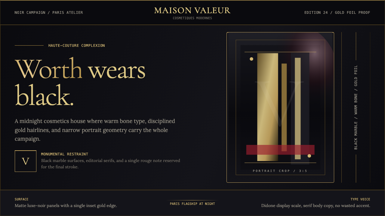 L'Oréal Paris CosmeticsMonumental restraint. Black marble fields, gold Didone type, and narrow portr…纪念碑式克制:黑色大理石场域、金色Didone字与窄幅肖像几何。
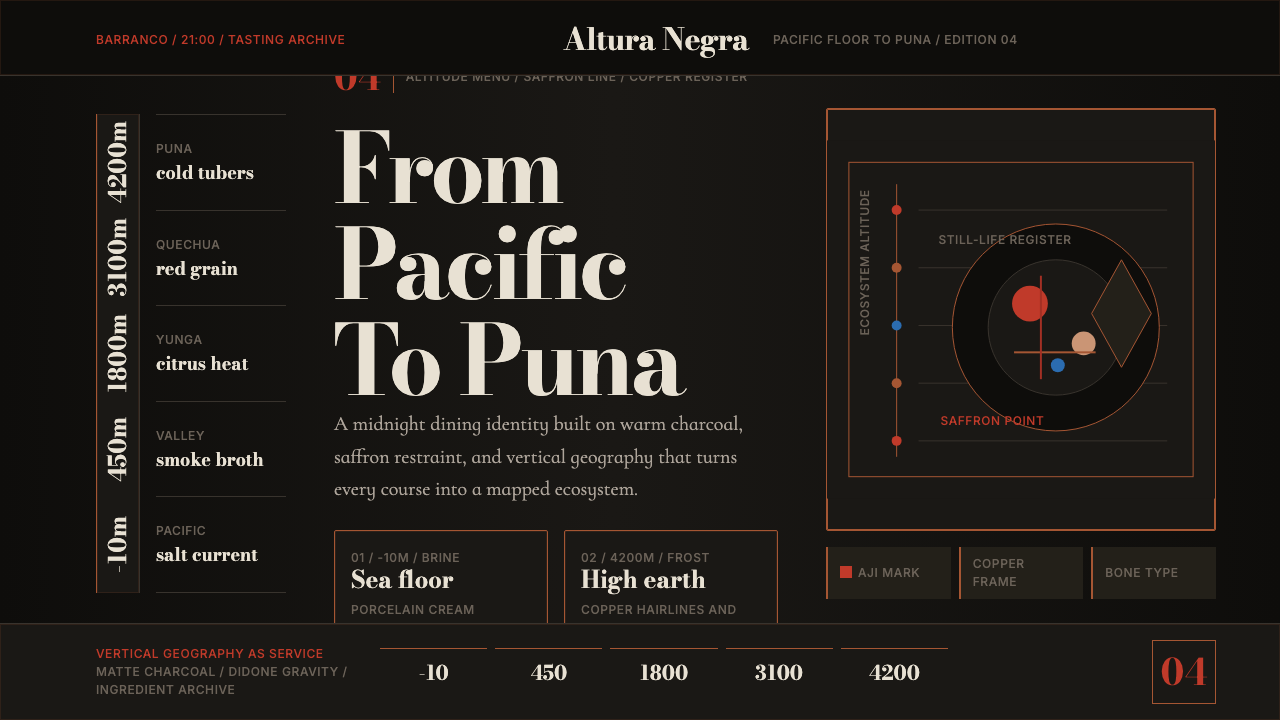 Lima Nuevo Andino CuisineAltitude turns luxurious. Charcoal fields, copper hairlines, and saffron-red…奢华来自海拔:炭黑底、铜发丝线与藏红花红纵向节奏。
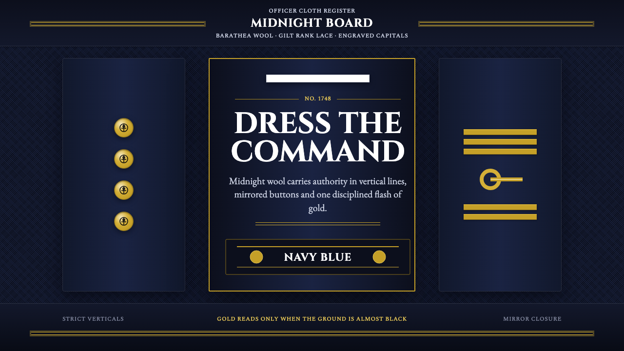 Naval Dress UniformAuthority in midnight wool. Cinzel capitals, gold lace and button symmetry ho…午夜羊毛写下权威:Cinzel 大写、金线与对称纽扣定住军阶。
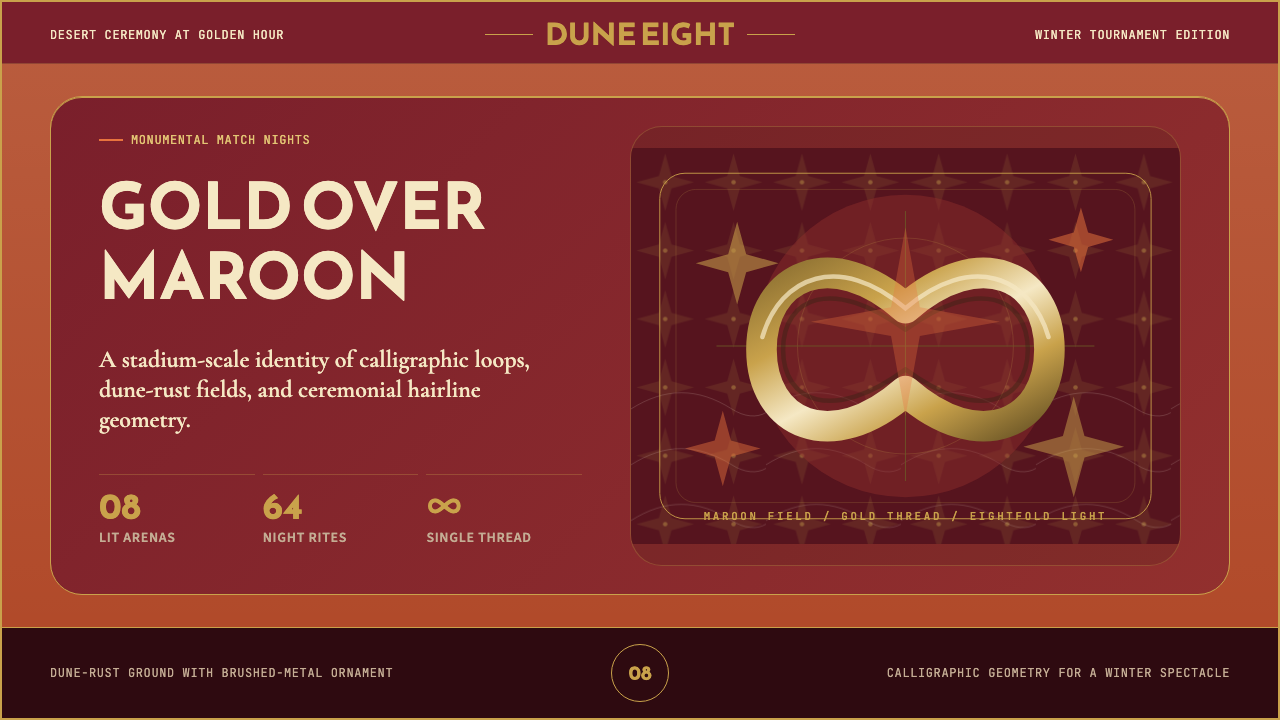 Qatar World Cup 2022Desert spectacle in gold. Maroon fields, Reem Kufi scale, and eightfold star…金色沙漠盛典。栗色场域、Reem Kufi巨字与八角星几何。
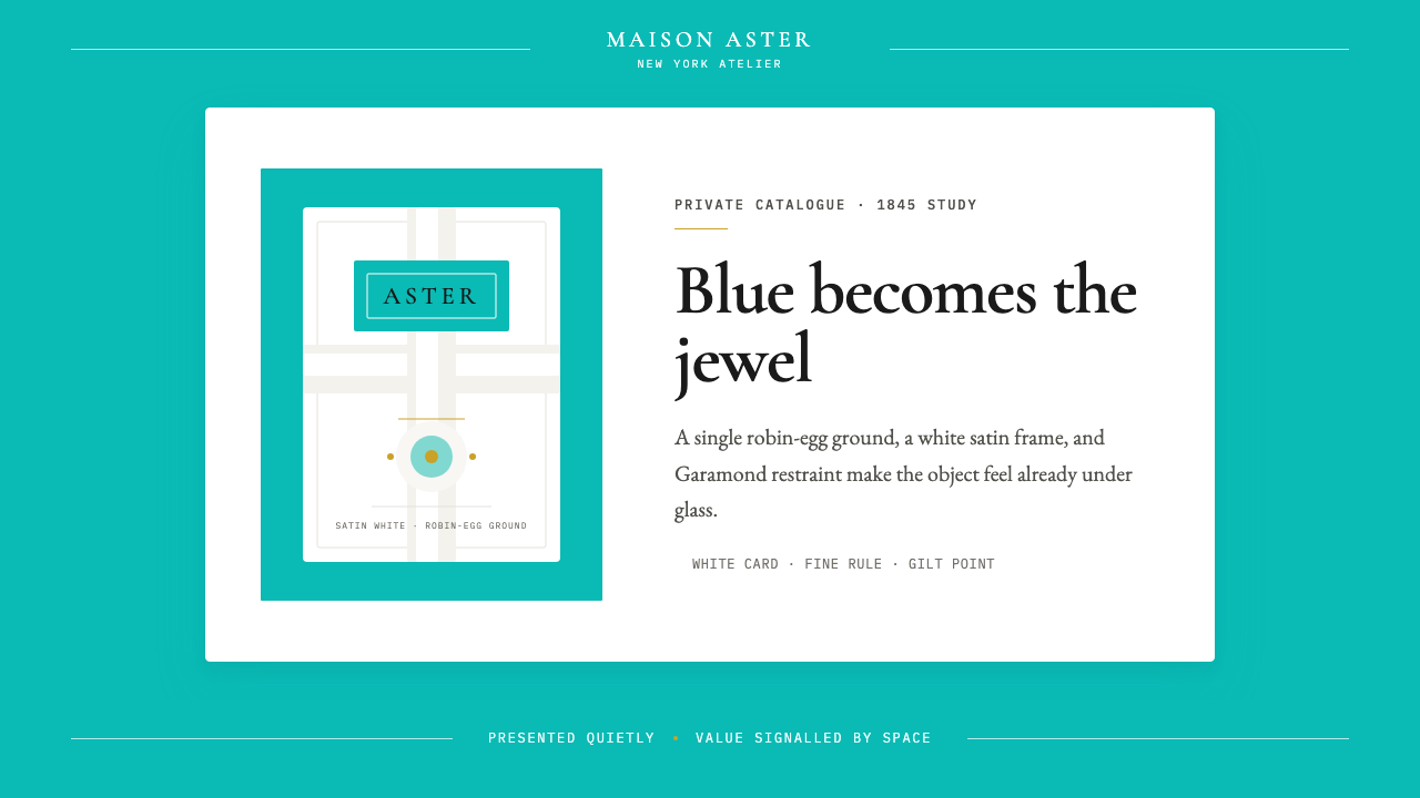 Tiffany Robin-Egg BlueBlue is the luxury signal. Robin-egg ground, white satin rules, Garamond rest…蓝色即奢华信号:知更鸟蛋蓝铺底,白缎细线与Garamond克制成章。
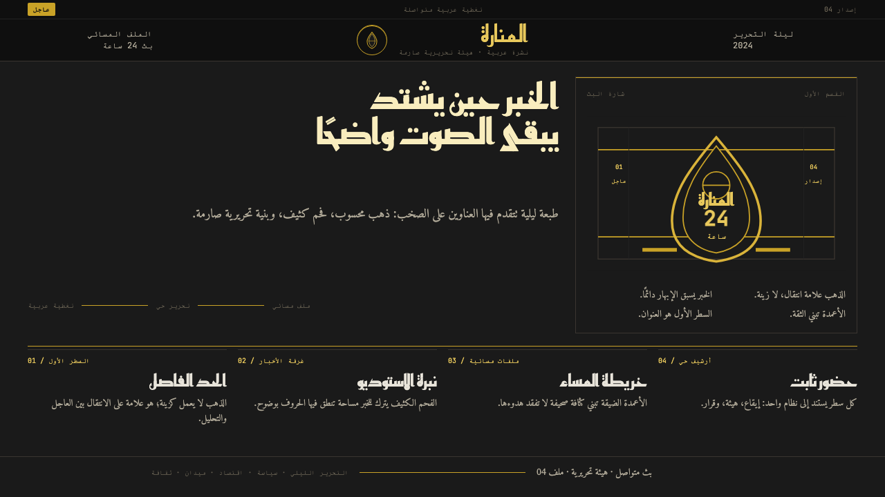 Al Jazeera Arabic NewsAuthority, stripped bare. Gold seal, dense Arabic type, matte charcoal.权威感被提纯。金色印章、密集阿文、炭黑底面构成画面。