What is Matchbox Label?
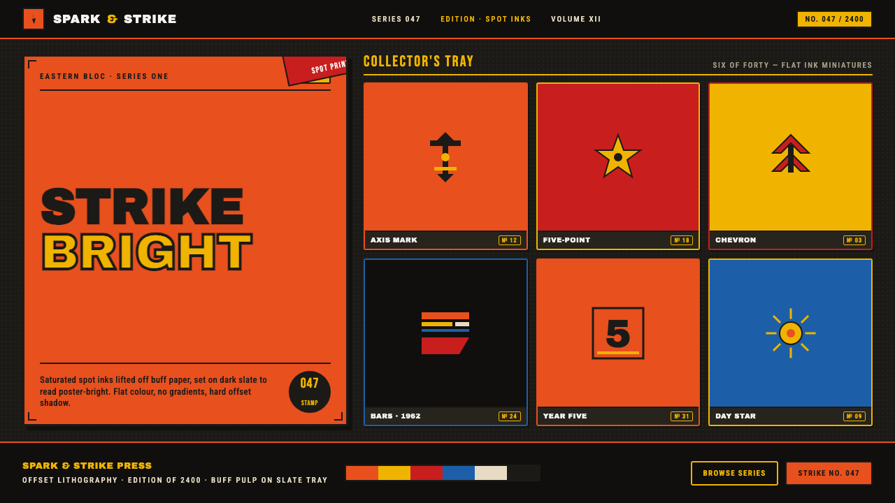
Matchbox Label turns pocket-sized propaganda into a dark, compressed design language of spot colour, constructivist force, and typographic urgency.
Matchbox Label in brief
Matchbox Label draws from Eastern-bloc matchbox labels produced across Czechoslovakia, the USSR, and the wider Eastern bloc from 1950 to 1990. These labels were tiny offset-lithographed posters: bright orange, red, and yellow spot inks printed on rough buff pulp paper, with stylised icons, serial numbers, and condensed lettering compressed into a thumb-sized field.
Its visual character belongs to a stripped-down Soviet-modernist idiom shaped by Constructivism, flat-colour offset lithography, and miniature propaganda graphics. Large blocks of colour do the work of illustration. Bars and diagonals create direction. Type is not a caption placed beside an image; it is one of the image’s structural forces.
The design system relocates that printed vocabulary onto a dark slate display ground. Against the darker field, the orange, red, and yellow read as poster-bright rather than as modest marks on buff paper. The result is graphic, declarative, and highly compressed: flat colour, bold condensed type, hard geometry, and almost no visual softness.
Where does Matchbox Label come from?
The source object is the Eastern-bloc matchbox label: a small printed surface that had to carry recognition, identity, and visual energy within an extremely limited field. Its scale encouraged reduction. Illustration became a stylised icon, wording became condensed display type, and colour became a set of flat, reproducible spot inks rather than a continuous pictorial image.
The historical setting is Eastern Europe during the Soviet mid-century and the decades that followed, from 1950 through 1990. The relevant region includes Czechoslovakia, the USSR, and the wider Eastern bloc. The style is therefore not attached to a single national school or one named author. It is a graphic language emerging from state-print matchbox label design, Soviet modernist practice, and Constructivist poster lithography.
Constructivism supplies the system’s sense of movement and command. Its bars, diagonals, compressed lettering, and assertive placement make the small label feel like a fragment of a larger public message. Soviet modernism contributes the stripped-down, functional attitude: imagery is simplified, colour is decisive, and every element must survive reproduction without relying on delicate effects.
Matchbox Label is a contemporary visual adaptation of that material history rather than a literal recreation of the paper object. It keeps the saturated orange, red, and yellow, the stylised symbols, serial logic, condensed type, and constructivist geometry, then places them on dark slate. The shift changes the emotional register while preserving the original principle: maximum graphic force from a very small vocabulary.
What defines the Matchbox Label look?
Spot Colour
Colour is treated as a printed decision, not as atmosphere. Orange, red, and yellow appear in broad, unmodulated fields whose edges remain crisp and declarative. The palette is saturated but disciplined: each hue should carry attention, separation, or directional emphasis rather than simply add visual variety.
Dark Slate Ground
The dark slate ground is the system’s defining adaptation. Historic labels placed bright inks on rough buff paper; here, the darker display field gives those inks greater contrast and a more nocturnal, concentrated presence. Slate should feel dense and stable, allowing the warm colours to behave like signals rather than decoration.
Condensed Typography
Letterforms are bold, narrow, and tightly organized, echoing the need to fit urgent messages into a small printed field. Type often behaves as a block or vertical mass, with little room for leisurely spacing. Its authority comes from compression, repetition, and contrast against the slate ground.
Constructivist Direction
Bars and diagonals are structural instruments. They divide the field, point toward a word or icon, and create the sensation that the composition is moving beyond its frame. These devices should feel purposeful and mechanically placed, not like casual decoration. A diagonal is a command line; a bar is a point of resistance or alignment.
Stylised Iconography
Images are reduced to recognisable silhouettes and emblematic forms. The icon must read quickly, even when surrounded by dense type and colour. Detail is less important than contour, contrast, and symbolic clarity. The result should feel printed and repeatable, closer to a sign or badge than to an illustration with naturalistic texture.
Serial Information
Serial numbers and compact informational marks add an administrative rhythm to the composition. They make the label feel catalogued, issued, and part of a larger graphic system. Even when the information is small, it should be aligned, repeated, or grouped with intention, giving the surface a sense of order beneath its poster-like energy.
Who shaped Matchbox Label?
These designers established the source vocabulary through the practical demands of state-print matchbox labels. Their work compressed icons, serial information, condensed lettering, and spot colour into a tiny field, proving that a small package could carry the visual force of a poster.
Soviet modernist graphic artists supplied the stripped-down attitude behind the system: simplified forms, decisive colour, and typography treated as an active component of the image. Their influence gives Matchbox Label its public, functional, and declarative character.
Constructivist poster lithographers contributed the grammar of bars, diagonals, compressed masses, and directional tension. In Matchbox Label, that grammar survives at a smaller scale, turning the label into a concentrated fragment of poster composition.
How do you use Matchbox Label today?
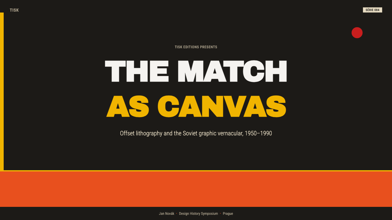
For presentation covers, Matchbox Label works best when the title is treated as a graphic block rather than a neutral heading. Set it against the dark slate field, surround it with a strong orange, red, or yellow shape, and let a bar or diagonal establish the composition’s direction. The cover should feel issued and recognisable at a glance, with the visual force coming from contrast and compression.
Content slides should preserve the same economy. Use condensed display type for section names, restrained supporting text, and a small family of flat colour blocks to distinguish topics. Data slides can borrow the label’s serial logic: numbers, categories, and annotations should be grouped like printed information marks, while bars, arrows, and diagonals turn the analytical material into part of the graphic structure.
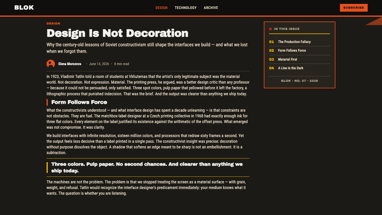
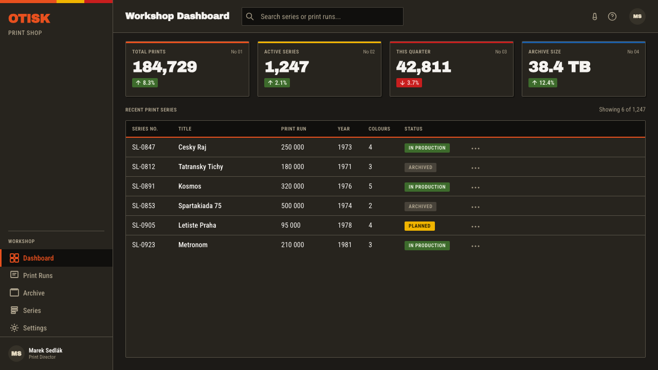
For web interfaces, the style suits dashboards, monitoring tools, and pricing pages that need to feel direct, functional, and highly scannable. Dark slate can carry the main surface, with orange, red, and yellow reserved for status, emphasis, calls to action, or tier distinction. Cards should feel like printed panels, icons should remain simplified, and dense information should be organised through alignment rather than softened by decorative effects.
Editorial and marketing work can use Matchbox Label for campaigns, product announcements, posters, packaging, and short-form information pages. Headlines can occupy large compressed blocks, while serial marks and small informational labels create a sense of system and distribution. The style is particularly effective when a message must feel public, urgent, or memorable without relying on photographic richness.
The common mistake is treating the palette and constructivist marks as surface decoration. Filling every space with orange, red, yellow, bars, diagonals, icons, and oversized type destroys the compression that gives the style its force. Keep a clear dark field, let one visual signal lead, and make every mark either identify, direct, separate, or inform.
Matchbox Label — FAQ
Is Matchbox Label simply a vintage print style?
No. Its source is historical, but its organising principles are still active: flat colour creates emphasis, condensed type creates urgency, icons create rapid recognition, and bars or diagonals create direction. The dark slate ground also makes it an adaptation rather than a literal reconstruction of a buff-paper matchbox label.
Why does the system use dark slate instead of the original buff paper?
The darker ground changes how the spot inks are perceived. Orange, red, and yellow become brighter, more concentrated, and more signal-like, while the slate surface supplies visual weight and a stronger frame. The historical paper remains part of the reference, but the dark adaptation gives the system a more focused display presence.
Should orange, red, and yellow always be used together?
Not necessarily. The important quality is the behaviour of saturated flat colour against the dark ground, not the obligation to display every hue at once. One colour can carry the main signal while another supports separation or direction. Using all the colours with equal intensity can flatten the hierarchy and make the label-like compression feel noisy.
What do the bars and diagonals contribute?
They give the composition a directional and mechanical rhythm. A bar can separate information or anchor a block; a diagonal can point, accelerate, or push the eye toward a title or icon. They should clarify the relationship between elements, not merely fill an empty area.
How should serial numbers and small information marks be used?
Use them to establish order and belonging. They can identify a section, classify a product, mark a sequence, or suggest that the page belongs to a larger issued system. Their value comes from deliberate grouping and alignment. If they are added without informational purpose, they become fake texture and weaken the style’s functional character.
Related design styles
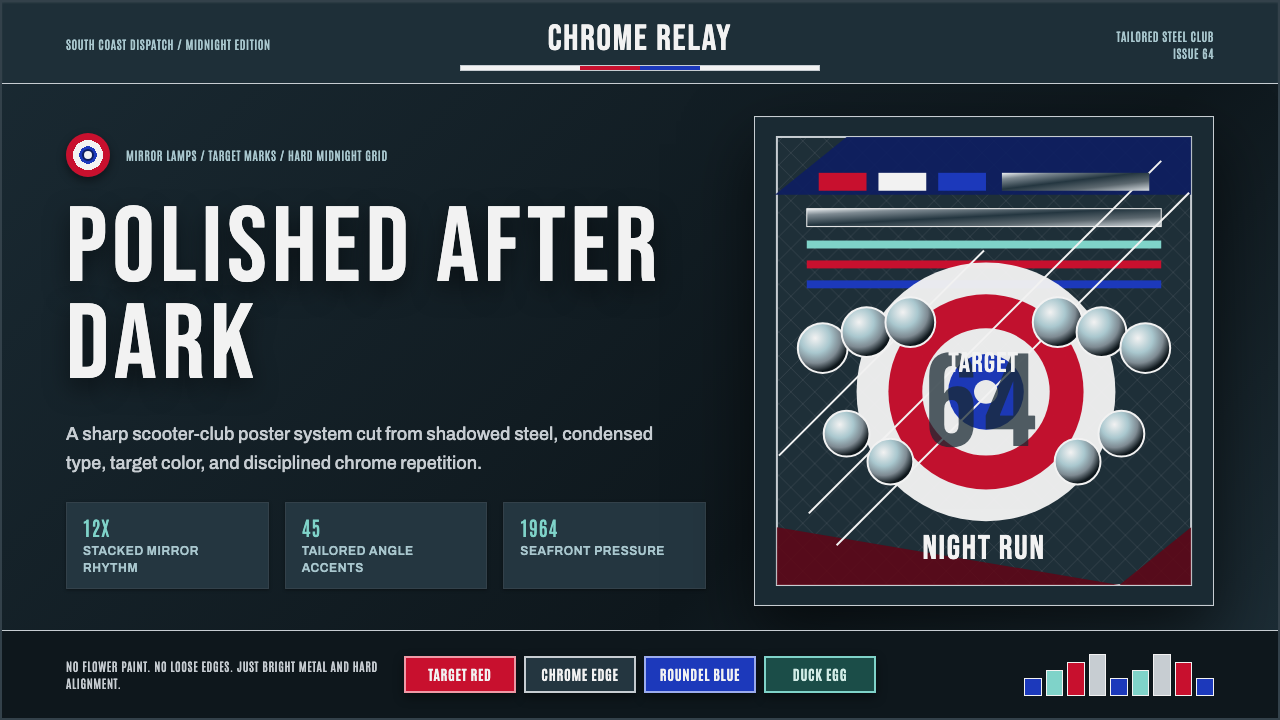 Mod Scooter ChromeSharp chrome discipline. Steel ground, roundel targets, condensed type, mirro…
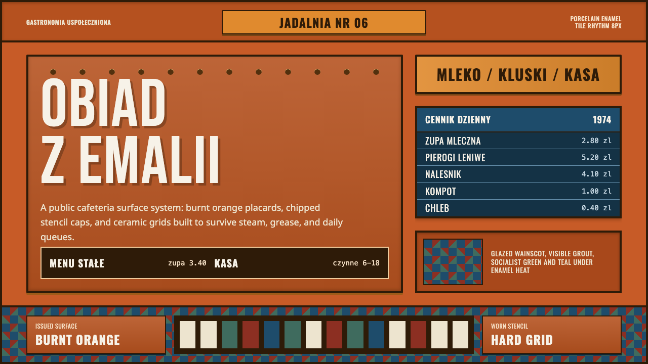 Polish Milk Bar (PRL)State-issued warmth. Burnt orange enamel, stencil caps, and hard tile grids.
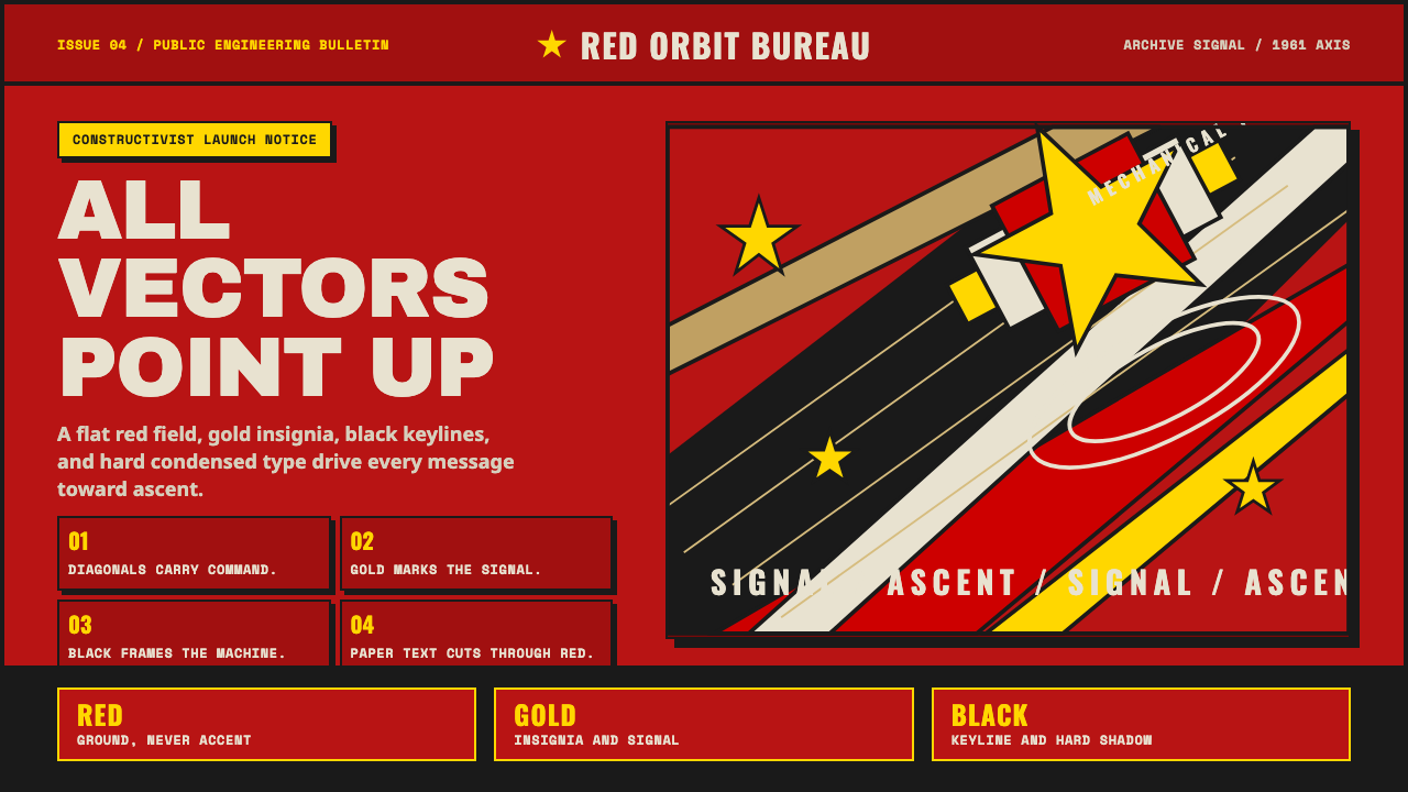 Soviet Space ProgramHeroic by construction. Red fields, gold stars, black keylines, and diagonal…
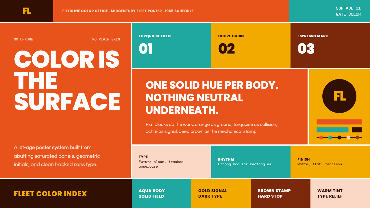 Braniff (Girard)Color becomes fuselage. Jellybean orange, turquoise blocks, and geometric san…
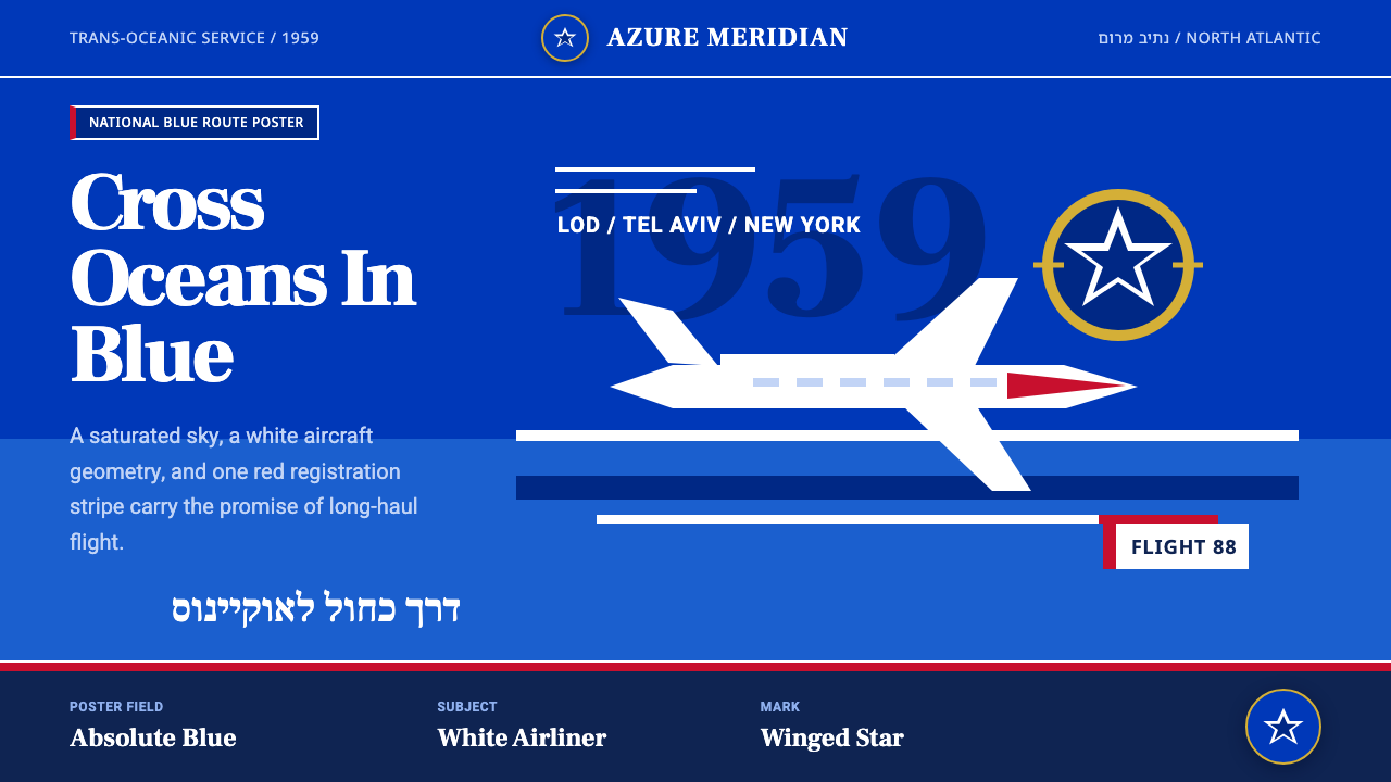 El Al Israel AirlinesNational blue takes command. White aircraft geometry cuts a flat jet-age post…
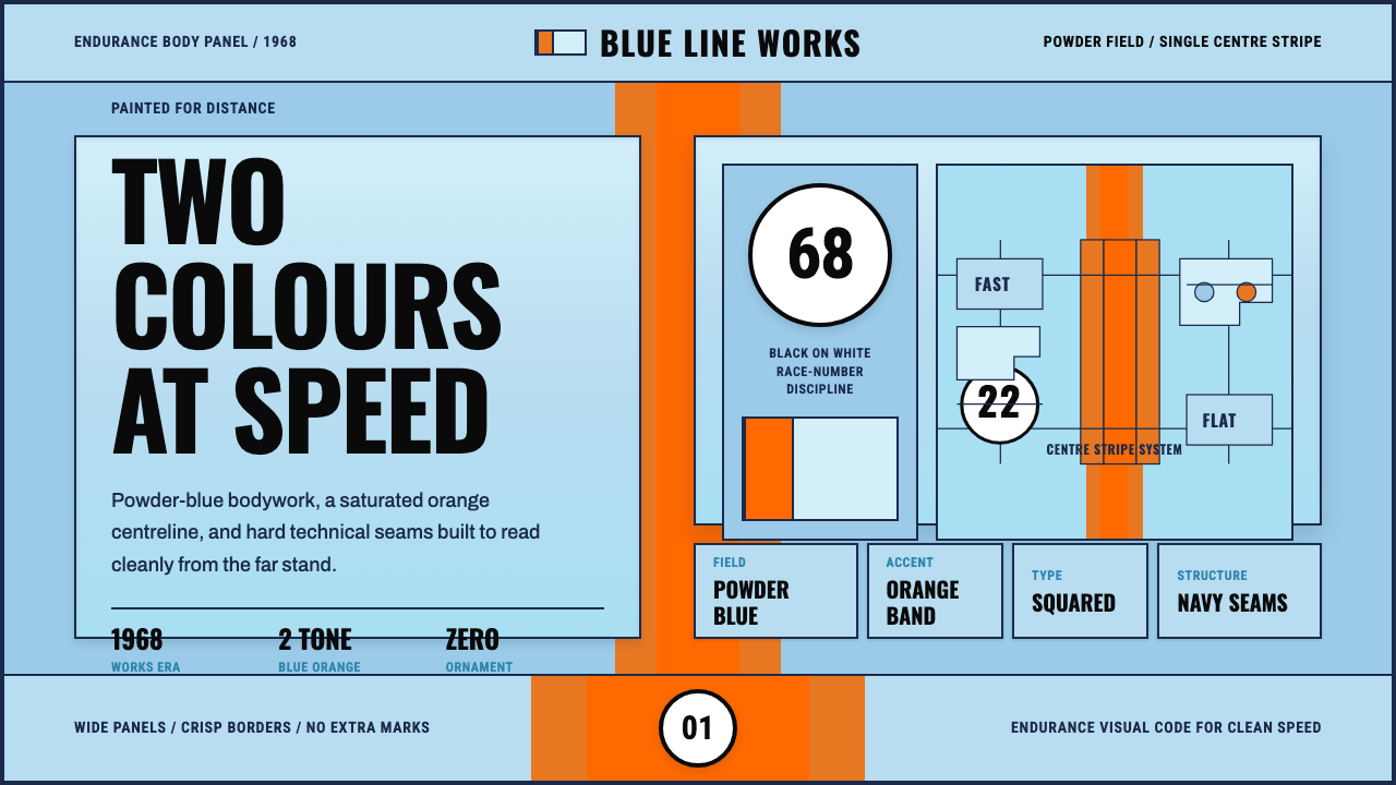 Gulf Racing LiverySpeed made disciplined. Powder blue, orange stripe, black roundel, strict gri…