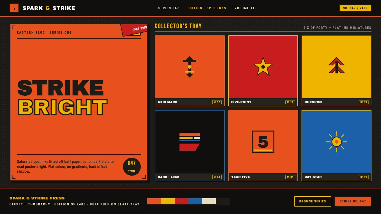
About Matchbox Label
Eastern-bloc matchbox labels were tiny offset-lithographed posters — bright orange, red and yellow spot inks printed on rough buff pulp paper in a stripped-down Soviet-modernist idiom. Big blocks of flat colour, stylised icons, serial numbers and condensed lettering packed propaganda-poster energy into a thumb-sized field.
This system lifts those saturated spot inks off the paper and sets them on a dark slate display ground, so the orange, red and yellow read poster-bright instead of defaulting to cream. Flat colour, bold condensed type, constructivist bars and diagonals.
- Origin
- Eastern Europe — Czechoslovakia, USSR and the wider Eastern bloc
- Era
- 1950–1990 (Eastern-bloc / Soviet mid-century)
- Key figures
- state-print matchbox label designers · Soviet modernist graphic artists · constructivist poster lithographers
- Movements
- Constructivism · Soviet modernism · Flat-colour offset lithography · Miniature poster / propaganda graphics
Matchbox Label design spec
Colors
Typography
The other 11 sections — buttons, cards, spacing, motion, techniques and more — open once you unlock. Download the DESIGN.md or send it to your AI in one click. Unlock once, yours forever.
Sign up nowStyles similar to Matchbox Label
Also inspired by pop culture, with a close feel.
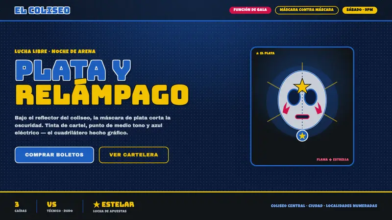 Mexican Lucha Mask GraphicComic-book lucha, lit from above. Silver-blue mask out of arena-night dark, halftone, Bungee slabs.
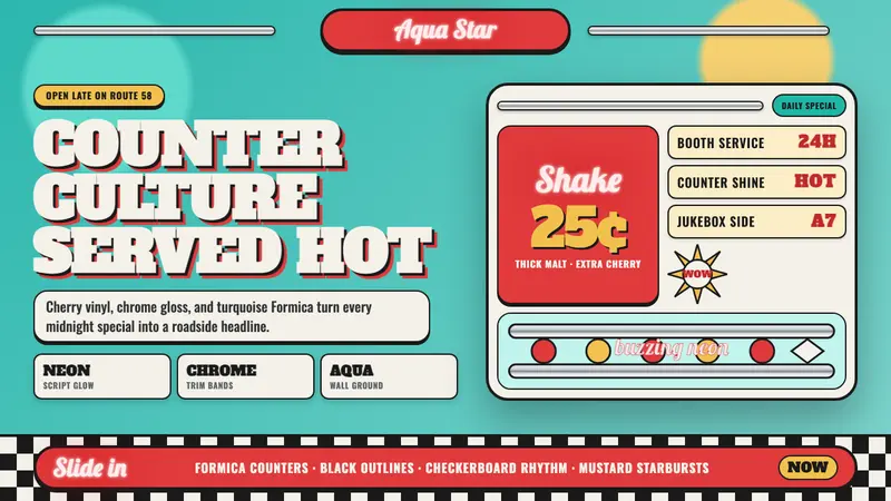 1950s Diner AquaRoadside optimism shouts. Aqua walls, cherry vinyl, chrome bands, and neon script glow.
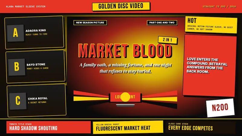 Nigerian Nollywood DVD Poster (2010)Market-stall cinema shouts. Tomato red type and yellow burst collide on jet black.
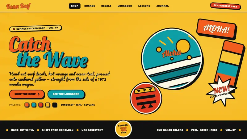 Hapa-Haole Surf DecalSurf-shop signage, loud and laminated. Sunburst yellow ground, chunky black keylines, bouncy script.