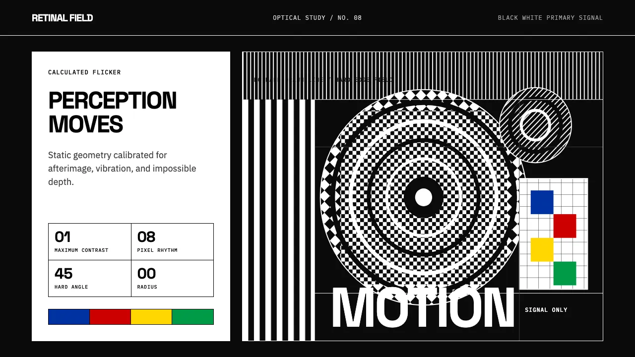
About Op Art (Riley / Vasarely)
Op Art turned perception itself into the medium. In the 1960s, Bridget Riley's undulating monochrome stripes and Victor Vasarely's impossible cubes proved that pure geometry could make a static image vibrate, flicker, and seem to move. The 1965 MoMA exhibition "The Responsive Eye" crystallized the movement into a global visual language.
The design system inherits that discipline: maximum-contrast black and white, hard edges, zero radius, flat surfaces, and mathematical grids. Color enters only as signal — Vasarely's primaries — never as decoration. Every line is calculated; nothing is hand-drawn.
- Origin
- London / Paris / New York
- Era
- 1960s peak (MoMA 'The Responsive Eye', 1965); roots in 1950s Bauhaus color theory
- Key figures
- Bridget Riley · Victor Vasarely · Josef Albers · Jesús Rafael Soto
- Movements
- Op Art · Kinetic Art · Hard-edge painting
Op Art (Riley / Vasarely) design spec
Colors
Typography
The other 11 sections — buttons, cards, spacing, motion, techniques and more — open once you unlock. Download the DESIGN.md or send it to your AI in one click. Unlock once, yours forever.
Sign up nowStyles similar to Op Art (Riley / Vasarely)
Also inspired by art & artists, with a close feel.
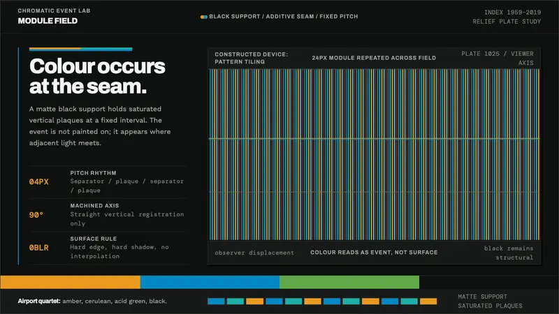 Cruz-Diez PhysichromieColour happens in motion. Fixed cyan-teal-amber stripes cut into structural black.
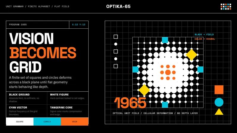 Hungarian Vasarely Op Art (1965)Mathematics makes vision pulse. Black grids, white units, cyan and tangerine warp depth.
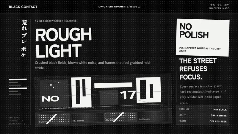 Daido Moriyama Are-Bure-BokeNothing is clean. Inky black, blown white grain, and tilted frames make the image restless.
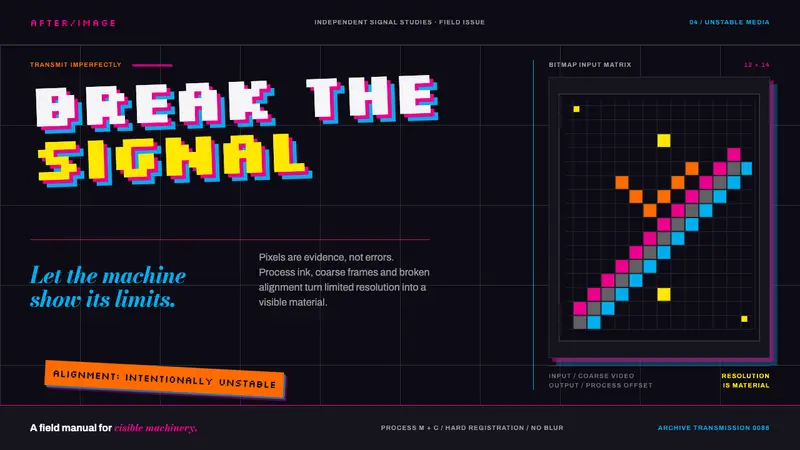 April Greiman HybridResolution becomes material. Bitmap type and process magenta collide on a broken grid.