What is Metabolism Tokyo (1960)?
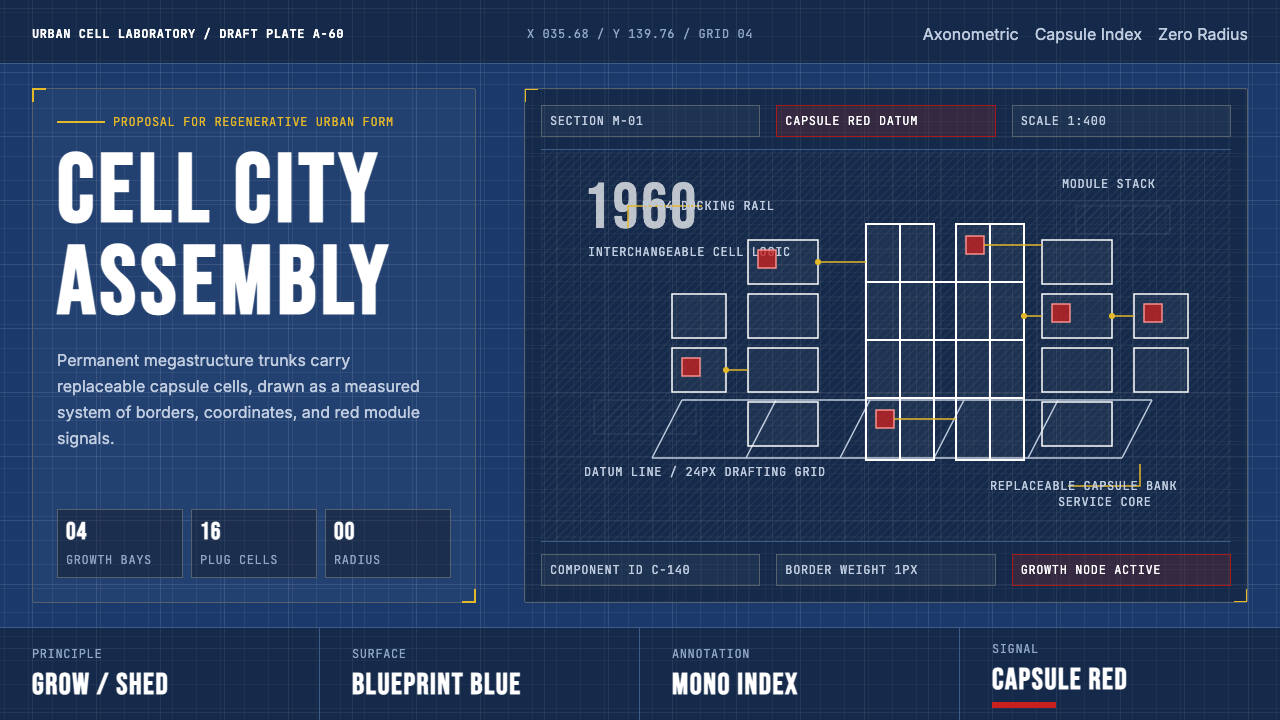
Metabolism imagined cities as living organisms — permanent megastructure spines carrying interchangeable capsule cells that grow, shed, and regenerate like biological tissue.
Metabolism Tokyo (1960) in brief
Metabolism was a Japanese architectural and design movement launched at the 1960 World Design Conference in Tokyo. Its central proposition was radical: cities should not be fixed monuments but adaptive organisms, built from a hierarchy of permanent megastructures and short-lived, interchangeable cellular units. Megastructure trunks — towering service cores, elevated roadways, suspended platforms — would provide infrastructure that outlasted any individual generation, while the capsule cells plugged into them could be replaced, upgraded, or discarded as society evolved.
The visual language of Metabolism grew directly from the technical drafting table. Axonometric projections, cross-section diagrams, exploded assembly views, and modular grid overlays formed the aesthetic foundation. Blueprint blue — the cyan ink of architectural drafting paper — became the movement's ground color, communicating engineering precision and the authority of the technical document. Capsule-red accents marked individual modular units within the larger diagram. Monospaced annotation labels and zero-radius geometries completed a look that treated every designed surface as an architectural drawing waiting to be constructed.
Unlike purely utopian modernisms that dissolved into abstraction, Metabolism produced real buildings. Kisho Kurokawa's Nakagin Capsule Tower (1972) in Tokyo is the movement's most iconic survivor — a pair of concrete cores bristling with 140 steel capsule pods, each individually replaceable in theory. The Osaka Expo of 1970 became the movement's great public stage, with Kenzo Tange's vast Festival Plaza megastructure serving as the theatrical spine of the entire fairground. These built works made the visual language of the movement legible to a global audience and established its aesthetic vocabulary as a distinct design system.

Where does Metabolism Tokyo (1960) come from?
The Metabolism movement was born at the 1960 World Design Conference (Sekai Dezain Kaigi) held in Tokyo — the first major international design conference hosted in Asia. A group of young Japanese architects and designers, dissatisfied with both the inherited forms of traditional Japanese architecture and the imported universalism of Western modernism, published a manifesto pamphlet titled simply Metabolism: The Proposals for New Urbanism. The founding members included Kiyonori Kikutake, Kisho Kurokawa, Fumihiko Maki, and Masato Ohta, with the theorist Noboru Kawazoe acting as a catalyst. They presented not unified designs but a set of provocations — each member contributed a project exploring a different facet of the organic city concept.
The intellectual roots of Metabolism drew from multiple streams. Postwar Japan was urbanizing at extraordinary speed, its cities reconstructed after wartime destruction and overwhelmed by rapid industrial growth and rural migration. The conventional city, these architects argued, could not metabolize this rate of change. They turned to biology for a model: just as living organisms maintain structural continuity while continuously replacing cellular material, cities needed permanent structural bones and replaceable tissue. The movement absorbed ideas from cybernetics and systems theory, which were reshaping fields from economics to engineering in the late 1950s. Kenzo Tange, the senior figure who provided institutional legitimacy and mentorship, had already been developing his own megastructure thinking in projects like his 1960 plan for Tokyo Bay, which proposed extending the city over the water on a vast elevated platform.
Japan's particular postwar position gave Metabolism a quality that European megastructuralism lacked. The country was simultaneously modernizing at breakneck pace and wrestling with the destruction of traditional culture and physical fabric. Metabolism offered a synthesis: modular growth that could accommodate change without erasing continuity, a technical vocabulary drawn from Western engineering married to a Japanese philosophical concept of cyclical renewal. The movement's visual language, rooted in the drafting traditions of civil and structural engineering, communicated seriousness and competence at a moment when Japan was positioning itself as a serious industrial and intellectual power on the world stage.
The 1970 Osaka World Exposition (Expo '70) was Metabolism's apotheosis and its swan song. Tange's master plan for the entire fairground was explicitly metabolist in structure, and several Metabolism architects contributed major pavilions. The Tower of the Sun by Taro Okamoto, though not a Metabolist work, presided over Tange's Festival Plaza as the symbolic heart of the event. The global television audience saw Japan project a vision of technological confidence and cultural ambition. But within three years, the 1973 oil crisis would collapse the economic conditions that had made Metabolism's grand infrastructure dreams seem plausible. Capsule replacement — the movement's central promise — proved expensive and organizationally impractical. The Nakagin Capsule Tower's pods were never replaced, and the tower itself was demolished in 2022. The movement's physical legacy is sparse, but its visual vocabulary has been continuously rediscovered by designers working in technical, systemic, and science-fiction-adjacent aesthetics.
What defines the Metabolism Tokyo (1960) look?
Blueprint Ground
The signature ground color is a deep blueprint blue — the saturated cyan of architectural drafting paper, associated with technical authority and engineering precision. It reads immediately as the domain of the technical document rather than the gallery wall, positioning every layout as a schematic rather than a decoration. Against this ground, white labels and annotations glow with the clarity of printed drafting ink.
Capsule-Red Accent
A vivid, saturated red marks individual modular units within the larger system — a direct reference to the capsule pods that define the movement's architectural identity. Used sparingly and with intention, this accent color functions as a component indicator rather than a decorative flourish: it says 'this is the replaceable unit, this is where growth happens.' The red reads against the blueprint ground with stark urgency.
Monospaced Annotation
Type in the Metabolism aesthetic is drawn from the engineering drafting tradition: monospaced or technically-inflected letterforms that evoke component numbering, assembly instructions, and structural labels. Text is treated as a labeling system rather than a typographic composition — it annotates the diagram rather than expressing personality. Hierarchy is established through consistent size relationships rather than varying typefaces.
Modular Grid
Composition is organized on a strict modular grid that reflects the movement's core argument: every element is a unit within a system, not an expression of individual artistic choice. Cells, panels, and content blocks are treated as interchangeable modules that could in principle be rearranged or replaced without destroying the overall structure. White gutters and alignment lines read as the structural seams between capsules.
Zero-Radius Geometry
Corners are sharp and uncompromising. The Metabolism aesthetic derives from structural engineering, where rounded corners are a cost rather than a refinement, and hard edges signal precision fabrication. Rectangles, cylinders, and hexagons with hard edges read as manufactured components. This severity distinguishes the style from softer modernisms: every form is a designed decision with structural justification.
Diagrammatic Depth
Where depth is expressed, it takes the form of axonometric or isometric projection — the engineering drawing convention that shows three-dimensional structure without the distortions of perspective. Components are drawn as if seen from a consistent technical viewpoint, enabling the viewer to understand how parts assemble. Cross-section lines and exploded views reveal interior structure. This is depth in service of comprehension, not depth as atmosphere.
Technical Restraint
Ornamentation is absent not from minimalist principle but from engineering discipline: everything present serves structural or informational function. Gradients, textures, and decorative motifs have no place in a technical drawing, and their exclusion in the Metabolism aesthetic carries the same logic. The result is a visual system that reads as rigorous rather than sparse — each element is load-bearing.
Who shaped Metabolism Tokyo (1960)?
Tange was the senior figure who provided Metabolism with its institutional authority and its most ambitious built realization. His 1960 Plan for Tokyo Bay proposed extending the city across the water on a vast elevated megastructure spine — a direct diagram of metabolist thinking at urban scale. His design of the Festival Plaza at Expo '70 in Osaka, a vast space-frame roof structure sheltering an open civic stage, became the movement's most-seen built work. Tange bridged Japanese modernism and international high technology, and his mentorship of the younger Metabolism architects gave the movement credibility in both domestic and global contexts.
Kurokawa was the most prolific theorist and builder of the Metabolism group. His Nakagin Capsule Tower (1972), a pair of concrete service cores studded with 140 individually bolted prefabricated steel capsule pods, became the definitive physical embodiment of metabolist principles — and the most photographed structure in the movement's history. He developed the concept of 'capsule architecture' as a philosophical position as well as a technical system, arguing that the individual capsule expressed both human individuality and the collective metabolism of urban life. After the movement's decline, Kurokawa went on to a prolific international career and continued to theorize about the relationship between biology, technology, and architectural form.
Kikutake was among the founding voices of the 1960 manifesto and contributed some of the movement's most visionary proposals, including Sky House (1958) — his own home, elevated on four massive concrete walls with provision for attaching prefabricated children's rooms below as the family grew — and the Marine City concept, a series of proposals for floating urban platforms that could be tethered in harbors or at sea. His work explored the furthest edges of metabolist urbanism and pushed the interchangeable-cell idea toward genuine structural experimentation. Sky House remains standing today and is considered a key prototype of the movement's residential ambitions.
Maki contributed a different register to the Metabolism group through his concept of 'group form' — the idea that urban identity emerges from the accumulated patterns of many individual acts of building rather than from a single imposed megastructure. His essay Investigations in Collective Form (1964) remains one of the most careful theoretical contributions to emerge from the movement, positioning it within a broader discourse about how cities accumulate meaning over time. Maki's own built work tended toward a refined modernism rather than the raw megastructuralism of his colleagues, and his long career extended well into the twenty-first century, earning him the Pritzker Prize in 1993.
Kawazoe was the critic and theorist who gave the Metabolism group its name and much of its intellectual framing. As editor of the design magazine Shinkenchiku, he was positioned at the intersection of architecture, design, and cultural criticism, and his role in organizing the 1960 conference and the manifesto publication was decisive. He articulated the connection between the movement's biological metaphors and Japan's specific postwar condition — the need to rebuild not just buildings but an entire cultural and urban metabolism. His writing remains the clearest primary-source account of the movement's intentions.
How do you use Metabolism Tokyo (1960) today?
The Metabolism aesthetic translates into contemporary design work through its core visual grammar: blueprint-blue grounds, capsule-red module accents, monospaced annotation type, and strict modular grids. Applying it correctly requires understanding the system's logic — every visual element is a labeled component within a larger architecture — rather than simply overlaying technical-looking type on a dark background.
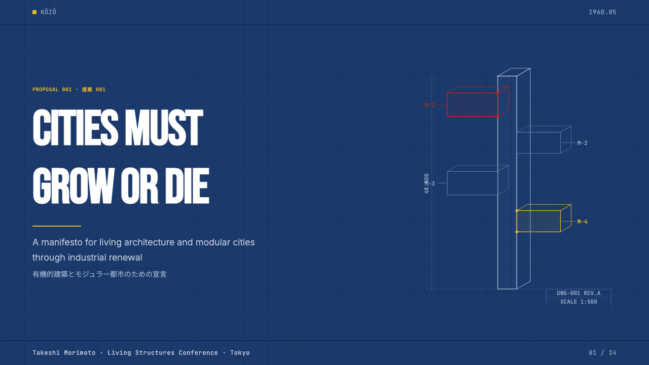
For presentation slides, the style is particularly effective in technical or systems-oriented contexts. A cover slide benefits from a bold axonometric or isometric diagram fragment as background — partial geometry extending beyond the frame, as if revealing only part of a larger blueprint. Title type in a monospaced or engineering-inflected face sits against the deep blue ground in white or light cyan. Content slides should treat each panel as a modular cell: consistent gutters, component labels in the upper corners, data visualized as diagrammatic objects — bar charts rendered as stacked modules, timelines as assembly sequences. Capsule red should appear on exactly one element per slide as a structural indicator, not as decoration.
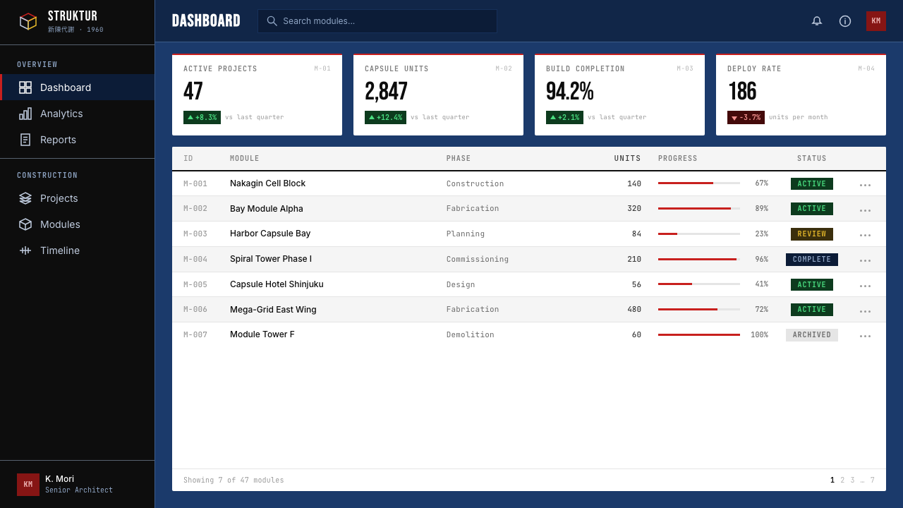
For web interfaces and dashboards, the Metabolism aesthetic is well-matched to technical platforms, developer tools, infrastructure monitoring, and systems that want to communicate rigor and engineering credibility. The approach: use the deep blueprint blue as the dominant background, white and light-gray for surface layers and text, and reserve capsule red for critical status indicators or primary action elements. Grid lines should be visible but light — structural guides rather than decorative borders. Card components should have hard edges with no border-radius, separated by tight consistent gutters. Navigation and labeling should be terse and annotation-like, using consistent alphanumeric or bracketed identifiers rather than verbose descriptive labels.
For editorial and marketing work, the style supports technical reports, annual reviews, product launches in engineering or infrastructure categories, and any context where authority and precision are primary brand values. Full-bleed blueprint-blue sections alternate with white grounds, with capsule-red used once per major section as a section identifier. Isometric diagrams replace photography wherever structural explanation is needed. Pull-quote typography in monospaced type creates a technical annotation effect. The style is less appropriate for consumer-facing warmth, hospitality, or lifestyle contexts, where its severity will read as cold rather than authoritative.
A common mistake when applying Metabolism is treating the dark ground as license for ambient glow effects, soft halos, or gradient atmospheric backgrounds — the kind of dark-UI aesthetics that dominate contemporary interfaces. Authentic Metabolism-derived work has no gradients, no glows, no depth-of-field blurring. Depth is expressed only through axonometric projection or hard-edged layer separation. A second common error is using rounded corners or soft shadows, which import a warmth and consumer-product softness that directly contradicts the engineering drafting origin. Keep edges hard, keep shadows structural if present at all, and let the grid do the organizational work.
Metabolism Tokyo (1960) — FAQ
Is Metabolism the same as brutalism?
They overlap but are distinct. Brutalism — roughly contemporary and also rooted in postwar reconstruction — is characterized by exposed raw concrete, monumental mass, and sculptural form. Metabolism shares the raw concrete aesthetic in many of its built works, but its defining idea is systemic rather than sculptural: the replaceable cell, the interchangeable module, the city-as-organism. A brutalist building is a single fixed composition; a metabolist building is theoretically a structure in perpetual change. In visual and graphic terms, Metabolism's vocabulary — blueprints, technical annotation, modular grids — is more engineering-drafting than sculptural. Brutalism tends toward heavy mass and shadow; Metabolism toward diagrammatic precision.
Why did the Metabolism movement decline so quickly after such a celebrated peak?
The 1973 oil crisis cut the economic conditions that had made large-scale megastructure construction imaginable. But the decline had structural causes too: the central promise of capsule replacement was logistically and economically impractical. Replacing a single pod in the Nakagin Capsule Tower required coordinating crane access, removing adjacent capsules, and navigating the ownership complexity of individual unit holders — costs that made the system's theoretical elegance irrelevant in practice. The movement had also depended heavily on Japan's exceptional postwar growth rate. When that growth slowed, the appetite for utopian infrastructure projects evaporated. The movement's visual legacy survived long after its architectural ambitions became untenable.
Does the dark blueprint-blue ground make Metabolism hard to use for accessibility?
The dark ground does require deliberate attention to contrast ratios, but the style's technical drafting origin naturally supports accessibility. Drafting conventions require legible annotation at small sizes, which means the monospaced type and white-on-blue text relationships in the Metabolism aesthetic can meet accessibility contrast requirements when set at sufficient weight and size. The risk comes from using mid-toned cyan or gray annotation text against the dark blue ground — in the name of 'secondary information,' these pairings often fall below acceptable contrast. Reserve the lighter, lower-contrast labels for purely decorative grid lines, and ensure all meaningful text clears the contrast threshold against the dark ground.
How does Metabolism relate to Japanese aesthetics like wabi-sabi or ma?
The relationship is one of conscious departure rather than inheritance. Metabolism deliberately rejected traditional Japanese aesthetics in favor of an international technical vocabulary — its founders were positioning Japan as a modern industrial power, not a carrier of ancient aesthetic tradition. However, the metabolist concept of cyclical renewal — structures that live, age, and are replaced — carries a philosophical resonance with Japanese ideas about impermanence, even if the visual language is entirely Western-engineering in derivation. Wabi-sabi finds beauty in age and incompleteness; Metabolism found structure in the cycle of replacement. The philosophical kinship is real; the visual overlap is essentially zero.
Can Metabolism work for consumer-facing products, or is it too technical?
The style is not inherently unsuited to consumer products, but it needs a product context where technical authority is itself a desirable quality. Developer tools, hardware products, infrastructure services, technical education platforms, and science-fiction-adjacent entertainment — all of these can carry the Metabolism aesthetic because their audiences read 'technical' as trustworthy and capable rather than cold or alienating. Conversely, the style struggles in contexts that require warmth, sensory pleasure, or accessibility for non-technical audiences: food, wellness, children's products, lifestyle brands. The honest test is whether the product's value proposition includes precision, systems thinking, or engineering credibility — if yes, Metabolism can amplify those values; if no, the aesthetic imposes costs the product cannot absorb.
Related design styles
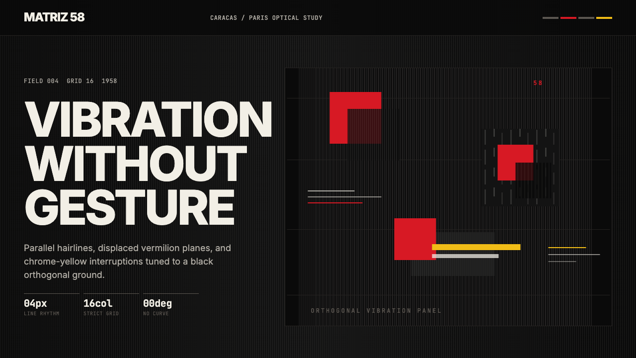 Venezuelan Cinético Soto 1958Optical tension holds still. Matte black, Inter, hairlines, and vermilion off…
 Bubble Chamber TracksPhysics becomes calligraphy. Cyan-white spirals glow on true photographic bla…
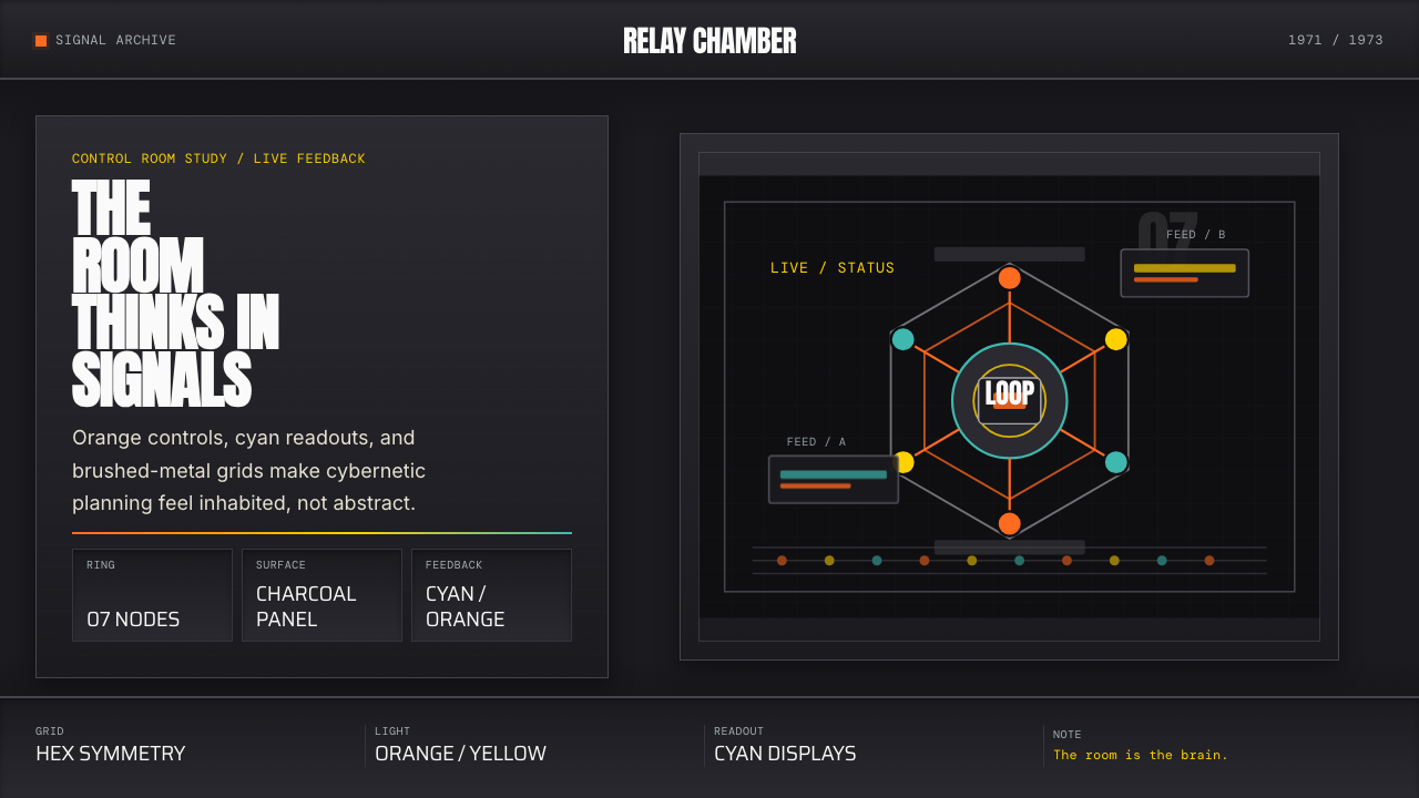 Cybernetic 1968 (Stafford Beer)Mission-control severity. Charcoal panels, orange buttons, cyan readouts, hex…
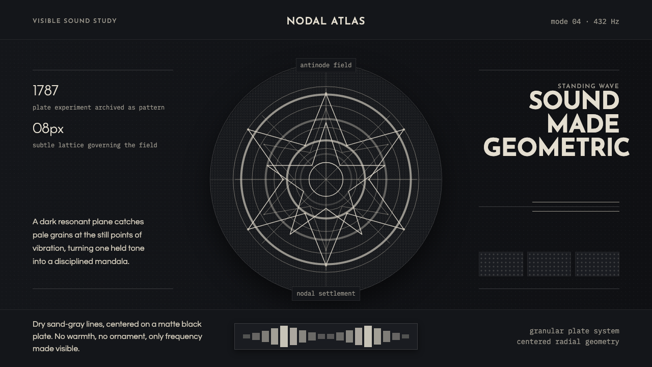 Cymatics Standing WaveSound becomes geometry. Sand-gray nodal rings settle on a dark resonant plate.
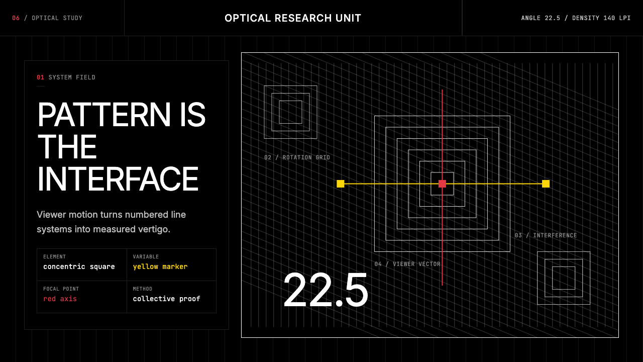 GRAV Op-Kinetic (1960)Vertigo by calculation. White line fields on black, with red and yellow as co…
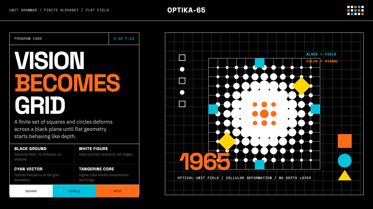 Hungarian Vasarely Op Art (1965)Mathematics makes vision pulse. Black grids, white units, cyan and tangerine…