What is Issey Miyake Pleats Please?什么是 Issey Miyake Pleats Please?
Pleats Please turned a single engineering breakthrough — heat-permanent polyester pleating — into a complete visual philosophy of sculpted lightness, restrained color, and Tokyo-modernist precision.「褶皱请」将一项工艺突破——热定型聚酯永久褶皱——演化为一套完整的视觉哲学:雕塑般的轻盈、克制的色彩,以及东京现代主义的精确。
Issey Miyake Pleats Please in briefIssey Miyake Pleats Please 速览
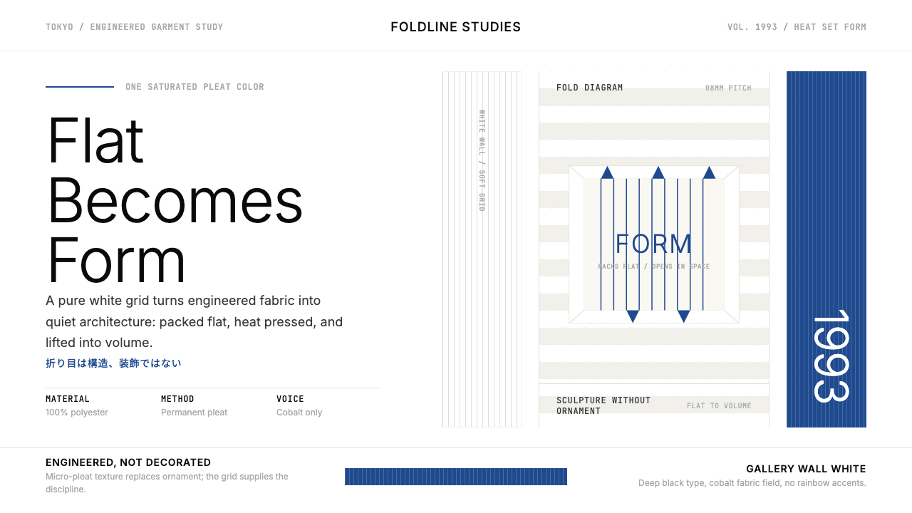
Issey Miyake's Pleats Please, launched in 1993, is a fashion and visual system built around a single technical conviction: that clothing should be engineered rather than decorated, that the intelligence of a garment lives in its structure rather than its surface. The brand's heat-permanent pleating process — applied after the garment is fully sewn, stretching polyester to two to three times its final size before heat-setting compresses it into permanent accordion folds — is not merely a technique. It is the organizing metaphor for everything the visual identity does.三宅一生的「Pleats Please 三宅褶皱」创立于1993年,是一套建立在单一技术信念上的时装与视觉系统:服装应当被工程化,而非被装饰;一件衣服的智慧存在于它的结构,而非它的表面。品牌的热定型褶皱工艺——在成衣缝制完成后施加,将聚酯面料拉伸至最终尺寸的两到三倍,再经热压收缩形成永久手风琴褶——不仅是一种技术,更是视觉识别系统的一切组织隐喻。
The aesthetic that results is immediately legible. Pure white or near-white space dominates every composition, leaving room for a single saturated pleat-color to enter as the sole chromatic voice — cobalt blue in one campaign, burnt orange in another, electric magenta in a third. The typography is clean, modernist Japanese sans-serif: unadorned, precisely spaced, never decorative. Thin parallel lines — evoking the pleat's own rhythm — serve as texture where other brands would reach for illustration or photography. The overall effect is warm-engineered: rigorous in structure, human in proportion, unmistakably rooted in Tokyo's particular brand of refined restraint.由此产生的美学语言清晰可辨。纯白或近白色空间主导每一个构图,为单一饱和的褶皱色留出登场空间——一个系列是钴蓝,另一个是橙红,又一个是电光洋红。字体是干净的日式现代主义无衬线:朴素、间距精确、从不流于装饰。细密的平行线条——唤起褶皱本身的韵律——在其他品牌会借助插图或摄影的地方充当纹理。整体效果是「温暖的工程感」:结构上严谨,比例上人性化,根植于东京特有的精炼克制。
As a design language, Pleats Please occupies a distinctive position between fashion minimalism and sculptural expressionism. It shares the white-ground discipline of Japanese modernist graphic design and the commitment to absence-as-statement, yet it permits one deliberate burst of high saturation that gives each composition emotional charge. This is not minimalism for its own sake — it is architecture that happens to be worn, a philosophy that treats fabric as form and form as the argument.作为一套设计语言,Pleats Please 占据着时装极简主义与雕塑表现主义之间的独特位置。它与日本现代主义平面设计共享白色底面的自律,共享「以缺席为宣言」的承诺,但它允许一次刻意的高饱和色爆发,赋予每个构图以情感张力。这不是为简洁而简洁的极简主义——这是碰巧被穿着的建筑,是将织物视为形态、将形态视为论点的哲学。
See the Issey Miyake Pleats Please design system查看 Issey Miyake Pleats Please 完整设计系统
Where does Issey Miyake Pleats Please come from?Issey Miyake Pleats Please 从何而来?
Issey Miyake (1938–2022) established his design house in Tokyo in 1970 after studying at Tama Art University and training in Paris under Hubert de Givenchy and Guy Laroche, then briefly in New York. From the outset, his practice was defined by a cross-disciplinary curiosity that ran counter to the prevailing European luxury-fashion model: he drew from Japanese textile craft, from sculptural art, from engineering, and from what he called a desire to understand the relationship between the body and cloth. This foundational openness — to material experimentation, to cross-pollination with science and art — made Pleats Please possible.三宅一生(1938—2022)在多摩美术大学求学、赴巴黎在纪梵希与拉罗什门下修业、短暂旅居纽约后,于1970年在东京创立自己的设计工作室。从一开始,他的实践就被一种跨学科的好奇心所定义,与当时主流的欧洲奢侈时装模式截然相悖:他从日本纺织工艺、从雕塑艺术、从工程学,以及他所说的「理解身体与布料关系的渴望」中汲取灵感。这种基础性的开放——对材料实验、对科学与艺术的跨界融合——使 Pleats Please 的诞生成为可能。
The pleating research that would become Pleats Please began in earnest in the late 1980s, conducted through Miyake Design Studio's in-house research arm, which the studio later formalized as the Reality Lab. The technical challenge was substantial: conventional pleating was applied to flat fabric before construction, which constrained the garment's shape. Miyake's team reversed the process — constructing the garment first, then pleating — which allowed the pleats to conform naturally to the body's contours. The material of choice was 100% polyester, often disparaged at the time as unglamorous, which Miyake embraced precisely because its thermoplastic properties allowed the heat-setting process to lock folds permanently. When the 1993 collection launched, the pleat was not a decorative detail but the structural principle itself.将成为 Pleats Please 的褶皱研究在1980年代末正式展开,由三宅设计工作室的内部研究部门负责推进,该部门后来正式命名为「Reality Lab(现实实验室)」。技术挑战相当艰巨:传统的褶皱加工是在布料裁剪前施加于平面织物,这限制了成衣的造型自由度。三宅的团队颠倒了这一流程——先完成成衣缝制,再施加褶皱——从而使褶皱能自然地贴合身体轮廓。选择的材料是100%聚酯,一种在当时常被视为缺乏格调的面料,三宅恰恰因其热塑性特质而采用——正是这种特质使热定型工艺得以将褶皱永久锁定。1993年系列发布时,褶皱不是装饰细节,而是结构原理本身。
The visual identity of Pleats Please emerged from the same engineering logic as the garment. Miyake's creative team — working in close collaboration with the brand's long-term visual collaborators and with designers shaped by Japanese modernism's graphic tradition — built a communication system around the materials and forms that the clothing itself embodied. The boutique interiors used white display stands arranged as sculpture, with garments hung by color rather than by silhouette. Campaign photography isolated single pieces against pure white, lit to reveal the pleat's three-dimensional geometry rather than to flatter the body in conventional fashion-editorial terms. The poster and print work reduced each composition to white ground, a single typographic statement, and the one chosen pleat-color for that season.Pleats Please 的视觉识别与服装本身出于同一套工程逻辑。三宅的创意团队——与品牌长期的视觉合作者密切协作,与受日本现代主义平面传统塑造的设计师共同工作——围绕服装本身所体现的材料与形态,建立了一套传播系统。精品店内部以白色展示台排列为雕塑,服装按颜色而非廓形悬挂陈列。广告摄影将单件服装孤立于纯白背景,以光线揭示褶皱的三维几何结构,而非以常规时尚大片的方式美化身体。海报与印刷作品将每个构图浓缩为:白色底面、单一排印陈述,以及当季所选定的那一种褶皱色。
The 1993 launch coincided with a broader moment in Japanese fashion's international emergence. Rei Kawakubo of Comme des Garçons and Yohji Yamamoto had already disrupted Paris in the early 1980s with deconstructed, body-concealing silhouettes; Miyake had shown in Paris since 1973. By 1993, the appetite for a Japanese design philosophy that was neither imitation Western luxury nor folkloric traditionalism — but a genuinely engineered modernity — had an audience. Pleats Please named and embodied that space with unusual precision. The subsequent development of the A-POC (A Piece of Cloth) project in 1998, led by Miyake and Dai Fujiwara, extended the same logic: a single tube of knit fabric from which any garment could be cut, with no waste, no seams, no ornament beyond the textile's inherent structure.1993年的发布恰逢日本时装国际崛起的更广阔时刻。川久保玲的 Comme des Garçons 与山本耀司已于1980年代初以解构的、遮盖身体的廓形震撼了巴黎;三宅一生自1973年起便在巴黎发布秀。到1993年,一种既非模仿西方奢侈风格、又非民俗传统主义,而是真正经由工程化现代性构建的日本设计哲学,已经拥有了自己的受众。Pleats Please 以异乎寻常的精确度命名并具象化了这一位置。1998年,三宅一生与藤原大共同推进的 A-POC(一块布)项目延伸了同一逻辑:从一根针织管状布料剪裁出任何服装,无废料、无接缝、无任何超越织物固有结构的装饰。
What defines the Issey Miyake Pleats Please look?Issey Miyake Pleats Please 的视觉特征是什么?
White Ground and Breathing Space白色底面与呼吸空间
The dominant visual choice in Pleats Please is the uncompromising use of pure white or very near-white as the compositional ground. This is not simply negative space — it is the canvas against which the pleat's three-dimensional form becomes legible. Generous margins and wide inter-element spacing mean that each component of a composition — a single garment, a typographic title, a pleat-color stripe — can be read in isolation before being understood in relation. The white ground is the garment's display stand, translated into two dimensions.Pleats Please 最主导的视觉选择是毫不妥协地以纯白或接近纯白的色调作为构图底面。这不仅仅是负空间——它是使褶皱三维形态得以清晰呈现的画布。慷慨的页边距与宽阔的元素间距意味着构图中的每个组成部分——一件单独的服装、一个排印标题、一条褶皱色条带——都能在被整体理解之前被独立阅读。白色底面是服装展示台向二维空间的转译。
Single Saturated Pleat-Color单一饱和褶皱色
Where Bauhaus uses all three primaries in symbolic rotation, Pleats Please commits to exactly one saturated color per composition — and that color is drawn from the season's pleat palette rather than from any fixed chromatic system. Cobalt blue, signal orange, electric magenta, acid green: each appears alone, at full saturation, against the white ground. The rule is strict — introducing a second hue breaks the logic. The single color functions simultaneously as brand signal, emotional register, and architectural accent, doing the work that multiple colors would dilute.与包豪斯在三原色之间象征性轮换不同,Pleats Please 对每个构图严格坚持恰好一种饱和色——而这种颜色来自当季褶皱色板,而非任何固定的色彩体系。钴蓝、信号橙、电光洋红、荧光绿:每种颜色单独出现,以全饱和度置于白色底面上。规则是严格的——引入第二种色调会打破这套逻辑。那一种单色同时承担品牌信号、情感调性与建筑性点缀的功能,完成多种颜色只会稀释的工作。
Pleat-Line Texture褶纹质感
The visual vocabulary includes fine parallel lines — spaced with the same regularity as the garment's accordion folds — used as a textural element in backgrounds, borders, and compositional fields. These lines are not decorative in the conventional sense; they are the two-dimensional projection of the pleat's three-dimensional geometry. Their density and direction can be varied — tighter spacing reads as shadow within a fold, looser spacing as the open pleat at its widest — but their reference is always structural. The lines replace illustration, photography, and pattern as the brand's primary textural register.视觉词汇中包含细密的平行线条——以与服装手风琴褶相同的规律间距排列——用作背景、边框与构图区域的纹理元素。这些线条不是常规意义上的装饰;它们是褶皱三维几何结构在二维上的投影。线条的密度与方向可以变化——更密的间距读作褶皱内的阴影,更疏的间距读作褶皱展开最宽处——但其参照始终是结构性的。这些线条替代插图、摄影与图案,成为品牌的主要纹理表达。
Japanese Modernist Typography日式现代主义排印
The typographic system draws from the Japanese modernist tradition: clean, geometric sans-serif letterforms for both Latin and Japanese scripts, set with precise and often generous tracking, never condensed or decoratively manipulated. Headlines are spare — sometimes a single word or phrase — and body text, where it appears, is set at a measured scale that does not compete with the spatial silence around it. The type functions as a structural anchor, not as an expression of personality. It speaks once, clearly, and then cedes the stage to space and color.排印系统源自日本现代主义传统:干净的几何无衬线字形,同时适用于拉丁字母与日文,以精确且通常较宽松的字间距排列,从不被压缩或以装饰性方式处理。标题极为简洁——有时仅是一个词或一个短语——正文(若出现)以一种不与周围空间沉默竞争的节制尺度排印。文字作为结构性锚点,而非个性表达。它清晰地说一次,然后将舞台让给空间与颜色。
Architectural Restraint in Layout版面上的建筑性克制
Compositions are built on a strict modernist grid, but the organizing logic is closer to exhibition design than to editorial layout. Objects — garments, type blocks, color fields — are placed as sculptures in space, with clear sightlines between them. Asymmetry is preferred over centering: a garment might occupy one third of the frame while the remaining two thirds hold only white and a single typographic element. This creates the visual equivalent of the brand's boutique interiors, where a single piece on a white stand is the entire statement.构图建立在严格的现代主义网格之上,但其组织逻辑更接近展览设计而非编辑排版。对象——服装、文字块、色彩区域——被安置为空间中的雕塑,彼此之间有清晰的视线间距。非对称优于居中:一件服装可能占据画面的三分之一,而剩余的三分之二只持有白色与单一排印元素。这创造了相当于品牌精品店室内陈设的视觉等价物——一件白色展台上的单独作品,就是全部的陈述。
Engineering Over Ornament工程感优先于装饰
The deepest principle organizing the visual language is the same one that organizes the garment: intelligence expressed through structure, not surface. There are no flourishes, no decorative borders, no gradient fills, no ambient texture applied for visual richness. Where an element exists, it exists because it serves a compositional or communicative function. The pleat-line textures are not decoration — they are a literal reference to the making process. The white space is not emptiness — it is the room the form needs to be itself. Every apparent absence is a considered choice.组织这套视觉语言的最深层原则与组织服装本身的相同:智慧通过结构而非表面来表达。没有花饰,没有装饰边框,没有渐变填充,没有为丰富视觉而施加的环境纹理。一个元素的存在,是因为它服务于构图或传达功能。褶纹质感不是装饰——它是对制造过程的字面援引。白色空间不是空洞——它是形态成为其自身所需要的空间。每一处表面上的缺席,都是一个经过深思熟虑的选择。
Monochromatic Color Discipline单色调纪律
Within any single composition or campaign, color is strictly monochromatic in its application: one pleat-color, deployed at full saturation as the accent, against a white-dominant field with black used only for typography and structural lines. Tonal variation within the chosen color — lighter tints, darker shades — is permitted and used to suggest the pleat's folded depth, but the hue itself does not shift. This monochromatic discipline means that the brand can shift its emotional register entirely by changing the single chosen color from season to season, without altering any other element of the system.在任何单一构图或系列活动中,色彩应用严格保持单色调:一种褶皱色,以全饱和度作为点缀,置于白色为主的底面,黑色仅用于排印与结构线条。所选颜色的明度变化——更浅的淡色调、更深的暗色调——是被允许的,用于暗示褶皱折叠的深度,但色相本身不会偏移。这种单色调纪律意味着,品牌可以仅通过逐季更换那唯一一种选定颜色,在不改变系统任何其他元素的情况下,完全转换其情感调性。

See the Issey Miyake Pleats Please design system查看 Issey Miyake Pleats Please 完整设计系统
Who shaped Issey Miyake Pleats Please?谁塑造了 Issey Miyake Pleats Please?
Miyake founded his design house in Tokyo in 1970 and spent the following five decades pursuing a single question: what happens when fashion is treated as engineering problem rather than decorative art? His training in Paris and New York gave him literacy in both Western couture construction and avant-garde art; his Japanese formation gave him a material philosopher's patience with process. The Pleats Please project, launched in 1993, represented his most complete synthesis of these influences — a system in which the making process and the final form are inseparable, and in which the visual identity and the garment share the same organizing logic. Miyake received the Praemium Imperiale sculpture prize in 1999, and the brand has continued operating under successive creative directors following his death in 2022.三宅一生于1970年在东京创立设计工作室,此后五十年间追问同一个问题:当时装被当作工程问题而非装饰艺术对待时,会发生什么?在巴黎和纽约的训练赋予他通晓西方高级定制结构与先锋艺术的能力;日本的成长背景给予他材料哲学家般的过程耐心。1993年发布的 Pleats Please 项目代表了他对这些影响的最完整综合——一个制造过程与最终形态不可分割的系统,在其中,视觉识别与服装遵循同一套组织逻辑。三宅一生于1999年获得高松宫殿下纪念世界文化赏,品牌在他2022年辞世后在继任创意总监的带领下持续运营。
Fujiwara joined Miyake Design Studio in 1994 and became Miyake's closest creative collaborator on the technical research projects that defined the brand's later identity. He co-developed the A-POC (A Piece of Cloth) concept launched in 1998 — a system for producing complete garments from a single tube of knit fabric, with no cuts, no waste, and no construction beyond what the knitting machine itself inscribed. After Miyake stepped back from day-to-day design leadership, Fujiwara served as creative director, maintaining the studio's commitment to process-as-design. His work represents the most direct continuation of the founding engineering philosophy.藤原大于1994年加入三宅设计工作室,成为三宅一生在技术研究项目上最亲密的创意合作者,这些项目定义了品牌后来的身份。他共同开发了1998年发布的 A-POC(一块布)概念——一套从单根针织管状布料生产完整服装的系统,无裁切、无废料,除针织机自身铭刻的结构外无任何额外构造。三宅一生从日常设计领导工作退出后,藤原大担任创意总监,维持着工作室对「过程即设计」的承诺。他的工作是创始工程哲学最直接的延续。
Miyamae joined the studio in 1994 and eventually became creative director of the Issey Miyake womenswear line, overseeing collections that continued the studio's tradition of using technology as a creative collaborator rather than a production tool. He championed the use of digital knitting and weaving processes to produce textiles with inherent three-dimensional structure — extending the Pleats Please logic from pressed fold to engineered surface. His tenure exemplified the studio's model: individual creative directors who advance the founding principles rather than replacing them with personal authorship.宫前义之于1994年加入工作室,最终成为 Issey Miyake 女装线的创意总监,主持延续工作室传统的系列——将技术作为创意合作者而非生产工具。他倡导使用数码针织与梭织工艺生产具有固有三维结构的面料,将 Pleats Please 的逻辑从压制褶皱延伸至工程化的织物表面。他任职期间体现了工作室的模式:个体创意总监推进而非以个人署名取代创始原则。
Fukasawa, the industrial designer best known for his work with Muji and his development of the concept he called 'without thought' — design that integrates so completely into daily behavior it disappears — contributed to Miyake's wider creative circle and shares a deep philosophical alignment with the Pleats Please project. His thinking about objects that earn their presence through performance rather than appearance, and about the dignity of materials used according to their true properties, mirrors the Pleats Please argument from the territory of product design. The dialogue between Fukasawa's practice and the Miyake studio reflects Tokyo's particular cross-disciplinary design culture at its most productive.工业设计师深泽直人以其为无印良品所做的工作以及他所称的「无意识设计」概念而著称——设计完整融入日常行为,以至于消失其中——他参与了三宅更广泛的创意圈,与 Pleats Please 项目有着深刻的哲学共鸣。他关于物件通过功能而非外观赢得其存在的思考,以及关于按照材料真实属性使用材料的尊严的思考,从产品设计领域映照了 Pleats Please 的论点。深泽直人的实践与三宅工作室之间的对话,呈现了东京特有的跨学科设计文化在其最富创造力时刻的面貌。
How do you use Issey Miyake Pleats Please today?今天怎么用 Issey Miyake Pleats Please?
The Pleats Please visual system translates into contemporary design work with unusual directness, because its logic is structural rather than nostalgic. Applying it correctly requires internalizing the garment's own operating principle: intelligence through structure, not surface. The question to ask before adding any element is not 'does this look like Pleats Please?' but 'does this element do structural work, or is it decoration in disguise?'Pleats Please 视觉系统转化为当代设计实践时具有不寻常的直接性,因为其逻辑是结构性的,而非怀旧性的。正确应用它,需要内化服装本身的运作原则:通过结构而非表面体现智慧。在添加任何元素之前,要问的问题不是「这看起来像 Pleats Please 吗?」而是「这个元素在做结构性工作,还是伪装成的装饰?」
For presentation slides, the system works powerfully at both cover and content levels. A cover slide should commit to the full white-ground logic: the title in clean sans-serif type, a single pleat-color stripe or geometric field as the sole accent, and nothing else. Content slides should be treated as exhibition display rather than editorial layout — one primary idea per slide, positioned with wide margins, the supporting detail scaled noticeably smaller, and any data visualization rendered in the single chosen accent color against white. Data charts become sculptural objects: bar charts stripped of grid lines and background fills, with bars in the accent color and labels in black, the white ground doing the organizational work that gridlines would otherwise perform.对于演示文稿,这套系统在封面与内容两个层面都表现有力。封面幻灯片应完全遵循白色底面逻辑:以干净无衬线字体呈现的标题、作为唯一点缀的单一褶皱色条带或几何色块,以及其他一切的缺席。内容幻灯片应被当作展览陈设而非编辑排版处理——每张幻灯片一个主要观点,以宽阔的页边距定位,支撑性细节以明显更小的尺度呈现,所有数据可视化以唯一选定的点缀色在白底上呈现。数据图表成为雕塑性对象:去除网格线与背景填充的柱状图,条形以点缀色呈现,标签以黑色标注,白色底面完成原本需要网格线完成的组织工作。
For web interfaces, the style is particularly well-suited to dashboards, pricing pages, and product-feature pages where clarity of hierarchy is the primary design goal. Establish a generous and strict column grid, keep the background pure or near-white, and use black for all body text. The single accent color — chosen with the same seasonal conviction as the original pleat-color — should appear only at interactive focus points: active navigation states, primary call-to-action buttons, data highlights, and tier differentiators on pricing tables. Card components, where needed, should use a crisp visible border rather than a drop shadow; if shadow is used at all, it should be a hard-edged offset in the pleat-line style, not a soft ambient glow.对于网页界面,这种风格尤其适合以层级清晰度为首要设计目标的仪表板、定价页面与产品功能页面。建立慷慨而严格的列网格,将背景保持在纯白或接近白色,所有正文使用黑色。那唯一的点缀色——以与原始褶皱色相同的季节性确信来选择——只应出现在交互焦点处:激活的导航状态、主要行动号召按钮、数据亮点,以及定价表上的等级区分。卡片组件(若需要)应使用清晰可见的边框而非投影阴影;若确实使用阴影,应当是褶纹风格的硬边偏移投影,而非柔和的环境光晕。
For editorial and marketing design, the Pleats Please approach supports strong information hierarchy through spatial composition rather than decorative hierarchy. An editorial spread works with a wide margin on one side for pull quotes or metadata, body text set in a measured column, and section breaks marked by a ruled line in the accent color rather than by ornamental dividers. Marketing pages can achieve striking impact through full-width alternating blocks: white ground with accent-color type, then white type on an accent-color field, the rhythm of alternation evoking the pleat's own accordion logic. Photography, when used, should be treated as a sculptural object: isolated on white, cropped to emphasize three-dimensional form, never used as a full-bleed atmospheric backdrop.对于编辑与营销设计,Pleats Please 方法通过空间构图而非装饰层级来支持强劲的信息层级。一个编辑版面在一侧留有宽阔页边距用于引用语或元数据,正文在一个有节制的栏内排印,段落分隔以点缀色规则线而非装饰隔断标记。营销页面通过全宽交替区块实现引人注目的冲击力:白底点缀色文字,然后是点缀色底面上的白色文字,这种交替韵律唤起褶皱本身的手风琴逻辑。摄影图片(若使用)应被当作雕塑性对象处理:孤立于白色上、裁切以强调三维形态,绝不用作大面积铺满的氛围背景。
The most common mistake when working with this system is treating the single-color rule as optional — introducing a secondary accent, a gradient to add depth, or a warm-toned background to add approachability. Each of these additions breaks the logic. The white ground's coldness is not a problem to be solved; it is the medium through which the single color acquires its full intensity. A second hue halves the visual authority of the first. Similarly, the pleat-line texture is frequently misapplied as a purely decorative pattern: it should appear only where it can read as a literal reference to the pleat structure — as a field suggesting fold depth, or as a directional line suggesting the garment's drape. Applied randomly as wallpaper, it becomes ornament, which is precisely what the system refuses.使用这套系统时最常见的错误是将单色规则视为可选项——引入次要点缀色、用渐变增加深度,或用暖色调背景增加亲和感。这些添加中的每一项都打破了逻辑。白色底面的冷感不是需要解决的问题;它是使那唯一的颜色获得完整强度的媒介。第二种色相将第一种颜色的视觉权威减半。同样,褶纹质感常被错误地应用为纯装饰性图案:它只应出现在能被读作褶皱结构字面援引的地方——作为暗示折叠深度的色域,或作为暗示服装垂坠的方向性线条。随意作为壁纸应用时,它变成了装饰,而这恰恰是整套系统所拒绝的。
See the Issey Miyake Pleats Please design system查看 Issey Miyake Pleats Please 完整设计系统
Issey Miyake Pleats Please — FAQIssey Miyake Pleats Please · 常见问题
Is Pleats Please minimalism, or something else?Pleats Please 是极简主义,还是别的什么?
It is related to minimalism but should not be collapsed into it. Contemporary minimalism tends to be defined by reduction — less color, less type, less visual incident — as an end in itself, often producing work that reads as restrained luxury or calm authority. Pleats Please is organized by a different principle: engineering honesty. Elements are absent not because absence is a value, but because each absent element would have been superfluous to the structural argument. The single saturated color is emphatically not minimalist — it is a deliberate burst of maximum intensity within a field of restraint. A closer analogy might be Japanese spatial philosophy (ma — the meaningful pause, the interval that gives sound and form their definition) applied to graphic communication.它与极简主义相关,但不应被归入其中。当代极简主义倾向于以减法本身为目的——更少的颜色、更少的字体、更少的视觉事件——常产生读作克制奢华或平静权威的作品。Pleats Please 由不同的原则组织:工程诚实。元素的缺席不是因为缺席本身是一种价值,而是因为每个缺席的元素对于结构性论点来说是多余的。那单一的饱和色绝对不是极简主义的——它是在克制场域中的一次刻意的最大强度爆发。一个更贴切的类比可能是日本空间哲学(间——赋予声音与形态以定义的有意义停顿、音程间隔)应用于平面传播。
How do I choose the single accent color for a given project?如何为特定项目选择那唯一的点缀色?
The original brand chooses its pleat-color seasonally, as a product decision — the color of the physical garment and the color of the visual campaign are literally the same color. When applying the system to a design project, the equivalent question is: what is the one color that names this product's or season's character most precisely? The color should be fully saturated, cleanly hued (not muddied or muted), and selected with conviction rather than compromise. It should work as a single voice — tested in isolation against a white ground before any other context is introduced. Common successful choices include primary and secondary hues at full saturation: a pure cobalt, a clear signal orange, an unambiguous magenta. Colors that are too desaturated, too warm-neutral, or too complex to name in one word tend to underperform in this system.原始品牌按季选择其褶皱色,作为产品决策——实物服装的颜色与视觉系列的颜色从字面意义上就是同一种颜色。将这套系统应用于设计项目时,等价的问题是:哪一种颜色最精确地命名了这个产品或这个季节的特质?所选颜色应当是全饱和的、色相清晰的(而非浑浊或低饱和),并以笃定而非妥协的方式选择。它应当作为单一声音发挥作用——在引入任何其他语境之前,在白色底面上单独测试。常见的成功选择包括全饱和度的原色和间色:纯正钴蓝、清晰的信号橙、毫不含糊的洋红。那些过于低饱和、过于暖中性,或复杂到无法用一个词命名的颜色,在这套系统中往往表现不佳。
Can the system work with photography, or does it require avoiding images?这套系统能与摄影图像配合使用吗,还是需要回避图像?
Photography can work in the Pleats Please system, but only when treated as a sculptural object rather than an atmospheric backdrop. The brand's own campaign photography demonstrates the principle: garments are isolated on white grounds, lit to reveal three-dimensional pleat geometry, and cropped to eliminate environmental context. The same logic applies in other design contexts — a photograph used in a Pleats Please-informed layout should be isolated, cropped to its essential form, and placed with the same margin logic as any other compositional element. Full-bleed atmospheric photography — wide lifestyle shots, textured backgrounds, heavily graded landscapes — is incompatible with the system. The photograph should be readable as a designed object, not as a window.摄影可以在 Pleats Please 系统中发挥作用,但只有当其被当作雕塑性对象而非氛围背景对待时。品牌自身的系列摄影展示了这一原则:服装在白色底面上被孤立,以光线揭示三维褶皱几何,并裁切以消除环境语境。同样的逻辑适用于其他设计语境——在受 Pleats Please 启发的版面中使用的照片,应当被孤立、裁切至其本质形态,并以与任何其他构图元素相同的页边距逻辑放置。大面积铺满的氛围摄影——宽广的生活方式照片、有纹理的背景、大量调色的风景——与这套系统不兼容。照片应当被读作一个被设计的对象,而非一扇窗。
What kinds of products or brands is this style least suited to?这种风格最不适合哪类产品或品牌?
The Pleats Please visual logic performs poorly when the product's value proposition is built on warmth, abundance, sensory richness, or cultural belonging. Food brands — particularly those that sell pleasure and indulgence — need visual systems that invoke appetite and abundance; the Pleats Please palette and spatial logic reads as cool and architectural in contexts where warmth is the point. Children's products require visual systems that communicate play, color variety, and approachable energy — the single-color discipline is too austere. Wellness and self-care brands often need the softness of desaturated pastels and organic textures to signal comfort, which the system's engineered precision actively resists. The underlying test: if the brand's core promise is about feeling rather than thinking, structure rather than softness will be a misalignment.当产品的价值主张建立在温暖感、丰盛感、感官丰富性或文化归属感上时,Pleats Please 视觉逻辑表现不佳。食品品牌——尤其是那些售卖愉悦与享受的——需要能唤起食欲与丰盛的视觉系统;Pleats Please 的色板与空间逻辑在以温度为核心的语境中读起来过于冷峻和建筑感。儿童产品需要能传达玩耍、色彩多样性与亲切活力的视觉系统——单色调纪律过于严肃。健康与自我护理品牌常需要去饱和柔色与有机纹理的柔软感来传递舒适,而这套系统的工程精确性对此主动抵制。底层测试:如果品牌的核心承诺关于感受而非思考,那么以结构取代柔软就会产生错位。
How does Pleats Please differ visually from other Japanese design aesthetics like wabi-sabi or muji?Pleats Please 与侘寂或无印良品等其他日本设计美学在视觉上有何不同?
All three emerge from a Japanese modernist tradition that values restraint, absence, and the intelligence of materials, but they operate through very different visual vocabularies. Wabi-sabi finds beauty in imperfection, asymmetry, and the marks of time — its palette is earthy, organic, and desaturated; its forms are irregular and worn. Muji (and the broader muji aesthetic) is a systematized reduction to function: warm neutral grounds, natural material textures, carefully standardized proportion — it is restraint in service of democratic accessibility. Pleats Please is neither earthy nor neutral. It is precision-engineered, its forms are perfect and repeating, and its one concession to exuberance — the single saturated pleat-color — is neither organic nor muted. It has more in common with Kengo Kuma's architectural practice or the design culture of Tokyo's science museums than with the handcraft-adjacent philosophy of wabi-sabi.三者都源自日本现代主义传统——珍视克制、缺席与材料的智慧——但它们通过截然不同的视觉词汇运作。侘寂在不完美、不对称与时间痕迹中发现美——其色板是泥土色的、有机的、低饱和的;其形态是不规则的、有岁月感的。无印良品(以及更广泛的无印美学)是功能上的系统化减法:温暖的中性底面、天然材料质感、精心标准化的比例——这是服务于民主可及性的克制。Pleats Please 既不接地气,也不中性。它是精密工程化的,其形态完美而重复,它对丰盛的唯一让步——那单一的饱和褶皱色——既非有机,也非低调。它与隈研吾的建筑实践或东京科学博物馆的设计文化有更多共同之处,而非与侘寂的手工艺邻近哲学相近。
Related design styles相关设计风格
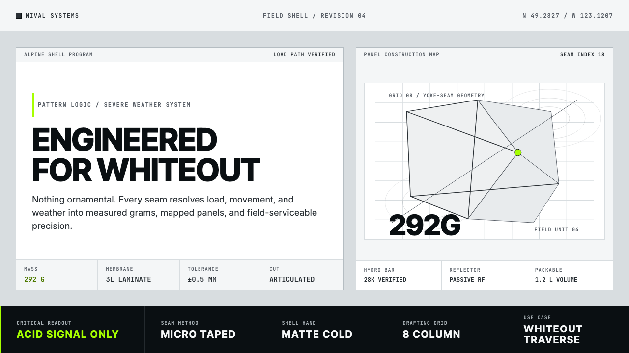 Arc'teryx Technical OutdoorEngineered, never ornamental. Glacier silver grid, mono specs, one acid-green…只讲工程,不作装饰。冰川银网格、等宽规格与一处酸绿信号。
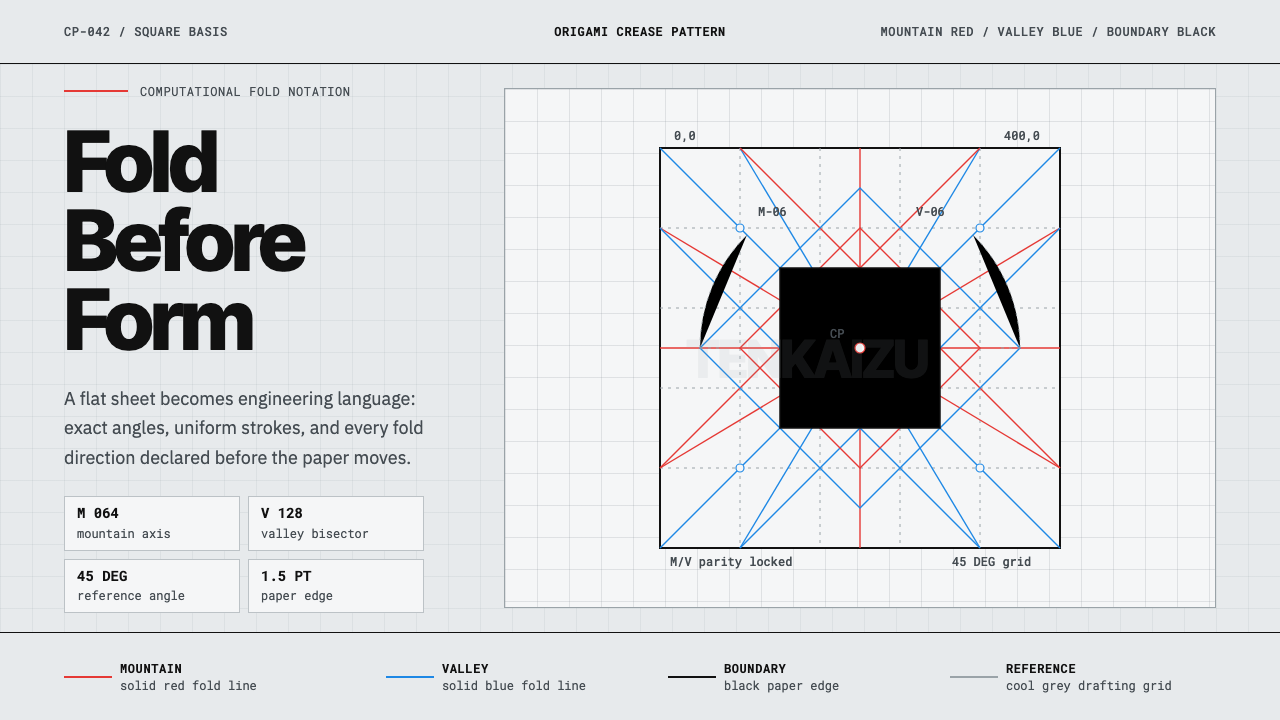 Origami Crease PatternPrecision is the brand. Red and blue fold lines map a cool grey drafting latt…精密就是品牌。红蓝折线铺成冷灰制图网格。
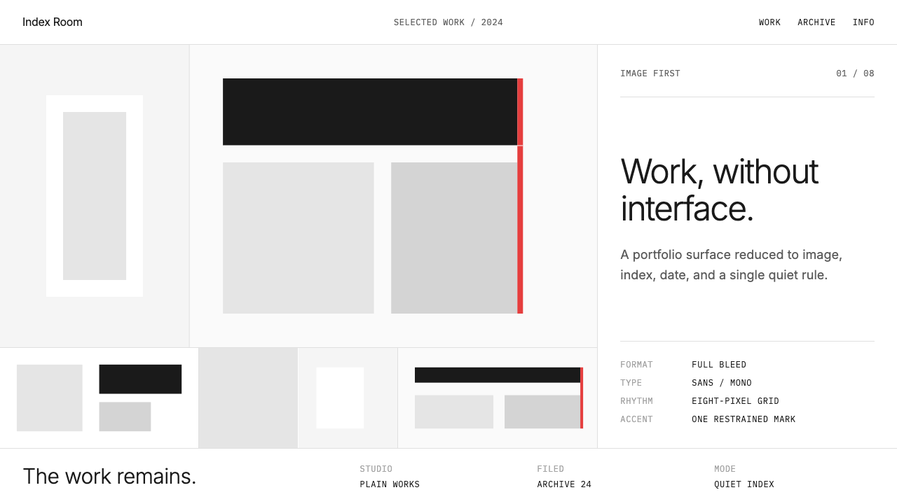 Cargo Collective PortfolioInterface disappears. White space, full-bleed blocks, mono metadata and hairl…界面退场:留白、全出血块面、等宽元数据与极细线。
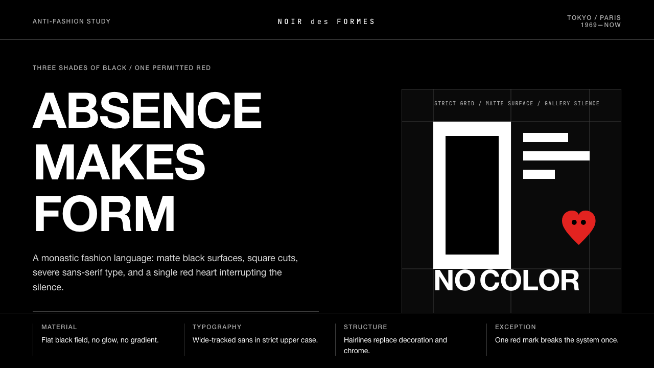 Comme des Garçons (Rei Kawakubo)Austerity becomes the event. Pure black, wide sans type, and one red heart br…克制即事件:纯黑、宽距无衬线与一枚红心打破沉默。
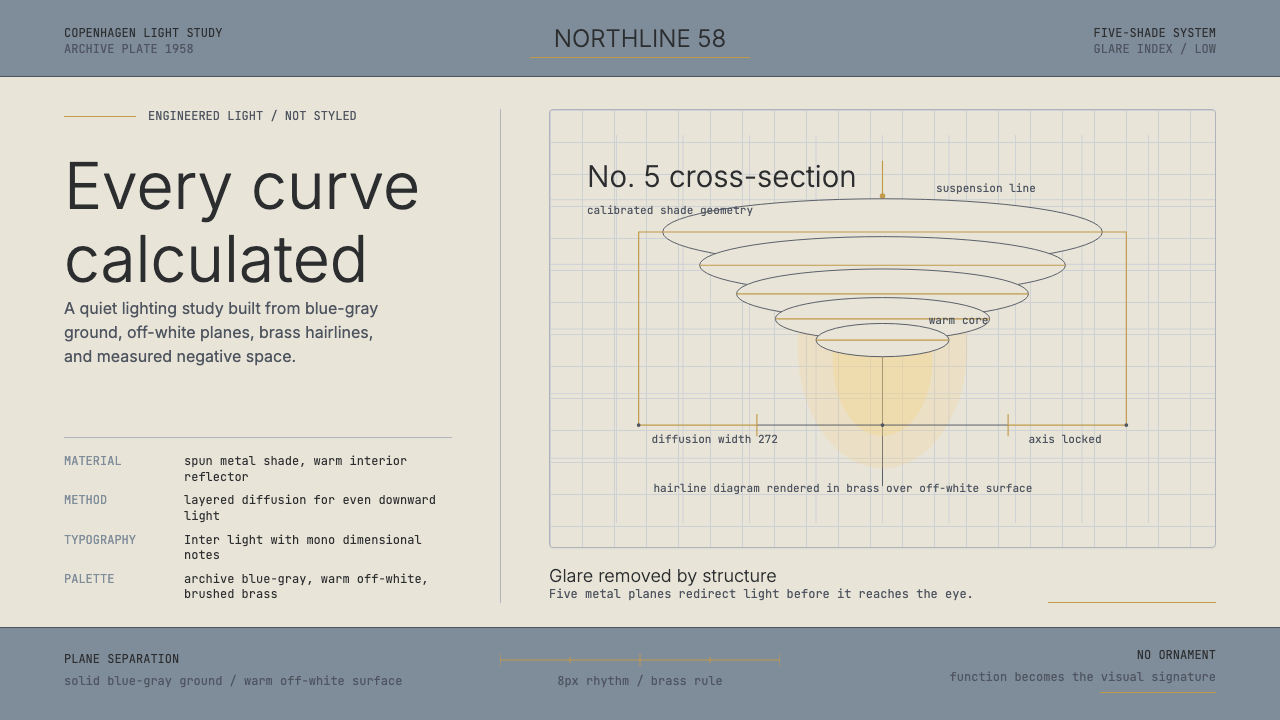 Danish PH5 Louis Poulsen (1958)Engineered, not styled. Blue-gray ground, brass hairlines, and a precise shad…工程感胜过装饰。蓝灰底、黄铜发丝线与精密灯罩剖面。
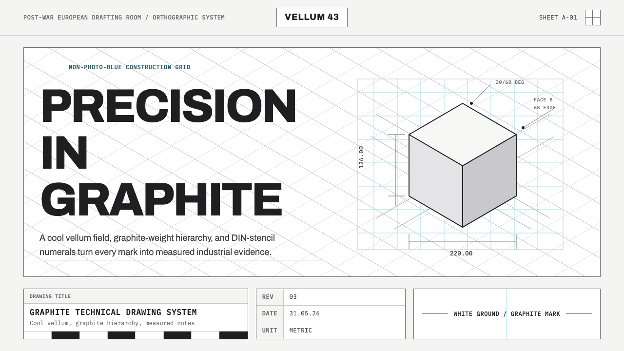 Graphite Technical DrawingDrafting-room precision. Non-photo-blue grid and graphite DIN lettering do th…制图室般精确:淡蓝网格与石墨DIN字母构成秩序。