What is Comme des Garçons (Rei Kawakubo)?什么是 Comme des Garçons (Rei Kawakubo)?
Rei Kawakubo built an empire from the color that contains all colors — black — and proved that the most radical statement a designer can make is to refuse decoration entirely.川久保玲用包含所有颜色的颜色——黑色——建立了一个帝国,并证明设计师所能做出的最激进宣言,是彻底拒绝装饰。
Comme des Garçons (Rei Kawakubo) in briefComme des Garçons (Rei Kawakubo) 速览
Comme des Garçons is the conceptual fashion house founded by Rei Kawakubo in Tokyo in 1969. Its visual identity is among the most severe and consequential in the history of fashion: a strict monastic system built from deep black, generous white space, austere sans-serif typography, and an almost total refusal of color, decoration, or ornament. Where other luxury houses pursue beauty through addition, Kawakubo's system pursues meaning through subtraction.Comme des Garçons 是川久保玲于1969年在东京创立的概念时装屋。其视觉识别系统是时装史上最严峻、影响最深远的之一:由深沉的黑色、慷慨的留白、简朴的无衬线字体以及对色彩、装饰与点缀近乎彻底的拒绝所构成的修道院式体系。其他奢侈品牌通过添加来追求美,而川久保玲的系统通过减法来追求意义。
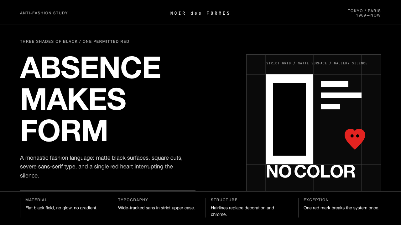
The brand's visual logic operates like a discipline rather than a style. Black is not a background choice but a philosophical position — Kawakubo famously stated she works with 'three shades of black,' acknowledging that within apparent darkness there is infinite variation. Type is set wide, with generous letter-spacing that gives each character room to exist as a form in its own right. Layouts are spare and gallery-like, treating products as art objects that require no contextual embellishment. Containers, cards, and buttons use sharp right angles; nothing rounds, nothing softens.这个品牌的视觉逻辑更像一种戒律,而非一种风格。黑色不是背景的选择,而是哲学立场——川久保玲那句被反复引用的话:「我用三种黑色工作」,承认了表面黑暗之中存在无限的变化。字体以宽松字距排版,给每个字符足够的空间以独立的形态存在。版面简练如画廊,将产品作为无需任何情境点缀的艺术品对待。容器、卡片与按钮均使用锐利直角,没有圆润,没有柔化。
The one permitted exception to the system's monochrome austerity is the PLAY sub-brand, introduced in 2002 with Filip Pagowski's iconic red heart-with-eyes mascot. This single saturated element functions as the system's only counterpoint — a deliberate, controlled rupture that makes the surrounding severity more visible by contrast. Its existence confirms rather than contradicts the rule: even the playful element is governed by deliberate design thinking.这套单色体系中唯一被允许的例外,是2002年推出的 PLAY 副线——与菲力普·帕高斯基(Filip Pagowski)合作设计的那枚红色带眼睛心形图腾。这个唯一的饱和元素作为整个系统的对位而存在:一处刻意的、受控的断裂,通过对比使周围的严峻更加清晰可见。它的存在印证而非违背了规则——即便是玩趣的元素,也受到深思熟虑的设计逻辑支配。
See the Comme des Garçons (Rei Kawakubo) design system查看 Comme des Garçons (Rei Kawakubo) 完整设计系统
Where does Comme des Garçons (Rei Kawakubo) come from?Comme des Garçons (Rei Kawakubo) 从何而来?
Rei Kawakubo founded Comme des Garçons — the name is French for 'like some boys' — in Tokyo in 1969, beginning as a clothing label before incorporating formally in 1973. She came to fashion without formal training as a designer, having studied fine arts and literature at Keio University. This absence of conventional tailoring education was not an accident but a condition: Kawakubo consistently maintained that not knowing the established rules freed her to question whether those rules served any purpose. She began making clothes because she could not find what she wanted to wear.川久保玲于1969年在东京创立 Comme des Garçons——这个法语名字意为「像某些男孩」——最初以服装品牌的形式运作,1973年正式注册成公司。她进入时装领域时并没有正规的设计师训练背景,在庆应义塾大学主修的是美术与文学。缺乏传统缝纫教育并非缺憾,而是一种条件:川久保玲始终坚持,不了解既成规则恰恰使她得以追问这些规则是否具有任何意义。她开始制作服装,只是因为找不到自己想穿的衣服。
The decisive moment in the brand's international history came in Paris in 1981, when Kawakubo presented her spring-summer 1983 collection on the Paris runway. French fashion journalists, conditioned by decades of Parisian elegance, encountered asymmetric silhouettes, deliberately unfinished hems, clothes with holes, wrapped and bound volumes, and a near-total elimination of conventional beauty cues. The response was shock and, in some quarters, contempt. Critics described the work as 'Hiroshima chic' and 'post-atomic.' Kawakubo received these characterizations as unintentional descriptions of her actual intent: to make visible what conventional fashion systematically concealed, including damage, imperfection, and the body's own asymmetry.品牌国际史上的决定性时刻发生在1981年的巴黎,当时川久保玲将她的1983年春夏系列带上巴黎秀场。习惯了数十年巴黎优雅美学的法国时装记者们,看到了不对称的廓形、刻意未收边的下摆、带洞的衣物、缠绕与包裹的体积,以及对传统美学信号的近乎彻底消除。反应是震惊,在某些角落甚至是蔑视。批评者将这些作品描述为「广岛风潮」和「后原子弹时代美学」。川久保玲将这些措辞理解为对她真实意图的无意识描述:使传统时装系统性遮蔽的东西变得可见——损伤、不完美,以及身体本身的不对称。
Over the following decades, Kawakubo built not a brand in the conventional sense but an institution — a parallel system within the fashion world with its own retail philosophy, publishing arm, and spatial logic. Dover Street Market, the multi-brand concept store co-founded with her partner Adrian Joffe in London in 2004, became a physical embodiment of the Comme des Garçons worldview: an anti-boutique in which merchandise from disparate labels coexisted in an environment closer to art installation than retail. The store model has since expanded to New York, Tokyo, Beijing, Los Angeles, and Singapore, each location an ongoing curatorial project rather than a static shop.在随后的数十年里,川久保玲构建的不是传统意义上的品牌,而是一套体制——时装世界内部一个平行的系统,拥有自己的零售哲学、出版部门和空间逻辑。2004年她与伴侣阿德里安·乔菲(Adrian Joffe)在伦敦共同创立的多品牌概念店 Dover Street Market,成为 Comme des Garçons 世界观的实体体现:一家反精品店,来自不同品牌的商品在更接近艺术装置而非零售环境的空间里共存。这一店铺模式此后扩展至纽约、东京、北京、洛杉矶和新加坡,每个地点都是持续进行的策展项目,而非静态的商店。
The visual identity that defines Comme des Garçons today — the wordmark, the typographic system, the deep-black art-direction vocabulary — consolidated gradually across the 1980s and 1990s as Kawakubo refined her position. Junya Watanabe, who joined the company as a pattern maker in 1984 and debuted his own line under the Comme des Garçons umbrella in 1992, extended the design philosophy while developing his own formal vocabulary. The house currently operates more than a dozen sub-lines and collaborative labels, each with its own visual register but all anchored to the same fundamental anti-decorative logic.如今定义 Comme des Garçons 的视觉识别系统——字标、字体体系、深黑色的艺术指导语汇——在整个1980至90年代随着川久保玲立场的精炼而逐步形成。1984年以纸样师身份加入公司、1992年在 Comme des Garçons 旗下推出个人系列的渡边淳弥,在延伸这一设计哲学的同时发展出自己的形式语汇。该品牌目前运营十余个子线与联名系列,每条线都有各自的视觉调性,但全部锚定于同一套反装饰的根本逻辑。
What defines the Comme des Garçons (Rei Kawakubo) look?Comme des Garçons (Rei Kawakubo) 的视觉特征是什么?
Chromatic Austerity色彩极简
The Comme des Garçons palette is anchored in black — not as a single flat tone but as a field of layered depths. Deep charcoal, near-black navy, and pure optical black coexist without hierarchy. Against this darkness, white appears as relief rather than background, making the space between elements feel intentional and charged. Color in the conventional sense is essentially absent from the primary brand identity, which positions the system not as bleak but as deliberately stripped — a palette that treats black as the starting point from which all meaning must be earned.Comme des Garçons 的色板以黑色为锚——不是单一平坦的色调,而是层次分明的深度域。深炭灰、近黑海军蓝与纯粹的视觉黑色在没有层级的状态下共存。在这片黑暗衬托下,白色作为缓解而非背景出现,使元素间的空间感到刻意而充盈。传统意义上的颜色在主品牌识别中基本缺席,这将整个系统定位为不是阴郁,而是刻意剥除——一个将黑色视为所有意义都必须从此处赢得的起点的色板。
Wide-Tracked Typography宽距排印
Typography in the Comme des Garçons system is characterized by unusually generous letter-spacing — the kind of tracking that slows the eye and forces each letterform to register individually. The wordmark and all branded text favor clean, humanist sans-serif forms set with considerable space between characters. This creates a quality of deliberate pause, as though the typography itself is performing restraint. Headlines are rarely large by conventional fashion standards; instead, presence is achieved through spacing and placement within a field of white or black.Comme des Garçons 体系中的字体排印,以异常慷慨的字距为特征——这种字距级别会放慢视线,迫使每个字形单独被感知。字标及所有品牌文字偏好简洁的人文主义无衬线字形,字符间保留相当的间距。这创造了一种刻意停顿的品质,仿佛排印本身正在表演克制。标题按传统时装标准通常不大;存在感反而通过间距以及在白色或黑色空间中的位置来实现。
Gallery-Grade Negative Space画廊级留白
Negative space is not empty in this system — it is load-bearing. Comme des Garçons layouts, whether in print campaigns, lookbooks, or retail environments, allocate space to silence with the same intentionality as they allocate it to content. A single garment floats in the center of a page with nothing competing for attention; a product display places one object in a case designed for several. This discipline of generous space positions each element as a considered object rather than an item in a sequence, elevating commercial work toward the conditions of gallery display.在这套系统中,留白并不空洞——它承载重量。Comme des Garçons 的版面,无论是印刷宣传、造型图册还是零售环境,都以与内容同等的刻意性将空间分配给沉默。一件单独的服装漂浮在页面中央,没有任何元素与之竞争注意力;一件产品陈列占据为多件设计的展示柜。这种慷慨留白的自律,将每个元素定位为经过深思的对象而非序列中的条目,将商业作品提升至画廊展示的条件。
Hard-Edge Geometry硬边几何
Comme des Garçons applies sharp right-angle geometry across every touchpoint. Corners are never rounded, boundaries are never blurred, and transitions are never gradual. This hard-edge quality extends from the garments themselves — where seams and hems are used as structural statements — to the two-dimensional work, where borders, containers, and typographic frames all present as precise cuts rather than suggestions. The visual effect is decisive and uncompromising: every edge is a commitment.Comme des Garçons 在每个接触点都应用锐利的直角几何。角落从不圆润,边界从不模糊,过渡从不渐进。这种硬边品质从服装本身延伸出来——在那里,接缝与下摆被用作结构性陈述——延伸至二维作品,其中边框、容器与字体框架均呈现为精确的切割而非建议。视觉效果是果决而不妥协的:每一条边都是一个承诺。
Anti-Decorative Logic反装饰逻辑
The most definitive principle in the Comme des Garçons visual system is the refusal of decoration for its own sake. There are no flourishes, no gradient fields applied for visual richness, no texture overlays, no illustrative embellishments. Every element must justify its presence by function or conceptual necessity. This is more radical than minimalism, which is typically an aesthetic preference; the Comme des Garçons approach is a philosophical stance. Decoration is not simply avoided — it is regarded as a failure of thinking, a capitulation to what convention expects rather than what the work actually requires.Comme des Garçons 视觉系统中最决定性的原则,是拒绝为其自身而存在的装饰。没有花饰,没有为视觉丰富而添加的渐变,没有质感叠加,没有插图点缀。每个元素都必须以功能或概念必要性来证明其存在。这比极简主义更为激进——极简主义通常只是一种审美偏好;Comme des Garçons 的方法是一种哲学立场。装饰不只是被回避——它被视为思维的失败,是对惯例所期待之物的妥协,而非对作品实际所需之物的回应。
The Controlled Exception受控的例外
The PLAY sub-brand's red heart-with-eyes mascot — designed by artist Filip Pagowski and introduced in 2002 — functions as the one deliberate break in the system's monochrome severity. It appears as a single saturated graphic on otherwise plain garments, acting as punctuation within an otherwise silent sentence. The heart's visual simplicity — flat, bold, immediate — means it does not contradict the system's values but extends them: even the playful element is diagrammatic and zero-ornament. Its presence makes the surrounding austerity legible by contrast.PLAY 副线由艺术家菲力普·帕高斯基设计、于2002年推出的红色带眼睛心形图腾,作为这套系统单色严峻中唯一刻意的断裂而存在。它作为一个单独的饱和图形出现在原本素净的服装上,充当原本沉默句子中的标点符号。心形图案的视觉简洁性——平面、大胆、即时——意味着它不是与系统价值观相矛盾,而是对其延伸:即便是玩趣的元素也是示意图式的、零装饰的。它的存在通过对比使周围的节制变得可读。
Spatial Restraint in Retail零售空间中的克制
The Comme des Garçons approach to retail space directly mirrors its typographic and photographic logic. Dover Street Market locations treat merchandise as art objects requiring space, light, and conceptual framing rather than density and variety. Display units are often sparse — a single rack in a large room, a single object on a table — and the store environments are regularly redesigned as ongoing installations. This spatial discipline ensures that the brand's visual system does not end at the printed page or digital screen but extends into three-dimensional experience.Comme des Garçons 对零售空间的处理方式,直接映照其排印与摄影逻辑。Dover Street Market 各地门店将商品视为需要空间、光线与概念框架的艺术对象,而非密度与多样性。陈列单元通常稀疏——一个大房间里的单独挂架,一张桌上的单独物件——店铺环境也定期作为持续进行的装置艺术重新设计。这种空间自律确保品牌的视觉系统不止步于印刷页面或数字屏幕,而是延伸至三维体验之中。
See the Comme des Garçons (Rei Kawakubo) design system查看 Comme des Garçons (Rei Kawakubo) 完整设计系统
Who shaped Comme des Garçons (Rei Kawakubo)?谁塑造了 Comme des Garçons (Rei Kawakubo)?
Kawakubo founded Comme des Garçons in Tokyo in 1969 and remains its creative director. She studied fine arts and literature, not tailoring or pattern-making, and has consistently credited this training gap as the source of her freedom to question fashion's foundational assumptions. Her 1981 Paris debut redefined the terms on which non-Western designers could be taken seriously by the European fashion establishment. She has said she is not interested in clothes but in 'creating things that didn't exist before.' The 2017 retrospective of her work at the Metropolitan Museum of Art in New York — only the second retrospective the Costume Institute has dedicated to a living designer — was titled 'Art of the In-Between,' acknowledging her deliberate occupation of the space between categories.川久保玲于1969年在东京创立 Comme des Garçons,至今仍担任创意总监。她主修的是美术与文学,而非裁缝或纸样制作,并始终将这一训练空白视为她质疑时装基本假设的自由之源。她1981年的巴黎首秀,重新定义了非西方设计师能够被欧洲时装圈认真对待的条件。她曾说,她感兴趣的不是服装,而是「创造从前不存在的事物」。2017年她在纽约大都会艺术博物馆服装学院举办的回顾展——该机构为在世设计师举办的仅第二次回顾展——以「居间的艺术」为题,承认了她刻意占据类别之间空间的姿态。
Joffe joined Comme des Garçons in 1987 and became its president, serving as both Kawakubo's business partner and life partner. He is responsible for the commercial architecture that allows the brand's radical aesthetic to function as a viable enterprise — managing its network of sub-lines, collaborative projects, and retail operations. The conception of Dover Street Market, which Joffe co-developed with Kawakubo, represents his most lasting structural contribution: a retail format that treats curation and installation as core business functions rather than marketing adjacent activities.乔菲于1987年加入 Comme des Garçons,成为公司总裁,既是川久保玲的商业伙伴,也是她的生活伴侣。他负责使品牌激进美学得以作为可行企业运作的商业架构——管理旗下子线网络、联名项目与零售运营。他与川久保玲共同构想的 Dover Street Market,代表了他最持久的结构性贡献:一种将策展与装置视为核心商业职能而非营销附属活动的零售形式。
Warsaw-born graphic designer and illustrator Pagowski created the red heart-with-eyes emblem that became the PLAY sub-brand's signature mark in 2002. The image had appeared in his personal illustration work before Kawakubo selected it. Its graphic simplicity — a flat red heart bearing a pair of round eyes — has made it one of the most reproduced fashion graphics of the early twenty-first century, appearing across apparel, accessories, and collaborations with Nike, Converse, and others. Pagowski has described the image as having a dual nature: innocent and slightly sinister simultaneously.生于华沙的平面设计师和插画家帕高斯基,创作了2002年成为 PLAY 副线标志性图腾的红色带眼睛心形图案。这个图像在川久保玲选中它之前,已经出现在他的个人插画作品中。其图形简洁性——一颗带着一双圆眼睛的平面红心——使它成为二十一世纪初最广泛传播的时装图形之一,出现于服装、配饰以及与 Nike、Converse 等品牌的联名合作中。帕高斯基曾描述这个图像具有双重性:同时天真而略带阴森。
Watanabe joined Comme des Garçons as a pattern maker in 1984 and has operated his own line under the Comme des Garçons umbrella since 1992. He is widely regarded as the most direct heir to Kawakubo's design philosophy, extending her interest in deconstruction and formal experimentation while developing a more technically precise and often Western-referencing vocabulary. His work on functional and workwear-derived garments, recombining utilitarian fabrics and construction methods, represents one branch of the Comme des Garçons conceptual tree that leans toward materiality and craft as much as concept.渡边淳弥于1984年以纸样师身份加入 Comme des Garçons,自1992年起在其旗下运营个人系列。他被普遍视为川久保玲设计哲学最直接的继承者,延续了她对解构与形式实验的兴趣,同时发展出一套更具技术精确性、且常常援引西方参照的形式语汇。他在功能性与工装衍生服装上的工作——重新组合实用面料与构造方法——代表了 Comme des Garçons 概念系谱树中一个在材料与工艺层面与概念层面同等倾斜的分支。
Throughout its history, Comme des Garçons has maintained a practice of not foregrounding individual collaborators — photographers, art directors, set designers — in ways that typical fashion brands use to signal creative credibility. The house's photographic work, particularly its biannual magazine Six (published 1988–1991), brought together figures including Peter Lindbergh and Cindy Sherman, but the work was always framed as the brand's rather than the contributor's. This practice of institutional rather than personal authorship is itself a design decision consistent with the system's anti-decorative logic: no individual flourish should overwhelm the whole.在整个品牌历史中,Comme des Garçons 始终保持着一种做法:不以普通时装品牌彰显创意可信度的方式,将摄影师、艺术总监、舞台设计师等个人合作者前置。品牌的摄影工作,尤其是其双年刊杂志《Six》(1988—1991年出版),汇聚了彼得·林德伯格、辛迪·舍曼等人,但作品始终以品牌之名而非贡献者之名呈现。这种机构式而非个人式的署名做法,本身就是一个与整套系统的反装饰逻辑一致的设计决定:任何个人风格都不应压倒整体。
How do you use Comme des Garçons (Rei Kawakubo) today?今天怎么用 Comme des Garçons (Rei Kawakubo)?
The Comme des Garçons aesthetic is one of the most challenging historical styles to apply outside fashion because its power depends not on specific visual elements but on what is absent. Applying it correctly requires a genuine commitment to removal: every design decision must begin with 'what can be taken away?' rather than 'what can be added?' A layout or interface built in this spirit will feel strange and perhaps uncomfortably sparse at first; that discomfort is partly the point.Comme des Garçons 的美学是最难在时装之外应用的历史风格之一,因为其力量不依赖于特定的视觉元素,而依赖于缺席的东西。正确应用它需要对移除的真正承诺:每一个设计决定都必须从「什么可以去掉?」而非「什么可以添加?」开始。以这种精神构建的版面或界面,起初会感觉陌生,甚至令人不安地空旷;这种不适感,在某种程度上正是其意义所在。
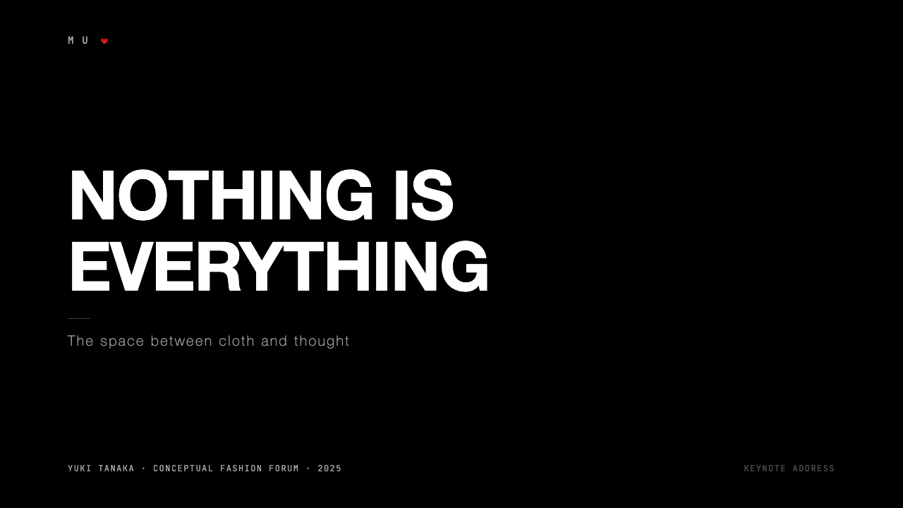
For presentation slides, the Comme des Garçons system works best when the designer resists the impulse to use the full available canvas. A cover slide might place a single line of widely-spaced type against a field of pure black, with nothing else present — no logo mark in the corner, no decorative rule along the bottom, no background texture. Content slides should treat each idea as a discrete object: one concept per slide, minimal text, no bullet-point lists, all typographic hierarchy achieved through scale and weight alone rather than color differentiation. Data visualizations should be stripped back to their essential geometric forms: the data, the axis, and nothing else. Any element that explains what the chart is rather than what it shows should be cut.对于演示文稿,Comme des Garçons 体系在设计师抵制使用全部可用画布冲动时效果最佳。一张封面幻灯片可能只在纯黑底面上放置一行宽距字体,别无其他——角落没有标志,底部没有装饰线,背景没有质感。内容幻灯片应将每个想法视为独立的对象:每张幻灯片一个概念,最少文字,没有项目符号列表,所有字体层级仅通过尺寸与字重实现,而非颜色区分。数据可视化应剥减至其基本几何形态:数据、坐标轴,仅此而已。任何解释图表是什么而非图表显示什么的元素,都应被删除。
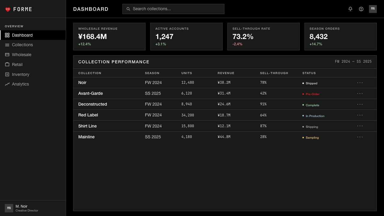
For web user interfaces, particularly dashboards, pricing pages, and product detail pages, the approach demands that the system choose one governing contrast — typically dark type on a near-white ground, or light type on a deep near-black ground — and hold that choice without variation across the entire surface. Interactive states (hover, focus, active) should be signaled through weight or opacity changes rather than color introduction. If a second color must enter the system, it should be as constrained and singular as the PLAY heart: one deliberate accent, never decorating but always signaling.对于网页用户界面,尤其是仪表板、定价页面与产品详情页,这种方法要求系统选择一种主导对比——通常是近白底面上的深色字体,或深近黑底面上的浅色字体——并在整个表面不作任何变化地坚持这个选择。交互状态(悬停、聚焦、激活)应通过字重或不透明度变化来标示,而非引入颜色。如果第二种颜色必须进入系统,它应当与 PLAY 心形图案一样受到约束和单一:一处刻意的强调,永远不是装饰,而是信号。
For editorial content and marketing materials, the style rewards commitment to asymmetric placement and extreme scale contrast. An editorial spread might fill three-quarters of the page with a single cropped image against black, then set the article headline in small widely-tracked type at the very bottom edge. Marketing headers can operate with similar boldness: a full-width black block with a product name in white at generous tracking, no imagery, no supporting graphics. The effect reads as confidence so complete that no persuasion is needed — the restraint performs authority.对于编辑内容与营销材料,这种风格会回报对非对称布局和极端尺寸对比的投入。一个编辑展开页面可能用单张裁剪图像在黑色背景上占据四分之三的页面,然后在底部边缘以小号宽距字体排列文章标题。营销标题可以以类似的大胆感运作:一个全宽黑色区块,其中以宽字距白色显示产品名称,没有图像,没有辅助图形。效果读起来是如此完整的自信,以至于不需要任何劝说——克制本身表演着权威。
The most common mistake when working in this system is treating the absence of color as permission for maximalist typography — outsized wordplay, multiple typeface combinations, aggressive layering of text at competing weights. This misreads the system entirely. In Comme des Garçons aesthetic, austerity is total: if the color is gone, the typography must become quieter too, not louder to compensate. A second common error is importing soft-edged elements — blurred drop shadows, rounded corners, gradient fills — under the assumption that they read as contemporary refinements. They do not; they read as a failure of commitment to the system's fundamental argument.在这套系统中工作时最常见的错误,是将颜色的缺席理解为最大化字体的许可——超大的文字游戏、多种字体组合、以相互竞争的字重积极叠加文本。这完全误读了这套系统。在 Comme des Garçons 美学中,节制是整体性的:如果颜色消失了,字体也必须变得更安静,而非更响亮来补偿。第二个常见错误是引入软边元素——模糊的投影、圆角、渐变填充——假设它们被理解为当代的精炼。事实并非如此;它们被理解为对系统根本论点的承诺失败。
See the Comme des Garçons (Rei Kawakubo) design system查看 Comme des Garçons (Rei Kawakubo) 完整设计系统
Comme des Garçons (Rei Kawakubo) — FAQComme des Garçons (Rei Kawakubo) · 常见问题
Is Comme des Garçons a style or a concept?Comme des Garçons 是一种风格还是一种概念?
It is primarily a concept that happens to have a consistent visual style as its expression. Kawakubo has repeatedly stated that she is not interested in making beautiful things but in questioning what clothing and design are for. The visual system — the black, the white space, the austere typography — is the result of that conceptual position, not the starting point. This distinction matters for application: if you use the visual language without understanding the underlying argument, the result will look like a dark, sparse layout rather than a coherent system. The system's austerity is always in service of a position about what design should refuse to do.它首先是一个概念,其一致的视觉风格只是这个概念的表达。川久保玲多次表示,她对制造美丽的事物不感兴趣,而是对质疑服装与设计的意义感兴趣。视觉系统——黑色、留白、简朴的排印——是那种概念立场的结果,而非起点。这个区分对于应用至关重要:如果你在不理解底层论点的情况下使用视觉语言,结果看起来只是一个黑暗、稀疏的版面,而非一套连贯的系统。系统的节制始终服务于一个关于设计应该拒绝做什么的立场。
How does this system handle imagery and photography?这套系统如何处理图像与摄影?
Photography in the Comme des Garçons tradition is treated as a flat graphic element rather than a window into a scene. Campaign images are typically high-contrast, shot against neutral or void-like backgrounds, often cropped to emphasize geometric or structural qualities of the garment rather than the model's expressiveness. The subject is frequently presented in a way that feels ambiguous or even uncomfortable — stillness, turned heads, occluded faces. When photography is absent, the space it would occupy is not filled with illustration or graphic pattern but left as air. The anti-decorative principle applies to imagery as fully as to typography.Comme des Garçons 传统中的摄影,被视为平面图形元素而非通向某一场景的窗口。宣传形象通常是高对比度的,在中性或虚空般的背景下拍摄,常以强调服装几何或结构品质而非模特表现力的方式裁切。被摄主体的呈现方式常常感觉模糊,甚至令人不安——静止、转头、遮掩的面孔。当摄影缺席时,它本会占据的空间不会被插图或图案图形填充,而是留作空气。反装饰原则对图像的适用,与对排印一样完整。
Can this style work for digital products and interfaces, or is it too severe?这种风格适合数字产品与界面吗?还是说它太过严峻?
It can work, but requires careful calibration for interactive contexts. The challenge is that digital interfaces carry usability obligations that print does not: users must be able to scan, navigate, and recover from errors efficiently. Applied without adaptation, the style's reduction can make interactive states invisible and navigation ambiguous. The solution is to maintain the visual austerity while ensuring that functional signals — which element is interactive, which state is active, what action is available — are legible through weight, scale, or opacity variation rather than color. The style also works better at larger viewport sizes where there is genuine room for the negative space to function; on small mobile screens, the generous white or black fields can become wasted real estate rather than intentional silence.可以,但需要针对交互语境进行谨慎的校准。挑战在于,数字界面承担着印刷品所没有的可用性义务:用户必须能够高效地扫描、导航和从错误中恢复。不加调整地应用,这种风格的简化可能使交互状态不可见,使导航模糊。解决方案是维持视觉节制,同时确保功能信号——哪个元素可交互、哪种状态处于激活、哪种操作可用——通过字重、尺寸或不透明度变化而非颜色来保持可读性。这种风格也在较大的视口尺寸下效果更好,在那里留白确实有空间发挥作用;在小屏幕移动设备上,慷慨的白色或黑色区域可能成为浪费的空间而非刻意的沉默。
How does the PLAY sub-brand fit without contradicting the parent system?PLAY 副线如何在不矛盾于母体系统的情况下融入其中?
The PLAY heart works within the system rather than against it because it obeys the same formal principles despite introducing color. The heart is flat and diagrammatic — no gradients, no drop shadows, no dimensional illusion. It uses a single saturated color, not multiple. It is a mark rather than an illustration. And crucially, it appears as a singular accent on otherwise entirely plain garments: one element of deliberate punctuation in an otherwise silent composition. This is the model for any designer who wants to introduce a single accent into a Comme des Garçons-inspired system — the accent must be equally diagrammatic, equally flat, and must remain truly singular rather than proliferating into a supporting cast.PLAY 心形图案在系统内部而非对立于它而运作,因为尽管引入了颜色,它仍然遵守同样的形式原则。心形是平面和示意图式的——没有渐变,没有投影,没有立体幻觉。它使用单一饱和色,而非多种颜色。它是一个标记而非插图。至关重要的是,它作为单一的强调出现在原本完全素净的服装上:在原本沉默的构图中,一处刻意的标点符号。这是任何想在 Comme des Garçons 启发系统中引入单一强调的设计师的范本——强调必须同样是示意图式的、同样平面的,并且必须保持真正的单一性,而非扩展为一群配角。
What kinds of projects should avoid this aesthetic entirely?哪类项目应该完全回避这种美学?
Projects where the primary emotional register is warmth, accessibility, playfulness, or sensory pleasure are poor fits for the Comme des Garçons visual system. Children's products, food and beverage brands, healthcare and wellness platforms, community-oriented social applications, and anything targeting audiences who equate severity with unfriendliness will find the system working against rather than for them. The style is also a poor match for contexts requiring high information density — comparison tables with many rows, complex form flows, notification-heavy dashboards — where its generous negative space becomes a functional problem rather than an expressive asset. Knowing when the style's values conflict with the communication's values is as important as knowing how to apply it correctly.主要情感基调是温暖、亲和力、玩趣或感官愉悦的项目,与 Comme des Garçons 视觉系统不匹配。儿童产品、食品与饮料品牌、医疗健康平台、社区导向的社交应用,以及任何面向将严峻等同于不友好的受众的项目,都会发现这套系统在与他们对抗而非为他们服务。这种风格也不适合需要高信息密度的语境——有很多行的对比表格、复杂的表单流程、通知密集的仪表板——在那里,其慷慨的留白成为功能性问题而非表达性资产。知道这种风格的价值观何时与传播的价值观相冲突,与知道如何正确应用它同等重要。
Related design styles相关设计风格
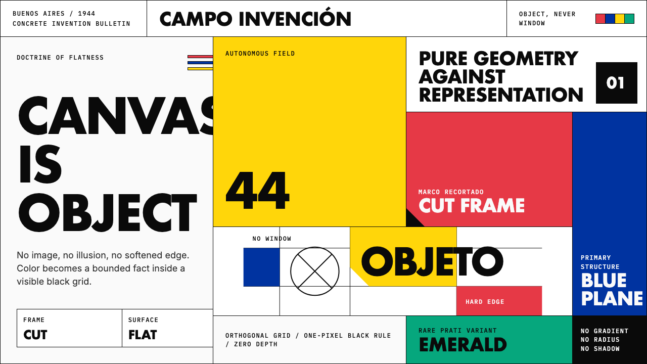 Argentine Arte ConcretoCanvas becomes object. Primary blocks, black hairlines, and a cut-frame grid…画布成为物:原色块、黑色细线与剪裁框网格强制平面性。
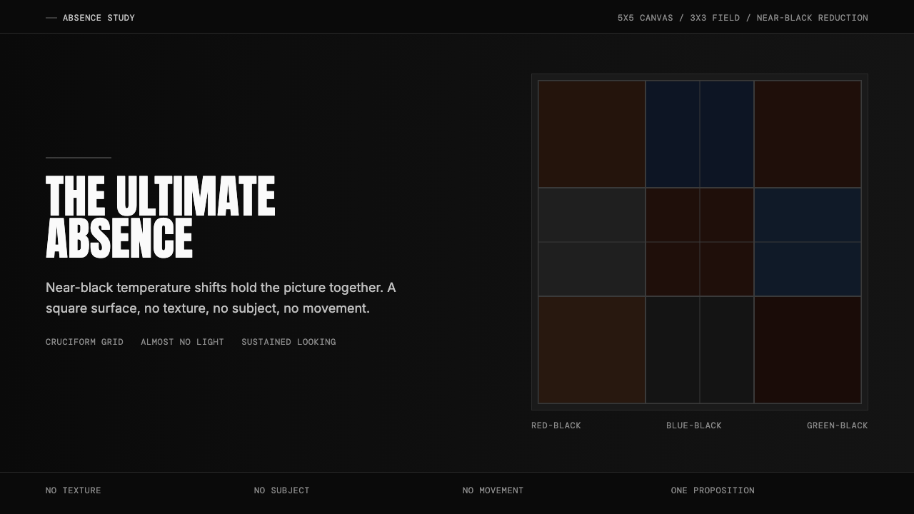 Ad Reinhardt Black Painting (1953)Austere absence. Near-black grid shifts reveal structure on sustained looking.苦行式缺席。近黑网格只在持续凝视中显形。
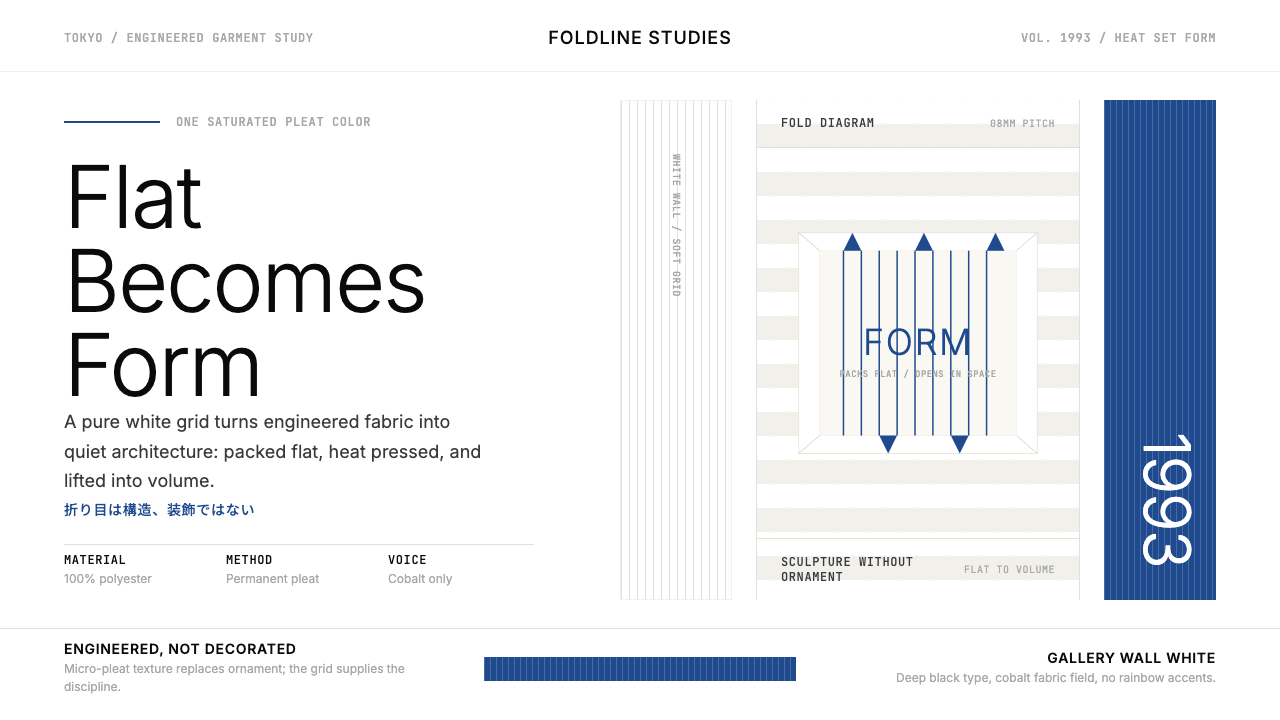 Issey Miyake Pleats PleaseEngineering wears white. Cobalt pleat stripes and a strict Inter grid turn fa…工程感穿上白色。钴蓝褶纹与严谨Inter网格让布料成立体。
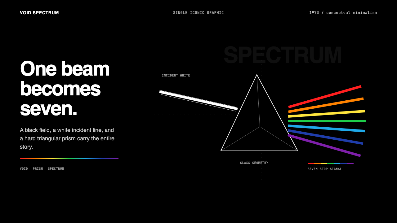 Pink Floyd — Dark Side of the MoonOne image does everything. Black void, white beam, hard prism, seven exact co…一个图像完成全部:黑色虚空、白光、硬棱镜与七色光谱。
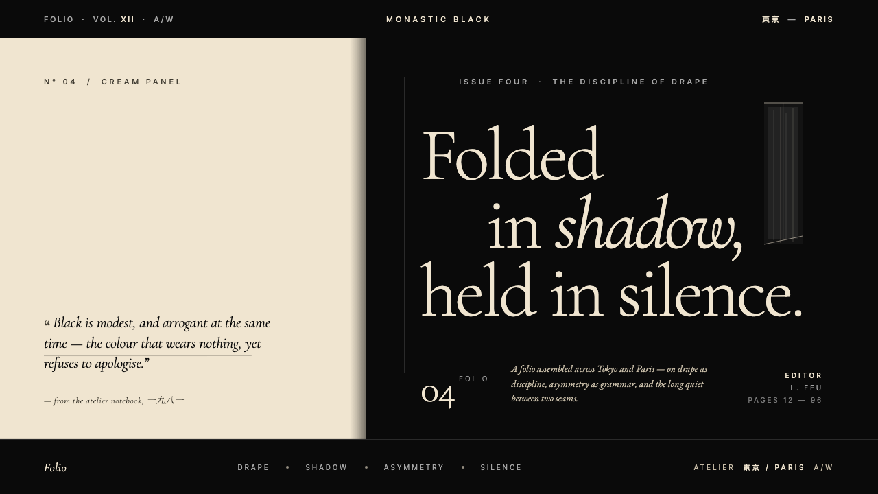 Yohji Yamamoto Monastic BlackBlack as philosophy. Monastic ink ground, warm cream reprieve, low-weight Gar…黑色即信仰:修道院般的深黑作底,温润米色为唯一呼吸,低重量衬线压低嗓音。
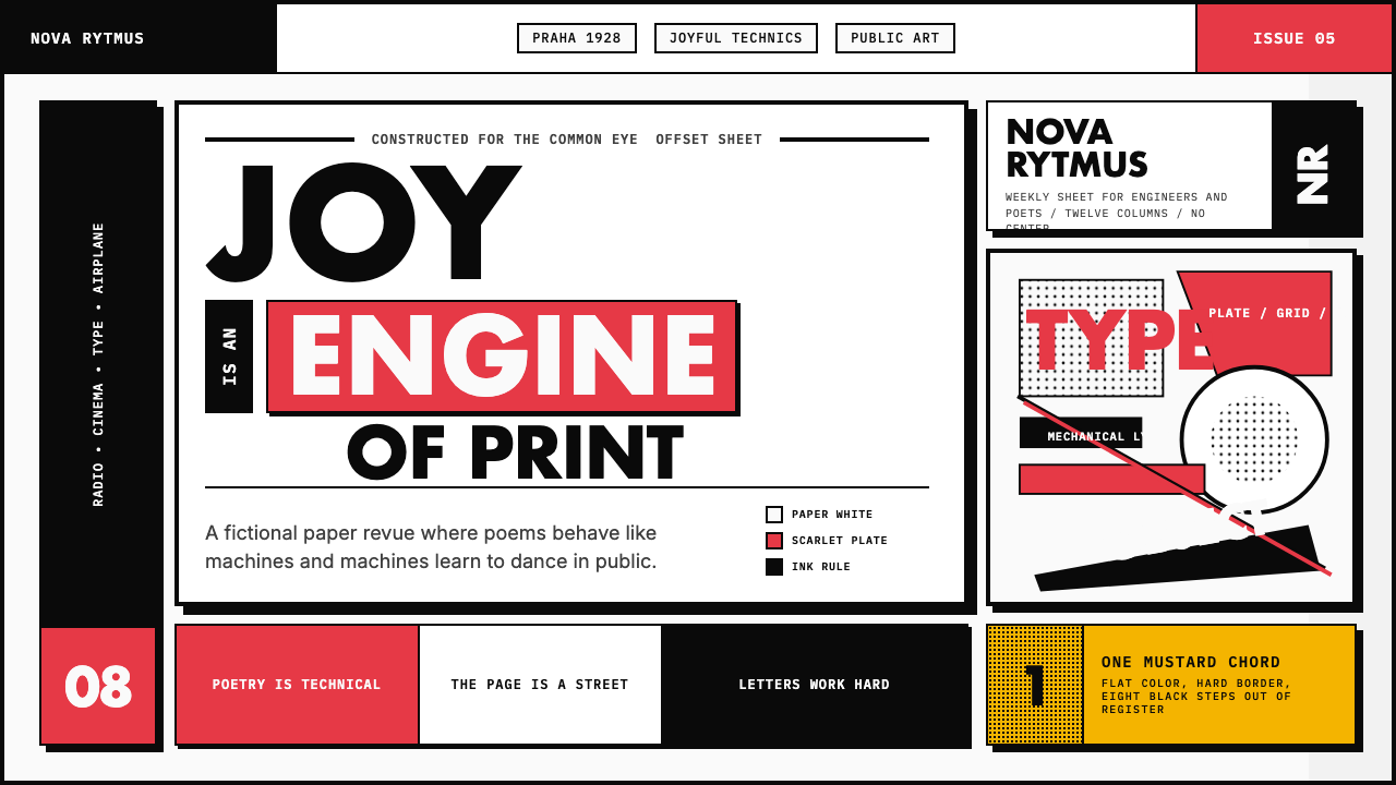 Czech Devětsil Avant-GardeJoy is engineered. Scarlet ink blocks and rotated sans type collide on an asy…欢愉被工程化:猩红墨块与旋转无衬线字撞上非对称网格。