What is Yohji Yamamoto Monastic Black?什么是 Yohji Yamamoto Monastic Black?
Yohji Yamamoto turned black into a philosophy — monastic, asymmetric, and as disciplined as a folded seam.山本耀司将黑色变成一种信仰——修道院式的克制、非对称的剪裁,每一道折痕都是一种纪律。
Yohji Yamamoto Monastic Black in briefYohji Yamamoto Monastic Black 速览
Yohji Yamamoto Monastic Black is a design system built on the conviction that black is not a color choice but a worldview. Where most visual systems use black as a neutral container, this one treats it as the primary substance — a deep, enveloping ground from which all other elements emerge sparingly. The single permitted reprieve is a warm cream, used not as background but as breath: a line, a margin, a typographic weight that lets the eye rest without breaking the gravity of the whole.山本耀司修道院黑是一套以信念为基础的设计系统——它的信念是:黑色不是一种色彩选择,而是一种世界观。大多数视觉系统将黑色用作中性容器,这套系统却把它视为主要物质:一片深沉、包裹一切的底色,其他所有元素都从中稀疏涌现。唯一被允许的喘息是温润的米色,它不是背景,而是呼吸——一条线、一段留白、一个字重,让眼睛得以歇息,却不打破整体的引力。
The typography of this system operates at near-whisper: low-weight serif letterforms, generous tracking, and a deliberate restraint in scale contrast. Where many dark design systems assert themselves through bold display type, this one withholds. The headline arrives quietly. The effect is closer to a hand-written note found inside a tailored coat than to a broadcast announcement. Hierarchy is established through spatial distance and weight rather than through size or color shock.这套系统的字体排印在低语声中运作:轻重量的衬线字形、宽松的字距、刻意克制的尺度对比。许多深色设计系统以粗重的展示字体彰显存在感,这套系统却选择保留。标题悄然抵达。那种效果更接近于在一件定制外套内口袋里发现的手写便条,而非一声广播宣告。层级由空间距离和字重确立,而非靠尺寸或色彩冲击来实现。
Structurally, the system inherits the asymmetric grammar of Yamamoto's fashion work — draped silhouettes, off-center composition, the deliberate refusal of mirror symmetry. A layout in this system never settles into comfortable bilateral balance. Elements are placed with the same intentionality as a cut that falls differently on each side of the body: the asymmetry is not accident but argument. Every surface is a stage; every line a folded seam.在结构上,这套系统继承了山本耀司时装作品的非对称语法——垂落的廓形、偏心的构图、对镜像对称的刻意拒绝。这套系统的版面从不安定于舒适的双边平衡。元素的放置与剪裁的落点有着同样的意图性:身体两侧的裁片各自不同——那种非对称不是意外,而是论点。每一处表面都是一个舞台;每一道线条都是一道折叠的衣褶。
See the Yohji Yamamoto Monastic Black design system查看 Yohji Yamamoto Monastic Black 完整设计系统
Where does Yohji Yamamoto Monastic Black come from?Yohji Yamamoto Monastic Black 从何而来?
Yohji Yamamoto opened his first Tokyo atelier in 1972, working within the Japanese fashion tradition of monpe trousers and farmer's garb — utilitarian forms that Western couture had never thought to dignify. His early training at Bunka Fashion College, followed by work in Paris in the late 1960s, gave him dual fluency: he understood the structure of Western tailoring well enough to dismantle it deliberately. The garments he produced in those early Tokyo years were experiments in volume, drape, and a specifically Japanese relationship to the body — one that concealed rather than celebrated, that treated clothing as shelter rather than display.山本耀司于1972年在东京开设了他的第一间工作室,从日本本土的劳作服装传统出发——野良裤、农民外衣,那些西方高级定制从未想到要赋予尊严的实用形态。他在文化服装学院的早期训练,加上1960年代末在巴黎的工作经历,赋予了他双重流利度:他对西方裁剪的结构了解得足够透彻,因此能够有意识地将其拆解。他在东京早期创作的那些服装是关于体量、垂坠感以及一种特别的日本式身体关系的实验——那种关系是遮蔽而非展示,是把服装视为庇护所而非表演。
The moment that changed international fashion came in October 1981, when Yamamoto and Rei Kawakubo of Comme des Garçons showed simultaneously in Paris for the first time. Western fashion press responded with a mix of fascination and hostility. Critics coined the phrase 'Hiroshima chic' — a term meant to be dismissive but one that captured something real: the collections confronted European aesthetics with an entirely different grammar, one rooted in asymmetry, deconstruction, monochrome severity, and a refusal of the body-revealing silhouette that Western fashion had taken as its baseline assumption. Black dominated. Seams were exposed. Garments appeared unfinished by conventional standards. The effect was less a fashion show than a philosophical statement.改变国际时装格局的时刻发生在1981年10月,山本耀司与川久保玲的Comme des Garçons首次同期在巴黎发布。西方时装媒体的反应是迷惑与敌意交织。评论家创造了「广岛风」这个短语——本意是贬低,却捕捉到了某种真实的东西:这些系列用一套完全不同的语法向欧洲美学发起挑战,这套语法植根于非对称、解构、单色的严肃性,以及对西方时装视为基础假设的那种展示身体的廓形的拒绝。黑色主导一切。缝线裸露。服装以传统标准看来像是未完成品。那种效果与其说是一场时装秀,不如说是一份哲学宣言。
The visual identity that has coalesced around the Yamamoto brand across its history — particularly in its more recent art direction from approximately 2022 onward — translates those fashion principles into a graphic language. The catalogs, lookbooks, and digital presence that define this aesthetic share the same commitments as the clothes: deep monastic black as the primary field, warm cream as the only accent, typography held in a near-whisper rather than announced, and asymmetric composition that refuses the comfortable center. The graphic system is not illustrating the fashion; it is enacting the same discipline.围绕山本品牌历史凝聚的视觉识别——尤其是约2022年以来更近期的艺术指导——将那些时装原则转化为一种图形语言。定义这一美学的目录、造型手册与数字呈现与服装共享同样的信念:深邃的修道院黑作为主要场域,温润的米色作为唯一强调,字体在近乎低语的状态下保持克制而非被宣告,非对称的构图拒绝舒适的居中。图形系统不是在图解时装,而是在履行同样的纪律。
The broader cultural context matters too. Yamamoto's aesthetic draws simultaneously from Zen Buddhist visual culture — the appreciation of emptiness, incompleteness, and the beauty of the unadorned — and from the tradition of the Japanese craftsman, whose mastery is expressed through restraint rather than elaboration. These are not decorative references; they are structural principles. The western monastic tradition shares some of this grammar: the bare stone, the single candle, the vow of silence made visible. That cross-cultural resonance is part of why the system travels so well — it is legible to audiences who have never encountered the specific Japanese aesthetic tradition it draws from, because the underlying logic of disciplined subtraction is universal.更广泛的文化背景同样重要。山本的美学同时汲取禅宗视觉文化——对空寂、不完整以及素净之美的欣赏——以及日本工匠传统,那种传统中的精湛技艺通过克制而非繁复来表达。这不是装饰性的引用,而是结构性的原则。西方修道院传统也分享着部分相似的语法:裸露的石壁、单支烛火、以可见形式体现的静默誓言。这种跨文化的共鸣,正是这套系统得以广泛流传的原因之一——对于从未接触过其所汲取的特定日本美学传统的受众而言,它仍然是可读的,因为有纪律的减法其底层逻辑是普世的。
What defines the Yohji Yamamoto Monastic Black look?Yohji Yamamoto Monastic Black 的视觉特征是什么?
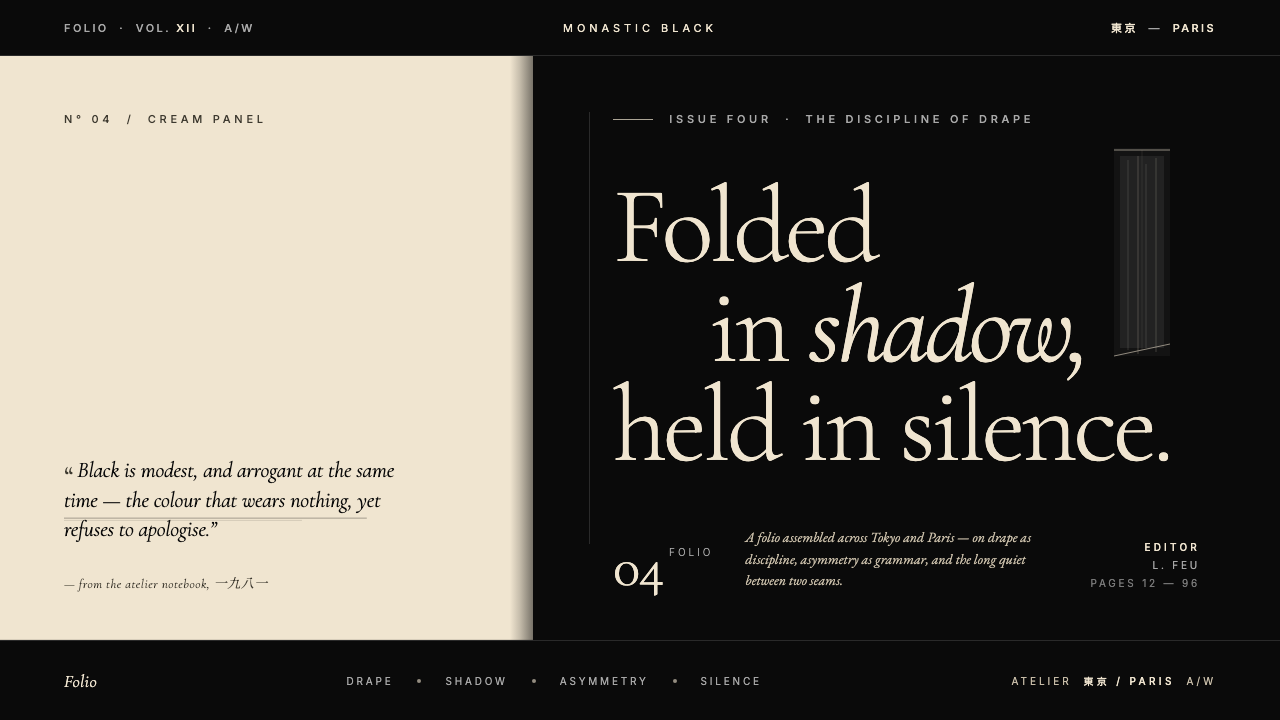
The Black Ground黑色底场
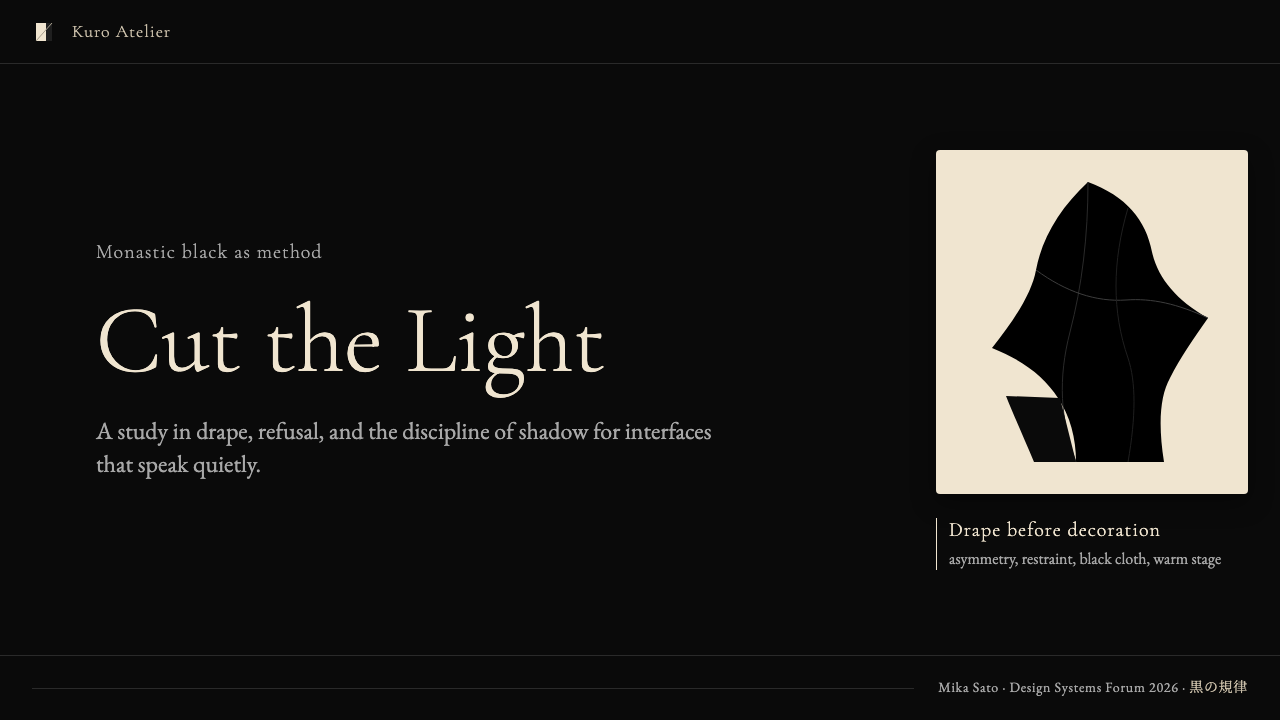
The foundational surface is a deep, enveloping black — not the hard mechanical black of printing ink or the pure digital maximum, but a black that reads as having depth, almost like cloth absorbing light. This ground is not neutral; it is the primary content. Everything placed against it must justify its presence. Nothing decorative survives on this field: only elements that carry weight — typographic, spatial, or compositional — are permitted to interrupt the ground.基础底面是一片深沉、包裹一切的黑——不是印刷油墨的硬质机械黑,也不是纯粹的数字极值黑,而是一种读起来有深度的黑,近乎织物吸收光线的质感。这片底场不是中性的,它是主要内容。放置在它之上的一切都必须证明自身的存在是合理的。任何装饰性的元素都无法在这个场域中存活:只有携带重量的元素——字体性的、空间性的或构图性的——才被允许打断这片底场。
Warm Cream as the Only Reprieve温润米色作为唯一喘息
The single chromatic departure from black is a warm cream — a tone that carries the memory of aged linen, unbleached cotton, or paper that has been handled. It is never a cold white, which would create harsh contrast; the warmth is essential because it introduces a human quality into the severity. Used for primary typographic weight and key structural lines, cream functions as the system's breathing space rather than as a color accent in the conventional sense.唯一一次从黑色的色彩出走,是温润的米色——一种携带着陈旧亚麻、未漂白棉布或被人触碰过的纸张记忆的色调。它绝不是冷白色,那会制造刺目的对比;温暖感至关重要,因为它在严肃性中引入了一种人性的品质。用于主要字体重量和关键结构线条的米色,作为系统的呼吸空间发挥作用,而非传统意义上的色彩强调。
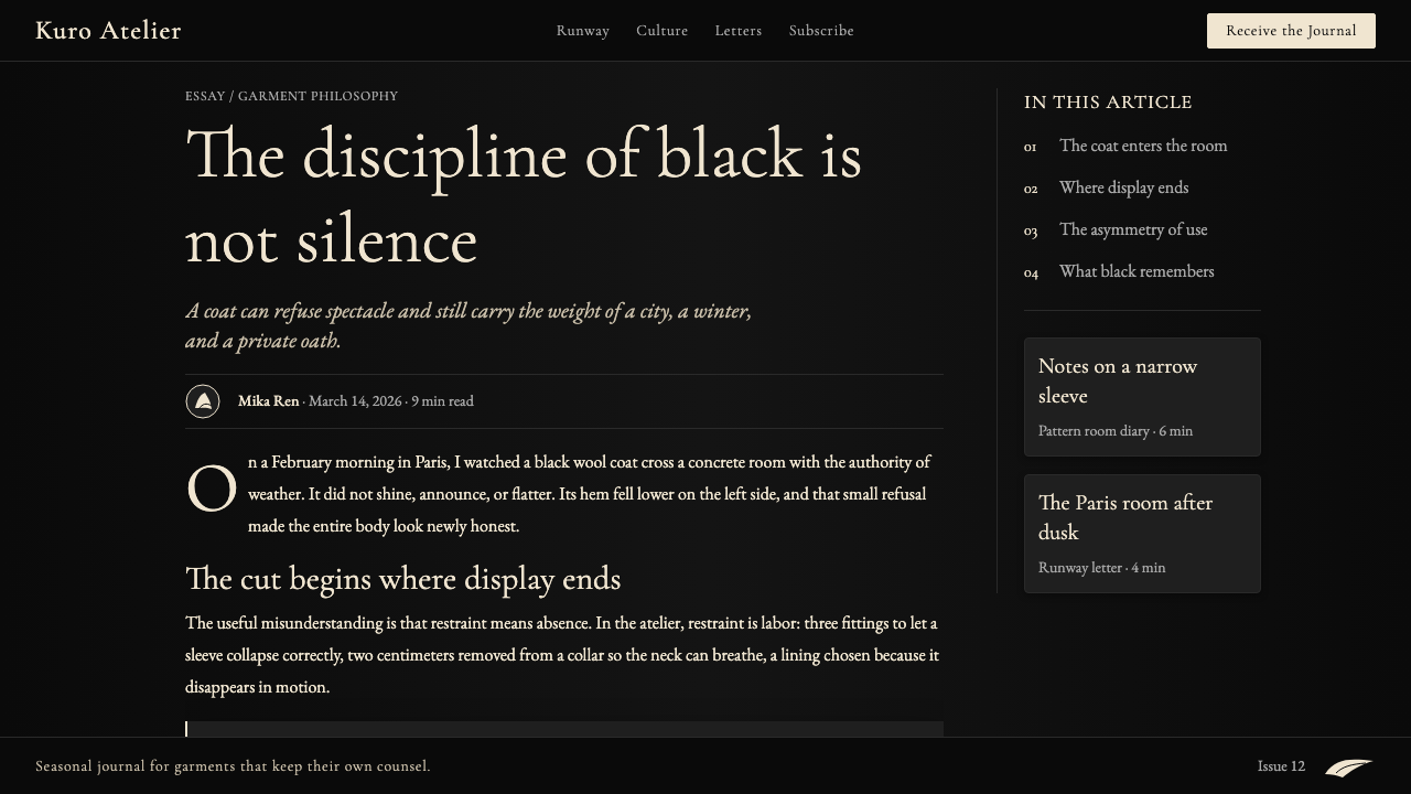
Low-Weight Serif Typography低重量衬线字体排印
Typography in this system is deliberately held at a low register — fine, light-weight serif letterforms that do not announce themselves. The contrast between the dark ground and the pale type is stark, but the type weight itself is gossamer rather than bold. This creates an unusual effect: text that is luminously visible yet somehow quiet, as if the words are being offered rather than stated. Generous letter-spacing amplifies the sense of restraint, and line lengths are kept relatively narrow to encourage deliberate reading.这套系统的字体排印刻意保持在低调的音区——细腻、轻重量的衬线字形,它们不会自我宣告。深色底场与浅色文字之间的对比是强烈的,但字重本身轻若薄纱而非粗重。这制造了一种不寻常的效果:文字清晰可见,却又以某种方式保持安静,仿佛那些词语是被奉上而非被宣示的。宽松的字距放大了克制感,行长保持相对较窄,以鼓励刻意的阅读节奏。
Asymmetric Composition非对称构图
Layouts in this system refuse bilateral symmetry. Composition is built through deliberate imbalance: a large expanse of black against a narrow column of text, a single element placed off-axis in a way that makes the negative space around it as meaningful as the element itself. This asymmetry is borrowed directly from Yamamoto's fashion grammar — the cut that falls differently on each side of the body, the seam placed where it would not conventionally be expected. The result is a visual tension that feels resolved rather than accidental.这套系统的版面拒绝双边对称。构图通过刻意的失衡建立:一大片黑色面对一列窄窄的文字,一个单一元素偏轴放置,使其周围的负空间与元素本身同样充满意义。这种非对称直接借鉴自山本耀司的时装语法——在身体两侧各自不同方式落下的裁片,缝线放置在常规预期之外的位置。结果是一种视觉张力,它令人感到已经被化解,而非是偶然的。
Restraint as Presence克制作为存在感
The most counterintuitive quality of this system is that its power comes from what is absent rather than what is present. Large areas of uninterrupted black ground are not empty — they are active. The space between elements is as designed as the elements themselves. This discipline requires resisting the instinct to fill, to vary, to add visual interest through accumulation. What results is a visual gravity that more crowded systems cannot achieve: the eye has nowhere to escape, so it settles into the work.这套系统最反直觉的品质,是其力量来自缺席之物而非在场之物。大面积不被打断的黑色底场不是空洞的——它是主动的。元素之间的空间与元素本身同样是被设计的。这种纪律要求抵抗填充的本能,抵抗变化的本能,抵抗通过积累来制造视觉趣味的本能。结果是一种更拥挤的系统无法实现的视觉引力:眼睛无处逃遁,于是沉入作品之中。
Texture Without Decoration无装饰的质感
While the system uses no applied decorative texture, it achieves a sense of material quality through the relationship between type weight, spatial density, and the particular quality of its blacks and creams. The aesthetic suggests fabric rather than screen, paper rather than pixel. This is accomplished not through simulated grain or noise effects but through the pacing of elements and the warmth embedded in the color selection. The system feels tactile without being skeuomorphic.这套系统虽然不使用任何附加的装饰性纹理,却通过字体重量、空间密度以及其黑色与米色的特定品质之间的关系,实现了一种材料质感。这种美学令人联想到织物而非屏幕,联想到纸张而非像素。这并非通过模拟颗粒感或噪点效果来实现,而是通过元素节奏的把控以及色彩选择中蕴含的温度来实现的。这套系统令人感到可触碰,却并非拟物化的。
Philosophical Coherence哲学连贯性
Unlike systems assembled from aesthetic preferences, this one is held together by a consistent underlying argument: that subtraction is more powerful than addition, that concealment can be more articulate than display, that discipline is itself a form of expression. Every visual decision in the system — the choice of black over any other dark tone, the use of cream rather than white, the insistence on low-weight type — can be traced back to this argument. The coherence is not stylistic but philosophical, which is why the system resists pastiche more effectively than most.与那些由美学偏好拼凑而成的系统不同,这套系统由一个一致的底层论点维系在一起:减法比加法更有力量,遮蔽比展示更具表达力,纪律本身就是一种表达形式。系统中每一个视觉决定——选择黑色而非其他深色调,使用米色而非白色,坚持低重量字体——都能追溯回这个论点。其连贯性不是风格性的,而是哲学性的,这正是为什么这套系统比大多数系统更能抵御拙劣的模仿。

See the Yohji Yamamoto Monastic Black design system查看 Yohji Yamamoto Monastic Black 完整设计系统
Who shaped Yohji Yamamoto Monastic Black?谁塑造了 Yohji Yamamoto Monastic Black?
Born in Tokyo in 1943, Yamamoto trained in law before attending Bunka Fashion College, where he graduated at the top of his class. He founded his label Y's in 1972 and the main Yohji Yamamoto line in 1977. His 1981 Paris debut alongside Rei Kawakubo is credited with introducing Japanese avant-garde fashion to the Western mainstream. Yamamoto's work is defined by its exploration of black as philosophical substance, its asymmetric silhouettes, its use of found and repurposed materials, and a consistent refusal to celebrate or sexualize the female form. He has described his relationship to black as: 'above black there is no other color.' His influence on subsequent generations of designers — from Ann Demeulemeester to Rick Owens — is pervasive and direct.山本耀司1943年生于东京,曾修习法律,后就读于文化服装学院并以第一名毕业。他于1972年创立Y's品牌,1977年建立主线Yohji Yamamoto。1981年与川久保玲同台的巴黎首秀,被认为是将日本前卫时装引介给西方主流的历史性时刻。山本的作品以将黑色探索为哲学物质、非对称廓形、使用拾得材料以及对女性身体的一贯拒绝展示或性化而著称。他曾描述自己与黑色的关系:「黑色之上,再无其他颜色。」他对后辈设计师的影响——从安·迪穆拉米斯特到瑞克·欧文斯——是普遍而直接的。
Founder of Comme des Garçons and Yamamoto's closest peer in the Japanese avant-garde movement, Kawakubo debuted in Paris in the same 1981 season. Her work shares several structural commitments with Yamamoto's: the primacy of black, the rejection of conventional beauty standards, the use of deconstruction and asymmetry as formal principles. The two designers are often discussed together as the founding generation of Japanese conceptual fashion. Kawakubo's influence on the broader design culture that surrounds the Yamamoto aesthetic — particularly its graphic identity and art direction — is significant, as the visual systems developed around both labels share a family resemblance rooted in the same counter-cultural moment.Comme des Garçons创始人,山本耀司在日本前卫运动中最亲密的同辈,川久保玲在同一个1981年秋冬季首次亮相巴黎。她的作品与山本的作品共享若干结构性信念:黑色的首要地位、对传统审美标准的拒绝、以解构和非对称作为形式原则。两位设计师常被并列讨论为日本概念时装的创始一代。川久保玲对围绕山本美学的更广泛设计文化的影响是显著的——尤其是其图形识别与艺术指导——因为两个品牌周围发展起来的视觉系统共享一种家族相似性,植根于同一场反文化时刻。
Limi Yamamoto, Yohji Yamamoto's daughter, founded her own label Limi Feu in 2002. Working within the family aesthetic — dark grounds, deconstruction, asymmetric garments — she has extended the Yamamoto visual grammar into a younger, more streetwear-influenced context while maintaining its essential philosophical commitments. The existence of Limi Feu demonstrates the durability of the Yamamoto visual system: it can accommodate a generational shift without losing its identity, because its logic is structural rather than stylistic. The label's graphic identity and the design system described here share a recognition of the same underlying principles.山本耀司之女山本理美于2002年创立了自己的品牌Limi Feu。在家族美学框架内——深色底场、解构、非对称服装——她将山本式的视觉语法延伸至更年轻、更受街头服饰影响的语境,同时保持其核心哲学信念。Limi Feu的存在证明了山本视觉系统的耐久性:它能够容纳代际的转变而不失去其身份认同,因为其逻辑是结构性的而非风格性的。该品牌的图形识别与这里所描述的设计系统共享对同样底层原则的认知。
British fashion photographer whose long collaboration with Yamamoto produced some of the definitive visual documents of the aesthetic. Knight's work for the label — high contrast, often in near-monochrome, with the body treated as form rather than figure — helped translate Yamamoto's three-dimensional fashion thinking into the two-dimensional visual language that defines the brand's photographic identity. Knight's images demonstrate how the system handles photography: not as naturalistic window but as formal plane, where light and shadow are compositional decisions rather than documentation of a scene.英国时装摄影师,与山本耀司的长期合作产生了这一美学最具权威性的视觉文献之一。Knight为该品牌创作的作品——高对比度,常接近单色,将身体作为形态而非具象人物来处理——帮助将山本的三维时装思维转化为定义品牌摄影身份的二维视觉语言。Knight的图像展示了这套系统如何处理摄影:不是作为自然主义的窗口,而是作为形式性的平面,光与影是构图决定,而非对某个场景的记录。
How do you use Yohji Yamamoto Monastic Black today?今天怎么用 Yohji Yamamoto Monastic Black?
Yohji Yamamoto Monastic Black is a high-commitment system: it rewards applications where the product's own values align with the system's philosophical logic — restraint, depth, the authority of absence. Used correctly, it conveys a level of seriousness and intentionality that few other design systems can match. Used incorrectly, it reads as merely dark and inaccessible. The difference lies almost entirely in discipline: whether the designer can sustain the restraint across the full layout without reaching for visual comfort.山本耀司修道院黑是一套高承诺的系统:它奖励那些产品自身价值观与系统哲学逻辑相契合的应用场景——克制、深度、缺席的权威。使用得当,它传达出其他设计系统难以匹敌的严肃感与意图感。使用不当,它读起来只是晦暗而难以接近。差别几乎完全在于纪律:设计师是否能在整个版面中维持那种克制,而不向视觉舒适感妥协。
For presentation slides, this system works best when the content itself has weight — strategy documents, editorial pitches, fashion or creative industry decks, any context where the audience is expected to read carefully rather than scan. A cover slide works well with a single centered or off-center text element against the full black ground, possibly with a fine cream rule or margin note as the only additional element. Content slides should be treated as monastic pages: one hierarchy of type in two sizes, wide margins treated as active negative space rather than unused area, and data presented as forms — bar and line elements in cream against the black field — rather than as conventional charts with legends and grid lines. The system struggles on slides that need to convey warmth, urgency, or consumer-facing accessibility; in those contexts, the severity can feel like distance.对于演示文稿,这套系统在内容本身具有分量时效果最佳——战略文档、编辑提案、时尚或创意行业的幻灯片,任何预期受众会仔细阅读而非快速扫描的场景。封面幻灯片在完整黑色底场上放置一个居中或偏心的文字元素效果很好,可能仅以一条细米色线或边注作为唯一附加元素。内容页应当被当作修道院页面来处理:两个尺寸级别的字体层级,宽阔的留白被视为主动的负空间而非未使用的区域,数据以形态呈现——黑色底场上的米色柱形和线形元素——而非带图例和网格线的常规图表。这套系统在需要传达温暖感、紧迫感或面向消费者的亲和力的幻灯片上表现不佳;在那些场景中,严肃性会感觉像是距离感。
For web interfaces, the system is well-suited to luxury fashion contexts, portfolio sites, editorial platforms, and any product where the primary user action is reading or contemplating rather than transacting quickly. Dashboard applications can use this system if the dashboard is monitoring or analytical in character rather than operational and alert-driven; in those cases, data elements read well in cream against the dark field, with fine lines as structural dividers and type held at a reading weight rather than a display weight. Pricing pages work in this system when the product being priced has aspirational positioning — the severity signals premium. They do not work well when the pricing needs to feel approachable or when there are many tiers requiring color differentiation, since the palette provides only one accent color.对于网页界面,这套系统非常适合奢侈时装语境、作品集网站、编辑平台,以及任何主要用户行为是阅读或沉思而非快速交易的产品。仪表板应用可以使用这套系统,前提是仪表板具有监控或分析性质,而非操作性和告警驱动性;在那些情况下,数据元素在深色底场上以米色呈现效果很好,以细线作为结构性分割,字体保持阅读重量而非展示重量。定价页面在这套系统中有效,前提是被定价的产品具有向往性定位——严肃性传递出高端信号。当定价需要感觉亲切,或者有许多等级需要色彩区分时,效果则不佳,因为这套色板只提供一种强调色。
For editorial and marketing use, the system is at its most natural. Long-form editorial content — interviews, essays, brand narratives — benefits from the reading conditions the system creates: the eye settles, the pacing is unhurried, and typographic hierarchy does the organizational work that decorative elements might otherwise perform. Pull quotes work well in a lighter cream weight against the black ground, with generous space above and below. Marketing materials — campaign posters, lookbook spreads, event invitations — can use the full drama of the black ground with single typographic elements, exploiting the system's poster-like gravity. Email marketing in this system requires care: dark-mode rendering varies by client, and the cream-on-black palette can shift unpredictably. Testing across clients before deployment is essential.对于编辑与营销用途,这套系统处于最自然的状态。长篇编辑内容——访谈、随笔、品牌叙事——得益于系统创造的阅读条件:眼睛安定下来,节奏从容,字体层级完成了装饰元素可能承担的组织工作。引文在黑色底场上以更浅的米色字重呈现效果很好,上下留有充裕的空间。营销材料——活动海报、造型手册跨页、活动邀请函——可以充分利用黑色底场配以单一文字元素的戏剧感,发挥系统的海报式引力。这套系统的电子邮件营销需要谨慎:深色模式渲染因客户端而异,米色配黑色的色板可能会出现不可预测的偏移。部署前在各客户端进行测试至关重要。
The most common mistake when applying this system is treating the black ground as a container to be filled rather than as a primary material to be respected. Designers accustomed to light-ground systems instinctively add elements to avoid the sense that a layout is sparse; in this system, that instinct must be reversed. A layout that feels underpopulated to a conventional eye may be perfectly calibrated for this system — the black is doing work that additional elements would interrupt. A related mistake is introducing a third color — any color beyond black and cream — on the grounds that the palette is too limited. The introduction of any third tone immediately breaks the philosophical logic of the system and converts what was a statement into a style choice.应用这套系统时最常见的错误,是将黑色底场视为需要被填满的容器,而非需要被尊重的主要材料。习惯于浅色底场系统的设计师会本能地添加元素,以避免版面感觉稀疏;在这套系统中,这种本能必须被逆转。一个以传统眼光看来显得元素不足的版面,在这套系统中可能是完全经过校准的——黑色在做着额外元素会打断的工作。另一个相关的错误是引入第三种颜色——任何超出黑色与米色的色调——理由是色板过于有限。任何第三种色调的引入都会立即打破系统的哲学逻辑,将一个陈述转变为一种风格选择。
See the Yohji Yamamoto Monastic Black design system查看 Yohji Yamamoto Monastic Black 完整设计系统
Yohji Yamamoto Monastic Black — FAQYohji Yamamoto Monastic Black · 常见问题
Is this system only appropriate for luxury or fashion brands?这套系统只适合奢侈品或时装品牌吗?
Not exclusively, but the system does carry strong fashion and luxury associations that are difficult to separate from its visual grammar. Its power comes precisely from its severity and philosophical weight, which in many commercial contexts can read as inaccessible or unfriendly. It works well beyond fashion in contexts where depth, authority, and a premium positioning are explicit goals — architecture, publishing, certain technology products with a design-literate audience, cultural institutions. It works poorly wherever the primary communication goal is approachability, warmth, or inclusivity, because the system's language is constitutively exclusive in the sense of demanding patient attention.并非仅限于此,但这套系统确实携带着难以从其视觉语法中分离的强烈时装与奢侈品联想。它的力量恰恰来自其严肃性和哲学重量,而在许多商业语境中,这可能被读作难以接近或不友好。它在时装之外的有效场景,是那些以深度、权威和高端定位为明确目标的领域——建筑、出版、某些面向有设计素养受众的科技产品、文化机构。在主要传播目标是亲和力、温暖感或包容性的场合,它则表现不佳,因为这套系统的语言在本质上是排他性的——它要求耐心的注意力。
How does this system differ from generic 'dark mode' design?这套系统与通用的「深色模式」设计有何区别?
Generic dark mode is a functional inversion — it takes a light-ground system and reverses the contrast for readability in low-light conditions. The primary concerns are accessibility, legibility, and system consistency. Yohji Yamamoto Monastic Black is not a functional mode but a philosophical position: the black ground is the starting argument, not a practical accommodation. Where dark mode design typically uses a wide range of grays to establish hierarchy, this system uses almost none — the transitions between elements are achieved through weight, spacing, and that single warm cream, not through tonal gradation. The discipline required is also different: dark mode permits decoration and visual richness; this system actively refuses them.通用的深色模式是一种功能性反转——它把一套浅色底场系统颠倒过来,以便在低光照条件下提高可读性。主要关注点是无障碍性、易读性和系统一致性。山本耀司修道院黑不是一种功能性模式,而是一种哲学立场:黑色底场是起始论点,不是实际的妥协。通用深色模式设计通常使用大量灰度层级来建立层级关系,这套系统几乎不使用灰色——元素之间的过渡通过字重、间距和那单一的温润米色来实现,而非通过色调渐变。所要求的纪律也不同:深色模式允许装饰和视觉丰富性;这套系统主动拒绝它们。
Can the system accommodate color photography or illustration?这套系统能容纳彩色摄影或插图吗?
With significant constraints. Photography can appear in this system, but it must be treated as a formal plane rather than a naturalistic window — cropped with extreme deliberateness, possibly desaturated to near-monochrome, and placed with the same compositional intention as a typographic element. A full-color photograph dropped into a Monastic Black layout will almost always feel like a rupture; the color information competes with the ground rather than serving the composition. Illustration follows the same logic: geometric or calligraphic forms in cream on the black field can work beautifully, but illustrative or representational content in multiple colors will break the system's philosophical coherence. When imagery is essential, the closer it moves toward monochrome and formal abstraction, the more comfortably it inhabits the system.有相当大的限制条件。摄影可以出现在这套系统中,但必须被当作形式性平面而非自然主义窗口来处理——以极度刻意的方式裁切,可能去饱和至接近单色,并以与文字元素同样的构图意图来放置。一张全彩照片投入修道院黑版面,几乎总会感觉像是一次断裂;色彩信息与底场竞争,而非服务于构图。插图遵循同样的逻辑:黑色底场上米色的几何或书法形态可以效果极佳,但多色的插图或具象内容会打破系统的哲学连贯性。当图像是必要的,它越趋向单色和形式性抽象,在系统中的居住感就越舒适。
How do you establish hierarchy in a system with so few visual variables?在视觉变量如此有限的系统中,如何建立层级关系?
The constraint is the discipline. With only black and cream as tonal options and a limited typographic weight range, hierarchy is established primarily through three variables: size, spatial position, and density. A heading is not distinguished from body text by color or weight so much as by the space granted to it — the amount of black ground surrounding a smaller element can make it feel more significant than a larger element that is crowded by neighboring content. Reading direction is managed through placement rather than through typographic ornament: the element you encounter first in a natural reading path is the primary element, not necessarily the largest. Mastery of this system means developing an unusually refined sense of spatial proportion, because proportion is doing the work that color, decoration, and typographic variety do in other systems.约束本身就是纪律。在仅有黑色和米色作为色调选项、字体重量范围有限的情况下,层级主要通过三个变量来建立:尺寸、空间位置和密度。标题区别于正文,与其说是通过颜色或字重,不如说是通过被赋予的空间——围绕一个较小元素的黑色底场面积,可以使其感觉比一个被相邻内容拥挤包围的较大元素更具重要性。阅读方向通过放置来管理,而非通过字体装饰:在自然阅读路径中最先遇到的元素是主要元素,不一定是最大的元素。掌握这套系统意味着培养出对空间比例异常精细的感知,因为比例在承担着其他系统中由色彩、装饰和字体多样性完成的工作。
What is the most important single principle for applying this system faithfully?忠实应用这套系统最重要的单一原则是什么?
Trust the black. The deepest misapplication of this system occurs when a designer treats the large expanses of dark ground as a problem to be solved — something to be relieved by texture, varied by tone, or populated by additional elements. In the Yamamoto visual logic, the black ground is not empty; it is dense with meaning, the way silence in a musical composition is not the absence of music but a structural element within it. Applying this system faithfully means accepting that a layout in which sixty or seventy percent of the surface is uninterrupted black is not a layout that needs more — it is a layout that is working. That acceptance requires confidence in the system's philosophical argument, which in turn requires understanding where that argument comes from.信任黑色。对这套系统最深层的误用,发生在设计师将大面积深色底场视为需要被解决的问题时——需要用纹理来缓解,用色调变化来打破,或用额外元素来填充。在山本耀司的视觉逻辑中,黑色底场不是空洞的;它充满了意义,就如同音乐作品中的静默不是音乐的缺席,而是其中的结构性元素。忠实应用这套系统意味着接受这样一个事实:一个版面中百分之六七十的表面是不被打断的黑色,这不是一个需要更多东西的版面——它是一个正在运作的版面。这种接受需要对系统的哲学论点抱有信心,而这种信心又需要理解这个论点从何而来。
Related design styles相关设计风格
 Maison Margiela Tabi-WhiteAnonymity becomes luxury. Pure white, Helvetica mass, numbered lines, four st…匿名即奢华:纯白、Helvetica、编号线与四道缝线。
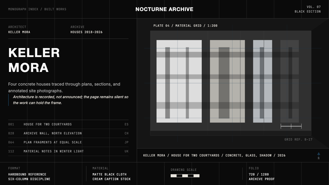 Architect Monograph (Black Edition)Architecture stays sovereign. Matte black, Helvetica caps, hairline grids, bl…建筑始终为主:哑光黑、Helvetica 大写、发丝网格与蓝图蓝。
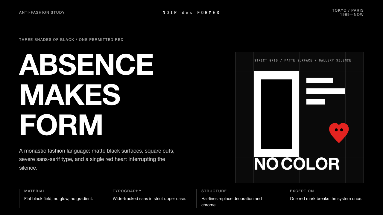 Comme des Garçons (Rei Kawakubo)Austerity becomes the event. Pure black, wide sans type, and one red heart br…克制即事件:纯黑、宽距无衬线与一枚红心打破沉默。
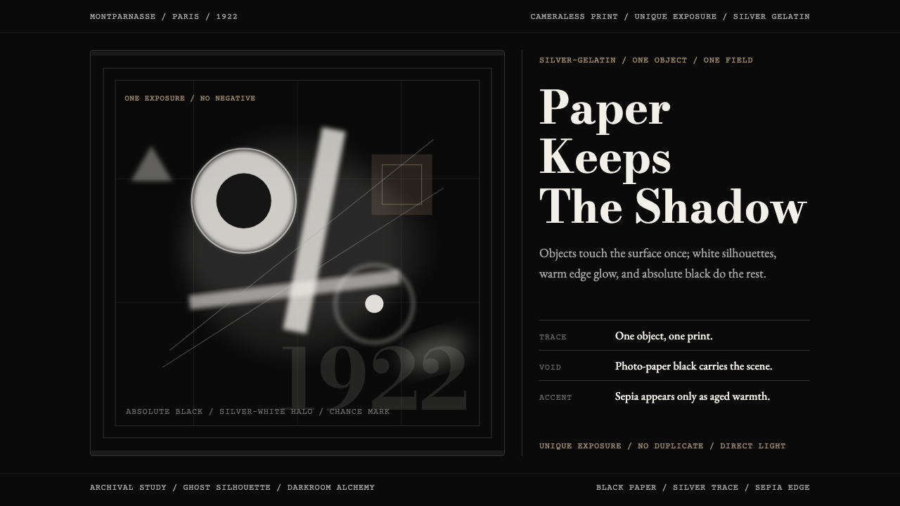 Man Ray Rayograph (1922)Light leaves the trace. Black voids, silver type, and sepia edges stage one g…光留下痕迹。黑底、银字与赭边,共构一张幽影印迹。
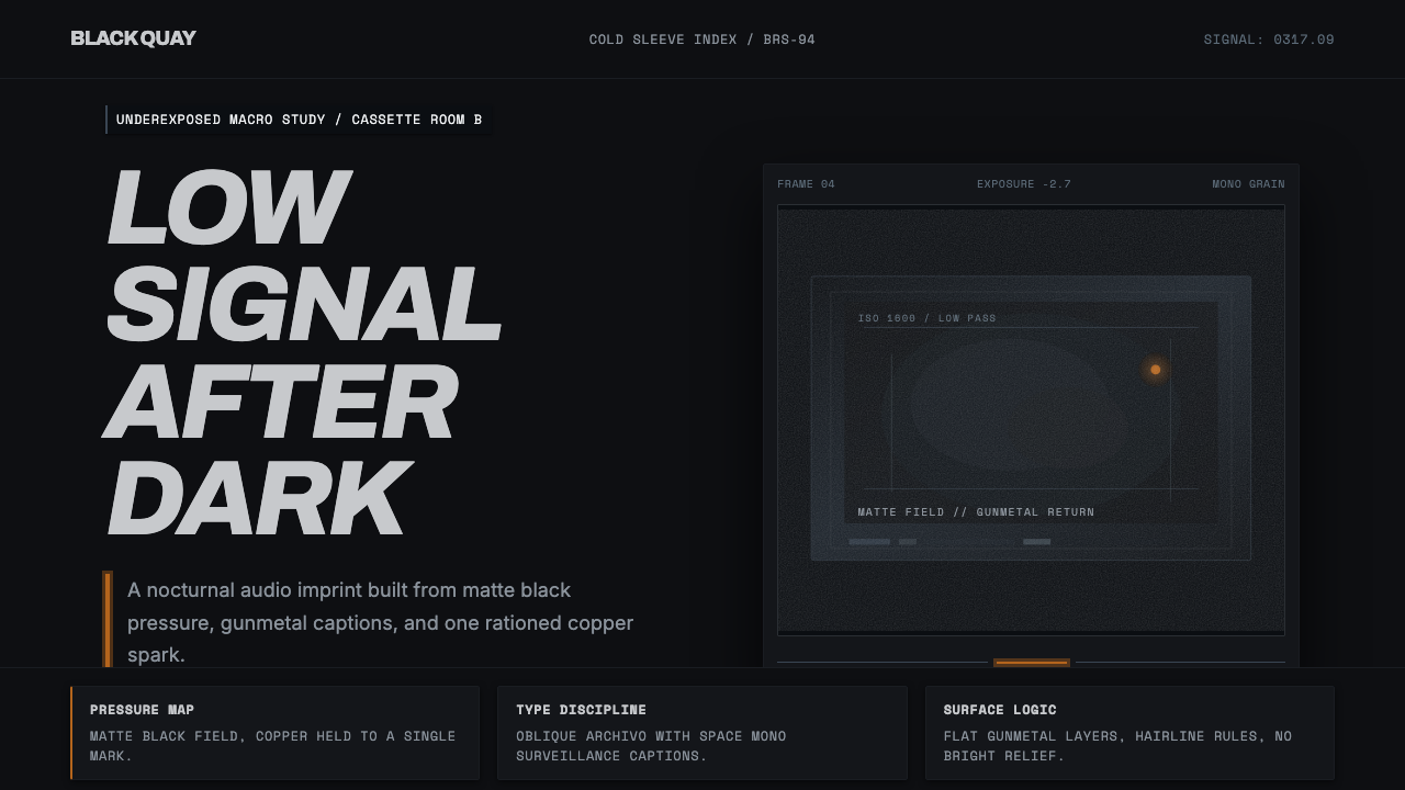 Bristol Trip-HopMenace through minimalism. Near-black grain, gunmetal type, one copper spark.以极简制造威胁感:近黑颗粒、枪金属字体、一点铜火。
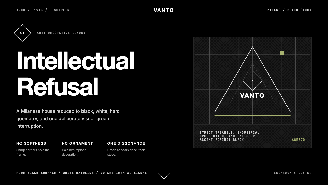 Prada Milan MinimalistLuxury refuses ornament. Pure black, austere sans, and one sour green hairlin…奢华拒绝装饰:纯黑、冷峻无衬线与一根涩绿细线。