What is Bristol Trip-Hop?
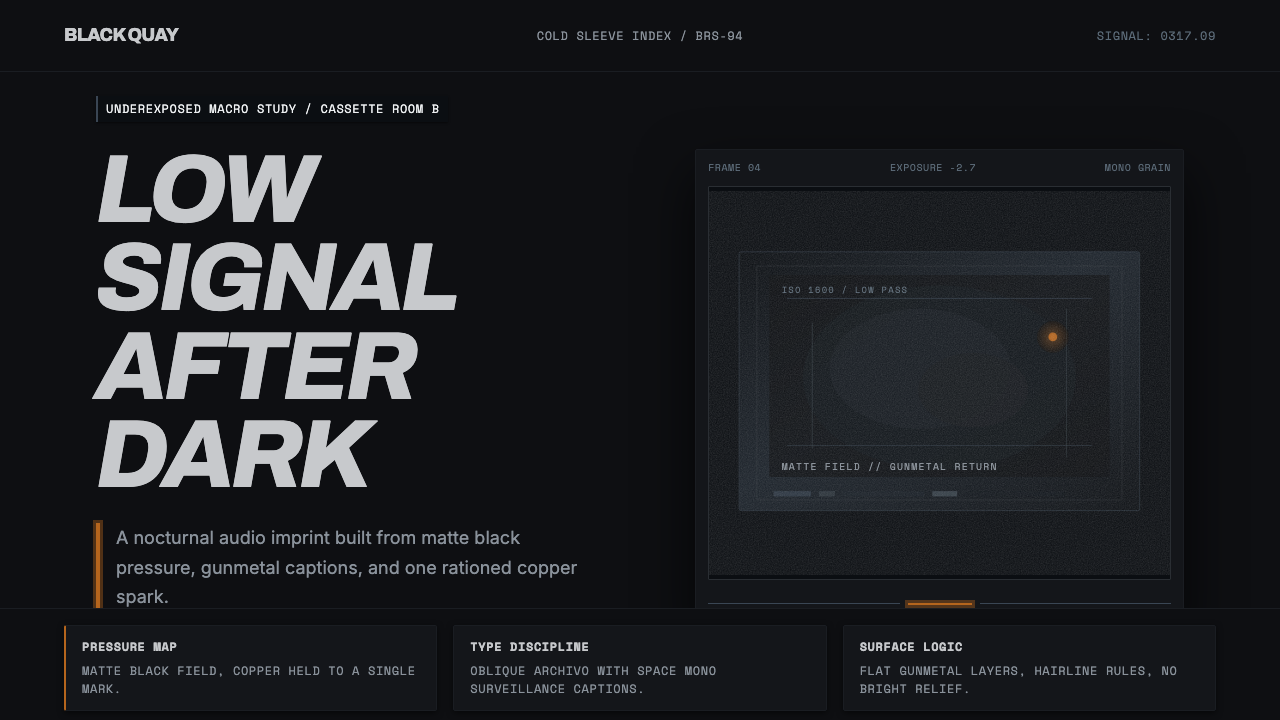
Bristol trip-hop turned the comedown into a visual language — matte near-black fields, underexposed grain, and a single warm accent burning against a palette that has been drained of everything else.
Bristol Trip-Hop in brief
Bristol Trip-Hop style is drawn from the sleeve design and visual identity surrounding the trip-hop records that emerged from Bristol, England in the early 1990s — most canonically Massive Attack's Blue Lines and Mezzanine, Portishead's Dummy, and Tricky's Maxinquaye. These records shared a producer and photographer pool and, as a result, a coherent visual signature: matte near-black backgrounds, underexposed macro photography, and clinical grotesque typefaces set with almost surgical restraint.
The palette is deliberately narrow and cold — gunmetal, ash gray, cold slate — a family of desaturated metallic tones that read as urban, nocturnal, and slightly menacing. Against that near-monochrome field, one warm accent, typically a coppery or amber flame, is allowed to appear, and its rarity is precisely what gives it force. If the accent appeared everywhere, it would mean nothing; because everything else has been drained of color, the one warm note reads as urgent.
This is a minimalism built on menace rather than calm. Heavy film grain sits over the black fields, refusing the flat, clean darkness of a modern digital black; the texture insists that the image was shot on film, underexposed, and printed without correction. White-on-black caption blocks carry information in a clinical, almost forensic register — data delivered without warmth, in keeping with the emotional distance the music itself cultivated.

Where does Bristol Trip-Hop come from?
Trip-hop as a Bristol phenomenon coalesced roughly between 1991 and 1998, though the wider Bristol sound persisted and evolved for two decades on either side of that window. The city's particular blend of Jamaican sound-system culture, post-punk austerity, and hip-hop production technique produced a slow, bass-heavy, downtempo music that resisted the euphoria of the rave scene happening elsewhere in Britain at the same moment. The visual identity that grew up around it was, in effect, a rejection of the neon-and-smiley-face palette of contemporaneous rave graphics.
Massive Attack, led by Robert Del Naja (known professionally as 3D, himself a trained graffiti artist before turning to music), treated the group's album artwork with the same seriousness as its production. Del Naja's own visual sensibility, combined with recurring collaborations with designer Tom Hingston and photographer Nick Knight, produced a run of sleeves — most definitively Mezzanine's near-black, grain-heavy imagery — that established the gunmetal-and-single-accent formula as a genre signature rather than a one-off design choice.
Tricky, a former Massive Attack collaborator who split off to make Maxinquaye, pushed the aesthetic toward something even more unsettling — underexposed, claustrophobic, and personal, in keeping with the record's lyrical content. Portishead's Dummy, meanwhile, paired the same restrained, cold visual register with a more cinematic, almost noir sensibility, drawing on the group's own background making short films before forming as a band.
What unified these otherwise distinct visual approaches was a shared refusal of ornament and a shared distrust of brightness. Post-rave Britain, and Bristol in particular, had access to abundant references for maximalist, colorful club and record design; trip-hop's sleeve art deliberately went the other way, treating restraint, grain, and cold metallic tone as more honest to the music's comedown mood than any brighter alternative could have been.
What defines the Bristol Trip-Hop look?
Gunmetal Palette
The core color range sits entirely within cold, desaturated metallics — slate, ash, and gunmetal gray — with no warm midtones permitted to soften it. This narrow range is what gives the style its urban, nocturnal character; introducing a second warm tone alongside the single accent immediately dilutes the tension the palette is built to hold.
The Single Warm Accent
A single copper, amber, or flame-toned accent is permitted, and only one. Its power comes entirely from scarcity — surrounded by cold metallic desaturation, one warm mark reads as urgent, almost dangerous. Overusing the accent, or introducing a second warm hue, collapses the hierarchy the style depends on.
Heavy Film Grain
Near-black fields are never rendered flat and clean; a layer of coarse, visible grain sits over them, insisting on a film-photographic origin rather than a modern digital one. The grain is not noise added for texture's sake — it is what separates an authentic underexposed macro shot from a generic dark gradient.
Clinical Grotesque Type
Typography is set in a cold, unadorned grotesque sans, arranged with surgical, near-obsessive restraint — tight, precise, and unornamented. The type carries information the way a lab report does: without warmth, without flourish, letting the cold tone reinforce rather than soften the overall mood.
Underexposed Macro Photography
Where photography appears, it favors extreme close-up framing shot deliberately under-lit, obscuring rather than clarifying the subject. This underexposure is a compositional choice, not a technical failure — it withholds visual information the way the music withholds emotional resolution.
White-on-Black Caption Blocks
Information is delivered in solid black rectangles carrying clean white text — a device borrowed from record-sleeve credits and liner notes. The blocks are unornamented and hard-edged, functioning as data carriers rather than decorative elements, and they never soften into gray or introduce a border.
Zero Festivity
Nothing in the style is bright, playful, or celebratory. Every choice — the cold palette, the grain, the restrained type — pushes toward menace, distance, and controlled tension rather than warmth or approachability. This is the trait most often lost when the style is diluted for broader commercial use.

Who shaped Bristol Trip-Hop?
As a trained graffiti artist before co-founding Massive Attack, Del Naja treated the group's visual identity with the same authorship he applied to its sound. His involvement across albums such as Blue Lines and Mezzanine helped establish the gunmetal-plus-single-accent formula as a coherent artistic signature rather than a series of unrelated design jobs.
A frequent Massive Attack collaborator, Hingston's design work helped codify the restrained, cold-toned sleeve language that came to define the Bristol sound's visual identity, translating the group's sonic mood into a consistent typographic and photographic system.
A photographer known for stark, high-contrast, and often underexposed imagery, Knight's collaborations with the Bristol scene contributed the macro, low-light photographic sensibility that became a hallmark of the style's visual grammar.
A former Massive Attack collaborator who departed to record Maxinquaye under his own name, Tricky pushed the aesthetic toward a more claustrophobic and personal register, proving the visual language could bend toward individual intensity while retaining its core gunmetal-and-grain discipline.
How do you use Bristol Trip-Hop today?
Bristol Trip-Hop style suits any product or piece of communication that wants to feel serious, nocturnal, and slightly dangerous rather than friendly or bright. Applying it well depends on genuine restraint: the cold palette and single accent only work if the designer resists the temptation to add color for variety.
For presentation slides, a cover slide can commit fully to a near-black, grain-textured field with a single copper or amber shape or rule cutting through it, title set in cold grotesque type. Content slides should hold to white-on-black caption blocks for key data points, keeping body text restrained and avoiding any secondary color beyond the one accent. Data visualizations read well in monochrome gunmetal tones with the accent color reserved exclusively for the single most important metric on the slide.
For web interfaces, the style suits music, nightlife, audio-gear, and any product positioning itself as underground or premium-serious rather than mainstream-cheerful. Dark-mode dashboards benefit from the grain-over-black treatment on hero or empty-state imagery, with the single accent reserved for primary calls to action so it retains its urgency. Pricing pages should avoid using the accent for anything but the recommended tier, echoing the style's one-mark-of-warmth discipline.
For editorial and marketing, the register suits music journalism, film, and culture writing that wants a noir, comedown mood. Full-bleed grain-textured black sections work as chapter breaks; a single accent-colored pull-quote or rule is more effective than repeated color accents scattered through a layout.
The most common mistake is treating the palette as simply "dark mode with an orange highlight," which loses the grain, the underexposed photographic quality, and the discipline of using the accent exactly once per composition. A flat, clean digital black with no grain reads as generic dark UI rather than authentic Bristol trip-hop, and multiple accent colors immediately dissolve the tension the style is built to sustain.

Bristol Trip-Hop — FAQ
Why does the style use only one warm accent color instead of a full warm-cool contrast palette?
Because scarcity is the entire mechanism. If warm and cool tones were balanced evenly, the composition would read as a conventional contrast palette, pleasant but unremarkable. By allowing exactly one warm mark against an otherwise fully desaturated metallic field, the style manufactures urgency and menace precisely because that single mark stands out as an exception rather than a pattern.
Is heavy film grain necessary, or can this style work with clean digital darkness?
The grain is essential to the style's authenticity. Bristol trip-hop's visual identity grew directly out of underexposed film photography, and the coarse, visible texture is what signals that origin. A clean, noise-free digital black reads as generic dark-mode design rather than the specific photographic history this style references — grain is one of the few non-negotiable elements.
Can this style be adapted for a light-background product?
Not without losing most of its identity. The near-black field is not incidental — it is where the grain, the underexposed photographic quality, and the single warm accent all derive their meaning. A light-ground adaptation would need to invert so much of the system that what remains would no longer read as Bristol trip-hop, more likely as a generic cold-toned minimalism.
How does this style differ from generic "dark mode" UI design?
Generic dark mode typically aims for comfort and reduced eye strain, using flat, evenly lit dark surfaces with no texture and often multiple accent colors for different UI states. Bristol trip-hop style aims for the opposite emotional effect — menace and tension — through grain, underexposure, a narrow cold-metallic range, and the discipline of a single accent color used sparingly rather than distributed across UI states.
Where does this style struggle or feel out of place?
It struggles in any context that needs to feel warm, welcoming, or family-friendly — children's products, hospitality, healthcare, or brands built on approachability. The deliberate menace and coldness that make the style powerful for music and nightlife contexts read as off-puttingly bleak in settings where users expect reassurance rather than tension.
Related design styles
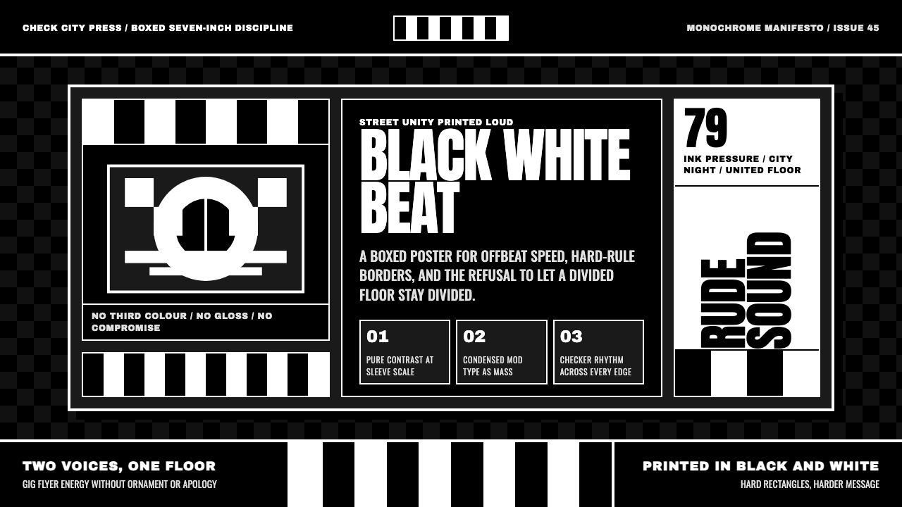 2 Tone SkaContrast as manifesto. White Anton type locks into a near-black checkerboard…
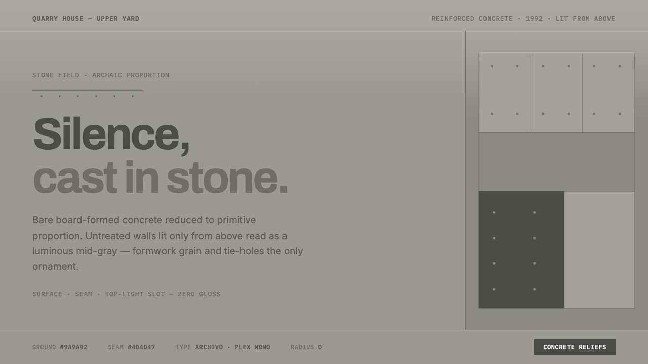 Peter Märkli Concrete ReliefsSilence cast in stone. Luminous mid-gray concrete, hairline formwork seams, t…
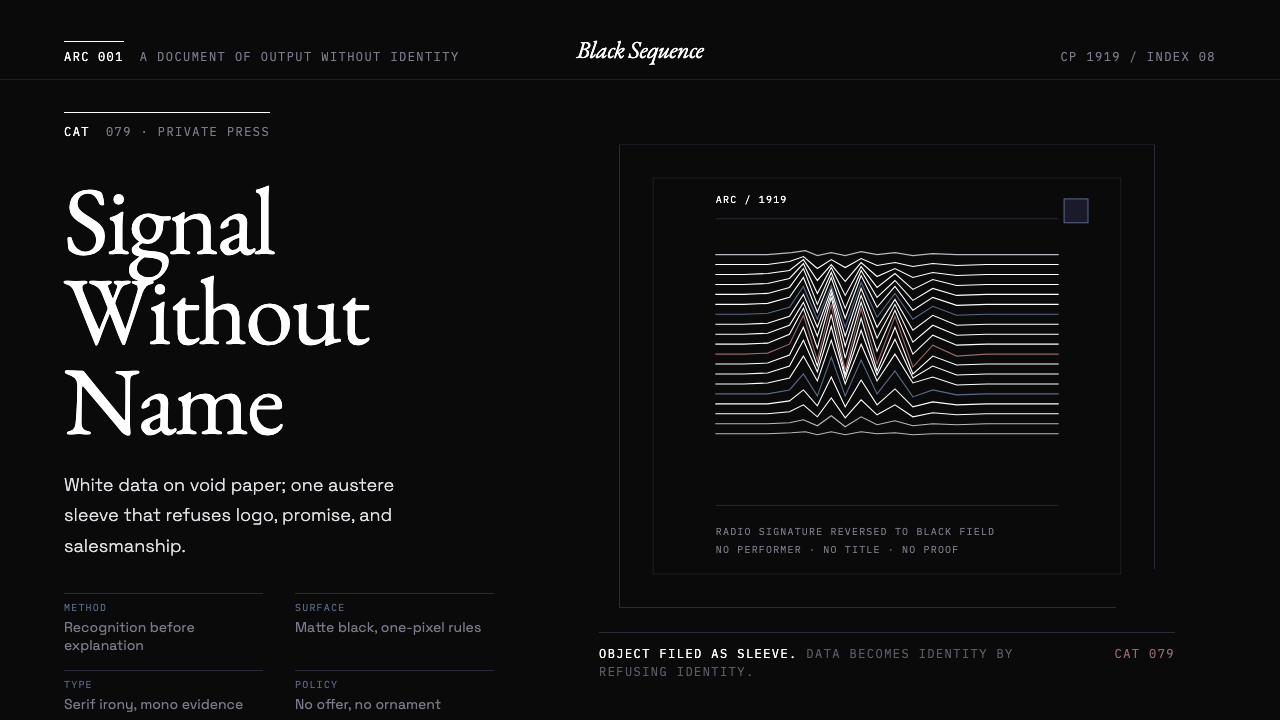 Peter Saville / Factory RecordsAnti-design becomes high art. Void black, white pulsar lines, and FAC mono la…
 Xenolinguistics LabEvidence before spectacle. IPA-style ruled cells and a red falsification marg…
 ASCII Art BBS (1992)Terminal art hits hard. Cyan-magenta-yellow glow, box borders, block ramps.
 Berlin Techno (Berghain era)Refuses spectacle. Black grid, steel rules, condensed type, one acid-green si…