What is Xenolinguistics Lab?
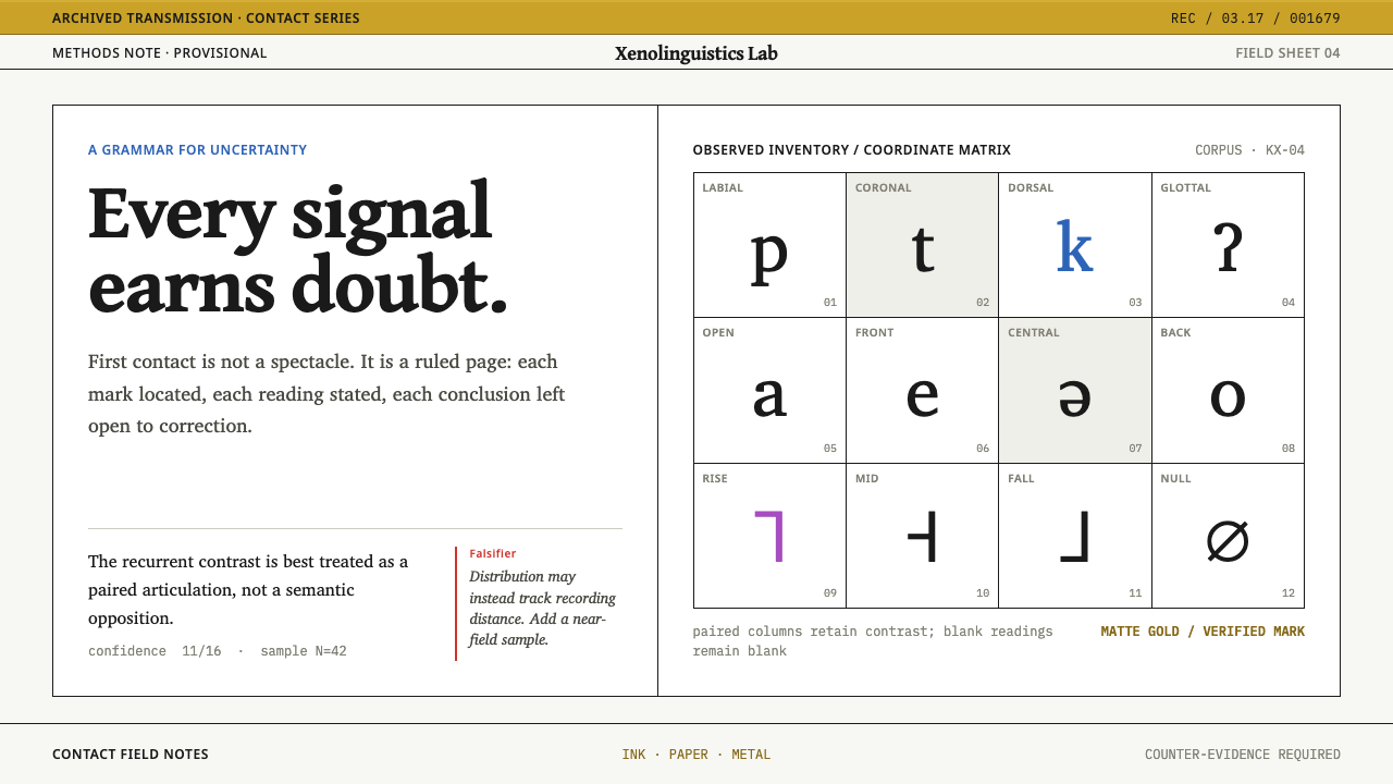
Xenolinguistics Lab designs like a field linguist's working draft: plain paper, ruled cells, confidence written as a fraction, and a red margin where every claim meets its counter-evidence.
Xenolinguistics Lab in brief
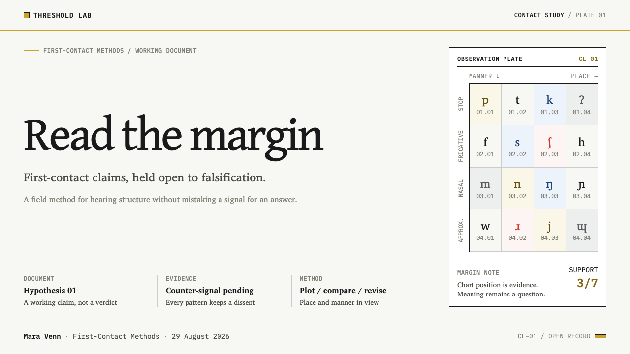
Xenolinguistics Lab is a design system for documents that try to describe, decode or communicate across a language barrier, whether the other party is a human community or an imagined alien one. Its look is borrowed from descriptive linguistics: black ink on plain printing paper, ruled cells, and tables in which place of articulation runs across the columns and manner runs down the rows — the structure of the International Phonetic Alphabet chart.
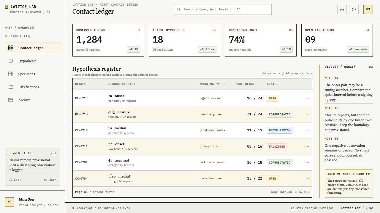
The attitude is 'record first, judge later'. Specimens are plotted and tabulated, never drawn freehand. Confidence is stated as a fraction rather than shown as a progress bar. Every hypothesis carries its counter-evidence in a narrow outer margin set in red, because a claim with no falsification column is, in the system's own phrasing, a guess rather than a finding.
The only metal in the palette comes from the Voyager Golden Record: a very thin anodised gold and the pale grey-white of the aluminium cover that carries the playing instructions. The gold is matte and never mirrored — no highlights, no gleam. The overall impression is deliberately unglamorous. This is not a science-fiction aesthetic; it is a working document that a colleague could overturn.
Where does Xenolinguistics Lab come from?
The system's mother document is the phonetic chart. The International Phonetic Association was organised in 1886, with the French phonetician Paul Passy among its leading figures, to give linguists a single notation for the sounds of any language. The resulting International Phonetic Alphabet is laid out as a grid: places of articulation across the top, manners of articulation down the side, and a symbol wherever a sound exists. It is less a writing system than a measuring instrument, and it taught generations of linguists to see speech as something plotted rather than merely described.
The typography of language documentation has its own history. SIL International, a nonprofit organisation that studies and documents minority languages, has released open-licensed fonts from 2003 onward, built to handle the full range of phonetic symbols and stacked diacritics that fieldwork demands. The type designer Victor Gaultney is a central name in that work. These typefaces made it possible to publish, share and archive transcriptions of any language without special tooling, and their sober, text-first character is the system's typographic voice.
Two famous attempts to speak to someone with no shared language supply the rest. In 1974 the Arecibo Observatory in Puerto Rico transmitted a radio message composed by Frank Drake with Carl Sagan and others, aimed at a distant star cluster. It consisted of exactly 1679 binary digits, a number that factors only into two primes, so a recipient arranging the bits into a rectangle would find structure instead of noise. The colour-coded diagrams in which the message is usually reproduced — numbers in one colour, chemistry in another — were added later as explanation. The transmission itself contained only ones and zeros.
In 1977 the Voyager spacecraft carried the Golden Record, a phonograph disc with an aluminium cover etched with instructions for playing it, assembled by a team led by Carl Sagan, with Ann Druyan as creative director and Jon Lomberg as design director. Notation, message, record: each is a document addressed to a reader who may share nothing with the writer, and each has to say how to read it before it says what it says. That is the problem the system takes on — how to make a page legible with no assumed context, and honest about what remains unknown.
What defines the Xenolinguistics Lab look?
Printing-Paper Ground
The page is plain, unaged printing paper: a very light, neutral off-white with no warm tint, no yellowing and no texture. The system rejects the vintage-manuscript look that science-adjacent design often reaches for. This is a freshly printed working draft laid flat on a desk, and the ground should recede so that the marks on it carry the interest.
Black Ink and Ruled Cells
Text is set in black ink and organised by thin, even rules into cells. The rules do real work: they separate categories, frame specimens and show where one claim stops and the next begins. Nothing is boxed for decoration. A cell with no content is left empty on purpose, since an empty cell is itself a finding — a sound that does not occur, or a gap in the data.
Place and Manner
Tables follow the phonetic chart's two-axis logic: one dimension across the columns, another down the rows, with each occupied cell holding a specimen. This is the system's organising pattern for comparison, from sound inventories to feature lists. Layouts are plotted by coordinate, so a reader can locate any item by its two properties instead of hunting through a paragraph.
The Falsification Margin
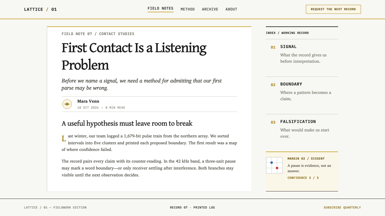
A narrow outer column, set in red, holds counter-evidence, caveats and open objections. It is the system's signature element. Every significant claim in the main column has a matching entry there, or a visible empty slot that says none has yet been found. The red is functional rather than alarming: it marks the place where the document invites a challenge.
Confidence as Fractions
Uncertainty is stated numerically and modestly — a fraction of observations that agree, a count of attestations out of a total — rather than drawn as a bar, gauge or percentage ring. A fraction exposes its denominator, so the reader can see how little or how much evidence stands behind it. The system treats a confident-looking graphic with a hidden denominator as a kind of overclaim.
Matte Gold and Aluminium
Metal appears only in the colours of the Voyager record: a thin, matte, anodised gold and the pale grey-white of the aluminium cover. They are used for rare emphasis, such as a key specimen or a section marker, and never as gradients, bevels or highlights. The metal is a citation of a real object, not a decoration, and it is never mirrored.
Open-Font Documentary Type
Type is chosen for its ability to handle dense, symbol-rich text: a sober, text-first design in which diacritics, phonetic symbols and numerals all sit clearly. Hierarchy comes from placement, weight and position in the grid rather than from display flourish. Set it as you would a journal's methods section, not as you would a film title.
Who shaped Xenolinguistics Lab?
Passy was a French phonetician and a leading figure in the International Phonetic Association, organised in 1886. He and his colleagues pressed for a single set of symbols in which each sound has its own unambiguous character, whatever the language. That principle — one sign, one sound — is why the chart reads like a table of measurements, and why this system treats notation as evidence rather than illustration.
Drake, a radio astronomer, led the composition of the 1974 Arecibo message and is also known for the equation that bears his name, a framework for estimating how many communicative civilisations might exist. In design terms his message is a lesson in constraint: 1679 bits, no colour, no language, and a grid whose dimensions are the first clue to reading it.
Sagan, astronomer and science communicator, collaborated on the Arecibo message and led the team that chose the contents of the Voyager Golden Record, working with Ann Druyan as the project's creative director. His influence on the system is tonal: a belief that rigour and wonder are compatible, and that an address to the unknown should be careful, modest and clear.
Lomberg, a space artist, was design director of the Golden Record project, which included the selection and arrangement of the images on the disc. His work shows how to build a message from pictures alone, ordering them so that each helps decode the next. The system takes from him the idea that layout is part of the argument: sequence, grouping and scale tell the reader how to read before any caption does.
Gaultney is a type designer whose work with SIL International helped produce open-licensed typefaces that cover the characters language documentation needs. His relevance is practical and ethical: fonts that anyone may use and adapt keep records of minority languages readable without licensing barriers. The system's typographic voice is built on that tradition.
How do you use Xenolinguistics Lab today?
Xenolinguistics Lab is the right choice when a document's credibility depends on showing its working. It is ideal for research, methods, evidence and analysis, and it works poorly when the goal is excitement or atmosphere.
On slides, a cover is a plain paper field with the title in black, a ruled table fragment as the only graphic, and a thin matte-gold marker if a flourish is wanted. Content slides should be treated as tables: two axes, ruled cells, a falsification column at the right edge for caveats. Data slides are where the system shines — plotted specimens, fractions instead of percentages, and a visible denominator under every claim. Use the red margin on every slide that makes a claim, so the audience learns where to look for the objection.
In interfaces, the system suits research tools, annotation platforms, dataset browsers, model-evaluation dashboards and documentation sites. Tables are the primary component. Each row can carry a confidence fraction, and a persistent outer column can hold counter-evidence, known limitations or open questions. For pricing pages, a plain comparison table with ruled cells is natural, with a single note in the margin for what a plan does not cover — honesty as a feature.
For editorial and marketing work, the system suits white papers, lab notebooks, technical explainers and science-adjacent product launches that want to sound careful rather than breathless. Long-form layouts use a single main column with the red margin carrying objections and caveats beside the passages they affect. Marketing copy should state what is known and what is not; the visual system makes overclaiming look out of place.
The most common mistake is adding science-fiction cues: glowing gold, star fields, scan lines, or a dark interface with neon accents. Each of these undoes the premise. A second mistake is using the red margin as a general alert colour for errors and warnings; it is reserved for counter-evidence. A third is making the gold shiny. Matte, thin and rare is the instruction.
Xenolinguistics Lab — FAQ
Is Xenolinguistics Lab a science-fiction style?
No, and the system is explicit about it. Its subject matter touches on messages to other civilisations, but its visual language comes from the phonetic chart and the fieldwork notebook: plain paper, ruled cells, matte metal. If anything looks like a film prop, it is off-brief. The ambition is a record a peer could challenge, not a spectacle.
What goes in the red falsification margin?
Anything that could weaken the claim beside it: a counter-example, a competing hypothesis, a sampling limit, a note that only one speaker was recorded. When nothing has been found, say so with a visible empty slot rather than leaving the margin blank. The margin works only if readers learn that its emptiness is a statement and not an omission.
Why state confidence as a fraction instead of a progress bar?
Because a fraction shows its denominator. Three of four attestations and three hundred of four hundred look very different once you can see the totals, and a bar hides that difference behind a smooth shape. The system prefers a plain number that can be checked over a graphic that merely looks certain.
Do the colours in the Arecibo diagrams belong in the system?
Only with disclosure. The 1974 transmission was 1679 binary digits with no colour; the colour-coded sections familiar from diagrams were added later as a teaching aid. The system allows coloured zones when a page needs to explain such a thing, but it expects them to be labelled as explanatory overlays and never presented as part of the original.
Where does Xenolinguistics Lab struggle?
It struggles in consumer entertainment, emotional brand storytelling and quick-glance mobile experiences, where atmosphere and speed matter more than showing the working. Its text-and-table density asks for attention, and a reader who wants a verdict in two seconds will find it slow. It is strongest where the audience is willing to check the reasoning.
Related design styles
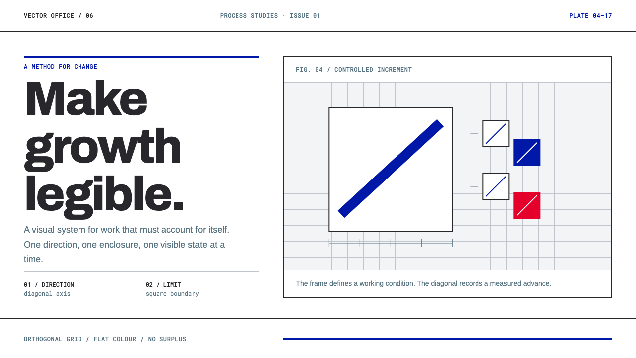 Anton Stankowski ConstructiveProcess becomes visible. Flat blue diagonals and hard square rules make chang…
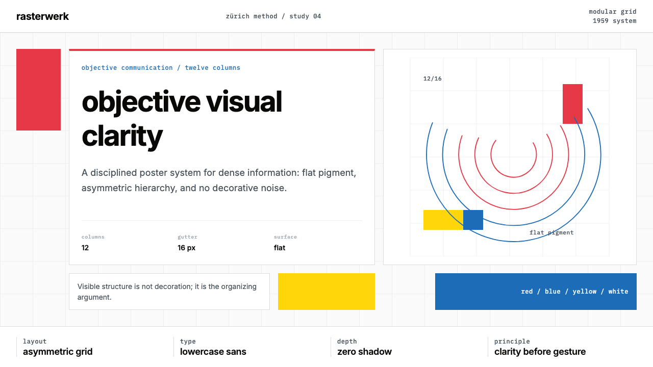 Müller-Brockmann SwissClarity is the system. Inter grids, red-blue blocks, and concentric arcs make…
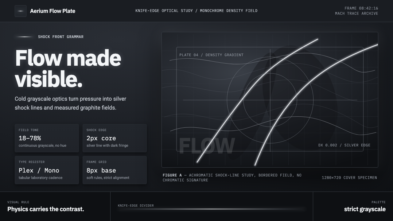 Schlieren ShadowgraphInvisible air becomes silver. Cool grayscale fields cut by precise shock line…
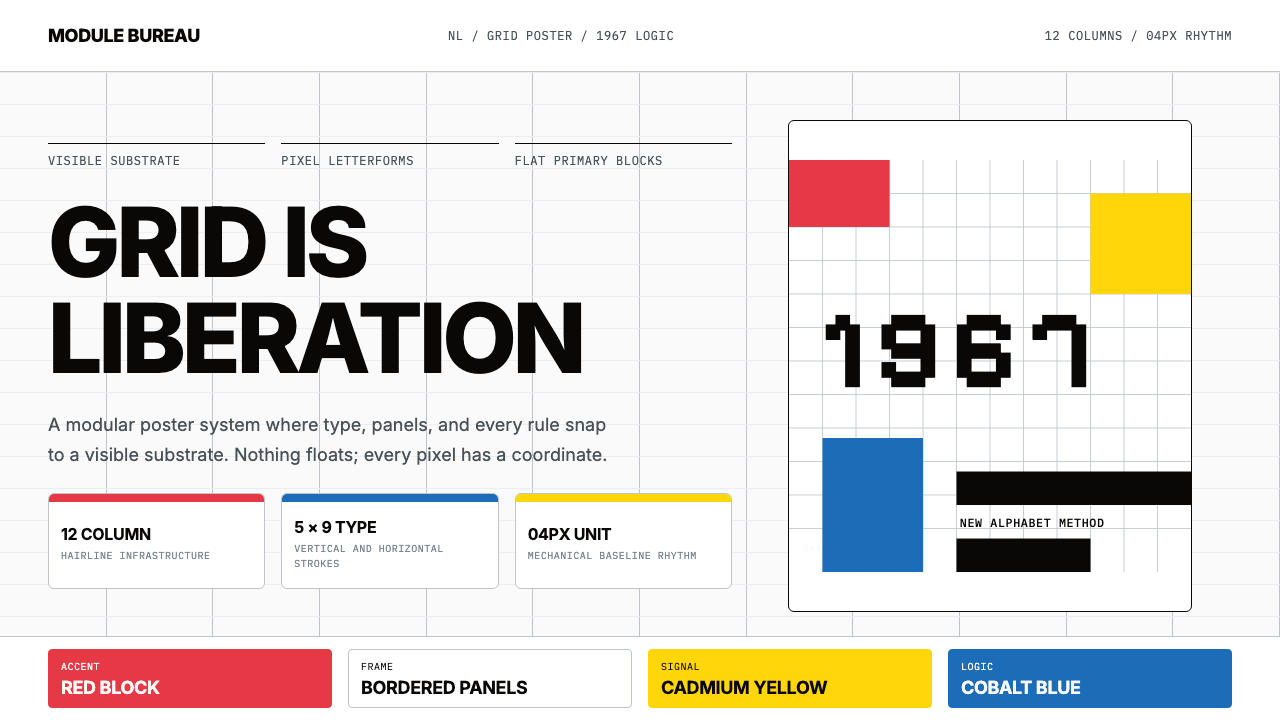 Wim Crouwel GridGrid becomes freedom. Cobalt, red and yellow blocks lock Inter type to a 12-c…
 Bechers Industrial TypologyDeadpan order. Mid-grey ground, Archivo labels, and strict hairline grids rev…
 Mohs Hardness ScaleRanked by what scratches what. Ten mineral-gray chips on cool chart-white, en…