What is Schlieren Shadowgraph?
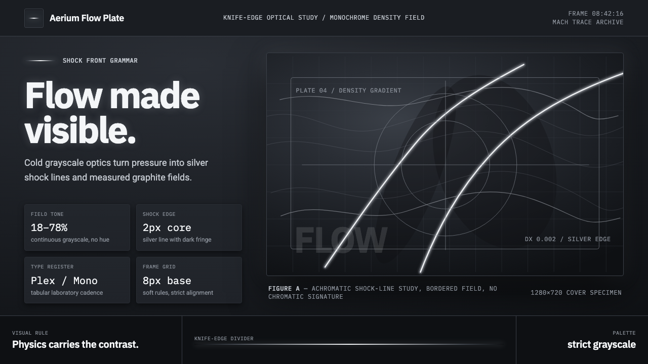
Schlieren Shadowgraph gives invisible air a visible edge — silver shock lines, dark bands, and the cool discipline of the wind tunnel.
Schlieren Shadowgraph in brief
Schlieren and shadowgraph photography are techniques for making otherwise invisible density gradients in air visible. Across a mid-gray field, changes in air density emerge as luminous silver lines, dark bands, and soft tonal shifts. The resulting image does not illustrate airflow in a conventional sense; it records where light has been redirected or interrupted by conditions in the air itself.
Its visual grammar is strictly achromatic. Brightness concentrates at the shock front, where a narrow silver trace can cut sharply through the field, while the surrounding space remains smooth, cool, and gray. Contrast is precise rather than decorative: light identifies a disturbance, darkness marks its counterpart, and the neutral field preserves the sense of an atmosphere under observation.
As a design language, Schlieren Shadowgraph borrows the restraint of scientific flow imaging. Cool grotesque typography, thin ruled lines, and sharply controlled grayscale create an interface that feels instrument-like without becoming sterile. Airflow is suggested as something engraved into light: present, dynamic, and exact, yet never rendered as ornamental spectacle.
Where does Schlieren Shadowgraph come from?
The technique began in the 1860s with August Toepler, whose work established a way to reveal density gradients that could not be seen directly. This was a consequential shift in experimental observation. Air could now be treated not merely as empty space surrounding an object, but as a visible field whose changes could be studied through light.
The name Schlieren refers to the visible traces produced by those gradients. Shadowgraph photography operates within the same broad effort to make flow legible through tonal change. In both cases, the image is inseparable from measurement: a bright line, dark band, or altered gray field carries evidence of a condition in motion rather than an independently chosen visual effect.
Through the twentieth century, these methods were refined for high-speed flow imaging and became a canonical visual language of wind tunnels and ballistics laboratories. Their maturity from the 1940s onward connected experimental fluid dynamics, scientific high-speed photography, and aerospace flow visualization. The grayscale field was not an aesthetic limitation imposed afterward; it was central to how subtle differences in air could remain readable.
Ernst Mach is named among the key figures associated with this lineage, alongside Toepler. The techniques also became closely associated with aerospace research, including NASA research, where flow visualization gave form to forces that were otherwise difficult to observe. Schlieren Shadowgraph therefore belongs less to a decorative movement than to a continuing scientific culture: one concerned with exposing motion, pressure, and density through disciplined control of light.
What defines the Schlieren Shadowgraph look?
Achromatic Field
The palette stays within cool grayscale. A mid-gray ground carries the composition, with silver-white reserved for luminous disturbances and deep charcoal for shadowed bands or structural type. This restraint makes every tonal departure meaningful. Color would imply a separate coding system; grayscale keeps attention on intensity, direction, and contrast.
Shock-Line Contrast
The defining event is a precise bright line against a controlled gray field. It should feel discovered rather than drawn: narrow, sharp, and consequential. Dark bands may sit nearby as a counterforce, but neither side should dissolve into decorative haze. The image gains authority when contrast reads as evidence.
Smooth Gradient
Away from the shock front, tonal change is continuous and restrained. The background should feel atmospheric rather than flatly filled, but never theatrical. Smooth gray allows the eye to notice small disturbances without competing texture, pattern, or chromatic noise. It is the quiet condition that gives the bright event its force.
Instrumental Typography
Cool grotesque type supports the system because its forms are direct and controlled. Headings should establish a clear observational hierarchy, while labels and technical notes remain compact and precise. Typography is not meant to imitate laboratory hardware; it should instead carry the same disciplined neutrality as the image field.
Fine Rules
Thin rules act as measured boundaries, reading guides, and quiet separators. They should feel aligned with the silver traces of airflow rather than like ornamental borders. A rule can imply an instrument scale, a sectional cut, or a path of observation, giving layout structure without overwhelming the tonal image.
Air Etched in Light
The system treats airflow as an optical event. Lines and bands imply speed, pressure, or change without requiring illustrative arrows, simulated particles, or expressive brushwork. This is its central tension: the composition feels active, yet its activity is registered through observation rather than visual drama.
Who shaped Schlieren Shadowgraph?
Toepler is identified as the originator of Schlieren technique in the 1860s. His contribution established the foundational premise of the style: density gradients in air can become visible through light. Every contemporary Schlieren-derived composition inherits that act of turning an unseen condition into a readable image.
Mach is named as a key figure in the technical lineage of Schlieren and shadowgraph imaging. His presence anchors the style in the history of experimental observation, where visual form serves the study of airflow and its changing conditions rather than the pursuit of surface effect.
NASA aerospace research is part of the broader setting in which high-speed grayscale flow visualization became culturally recognizable. Its association reinforces the language of controlled observation: luminous fronts, dark bands, and measured fields that make aerodynamic phenomena legible without reducing them to decoration.
How do you use Schlieren Shadowgraph today?
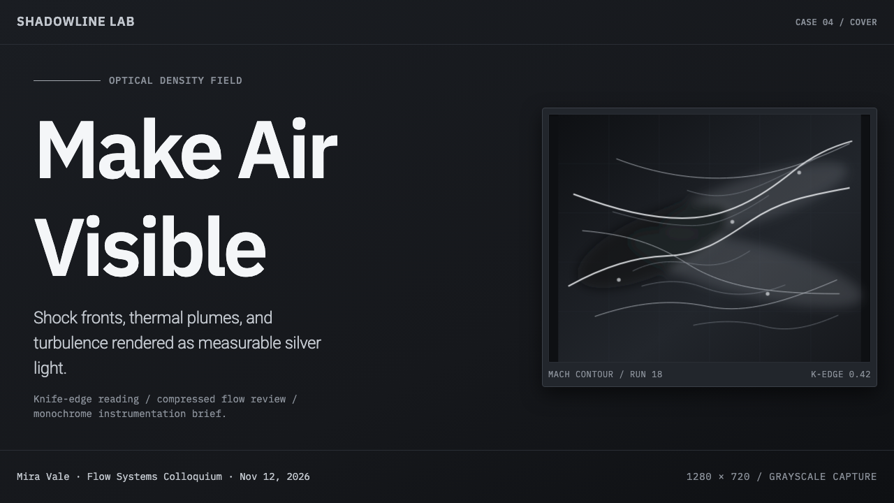
For presentation slides, treat the cover as a single observed event. A broad gray field can hold a silver shock-like trace crossing near the title, while restrained metadata sits along a fine rule. Content slides should preserve that field discipline: clear heading hierarchy, compact notes, and a quiet image area rather than a collection of competing panels. Data slides work best when charts remain grayscale instruments, with the brightest tone reserved for the finding that deserves attention and dark bands used to establish comparison.
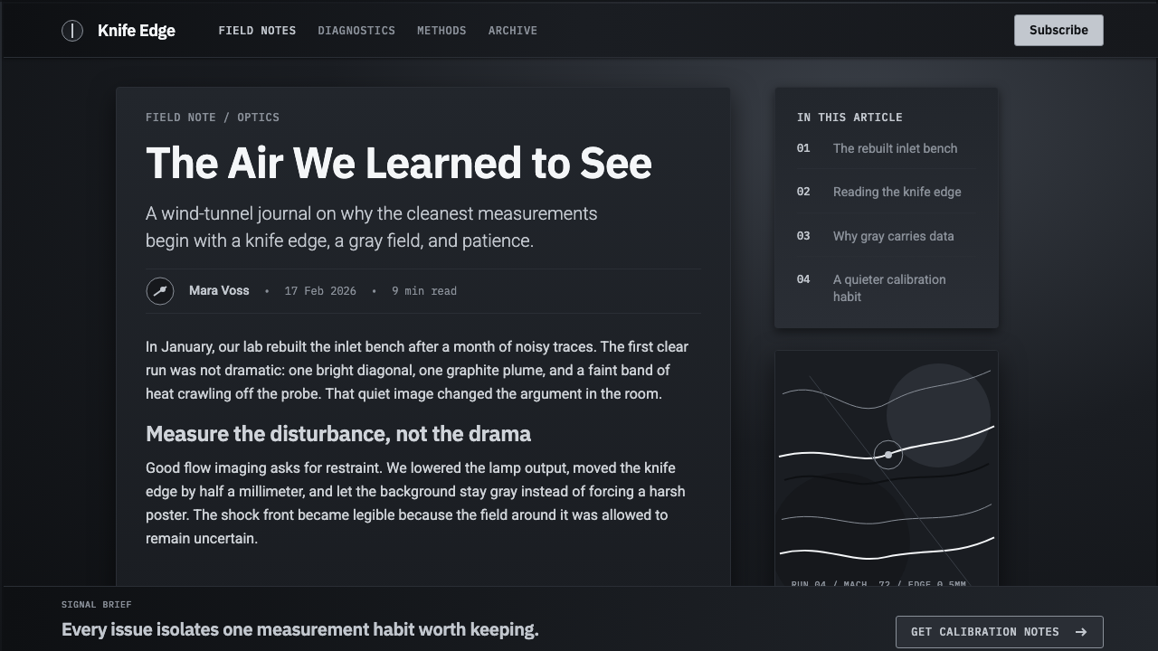
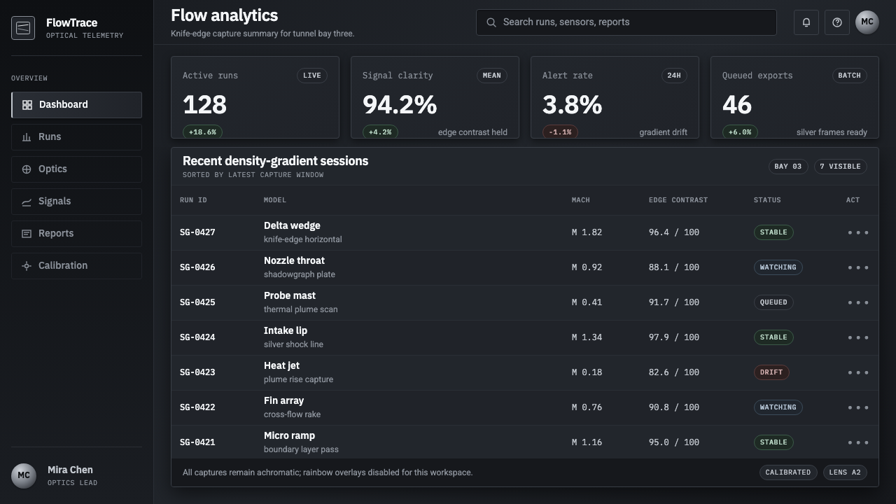
For web interfaces, Schlieren Shadowgraph suits dashboards, analytical tools, research portals, and pricing pages that need a technical but composed voice. Let the gray field establish continuity across navigation, tables, and cards. Use silver contrast for active states, priority metrics, or a selected plan, while rules create boundaries between information groups. The result should feel like an interface for reading conditions, not a futuristic control room crowded with effects.
For editorial and marketing work, use the style to make complex subjects feel observed and consequential. An article can open with a wide gray image field, then move through narrow text measures divided by subtle lines and occasional silver callouts. Marketing pages benefit when the visual metaphor remains tied to clarity: a bright trace can introduce a feature, a dark band can frame supporting evidence, and smooth tonal space can keep claims from feeling overstated.
A common mistake is to interpret the style as generic dark technology. Dense black backgrounds, glowing blue accents, metallic bevels, random particle fields, and aggressive sci-fi decoration all obscure its scientific origin. The essential contrast is not neon against darkness; it is a controlled silver disturbance against a smooth gray atmosphere. Preserve the measured field, and use brightness sparingly enough that each visible change still reads as information.
Schlieren Shadowgraph — FAQ
Is Schlieren Shadowgraph the same as a generic scientific or aerospace style?
No. Its identity comes from a specific image-making premise: density gradients in air become visible as tonal events. Aerospace research and wind tunnels are important contexts, but the visual system is not defined by spacecraft imagery, mechanical diagrams, or futuristic interface conventions. Its strongest cues are the smooth gray field, the silver shock line, the dark band, and the disciplined use of contrast.
Why must the palette remain nearly monochrome?
Because grayscale is intrinsic to the visual logic of Schlieren and shadowgraph imaging. The field needs to make small tonal changes legible, while bright silver and deep shadow identify sharper disturbances. Introducing many colors shifts attention from airflow-like evidence to decorative categorization. A cool achromatic range keeps the composition observational and lets contrast carry meaning.
Can this style work without a literal airflow image?
Yes, provided the composition preserves the underlying grammar. A restrained gray atmosphere, fine rules, cool grotesque typography, and a small number of luminous or shadowed interruptions can evoke the same logic. The goal is not to imitate a laboratory photograph everywhere, but to make hierarchy and movement feel as though they have been revealed by light.
Where does Schlieren Shadowgraph struggle as a design direction?
It can struggle where warmth, abundance, or immediate emotional intimacy are central to the message. Its cool grayscale restraint and laboratory associations are strongest when a product needs to communicate observation, precision, research, or controlled complexity. If a project depends on rich material color, playful abundance, or a strongly domestic mood, the system may feel too distant unless it is softened by the content itself.
Related design styles
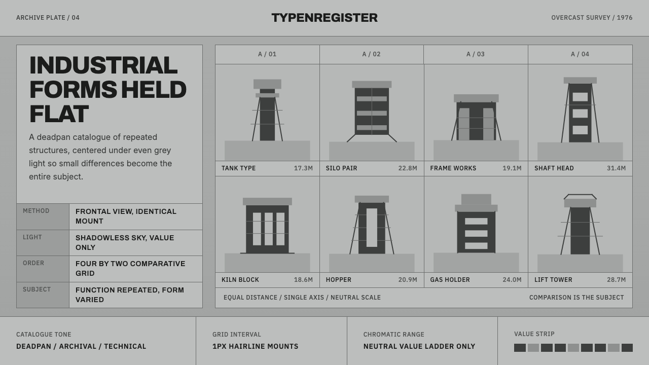 Bechers Industrial TypologyDeadpan order. Mid-grey ground, Archivo labels, and strict hairline grids rev…
 Frutiger CDG AirportLegibility at runway scale. Navy panels, white humanist sans, arrow-led grids.
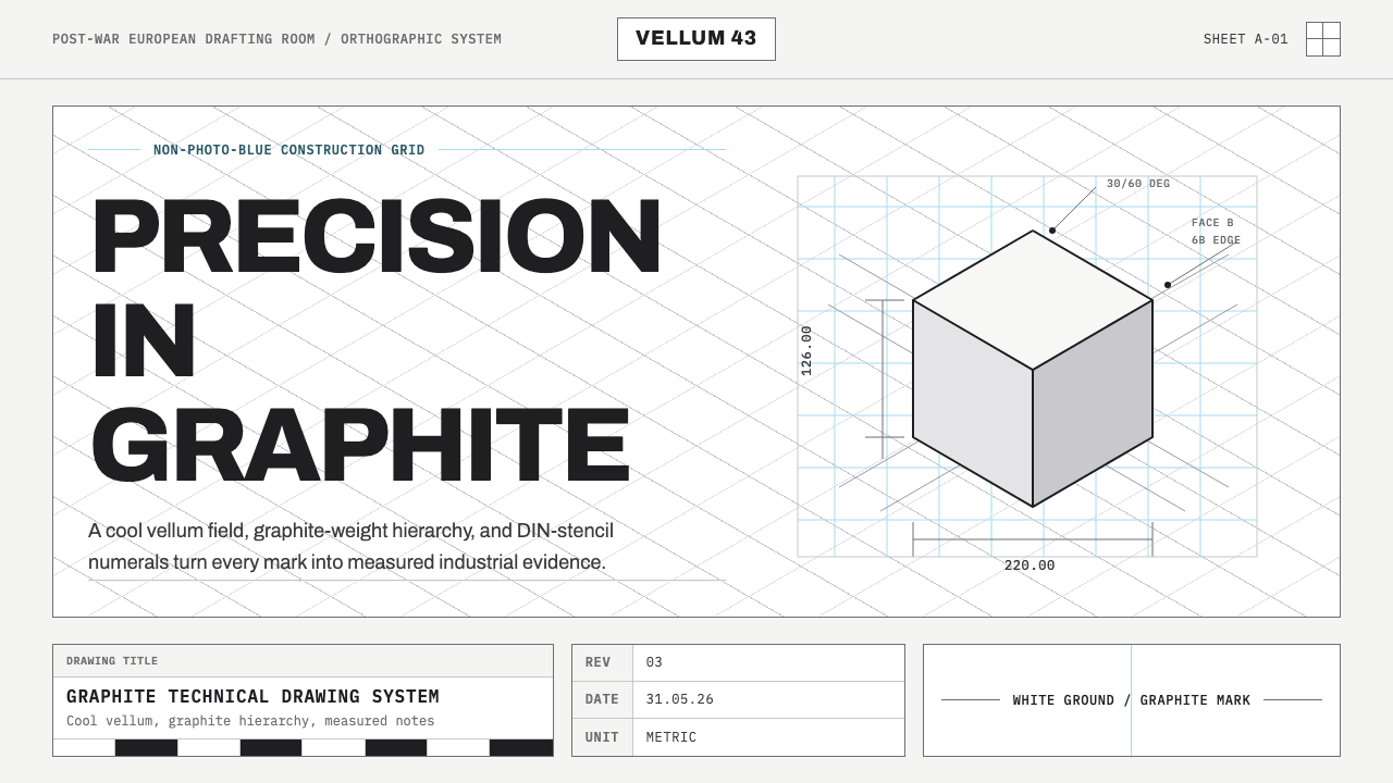 Graphite Technical DrawingDrafting-room precision. Non-photo-blue grid and graphite DIN lettering do th…
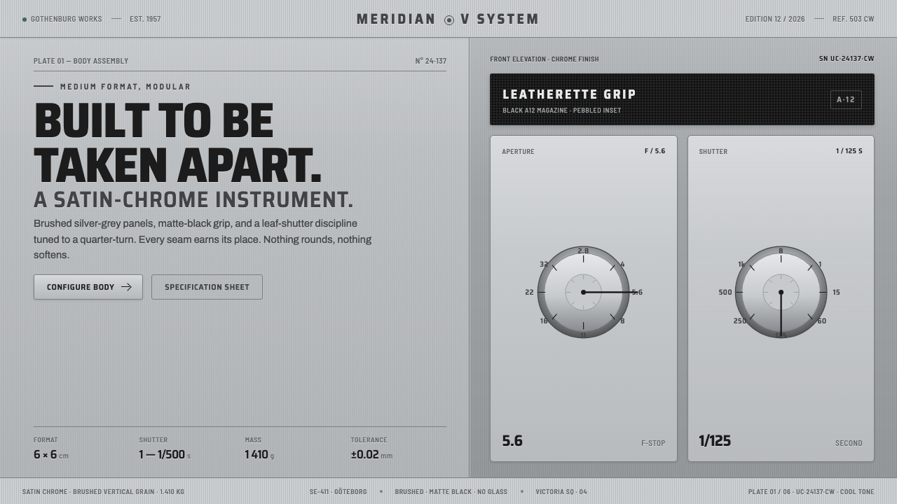 Hasselblad 500C ChromeBuilt to be taken apart. Brushed silver-grey panels, matte-black leatherette,…
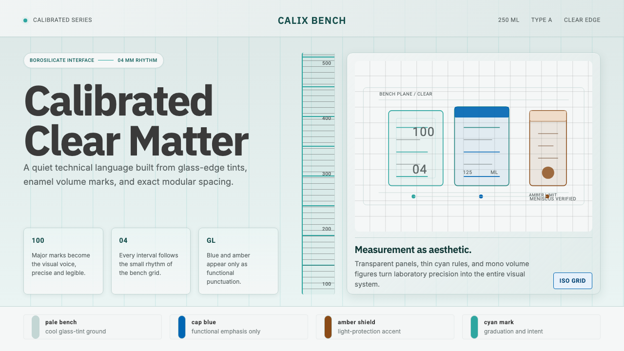 Laboratory GlasswareClarity is the system. Pale glass cyan, volume marks, and bordered bench grid…
 Müller-Brockmann GridOrder becomes force. Black-white 12-column grid, Inter type, one red downbeat.