What is Peter Saville / Factory Records?什么是 Peter Saville / Factory Records?
Peter Saville turned Factory Records sleeves into conceptual art — no names, no logos, just the austere beauty of found data and void black.彼得·萨维尔将 Factory 唱片的封套变成观念艺术——没有名字,没有商标,只有从现实中拾取的数据与虚空黑的肃穆之美。
Peter Saville / Factory Records in briefPeter Saville / Factory Records 速览
Peter Saville's work for Factory Records between 1978 and 1992 is among the most consequential bodies of graphic design produced in the twentieth century. It treated the record sleeve — a commercial object, a marketing surface — as a site for conceptual art. The result was a visual language that refused every convention of the music industry: no band name on the front cover, no album title where one was expected, no logo asserting the label's identity. In its place: a pulsar's radio emissions plotted as stacked waveforms, a twelve-inch sleeve die-cut to the shape of a floppy disk, a nightclub that declined to post its own name above the door.彼得·萨维尔为 Factory 唱片公司在 1978 至 1992 年间所做的设计,是二十世纪最具影响力的平面设计作品之一。他将唱片封套——一个商业物件、一块营销平面——视为观念艺术的发生场所。结果是一套拒绝音乐产业一切惯例的视觉语言:封面不印乐队名,专辑名不出现在应该出现的地方,没有任何商标在主张唱片公司的身份。取而代之的是:脉冲星的射电辐射被绘成堆叠波形图;一张十二英寸封套被模切成软盘的轮廓;一家俱乐部拒绝在门楣上张贴自己的名称。
The aesthetic that emerged from this refusal is not minimalism in the contemporary sense. It is something more specific — intellectual austerity as a stance, an insistence that the work rewards only those who already understand its context. The palette runs from near-absolute black through pure white, with slate blue and a muted, dusty rose appearing as accents rather than foundations. Classical serif letterforms appear in tension with modernist sans-serif reasoning, and monospace catalog numbers from Factory's FAC numbering system function as both indexing system and design element. Nothing decorates; everything signifies.从这种拒绝中生发出来的美学,并非当代意义上的极简主义。它是更具体的某种东西——以知识上的克制作为立场,坚持认为作品只向已经理解其语境的人回报意义。色调从接近绝对的黑延伸至纯白,石板蓝与晦暗玫瑰以点缀而非基底的角色出现。古典衬线字形与现代主义无衬线逻辑相互张力并置,Factory FAC 编号系统的等宽目录编号既是索引体系,也是设计元素。没有任何东西在装饰;所有东西都在表意。
What makes the Saville-Factory aesthetic enduringly distinctive is that it refuses to be legible on first encounter. It does not explain itself. The Unknown Pleasures cover — a white-line data visualization on pure black — offers no text to orient the viewer. Blue Monday's packaging cost more to produce than the record retailed for. These were not accidents or oversights; they were positions. The work says, in effect, that recognition is earned, not granted, and that beauty does not owe the viewer an introduction.萨维尔-Factory 美学经久不衰的独特性,在于它拒绝在第一次相遇时就变得可读。它不解释自己。《Unknown Pleasures》的封面——纯黑底面上的白线数据可视化——没有提供任何文字来为观看者定向。《Blue Monday》的包装制作成本超过了唱片的零售价格。这些都不是意外或疏失;它们是立场。作品实际上在说:认知是被赚到的,而非被赐予的,美丽不欠观者一个自我介绍。
See the Peter Saville / Factory Records design system查看 Peter Saville / Factory Records 完整设计系统
Where does Peter Saville / Factory Records come from?Peter Saville / Factory Records 从何而来?
Factory Records was founded in Manchester in 1978 by Tony Wilson, a Granada Television presenter, and Alan Erasmus, with Peter Saville brought in almost immediately as the label's designer. The timing placed the enterprise at the exact center of the post-punk moment — a period when the collapse of the major-label system's commercial certainties opened a brief window for independent labels to operate on entirely different principles. Wilson and Saville both understood that Factory's identity would be its aesthetic, and that the aesthetic would need to be something that the industry could not or would not imitate.Factory 唱片公司由电视主持人托尼·威尔逊(Tony Wilson)与艾伦·伊拉斯穆斯(Alan Erasmus)于1978年在曼彻斯特创立,彼得·萨维尔几乎同时被引入,担任厂牌设计师。这一时间节点将该企业置于后朋克时刻的正中心——在这个短暂的窗口期里,主要唱片公司商业体系的确定性轰然崩塌,独立厂牌得以在截然不同的原则下运营。威尔逊与萨维尔都清楚,Factory 的身份将由其美学构成,而这套美学需要成为那种音乐产业无法或不愿模仿的东西。
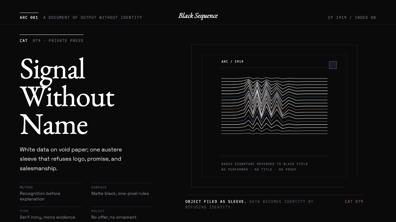
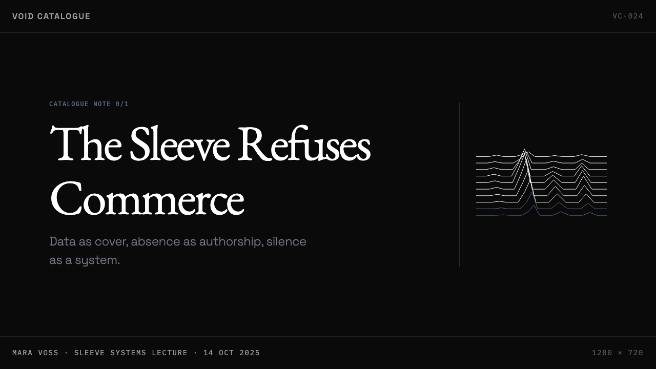
The Unknown Pleasures sleeve, designed for Joy Division's debut album in 1979, established the template. Saville found an image in an astronomy encyclopedia — Harold Craft's 1975 doctoral thesis contained a plot of successive radio pulses from pulsar CP 1919, stacked to reveal the interference pattern. Saville reproduced the image in white on black, with no text on the front cover. The choice of a scientific data visualization as primary imagery — rather than photography, illustration, or typography — was entirely without precedent in rock music packaging. It announced that Factory sleeves would operate by the logic of found images and conceptual framing rather than promotional design.1979年为 Joy Division 首张专辑设计的《Unknown Pleasures》封套确立了这一模板。萨维尔在一本天文学百科全书中找到了那张图像——哈罗德·克拉夫特(Harold Craft)1975年的博士论文中,包含一幅脉冲星 CP 1919 连续射电脉冲的叠加图,揭示出干涉图样。萨维尔在黑底上以白线复制了这幅图像,封面上没有任何文字。以科学数据可视化而非摄影、插图或字体排印作为主要图像的选择,在摇滚乐包装史上完全没有先例。它宣告了 Factory 封套将遵从现成图像与观念框架的逻辑,而非推广设计的逻辑来运作。
The Factory catalog system itself was part of the aesthetic program. Every Factory release, contract, building, and legal document received a FAC number, logged in monospace type. FAC 1 was a poster for a Factory night at the Russell Club. FAC 51 was the Hacienda nightclub. FAC 73 was Joy Division's 'Atmosphere' seven-inch. The numbering system, borrowed from the bureaucratic language of institutional catalogs, turned Factory's entire output into a readymade archive — and the monospace typeface used for these numbers became one of the label's most recognizable design signatures.Factory 目录系统本身就是这套美学方案的组成部分。每一张 Factory 发行物、每一份合同、每一栋建筑、每一份法律文件都被赋予一个 FAC 编号,以等宽字体记录。FAC 1 是一张在 Russell Club 举办 Factory 之夜的海报;FAC 51 是 Haçienda 夜总会;FAC 73 是 Joy Division 的七英寸单曲《Atmosphere》。这套借自机构目录官僚语言的编号系统,将 Factory 的全部产出变成了一个现成的档案——而用于这些编号的等宽字体,也成为了这家唱片公司最具辨识度的设计签名之一。
The context of post-punk Manchester was essential. The city's industrial heritage — its Victorian brick warehouses, its legacy of manufacturing decline — gave the visual language a material ground. The palest echo of that grey northern light appears in the slate-blue and muted-rose accents that recur across Factory releases. But Saville was also drawing on sources far outside music: the typography of Jan Tschichold, the photography of Man Ray, the Constructivist grid, the art historical vocabulary he had encountered at Manchester Polytechnic. The result was a design practice that was local in its emotional register and cosmopolitan in its references.曼彻斯特后朋克语境是不可或缺的。这座城市的工业遗产——维多利亚时代的砖砌仓库、制造业衰退的历史积淀——为这套视觉语言提供了物质底色。那种灰色北方光线最淡的回声,出现在贯穿 Factory 各发行物的石板蓝与晦暗玫瑰色调之中。但萨维尔也在从远远超出音乐范畴的源头汲取资源:扬·奇肖尔德(Jan Tschichold)的字体排印学、曼·雷(Man Ray)的摄影、构成主义网格、他在曼彻斯特理工学院所接触的艺术史词汇。最终的结果是一种情感基调上在地而参照上跨越国界的设计实践。
By the mid-1980s the Saville-Factory visual language had begun to influence fashion, advertising, and eventually the emerging culture of digital interface design. New Order's Blue Monday — the best-selling twelve-inch single of all time — came in a sleeve that was both a formal homage to Floppy disk aesthetics and a ruinously expensive production decision. Saville's increasing use of appropriated imagery from art history (Renaissance portrait fragments, Constructivist posters reworked as New Order sleeves) extended the original conceptual premise through the label's final years. Factory Records went bankrupt in 1992. The visual language it had established survived the institution by decades.到1980年代中期,萨维尔-Factory 视觉语言已开始影响时尚、广告,并最终渗入正在兴起的数字界面设计文化。New Order 的《Blue Monday》——有史以来最畅销的十二英寸单曲——其封套既是对软盘美学的形式致敬,也是一项造成财务损失的昂贵制作决策。萨维尔在厂牌最后几年里对艺术史图像的挪用日益增多(文艺复兴肖像片段、构成主义海报被重新处理为 New Order 封套),将最初的观念前提延续至终。Factory 唱片公司于1992年宣告破产。它所建立的视觉语言则比这家机构多存活了数十年。
What defines the Peter Saville / Factory Records look?Peter Saville / Factory Records 的视觉特征是什么?
Void Black Ground虚空黑底面
The canonical Factory ground is not merely dark — it is black in the most absolute sense available in print, a field that reads as empty space rather than colored surface. This is not the functional dark of a night scene but the conceptual black of the void: a non-space in which data, line, and text float without visible support. When a ground of this depth is used, all other elements must earn their presence against it through precision of tone and deliberate placement.Factory 标准底面并非单纯的深色——它是印刷中所能呈现的最接近绝对意义的黑:一个读起来像空洞空间而非着色表面的场域。这不是夜景的功能性暗,而是虚空的观念性黑:数据、线条与文字在其中漂浮,没有任何可见的支撑。当这种深度的底面被使用时,所有其他元素都必须通过色调的精准与刻意的安置,来争取自己在其中的存在资格。
Scientific and Found Imagery科学图像与现成图像
Saville's decisive formal move was the substitution of scientific data visualization and appropriated historical imagery for conventional illustrative or photographic content. Waveforms, spectrograms, astronomical charts, and fragments from art-historical sources replace photography and commissioned illustration entirely. These images are not chosen for beauty alone — they carry their original context with them, importing the authority of science or art history into a commercial object without translating that authority into accessible explanation.萨维尔决定性的形式举动,是以科学数据可视化与挪用自历史的图像,取代惯常的插图或摄影内容。波形图、频谱图、天文星图,以及截取自艺术史的片段,彻底取代了摄影与委托插图。这些图像的选取并非仅凭美感——它们携带着各自原本的语境,将科学或艺术史的权威引入商业物件,同时并不将这种权威翻译成易于理解的解释。
Restrained Palette克制的色彩
The Factory palette moves between near-absolute black, pure white, and a small number of cold, desaturated accents — slate blue and a muted, dusty rose that reads more as atmospheric memory than as color. These tones are never vivid, never warm, never used for decorative effect. Color in this system functions as temperature and as signal: blue implies distance and emotional restraint; the pale rose implies a historical or elegiac register. Richness of hue is explicitly rejected in favor of tonal precision.Factory 色板在接近绝对的黑、纯白,以及少量冷调、去饱和强调色之间游移——石板蓝与一种晦暗、尘雾般的玫瑰色,后者读起来更像氛围记忆而非颜色本身。这些色调从不鲜亮,从不温暖,从不用于装饰效果。色彩在这个系统中的功能是温度与信号:蓝色暗示距离与情感克制,淡玫瑰色暗示历史性或哀悼性的基调。对色调饱和度的丰富性,被明确以色调精准为代价而拒绝。
Typographic Authority字体的权威性
When text appears in Factory design, it behaves as information rather than promotion. Classical serif faces are used not for warmth or tradition but for a particular kind of institutional authority — the seriousness of the art catalog, the museum label, the historical document. Monospace type marks catalog numbers and edition information with the neutral precision of a database record. Crucially, type is often absent from positions where convention demands it — a cover may carry no title, a label no artist name. The decision not to use typography is itself a typographic decision.在 Factory 设计中出现的文字,其行为更接近信息而非推广。古典衬线字体的使用并非为了温暖或传统,而是为了一种特定的机构权威感——艺术图录、美术馆标签、历史文献的严肃性。等宽字体以数据库记录式的中性精准标注目录编号与版次信息。至关重要的是,文字往往缺席于惯例要求它出现的位置——封面可以不印标题,标签可以没有艺人姓名。不使用字体排印的决定,本身就是一个字体排印决定。
Deliberate Anti-Branding刻意的反品牌化
The Factory visual system is constructed to resist the standard functions of commercial design. It does not communicate immediately. It does not explain its references. It does not position the product for a target demographic. In this sense it operates more like a closed system of connoisseurship than a public communication — understanding it confers membership in a cultural community, and that membership is the real product being offered. The monospace FAC numbering system captures this perfectly: it signals systematic intent to those who recognize it and reads as pure data to those who do not.Factory 视觉系统的构建目的是抵制商业设计的标准功能。它不即时传达。它不解释自身的参照。它不为目标受众定位产品。从这个意义上说,它更像是一个封闭的鉴赏体系,而非公共传播——理解它意味着加入某个文化社群,而这种成员身份才是真正被提供的产品。等宽 FAC 编号系统完美地捕捉了这一点:对认识它的人来说,它传递系统性意图;对不认识的人来说,它读起来就是纯粹的数据。
Material Consequence材料后果
Several of the most celebrated Factory designs required manufacturing processes that were technically complex, commercially irrational, or both. The Blue Monday sleeve used a die-cut format that required production costs exceeding the record's retail price. This willingness to let the formal concept determine the object — regardless of commercial consequence — is a structural feature of the aesthetic, not an incidental detail. It means the designs cannot be trivially reproduced: they carry the evidence of their own making as part of their meaning.几件最受推崇的 Factory 设计,需要技术上复杂、商业上不合理,或两者兼而有之的制造工艺。《Blue Monday》的封套采用了制作成本超过唱片零售价的模切形式。这种不惜商业代价、让形式概念决定物件的意愿,是这套美学的结构性特征,而非偶发细节。这意味着这些设计无法被轻易复制:它们将自身制作过程的证据,作为意义的一部分携带其中。
Elegiac Tone哀悼性基调
Across the body of work, even the most formally severe pieces carry an emotional quality that can be described as elegiac — mournful without sentimentality, beautiful without reassurance. This tone is not incidental to the aesthetic; it is what separates it from cold formalism. The near-black ground, the cold accents, the absence of navigational text — these formal choices accumulate into an atmosphere of sustained, intellectual melancholy. It is not a style designed to comfort or welcome; it is designed to mark and to remember.纵观这批作品,即便是形式上最严苛的作品,也携带着一种可以被描述为哀悼性的情感品质——有悲伤而无感伤,有美而不带抚慰。这种基调并非这套美学的偶然附属;它是将其与冷峻形式主义区分开来的东西。接近黑色的底面、冷调的强调色、导航性文字的缺席——这些形式选择积累成一种持续的、知性的忧郁氛围。这不是一种为安慰或欢迎而设计的风格;它是为了标记与铭记而设计的。
See the Peter Saville / Factory Records design system查看 Peter Saville / Factory Records 完整设计系统
Who shaped Peter Saville / Factory Records?谁塑造了 Peter Saville / Factory Records?
Saville studied graphic design at Manchester Polytechnic, where he encountered the European modernist typography that would underpin his Factory work. Brought in by Tony Wilson in 1978, he designed nearly every significant Factory release and defined the label's identity without ever working from a conventional brief. His practice of using found imagery — scientific diagrams, art-historical photographs, Constructivist source material — transformed the record sleeve into a curatorial object. After Factory, his influence extended into fashion (Yohji Yamamoto, Jil Sander, Peter Saville Studio for Raf Simons) and, through the diffusion of the Factory aesthetic, into digital interface culture and contemporary graphic design at large.萨维尔就读于曼彻斯特理工学院平面设计专业,在那里接触到了支撑其 Factory 作品的欧洲现代主义字体排印学。1978年由托尼·威尔逊引入,他设计了几乎所有重要的 Factory 发行物,并在从未遵循惯常设计简报的情况下,界定了这家唱片公司的身份。他使用现成图像的实践——科学图表、艺术史照片、构成主义源材料——将唱片封套转化为一种策展性物件。离开 Factory 之后,他的影响延伸至时尚领域(山本耀司、吉尔·桑德、与拉夫·西蒙斯合作的 Peter Saville Studio),并通过 Factory 美学的扩散,渗入数字界面文化与当代平面设计的广泛领域。
Wilson was the impresario and intellectual architect of the Factory project. A Cambridge-educated journalist and television presenter, he brought to Factory an unusually explicit theorization of what the label was doing — drawing on Situationist theory, Debord's Society of the Spectacle, and a conviction that pop culture could be a vehicle for genuine artistic and political ideas. His willingness to give Saville complete creative autonomy, to absorb the financial cost of genuinely unconventional design decisions, and to treat the label's own identity as an art project rather than a brand is what made the Factory aesthetic possible.威尔逊是 Factory 项目的主持人与智识设计者。这位剑桥受教的新闻记者与电视主持人,为 Factory 带来了对厂牌所作之事异常明确的理论化框架——援引情境主义理论、德波的《景观社会》,以及流行文化可以成为真正艺术与政治思想载体的信念。他愿意给予萨维尔完全的创意自主权,愿意承担真正非惯例设计决策的财务代价,愿意将厂牌自身的身份视作艺术项目而非品牌来对待——正是这一切让 Factory 美学成为可能。
Joy Division and, after Ian Curtis's death in 1980, New Order provided both the creative context and the commercial foundation for the Factory design project. The Unknown Pleasures cover defined the aesthetic at its most concentrated; subsequent New Order sleeves — including Blue Monday, Power Corruption and Lies, and Technique — extended the system across a decade, adapting the original severity to the different emotional registers of each release. The bands were not passive subjects of design: they actively endorsed a visual approach that withheld the most basic promotional information about their own work.Joy Division,以及1980年伊恩·柯蒂斯(Ian Curtis)去世后的 New Order,为 Factory 设计项目提供了创作语境与商业基础。《Unknown Pleasures》的封面以最浓缩的形态界定了这套美学;其后的 New Order 系列封套——包括《Blue Monday》、《Power Corruption and Lies》与《Technique》——将这个系统延伸贯穿整整十年,使原有的严峻感适应于每张专辑不同的情感基调。乐队并非设计的被动对象:他们主动认可了一种拒绝提供关于自身作品最基本推广信息的视觉方式。
Wickens worked closely with Saville in the later Factory years and was a key collaborator on several of the most celebrated New Order sleeves. His contribution helped extend the design system beyond Saville's singular sensibility, demonstrating that the Factory aesthetic was a coherent methodology rather than the idiosyncratic output of a single designer. After Factory, Wickens pursued a career in corporate identity and interface design, carrying Factory-era thinking into contexts very different from music packaging.威肯斯在 Factory 后期与萨维尔密切合作,是多张最受推崇的 New Order 封套的核心合作者。他的贡献帮助将这个设计系统延伸至萨维尔个人感性之外,证明 Factory 美学是一套连贯的方法论,而非单一设计师的特异性产出。离开 Factory 后,威肯斯在企业识别与界面设计领域延续职业生涯,将 Factory 时代的思维方式带入了与音乐包装截然不同的语境。
How do you use Peter Saville / Factory Records today?今天怎么用 Peter Saville / Factory Records?
The Factory-Saville aesthetic transfers well to contemporary design work, but only when applied as a system of principles rather than as a surface collection of visual clichés. The tendency — especially among designers new to the style — is to apply void black, select a monospace typeface, and consider the job done. Authentic application requires making the same kind of structural decisions Saville made: what information is withheld, what image is allowed to stand without explanation, where the viewer is trusted to find their own context.Factory-萨维尔美学可以很好地移植到当代设计工作中,但前提是将其作为一套原则系统来应用,而非表面的视觉陈词汇编。最常见的倾向——尤其在刚接触这种风格的设计师中——是施加虚空黑底面,选一款等宽字体,便认为大功告成。真正的应用需要做出与萨维尔同类的结构性决策:什么信息被隐去,什么图像被允许在无需解释的情况下独立存在,在哪些地方信任观者自己找到语境。
For presentation slides, the style is particularly effective in high-stakes, intellectually serious contexts: investment decks, research presentations, architecture and design portfolios, cultural institution materials. A cover slide benefits from the same compositional logic as an Unknown Pleasures sleeve — a single image or graphic element, occupying the full field, with title text placed with precision but without decorative framing. Content slides should treat the information hierarchy as the only design system: two or three levels of text scale, a restrained accent color used only for the single most critical data point or label per slide, and no ornamental dividers or background textures. Data visualization slides become genuinely powerful in this style: charts and graphs treated as objects in the space, with bars and areas filled in the desaturated palette tones rather than in conventional chart colors.对于演示文稿,这种风格在高要求、知识性严肃的场景中尤为有效:投资简报、研究报告、建筑与设计作品集、文化机构材料。封面页适合采用与《Unknown Pleasures》封套相同的构图逻辑——单一图像或图形元素,占满整个画面,标题文字以精准的位置排布,不加任何装饰性框架。内容页应将信息层级作为唯一的设计系统:两到三级文字尺度,一种克制的强调色仅用于每张幻灯片中最关键的单一数据点或标签,没有装饰性分割线或背景纹理。在这种风格下,数据可视化页面能产生真正的力量:将图表视为空间中的对象,以去饱和的色调而非惯常图表配色填充柱体与面积。
For web interfaces, the aesthetic is well matched to dashboards, developer tools, editorial platforms, and any product that positions itself as serious, authoritative, or sophisticated. The approach is structurally similar to its application in print: a strict grid, near-black or void-black backgrounds for dark-mode variants, cold accent tones used exclusively for primary interactive states or critical alerts. Components should have sharp edges rather than excessive rounding; borders replace ambient shadows; monospace typography handles all numerical, code-adjacent, or catalog-like data. Pricing pages work particularly well — the style's natural authority communicates tier hierarchy without resorting to the conventional gradient badge or saturated highlight.对于网页界面,这套美学与仪表板、开发者工具、编辑内容平台,以及任何将自身定位为严肃、权威或精致的产品高度匹配。应用方法在结构上与印刷中的应用类似:严格的网格,深色模式变体采用接近纯黑或绝对黑的背景,冷调强调色仅用于主要交互状态或关键警示。组件应有锐利边缘而非过度圆角;边框取代漫散阴影;等宽字体处理所有数值性、代码相邻性或目录式数据。定价页面尤其适合——这种风格天然的权威感在传达层级差异时,无需借助惯常的渐变徽章或高饱和高亮。
For editorial design and marketing materials, the style supports a poster-like boldness that works across both digital and print contexts. A marketing page structured in the Factory aesthetic alternates between void-black feature sections and white or very pale sections, using a single cold accent color to mark calls to action. Pull quotes and key statements can be treated as the data visualizations were on the record sleeves — isolated in the field, without quotation marks or decorative attribution devices, trusting their own authority. In editorial layouts, the typographic hierarchy should be wide: a very large display setting for headlines, a compact body measure, and a wide margin reserved for catalog-style metadata or call-outs in a smaller, monospace face.对于编辑设计与营销材料,这种风格支持一种跨数字与印刷媒介的海报式大胆感。以 Factory 美学结构化的营销页面,在虚空黑特性区块与白色或极浅色区块之间交替,以单一冷调强调色标记行动号召。引文与关键陈述可以像唱片封套上的数据可视化那样处理——孤立在画面中,不加引号或装饰性归属设计,信任它们自身的权威。在编辑版面中,字体层级应当跨度宽阔:极大的展示级标题排版,紧凑的正文行宽,以及一个宽阔边距专门保留给以较小等宽字体呈现的目录式元数据或引注。
The most common mistake when working in this style is misunderstanding what the darkness is for. Void black applied as a background is not a mood choice or a color preference — in the Factory system, it functions as the conceptual ground from which meaning emerges. When designers use it simply as a visual convention, the result looks like any number of contemporary dark-mode interfaces and loses everything that distinguishes the style. The second common mistake is overloading the layout with multiple accent colors. The Factory palette is deliberately limited: one cold accent, used sparingly, against the black-and-white foundation. Adding a second accent color — however restrained — immediately collapses the tension that gives the system its authority. The restraint is not optional; it is the mechanism.使用这种风格时最常见的错误,是误解了黑色的用途。将虚空黑用作底面,并非心情选择或色彩偏好——在 Factory 系统中,它作为意义从中涌现的观念性地基而运作。当设计师仅仅将它作为视觉惯例使用时,结果看起来像任何一个当代深色模式界面,丧失了使这种风格具有辨识度的一切。第二个常见错误是在版面上叠加多种强调色。Factory 色板是刻意受限的:一种冷调强调色,在黑白基础上稀疏使用。添加第二种强调色——无论多么克制——会立即瓦解赋予这个系统以权威性的张力。克制不是可选项;它是机制本身。
See the Peter Saville / Factory Records design system查看 Peter Saville / Factory Records 完整设计系统
Peter Saville / Factory Records — FAQPeter Saville / Factory Records · 常见问题
Is the Factory aesthetic the same as post-punk graphic design in general?Factory 美学等同于后朋克平面设计吗?
No. Post-punk graphic design as a broader category includes collage aesthetics (Buzzcocks, early Rough Trade), hand-lettered and photocopied punk-adjacent work, and the industrial-gothic imagery of labels like 4AD. Factory is distinctive within this field because it was the only label that consistently applied a conceptual-art logic — found imagery, suppressed identification, anti-promotional framing — rather than a countercultural handmade aesthetic. Saville's approach was more indebted to European modernist typography and conceptual art than to punk's artisanal visual tradition. The result is cooler, more cerebral, and considerably more formal than the broader post-punk visual field.不。后朋克平面设计作为更宽泛的类别,包括拼贴美学(Buzzcocks、早期 Rough Trade)、手写与复印式的朋克邻近作品,以及 4AD 等厂牌的工业哥特图像。Factory 在这个领域中的独特之处,在于它是唯一持续应用观念艺术逻辑的厂牌——现成图像、压制身份信息、反推广框架——而非反文化的手工美学。萨维尔的方式更多得益于欧洲现代主义字体排印学与观念艺术,而非朋克的手工视觉传统。结果比后朋克视觉领域的整体更冷峻、更知性,也更具形式感。
Can this style work in color-forward applications, or is it necessarily dark and restrained?这种风格能用在以色彩为主导的应用中吗,还是说它必然是深暗克制的?
The style is not locked to a dark ground — several Factory releases used white or cream grounds with the same formal logic — but it is necessarily tonal-range-restrained. The system breaks down when multiple saturated colors are introduced simultaneously, because the aesthetic depends on the precision of a narrow palette to communicate intellectual intention rather than emotional warmth. A white-ground Factory-derived design is entirely coherent; a brightly multicolored one is not, regardless of how rigorously it observes the other formal conventions. The irreducible element is restraint in the number and saturation of colors used, not necessarily the use of dark grounds.这种风格并非锁定于深色底面——Factory 有多张发行物使用了白色或奶油色底面,同样遵循相同的形式逻辑——但它必然在色调范围上受到限制。当多种饱和色被同时引入时,这个系统就会崩溃,因为这套美学依赖窄色板的精准性来传达知识上的意图,而非情感上的温暖。以白色底面呈现的 Factory 衍生设计完全连贯;而色彩丰富鲜艳的版本则不然,无论它在多大程度上遵守其他形式惯例。不可化约的元素是对所用色彩数量与饱和度的克制,而非对深色底面的必然使用。
Why do some design applications that borrow this look feel generic or superficial?为什么一些借用这种外观的设计应用感觉千篇一律或流于表面?
Because the style is widely recognized but poorly understood in terms of what actually generates its authority. The dark background, the monospace type, and the absent text are visible features — they can be adopted without understanding their structural function. What cannot be easily adopted is the logic behind them: the decision not to include a band name is a specific position about the relationship between a work and its audience; the use of a found scientific diagram rather than commissioned illustration encodes a particular theory of image. When designers apply the visible features without the underlying logic, the result is a competent approximation with no internal consistency. It looks like Factory without being Factory, which is precisely what the original work would refuse to be.因为这种风格被广泛认识,但其权威性的真正来源却很少被真正理解。深色背景、等宽字体、缺席的文字——这些是可见特征,可以在不理解其结构功能的情况下被采用。而无法被轻易采用的是它们背后的逻辑:不印乐队名的决定,是关于作品与受众关系的特定立场;使用现成科学图表而非委托插图,编码了一种关于图像的特定理论。当设计师只应用可见特征而缺少底层逻辑时,结果是一个没有内在一致性的称职近似。它看起来像 Factory,却并非 Factory——而这恰恰是原作所拒绝成为的东西。
How does this aesthetic relate to contemporary dark-mode UI design?这套美学与当代深色模式 UI 设计有何关系?
Contemporary dark-mode interfaces share the dark-ground convention but almost never share the underlying logic. Most dark-mode UI is motivated by battery conservation, reduced eye strain, or trend following — the darkness is a practical or fashionable choice, not a conceptual one. Factory's void black functions as a conceptual field: it signals that the content it frames is being presented without commercial mediation, without persuasion, without promotional packaging. This distinction matters in application: a dark-mode dashboard that merely uses dark backgrounds will look fashionable; one that also withholds conventional navigational cues, limits its palette to one cold accent, and treats its data as found imagery rather than a designed visualization will begin to approach the Factory register — with both its power and its demands on the viewer.当代深色模式界面共享深色底面的惯例,但几乎从不共享底层逻辑。大多数深色模式 UI 的动机是节省电池、减少眼睛疲劳或追随趋势——黑暗是实用性或时尚性的选择,而非观念性的。Factory 的虚空黑作为一个观念性场域运作:它表明其中呈现的内容没有经过商业调停、没有经过说服、没有经过推广包装。这一区别在应用中至关重要:一个仅使用深色背景的深色模式仪表板看起来时髦;而一个同时回避惯常导航线索、将色板限制为单一冷调强调色、并将数据视为现成图像而非精心设计的可视化的界面,才会开始接近 Factory 的调性——连同其力量与对观者的要求。
Is the style suited to brands or products that want to feel approachable and warm?这种风格适合希望显得亲切温暖的品牌或产品吗?
No, and this mismatch is worth understanding rather than working around. The Factory aesthetic was designed — consciously and explicitly — to exclude, to demand, and to withhold. Its emotional register is cool, restrained, and elegiac. Applied to a consumer product meant to feel welcoming, it will read as cold, inaccessible, or affected. The style's authority depends on alignment between what the visual system communicates and what the product actually is: it works for a research tool, a serious editorial platform, a cultural institution, or a technology product positioning itself on intellectual rather than emotional terms. For products where warmth, inclusivity, or sensory pleasure are core values, a different aesthetic system is not just preferable — it is necessary.不适合,而且这种不匹配值得理解,而非绕过。Factory 美学是有意识、明确地为排斥、要求与拒绝而设计的。它的情感基调是冷静、克制与哀悼性的。将其应用于一个意在令人感到受欢迎的消费产品,会被读取为冷漠、难以接近或矫揉造作。这种风格的权威性有赖于视觉系统所传达的内容与产品实际所是之间的对齐:它适用于研究工具、严肃编辑平台、文化机构,或以知识而非情感为定位的科技产品。对于温暖、包容或感官愉悦是核心价值的产品,选择一套不同的美学系统不只是更好的选择——而是必要的。
Related design styles相关设计风格
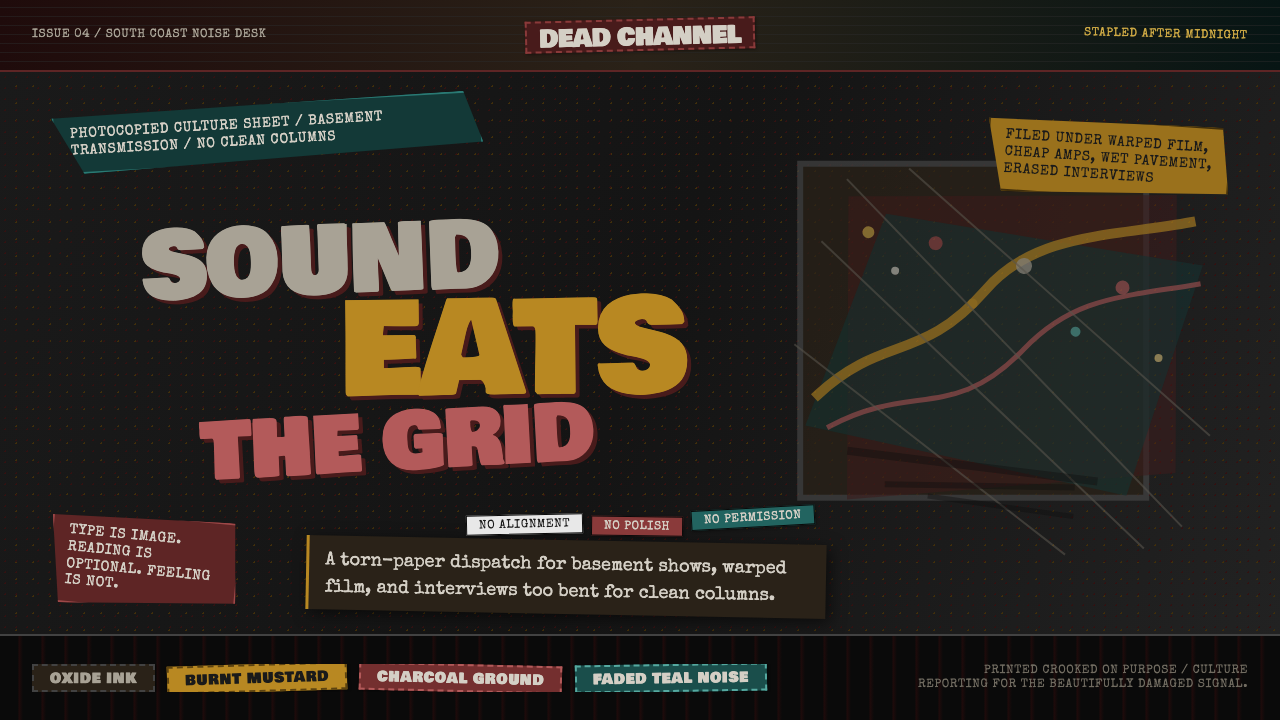 Grunge (Carson 1993)Carson's anti-rules, photocopied. Oxblood on charcoal, distressed type, delib…大卫·卡森颠覆现代主义排版的粗粝美学:暗红与焦黄、炭灰底、刻意打破的网格、油墨…
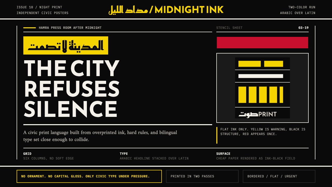 Beirut Indie Graphic DesignCivic type as protest. Sulfur yellow Arabic blocks collide with ink-black pos…公民字体即抗议:硫磺黄阿文块撞上墨黑海报网格。
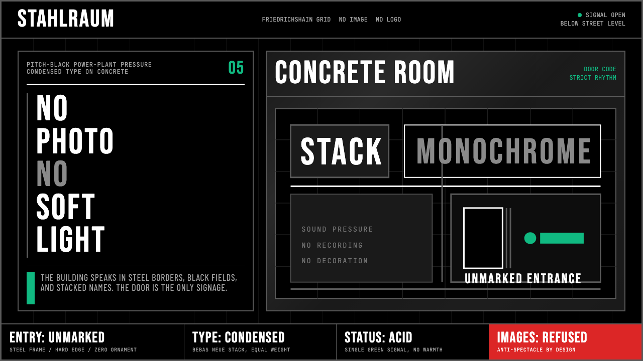 Berlin Techno (Berghain era)Refuses spectacle. Black grid, steel rules, condensed type, one acid-green si…拒绝景观:黑色网格、钢灰粗线、窄体大字,只留一盏酸绿信号。
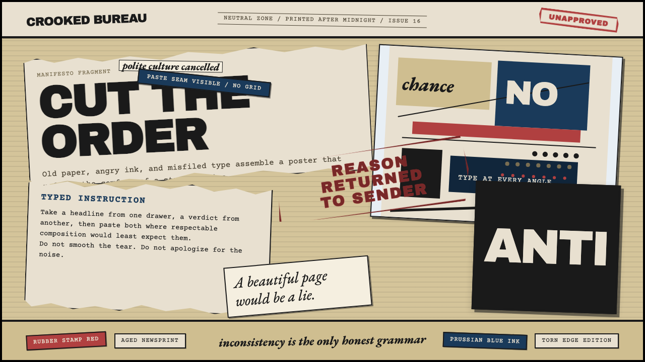 Dadaism (Zürich 1916)Chaos is the grammar. Aged newsprint, stamp red, Prussian blue, and tilted ty…混乱即语法:旧报纸底、印章红、普鲁士蓝与倾斜字体相撞。
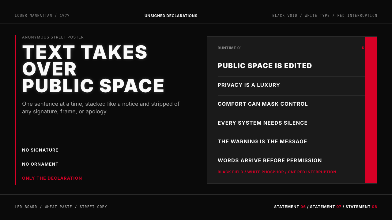 Jenny Holzer Truisms (1977)Austere declarations. White all-caps on black, cut by a single red warning.克制宣言。黑底白字,全大写排成LED板,红色只作警示。
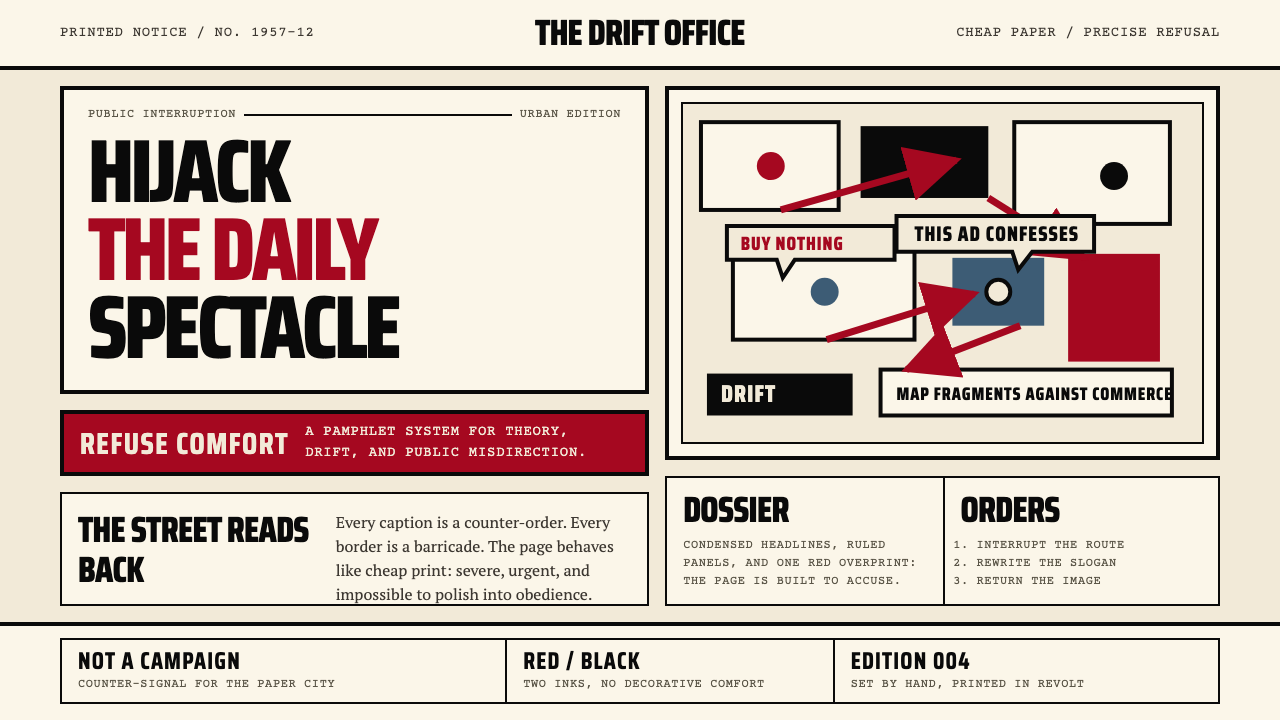 Situationist International (Debord, 1957)Agitation becomes structure. Red-black blocks and condensed type weaponize ne…煽动化为结构。红黑块面与压缩字体把新闻纸变成武器。