What is Maison Margiela Tabi-White?什么是 Maison Margiela Tabi-White?
Maison Margiela turned anonymity into the purest luxury — white walls, blank tags, numbered lines, and four stitches that sign nothing but mean everything.Maison Margiela 将匿名变为最纯粹的奢华——白墙、空白标签、编号线条,以及四道什么都不签却意味着一切的缝线。
Maison Margiela Tabi-White in briefMaison Margiela Tabi-White 速览
Maison Margiela Tabi-White is the visual identity system of Maison Margiela: a Parisian conceptual fashion house whose design language is built entirely on absence. Where other luxury brands accumulate monograms, crest motifs, and proprietary color stories, Margiela strips its surfaces down to pure white, a single industrial typeface, and a four-stitch signature that appears on blank white cotton labels sewn with visible basting thread. The result is a visual system so committed to restraint that restraint itself becomes the statement.Maison Margiela Tabi-White 是 Maison Margiela 的视觉识别系统:这是一个建立在缺席之上的巴黎概念时装屋。其他奢侈品牌不断积累字母组合图案、纹章母题和专属色彩叙事,而 Margiela 则将所有表面剥至纯白——一种工业感字体、四道出现在空白棉布标签上的缝线签名,标签本身以可见的假缝线固定。这套视觉系统对克制的承诺彻底到令克制本身成为声明。
The name references two defining elements of the house: the Tabi split-toe silhouette — a boot form derived from traditional Japanese tabi socks and first introduced in the debut 1989 collection — and the dominant ground color of every surface in the Margiela universe, from showroom walls to product tags to lookbook pages. White is not a background here; it is the primary design element. Everything that appears on it — black Helvetica-weight type, a number from the 0-to-23 line system, the four white stitches — reads as a deliberate incision into that white field.这个名称指向两个定义性元素:Tabi 分趾轮廓——源自日本传统分趾袜的靴子形态,首次亮相于 1989 年的首场发布会——以及 Margiela 宇宙中每一个表面的主导底色:从展厅墙面到产品标签再到大片页面,无处不是白。白色在此不是背景,而是首要设计元素。出现其上的一切——Helvetica 字重的黑色字体、0 到 23 编号系统中的某个数字、四道白色缝线——都像是对那片白色域面的刻意切入。
What distinguishes this system from generic minimalism is its conceptual foundation. The house was structured around the erasure of the conventional luxury brand signature: no founder portrait, no hero logo, no seasonal brand color. In place of identity, Margiela offered a system of categories — numbered lines replacing named collections — and a visual language so austere it functions almost as an anti-brand. For designers and communicators, the style offers a rigorous vocabulary of pure white ground, high-contrast monochrome type, precise corner geometry, and restrained structural detail.这套系统区别于泛化极简主义的,是其概念基础。Margiela 围绕抹除传统奢侈品牌签名这一核心构建起整个体系:没有创始人肖像,没有主导 logo,没有季节性品牌色。以编号产品线取代命名系列,以近乎反品牌的严苛视觉语言取代身份认同。对于设计师与传播者而言,这套风格提供了一套严谨的词汇:纯白底面、高对比度黑白字体、精准的直角几何、克制的结构性细节。
See the Maison Margiela Tabi-White design system查看 Maison Margiela Tabi-White 完整设计系统
Where does Maison Margiela Tabi-White come from?Maison Margiela Tabi-White 从何而来?
Martin Margiela was born in Belgium in 1957 and trained at the Royal Academy of Fine Arts in Antwerp, graduating in 1980 as part of a generation that would become known as the Antwerp Six — a cohort whose collective impact on European fashion in the 1980s was seismic. After graduating, Margiela spent several years assisting Jean Paul Gaultier in Paris, absorbing the mechanics of a working couture house while developing ideas that ran in an entirely opposite direction: away from spectacle and toward structural deconstruction, away from the designer's personality and toward anonymous process.Martin Margiela 于 1957 年生于比利时,就读于安特卫普皇家美术学院,1980 年毕业,属于后来被称为「安特卫普六君子」的那一代人——这个群体在 1980 年代对欧洲时装的集体冲击是震撼性的。毕业后,Margiela 在巴黎为 Jean Paul Gaultier 做了数年助理,一边吸收一家运转中的高定时装屋的内部机制,一边发展着与之完全相反方向的想法:远离奇观,走向结构性解构;远离设计师个性,走向匿名过程。
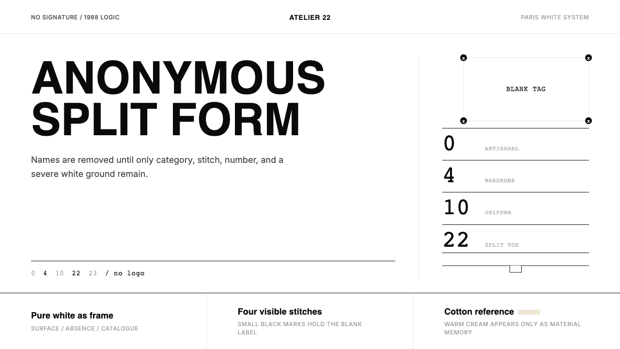
In 1988, Margiela founded Maison Martin Margiela in Paris with business partner Jenny Meirens. The house's founding position was radical and deliberately paradoxical: it would operate as a luxury fashion brand while systematically dismantling every convention of luxury fashion branding. Margiela himself refused all interviews and public appearances from the beginning, communicating with the press only through fax, always signed with a collective 'we' rather than his name. The blank white tag — sewn into garments by four white stitches of exposed basting thread, with no printed name — became the house's most iconic and widely recognized signature. To know that a blank tag meant Margiela required cultural fluency, making the label itself a form of insider knowledge.1988 年,Margiela 与商业伙伴 Jenny Meirens 在巴黎创立了 Maison Martin Margiela。时装屋的创立立场是激进而刻意悖论的:以奢侈时装品牌的形式运作,同时系统性地拆解奢侈时装品牌的每一项惯例。Margiela 本人从一开始就拒绝所有采访和公开露面,只通过传真与媒体沟通,始终以集体性的「我们」而非他的名字署名。那枚空白白色标签——以四道裸露假缝线的白线缝入服装,没有印刷任何名称——成为时装屋最具标志性的签名。识别一张空白标签意味着 Margiela,需要文化上的默契,这让标签本身成为一种内部知识的形式。
The 1989 debut collection introduced the Tabi boot: a heeled shoe split at the toe in the form of the Japanese tabi sock, an object with no direct precedent in Western fashion. The Tabi became the house's most legible symbol — a shape so specific that its silhouette alone functions as a trademark — and it has continued in production, in varying materials and heel heights, through every subsequent creative directorship. The Tabi's split form also encodes the house's conceptual method: taking a vernacular form from an entirely different cultural context and reframing it as fashion through radical decontextualization.1989 年的首场发布会带来了 Tabi 靴:一款鞋头以日本分趾袜形式一分为二的高跟鞋,在西方时装中没有任何直接前例。Tabi 成为时装屋最可辨认的符号——一个特定到仅凭轮廓便能充当商标的形态——并在此后历届创意总监任期内持续生产,以不同材质和跟高呈现。Tabi 的分叉形态同样编码了时装屋的概念方法:从完全不同的文化语境中取一个日常形态,通过激进的去语境化将其重构为时装。
In 2002, Margiela sold a controlling stake in the house to Renzo Rosso's OTB Group (the parent company of Diesel), and in 2009 Martin Margiela quietly departed the creative director role — an exit so consistent with his philosophy of anonymity that it was not publicly confirmed for years afterward. John Galliano, the former Dior creative director, was appointed in 2014 and brought his own baroque sensibility into a productive tension with the house's strict restraint. Under Galliano, the Tabi-White visual language has been maintained as the house's graphic foundation while the garments themselves have absorbed more overt drama — creating a productive tension between image and object that defines the Margiela visual experience in the current era.2002 年,Margiela 将时装屋的控股股权出售给 Renzo Rosso 的 OTB 集团(Diesel 的母公司);2009 年,Martin Margiela 悄然离开创意总监一职——这次离开与他的匿名哲学如此一致,以至于多年后才得到公开确认。前迪奥创意总监 John Galliano 于 2014 年获任,他的巴洛克感性与时装屋严格的克制传统形成了富有成效的张力。在 Galliano 时代,Tabi-White 视觉语言作为时装屋的图形基础被完整保留,而服装本身则吸收了更多外显的戏剧性——图像与物件之间的张力定义了当代 Margiela 视觉体验。
What defines the Maison Margiela Tabi-White look?Maison Margiela Tabi-White 的视觉特征是什么?
White as Primary Element白色作为首要元素
In Tabi-White, white is not a neutral background — it is the dominant visual element. Every surface, from showroom walls to lookbook pages to product tags, is rendered in the same uncompromised pure white. Marks appear on this white field as deliberate incisions: black type, a four-stitch signature, a numbered line. The whiteness carries weight and presence, functioning the way a primary color functions in a more conventional palette: as the first thing the eye registers and the organizing principle of the whole.在 Tabi-White 中,白色不是中性背景,而是主导性的视觉元素。每一个表面——从展厅墙面到大片页面再到产品标签——都以同一种毫不妥协的纯白呈现。标记以刻意切入的姿态出现在这片白色域面上:黑色字体、四道缝线签名、编号线条。白色承载重量与存在感,发挥着主色在更常规色板中发挥的作用:成为视线最先捕捉的事物,也是整体的组织原则。
Monochrome with Structural Contrast黑白对比的单色体系
The palette is strictly two-tone: pure white ground and pure black mark, with no softening, no grey gradation, and no accent color introduced for warmth or hierarchy. Contrast here is structural rather than decorative — the black of the type against the white of the ground is not a style choice but a statement about what constitutes information. This severe reduction means every element that appears on the page is intentional, because nothing is hidden by complexity or distracted by color.色板严格为双色调:纯白底面,纯黑标记,没有柔化,没有灰阶过渡,没有为温暖或层级而引入的强调色。对比在此是结构性的而非装饰性的——字体的黑色对抗底面的白色,不是一种风格选择,而是关于何为信息的声明。这种极度简化意味着出现在页面上的每一个元素都是刻意的,因为没有什么能藏在复杂性或被色彩分散注意力。
Industrial Sans-serif Typographic Weight工业感无衬线字重
All text in the Tabi-White system uses a single family of grotesque or neo-grotesque sans-serif letterforms — the kind of industrial, rationalist typeface associated with anonymous mass production rather than designer personality. The type is set with extreme economy: often a single size for a given text block, with hierarchy established through spatial separation and capitalization rather than through multiple sizes or weights. This typographic austerity enforces the house's anti-signature philosophy at the letter level.Tabi-White 系统中所有文字使用单一家族的怪诞或新怪诞无衬线字形——那种与匿名大规模生产而非设计师个性相关联的工业感理性主义字体。排版以极度经济为原则:给定文字块通常只有单一字号,层级通过空间分隔和大写而非多个字号或字重来建立。这种排版上的严苛,在字母层面强化了时装屋的反签名哲学。
Zero-radius Corner Geometry零圆角几何
Where most contemporary luxury brands have adopted rounded corners as a signal of approachability and modernity, Tabi-White insists on absolute sharp corners throughout — in card components, image frames, tag silhouettes, and layout borders. This precision reads not as cold calculation but as intellectual commitment: the corner is where two lines meet, and rounding that meeting is a concession the system refuses to make. Hard corners enforce a sense that every edge is a decision.当大多数当代奢侈品牌以圆角作为亲和力与现代感的信号时,Tabi-White 在所有地方坚持绝对的直角——卡片组件、图像框、标签轮廓与版面边界,无一例外。这种精准读来不是冷酷的计算,而是智识上的承诺:角是两条线的交汇处,而对这个交汇处的圆化是这套系统拒绝作出的妥协。直角强化了每一条边都是一个决定的感知。
The Four-Stitch Signature四道缝线签名
The four white stitches on a blank white label — sewn with visible basting thread that connects the tag to the garment at four points — function as the house's entire visual identity compressed into a craft gesture. In digital and print contexts, this detail translates into a use of minimal structural marks: ruled lines that appear at precise intervals, thin structural dividers that carry weight without decoration, and a general preference for marks that look constructed rather than designed. The four-stitch logic is about evidence of process, not evidence of brand.空白白色标签上的四道白色缝线——以可见的假缝线在四个点将标签连接到服装上——是时装屋将整个视觉识别压缩进一个工艺姿态的结果。在数字与印刷语境中,这个细节转化为最小化结构标记的使用:以精确间距出现的直线、无装饰却有分量的细结构分割线,以及对那些看起来是被构造而非被设计出来的标记的普遍偏好。四道缝线的逻辑是过程的痕迹,而非品牌的痕迹。
Numbered System over Named Identity编号系统取代命名身份
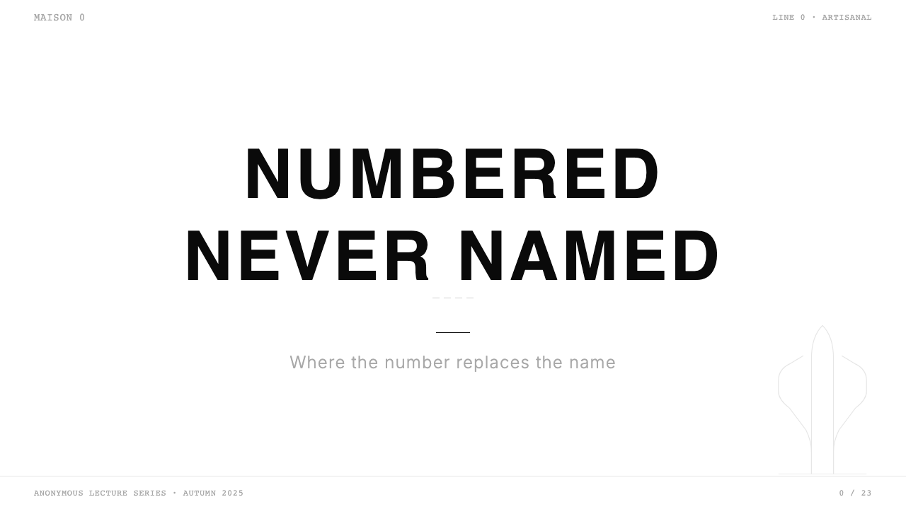
The house's 0-to-23 line system replaces collection names, seasonal titles, and founder signatures with numeric category codes. In design terms, this translates to a preference for structural labeling over expressive naming: dates rather than season titles, numbers rather than descriptor words, categories rather than narratives. Applied to presentations, editorial layouts, or product systems, this principle produces a system that feels encyclopedic and authoritative rather than promotional — information as primary content, not as frame for an image.时装屋的 0 到 23 产品线系统以数字类别代码取代了系列名称、季节标题和创始人签名。在设计层面,这转化为对结构性标注而非表达性命名的偏好:日期而非季节标题,数字而非描述词,类别而非叙事。应用于演示文稿、编辑版面或产品体系,这一原则产生出一套感觉上像百科全书式权威而非推广性的系统——信息作为主要内容,而非图像的框架。
Flatness and Surface Refusal平面性与表面拒绝
No gradients, no ambient shadows, no simulated depth or texture appear in the Tabi-White system. The surfaces are entirely flat — not as a contemporary digital trend, but as a conceptual position. Adding depth simulation would import luxury conventions (gloss, warmth, tactile suggestion) that the house's entire aesthetic opposes. Flatness keeps the visual field open and neutral, a white room in which the marked element — number, word, stitch — stands alone.Tabi-White 系统中没有渐变、没有环境阴影、没有深度或质感的模拟。表面是彻底平面的——不是作为当代数字潮流,而是作为一种概念立场。添加深度模拟会引入奢侈品惯例(光泽、温度、触觉暗示),而时装屋的整套美学正是反对这些的。平面性使视觉域保持开放与中立——一个白色房间,在其中被标记的元素——数字、文字、缝线——独自存在。
See the Maison Margiela Tabi-White design system查看 Maison Margiela Tabi-White 完整设计系统
Who shaped Maison Margiela Tabi-White?谁塑造了 Maison Margiela Tabi-White?
Martin Margiela founded the house in 1988 after training in Antwerp and working under Jean Paul Gaultier. His decision to remain entirely anonymous — never photographed, never interviewed, communicating only by collective fax — was not a marketing posture but a consistent philosophical position: the work should speak, not the person. The blank white tag, the four stitches, the 0-to-23 numbering system, and the Tabi boot silhouette were all established during his tenure and constitute the complete foundational vocabulary of the visual system that bears his name.Martin Margiela 在安特卫普接受训练并在 Jean Paul Gaultier 麾下工作后,于 1988 年创立了时装屋。他选择保持彻底匿名——从不被拍照、从不接受采访、只以集体传真方式沟通——不是一种营销姿态,而是一种一贯的哲学立场:作品应当说话,而非人。空白白色标签、四道缝线、0 到 23 编号系统、Tabi 靴轮廓,都在他任职期间确立,构成了以他名字命名的视觉系统的完整基础词汇。
John Galliano became creative director in 2014, bringing a background in theatrical spectacle and historical reference that stands in apparent tension with the house's austere identity. Rather than softening the visual system, Galliano has maintained the Tabi-White graphic language with fidelity while pushing the garment designs toward denser conceptual territory — deconstructed tailoring, newspaper-print fabrics, Artisanal reworkings of found objects. The pairing demonstrates that the visual system can hold as a stable container for wildly varied creative content, provided its structural rules are upheld.John Galliano 于 2014 年出任创意总监,带来了戏剧性奇观与历史参照的创作背景,与时装屋严苛身份之间看似存在张力。Galliano 没有软化视觉系统,而是忠实维护着 Tabi-White 图形语言,同时将服装设计推向更密集的概念领域——解构剪裁、报纸印花面料、对拾得物的 Artisanal 改造。这种组合证明,只要结构性规则得到维护,视觉系统就能作为稳定容器容纳千变万化的创意内容。
Jenny Meirens co-founded Maison Martin Margiela with Martin Margiela in 1988 and served as the business and commercial intelligence behind the house's early years. While Margiela shaped the creative language, Meirens managed the operational and commercial realities that allowed that language to develop without compromise. Her role is often underexamined in accounts of the house's aesthetic development, but the coherence and consistency of the identity system across all touchpoints — retail, press, presentation — reflects the organizational discipline she brought to the enterprise.Jenny Meirens 于 1988 年与 Martin Margiela 共同创立了 Maison Martin Margiela,是时装屋早期岁月背后的商业与运营智慧。Margiela 塑造创意语言的同时,Meirens 管理着让这套语言得以无妥协发展的运营与商业现实。在时装屋美学发展的叙述中,她的角色常常被低估,但跨所有触点——零售、媒体、发布——身份系统的连贯性与一致性,恰恰反映了她为这项事业带来的组织纪律。
Renzo Rosso, founder of Diesel and OTB Group, acquired a controlling stake in the house in 2002, providing the financial infrastructure that allowed Margiela's visual system to scale globally while maintaining its integrity. Rosso's stewardship during the transition from founder-led to post-founder operations — and through the Galliano appointment — preserved the visual identity intact at a moment when many comparable transitions have resulted in brand dilution. The business relationship between radical conceptualism and commercial distribution that the Rosso-era structure represents is itself a case study in identity management.Diesel 和 OTB 集团创始人 Renzo Rosso 于 2002 年收购了时装屋的控股股权,提供了让 Margiela 视觉系统在保持完整性的同时全球扩张的财务基础设施。Rosso 在从创始人主导向后创始人运营过渡期间——以及在 Galliano 任命过程中——完整保存了视觉识别,而许多类似过渡往往导致品牌稀释。Rosso 时代结构所代表的激进概念主义与商业分发之间的商业关系,本身就是一个身份管理的案例。
How do you use Maison Margiela Tabi-White today?今天怎么用 Maison Margiela Tabi-White?
Tabi-White is one of the most exacting styles to apply correctly because its power comes not from any single visual element but from the discipline of the whole system. A pure white background with black type is not Tabi-White; it is simply monochrome. What distinguishes authentic application is the combination of absolute restraint, structural precision, and the refusal of every softening gesture — no rounded corner, no warm tint, no ambient glow, no gradient fill, no decorative border. Each of those refusals must be active and intentional, or the system collapses into generic minimalism.Tabi-White 是最难正确应用的风格之一,因为它的力量来自整个系统的纪律,而非任何单一视觉元素。纯白背景配黑色字体不是 Tabi-White,那只是单色。真正区分原真应用的,是绝对克制、结构精准,以及对每一个软化姿态的拒绝——没有圆角、没有暖色调、没有环境光晕、没有渐变填充、没有装饰边框。每一种拒绝都必须是主动且刻意的,否则系统就会坍塌为泛化的极简主义。
For presentation slides, Tabi-White works with exceptional clarity on both cover and content pages. A cover should be almost entirely white, with a single typographic element — a date, a category number, a title set in a single weight without variation — positioned with precise spatial tension against the white field. No imagery is necessary on the cover; if imagery appears, it should be a high-contrast black-and-white photograph cropped to a hard geometric frame. Content slides maintain the same logic: a narrow column of text on a pure white ground, structural dividers rendered as thin precise rules, and data presented as diagrammatic flat elements rather than styled chart components. Section breaks should be marked typographically rather than with decorative ornaments.对于演示文稿,Tabi-White 在封面页与内容页上都呈现出卓越的清晰度。封面应当几乎完全是白色的,以单一排版元素——一个日期、一个类别编号、以单一字重无变化设置的标题——与白色域面形成精确的空间张力。封面上不需要图像;若图像出现,应当是裁切为硬边几何框的高对比度黑白照片。内容页保持同样的逻辑:纯白底面上一列窄幅文字,结构分割线以精细规则线呈现,数据以图示化平面元素而非样式化图表组件呈现。段落分隔应以排版方式标记,而非装饰性元素。
For web interfaces, the system maps well to contexts that require authority and precision over warmth: editorial platforms, archival databases, portfolio presentations, pricing and specification pages. The approach is to use a pure white or very near-white ground throughout, apply black for all text and structural lines, and introduce no color whatsoever — or, if a single accent is needed for interactive states, use it as sparingly as the house uses its numbered-line system: one function, one application, no decoration. Hard-edged card components, sharp-cornered image containers, and typographically pure navigation replace softened contemporary UI conventions.对于网页界面,这套系统适合需要权威与精准而非温度的语境:编辑平台、档案数据库、作品集展示、定价与规格页面。方法是全程使用纯白或接近纯白的底面,所有文字与结构线条用黑色,完全不引入色彩——或者,若交互状态需要单一强调色,使用它的方式应当与时装屋使用编号线系统一样克制:一种功能,一处应用,无装饰。硬边卡片组件、直角图像容器,以及字体纯粹的导航,取代软化的当代界面惯例。
For editorial and marketing work, Tabi-White imposes a discipline that can elevate standard content significantly. A Tabi-White editorial layout uses extreme whitespace — margins that feel almost uncomfortably generous — to give each textual element the isolation of an object in a white room. Marketing pages should resist the instinct to fill space; the empty white field is the asset, not a problem to solve. Product or campaign imagery should be photographed or treated to high-contrast monochrome and presented in hard-cornered frames that sit on the white ground without shadow or blur. The typographic voice is factual and categorical — announcements rather than persuasion, numbers and dates rather than evocative adjectives.对于编辑与营销工作,Tabi-White 施加的纪律能够显著提升标准内容的质量。Tabi-White 编辑版面使用极端留白——留白之大几乎令人不适——给予每个文字元素如白色房间中一件物品般的隔离感。营销页面应抵制填充空间的本能;空旷的白色域面是资产,而非需要解决的问题。产品或广告图像应拍摄为或处理为高对比度黑白,以硬角框呈现于白色底面上,无阴影无模糊。排版声音是陈述性与分类性的——公告而非说服,数字与日期而非富有感召力的形容词。
A common and fatal error when applying Tabi-White is importing luxury warmth conventions into the system: adding a warm off-white tint, softening corners to feel more approachable, or introducing a secondary color — gold, cream, blush — to suggest premium quality. Each of these moves contradicts the system's foundational logic, which holds that purity of surface is the luxury signal, not the addition of conventional luxury decoration. A second error is reducing the system to its most visible element — the blank tag, the four stitches — without understanding the spatial and typographic discipline that surrounds those marks. Tabi-White borrowed as surface decoration produces results that look ironic or referential rather than authoritative. The system works only when its refusals are taken seriously.应用 Tabi-White 时,最常见且致命的错误是将奢侈品温度惯例引入系统:添加温暖的米白色调、软化角落以显得更亲和,或引入第二种颜色——金色、奶油色、藕粉色——暗示高端品质。这些动作中的每一个都与系统的基础逻辑相悖——这套逻辑认为,表面的纯粹就是奢华的信号,而非增加常规奢侈装饰。第二种错误是将系统简化为其最可见的元素——空白标签、四道缝线——而不理解围绕这些标记的空间与排版纪律。作为表面装饰借用的 Tabi-White 产生的结果看起来是讽刺性的或参照性的,而非权威性的。只有当系统的拒绝被认真对待时,它才能发挥作用。
See the Maison Margiela Tabi-White design system查看 Maison Margiela Tabi-White 完整设计系统
Maison Margiela Tabi-White — FAQMaison Margiela Tabi-White · 常见问题
Is Tabi-White the same as generic white minimalism?Tabi-White 和泛化白色极简主义是同一回事吗?
No, and the difference is consequential. Generic white minimalism is a stylistic preference — it uses white space and simple layouts because they look contemporary and clean. Tabi-White is a conceptual system built on specific refusals: no warmth tint, no rounded corners, no accent color, no decorative marks of any kind. More importantly, the whiteness in Tabi-White is not a neutral background — it is the primary element, carrying the meaning that pigment carries in other systems. Generic minimalism produces designs that feel open; Tabi-White produces designs that feel like arguments. The difference is the presence or absence of a governing philosophy behind the surface decisions.不,区别是有实质意义的。泛化白色极简主义是一种风格偏好——它使用留白和简洁版面,因为这看起来当代而清爽。Tabi-White 是一套建立在特定拒绝之上的概念系统:无暖色调、无圆角、无强调色、无任何形式的装饰标记。更重要的是,Tabi-White 中的白色不是中性背景——它是首要元素,承载着其他系统中颜料所承载的意义。泛化极简主义产生感觉开阔的设计;Tabi-White 产生感觉像论点的设计。区别在于表面决策背后是否存在一种支配性哲学。
Can Tabi-White work with color imagery or photography?Tabi-White 能与彩色图像或摄影一起使用吗?
With careful handling, yes — but the photography must be treated rather than presented naturally. The house itself uses photography extensively but processes it toward high contrast and near-monochrome. If color photography appears in a Tabi-White layout, it should be bounded by a hard-cornered frame, presented on an otherwise untouched white field, and used sparingly — one strong image rather than a grid of many. The risk is that naturalistic color photography imports warmth, texture, and dimensional illusion that the system's flat, white, precise logic cannot absorb without losing coherence. Treating the image as a bounded, isolated object within the white field is the path that preserves the system's logic.谨慎处理的话可以——但摄影必须经过处理而非自然呈现。时装屋本身大量使用摄影,但将其处理为高对比度和接近黑白。若彩色摄影出现在 Tabi-White 版面中,它应当被硬角边框限定,呈现在未经处理的白色域面上,并节制使用——一张强有力的图像,而非多张图像的网格。风险在于,自然主义的彩色摄影会引入温度、质感和维度幻觉,而系统平面、白色、精准的逻辑无法在不失去连贯性的情况下吸收这些。将图像视为白色域面中一个被限定的、隔离的对象,是保持系统逻辑的路径。
How does this style handle dark mode or dark-background contexts?这种风格如何处理深色模式或深色背景语境?
A dark inversion of Tabi-White — pure black ground, pure white marks — is conceptually coherent with the house's logic and does appear in some Margiela contexts. However, the inversion changes the system's feel significantly: on a black ground, the marks read as more confrontational and stark rather than quietly authoritative. The structural rules remain the same — no gradients, no rounded corners, no warm tints, no decorative elements — but the hierarchy of presence inverts. A pure black ground is a valid application; mixing black and white grounds in the same layout, or introducing dark grey as a third tone, breaks the system's binary discipline.Tabi-White 的深色反转——纯黑底面、纯白标记——在概念上与时装屋的逻辑一致,也确实出现在某些 Margiela 的语境中。然而,反转显著改变了系统的感觉:在黑色底面上,标记呈现出更具对抗性和强烈的感觉,而非低调的权威。结构性规则保持不变——无渐变、无圆角、无暖色调、无装饰元素——但存在的层级关系反转了。纯黑底面是一种有效的应用;在同一版面中混合黑白底面,或引入深灰色作为第三色调,则打破了系统的二元纪律。
What kinds of products or brands is Tabi-White unsuitable for?Tabi-White 不适合哪类产品或品牌?
Tabi-White's severity and conceptual density make it poorly suited for contexts where emotional warmth, accessibility, or sensory richness are the primary user expectations. Food and beverage brands, children's products, wellness applications, and hospitality brands that rely on welcoming visual cues will find the system actively counterproductive — the white field that reads as sophisticated authority in a fashion context reads as clinical coldness in a consumer or care context. Similarly, brands that depend on color as a primary differentiator in a competitive landscape — retail, consumer electronics, or any category where shelf impact and color recognition drive choice — cannot sustain the system's strict monochrome without significant commercial disadvantage.Tabi-White 的严苛性和概念密度,使其在情感温度、可及性或感官丰富性是主要用户期待的语境中表现欠佳。食品饮料品牌、儿童产品、健康应用,以及依赖热情视觉线索的酒店品牌,会发现这套系统起反效果——在时装语境中读来是精致权威的白色域面,在消费或关怀语境中读来是冰冷的临床感。同样,依赖色彩作为竞争格局中主要差异化手段的品牌——零售业、消费电子,或任何货架冲击力和色彩识别驱动选择的品类——在不造成重大商业劣势的情况下,无法维持系统严格的单色方案。
How literal should the Tabi boot reference be in design applications?在设计应用中,Tabi 靴的参照应当多直接?
Not literal at all, in most contexts. The Tabi reference in the style name is conceptual — it points to the house's most recognizable silhouette as a way of naming the aesthetic system, not as a directive to incorporate the boot form into designs. What the Tabi communicates as a concept is instructive: it is a precise, unexpected, culturally specific form that functions as vocabulary rather than ornament. In design terms, this translates as a preference for exact, purposeful shape choices over generic geometric defaults — the decision to use a very specific proportion, an unexpected structural mark, or a particular negative space treatment, rather than defaulting to the safe average. The Tabi's split is not decorative; it is a decision. That is the principle to carry into application.在大多数语境中,完全不需要字面参照。风格名称中的 Tabi 指涉是概念性的——它指向时装屋最具辨识度的轮廓,作为命名这套美学系统的方式,而非将靴子形态融入设计的指令。Tabi 作为概念所传达的是有教益的:它是一个精确的、出乎意料的、文化上特定的形态,作为词汇而非装饰发挥功能。在设计层面,这转化为对精确、有目的的形态选择而非通用几何默认值的偏好——决定使用非常特定的比例、出乎意料的结构性标记,或特定的负空间处理,而非退回到安全的平均值。Tabi 的分叉不是装饰性的;它是一个决定。这才是需要带入应用的原则。
Related design styles相关设计风格
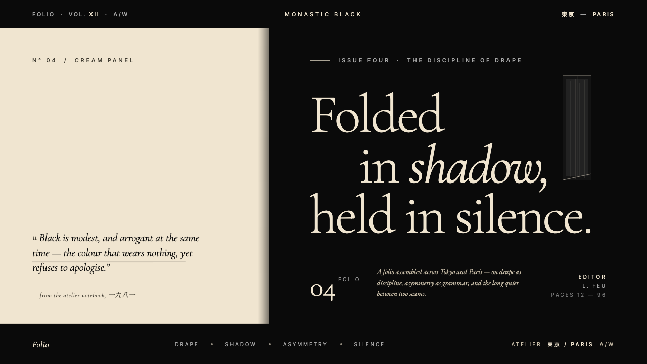 Yohji Yamamoto Monastic BlackBlack as philosophy. Monastic ink ground, warm cream reprieve, low-weight Gar…黑色即信仰:修道院般的深黑作底,温润米色为唯一呼吸,低重量衬线压低嗓音。
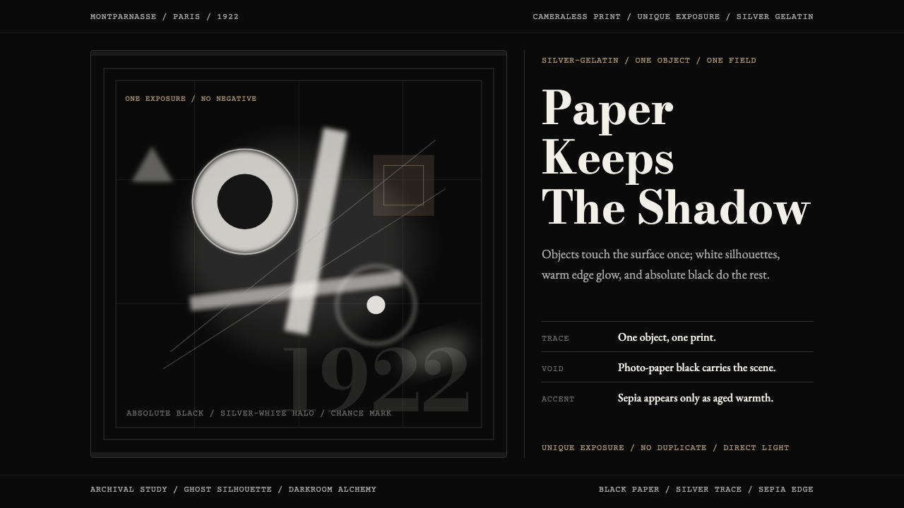 Man Ray Rayograph (1922)Light leaves the trace. Black voids, silver type, and sepia edges stage one g…光留下痕迹。黑底、银字与赭边,共构一张幽影印迹。
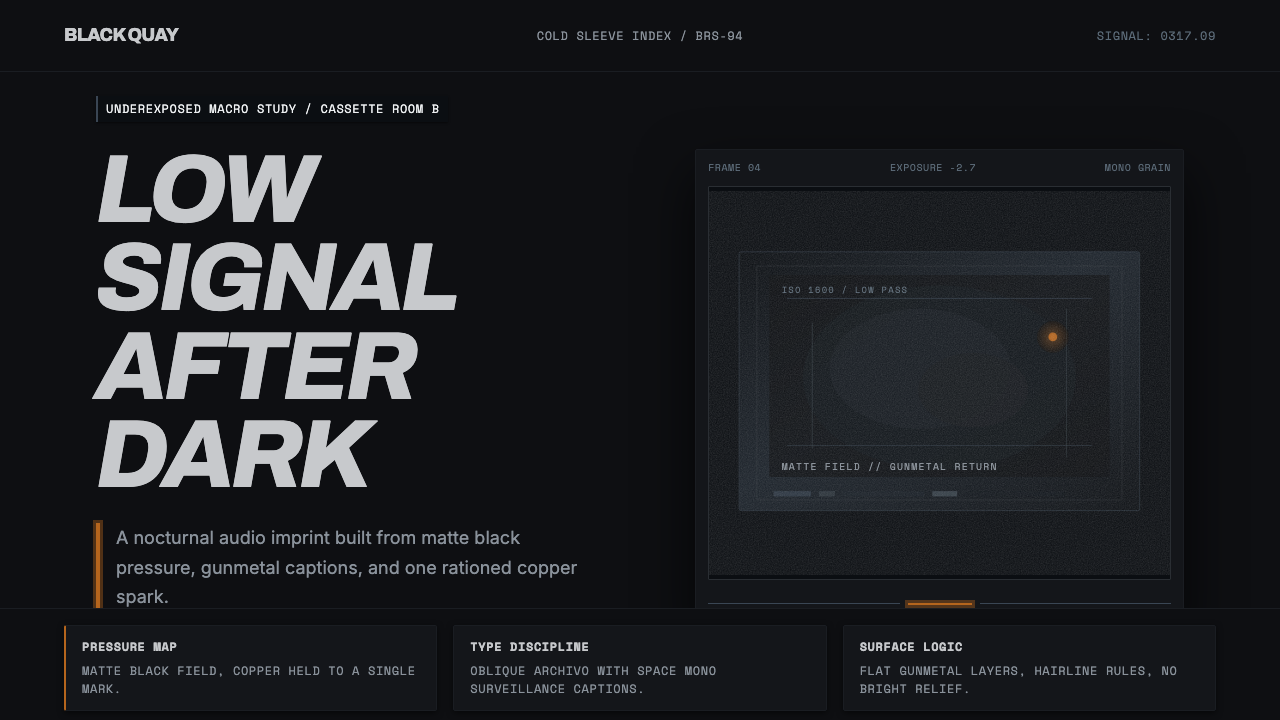 Bristol Trip-HopMenace through minimalism. Near-black grain, gunmetal type, one copper spark.以极简制造威胁感:近黑颗粒、枪金属字体、一点铜火。
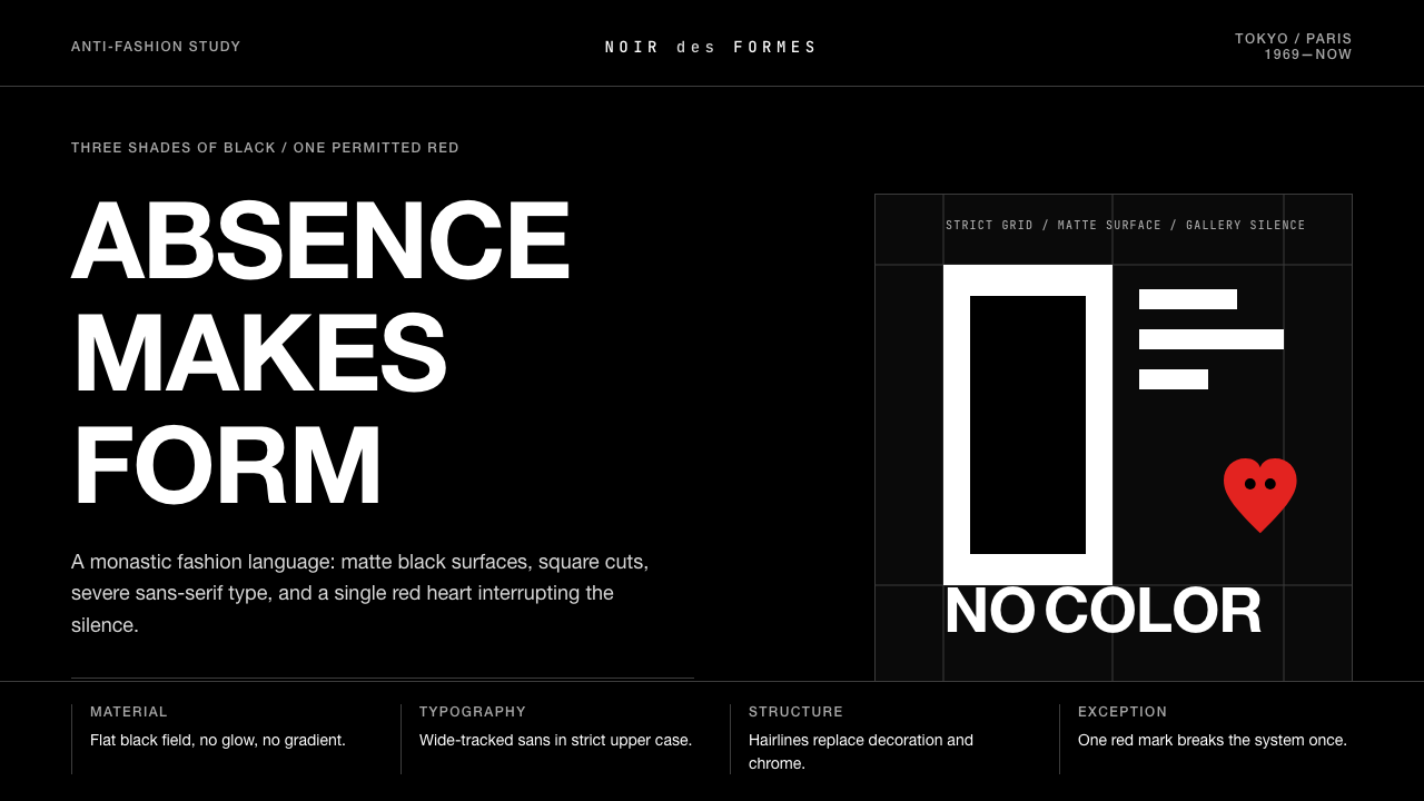 Comme des Garçons (Rei Kawakubo)Austerity becomes the event. Pure black, wide sans type, and one red heart br…克制即事件:纯黑、宽距无衬线与一枚红心打破沉默。
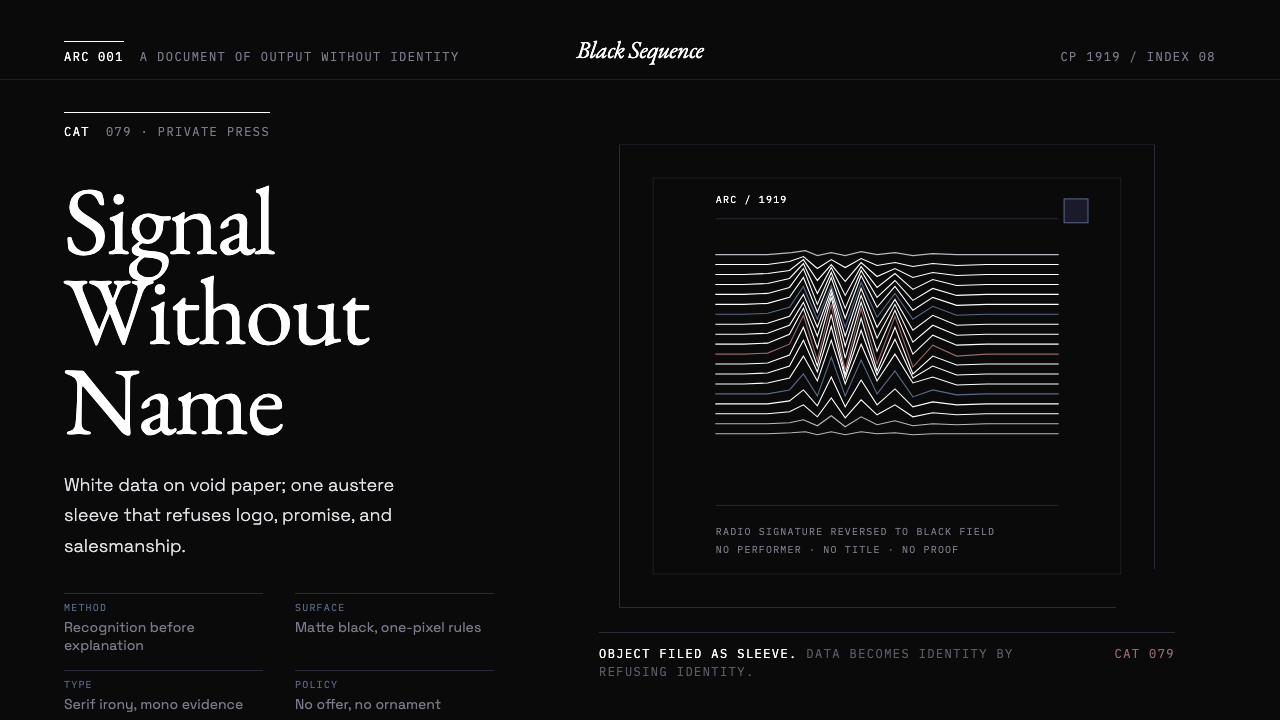 Peter Saville / Factory RecordsAnti-design becomes high art. Void black, white pulsar lines, and FAC mono la…反设计即高级艺术:黑色虚空、白色脉冲线与 FAC 等宽标签拒绝品牌化。
 Balenciaga (Demna era)Threatening restraint. Black grids, white hairlines, spaced sans at brutal sc…危险的克制。黑底网格、白色发丝线与巨型宽字距无衬线制造压迫。